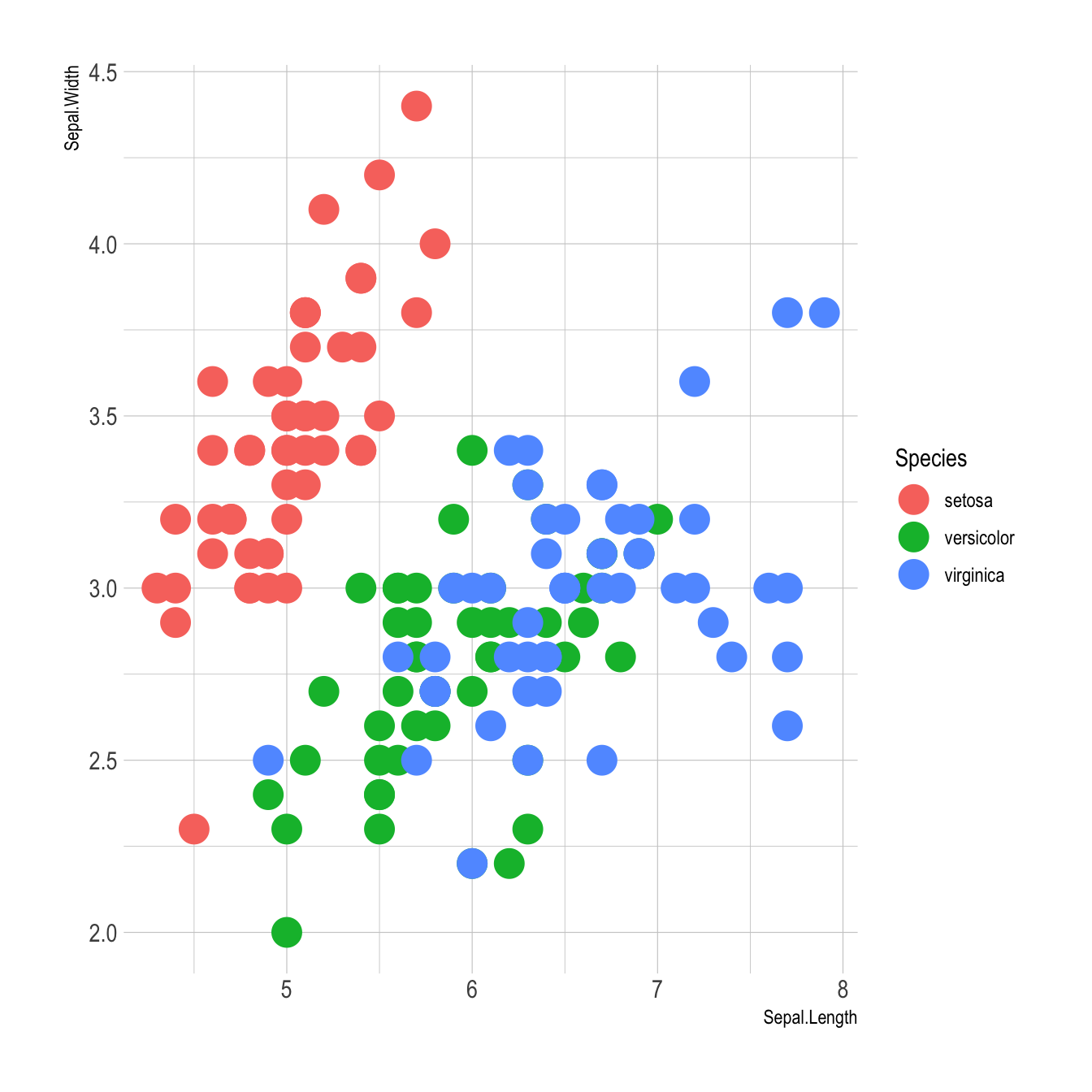
Basic example
Here is the magick of ggplot2: the ability
to map a variable to marker features. Here, the marker
color depends on its value in the field called
Species in the input data frame.
Note that the legend is built automatically.
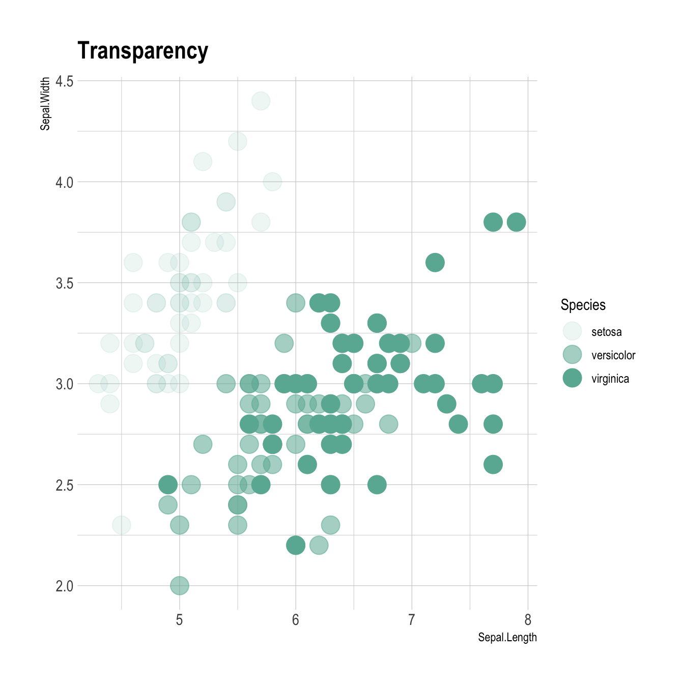
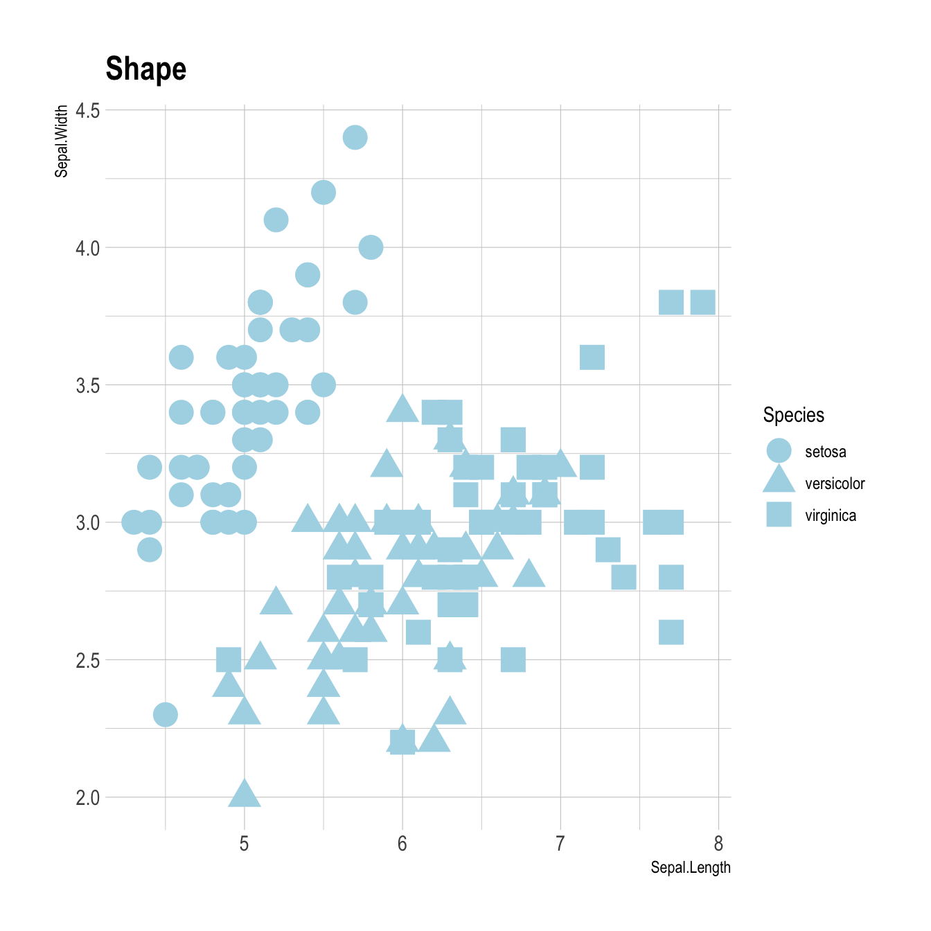
Works with any aesthetics
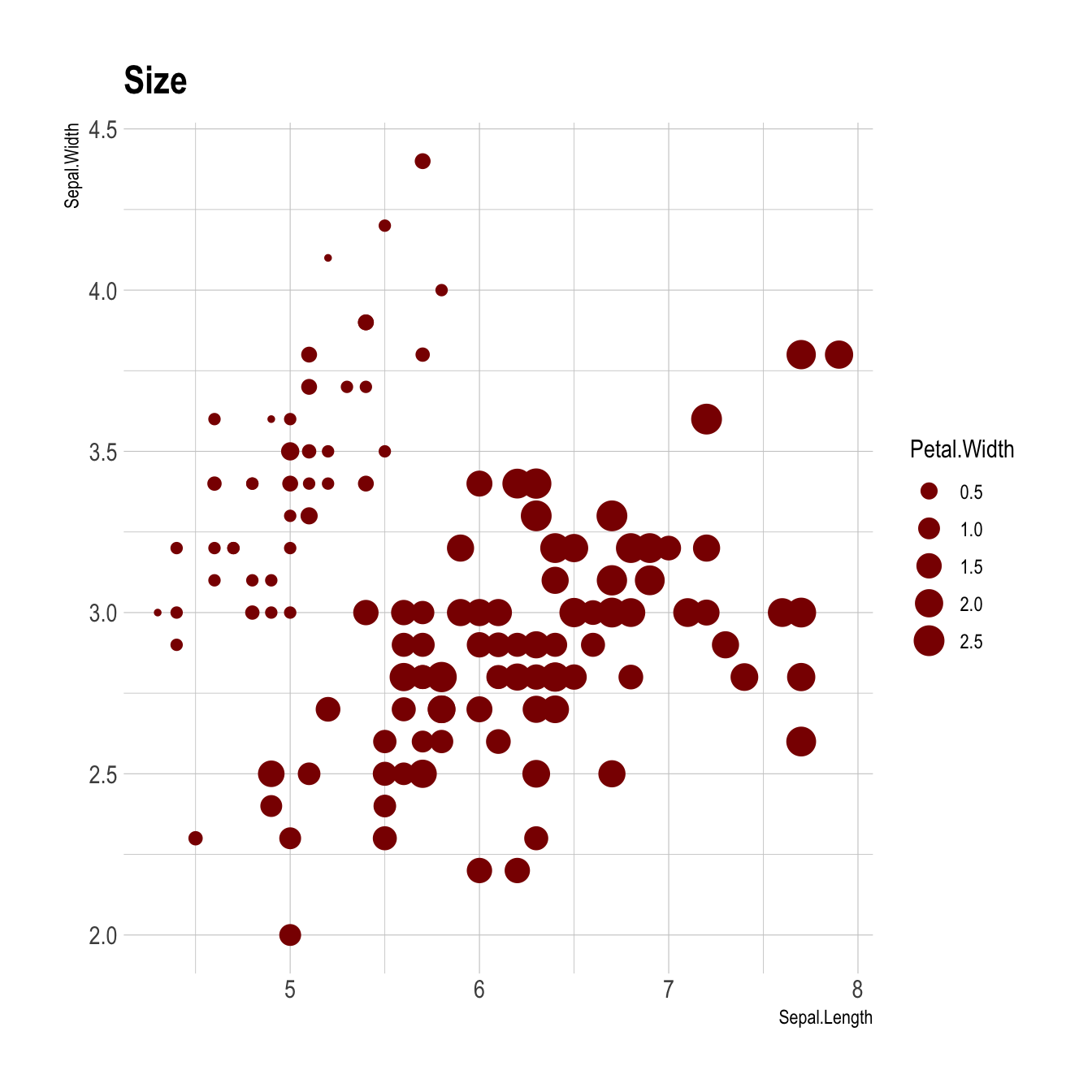
You can map variables to any marker features. For instance, specie is represente below using transparency (left), shape (middle) and size (right).
# Transparency
ggplot(iris, aes(x=Sepal.Length, y=Sepal.Width, alpha=Species)) +
    geom_point(size=6, color="#69b3a2") +
    ggtitle("Transparency") +
    theme_ipsum()

# Shape
ggplot(iris, aes(x=Sepal.Length, y=Sepal.Width, shape=Species)) +
    geom_point(size=6, color="lightblue") +
    ggtitle("Shape") +
    theme_ipsum()

# Size
ggplot(iris, aes(x=Sepal.Length, y=Sepal.Width, size=Petal.Width)) +
    geom_point(color="darkred") +
    ggtitle("Size") +
    theme_ipsum()
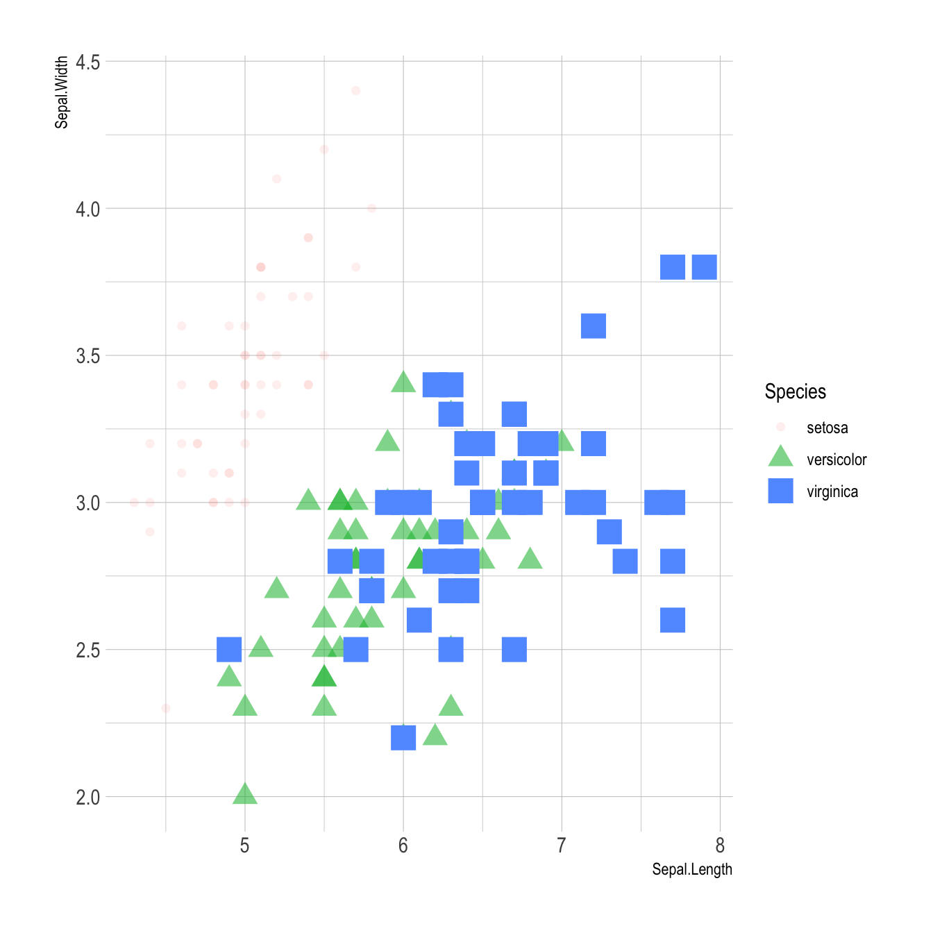
Mapping to several features
Last but not least, note that you can map one or several variables to
one or several features. Here, shape, transparency, size and color all
depends on the marker Species value.
# load ggplot2
library(ggplot2)
library(hrbrthemes)

# A basic scatterplot with color depending on Species
ggplot(iris, aes(x=Sepal.Length, y=Sepal.Width, shape=Species, alpha=Species, size=Species, color=Species)) +
    geom_point() +
    theme_ipsum()