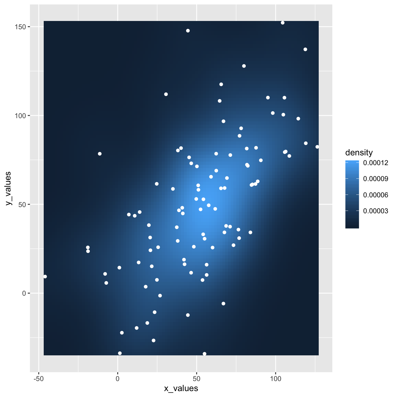
This plot extends the concepts described in the 2d density chart with ggplot2 document. It simply illustrates that a scatterplot can be added on top of the 2d density chart.
Thanks Christian Jacob for this submission.
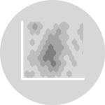
This post explains how to build a hexbin chart with a
scatterplot on top using
R and ggplot2. It is
an addition to the page about
2d density plot with ggplot2.
This plot extends the concepts described in the 2d density chart with ggplot2 document. It simply illustrates that a scatterplot can be added on top of the 2d density chart.
Thanks Christian Jacob for this submission.
Related chart types

👋 After crafting hundreds of R charts over 12 years, I've distilled my top 10 tips and tricks. Receive them via email! One insight per day for the next 10 days! 🔥