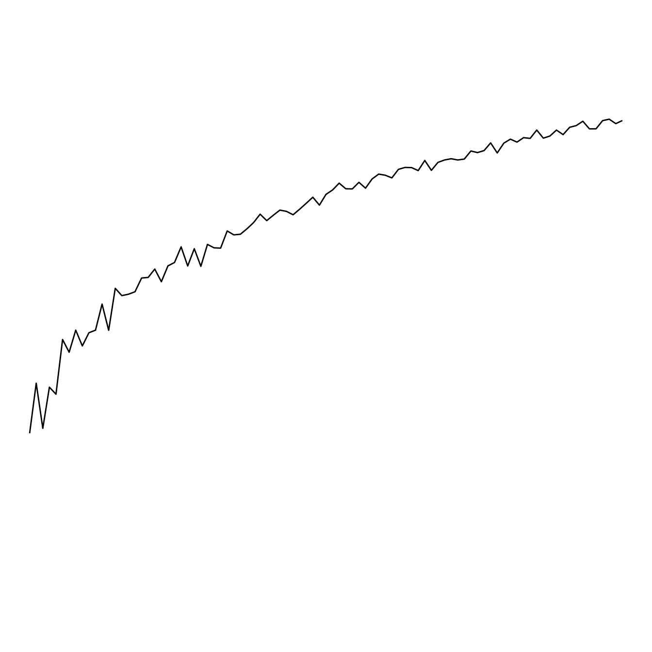
It is sometimes useful to use a log scale for a numeric variable. Indeed, it allows to “magnify” the lower part of the curve.
This is possible thanks to the
scale_y_log10() function. Control the horizontal grid
lines with breaks, and the axis limits with
limits. (Note that 0 is not allowed, since log(0) is
not defined.)
# Library
library(ggplot2)

# Create dummy data
data <- data.frame(
  x=seq(10,100),
  y=seq(10,100)/2+rnorm(90)
)

# Make the plot
ggplot(data, aes(x=x, y=y)) +
  geom_line() +
  scale_y_log10( breaks=c(1,5,10,15,20,50,100), limits=c(1,100) )
Without log transform
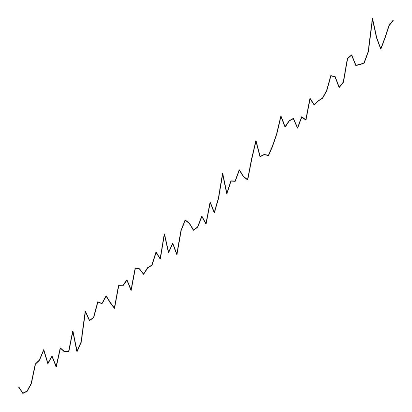
This is the same chart without the log transform: