Packages
In order to create this chart, we need to load the following packages, as well as some fonts:
Dataset
The data consists of a custom grid representing the
regions of Catalonia, stored in a data frame called
comarques. Each region is identified by a
unique code and name, and has corresponding row and
column coordinates.
Additionally, a CSV file containing data for December is loaded into a
data frame called datos. The setmana column
in the datos data frame is converted to a factor with
levels representing the weeks of the month.
# Creating the custom grid ()
comarques <- data.frame(
  code = c("AN", "CE", "AR", "PS", "RI", "AE", "PE", "GA", "BE", "AU", "PJ", "SO", "GI", "BE", "OS", "NO", "BA", "SE", "MO", "SE", "VO", "AN", "SA", "PU", "UR", "VR", "MA", "AC", "CB", "GG", "PR", "AP", "BA", "GA", "RE", "BP", "TA", "BL", "BE", "BC", "TA", "MO"),
  name = c("Aran", "Cerdanya", "Alta Ribagorça", "Pallars Sobirà", "Ripollès", "Alt Empordà", "Pla de l'Estany", "Garrotxa", "Berguedà", "Alt Urgell", "Pallars Jussà", "Solsonès", "Gironès", "Baix Empordà", "Osona", "Noguera", "Bages", "Segarra", "Moianès", "Selva", "Vallès Occidental", "Anoia", "Segrià", "Pla d'Urgell", "Urgell", "Vallès Oriental", "Maresme", "Alt Camp", "Conca de Barberà", "Garrigues", "Priorat", "Alt Penedès", "Barcelonès", "Garraf", "Ribera d'Ebre", "Baix Penedès", "Terra Alta", "Baix Llobregat", "Baix Ebre", "Baix Camp", "Tarragonès", "Montsià"),
  row = c(1, 2, 2, 2, 2, 2, 3, 3, 3, 3, 3, 3, 3, 3, 4, 4, 4, 4, 4, 4, 5, 5, 5, 5, 5, 5, 5, 6, 6, 6, 6, 6, 7, 7, 7, 7, 7, 7, 8, 8, 8, 9),
  col = c(3, 6, 3, 4, 7, 9, 8, 7, 6, 4, 3, 5, 9, 10, 7, 3, 5, 4, 6, 8, 6, 5, 2, 3, 4, 7, 8, 5, 4, 3, 2, 6, 6, 4, 2, 3, 1, 5, 2, 3, 4, 2),
  stringsAsFactors = FALSE
)

datos <- read.csv("https://raw.githubusercontent.com/lau-cloud/geo_data/main/grid_catalonia/setmanes_desembre.csv", encoding = "UTF-8")
datos$setmana <- factor(datos$setmana, levels = c("16-22", "23-29", "30-06", "07-13", "14-20"))
Simple density plot
The code creates a geographical faceted area plot,
where each facet represents a unique value in the
name variable. The x-axis represents setmana, the y-axis
represents positius_x, and the fill color of the area
under the line is determined by tendencia. The fill colors are
manually set to "#FF5A31", "#FACB66", and
"grey".
ggplot(datos, aes(x = setmana, y = positius_x, group = name, fill = tendencia)) +
  geom_area() +
  scale_fill_manual(values = c("#FF5A31", "#FACB66", "grey")) +
  facet_geo(~name, grid = comarques, label = "name")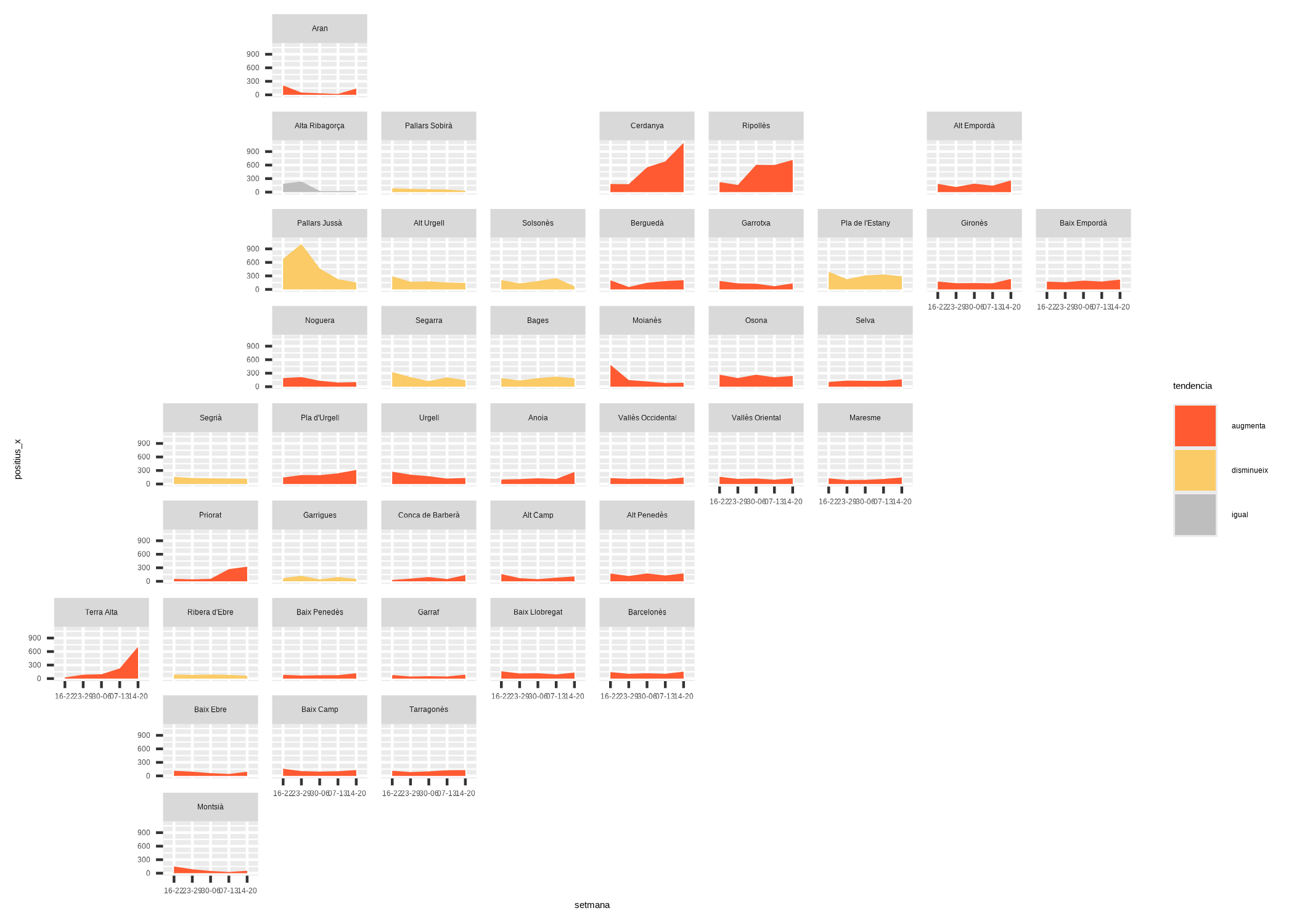
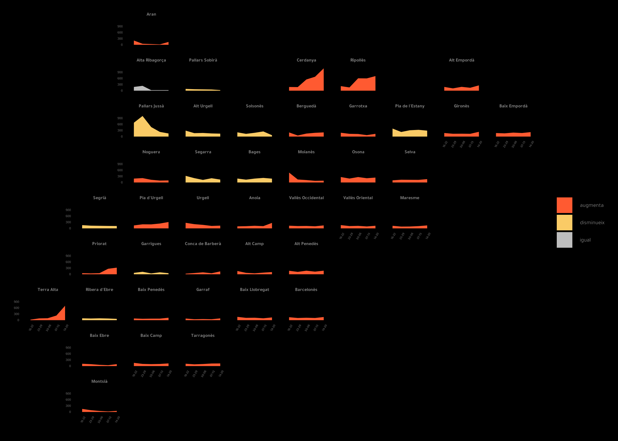
Improve theme and remove unused labels
The next step is to customize the theme of the plot
using the theme() function, especially to turn this chart
into a dark theme one.
ggplot(datos, aes(x = setmana, y = positius_x, group = name, fill = tendencia)) +
  geom_area() +
  scale_fill_manual(values = c("#FF5A31", "#FACB66", "grey")) +
  facet_geo(~name, grid = comarques, label = "name") +
  theme_minimal() +
  theme(
    panel.grid.minor = element_blank(),
    plot.background = element_rect(fill = "black"),
    panel.background = element_rect(fill = "black"),
    panel.grid.major.x = element_blank(),
    panel.grid.major.y = element_blank(),
    plot.title = element_text(color = "#818181", size = 26, family = "abril"),
    plot.subtitle = element_text(color = "#818181", size = 18, family = "tawa"),
    plot.caption = element_text(color = "#818181", size = 10),
    strip.text.x = element_text(color = "#818181", size = 12, face = "bold", family = "tawa"),
    legend.position.inside = c(0.8, 0.2),
    axis.text.x = element_text(size = 8, face = "bold", angle = 60, family = "tawa"),
    axis.text.y = element_text(size = 8, face = "bold"),
    legend.text = element_text(color = "#818181", size = 14, family = "tawa"),
    legend.key.size = unit(0.5, "cm"),
    legend.spacing.y = unit(.5, "char")
  )
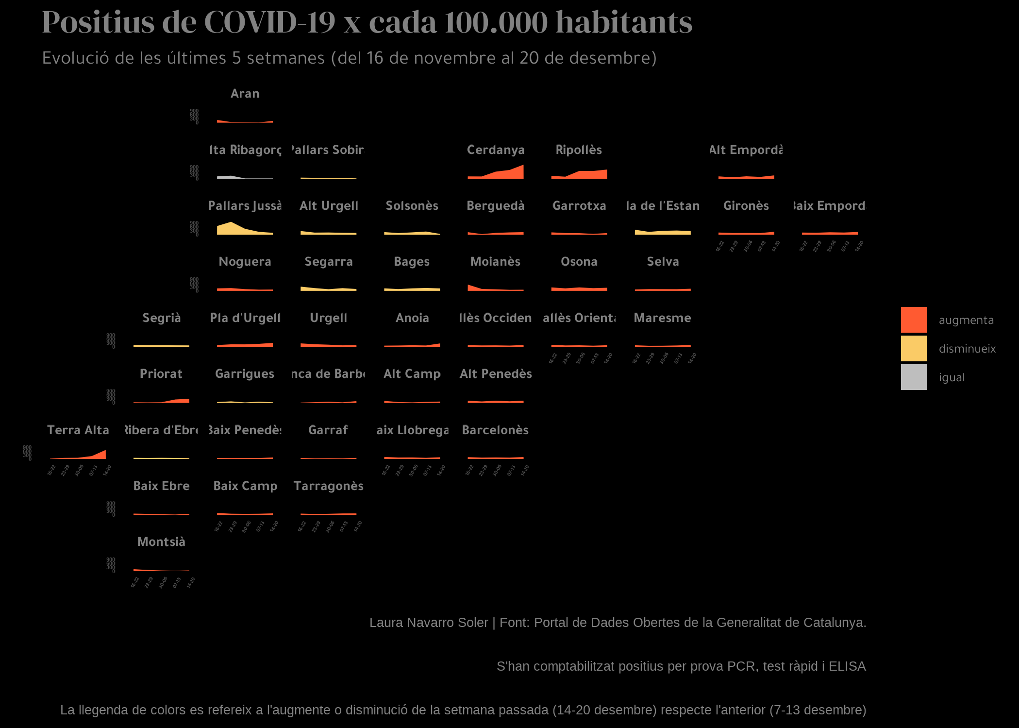
Final plot
The final step is to add title,
subtitle and caption to our chart,
and we do it thanks to the labs() function:
ggplot(datos, aes(x = setmana, y = positius_x, group = name, fill = tendencia)) +
  geom_area() +
  scale_fill_manual(values = c("#FF5A31", "#FACB66", "grey")) +
  facet_geo(~name, grid = comarques, label = "name") +
  theme_minimal() +
  labs(
    x = "setmana", y = "positius x 100.000 habitants",
    title = "Positius de COVID-19 x cada 100.000 habitants",
    subtitle = "Evolució de les últimes 5 setmanes (del 16 de novembre al 20 de desembre)",
    caption = "Laura Navarro Soler | Font: Portal de Dades Obertes de la Generalitat de Catalunya.\n S'han comptabilitzat positius per prova PCR, test ràpid i ELISA \n La llegenda de colors es refereix a l'augmente o disminució de la setmana passada (14-20 desembre) respecte l'anterior (7-13 desembre)"
  ) +
  theme(
    panel.grid.minor = element_blank(),
    plot.background = element_rect(fill = "black"),
    panel.background = element_rect(fill = "black"),
    panel.grid.major.x = element_blank(),
    panel.grid.major.y = element_blank(),
    plot.title = element_text(color = "#818181", size = 50, family = "abril"),
    plot.subtitle = element_text(color = "#818181", size = 30, family = "tawa"),
    plot.caption = element_text(color = "#818181", size = 20),
    strip.text.x = element_text(color = "#818181", size = 22, face = "bold", family = "tawa"),
    legend.position.inside = c(0.8, 0.2),
    axis.text.x = element_text(size = 8, face = "bold", angle = 60, family = "tawa"),
    axis.text.y = element_text(size = 8, face = "bold"),
    legend.text = element_text(color = "#818181", size = 20, family = "tawa"),
    legend.key.size = unit(0.5, "cm"),
    legend.spacing.y = unit(.5, "char")
  )
Going further
You might be interested in:
- this beautiful ridgeline plot about rental prices
- how to create a small multiple line chart
- how to mix time series and facetting