Most basic scatterplot
The plot() function of R allows to build a scatterplot. Both numeric variables of the input dataframe must be specified in the x and y argument.
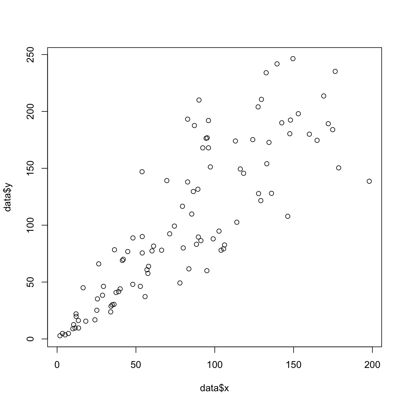
# Create data
data = data.frame(
  x=seq(1:100) + 0.1*seq(1:100)*sample(c(1:10) , 100 , replace=T),
  y=seq(1:100) + 0.2*seq(1:100)*sample(c(1:10) , 100 , replace=T)
)

# Basic scatterplot
plot(x=data$x, y=data$y)
Customizations
Here is a description of the most common customization:
cex: circle sizexlimandylim: limits of the X and Y axispch: shape of markers. See all here.xlabandylab: X and Y axis labelscol: marker colormain: chart title
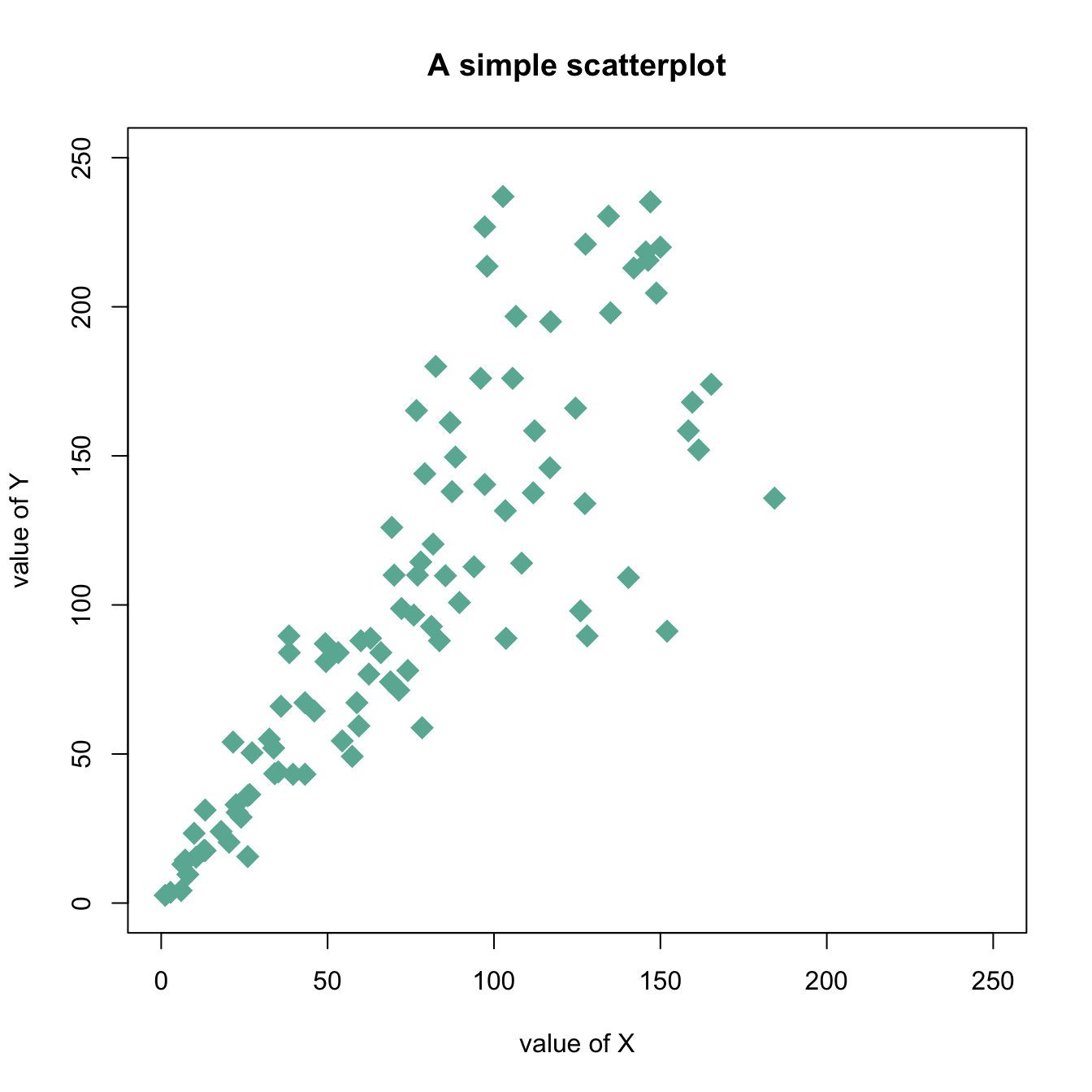
# Create data
data = data.frame(
  x=seq(1:100) + 0.1*seq(1:100)*sample(c(1:10) , 100 , replace=T),
  y=seq(1:100) + 0.2*seq(1:100)*sample(c(1:10) , 100 , replace=T)
)

# Basic scatterplot
plot(data$x, data$y,
     xlim=c(0,250) , ylim=c(0,250),
     pch=18,
     cex=2,
     col="#69b3a2",
     xlab="value of X", ylab="value of Y",
     main="A simple scatterplot"
     )