Start basic: the barplot() function
Graph #208 describes the most simple barchart you can do with R and the barplot() function. Graph #209 shows the basic options of barplot().
Let’s recall how to build a basic barplot:
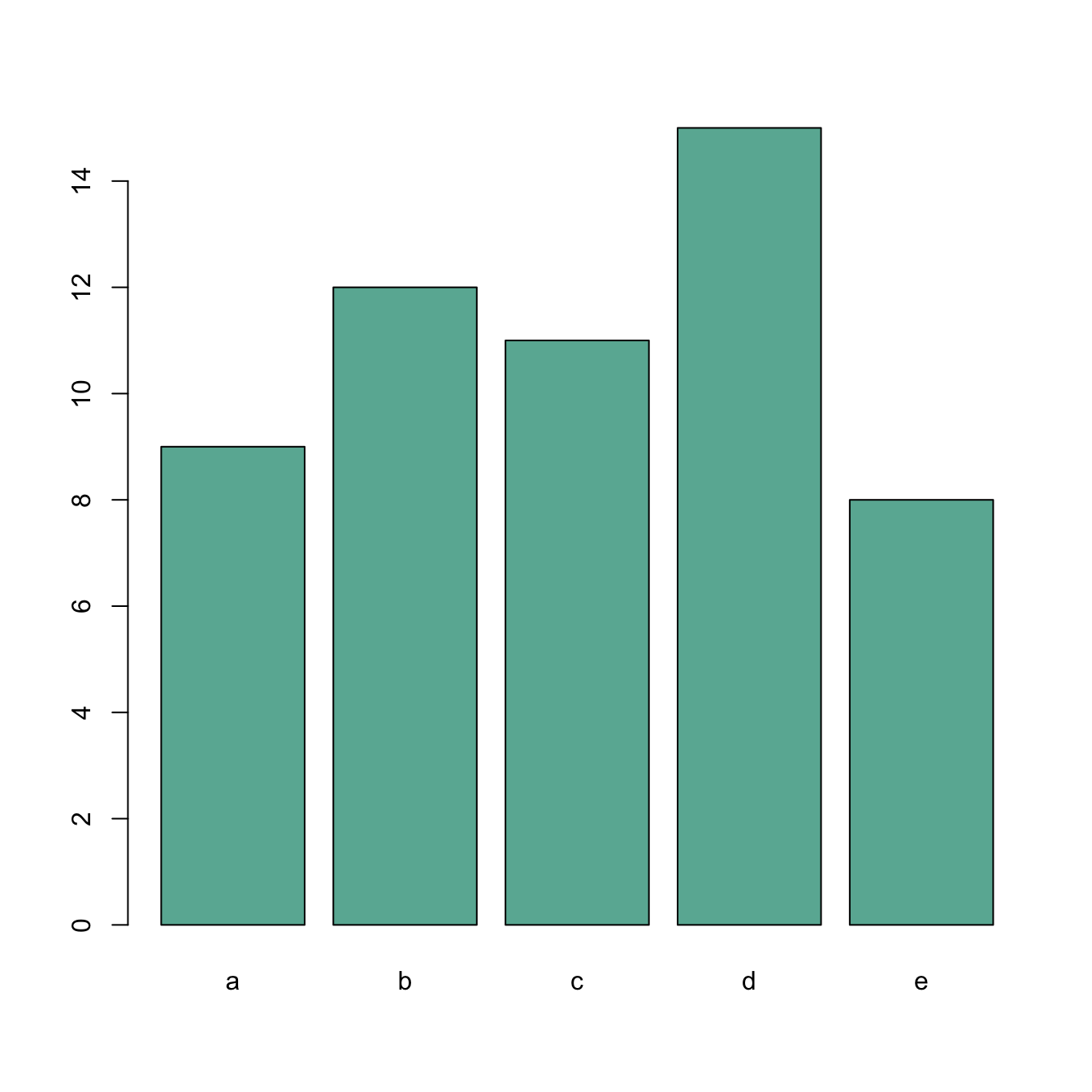
# create dummy data
data <- data.frame(
  name=letters[1:5],
  value=sample(seq(4,15),5)
)

# The most basic barplot you can do:
barplot(height=data$value, names=data$name, col="#69b3a2")
Axis labels orientation with las
The las argument allows to change the orientation of the axis labels:
0: always parallel to the axis1: always horizontal2: always perpendicular to the axis3: always vertical.
This is specially helpful for horizontal bar chart.
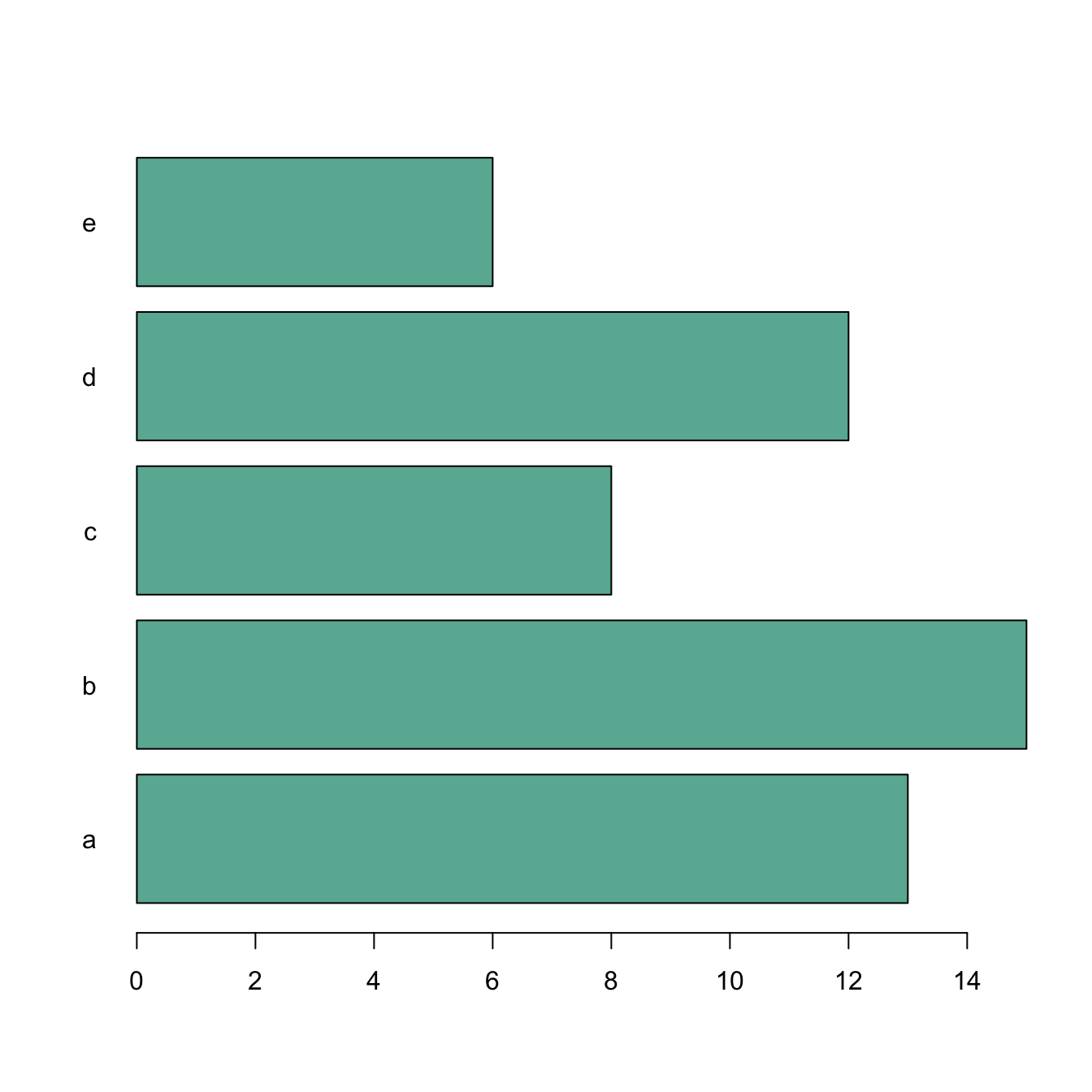
# create dummy data
data <- data.frame(
  name=letters[1:5],
  value=sample(seq(4,15),5)
)

# The most basic barplot you can do:
barplot(height=data$value, names=data$name, col="#69b3a2", horiz=T , las=1)
Change group labels with names.arg
Change the group names using the names.arg argument. The vector you provide must be the same length as the number of categories.
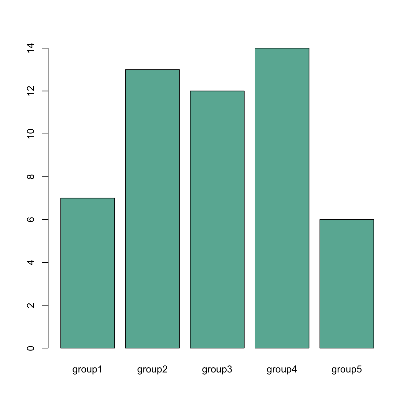
# create dummy data
data <- data.frame(
  name=letters[1:5],
  value=sample(seq(4,15),5)
)

# Uniform color
barplot(height=data$value, names.arg=c("group1","group2","group3","group4","group5"), col="#69b3a2")
Axis labels & axis title style
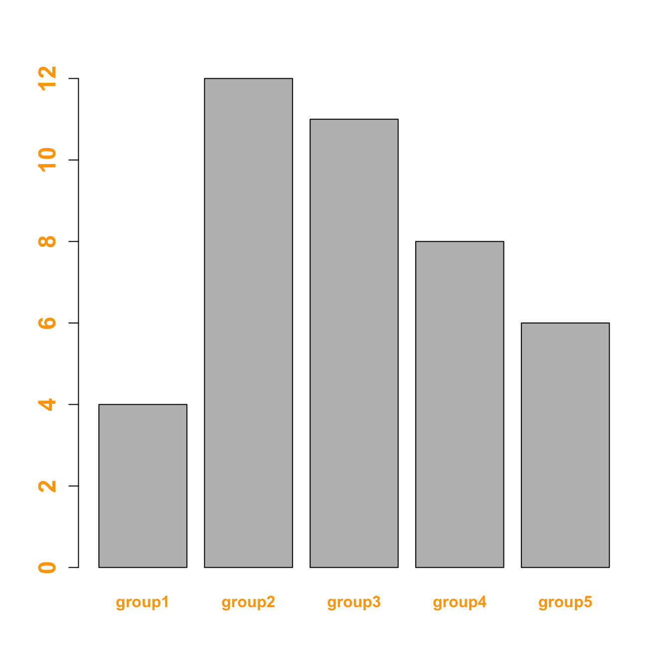
Customize the labels:
font.axis: font: 1: normal, 2: bold, 3: italic, 4: bold italiccol.axis: colorcex.axis: size
Customize axis title:
font.labcol.labcex.lab
# create dummy data
data <- data.frame(
name=letters[1:5],
value=sample(seq(4,15),5)
)
# Customize labels (left)
barplot(height=data$value, names=data$name,
names.arg=c("group1","group2","group3","group4","group5"),
font.axis=2,
col.axis="orange",
cex.axis=1.5
)
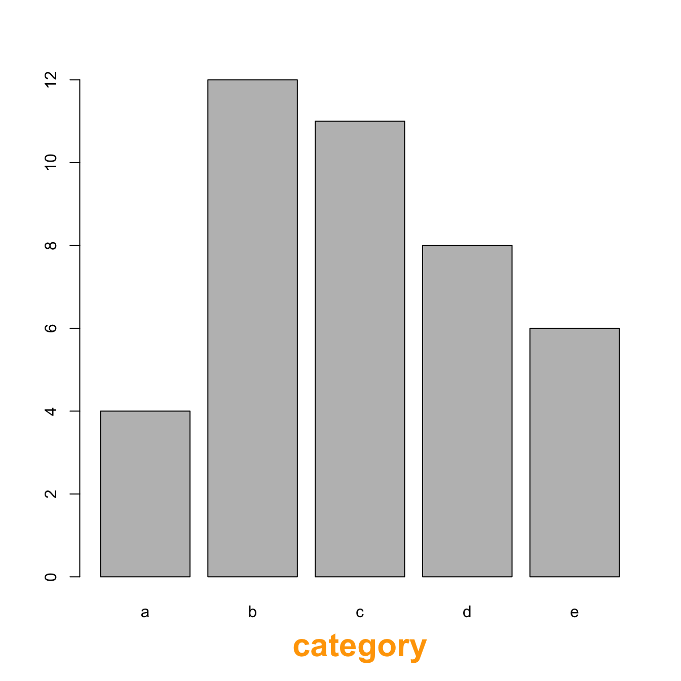
# Customize title (right)
barplot(height=data$value, names=data$name,
xlab="category",
font.lab=2,
col.lab="orange",
cex.lab=2
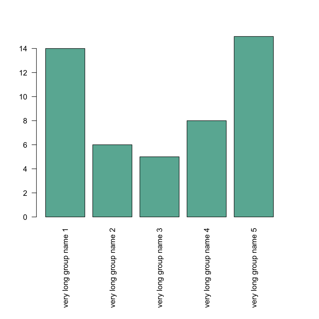
)Increase margin size
If your group names are long, you need to:
- rotate them to avoid overlapping. This is done with
las - increase bottom margin size using the
marparameter of thepar()function. Four values are provided: bottom, left, top, right respectively.
Note: prefer a horizontal barplot in this case.
# create dummy data
data <- data.frame(
  name=letters[1:5],
  value=sample(seq(4,15),5)
)

# Increase margin size
par(mar=c(11,4,4,4))

# Uniform color
barplot(height=data$value,
        col="#69b3a2",
        names.arg=c("very long group name 1","very long group name 2","very long group name 3","very long group name 4","very long group name 5"),
        las=2
)