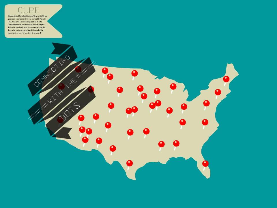
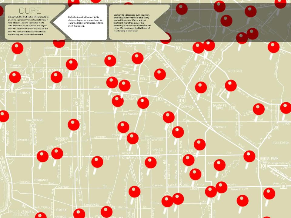
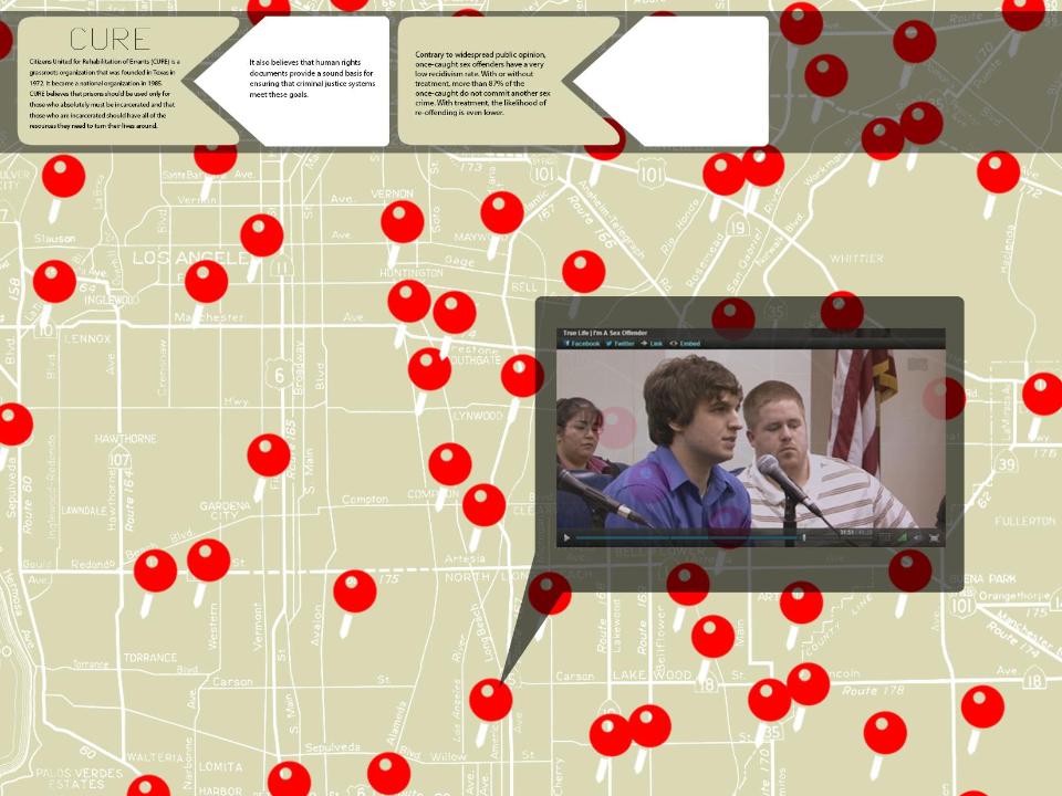
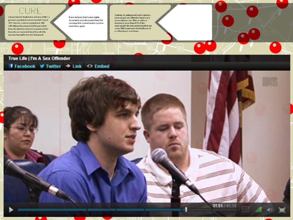
This past week, Team CURE made substantial headway with prototyping our project. While we are still working on finding a way to get a working prototype off the ground (neither Miho nor I are very adept at website design — hopefully we will get some help from NEO soon!), we have been trying to work through the graphic language + user experience of our project by creating mock up boards.
The website is meant to be a visual subversion of the existing red dot sex offender registry map. Instead of seeing registrant information when you click on the dots, you get super useful information from CURE about why the registry might be more damaging than productive. We anticipate that one of the main problems that we will be encountering going forward is the management of all of our dots (the multimedia content embedded in the site). As of now, we want the dots to have…. embedded video, essays, research pieces, facts, personal narratives, news articles and links to organizations. Depending on which dot you click, you will get a tiny morsel of information. The more you click the more you know!
Based on the feedback that we got from CURE, we will be working to make the graphic language less cute and more serious so expect a few more iterations of this shortly!
