A modern Vue 3 Gantt chart component library with built-in resource view and resource planning capabilities, providing complete solutions for project management, task scheduling, and resource allocation
⚠️ Important Notice: Following recent security vulnerability updates, all base packages now require Nodejs >= 20. If you maintain any local customizations or secondary development, please ensure your Node.js version is upgraded before continuing development and build operations.
⚠️ Important Notice (Read Before Upgrading): If you are upgrading to v1.13.5 or later, the semantics of the type field on the Resource interface have changed (free text → resource category Human/Device/Others). Any job-title/role text previously stored in type will NOT be migrated automatically — please migrate it to the new title field before upgrading, otherwise the "title" column will be empty and the "category" column will show unexpected text. See the Breaking Change note in the Resource Data Structure section for details.
---
## ✨ Introduction
jordium-gantt-vue3 is a modern Gantt chart component for Vue3 with built-in Resource View and Resource Planning capabilities. Manage tasks, timelines, and resource allocation in one unified interface, ideal for project scheduling and workforce planning.
### Core Features
- 📊 **Resource Planning View** - The only Vue 3 Gantt component with a dedicated resource view. Visualize task assignments and workload per resource (people / equipment)
- 📊 **Feature Complete** - Task management, milestones, dependencies, progress tracking
- 🎨 **Theme System** - Built-in light/dark themes with customizable styles
- 🖱️ **Smooth Interaction** - Drag & resize, zoom, double-click edit, context menu
- 🌍 **Internationalization** - Built-in Chinese/English with extensible language support
- ⚡ **High Performance** - Virtual scrolling, lazy loading for handling massive data
- 💎 **Type Safe** - Full TypeScript support
### Preview
#### Light Theme
#### Dark Theme
---
## 📦 Installation
Install using your preferred package manager:
```bash
# npm
npm install jordium-gantt-vue3
# yarn
yarn add jordium-gantt-vue3
# pnpm
pnpm add jordium-gantt-vue3
```
---
## 🚀 Quick Start
### Import Component
Import the `GanttChart` component and styles:
```vue
```
> **Tip**: The style file only needs to be imported once in your project. It's recommended to import it in `main.ts` or the root component.
### First Example
Create your first Gantt chart:
```vue
```
## 🌞 NPM Package Usage Example
Please refer to the npm-demo folder in the project.
It is a standalone project that can be opened and run independently using your IDE.
Before running, make sure to install the Element Plus library and the jordium-gantt-vue3 plugin package.
```bash
# npm
npm install element-plus
npm install jordium-gantt-vue3
npm run dev
```
---
## 📖 Component Guide
### GanttChart Component
`GanttChart` is the core entry point of the library, providing complete Gantt chart functionality.
#### Basic Props
| Prop | Type | Default | Description |
| --------------------------- | --------- | ------- | ------------------------------------------------------------------------- |
| `tasks` | `Task[]` | `[]` | Array of task data |
| `milestones` | `Task[]` | `[]` | Array of milestone data (Note: Type is Task[], must set type='milestone') |
| `resources`  | `Resource[]` | `[]` | Array of resource data (used in resource planning view) |
| `viewMode`  | `'task' \| 'resource' \| 'calendar' \| 'resource-usage'` | `'task'` | View mode: 'task' for task planning view \| 'resource' for resource planning view \| 'calendar' for calendar view  \| 'resource-usage' for resource-usage view  |
| `availableViewModes`  | `Array<'task' \| 'resource' \| 'calendar' \| 'resource-usage'>` | `['task', 'resource']` | View mode buttons actually displayed on the toolbar; defaults to task/resource only (backward-compatible with pre-upgrade behavior). Add `'calendar'` / `'resource-usage'` to enable calendar or resource-usage views |
| `calendarProps`  | `Partial` | `undefined` | Props forwarded to the internal `CalendarView` component when `viewMode='calendar'` (e.g. `taskCardOpacity`, `allDayLabel`, etc.). See [CalendarView Component](#calendarview-component) for the full list and [CalendarView Configuration (calendarProps)](#calendarview-configuration-calendarprops-) for forwarding details |
| `resourceUsageProps`  | `Partial` | `undefined` | Props forwarded to the internal `ResourceUsageView` component when `viewMode='resource-usage'` (e.g. `overloadColor`, `columnRenderMode`, etc.). See [ResourceUsageView Component](#resourceusageview-component-) for the full list and [ResourceUsageView Configuration (resourceUsageProps)](#resourceusageview-configuration-resourceusageprops-) for forwarding details |
| `showToolbar` | `boolean` | `true` | Whether to show the toolbar |
| `useDefaultDrawer` | `boolean` | `true` | Whether to use the built-in task edit drawer (TaskDrawer) |
| `useDefaultMilestoneDialog` | `boolean` | `true` | Whether to use the built-in milestone edit dialog (MilestoneDialog) |
| `autoSortByStartDate` | `boolean` | `false` | Whether to automatically sort tasks by start date |
| `allowDragAndResize` | `boolean` | `true` | Whether to allow dragging and resizing tasks/milestones |
| `enableTaskRowMove` | `boolean` | `false` | Whether to allow dragging and dropping TaskRow |
| `enableTaskListContextMenu` | `boolean` | `true` | Whether to enable TaskList (TaskRow) context menu. When `true`: uses built-in menu if `task-list-context-menu` slot is not declared, uses custom menu if slot is declared; when `false`: context menu is completely disabled |
| `enableTaskBarContextMenu` | `boolean` | `true` | Whether to enable TaskBar context menu. When `true`: uses built-in menu if `task-bar-context-menu` slot is not declared, uses custom menu if slot is declared; when `false`: context menu is completely disabled |
| `assigneeOptions` | `Array<{ key?: string \| number; value: string \| number; label: string; avatar?: string; type?: string  }>` | `[]` | Assignee dropdown options in task edit drawer. `type` is an optional resource category (Human/Device/Others); selecting a resource auto-fills the category field on the bound resource row |
| `resourceTypeOptions`  | `ResourceTypeOption[]` (`{ value: string; label: string }`) | `[]` | Custom option set for the "category" dropdown in the TaskDrawer resource allocation row. When not set or an empty array is passed, falls back to the built-in Human/Device/Others options. `label` is fully controlled externally, enabling custom categories or i18n. See the "Custom Resource Categories" example below |
| `showResourceTypeOption`  | `boolean` | `true` | Whether to show the "category" dropdown in the TaskDrawer resource allocation row. Set to `false` to fully hide this column (still defaults to `'Human'` internally for `resource.type`, no impact on the underlying data) |
| `locale`  | `'zh-CN' \| 'en-US'` | `'zh-CN'` | Language setting (reactive). Component's internal language will follow changes |
| `theme`  | `'light' \| 'dark'` | `'light'` | Theme mode (reactive). Component's theme will follow changes |
| `timeScale`  | `'hour' \| 'day' \| 'week' \| 'month' \| 'quarter' \| 'year'` | `'week'` | Time scale (reactive). Timeline scale will follow changes |
| `fullscreen`  | `boolean` | `false` | Fullscreen state control (reactive). Component's fullscreen state will follow changes |
| `expandAll`  | `boolean` | `true` | Expand/collapse all tasks (reactive). All tasks' expand state will follow changes |
| `enableLinkAnchor`  | `boolean` | `true` | Whether to enable Link Anchor,Default: true |
| `pendingTaskBackgroundColor`  | `string` | `'#409eff'` | Background color for pending tasks' TaskBar. Supports hex color values (e.g., `'#409eff'`). **Priority**: Higher than system default, lower than Task object's `barColor` property |
| `delayTaskBackgroundColor`  | `string` | `'#f56c6c'` | Background color for overdue tasks' TaskBar. Supports hex color values (e.g., `'#f56c6c'`). **Priority**: Higher than system default, lower than Task object's `barColor` property |
| `completeTaskBackgroundColor`  | `string` | `'#909399'` | Background color for completed tasks' TaskBar. Supports hex color values (e.g., `'#909399'`). **Priority**: Higher than system default, lower than Task object's `barColor` property |
| `ongoingTaskBackgroundColor`  | `string` | `'#e6a23c'` | Background color for ongoing tasks' TaskBar. Supports hex color values (e.g., `'#e6a23c'`). **Priority**: Higher than system default, lower than Task object's `barColor` property |
| `showActualTaskbar`  | `boolean` | `false` | Whether to display actual TaskBar (shows actual execution progress below planned TaskBar) |
| `enableTaskbarTooltip`  | `boolean` | `true` | Whether to enable TaskBar hover tooltip (shows task details on mouse hover) |
| `enableMilestoneTooltip`  | `boolean` | `true` | Whether to enable milestone hover tooltip (shows milestone name and date on mouse hover) |
| `milestoneLabelPosition`  | `'left' \| 'top' \| 'right' \| 'bottom'` | `'right'` | Milestone label position relative to the icon (or custom `custom-milestone-content` slot content). Default matches the previous hardcoded behavior |
| `showConflicts`  | `boolean` | `true` | Whether to display resource conflict visualization layer (shows diagonal stripe background for overload zones in resource view) |
| `showTaskbarTab`  | `boolean` | `true` | Whether to display resource tab on TaskBar (shows resource allocation label on TaskBar in resource view) |
| `enableTaskListCollapsible`  | `boolean` | `true` | Whether to allow collapsing/expanding the TaskList panel. When `false`: forcibly hides TaskList, SplitterBar and collapse button; Timeline takes full width |
| `taskListVisible`  | `boolean` | `true` | Controls TaskList visibility (reactive). Only effective when `enableTaskListCollapsible=true` |
| `enableTaskDrawerAutoClose`  | `boolean` | `true` | Whether to allow TaskDrawer to auto-close (closes on outside click or Esc key). Set to `false` to disable auto-close — the drawer can only be closed via its internal close button |
| `rowHeight`  | `number` | `51` | Row height (px) shared by both Timeline and TaskList. Valid range: `30`–`60`. Values below 30 are clamped to 30, values above 60 are clamped to 60. When set below 40, TaskBar content (name + progress) automatically switches to a compact horizontal layout to fit the smaller row |
| `enableParentTaskAutoSchedule`  | `boolean` | `true` | Whether to enable auto-scheduling for parent tasks. `true`: parent task's TaskBar time window automatically stretches to span the earliest start and latest end of its children. `false`: parent task displays its own configured date range; a red indicator line appears above its TaskBar when children overflow the configured bounds |
| `enableResourceLaneStacking`  | `boolean` | `true` | Resource view lane stacking mode. `true`: greedy lane packing — non-overlapping tasks share the same row, maximizing space efficiency. `false`: each task occupies its own row, ideal for dense schedules where individual task readability matters. **Interaction note**: when enabled and `taskBarConfig.titlePosition='right'`, the resource view automatically renders as `'inside'` instead, to avoid covering the adjacent task sharing the same lane; disabling it restores the `'right'` rendering |
| `linkConfig`  | `LinkConfig` | `undefined` | Link line style configuration. Supports switching line type (bezier/straight/orthogonal), customizing colors, line width, and dotted/solid style. See [LinkConfig Configuration](#linkconfig-configuration) |
| `taskbarDescFixed`  | `boolean` | `false` | Whether the Taskbar content follows the horizontal scrolling of the Timeline. `false`: The Taskbar content, including the title, progress, and avatar information, moves horizontally with the Timeline. When approaching the left or right boundary of the Timeline, the content will be automatically pinned with a snapping effect. `true`: The Taskbar content, including the title, progress, and avatar information, remains fixed at the center of the Taskbar. When approaching the left or right boundary of the Timeline, no snapping effect will be applied. |
#### TaskListColumn Component Props
The `TaskListColumn` component is used to define task list columns in declarative mode (`taskListColumnRenderMode="declarative"`). Similar to Element Plus's `el-table-column` component.
| Prop | Type | Default | Description |
| ---------- | ------------------------------ | -------- | ------------------------------------------------------------------------------------------------------------------------------------------------ |
| `prop` | `string` | - | Column property name, used to access task object fields. Examples: `'name'`, `'assignee'`, `'progress'`, etc. |
| `label` | `string` | - | Column header display text |
| `width` | `number \| string` | - | Column width. Number represents pixels (e.g., `200`), string supports percentage (e.g., `'20%'`) |
| `align` | `'left' \| 'center' \| 'right'` | `'left'` | Column content alignment |
| `cssClass` | `string` | - | Custom CSS class name for column styling |
| `fixed`  | `'left' \| 'right' \| boolean` | - | Column pinning. `'left'`: column auto-reorders to far left and sticks; `'right'`: column sticks to far right. `true` is equivalent to `'left'` |
**Usage Example**:
```vue
```
**Fixed Columns Example** (`fixed` prop):
```vue
```
> **💡 Tips**:
> - The `TaskListColumn` component itself does not render any content, it only declares column configuration
> - Must be used inside the `GanttChart` component with `task-list-column-render-mode="declarative"` set
> - Column display order is determined by the declaration order of `TaskListColumn` components, but `fixed` columns are auto-reordered: `fixed='left'` to the far left, `fixed='right'` to the far right
> - Using `fixed` without a value (e.g. ``) is equivalent to `fixed="left"`
> - For detailed column content customization and slot usage, see [Slots](#slots) section
#### TaskListContextMenu Component Props
The `TaskListContextMenu` component is used to declaratively define the context menu for TaskList (TaskRow). Takes effect when `enableTaskListContextMenu` is `true`.
| Prop | Type | Default | Description |
| ---------- | ---------------------- | ----------- | -------------------------------------------------------------------------------------------------------------------------------------------------------------------------------------------------------------------------------- |
| `taskType` | `string \| string[]` | `undefined` | Specifies which task types should display this context menu. When not set, follows existing logic (all tasks show menu). When set, only specified types show menu. Supports single type (e.g., `'task'`) or multiple types (e.g., `['task', 'milestone']`) |
**Usage Examples**:
```vue
Edit
Delete
Task Specific Menu
Task and Milestone Menu
```
> **💡 Tips**:
> - The `TaskListContextMenu` component itself does not render any content, it only declares menu configuration
> - Must be used inside the `GanttChart` component with `enable-task-list-context-menu="true"` set
> - Menu positioning and visibility are automatically managed internally, users only need to focus on menu content HTML structure
> - Menu automatically closes when clicking outside or scrolling
> - For detailed slot usage, see [Slots](#slots) section
#### TaskBarContextMenu Component Props
The `TaskBarContextMenu` component is used to declaratively define the context menu for TaskBar (timeline task bars). Takes effect when `enableTaskBarContextMenu` is `true`.
| Prop | Type | Default | Description |
| ---------- | ---------------------- | ----------- | -------------------------------------------------------------------------------------------------------------------------------------------------------------------------------------------------------------------------------- |
| `taskType` | `string \| string[]` | `undefined` | Specifies which task types should display this context menu. When not set, follows existing logic (all tasks show menu). When set, only specified types show menu. Supports single type (e.g., `'task'`) or multiple types (e.g., `['task', 'milestone']`) |
**Usage Examples**:
```vue
Extend Task
Move Task
Task Bar Specific Menu
Task and Story Menu
```
> **💡 Tips**:
> - The `TaskBarContextMenu` component itself does not render any content, it only declares menu configuration
> - Must be used inside the `GanttChart` component with `enable-task-bar-context-menu="true"` set
> - Menu positioning and visibility are automatically managed internally, users only need to focus on menu content HTML structure
> - Menu automatically closes when clicking outside or scrolling
> - For detailed slot usage, see [Slots](#slots) section
#### Configuration Object Props
For complete configuration object documentation, see [⚙️ Configuration & Customization](#⚙️-configuration--customization) section.
| Prop | Type | Default | Description |
| ---------------- | ---------------------------- | ----------------------------------------------------------------------- | ---------------------------- |
| `toolbarConfig` | `ToolbarConfig` | `{}` | Toolbar configuration |
| `taskListConfig` | `TaskListConfig` | `undefined` | Task list configuration |
| `resourceListConfig`  | `ResourceListConfig` | `undefined` | Resource list configuration |
| `taskBarConfig` | `TaskBarConfig` | `undefined` | Task bar style configuration |
| `localeMessages` | `Partial` | `undefined` | Custom localization messages |
| `workingHours` | `WorkingHours` | `{ morning: { start: 8, end: 11 }, afternoon: { start: 13, end: 17 } }` | Working hours configuration |
| `workCalendarExceptions`  | `WorkCalendarException[]` | `undefined` | Work calendar exceptions (holidays/makeup workdays/leave), driving the **shared weekend gray-out header** across Timeline / CalendarView / ResourceUsageView (only "full-day + no resourceIds" entries take effect); also the default exception source for ResourceUsageView's numeric work-hour calculation, which can be overridden separately via `resourceUsageProps.workCalendarExceptions` (affects only that view's numbers, not the shared header). Field reference and data sample: see [workCalendarExceptions (Work Calendar Exception Configuration)](#workcalendarexceptions-work-calendar-exception-configuration), propagation scope: see [ResourceUsageView Props](#resourceusageview-props) |
| `scaleConfigs`  | `{ [scale: TimelineScale]?: ScaleConfigOption }` | `undefined` | Custom display configuration per time scale (cell width, header formatters, buffers, etc.), see [scaleConfigs (Timeline Scale Configuration)](#scaleconfigs-timeline-scale-configuration) |
#### Callback Props
| Prop | Type | Description |
| -------------------- | ------------------------------------ | ------------------------------------------------------------------------------------ |
| `onTodayLocate` | `() => void` | Toolbar "Today" button click callback |
| `onExportCsv` | `() => boolean \| void` | Toolbar "Export CSV" button click callback, return `false` to prevent default export |
| `onExportPdf` | `() => void` | Toolbar "Export PDF" button click callback |
| `onLanguageChange` | `(lang: 'zh-CN' \| 'en-US') => void` | Language switch callback |
| `onThemeChange` | `(isDark: boolean) => void` | Theme switch callback |
| `onFullscreenChange` | `(isFullscreen: boolean) => void` | Fullscreen toggle callback |
| `onExpandAll` | `() => void` | Toolbar "Expand All" button click callback |
| `onCollapseAll` | `() => void` | Toolbar "Collapse All" button click callback |
#### Component Events
For complete event documentation, see:
- **Task-related events**: See [Task Management](#task-management) section below
- **Milestone-related events**: See [Milestone Management](#milestone-management) section below
- **Calendar view events** : See [CalendarView Component](#calendarview-component) section below
- **Resource-usage view events** : See [ResourceUsageView Component](#resourceusageview-component-) section below
**Event List Overview:**
| Event Name | Parameters | Description |
| ------------------------ | --------------------------------- | -------------------------------------- |
| `add-task` | - | Clicked toolbar "Add Task" button |
| `task-click` | `(task: Task, event: MouseEvent)` | Clicked task |
| `task-double-click` | `(task: Task)` | Double-clicked task |
| `task-added` | `{ task: Task }` | Triggered after task added |
| `task-updated` | `{ task: Task }` | Triggered after task updated |
| `task-deleted` | `{ task: Task }` | Triggered after task deleted |
| `taskbar-drag-end` | `(task: Task)` | Task drag ended |
| `taskbar-resize-end` | `(task: Task)` | Task resize ended |
| `predecessor-added` | `{ targetTask, newTask }` | Added predecessor task |
| `successor-added` | `{ targetTask, newTask }` | Added successor task |
| `timer-started` | `(task: Task)` | Task timer started |
| `timer-stopped` | `(task: Task)` | Task timer stopped |
| `add-milestone` | - | Clicked toolbar "Add Milestone" button |
| `milestone-saved` | `(milestone: Task)` | Milestone saved |
| `milestone-deleted` | `{ milestoneId: number }` | Milestone deleted |
| `milestone-icon-changed` | `{ milestoneId, icon }` | Milestone icon changed |
| `milestone-drag-end` | `(milestone: Task)` | Milestone drag ended |
| `task-row-moved` | `payload: { draggedTask: Task, targetTask: Task, position: 'after' \| 'child', oldParent: Task \| null, newParent: Task \| null }` | TaskRow drag ended (optional) |
| `taskbar-resource-change`  | `payload: { task: Task, oldResourceId: string \| number, newResourceId: string \| number }` | Task moved across resources (dragging task to another resource row in resource view) |
| `view-mode-changed`  | `(mode: 'task' \| 'resource' \| 'calendar' \| 'resource-usage')` | Triggered after view mode switch (via toolbar button click or `viewMode` property change) |
| `resource-drag-end`  | `(task: Task)` | Triggered after vertical task drag ends in resource view |
| `calendar-selection-complete`  | `CalendarSelectionRange` | Triggered after calendar view drag selection is confirmed (forwarded from `CalendarView`'s `selection-complete`) |
| `calendar-selection-cancel`  | `{ reason }` | Triggered when calendar view drag selection is cancelled |
| `calendar-resource-change`  | `{ next, prev }` | Triggered after selected resource changes in calendar view |
| `calendar-view-change`  | `{ next, prev }` | Triggered after day/week/month switch in calendar view |
| `calendar-date-change`  | `{ next, prev }` | Triggered after anchor date changes in calendar view |
| `calendar-task-click`  | `(task: Task, event: MouseEvent)` | Triggered when an existing task card is clicked in calendar view |
| `calendar-task-move`  | `CalendarTaskMovePayload` | Triggered after an existing task card is dragged and dropped in calendar view |
| `resource-usage-scale-change`  | `{ next, prev }` | Triggered after scale switch in resource-usage view |
| `resource-usage-cell-click`  | `ResourceUsageCellPayload` | Triggered when a workload cell is clicked in resource-usage view |
| `resource-usage-cell-hover`  | `ResourceUsageCellPayload \| null` | Triggered when mouse enters/leaves a workload cell in resource-usage view |
| `resource-usage-overload-detected`  | `{ resourceId, periods }` | Triggered when an overload period is detected for a resource in resource-usage view |
| `resource-usage-task-detail-click`  | `ResourceUsageTaskDetailClickPayload` | Triggered when a task item inside the workload cell tooltip detail is clicked; automatically switches to `'task'` view and scrolls to that task |
#### Example 1: Simplest Gantt Chart
```vue
```
#### Example 2: Gantt Chart with Milestones
```vue
```
#### Example 3: Hide Toolbar, Custom Control Buttons with Event Binding
```vue
```
#### Example 4: External Component State Control (TimeScale, Fullscreen, Expand/Collapse, Locale, Theme)
Control component state through reactive Props binding. Component state will automatically follow Props changes.
```vue
```
---
### Task Management
Tasks are the core elements of the Gantt chart. The component provides complete CRUD operation support for tasks, including adding, editing, deleting tasks, and rich interactive events.
#### Task Data Structure
| Field | Type | Required | Default | Description |
| ------------------ | ---------- | -------- | ----------- | ----------------------------------------------------------------------------------------------------------------------------------------------------------------------------------- |
| `id` | `number` | ✅ | - | Unique task identifier |
| `name` | `string` | ✅ | - | Task name |
| `startDate` | `string` | - | - | Start date, format: 'YYYY-MM-DD' or 'YYYY-MM-DD HH:mm' |
| `endDate` | `string` | - | - | End date, format: 'YYYY-MM-DD' or 'YYYY-MM-DD HH:mm' |
| `progress` | `number` | - | `0` | Task progress, range 0-100 |
| `predecessor` | `number[]` | - | - | Array of predecessor task IDs, standard format: `[1, 2, 3]` **Compatible formats**: Also supports string `'1,2,3'` or string array `['1', '2', '3']`, component will auto-parse |
| `assignee` | `string` \| `string[]`  | - | - | Task assignee, used as the value binding for the assignee dropdown menu. Supports single assignee (string) or multiple assignees (string array) |
| `assigneeName` | `string` \| `string[]`  | - | - | Task assignee name, automatically obtained from the label in the bound `assigneeOptions` dataset; for custom display, you can set it in the `task-added` callback event of GanttChart. Supports single name (string) or multiple names (string array) |
| `avatar` | `string` \| `string[]`  | - | - | Avatar URL of task assignee. Supports single avatar (string) or multiple avatars (string array) |
| `estimatedHours` | `number` | - | - | Estimated hours |
| `actualHours` | `number` | - | - | Actual hours |
| `parentId` | `number` | - | - | Parent task ID, used for task grouping |
| `children` | `Task[]` | - | - | Array of child tasks |
| `collapsed` | `boolean` | - | `false` | Whether child tasks are collapsed |
| `isParent` | `boolean` | - | - | Whether this is a parent task |
| `type` | `string` | - | - | Task type, 'milestone' for milestone, 'milestone-group' for milestone group |
| `description` | `string` | - | - | Task description |
| `icon` | `string` | - | `'diamond'` | Task icon (for milestones), options: 'diamond', 'flag', 'star', 'rocket', etc. |
| `level` | `number` | - | `0` | Task level (auto-calculated) |
| `isTimerRunning` | `boolean` | - | `false` | Whether timer is running |
| `timerStartTime` | `number` | - | - | Timer start time (timestamp) |
| `timerEndTime` | `number` | - | - | Timer end time (timestamp) |
| `timerStartDesc` | `string` | - | - | Description filled when timer starts |
| `timerElapsedTime` | `number` | - | `0` | Elapsed time (milliseconds) |
| `isEditable` | `boolean` | - | `true` | Whether individual task is editable (draggable, resizable), overrides global `allowDragAndResize` |
| `[key: string]` | `unknown` | - | - | Supports custom property extensions, can add any additional fields |
> **Custom Property Extensions**: The Task interface supports adding arbitrary custom fields, such as: `priority`, `tags`, `status`, `department`, and other business-related fields.
>
> **Predecessor Field Notes**:
>
> - **Standard format** (recommended): `predecessor: [1, 2, 3]` - number array
> **Compatible format 1**: `predecessor: '1,2,3'` - comma-separated string
> - **Compatible format 2**: `predecessor: ['1', '2', '3']` - string array
> - Component will automatically parse all formats into number array
> - No predecessors: use empty array `[]`, empty string `''`, or don't set this field
#### Task-Related Props
| Prop | Type | Default | Description |
| --------------------- | ---------------- | ----------- | --------------------------------------------------------------------------------------------- |
| `tasks` | `Task[]` | `[]` | Array of task data |
| `useDefaultDrawer` | `boolean` | `true` | Whether to use built-in task edit drawer (TaskDrawer) |
| `taskBarConfig` | `TaskBarConfig` | `{}` | Task bar style configuration, see [TaskBarConfig Configuration](#taskbarconfig-configuration) |
| `linkConfig`  | `LinkConfig` | `undefined` | Link line style configuration, see [LinkConfig Configuration](#linkconfig-configuration) |
| `taskListConfig` | `TaskListConfig` | `undefined` | Task list configuration, see [TaskListConfig Configuration](#tasklistconfig-configuration) |
| `autoSortByStartDate` | `boolean` | `false` | Whether to automatically sort tasks by start date |
| `enableTaskRowMove` | `boolean` | `false` | Whether to alloww dragging and dropping TaskRow |
| `assigneeOptions` | `Array<{ key?: string \| number; value: string \| number; label: string; avatar?: string; type?: string  }>` | `[]` | Assignee dropdown options in task edit drawer. `type` is an optional resource category (Human/Device/Others); selecting a resource auto-fills the category field on the bound resource row |
| `taskListColumnRenderMode` | `'default' \| 'declarative'` | `'default'` | Task list column render mode. `'default'`: Use TaskListColumnConfig configuration (compatibility mode, will be gradually deprecated); `'declarative'`: Use TaskListColumn component for declarative column definition (recommended). See [TaskListColumn Declarative Column Definition](#tasklistcolumn-declarative-column-definition) |
| `taskListRowClassName` | `string \| ((task: Task) => string)` | `undefined` | Custom CSS class name for task rows. Can be a string or a function that returns a string. **Note**: Row height is managed internally by the component, custom height styles will not take effect |
| `taskListRowStyle` | `CSSProperties \| ((task: Task) => CSSProperties)` | `undefined` | Custom inline styles for task rows. Can be a style object or a function that returns a style object. **Note**: Row height and width are managed internally by the component, custom width/height styles will not take effect |
**Configuration Notes**:
- **Default mode**: `useDefaultDrawer=true` (default), double-click task to auto-open built-in TaskDrawer
- **Custom editor**: `useDefaultDrawer=false` disables built-in drawer, listen to `@task-double-click` event to open custom editor
- **Read-only mode**: `useDefaultDrawer=false` and don't listen to `@task-double-click` event, user double-click task has no response
#### Task Events
> **💡 Event-Driven Architecture**: Component adopts pure event-driven design. All user operations (add, edit, delete, drag, etc.) will trigger corresponding events for easy external listening and handling.
| Event Name | Parameters | When Triggered | Description |
| -------------------- | ----------------------------------------- | ----------------------------------------- | -------------------------------------------------------------------------------------------------------------------------------------------------------------------------------------------------------- |
| `add-task` | - | When clicking toolbar "Add Task" button | Can be used for custom add task logic. If `useDefaultDrawer=true`, component will auto-open built-in TaskDrawer |
| `task-click` | `(task: Task, event: MouseEvent) => void` | When clicking task bar | Triggered on single-click task |
| `task-double-click` | `(task: Task) => void` | When double-clicking task bar | Double-click task **always triggers**. When `useDefaultDrawer=true`, component will additionally open built-in editor; when `false`, won't open. Event triggering is independent of property value |
| `task-added` | `{ task: Task }` | After task added | Triggered after adding task via built-in TaskDrawer. **Note**: Component has auto-updated `tasks` data, external only needs to listen to this event for additional processing (like calling API to save) |
| `task-updated` | `{ task: Task }` | After task updated | Triggered after updating task via built-in TaskDrawer or drag. **Note**: Component has auto-updated `tasks` data, external only needs to listen to this event for additional processing |
| `task-deleted` | `{ task: Task }` | After task deleted | Triggered after deleting task via built-in TaskDrawer. **Note**: Component has auto-updated `tasks` data, external only needs to listen to this event for additional processing |
| `taskbar-drag-end` | `(task: Task) => void` | When task bar drag ends | Task position changed, startDate and endDate updated. **Note**: Component has auto-updated `tasks` data |
| `taskbar-resize-end` | `(task: Task) => void` | When task bar resize ends | Task duration changed, endDate updated. **Note**: Component has auto-updated `tasks` data |
| `predecessor-added` | `{ targetTask: Task, newTask: Task }` | After adding predecessor via context menu | `targetTask` is the task to which predecessor is added, `newTask` is the newly created predecessor task |
| `successor-added` | `{ targetTask: Task, newTask: Task }` | After adding successor via context menu | `targetTask` is the original task, `newTask` is the newly created successor task (its predecessor already contains targetTask.id) |
| `timer-started` | `(task: Task) => void` | When task timer starts | Start recording task hours |
| `timer-stopped` | `(task: Task) => void` | When task timer stops | Stop recording task hours |
| `task-row-moved` | `payload: { draggedTask: Task, targetTask: Task, position: 'after' \| 'child', oldParent: Task \| null, newParent: Task \| null }` | TaskRow drag ended (optional) | Component has automatically completed data movement and TaskList/Timeline sync via object reference mutation. Listening to this event is completely optional, only for showing messages, calling API, etc. `position`: 'after'=same level, 'child'=as child |
**Data Synchronization Notes**:
- ✅ **Component auto-updates internally**: For all task CRUD operations, component will auto-update `props.tasks` data
- ✅ **Events are for notification only**: External event listeners are mainly for: showing messages, calling backend APIs, updating other related data, etc.
- ❌ **Avoid duplicate operations**: Don't modify `tasks` data again in event handlers, otherwise it will cause duplicate updates
#### Example 1: Basic Task Operations
```vue
```
#### Example 2: Task Dependencies (Predecessors/Successors)
Tasks can configure predecessors via the `predecessor` field, and the component will automatically draw dependency lines:
```vue
```
**Dependency Relationship Notes**:
- **`predecessor` field supports multiple formats**:
- Standard format (recommended): `[1, 2, 3]` - number array
- Compatible format 1: `'1,2,3'` - comma-separated string
- Compatible format 2: `['1', '2', '3']` - string array
- Component will automatically parse all formats
- Predecessor task: Task that must be completed first (e.g., design must be done before development)
- Successor task: Task that depends on current task (current task is a predecessor for other tasks)
- Component will automatically draw dependency lines from predecessor tasks to dependent tasks
- Can add/delete predecessor and successor tasks via built-in context menu
- When deleting tasks via built-in menu, component will automatically clean up related dependency references
- No predecessors: use empty array `[]`, empty string `''`, or don't set `predecessor` field
#### Example 3: Hide Toolbar, Use Custom Buttons to Trigger Events
Suitable for scenarios requiring complete custom control bar:
```vue
```
> **💡 Flexibility Design**:
>
> - Show toolbar + default editor: Simplest out-of-the-box approach
> - Hide toolbar + custom buttons + default editor: Custom control bar style while keeping default edit functionality
> - Hide toolbar + custom buttons + custom editor: Fully customize all interaction logic
#### Example 4: Task Row Drag and Drop Sorting
Allow users to adjust task hierarchy and order by dragging TaskRow:
```vue
```
**Drag and Drop Sorting Notes**:
- **Enable Dragging**: Set `enable-task-row-move="true"` to enable task row dragging (default is `false`)
- **Dragging Algorithms** (automatically executed by component):
- **Algorithm 1 (Place After)**: When target task has no children, dragged task will be placed after target task (same level), `position='after'`
- **Algorithm 2 (As Child)**: When target task has children, dragged task will become first child of target task, `position='child'`
- **Visual Feedback**:
- Semi-transparent following element displayed while dragging
- Blue border hint shown when hovering over valid target tasks
- Tasks without children show blue bottom border
- Tasks with children show blue border on all sides
- **Auto Sync**: Component internally mutates `props.tasks` via object reference, automatically completing task move, `parentId` update, `children` array adjustment, and TaskList/Timeline synchronization
- **Event Listening (Optional)**:
- `task-row-moved` event is completely optional, only used for showing messages, calling API to save, recording logs, etc.
- No need to manually update `tasks.value`, component has automatically completed data synchronization
- **Event Parameters**:
- `draggedTask`: The dragged task
- `targetTask`: The target task
- `position`: Drop position ('after' or 'child')
- `oldParent`: Original parent task (null means root)
- `newParent`: New parent task (null means root)
- **Constraints**:
- Cannot drag onto itself
- Cannot drag onto its own child tasks (avoid circular reference)
- Milestones and milestone groups cannot be dragged
### Resource Management 
Resource management is used to manage human resources or equipment in a project, supporting task allocation, resource load analysis, and conflict detection in resource view. Switch to resource planning view using the `viewMode="resource"` prop.
> **Core Features**:
> - 📊 **Resource View**: Display task allocation by resource dimension
> - 🎯 **Load Analysis**: Real-time display of resource utilization and overload status
> - ⚠️ **Conflict Detection**: Automatically detect resource time conflicts (e.g., Task A:40% + Task B:40% + Task C:30% = 110% overload)
> - 🎨 **Visualization**: Diagonal stripe background marks conflict zones, resource tabs show utilization percentage
> - 🔄 **Cross-Resource Move**: Support dragging tasks to different resource rows for reallocation
>
> **View Limitations**:
> - ❌ **Task Links Disabled**: Resource view does not display predecessor/successor relationship lines between tasks, as resource view focuses on resource allocation rather than task dependencies
> - ❌ **No Actual TaskBar**: `showActualTaskbar` prop has no effect in resource view, actual execution progress bar will not be displayed
#### Resource Data Structure
| Field | Type | Required | Default | Description |
| --------------- | ------------------- | -------- | ------- | ----------------------------------------------------------------------------------------------------------- |
| `id` | `string \| number` | ✅ | - | Unique resource identifier |
| `name` | `string` | ✅ | - | Resource name (e.g., person name, device name) |
| `title`  | `string` | - | - | Resource job title/role (e.g. 'Frontend Engineer', 'Project Manager'), free text |
| `type`  | `string` | - | `'Human'` | Resource category, used to distinguish human/device/other resources. Preset values: `'Human'` / `'Device'` / `'Others'` (plain string, no strict enum validation, custom values allowed) |
| `avatar` | `string` | - | - | Resource avatar URL |
| `description` | `string` | - | - | Resource description |
| `department` | `string` | - | - | Department |
| `skills` | `string[]` | - | - | Skill tags array (e.g., `['Vue', 'React', 'TypeScript']`) |
| `capacity` | `number` | - | - | Resource capacity/utilization (0-100), can represent overall load level |
| `color` | `string` | - | - | Custom resource row left border color (e.g., `'#ff5733'`), uses default color scheme if not set |
| `tasks` | `Task[]` | - | `[]` | Array of tasks assigned to this resource, **each task needs `resources` field to mark resource utilization** |
| `[key: string]` | `unknown` | - | - | Support custom property extension, can add any additional fields |
> **⚠️ Breaking Change (v1.13.5)**: The semantics of the `type` field changed from "free-text description" to "resource category". Please migrate any job-title/role text previously stored in `type` to the new `title` field (before: `{ type: 'Frontend Engineer' }` → after: `{ title: 'Frontend Engineer', type: 'Human' }`). **No automatic runtime fallback is provided** — please migrate your resource data before upgrading. If `type` is not set, it defaults to `'Human'` internally. See [CHANGELOG.md](./CHANGELOG.md) for details.
>
> **Custom Property Extension**: Resource interface supports adding any custom fields, e.g., `email`, `phone`, `location`, `workHours`, etc.
>
> **Task-Resource Association**:
>
> - Each Resource contains a `tasks` array storing tasks assigned to that resource
> - Each Task should include a `resources` field marking which resources are used and their utilization percentage
> - Resource utilization format: `task.resources = [{ id: 'resource1', capacity: 60 }, { id: 'resource2', capacity: 40 }]`
> - `capacity` range: 20-100, representing the percentage of resource used by that task
> - Conflict detection: When multiple tasks' `capacity` sum > 100% for the same resource in the same time period, a conflict warning is displayed
#### Custom Resource Categories 
The "category" dropdown in the TaskDrawer resource allocation row shows the built-in Human/Device/Others options by default (labels auto-switch between Chinese/English based on `locale`). If your business has its own category taxonomy, or needs custom i18n, you can pass `resourceTypeOptions` to fully replace the default options, or use `showResourceTypeOption` to hide the dropdown entirely (when hidden, `resource.type` still defaults to `'Human'` internally, with no impact on the underlying data structure).
```vue
```
- When `resourceTypeOptions` is not set (or an empty array is passed), the built-in Human/Device/Others options are used, matching pre-upgrade behavior exactly.
- To only hide the dropdown without providing a custom category set, simply set `:show-resource-type-option="false"` — `resource.type` still defaults to `'Human'` per the built-in logic.
**Resource Data Example**:
```typescript
import type { Resource, Task } from 'jordium-gantt-vue3'
const resources: Resource[] = [
{
id: 'dev-001',
name: 'Zhang San',
title: 'developer', // Migrated from the old `type` field
type: 'Human', // New: resource category
avatar: '/avatars/zhangsan.jpg',
department: 'R&D',
skills: ['Vue', 'TypeScript', 'Node.js'],
capacity: 85, // Overall load level
color: '#409eff',
tasks: [
{
id: 1,
name: 'Frontend Development',
startDate: '2026-02-01',
endDate: '2026-02-10',
progress: 50,
resources: [
{ id: 'dev-001', capacity: 60 }, // This task uses 60% of Zhang San's time
{ id: 'dev-002', capacity: 40 } // Also uses 40% of Li Si's time
]
},
{
id: 2,
name: 'Code Review',
startDate: '2026-02-05',
endDate: '2026-02-08',
progress: 0,
resources: [
{ id: 'dev-001', capacity: 40 } // This task uses 40% of Zhang San's time
]
}
// Note: If two tasks overlap, Zhang San's total utilization on Feb 5-8 is 100% (60%+40%), at threshold
]
},
{
id: 'dev-002',
name: 'Li Si',
title: 'developer', // Migrated from the old `type` field
type: 'Human', // New: resource category
avatar: '/avatars/lisi.jpg',
department: 'R&D',
skills: ['React', 'TypeScript'],
tasks: []
}
]
```
**Resource Conflict Detection Example**:
```typescript
// Scenario: Zhang San is assigned 3 tasks in the same time period
const resource = {
id: 'dev-001',
name: 'Zhang San',
tasks: [
{
id: 1,
name: 'Task A',
startDate: '2026-02-10',
endDate: '2026-02-15',
resources: [{ id: 'dev-001', capacity: 40 }] // Uses 40%
},
{
id: 2,
name: 'Task B',
startDate: '2026-02-10',
endDate: '2026-02-20',
resources: [{ id: 'dev-001', capacity: 40 }] // Uses 40%
},
{
id: 3,
name: 'Task C',
startDate: '2026-02-12',
endDate: '2026-02-18',
resources: [{ id: 'dev-001', capacity: 30 }] // Uses 30%
}
]
}
// Conflict Analysis:
// - Feb 10-11: A(40%) + B(40%) = 80%, not overloaded
// - Feb 12-15: A(40%) + B(40%) + C(30%) = 110%, overloaded! Shows conflict warning
// - Feb 16-18: B(40%) + C(30%) = 70%, not overloaded
// - Feb 19-20: B(40%), not overloaded
```
#### Resource-Related Props
| Prop | Type | Default | Description |
| --------------------- | ---------------------- | ------------ | -------------------------------------------------------------------------------------------------------- |
| `resources` | `Resource[]` | `[]` | Array of resource data |
| `viewMode` | `'task' \| 'resource'` | `'task'` | View mode: 'task' for task planning view, 'resource' for resource planning view |
| `resourceListConfig` | `ResourceListConfig` | `undefined` | Resource list configuration, similar to TaskListConfig, for configuring resource list columns, width etc |
| `resourceTypeOptions`  | `ResourceTypeOption[]` (`{ value: string; label: string }`) | `[]` | Custom option set for the "category" dropdown in the TaskDrawer resource allocation row. When not set or an empty array is passed, falls back to the built-in Human/Device/Others options. `label` is fully controlled externally, enabling custom categories or i18n. See the "Custom Resource Categories" example below |
| `showResourceTypeOption`  | `boolean` | `true` | Whether to show the "category" dropdown in the TaskDrawer resource allocation row. Set to `false` to fully hide this column (still defaults to `'Human'` internally for `resource.type`, no impact on the underlying data) |
| `showConflicts` | `boolean` | `true` | Whether to display resource conflict visualization layer (diagonal stripe background in resource view) |
| `showTaskbarTab` | `boolean` | `true` | Whether to display resource tab on TaskBar (resource utilization label on TaskBar in resource view) |
#### Resource Events
| Event Name | Parameters | Trigger Timing | Description |
| -------------------------- | -------------------------------------------------------------------------------------------- | ------------------------------ | -------------------------------------------------------------------------------------------------- |
| `taskbar-resource-change` | `payload: { task: Task, oldResourceId: string \| number, newResourceId: string \| number }` | When task drag across resources | Triggered when dragging task to another resource row in resource view, component auto-updates task's `resources` field |
**Data Sync Notes**:
- ✅ **Auto Update**: Resource-related operations (like task cross-resource move) are automatically updated by the component in `props.resources` and task's `resources` field
- ✅ **Events for Notification**: External event listeners are mainly used for: showing messages, calling backend APIs, updating other related data, etc.
- ❌ **Avoid Duplicate Operations**: Do not modify data again in event handlers, as this causes duplicate updates
#### Example: Basic Resource View Usage
```vue
```
### Milestone Management
Milestones are used to mark important time points in a project, such as project kickoff, phase completion, product release, etc. The component provides flexible milestone editing configuration, using the built-in MilestoneDialog by default, and also supports fully custom editing behavior.
> **Note**: Milestones and tasks are independent data collections with no direct association. Milestones are managed independently through the `milestones` prop.
#### Milestone Data Structure
| Field | Type | Required | Default | Description |
| ------------- | -------- | -------- | ------------- | --------------------------------------------------------------------------- |
| `id` | `number` | ✅ | - | Unique milestone identifier |
| `name` | `string` | ✅ | - | Milestone name |
| `startDate` | `string` | ✅ | - | Milestone date, format: 'YYYY-MM-DD' or 'YYYY-MM-DD HH:mm' |
| `endDate` | `string` | - | - | End date (usually not needed for milestones, auto-set to same as startDate) |
| `assignee` | `string` | - | - | Assignee |
| `type` | `string` | ✅ | `'milestone'` | Type identifier, must be set to 'milestone' |
| `icon` | `string` | - | `'diamond'` | Milestone icon, options: 'diamond', 'flag', 'star', 'rocket', etc. |
| `description` | `string` | - | - | Milestone description |
> **Note**: The `milestones` prop type is `Task[]`, ensure each milestone object's `type` field is set to `'milestone'`.
#### Milestone-Related Props
| Prop | Type | Default | Description |
| --------------------------- | --------- | ------- | ------------------------------------------------------------------ |
| `milestones` | `Task[]` | `[]` | Array of milestone data (type is Task[], ensure type='milestone') |
| `useDefaultMilestoneDialog` | `boolean` | `true` | Whether to use built-in milestone edit dialog (MilestoneDialog) |
| `milestoneLabelPosition`  | `'left' \| 'top' \| 'right' \| 'bottom'` | `'right'` | Milestone label position relative to the icon (or custom `custom-milestone-content` slot content). Default matches the previous hardcoded behavior |
**Milestone Label Position Example** :
```vue
```
| Value | Description |
| ---------- | ------------------------------------ |
| `'right'` | Label to the right of icon (default) |
| `'left'` | Label to the left of icon |
| `'top'` | Label above the icon |
| `'bottom'` | Label below the icon |
**Configuration Notes**:
- **Default mode**: `useDefaultMilestoneDialog=true` (default), double-click milestone to auto-open built-in MilestoneDialog
- **Disable editor**: `useDefaultMilestoneDialog=false`, double-click milestone has no response (component doesn't open any editor)
- **Custom editor**: Can listen to `onMilestoneDoubleClick` callback or related events to implement custom editing logic
> **💡 Differences Between Milestones and Tasks**:
>
> - Milestone data is managed independently via `milestones` prop, separate from `tasks`
> - Milestone object's `type` field must be set to `'milestone'`
> - Milestones don't support child tasks, dependency relationships, and other complex structures
> - Milestones are mainly used to mark key time points
#### Milestone Callbacks (Backward Compatible)
> **⚠️ Deprecated**: Please use the new event-driven API (see "Milestone Events" section below)
#### Milestone Events
> **💡 Event-Driven Architecture**: Milestone management adopts event-driven design. Using event API is recommended over callback functions.
| Event Name | Parameters | When Triggered | Description |
| ------------------------ | --------------------------------------- | -------------------------------------------- | ----------------------------------------------------------------------------------------------------------------------------------------------------------------------------------------------------------------------- |
| `add-milestone` | - | When clicking toolbar "Add Milestone" button | Can be used for custom add milestone logic. If `useDefaultMilestoneDialog=true`, component will auto-open built-in MilestoneDialog |
| `milestone-saved` | `(milestone: Task) => void` | After milestone saved (add or edit) | Triggered after saving milestone via built-in MilestoneDialog. **Note**: Component has auto-updated `milestones` data, external only needs to listen to this event for additional processing (like calling API to save) |
| `milestone-deleted` | `{ milestoneId: number }` | After milestone deleted | Triggered after deleting milestone via built-in MilestoneDialog. **Note**: Component has auto-updated `milestones` data, external only needs to listen to this event for additional processing |
| `milestone-icon-changed` | `{ milestoneId: number, icon: string }` | After milestone icon changed | Triggered after modifying icon via built-in MilestoneDialog |
| `milestone-drag-end` | `(milestone: Task) => void` | When milestone drag ends | Milestone date updated. **Note**: Component has auto-updated `milestones` data |
**Data Synchronization Notes**:
- ✅ **Component auto-updates internally**: For all milestone CRUD operations, component will auto-update `props.milestones` data
- ✅ **Events are for notification only**: External event listeners are mainly for: showing messages, calling backend APIs, updating other related data, etc.
- ❌ **Avoid duplicate operations**: Don't modify `milestones` data again in event handlers, otherwise it will cause duplicate updates
#### Example 1: Using Event-Driven API (Recommended)
Using the new event API, component auto-manages data, more concise:
```vue
```
#### Example 2: Using Custom Milestone Edit Dialog
If you need to fully customize the milestone editing interface, you can disable the built-in dialog and use your own component:
```vue
```
**Custom Dialog Component Example** (`CustomMilestoneDialog.vue` - Using Element Plus):
> **Note**: The following examplesUsing Element Plus UI framework. You can also use other UI frameworks (such as Ant Design Vue, Naive UI, etc.) or native HTML implementation.
```vue
```
> **💡 Custom Dialog Notes**:
>
> - Set `use-default-milestone-dialog="false"` to disable built-in dialog
> - Listen to `@add-milestone` event to open custom dialog
> - Need to manually manage `milestones` array CRUD operations
> - Can still listen to other events (like `@milestone-drag-end`) to handle drag operations
> - Suitable for scenarios requiring complex form validation, special UI design, or additional fields
---
### CalendarView Component 
`CalendarView` powers GanttChart's calendar view (`view-mode="calendar"`) and can also be mounted standalone via `import`, for viewing/creating day/week/month-level task schedules per resource.
#### Data Model
`CalendarView` has **no separate calendar-only data structure** — it reuses the same `Task[]` / `Resource[]` model as the task/resource views (see [Task Management](#task-management) and [Resource Management](#resource-management-)). `CalendarTypes.ts` only adds calendar-specific helper types: `WorkingHoursConfig`, `CalendarScale` (`'day' | 'week' | 'month'`), `CalendarSelectionDraft` / `CalendarSelectionRange`, and `CalendarTaskMovePayload` ( the old/new time range after dragging a task, containing `task` (the fully updated Task object), `previousStartDate` / `previousEndDate` / `newStartDate` / `newEndDate` (Date), and `resourceId`).
This means the same `tasks` / `resources` datasets passed to GanttChart via `:tasks` / `:resources` are reused directly by the calendar view; tasks created or edited in the calendar view are synced back into that same dataset — no adapter/mapping code is required.
#### CalendarView Props
| Prop | Type | Default | Description |
| ----------------------- | --------------------------------------------------------- | -------------------------------------------- | ------------------------------------------------------------------------------- |
| `tasks` | `Task[]` | - | Task dataset (shared with GanttChart) |
| `resources` | `Resource[]` | `[]` | Resource dataset (shared with GanttChart) |
| `scale` / `defaultScale`| `'day' \| 'week' \| 'month'` | `'day'` | Current / default view scale |
| `currentDate` | `Date \| string` | today | Anchor date |
| `selectedResourceId` | `string \| number \| null` | - | Selected resource ID; no tasks are shown when unset |
| `workingHours` | `WorkingHoursConfig` | 8-11am / 1-5pm | Working hours config, used for highlighting/snapping |
| `workCalendarExceptions`  | `WorkCalendarException[]` | `undefined` | Work calendar exceptions, driving the weekend gray-out header in Day/Week/Month views (only "full-day + no resourceIds" entries take effect); usually passed through from GanttChart's top-level prop of the same name |
| `selectionMinuteStep` | `number` | `15` | Minute-snap granularity for drag selection |
| `disabled` | `boolean` | `false` | Disable drag-to-create |
| `allDayLabel` | `string` | `'全天'` |  Label text for the all-day task row in Day/Week views |
| `taskCardOpacity` | `number` | `0.18` |  Task card background opacity (0-1) in Day/Week views; base color is `task.barColor` or the theme accent |
| `taskAccentWidth` | `number` | `5` |  Left accent bar width (px) of task cards in Day/Week views |
| `onBeforeSelect` | `(range) => boolean \| Promise` | - | Hook before a drag selection is confirmed; return `false` to cancel |
| `onBeforeResourceChange`| `(nextId, prevId) => boolean \| Promise` | - | Hook before switching the selected resource |
| `onBeforeViewChange` | `(next, prev) => boolean \| Promise` | - | Hook before switching day/week/month scale |
| `onTaskClick` | `(task, event) => void` | - |  Fired when an existing task card is clicked |
| `onTaskMove` | `(payload: CalendarTaskMovePayload) => void` | - |  Fired after an existing task card is dragged and dropped |
#### CalendarView Slots
| Slot | Params | Description |
| ----------- | ----------------- | ------------------------------------------------------------------------------------- |
| `task-card` | `{ task, style }` |  Custom render slot for timed task cards in Day/Week views. Default content: a title line showing `"task.name - HH:mm ~ HH:mm"` (or just `task.name` for all-day tasks), plus a description line below when `task.description` is set; `style` already includes position/color styles and can be bound directly to the custom card root |
#### CalendarView Events
| Event | Payload | Description |
| ---------------------- | --------------------------- | -------------------------------- |
| `selection-complete` | `CalendarSelectionRange` | Fired after a drag selection is confirmed |
| `selection-cancel` | `{ reason }` | Fired after a drag selection is cancelled |
| `resource-change` | `{ next, prev }` | Fired after the selected resource changes |
| `view-change` | `{ next, prev }` | Fired after day/week/month scale changes |
| `date-change` | `{ next, prev }` | Fired after the anchor date changes |
| `task-click` | `(task: Task, event: MouseEvent)` |  Fired when an existing task card is clicked |
| `task-move` | `CalendarTaskMovePayload` |  Fired after an existing task card is dragged and dropped: Day view supports moving within the same day, Week view supports both time and cross-day moves, Month view supports dropping onto any day cell |
> When used inside GanttChart, these two events are forwarded as `calendar-task-click` / `calendar-task-move` (consistent with the other `calendar-*` prefixed events), and the built-in TaskDrawer is opened automatically for editing when `useDefaultDrawer=true`.
> 💡 **Expose Methods** (`goToToday()`, `goToDate()`, `setScale()`, `clearSelection()`) are also documented in [Configuration & Customization → Expose Methods → CalendarView Expose Methods](#calendarview-expose-methods-); note that GanttChart **does not** forward these methods — they are only callable via `CalendarView`'s own template ref when [using it standalone](#calendarview-component).
>
> Within GanttChart, all CalendarView props above can be forwarded via the `calendarProps` prop (e.g. `:calendar-props="{ taskCardOpacity: 0.25, taskAccentWidth: 4 }"`). See [Configuration & Customization → CalendarView Configuration (calendarProps)](#calendarview-configuration-calendarprops-).
#### Expose Methods
| Method | Description |
| -------------------- | -------------------------------- |
| `goToToday()` | Jump to today |
| `goToDate(date)` | Jump to a specific date |
| `setScale(scale)` | Switch day/week/month scale |
| `clearSelection()` | Clear the current drag selection highlight |
#### Example: Custom `#task-card` Slot
```vue
```
The scoped `style` object already contains the card's position/color styles computed by CalendarView (top/height/left/width/background/border-left, etc.) — bind it directly to your custom card's root element so it stays correctly positioned on the day/week grid; you're then free to lay out the title, time range, description, or any other custom content inside.
---
### ResourceUsageView Component 
`ResourceUsageView` powers GanttChart's resource-usage view (`view-mode="resource-usage"`) and can also be mounted standalone via `import`, displaying an MS-Project-style dual-panel layout (left resource list + right work-hour grid) to inspect each resource's workload percentage and overload status across day/week/month periods.
Since v1.13.0, the left resource-list panel **directly embeds the same `TaskList` component instance** used by the resource-planning view (rather than a look-alike reimplementation), gaining declarative columns (`TaskListColumn`), column/header slots, sticky header, and first-column pinning — identical to the resource-planning view. Vertical scroll position and row-hover highlight are synced with the right work-hour grid panel automatically, bridged through the same global event protocol used by `TaskList`/`Timeline`, requiring no extra configuration. Both axes use virtual scrolling (rendering only the visible viewport plus a buffer), so the view scales to many resources and long time spans (e.g. a full year at "day" scale) without impacting scroll performance.
#### Data Model
`ResourceUsageView` requires **no separate data structure or conversion step** — it reuses the same `Resource[]` dataset already used by GanttChart (identical to the `resources` passed for the resource-planning view, `view-mode="resource"`):
- `resource.id` / `resource.name`: shown in the left resource list
- `resource.tasks: Task[]`: the tasks assigned to this resource, used for workload aggregation; each task needs `startDate` / `endDate` (required), `estimatedHours` (optional, defaults to 8h/workday), `resources: [{ id, capacity }]` (optional, defaults to 100%)
`ResourceUsageTypes.ts` adds a few helper types specific to this view: `ResourceUsageScale` (`'day' | 'week' | 'month'`), `ResourceUsageCellData` (a single resource's aggregated workload for one time bucket, containing `totalHours`/`totalPercent`/`isOverloaded`/`taskBreakdown`), and `ResourceUsageCellPayload` (the payload for `cell-click`/`cell-hover`).
#### ResourceUsageView Props
| Prop | Type | Default | Description |
| ----------------------- | -------------------------------------------------------------- | ----------- | ------------------------------------------------------------------------------------------------ |
| `resources` | `Resource[]` | - | Resource dataset (shared with GanttChart) |
| `scale` / `defaultScale`| `'day' \| 'week' \| 'month'` | `'week'` | Current / default workload scale |
| `dateRange` | `{ start: Date; end: Date }` | current month | Time range for workload aggregation |
| `resourceListConfig` | `ResourceListConfig` | `undefined` | Left resource-list column config; falls back to the built-in `DEFAULT_RESOURCE_LIST_COLUMNS` |
| `columnRenderMode` | `'default' \| 'declarative'` | `'default'` |  `'default'` uses `resourceListConfig.columns`; `'declarative'` uses `TaskListColumn` declared in the default slot |
| `overloadThreshold` | `number` | `100` | Overload threshold (percentage) |
| `underloadThreshold` | `number` | `60` | Underload threshold (percentage) |
| `overloadColor` | `string` | theme default | Overloaded cell background color |
| `normalColor` | `string` | theme default | Normal cell background color |
| `underloadColor` | `string` | theme default | Underloaded cell background color |
| `weekendColor` | `string` | theme default | Weekend column background color (only effective at `scale === 'day'`) |
| `resourceOffOrLeaveColor`  | `string` | built-in light purple | Resource-specific leave/downtime cell background color (effective only when `scale === 'day'` and `showResourceOffOrLeaveStyle` is `true`), distinct from the shared `weekendColor`; see [resourceOffOrLeaveLevel (Resource-Specific Leave/Downtime Cell Style)](#resourceofforleavelevel-resource-specific-leavedowntime-cell-style) |
| `showResourceOffOrLeaveStyle`  | `boolean` | `true` | Whether to show the resource-specific leave/downtime cell style; only effective at `scale === 'day'`; when disabled, cells fall back to overload/normal/underload threshold coloring only |
| `rowHeight` | `number` | `51` | Row height (px), shared by both panels |
| `columnWidth` | `number` | scale-based | Cell column width (px); defaults by `scale` when unset (day: 56 / week: 80 / month: 100) |
| `disabled` | `boolean` | `false` | Disable the component (dimmed and non-interactive) |
| `resolveWorkingMinutes`  | `(rangeStart: Date, rangeEnd: Date, resource: Resource) => number` | - | Custom callback returning effective working minutes (normalized to 1440/day) for a resource in a date range; unset falls back to the default weekend-excluded rule. Takes priority over `workCalendarExceptions`; usage and examples: see [resolveWorkingMinutes (Custom Work-Minutes Callback)](#resolveworkingminutes-custom-work-minutes-callback) |
| `workCalendarExceptions`  | `WorkCalendarException[]` | - | Work calendar exceptions (holidays/makeup workdays/leave), passed through from GanttChart's top-level prop of the same name by default; converted internally via `createWorkCalendarResolver` into work-hour numbers when `resolveWorkingMinutes` is not provided. Overriding it here only affects this view's numeric calculation, not the shared weekend header in Timeline/CalendarView (which always follows GanttChart's top-level `workCalendarExceptions`). Field reference and data sample: see [workCalendarExceptions (Work Calendar Exception Configuration)](#workcalendarexceptions-work-calendar-exception-configuration) |
| `workingHours` | `{ morning?, afternoon? }` | 8-11/13-17 | Clock-hour basis used to ratio partial-day `workCalendarExceptions`; independent from `dailyCapacityHours`; semantically identical to GanttChart's top-level `workingHours` (v1.3.0), but **not** auto-propagated from it — if the top-level `workingHours` is customized, sync it explicitly via `resourceUsageProps.workingHours`, otherwise this view keeps using its own default clock hours; see the relationship table in [workCalendarExceptions (Work Calendar Exception Configuration)](#workcalendarexceptions-work-calendar-exception-configuration) |
| `dailyCapacityHours`  | `number \| ((resource: Resource) => number)` | `8` | Base hours per full workday; can vary by resource (e.g. 8 for humans, 24 for devices) |
| `onBeforeScaleChange` | `(next, prev) => boolean \| Promise` | - | Hook before the scale changes; return `false` to cancel |
| `onCellClick` | `(payload: ResourceUsageCellPayload) => void` | - | Fired when a work-hour cell is clicked |
| `onTaskDetailClick`  | `(payload: ResourceUsageTaskDetailClickPayload) => void` | - | Fired when a task item inside the workload cell tooltip detail is clicked; when used via GanttChart, automatically switches to `'task'` view and scrolls to that task |
#### ResourceUsageView Slots
| Slot | Description |
| --------- | ------------------------------------------------------------------------------------------------------------------------------------------ |
| `default` |  Forwarded to the embedded `TaskList`'s default slot; when `columnRenderMode="declarative"`, place `TaskListColumn` declarations here, identical to the resource-planning view |
#### ResourceUsageView Events
| Event | Payload | Description |
| --------------------- | ----------------------------------------------------------------------------- | ------------------------------------ |
| `scale-change` | `{ next: ResourceUsageScale; prev: ResourceUsageScale }` | Fired after the workload scale changes |
| `cell-click` | `ResourceUsageCellPayload` | Fired when a work-hour cell is clicked |
| `cell-hover` | `ResourceUsageCellPayload \| null` | Fired on mouse enter/leave of a work-hour cell |
| `overload-detected` | `{ resourceId: string \| number; periods: ResourceUsageCellData[] }` | Fired when a resource has overloaded periods (re-evaluated automatically as data changes) |
| `task-detail-click`  | `ResourceUsageTaskDetailClickPayload` | Fired when a task item inside the workload cell tooltip detail is clicked |
> 💡 **Expose Methods** (`setScale()`, `refreshAggregation()`) are also documented in [Configuration & Customization → Expose Methods → ResourceUsageView Expose Methods](#resourceusageview-expose-methods-); GanttChart **does not** forward these methods — they are only callable when [using `ResourceUsageView` standalone](#resourceusageview-component-). Scale switching is driven by the controlled `scale` prop from an external control (e.g. GanttChart toolbar's Day/Week/Month buttons); when used standalone, set an initial value via `defaultScale`, or call `setScale()` programmatically.
>
> Within GanttChart, set `view-mode="resource-usage"` to switch to the resource-usage view; all props in the table above can be forwarded via the `resourceUsageProps` prop (e.g. `:resource-usage-props="{ columnRenderMode: 'declarative', overloadColor: '#fde2e2' }"`). See [Configuration & Customization → ResourceUsageView Configuration (resourceUsageProps)](#resourceusageview-configuration-resourceusageprops-). The five events above are forwarded as `resource-usage-scale-change` / `resource-usage-cell-click` / `resource-usage-cell-hover` / `resource-usage-overload-detected` / `resource-usage-task-detail-click`. GanttChart's default slot (declarative column definitions) is also forwarded to the embedded `TaskList` under `view-mode="resource-usage"`, consistent with the `TaskList` branch.
#### Example: Resource-Usage View via GanttChart
```vue
```
---
## ⚙️ Configuration & Customization
This section details the configuration options and extension capabilities of the GanttChart component, including Component Configuration, Theme & Internationalization, and Custom Extensions.
### Task Type Definition
Task type (`type` field) is used to distinguish different types of tasks, and the component internally executes different logic based on the type.
#### Built-in Task Types
| Type | Description | Default |
| ------- | ------------- | ------- |
| `story` | User Story | - |
| `task` | Regular Task | ✅ |
| `bug` | Bug/Issue | - |
#### Feature Differences
Different task types have different functional characteristics in the component:
| Feature | story | task | bug |
| -------------------- | ----- | ---- | --- |
| Can be parent task | ✅ | ✅ | ❌ |
| Can be predecessor | ❌ | ✅ | ❌ |
| Timer support | ❌ | ✅ | ✅ |
| Auto parent task | ✅ | ❌ | ❌ |
| Special delete hint | ✅ | ❌ | ❌ |
#### Important Notes
> ⚠️ **Important**
>
> 1. Task type values are used for internal component logic, **do not modify** these enum values arbitrarily
> 2. When customizing TaskDrawer, you must maintain these three enum values: `story`, `task`, `bug`
> 3. For additional business labels, use custom property fields such as: `customType`, `category`, `label`, etc.
**Example: Using Custom Labels**
```typescript
const tasks = ref([
{
id: 1,
name: 'Requirements Analysis',
type: 'task', // Keep built-in component type
customType: 'requirement', // Custom business type
category: 'analysis', // Custom category
startDate: '2025-01-01',
endDate: '2025-01-10',
},
])
```
### Component Configuration
#### ToolbarConfig (Toolbar Configuration)
Customize the toolbar functional buttons and time scale options.
**Type Definition:**
| Field | Type | Default | Description |
| --------------------- | ----------------- | ----------------------------------------------------- | ------------------------------------------------------------------------------------------------------------ |
| `showAddTask` | `boolean` | `true` | Show "Add Task" button |
| `showAddMilestone` | `boolean` | `true` | Show "Add Milestone" button |
| `showTodayLocate` | `boolean` | `true` | Show "Locate to Today" button |
| `showExportCsv` | `boolean` | `true` | Show "Export CSV" button |
| `showExportPdf` | `boolean` | `true` | Show "Export PDF" button |
| `showLanguage` | `boolean` | `true` | Show "Language Switch" button (Chinese/English) |
| `showTheme` | `boolean` | `true` | Show "Theme Switch" button (Light/Dark) |
| `showFullscreen` | `boolean` | `true` | Show "Fullscreen" button |
| `showTimeScale` | `boolean` | `true` | Show time scale button group (controls entire group visibility) |
| `timeScaleDimensions` | `TimelineScale[]` | `['hour', 'day', 'week', 'month', 'quarter', 'year']` | Set time scale dimensions to display, options: `'hour'`, `'day'`, `'week'`, `'month'`, `'quarter'`, `'year'` |
| `defaultTimeScale` | `TimelineScale` | `'week'` | Default selected time scale |
| `showExpandCollapse` | `boolean` | `true` | Show "Expand All/Collapse All" button (for parent-child task tree structure) |
| `showViewMode`  | `boolean` | `true` | Show Task / Resource view mode toggle button group |
**TimelineScale Type Description:**
```typescript
type TimelineScale = 'hour' | 'day' | 'week' | 'month' | 'quarter' | 'year'
// Can also use constant form
import { TimelineScale } from 'jordium-gantt-vue3'
TimelineScale.HOUR // 'hour' - Hour view
TimelineScale.DAY // 'day' - Day view
TimelineScale.WEEK // 'week' - Week view
TimelineScale.MONTH // 'month' - Month view
TimelineScale.QUARTER // 'quarter' - Quarter view
TimelineScale.YEAR // 'year' - Year view
```
**Example 1: Complete Configuration (Show All Features)**
```vue
```
**Example 2: Simplified Configuration (Show Common Features Only)**
```vue
```
**Example 3: Using TimelineScale Constants**
```vue
```
**Example 4: Minimal Configuration (Suitable for Embedded Use)**
```vue
```
> **💡 Configuration Recommendations**:
>
> - **Default configuration**:When not passed, all buttons are shown by default
> - **Show as needed**: Hide unnecessary feature buttons based on business requirements
> - **Time scale**:`timeScaleDimensions` controls which time dimensions to display, recommend selecting 2-4 common dimensions
> - **Responsive layout**:toolbar will automatically adapt to container width, excessive buttons will collapse into more menu
#### TaskListConfig(Task List Configuration)
Customize task list display columns, width limits, etc. Task list is located on the left side of the Gantt chart, showing detailed task information.
**Type Definition:**
| Field | Type | Default | Description |
| ---------------- | ------------------------ | ----------------- | ---------------------------------------------------------------------------------------------------------------- |
| `columns` | `TaskListColumnConfig[]` | Default 8 columns | Task list column configuration array, defines which columns to display and their properties |
| `showAllColumns` | `boolean` | `true` | Whether to show all columns. When `true`, ignores `visible` setting in `columns` |
| `defaultWidth` | `number \| string` | `320` | Default expanded width. Supports pixel number (like `320`) or percentage string (like `'30%'`) |
| `minWidth` | `number \| string` | `280` | Minimum width. Supports pixel number (like `280`) or percentage string (like `'20%'`). Cannot be less than 280px |
| `maxWidth` | `number \| string` | `1160` | Maximum width. Supports pixel number (like `1160`) or percentage string (like `'80%'`). Automatically capped to the actual rendered column total width (measured via DOM) to prevent a blank area on the right side, regardless of whether columns use explicit pixel widths or flex layout |
| `showTaskIcon` | `boolean` | `true` | Whether to show Tasks' icons |
**TaskListColumnConfig Type Definition:**
| Field | Type | Required | Description |
| ---------- | --------- | -------- | ----------------------------------------------------------------------------------------------- |
| `key` | `string` | ✅ | Unique column identifier, used to access fields in Task object and for internationalization |
| `label` | `string` | - | Column display label (header text) |
| `cssClass` | `string` | - | Custom CSS class name |
| `width` | `number` | - | Column width (unit: pixels) |
| `visible` | `boolean` | - | Whether to show this column, default `true`. This setting is invalid when `showAllColumns=true` |
| `fixed`  | `'left' \| 'right' \| boolean` | - | Column pinning. `'left'`: column auto-reorders to far left and sticks (name column always at `left:0`, multiple left-fixed columns offset cumulatively). `'right'`: column sticks to far right. `true` is equivalent to `'left'` |
**Example1:Basic Configuration (Adjust Width)**
```vue
```
**Example2:Using Percentage Width**
```vue
```
**Example3:Custom Display Columns (Standard Configuration)**
Based on business requirements, you can customize columns to display, column widths, and display order. Recommend defining column configuration array first, then assign to `columns` prop.
```vue
```
**Example4:Simplified Column Configuration**
Only show core information columns, suitable for scenarios with limited space or requiring concise display.
```vue
```
**Example5:Custom Business Columns**
Add business-related custom columns, ensure Task object contains corresponding fields.
```vue
```
**Example6:Dynamic Column Configuration**
Combine `ref` and `computed` to achieve dynamic show/hide and width adjustment of columns.
```vue
```
> **💡 Configuration Notes**:
>
> - **Default behavior**:When not passed, show all 8 default columns with width of 320px
> - **Width units**:Supports pixel (`number`) and percentage (`string`, like `'30%'`) methods
> - **Percentage calculation**:Based on total width of Gantt chart container, responsive adjustment
> - **Column order**: `columns` array order determines column display order
> - **Column configuration standards**:Recommend defining `TaskListColumnConfig[]` type column array first, then assign to `columns` prop
> - **Custom column support**:Task interface supports arbitrary custom fields through `[key: string]: unknown` index signature, component will dynamically read column values through `task[column.key]`, no need to modify Task interface to add custom columns
> - **Dynamic configuration**:Combine `ref` and `computed` to achieve dynamic show/hide and width adjustment of columns
> - **Minimum width limit**: `minWidth` cannot be less than 280px, this is the minimum value to ensure basic usability
#### TaskBarConfig (Task Bar Configuration)
Controls task bar display content and interaction behavior。
**Configuration Fields:**
| Field | Type | Default | Description |
| ------------------- | --------- | ------- | --------------------------------------------------------- |
| `showAvatar` | `boolean` | `true` | Whether to show avatar |
| `showTitle` | `boolean` | `true` | Whether to show title text |
| `showProgress` | `boolean` | `true` | Whether to show progress text |
| `dragThreshold` | `number` | `5` | Drag trigger threshold (pixels) |
| `resizeHandleWidth` | `number` | `5` | Resize handle width (pixels), max 15px |
| `enableDragDelay` | `boolean` | `false` | Whether to enable drag delay (prevent accidental trigger) |
| `dragDelayTime` | `number` | `150` | Drag delay time (milliseconds) |
| `titlePosition`  | `'inside' \| 'above' \| 'right'` | `'inside'` | Task title render position. `'inside'`: title inside the bar (white text, default). `'above'`: title floats above the bar; only progress percentage is shown inside — ideal for narrow bars (1–3 day tasks) or long task names. `'right'`: title floats outside the bar on the right; only progress percentage is shown inside — ideal when the task name text overlaps the bar; **in Resource View, when `enableResourceLaneStacking` (default `true`) is enabled, this automatically renders as `'inside'`** to avoid covering the adjacent task sharing the same lane, and only renders as `'right'` once lane stacking is disabled |
> **💡 Edit Permission Control**:
>
> - **Global control**: Use `` to disable drag/resize for all tasks
> - **Individual task control**: Set task object `isEditable: false` property to control individual task
**Example1:Complete Configuration**
```vue
```
**Example2:Global Read-Only Mode**
Disable edit operations for all tasks.
```vue
```
**Example3:Individual Task Read-Only**
Only certain tasks are non-editable, other tasks are normal.
```vue
```
**Example4:Simplified Display**
Only show task bar, hide avatar, title and progress text.
```vue
```
**Example5:Anti-Accidental Touch Configuration**
In mobile or touch screen scenarios, increase drag threshold and delay time.
```vue
```
**Example6:Title Displayed Outside the Bar on the Right**
Ideal for scenarios where the task name text overlaps the bar (e.g. a task only has planned dates, no actual dates).
```vue
```
> **💡 Automatic downgrade in Resource View**: Resource View enables lane stacking by default
> (`enableResourceLaneStacking=true`), where non-overlapping tasks for the same resource share the same
> row, often sitting right next to each other. Keeping `'right'` in that case would cover the adjacent
> task, so the component **automatically downgrades the behavior to `'inside'`** in this combination;
> `'right'` only renders as expected in Resource View once you explicitly set
> `enableResourceLaneStacking: false` (each task occupies its own row). Task View is unaffected —
> `'right'` always renders as configured.
#### LinkConfig (Link Line Style Configuration) 
Controls the style and interaction behavior of dependency links (GanttLinks) in the Gantt chart.
**Configuration Fields:**
| Field | Type | Default | Description |
| --- | --- | --- | --- |
| `type` | `'bezier' \| 'straight' \| 'orthogonal'` | `'orthogonal'` | Link path type. `'bezier'`: Bézier curve; `'straight'`: straight line; `'orthogonal'`: L/Z-shaped orthogonal polyline (default)  |
| `color` | `string` | `'#aaa'` | Normal link color |
| `highlightColor` | `string` | `'#409eff'` | Highlight link color (when hovering over dependent task) |
| `hoverColor` | `string` | `'#67c23a'` | Hover link color |
| `width` | `number` | `2` | Normal link line width |
| `highlightWidth` | `number` | `3` | Highlight link line width |
| `style` | `'dotted' \| 'solid'` | `'solid'` | Link style. `'dotted'`: dashed line; `'solid'`: solid line |
**Example 1: Static Configuration**
```vue
```
**Example 2: Runtime Dynamic Switching**
```vue
```
#### scaleConfigs (Timeline Scale Configuration) 
Customize the cell width, header formatter strings, and buffer sizes for each time scale. Only pass the scales you want to override — unspecified scales continue using built-in defaults.
**Configurable Fields (`ScaleConfigOption`):**
| Field | Type | Description |
| ------------- | --------------------------------------------- | ---------------------------------------------------------- |
| `cellWidth` | `number` | Cell width in px, clamped to each scale's built-in min/max |
| `formatter` | `{ primary: string; secondary?: string }` | Header formatter strings, see Token reference below |
| `preBuffer` | `number` | Leading buffer size (in current scale's natural unit) |
| `sufBuffer` | `number` | Trailing buffer size (in current scale's natural unit) |
**Built-in `cellWidth` Constraints (values outside range are automatically clamped):**
| Scale | Default (px) | Min (px) | Max (px) |
| --------- | ------------ | -------- | -------- |
| `hour` | 40 | 40 | 120 |
| `day` | 30 | 30 | 120 |
| `week` | 60 | 60 | 240 |
| `month` | 60 | 60 | 180 |
| `quarter` | 60 | 60 | 120 |
| `year` | 180 | 180 | 720 |
**Supported `formatter` Tokens:**
| Token | Meaning | Example Output |
| ------ | ------------------ | -------------- |
| `yyyy` | 4-digit year | `2025` |
| `MM` | Zero-padded month | `01` |
| `M` | Non-padded month | `1` |
| `dd` | Zero-padded day | `05` |
| `d` | Non-padded day | `5` |
| `HH` | Zero-padded hour | `09` |
| `mm` | Zero-padded minute | `30` |
| `Q` | Quarter number | `2` (rendered as "Q2" in en-US, "2季度" in zh-CN) |
| `W` | Week number | `5` (rendered as "W5" in en-US, "5周" in zh-CN) |
**Built-in Default Formatter Reference:**
| Scale | primary | secondary |
| --------- | ---------------------- | ------------------ |
| `hour` | `yyyy年MM月dd日` | `HH:mm` |
| `day` | `yyyy年MM月` | `dd` |
| `week` | `yyyy年MM月` | `d` |
| `month` | `yyyy年` | `MM月` |
| `quarter` | `yyyy年` | `Q季度` |
| `year` | `yyyy年` | `上半年\|下半年` |
> **Week scale note**: The default `secondary: 'd'` displays the date of the first day of the week (e.g., `5`). Set it to `'W'` to show the week number instead (e.g., "W5" in en-US, "5周" in zh-CN).
**Example 1: Override cell width for day and week views**
```vue
```
**Example 2: Custom formatter strings**
```vue
```
**Example 3: Adjust leading/trailing buffer range**
```vue
```
> **💡 Notes:**
>
> - **Incremental override**: Only specified scales and fields are overridden; all others keep their built-in defaults
> - **cellWidth clamping**: Values outside each scale's min/max are automatically clamped
> - **formatter replacement**: Passing `formatter` replaces the entire formatter object for that scale (no field-level merge)
> - **Buffer units**: `preBuffer` / `sufBuffer` use the scale's natural unit (`day` → days, `week` → weeks, `month` → months, etc.)
#### workCalendarExceptions (Work Calendar Exception Configuration) 
The work calendar exception table describes special working-time rules such as public holidays, makeup workdays, and personal/resource-level leave or downtime. It's a top-level `GanttChart` prop, and also an independent prop on `CalendarView` and `ResourceUsageView`—all three receive **the same data**, but the effect it drives isn't identical across them. This section clarifies that.
**`WorkCalendarException` fields:**
| Field | Type | Required | Description |
| ------------- | ----------------------------------- | -------- | ------------------------------------------------------------------------------------------------------ |
| `id` | `string` | No | Unique identifier for the exception entry, for host app list management |
| `name` | `string` | No | Display label, e.g. "New Year's Day" / "National Day makeup workday"; display only, not used in calc |
| `start` | `string` | Yes | Start time: `'YYYY-MM-DD'` (from midnight, treated as "full day") or `'YYYY-MM-DD HH:mm'` (partial day) |
| `end` | `string` | Yes | End time, same format as `start`; no time part means "inclusive full day" (next day's midnight is the exclusive boundary) |
| `working` | `boolean` | Yes | `true` = counts as normal/extra work time (makeup workday, overtime); `false` = doesn't count (holiday, leave, downtime) |
| `timeRanges` | `Array<{ start: string; end: string }>` | No | Only used when `working=true`; overrides the day's specific work segments (`HH:mm`); falls back to `workingHours` if omitted |
| `resourceIds` | `Array` | No | Applies only to specified resources (resource-level exception); omitted = company-wide (applies to all resources) |
**Two independent pipelines:**
| Pipeline | Scope | Which entries are used | Notes |
| -------------------------------------------- | ------------------------------------------------------ | ------------------------------------------------------------------------ | ------------------------------------------------------------------------ |
| ① Weekend gray-out header display | Shared across `Timeline` / `CalendarView` / `ResourceUsageView` | Only "full-day (`start`/`end` have no time part) + no `resourceIds` (company-wide)" entries | Driven uniformly by GanttChart's top-level `workCalendarExceptions`; all three views behave identically, and it **always** follows the top-level value—cannot be overridden per sub-view |
| ② ResourceUsageView numeric work-hour calc | `ResourceUsageView` only | All entries (including partial-day, cross-day, resource-level) | Defaults to the top-level `workCalendarExceptions`; can be overridden separately via `resourceUsageProps.workCalendarExceptions` (affects only the numeric calc, not ①'s header display) |
**Example:**
```typescript
import type { WorkCalendarException } from 'jordium-gantt-vue3'
const workCalendarExceptions: WorkCalendarException[] = [
// 1. New Year's Day public holiday (company-wide, full day, no work time)
// → Drives both ① header display and ② numeric calc
{ id: 'holiday-20260101', name: "New Year's Day", start: '2026-01-01', end: '2026-01-01', working: false },
// 2. National Day makeup workday (company-wide, full day, counts as normal work time)
// → working=true, so it does NOT trigger ①'s gray-out header; ② counts it as normal work time
{ id: 'makeup-20260927', name: 'National Day makeup workday', start: '2026-09-27', end: '2026-09-27', working: true },
// 3. Makeup workday with custom hours (09:00-12:00, 13:30-17:30)
{
id: 'makeup-20260928',
name: 'National Day makeup workday (custom hours)',
start: '2026-09-28',
end: '2026-09-28',
working: true,
timeRanges: [
{ start: '09:00', end: '12:00' },
{ start: '13:30', end: '17:30' },
],
},
// 4. A specific resource on half-day leave (resource-level, minute precision)
// → Not a "full-day" entry and has resourceIds, so it doesn't affect ①'s shared header, only ②'s numbers for that resource
{
id: 'leave-johndoe-001',
name: 'John Doe half-day leave',
start: '2026-09-10 08:00',
end: '2026-09-10 12:00',
working: false,
resourceIds: ['res-johndoe'],
},
// 5. A specific equipment resource down for 3 days of maintenance (resource-level, full day, cross-day)
// → Has resourceIds, so it also doesn't affect ①'s shared header, only ②'s numbers for that resource
{
id: 'maintenance-eq01',
name: 'Equipment maintenance downtime',
start: '2026-09-15',
end: '2026-09-18', // no time part = includes 9-15, 16, 17 as full days (9-18 is the exclusive boundary)
working: false,
resourceIds: ['eq-01'],
},
]
```
```vue
```
> **💡 Per-resource personalized schedules (echoing examples 4/5 above)**:
>
> - **Occasional differences** (a specific resource on temporary leave, a specific piece of equipment temporarily down for maintenance): use `workCalendarExceptions` + `resourceIds` as shown in examples 4/5 above. `resourceIds` is matched against a resource's `id` via `String(id)`, so unmatched resources are unaffected—you can append independent entries for different resources without them interfering with each other.
> - **Permanent/structural differences** (e.g. a class of equipment resources is inherently 24/7 with no days off, or a role has a fixed single day off instead of the standard weekend): rather than appending an exception entry for every single weekend date, it's recommended to implement a custom `resolveWorkingMinutes(rangeStart, rangeEnd, resource)` callback instead—it receives the `resource` parameter, so you can branch on `resource.type`/`resource.id` to return different baseline work-minute values (e.g. equipment types always return 1440), and `resolveWorkingMinutes` takes priority over `workCalendarExceptions` when both are provided (the former wins). This describes the whole rule set once, with no need to maintain per-date data.
**Relationship with `workingHours` / `dailyCapacityHours` (all three are independent—don't conflate them):**
| Prop | Owned by | Question it answers | Auto-propagated from GanttChart's top-level prop of the same name? |
| ------------------------- | ------------------------------------------------------------------------ | ---------------------------------------------------------- | -------------------------------------------------------------------------------------------------- |
| `workCalendarExceptions` | GanttChart top-level + CalendarView's own + ResourceUsageView's own | Which dates are holidays/makeup days/leave | ✅ Auto-propagated to CalendarView, Timeline, and ResourceUsageView (see the two pipelines above) |
| `workingHours` | GanttChart top-level (v1.3.0) + ResourceUsageView's own local prop (v1.14.0) | Which clock hours count as work time (e.g. 8-11/13-17) | ⚠️ **Auto-propagated only to CalendarView and Timeline** (used for rendering/highlighting work hours); **NOT auto-propagated to ResourceUsageView**. ResourceUsageView has its own separate `workingHours`, defaulting to the same clock hours as the top-level (8-11/13-17)—if the top-level value is customized, you must separately sync it via `resourceUsageProps.workingHours`, otherwise ResourceUsageView keeps using its own default when ratio-converting partial-day exceptions |
| `dailyCapacityHours` | ResourceUsageView only (no top-level equivalent) | How many hours count as "one full workday" (for overload/underload % calc) | Not applicable—entirely independent of the top-level `workingHours`, unaffected by whether `workingHours` is propagated or not |
> **💡 Summary**: `workCalendarExceptions` (the exception table) auto-syncs across all three views; `workingHours` (clock-hour range) only auto-syncs to CalendarView/Timeline—ResourceUsageView needs it set separately to stay in sync; `dailyCapacityHours` (full-workday length) is a ResourceUsageView-only, unrelated dimension.
#### resolveWorkingMinutes (Custom Work-Minutes Callback) 
`resolveWorkingMinutes` is the lowest-level, highest-priority customization point ResourceUsageView offers for computing work-hour numbers: once provided, `workCalendarExceptions` no longer participates in the numeric calculation (though it still drives the shared weekend header across Timeline/CalendarView/ResourceUsageView—these are two independent pipelines, see the comparison table above).
**Callback signature:**
```ts
type ResolveWorkingMinutes = (rangeStart: Date, rangeEnd: Date, resource: Resource) => number
```
- `rangeStart` / `rangeEnd`: the start/end instants of a single day, as sliced internally by ResourceUsageView.
- `resource`: the resource currently being calculated—**the callback is invoked once per resource per day** (see the call site of `resolveDayWorkRatio(day, resource, resolver)` in `useResourceUsageAggregation.ts`), so you can branch on `resource.id`/`resource.type`/any custom field to return entirely different results.
- Return value: the resource's effective working minutes within `[rangeStart, rangeEnd)`, normalized to 1440 minutes/day (24 hours)—e.g. return 480 for an 8-hour day, or 1440 if the resource is considered fully available that day (such as a 24/7 device).
**Usage 1: different resource types follow different rules (no exception table needed):**
```ts
import type { ResolveWorkingMinutes } from 'jordium-gantt-vue3'
const resolveWorkingMinutes: ResolveWorkingMinutes = (rangeStart, rangeEnd, resource) => {
// Device resources are always 24/7, unaffected by weekends
if (resource.type === 'Device') return 1440
// Human resources keep the default weekend-excluded rule (0 on Sat/Sun, 480 = 8h on weekdays)
const day = rangeStart.getDay()
return day === 0 || day === 6 ? 0 : 480
}
```
**Usage 2: extend `Resource` with a custom `workExceptions` field for a "per-resource, independent" exception table:**
The `Resource` interface already carries a `[key: string]: unknown` index signature (see `src/models/classes/Resource.ts`), so you can attach custom fields to any resource object without modifying the library. The example below keeps "company-wide shared exceptions" and "this resource's own exceptions" separate, then merges and converts them into a `resolveWorkingMinutes` callback via the built-in `createWorkCalendarResolver()` utility (the "Per-Resource Exceptions" demo block in `demo/App.vue` follows this exact pattern—refer to its source for a live reference):
```ts
import type { Resource, WorkCalendarException, ResolveWorkingMinutes } from 'jordium-gantt-vue3'
import { createWorkCalendarResolver } from 'jordium-gantt-vue3'
// 1. Extend the Resource type with a dedicated exceptions field (type annotation only, still a plain object property at runtime)
interface ResourceWithExceptions extends Resource {
workExceptions?: WorkCalendarException[]
}
// 2. Company-wide shared exceptions (public holidays etc., same source as workCalendarExceptions usage)
const companyExceptions: WorkCalendarException[] = [
{ id: 'holiday-2026-10-01', name: 'National Day', start: '2026-10-01', end: '2026-10-07', working: false },
]
// 3. Cache the resolver per resource.id to avoid rebuilding it on every resolveDayWorkRatio call
// (build cost scales with the number of exceptions—worth caching at scale; skip this optimization for small lists)
const resolverCache = new Map()
const resolveWorkingMinutes: ResolveWorkingMinutes = (rangeStart, rangeEnd, resource) => {
let resolver = resolverCache.get(resource.id)
if (!resolver) {
const personal = (resource as ResourceWithExceptions).workExceptions ?? []
resolver = createWorkCalendarResolver([...companyExceptions, ...personal])
resolverCache.set(resource.id, resolver)
}
return resolver(rangeStart, rangeEnd, resource)
}
// 4. Attach an exception specific to one resource (e.g. this resource takes one day of personal leave, unaffecting others)
const zhangsan: ResourceWithExceptions = {
id: 'res-zhangsan',
name: 'Zhang San',
tasks: [],
workExceptions: [
{ id: 'zs-leave', name: 'Personal leave', start: '2026-09-10', end: '2026-09-10', working: false },
],
}
```
> ⚠️ If a resource's `workExceptions` is modified afterwards, remember to also clear that resource's entry in `resolverCache` (e.g. `resolverCache.delete(resource.id)`), otherwise the cached resolver keeps using the stale exception list.
```vue
```
> **💡 Which one should I use, this or `workCalendarExceptions`?** Both can ultimately drive the numeric calculation—the choice comes down to data shape, not capability:
>
> - Data is "a single flat date table" (not owned by any particular resource, optionally tagged with `resourceIds`) → use `workCalendarExceptions` directly, no code required, and it also drives the shared header display.
> - Data is naturally "owned by each resource" (e.g. fetched per-resource leave records from a backend) → use this section's `resolveWorkingMinutes` + custom-field pattern, which semantically matches "the resource carries its own exception table" and avoids manually stitching together `resourceIds`.
> - Both can be combined: `resolveWorkingMinutes` can internally call `createWorkCalendarResolver()` to merge both data sources (as in Usage 2 above)—they are not mutually exclusive.
#### resourceOffOrLeaveLevel (Resource-Specific Leave/Downtime Cell Style) 
`ResourceUsageView`'s shared `isWeekend` (gray weekend) styling is **column/date-scoped**, shared across all resources, so it can never express "this specific resource is on leave/down today". v1.14.0 adds an independent, resource-scoped styling channel for that:
- **Data source**: reuses the per-resource "effective working ratio for the day" already computed internally from `resolveWorkingMinutes`/`workCalendarExceptions` (including `resourceIds` filtering)—no extra configuration or duplicate exception declarations needed.
- **Trigger condition**: only effective when `scale === 'day'`; when a resource's effective working ratio for the day is exactly `0`, and the day is not a company-wide shared weekend/holiday (i.e. `cell.isWeekend` is `false`), `ResourceUsageCellData.resourceOffOrLeaveLevel` is marked `'full'` (currently full-day granularity only—partial-day underload is already covered by the existing overload/underload percentage coloring, so it is not marked again).
- **Mutually exclusive with `isWeekend`**: the same day is never marked by both styles at once—company-wide weekends always display as `is-weekend`, and resource-specific leave only ever appears on days that are NOT a company-wide weekend, avoiding any visual conflict.
- **Style toggle & color**: `showResourceOffOrLeaveStyle` (default `true`) can fully disable this styling (cells then fall back to overload/underload/normal threshold coloring); `resourceOffOrLeaveColor` customizes the background color, defaulting to a built-in light purple when unset (inspired by Microsoft Teams' "on leave" presence color, visually distinct from the red/yellow/green load-based colors).
```vue
```
#### Timeline Container Auto-Fill Configuration
The component has built-in intelligent timeline range calculation logic, ensuring that regardless of task data volume or task duration, the timeline always fills the container width, providing the best visual experience.
**Core Design Principles:**
1. **Base Buffer Mechanism**: Add fixed buffers based on the actual time range of tasks, varying by view type
- Hour view:±1 day task range
- Day view: ±30 days before/after task range
- Week view: ±8 weeks (approx. 2 months) before/after task range
- Month view: ±1 year before/after task range
- Quarter view: ±1 year before/after task range
- Year view: ±1 year before/after task range
2. **Container Width Adaptation**: After base buffering, if calculated timeline width is less than container width, automatically extend the range
- Calculate time units (days/weeks/months/quarters/years) needed for container
- **Symmetrically extend** on both sides of base range to ensure timeline fills container
3. **Empty Data Handling**: When no task data exists, calculate reasonable time range based on container width and time scale
- Center on current date
- Dynamically calculate time span to display based on container width
- Ensure minimum display range (e.g., at least 60 days for day view, at least 20 weeks for week view)
4. **Independent Calculation on View Switch**: Each time scale switch triggers independent recalculation of optimal time range for that view
- Avoid unreasonable ranges caused by different views sharing cache
- Each view gets optimal display effect
**Calculation Pattern Reference Table:**
| View | Unit Width | Base Buffer | Empty Data Min Range | Container Auto-Fill? |
| ------------ | ------------------------- | ----------- | -------------------- | -------------------- |
| Hour View | 30px/hour | ±1 day | 3 days | ✅ |
| Day View | 30px/day | ±30 days | 60 days | ✅ |
| Week View | 60px/week | ±2 months | 20 weeks | ✅ |
| Month View | 60px/month | ±1 year | 3 years | ✅ |
| Quarter View | 60px/quarter (240px/year) | ±1 year | 5 years | ✅ |
| Year View | 360px/year | ±1 year | 5 years | ✅ |
**Practical Application Scenarios:**
- **Short-term Tasks** (e.g., 1-week project):
- Won't result in narrow timeline, automatically extends to fill container
- Day view: 1 week (7 days × 30px = 210px) → Extends to ≥1200px (approx. 40 days)
- Week view: 1 week (60px) → Extends to ≥1200px (approx. 20 weeks)
- **Long-term Projects** (e.g., 2-year project):
- After adding fixed buffer, automatically adapts to container
- Month view: 24 months + buffer → Extends to container width if needed
- Quarter view: 8 quarters + buffer → Extends to container width if needed
- **Empty Board** (no task data):
- Day view: Centered on today, displays at least 60 days
- Week view: Centered on today, displays at least 20 weeks
- Month view: Displays at least 3 years
- Quarter/Year view: Displays at least 5 years
> **💡 Automation Advantages**:
>
> - No need to manually set `startDate` and `endDate`, component automatically calculates optimal range
> - Responsive to container width changes, timeline automatically recalculates
> - Different views independently optimized, auto-adjusts to best display effect when switching views
> - Avoids issues with timeline being too narrow or having excessive whitespace
> - Suitable for displaying at different resolutions
#### CalendarView Configuration (calendarProps) 
Setting `view-mode="calendar"` on `GanttChart` renders the internal `CalendarView` component; `calendarProps` is a dedicated forwarding channel (to avoid bloating GanttChart's top-level props), where fields are bound to `CalendarView` via `v-bind` as-is.
For the complete property/slot/event list, see the [CalendarView Component](#calendarview-component) section's "CalendarView Props" table. Expose methods are documented in the [Expose Methods](#expose-methods) section below.
```vue
```
#### ResourceUsageView Configuration (resourceUsageProps) 
Setting `view-mode="resource-usage"` on `GanttChart` renders the internal `ResourceUsageView` component; `resourceUsageProps` is similarly forwarded to `ResourceUsageView`.
For the complete property/slot/event list, see the [ResourceUsageView Component](#resourceusageview-component-) section's "ResourceUsageView Props" table. Expose methods are documented in the [Expose Methods](#expose-methods) section below.
```vue
```
### Expose Methods
The GanttChart component exposes a series of methods through `defineExpose`, allowing parent components to directly call these methods via template references (`ref`) to control component behavior. This imperative control approach is suitable for scenarios requiring precise timing control.
#### Available Expose Methods
| Method | Parameters | Return Value | Description |
| --- | --- | --- | --- |
| `setLocale`  | `locale: 'zh-CN' \| 'en-US'` | `void` | Set component language |
| `currentLocale`  | - | `'zh-CN' \| 'en-US'` | Get current language setting |
| `setTheme`  | `mode: 'light' \| 'dark'` | `void` | Set theme mode |
| `currentTheme`  | - | `'light' \| 'dark'` | Get current theme mode |
| `setTimeScale`  | `scale: TimelineScale` | `void` | Set time scale (`'hour' \| 'day' \| 'week' \| 'month' \| 'quarter' \| 'year'`) |
| `zoomIn`  | - | `void` | zoom in time scale(`'year' -> 'quarter' -> 'month' -> 'week' -> 'day' -> 'hour'`) |
| `zoomOut`  | - | `void` | zoom out time scale(`'hour' -> 'day' -> 'week' -> 'month' -> 'quarter' -> 'year'`) |
| `currentScale`  | - | `TimelineScale` | Get current time scale |
| `toggleFullscreen`  | - | `void` | Toggle fullscreen state |
| `enterFullscreen`  | - | `void` | Enter fullscreen mode |
| `exitFullscreen`  | - | `void` | Exit fullscreen mode |
| `isFullscreen`  | - | `boolean` | Get current fullscreen state |
| `toggleExpandAll`  | - | `void` | Toggle expand/collapse all tasks |
| `expandAll`  | - | `void` | Expand all tasks |
| `collapseAll`  | - | `void` | Collapse all tasks |
| `isExpandAll`  | - | `boolean` | Get current expand all state |
| `scrollToToday`  | - | `void` | Scroll to today's position |
| `scrollToTask`  | `taskId: number \| string` | `void` | Scroll to specified task (task will auto-expand to visible state) |
| `scrollToDate`  | `date: string \| Date` | `void` | Scroll to specified date position (format: `'YYYY-MM-DD'` or Date object) |
| `getTaskListVisible`  | - | `boolean` | Get the current visibility state of TaskList |
| `setTaskListVisible`  | `visible: boolean` | `void` | Imperatively set TaskList visibility (only effective when `enableTaskListCollapsible=true`) |
| `toggleTaskList`  | - | `void` | Toggle TaskList expand/collapse state with animation |
| `setLinkConfig`  | `config: Partial` | `void` | Dynamically update link line style configuration (takes effect immediately at runtime) |
| `getLinkConfig`  | - | `Required` | Get current complete link configuration (merged with defaults) |
#### Usage Example
**Basic Usage: Imperative Control**
```vue
```
#### Best Practices
1. **Imperative vs Reactive**
- Use **Expose Methods**: When you need precise control over timing, such as button clicks or specific event triggers
- Use **Props Binding**: When state needs to automatically update following data source, such as syncing with URL parameters
2. **Getting State**
- Provides paired getter methods (like `currentLocale()`, `currentTheme()`)
- Can immediately get the latest state for verification after calling setters
3. **Error Handling**
- Check if `ref` is mounted before calling: `ganttRef.value?.methodName()`
- Safer to call after `onMounted` lifecycle
**Complete examples can be found in:**
- npm-demo project: `npm-demo/src/components/GanttTest.vue`
- npm-webpack-demo project: `npm-webpack-demo/src/App.vue`
#### CalendarView Expose Methods 
| Method | Description |
| ------------------- | ------------------------------------ |
| `goToToday()` | Navigate to today |
| `goToDate(date)` | Navigate to the specified date |
| `setScale(scale)` | Switch day/week/month scale |
| `clearSelection()` | Clear current drag selection highlight |
> ⚠️ **Note**: `GanttChart` holds an internal `CalendarView` ref, but **does not forward** the above methods through `defineExpose`. They can only be called via `CalendarView`'s own template ref when [using it standalone](#calendarview-component); they are not accessible through `GanttChart` integration.
#### ResourceUsageView Expose Methods 
| Method | Description |
| ------------------------ | ---------------------------------------------------------------------------- |
| `setScale(scale)` | Programmatically switch day/week/month scale |
| `refreshAggregation()` | Force-refresh work-hour aggregation (normally unnecessary; data changes trigger reactive updates automatically) |
> ⚠️ **Note**: Like `CalendarView`, `resourceUsageProps` only forwards props; `ResourceUsageView`'s expose methods **are not forwarded** through `GanttChart`'s `ref`. They can only be called when [using `ResourceUsageView` standalone](#resourceusageview-component-). Scale switching within `GanttChart` is already driven by the toolbar Day/Week/Month buttons, so manual `setScale()` calls are generally unnecessary.
---
### Theme & Internationalization
#### Theme Switching
Component has built-in light and dark themes, can switch via toolbar button, also can listen to switch events:
```vue
```
#### Custom Theme Variables
Customize theme by overriding CSS variables:
```css
/* Customize light theme */
:root {
/* Primary colors */
--gantt-primary-color: #409eff;
--gantt-success-color: #67c23a;
--gantt-warning-color: #e6a23c;
--gantt-danger-color: #f56c6c;
/* Background colors */
--gantt-bg-primary: #ffffff;
--gantt-bg-secondary: #f5f7fa;
--gantt-bg-hover: #ecf5ff;
/* Text colors */
--gantt-text-primary: #303133;
--gantt-text-secondary: #606266;
--gantt-text-placeholder: #c0c4cc;
/* Border colors */
--gantt-border-color: #dcdfe6;
--gantt-border-color-light: #e4e7ed;
/* Task bar colors */
--gantt-task-bg: #409eff;
--gantt-task-border: #66b1ff;
--gantt-task-text: #ffffff;
}
/* Customize dark theme */
.dark {
--gantt-bg-primary: #1a1a1a;
--gantt-bg-secondary: #2c2c2c;
--gantt-bg-hover: #3a3a3a;
--gantt-text-primary: #e5e5e5;
--gantt-text-secondary: #b0b0b0;
--gantt-border-color: #3a3a3a;
--gantt-border-color-light: #4a4a4a;
--gantt-task-bg: #409eff;
--gantt-task-border: #66b1ff;
--gantt-task-text: #ffffff;
}
```
#### Language Switching
Component has built-in Chinese (zh-CN) and English (en-US), can switch via toolbar button:
```vue
```
#### Custom Translations
Pass custom multilingual text via the `localeMessages` prop, which will be automatically merged into the default translations:
```vue
```
> **💡 Tip**:
>
> - `localeMessages` uses a **deep merge** strategy, only pass fields that need to be overridden or added
> - Supports nested object structures, such as `gantt.planEndDate`
> - For complete built-in translation keys, please refer to `useI18n.ts` in the component source code
##### Using Translations in Custom Slots
The component exports the `useI18n` composable, which can be used in custom slots to access translation text. It supports two access methods:
**Method 1: Reactive Access (`t.field`)**
Access translation text directly through a reactive object, with concise syntax, suitable for use in templates:
```vue
{{ t.department }}
```
**Method 2: Function Access (`getTranslation()`)**
Supports nested keys and default values, suitable for accessing deep structures or dynamic keys:
```vue
```
**Complete Example (with Language Switching):**
```vue
{{ t.department }}
```
**`useI18n` API Reference:**
| Export | Type | Description |
|--------|------|-------------|
| `t` | `Ref







 jordium-gantt-vue3
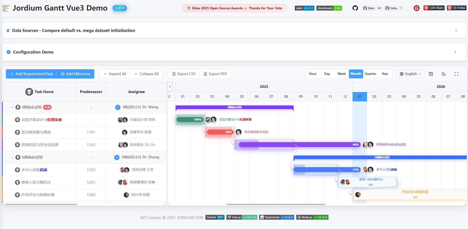
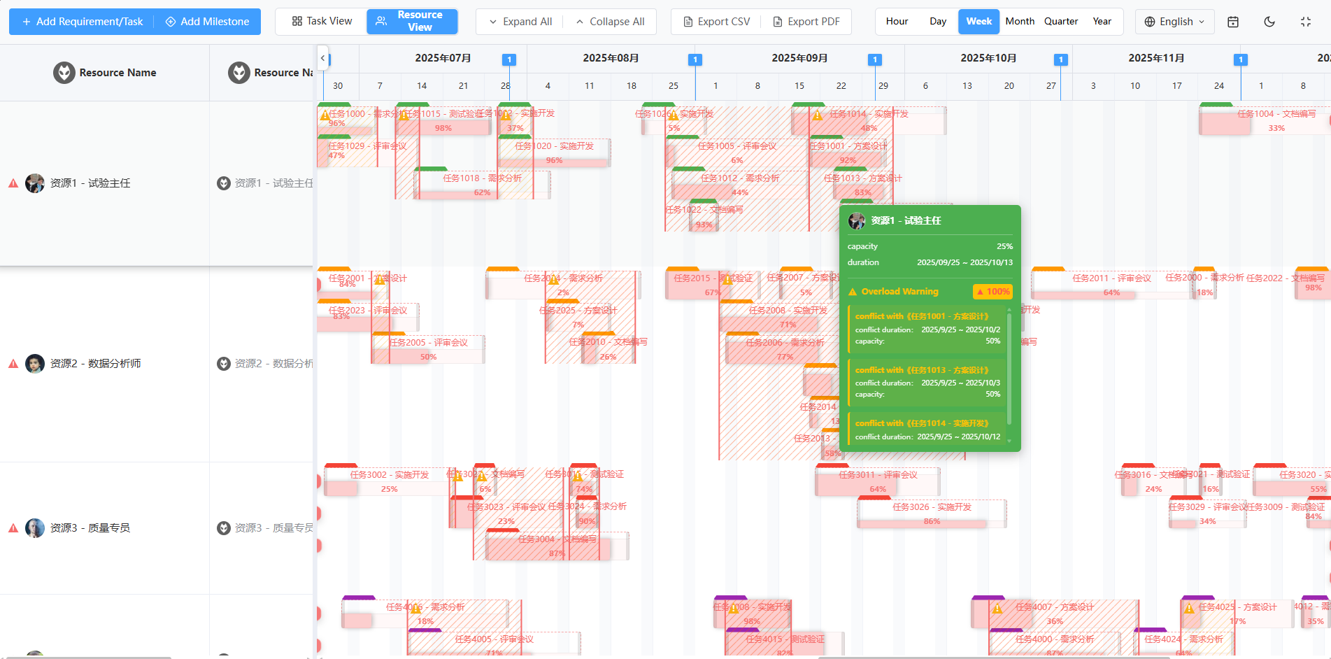 #### Dark Theme
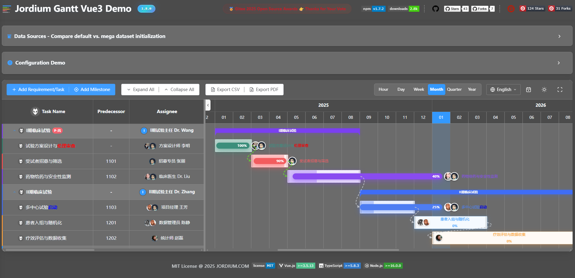
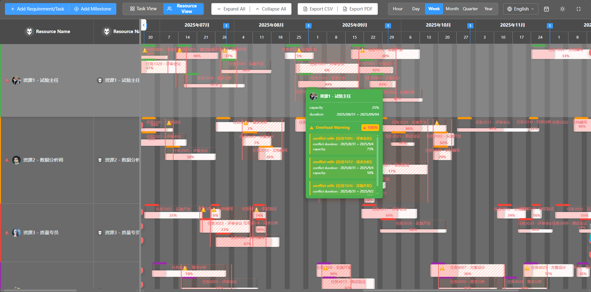 ---
## 📦 Installation
Install using your preferred package manager:
```bash
# npm
npm install jordium-gantt-vue3
# yarn
yarn add jordium-gantt-vue3
# pnpm
pnpm add jordium-gantt-vue3
```
---
## 🚀 Quick Start
### Import Component
Import the `GanttChart` component and styles:
```vue
```
> **Tip**: The style file only needs to be imported once in your project. It's recommended to import it in `main.ts` or the root component.
### First Example
Create your first Gantt chart:
```vue
---
## 📦 Installation
Install using your preferred package manager:
```bash
# npm
npm install jordium-gantt-vue3
# yarn
yarn add jordium-gantt-vue3
# pnpm
pnpm add jordium-gantt-vue3
```
---
## 🚀 Quick Start
### Import Component
Import the `GanttChart` component and styles:
```vue
```
> **Tip**: The style file only needs to be imported once in your project. It's recommended to import it in `main.ts` or the root component.
### First Example
Create your first Gantt chart:
```vue