この仕様は、 UI 設計に最適化された二次元~格子に基づく~layout~systemについて述べる。
格子~layout~modelにおいては、格子~容器の一連の子を,予め定義された
~flex可能な/固定的な
~sizeの~layout格子の中の任意の区画に位置させられる。
◎
This CSS module defines a two-dimensional grid-based layout system, optimized for user interface design. In the grid layout model, the children of a grid container can be positioned into arbitrary slots in a predefined flexible or fixed-size layout grid.
次の特色機能は
~risk下
にあり,勧告候補の期間内に取下げられるかもしれません:
◎
The following features are at-risk, and may be dropped during the CR period:
絶対位置された~boxに対する格子~配置の適用
◎
application of grid placement to absolutely-positioned boxes
Grid Layout Module と
Flexible Box Layout Module
とで整合しない点に気付かれた方は、誤りと見込まれるので
CSSWG まで報告されたし。
◎
If you notice any inconsistencies between this Grid Layout Module and the Flexible Box Layout Module, please report them to the CSSWG, as this is likely an error.
1. 序論
~INFORMATIVE
格子~layout( Grid Layout )は、~CSS用の新たな~layout~modelであり,~boxとその内容に対する~sizingと位置決めを制御する強力な能を備える。
単独の軸を指向する
Flexible Box Layout
と違って、
格子~layoutは,両~次元とも内容の整列が欲されるような二次元的な~layoutに最適化されている。
◎
Grid Layout is a new layout model for CSS that has powerful abilities to control the sizing and positioning of boxes and their contents. Unlike Flexible Box Layout, which is single-axis–oriented, Grid Layout is optimized for 2-dimensional layouts: those in which alignment of content is desired in both dimensions.
`flex-layout^dgm
~flex~layoutの例:
2 本の~rowがある。
1 本目には,それぞれが空間の 1 / 3 を占める 3 個の駒があり、
2 本目には,それぞれが空間の 1 / 5 を占める 5 個の駒がある。
したがって,~row沿いには整列があるが、~col沿いにはない。
◎
An example of flex layout: two rows of items, the first being three items a third of the space each, and the second being five items, a fifth of the space each. There is therefore alignment along the “rows”, but not along the “columns”.
◎
Representative Flex Layout Example
`grid-layout^dgm
格子~layoutの例:
2 本の~rowがある。
1 本目には 4 個の駒があり、その最後の駒は両~rowに~spanする。
2 本目には 最初の 2 本の~colに~spanする駒, 1 個の駒, 1 本目の~rowから~spanする最後の駒がある。
◎
An example of grid layout: two rows of items, the first being four items—the last of which spans both rows, and the second being two items—the first of which spans the first two columns— plus the spanned item from the first row.
◎
Representative Grid Layout Example
加えて,格子~layoutでは、格子~内に駒を明示的に位置する能に因り、対応する~markup変更を要することなく,視覚的~layout構造を劇的に変形できるようになる。
`媒体~照会$と, [
格子~容器とその一連の子の~layout
]を制御する各種~CSS~propとの組合せにより、作者は,内容に対する より理想的な意味論上の構造付けを 様々な呈示にわたって保全しながら、~layoutを多様な[
機器形態, 使用方位, 可用な空間
]に適応させられるようになる。
◎
In addition, due to its ability to explicitly position items in the grid, Grid Layout allows dramatic transformations in visual layout structure without requiring corresponding markup changes. By combining media queries with the CSS properties that control layout of the grid container and its children, authors can adapt their layout to changes in device form factors, orientation, and available space, while preserving a more ideal semantic structuring of their content across presentations.
◎
Although many layouts can be expressed with either Grid or Flexbox, they each have their specialties. Grid enforces 2-dimensional alignment, uses a top-down approach to layout, allows explicit overlapping of items, and has more powerful spanning capabilities. Flexbox focuses on space distribution within an axis, uses a simpler bottom-up approach to layout, can use a content-size–based line-wrapping system to control its secondary axis, and relies on the underlying markup hierarchy to build more complex layouts. It is expected that both will be valuable and complementary tools for CSS authors.
1.1. 背景と動機
`basic-form^dgm
横方向と縦方向の整列を要する~appの~layout例
◎
Application layout example requiring horizontal and vertical alignment.
~websiteが単純な文書から複雑で対話的な~appへ発展するに伴い、例えば浮動体( `float^en )などの文書~layout用の技法は,~appの~layoutにとり十分なものとは言えなくなってきている。
~web~app作者たちは、[
~table, JavaScript, 浮動体の要素に対する注意深い計量
]の組合せを用いながら,欲される~layoutを得るための対処法を模索してきた。
可用な空間の変化に適応する~layoutは,しばしば不安定であり、空間の拘束が厳しくなるに連れ,直感に反する挙動に悩まされる。
代替として、多くの作者たちは,固定的~layoutを~~選択しているが、画面~上の可用な描画~空間の可変性から得られる利点は享受できなくなる。
◎
As websites evolved from simple documents into complex, interactive applications, techniques for document layout, e.g. floats, were not necessarily well suited for application layout. By using a combination of tables, JavaScript, or careful measurements on floated elements, authors discovered workarounds to achieve desired layouts. Layouts that adapted to the available space were often brittle and resulted in counter-intuitive behavior as space became constrained. As an alternative, authors of many web applications opted for a fixed layout that cannot take advantage of changes in the available rendering space on a screen.
格子~layoutには、これらの問題を解消する能力がある。
それは、作者が,~sizingについての予測-可能な挙動の集合を用いて,可用な空間を何本かの~colや~rowに分割して~layoutするための仕組みを供する。
作者は、~appの構築部品となる要素~群の精確な位置と~sizeを,これらの~colや~rowの交差域で定義される`区画$の下で与えれるようになる。
格子~layoutの適応的~能力と,それにより 内容と~styleを よりきれいに分離する方法を以下の例で説明する。
◎
The capabilities of grid layout address these problems. It provides a mechanism for authors to divide available space for layout into columns and rows using a set of predictable sizing behaviors. Authors can then precisely position and size the building block elements of their application into the grid areas defined by the intersections of these columns and rows. The following examples illustrate the adaptive capabilities of grid layout, and how it allows a cleaner separation of content and style.
1.1.1. ~layoutを可用な空間に適応させる
`game-smaller^dgm
[
可用な空間と, それぞれの内容~size
]に則って配列された 5 個の格子~駒
◎
Five grid items arranged according to content size and available space.
格子~layoutを利用すれば、~web頁~内の要素を気の利いた形に~resizeさせられる。
ここに示す 2 つの図は、 5 個の主要な~component[
タイトル, 成績, 盤面, スコア, ~control
]を備えたゲームの~layoutを表現している。
作者の意図は、ゲーム用の空間を次の様に分割することである:
◎
Grid layout can be used to intelligently resize elements within a webpage. The adjacent figures represent a game with five major components in the layout: the game title, stats area, game board, score area, and control area. The author’s intent is to divide the space for the game such that:
成績~区画は、常に,タイトルの直下に現れる。
◎
The stats area always appears immediately under the game title.
盤面は、成績, タイトルを併せた区画の右側に現れる。
◎
The game board appears to the right of the stats and title.
タイトルと盤面の上端は常に整列されるべきである。
◎
The top of the game title and the game board should always align.
盤面と成績~区画の下端は、ゲームが可用な空間の最小~縦幅に達したときには整列するが、他のときは,可用な空間による利点を享受できるよう,盤面を伸張する(下の図)。
◎
The bottom of the game board and bottom of the stats area align when the game has reached its minimum height. In all other cases the game board will stretch to take advantage of all the space available to it.
~controlは、盤面の下側にて中央寄せにする。
◎
The controls are centered under the game board.
スコア区画は、成績~区画の下にあり,その上端は~control区画の上端に整列する。
◎
The top of the score area is aligned to the top of the controls area.
◎
The score area is beneath the stats area.
◎
The score area is aligned to the controls beneath the stats area.
`game-larger^dgm
可用な空間の増分による,格子の拡幅
◎
Growth in the grid due to an increase in available space.
次の格子~layout例に、すべての[
~sizing, 配置, 整列
]規則を宣言的に得る方法を示す:
◎
The following grid layout example shows how an author might achieve all the sizing, placement, and alignment rules declaratively.
/**
`格子~容器$上に格子を宣言して、各 `格子~駒$用の空間を定義する。
◎
Define the space for each grid item by declaring the grid on the grid container.
 */

#grid {

  /* 格子~layoutを用いて内容を~lay-outする。 */
  display: grid;

  /* 2 本の~col:
   • 1 本目の~colは内容に合わせて~sizeされる。
   • 2 本目の~colは残りの空間を受取る(が、この~colを占める盤面やゲーム~controlに要する最小~横幅よりは,決して小さくされない)。
◎
   * Two columns:
   *  1. the first sized to content,
   *  2. the second receives the remaining space
   *     (but is never smaller than the minimum size of the board
   *     or the game controls, which occupy this column [Figure 4])
  */

  grid-template-columns:
    /* col 1 */ auto
    /* col 2 */ 1fr;

  /* 3 本の~row:
   • 1 本目, 3 本目の~rowは内容に合わせて~sizeされる。
   • 2 本目の~rowは残りの空間を受取る(が、盤面/成績~区画に要する最小~縦幅よりは,決して小さくされない)。
◎
   * Three rows:
   *  3. the first sized to content,
   *  4. the middle row receives the remaining space
   *     (but is never smaller than the minimum height
   *      of the board or stats areas)
   *  5. the last sized to content.
  */

  grid-template-rows:
    /* row 1 */ auto
    /* row 2 */ 1fr
    /* row 3 */ auto;
}

  /*
各 駒の位置を,それぞれの `grid-row$p, `grid-column$p ~propによる座標を利用して,指定する。
◎
Specify the position of each grid item using coordinates on the 'grid-row' and 'grid-column' properties of each grid item.
*/

#title    { grid-column: 1; grid-row: 1; }
#score    { grid-column: 1; grid-row: 3; }
#stats    { grid-column: 1; grid-row: 2; align-self: start; }
#board    { grid-column: 2; grid-row: 1 / span 2; }
#controls { grid-column: 2; grid-row: 3; justify-self: center; }
注記:
格子の構造や, 一連の`格子~駒$の位置/~sizeを指定する際には、局面に応じて最適化された仕方が,複数あることに注意。
◎
Note: There are multiple ways to specify the structure of the grid and to position and size grid items, each optimized for different scenarios.
1.1.2. ~source順序からの独立性
先の例から継続して,作者は、ゲームを種々の異なる機器にも適応させたいとする。
また,ゲームでは、
縦長( `portrait^v )/横長( `landscape^v )
のいずれの方位( `orientation$d )で~~表示されるときでも(下の 2 つの図),各種~componentの配置が最適化されるべきであるとする。
格子~layoutを`媒体~照会$と組合せることで、作者は、一連の要素を,それらの意味論上の~markupは変えないまま, ~source順序とは独立に、いずれの方位でも欲される~layoutが得られるように,再配列できる。
◎
Continuing the prior example, the author also wants the game to adapt to different devices. Also, the game should optimize the placement of the components when viewed either in portrait or landscape orientation (Figures 6 and 7). By combining grid layout with media queries, the author is able to use the same semantic markup, but rearrange the layout of elements independent of their source order, to achieve the desired layout in both orientations.
`game-portrait^dgm
“縦長” 方位に適する配列。
◎
An arrangement suitable for “portrait” orientation.
`game-landscape^dgm
“横長” 方位に適する配列。
◎
An arrangement suitable for “landscape” orientation.
次の例では、格子~layoutの能を利用して,`格子~駒$に占められる空間に名前を付ける。
これにより、格子の定義が変更されても,`格子~駒$用の規則は書き直さずに済むようになる。
◎
The following example uses grid layout’s ability to name the space which will be occupied by a grid item. This allows the author to avoid rewriting rules for grid items as the grid’s definition changes.
@media (`orientation$d: portrait) {
  #grid {
    display: grid;

    /*
格子の各[
~row, ~col, 区画
]は、 `grid-template-areas$p ~propを用いて視覚的に定義される。
各~文字列が 1 本の~rowを表し, その中の各~単語が~rowの中のある区画を表す。
~col数は文字列~内の語数から決定される
— どの文字列~内の語数も一致するように揃えなければならないことに注意。
◎
The rows, columns and areas of the grid are defined visually using the grid-template-areas property. Each string is a row, and each word an area. The number of words in a string determines the number of columns. Note the number of words in each string must be identical.
*/
    grid-template-areas: "title stats"
                         "score stats"
                         "board board"
                         "ctrls ctrls";

    /*
各[
~col/~row
]を~sizeする仕方は[
`grid-template-columns$p / `grid-template-rows$p
]~propであてがえる。
◎
The way to size columns and rows can be assigned with the grid-template-columns and grid-template-rows properties.
*/

    grid-template-columns: auto 1fr;
    grid-template-rows: auto auto 1fr auto;
  }
}

@media (`orientation$d: landscape) /* 横長~方位 */ {
  #grid {
    display: grid;
    /*
ここでも, ~template~propは,同じ一連の名前からなる区画を定義するが、ここでは,
横長~方位により適するように位置を替える:
◎
Again the template property defines areas of the same name, but this time positioned differently to better suit a landscape orientation.
*/
    grid-template-areas: "title board"
                         "stats board"
                         "score ctrls";

    grid-template-columns: auto 1fr;
    grid-template-rows: auto 1fr auto;
  }
}

/*
`grid-area$p ~propにより、格子~駒は,格子の有名~区画に配置されるようになる:
◎
The grid-area property places a grid item into a named area of the grid.
*/
#title    { grid-area: title }
#score    { grid-area: score }
#stats    { grid-area: stats }
#board    { grid-area: board }
#controls { grid-area: ctrls }
注記:
格子~layoutによる並替えの能力は,意図的に
視覚的~描画に対してのみ
影響するようにされており、発話~順序や~source順序に基づく~naviは,そのままにされる。
これにより,作者は、[
非~CSSの~UA, あるいは
発話や逐次的~naviなどの一次元的~model
]用の~source順序には触れずに,視覚的~呈示を操作したり最適化できるようになる。
◎
Note: The reordering capabilities of grid layout intentionally affect only the visual rendering, leaving speech order and navigation based on the source order. This allows authors to manipulate the visual presentation while leaving the source order intact and optimized for non-CSS UAs and for linear models such as speech and sequential navigation.
格子~駒の配置と並替えは、~sourceに対する正しい順序付けの代用として利用されては~MUST_NOT
— 文書の~accessibilityが損なわれることになるので。
◎
Grid item placement and reordering must not be used as a substitute for correct source ordering, as that can ruin the accessibility of the document.
2. 概観
~INFORMATIVE
格子~layoutは、`格子$の利用を通して,その内容の~layoutを制御する:
まず、縦横に交差する罫の集合で,`格子~容器$の内容~用に~sizingと位置決めの座標系が作成される。
格子~layoutの特色機能には、次が挙げられる:
◎
Grid Layout controls the layout of its content through the use of a grid: an intersecting set of horizontal and vertical lines which create a sizing and positioning coordinate system for the grid container’s contents. Grid Layout features
固定的な/~flex可能な/内容に基づく,
筋~sizing関数
◎
fixed, flexible, and content-based track sizing functions
前方(正数)あるいは後方(負数)へ付番される格子~座標, および
格子の[
`有名~罫$, `有名~区画$
]による,明示的な駒の配置。
加えて、 `order$p による並替えも含む,空き区画の中への自動的な駒の配置。
【この訳では、名前が付与されていることを “有名” と記すことにする。】
◎
explicit item placement via forwards (positive) and backwards (negative) numerical grid coordinates, named grid lines, and named grid areas; automatic item placement into empty areas, including reordering with order
空間に応じて追加の内容を収容するための,`筋$(~rowや~col)の繰返し, および自動的な筋の追加。
◎
space-sensitive track repetition and automatic addition of rows or columns to accommodate additional content
[
~margin,
`側溝$,
各種 `~box整列~prop$
]による,整列とアキの制御。
◎
control over alignment and spacing with margins, gutters, and the alignment properties
内容を重合させる能, および
`z-index^p による重層法の制御。
◎
the ability to overlap content and control layering with z-index
`格子~容器$は、より複雑な~layoutを作成する必要に応じて,`~flex容器$と入子にしたり混在させたりできる。
◎
Grid containers can be nested or mixed with flex containers as necessary to create more complex layouts.
`格子$の各`筋$( ~row, ~col の総称)は、各種 `明示的な格子$ ~propを通して明示的に宣言して~sizeすることも,`明示的な格子$の外側に配置される駒に対し暗黙的に作成させることもできる。
`grid$p 略式~propとその各種~下位propは、格子の~parameterを定義する。
( 格子の定義-法 節 )
◎
The tracks (rows and columns) of the grid are declared and sized either explicitly through the explicit grid properties or are implicitly created when items are placed outside the explicit grid. The grid shorthand and its sub-properties define the parameters of the grid. §7 Defining the Grid
格子を宣言するいくつかの例を挙げる:
◎
Below are some examples of grid declarations:
次の宣言は、 4 個の有名~区画
— `H^css, `A^css, `B^css, `F^css —
を伴う格子を与える。
1 本目の~colは その内容が収まるように~sizeされ( `auto$vt )、
2 本目の~colは 残りの空間を占める( `1fr^v )。
各~rowの~sizingは既定の `auto$vt による(内容に基づく)が、最後の~rowには 固定的な~size `30px^v が与えられる。
◎
The following declares a grid with four named areas: H, A, B, and F. The first column is sized to fit its contents (auto), and the second column takes up the remaining space (1fr). Rows default to auto (content-based) sizing; the last row is given a fixed size of 30px.
main {
  `grid$p: "H    H "
        "A    B "
        "F    F " 30px
  /     auto 1fr;
}
次の宣言は、それぞれが `5em^v 以上の多数の~rowを伴い,格子~容器の縦幅( `100vh^v )までに収まる格子を与える。
明示的~colはなく、~colは,内容が追加されるに伴って追加される。
結果の~col横幅は等しくされる( `1fr^v )。
右端を~overflowする内容は 印刷されないので、印刷-用の代替-~layoutでは,代わりに~rowが追加される。
◎
The following declares a grid with as many rows of at least 5em as will fit in the height of the grid container (100vh). The grid has no explicit columns; instead columns are added as content is added, the resulting column widths are equalized (1fr). Since content overflowing to the right won’t print, an alternate layout for printing adds rows instead.
次で宣言される格子は、均等に~sizeされた 5 本の~col, および 3 本の~rowを伴う。
中段の~rowは,残りの空間すべてを占める(少なくともその内容が収まるに十分な)。
◎
The following declares a grid with 5 evenly-sized columns and three rows, with the middle row taking up all remaining space (and at least enough to fit its contents).
main {
  grid: auto 1fr auto / repeat(5, 1fr);
  min-height: 100vh;
}
2.2. 駒の配置-法
`格子~容器$の内容は、(`~flex駒$と相似的に)個々の`格子~駒$たちに編成された上で,`格子$内の予め定義された区画たちに割当される。
それらは、`格子~配置~prop$を通した座標を利用して明示的に配置したり、`自動-配置$を利用して空き区画に暗黙的に配置することもできる。
(格子~駒の配置-法 節)
◎
The contents of the grid container are organized into individual grid items (analogous to flex items), which are then assigned to predefined areas in the grid. They can be explicitly placed using coordinates through the grid-placement properties or implicitly placed into empty areas using auto-placement. §8 Placing Grid Items
`grid-area$p 略式を利用する いくつかの格子~配置~宣言:
◎
Below are some examples of grid placement declarations using the grid-area shorthand:
grid-area: a;          /*

有名~格子~区画 "a" の中に配置する
◎
Place into named grid area “a
 */
grid-area: auto;       /*

次の空き区画の中に自動-配置する
◎
Auto-place into next empty area
 */
grid-area: 2 / 4;      /*

~row 2, ~col 4 の中に配置する
◎
Place into row 2, column 4
 */
grid-area: 1 / 3 / -1; /*

すべての~rowに~spanする~col 3 の中に配置する
◎
Place into column 3, span all rows
 */
grid-area: header-start / sidebar-start
           / footer-end / sidebar-start; /*

有名~罫を利用して配置する
◎
Place using named lines
 */
これらは次の `grid-row$p, `grid-column$p を併用する宣言と等価になる:
◎
These are equivalent to the following grid-row + grid-column declarations:
これらは更に
`grid-row-start$p,
`grid-row-end$p,
`grid-column-start$p,
`grid-column-end$p
下位propに分解できる — 例えば:
◎
They can further be decomposed into the grid-row-start/grid-row-end/grid-column-start/grid-column-end longhands, e.g.
各 `筋$( ~row/~col )の~sizeが、それら駒の内容や可用な空間の~sizeを織り込みながら,格子~定義に指定されるように計算される。
◎
Once the grid items have been placed, the sizes of the grid tracks (rows and columns) are calculated, accounting for the sizes of their contents and/or available space as specified in the grid definition.
次に,~sizeされた格子は、`格子~容器$の[
`align-content$p, `justify-content$p
]~propに則って,その`格子~容器$の中で整列される。
(整列とアキ 節)
◎
The resulting sized grid is aligned within the grid container according to the grid container’s align-content and justify-content properties. §10 Alignment and Spacing
次の例では、横方向に余った空間をすべての~colに配分するように,両端の~colを端に寄せた上で、`格子~容器$内の格子の縦幅が `100vh^v 未満のときは、それを縦方向に中央寄せにする。
◎
The following example justifies all columns by distributing any extra space among them, and centers the grid in the grid container when it is smaller than 100vh.
最後に,各 `格子~駒$は、自身に割当された`区画$の中で,自前の~sizing~prop `CSS21$r と整列~prop `CSS-ALIGN-3$r に指定されるように~sizeされ,整列される。
◎
Finally each grid item is sized and aligned within its assigned grid area, as specified by its own sizing [CSS21] and alignment properties [CSS-ALIGN-3].
3. 格子~layoutの概念と各種用語
`格子~layout@
においては、`格子~容器$の内容は,`格子$の中で位置されてから, 整列されることにより,~lay-outされる。
`格子@( `grid^en )
とは、`格子~容器$の空間をいくつかの`区画$に分割する,縦横に交差する幾本かの`罫$からなる集合であり、(`格子~容器$の内容を表現する)一連の`格子~駒$を,それらの区画に配置できるようにする。
これらの`罫$のうち、`塊-軸$~~方向のものが
`格子~col@
を定義し、それに直交する`行内-軸$~~方向のものが
`格子~row@
を定義する。
`CSS3-WRITING-MODES$r
◎
In grid layout, the content of a grid container is laid out by positioning and aligning it into a grid. The grid is an intersecting set of horizontal and vertical grid lines that divides the grid container’s space into grid areas, into which grid items (representing the grid container’s content) can be placed. There are two sets of grid lines: one set defining columns that run along the block axis, and an orthogonal set defining rows along the inline axis. [CSS3-WRITING-MODES]
`grid-lines^dgm
塊-軸 方向の`罫$が 3 本, 行内-軸 方向の罫が 4 本。
◎
Grid lines: Three in the block axis and four in the inline axis.
3.1. 罫(格子~線)
`格子~線@,
もしくは単に
罫( `line^en )
とは、`格子$を横方向/縦方向に分割する【抽象的な】線である
【この訳では、もっぱら, “罫” の表記に統一する】
。
`罫$は、~colか~rowのいずれかの方向に沿って存在する。
それらは[
数量的~index【 1 から数える】, あるいは指定された名前
]で~~参照できる。
`格子~駒$の`格子$内における位置は、格子~配置~propを介して参照される`罫$から決定される。
◎
Grid lines are the horizontal and vertical dividing lines of the grid. A grid line exists on either side of a column or row. They can be referred to by numerical index, or by an author-specified name. A grid item references the grid lines to determine its position within the grid using the grid-placement properties.
次の 2 つの例では、いずれも[
3 本の~col`罫$と 4 本の~row`罫$
]が作成される。
◎
The following two examples both create three column grid lines and four row grid lines.
1 番目の例は、番号【すなわち,数量的~index — 端から数えた本数】による`罫$を利用して`格子~駒$を位置させる方法を示している:
◎
This first example demonstrates how an author would position a grid item using grid line numbers:
2 番目の例は、明示的な有名`罫$を利用している:
◎
This second example uses explicitly named grid lines:
/*
先の例に等価な~layout。
ここでは`有名~罫$を用いる。
◎
equivalent layout to the prior example, but using named lines
*/
#grid {
  display: grid;
  grid-template-columns: 150px [item1-start] 1fr [item1-end];
  grid-template-rows: [item1-start] 50px 1fr 50px [item1-end];
}

#item1 {
  grid-column: item1-start / item1-end;
  grid-row: item1-start / item1-end;
}
3.2. 格子の筋と升
`格子~筋@,
もしくは単に
筋( `track^en )
とは、
`格子~col$, `格子~row$
の総称である
【この訳では、もっぱら, “筋” と略記する】
— 言い換えれば、それは,隣接する 2 本の平行な`罫$の合間を成す空間である。
各`筋$には,~sizing関数が割当される。
それは、筋rcがどれだけ太く拡幅し得るか
— すなわち,その境界を成す`罫$の間隔をどれだけ離せるか —
を制御する。
互いに隣接する`筋$は、`側溝$で分離できる
— さもなければ すき間なく収納される。
◎
Grid track is a generic term for a grid column or grid row—in other words, it is the space between two adjacent grid lines. Each grid track is assigned a sizing function, which controls how wide or tall the column or row may grow, and thus how far apart its bounding grid lines are. Adjacent grid tracks can be separated by gutters but are otherwise packed tightly.
`格子~升@,
もしくは単に
升( `cell^en )
は、格子の ある[
~row, ~col
]の交差域である。
【この訳では、もっぱら, “升” と略記する】
—
それは、 ~rowと~colのそれぞれについて 隣接する 2 本の`罫$に囲まれた空間であり、`格子~駒$を位置させるときに参照できる,格子の最も小さい単位である。
◎
A grid cell is the intersection of a grid row and a grid column. It is the smallest unit of the grid that can be referenced when positioning grid items.
次の例では、 2 本の~colと 3 本の~rowが在る。
1 本目の~colは太さ `150px^v に固定されている。
2 本目の~colの太さには ~flex可能な~sizing( `1fr^v )が利用されている
— それは格子の中で まだ割当されてない空間の関数であり,`格子~容器$の横幅の変化に応じて変わることになる。
`格子~容器$の使用~横幅が `200px^v ならば、 2 本目の~colは太さ `50px^v になる。
`格子~容器$の使用~横幅が `100px^v ならば、 2 本目の~colは太さ `0px^v になり,この~colに位置される内容は `格子~容器$を~overflowすることになる。
◎
In the following example there are two columns and three rows. The first column is fixed at 150px. The second column uses flexible sizing, which is a function of the unassigned space in the grid, and thus will vary as the width of the grid container changes. If the used width of the grid container is 200px, then the second column is 50px wide. If the used width of the grid container is 100px, then the second column is 0px and any content positioned in the column will overflow the grid container.
`格子~区画@,
もしくは単に
区画( `area^en )
とは、`格子~駒$の~lay-outに利用される,論理的な空間である
【この訳では、もっぱら, “区画” と略記する】
。
`区画$は、互いに隣接する 1 個~以上の`升$からなる。
区画は、その境界の各~側に対応する 4 本の`罫$で囲まれる。
区画は、それに交差する`筋$の~sizingに関与する。
区画は、[
`格子~容器$の `grid-template-areas$p ~propを利用して付与される名前
]を介して明示的に,あるいは[
その境界を成す`罫$
]を介して暗黙的に、参照される。
それぞれの`格子~駒$は、格子~配置~propを用いて`区画$に割当される。
◎
A grid area is the logical space used to lay out one or more grid items. A grid area consists of one or more adjacent grid cells. It is bound by four grid lines, one on each side of the grid area, and participates in the sizing of the grid tracks it intersects. A grid area can be named explicitly using the grid-template-areas property of the grid container, or referenced implicitly by its bounding grid lines. A grid item is assigned to a grid area using the grid-placement properties.
/*
~template構文の用例
◎
using the template syntax
*/
#grid  {
  display: grid;
  grid-template-areas: ". a"
                       "b a"
                       ". a";
  grid-template-columns: 150px 1fr;
  grid-template-rows: 50px 1fr 50px;
}

#item1 { grid-area: a }
#item2 { grid-area: b }
#item3 { grid-area: b }

/*
`#item2^c と `#item3^c を区画 `b^l の中の異なる地点に整列させる。
既定では,各~格子~駒は 自身が置かれる区画に収まるように伸張されるので、これらの駒は重合することになる。
◎
Align items 2 and 3 at different points in the grid area "b".
By default, grid items are stretched to fit their grid area
and these items would layer one over the other.
*/
#item2 { align-self: start; }
#item3 { justify-self: end; align-self: end; }
`区画$は、その中に~lay-outされる`格子~駒$の包含塊を形成する。
同じ`区画$に配置された複数の`格子~駒$は、互いの~layoutに直に影響することはない。
しかしながら,間接的には、`格子~駒$が`内在的~sizing関数$を伴う場合,その駒が占めている筋の~sizeに(したがってそれを囲んでいる`罫$の位置にも)影響し得る結果、別の`格子~駒$の位置や~sizeにも影響することになる。
◎
A grid item’s grid area forms the containing block into which it is laid out. Grid items placed into the same grid area do not directly affect each other’s layout. Indirectly, however, a grid item occupying a grid track with an intrinsic sizing function can affect the size of that track (and thus the positions of its bounding grid lines), which in turn can affect the position or size of another grid item.
4. 並替えと~accessibility
格子~layoutは、文書に対する強力な再配列~~機能を作者に与えるが,文書~sourceの順序付けの代用になるものではない。
◎
Grid layout gives authors great powers of rearrangement over the document. However, these are not a substitute for correct ordering of the document source.
…
この値は、要素に`格子~容器$~boxを生成させる
— `~flow~layout$内に配置されたときには、`塊level$になるような。
◎
This value causes an element to generate a grid container box that is block-level when placed in flow layout.
`inline-grid@v
この値は、要素に`格子~容器$~boxを生成させる
— `~flow~layout$内に配置されたときには、`行内level$になるような。
◎
This value causes an element to generate an grid container box that is inline-level when placed in flow layout.
`格子~容器@
は、その内容~用に新たな
`格子~整形~文脈@
を確立する。
これは、その内容の~layoutに,塊~layoutではなく 格子~layoutを利用することを除き,`塊~整形~文脈$を確立するのと同じになる
【…を確立したとするときと同じにふるまう】
。
浮動体は格子~容器の中へは侵入せず,また,格子~容器の~marginと その内容の~marginとが相殺されることはない。
`格子~容器$の内容は、各 `駒$の包含塊の境界線を形成している`罫$により,`格子$の中へ~lay-outされる。
`overflow$p ~propは,`格子~容器$にも適用される。
◎
A grid container establishes a new grid formatting context for its contents. This is the same as establishing a block formatting context, except that grid layout is used instead of block layout: floats do not intrude into the grid container, and the grid container’s margins do not collapse with the margins of its contents. The contents of a grid container are laid out into a grid, with grid lines forming the boundaries of each grid items’ containing block. The overflow property applies to grid containers.
格子~容器は`塊~容器$ではないので、塊~layoutを前提に設計されている~propには,格子~layoutの文脈~下では適用されないものもある。
特に:
◎
Grid containers are not block containers, and so some properties that were designed with the assumption of block layout don’t apply in the context of grid layout. In particular:
`float$p, `clear$p は、`格子~駒$上では 効果はない。
しかしながら、 `float$p ~propは,依然として格子~容器の子~上の `display$p の算出値に影響する。
それは、`格子~駒$が決定される よりも前に 算出されるので。
◎
float and clear have no effect on a grid item. However, the float property still affects the computed value of display on children of a grid container, as this occurs before grid items are determined.
`vertical-align$p は、格子~駒~上では 効果はない。
◎
vertical-align has no effect on a grid item.
疑似~要素
`first-line$pe,
`first-letter$pe
は、`格子~容器$には適用されない。
`格子~容器$は、その先祖に[
`整形される最初の行l$( `first formatted line^en )や, 先頭字( `first letter^en )
]を供与しない。
◎
the ::first-line and ::first-letter pseudo-elements do not apply to grid containers, and grid containers do not contribute a first formatted line or first letter to their ancestors.
浮動体, または 絶対位置された要素に対しては、
`display$p の指定値が `inline-grid$v の場合,その算出値は `grid$v になる
【すなわち,`塊~化$される】
。
したがって,
CSS 2.1 の 9.7 節
の表は、次のように改正される
⇒
[
“指定値” 列の欄は `inline-grid$v,
“算出値” 列の欄は `grid$v
]なる行を追加する。
◎
If an element’s specified display is inline-grid and the element is floated or absolutely positioned, the computed value of display is grid. The table in CSS 2.1 Chapter 9.7 is thus amended to contain an additional row, with inline-grid in the "Specified Value" column and grid in the "Computed Value" column.
5.2. 格子~容器の~sizing
この節の用語【最小-/最大-〜】の定義については, `CSS-SIZING-3$r を見よ。
◎
Note see [CSS-SIZING-3] for a definition of the terms in this section.
`格子~容器$は、それが関与する整形~文脈の規則を利用して~sizeされる:
◎
A grid container is sized using the rules of the formatting context in which it participates:
`塊~整形~文脈$における`塊level$の~boxとしては、`塊~box$が整形~文脈を確立するときと同様に~sizeされる
— その際の `auto$vt による`行内~size$は、`置換され$ない塊~boxに対するときと同様に計算される。
◎
As a block-level box in a block formatting context, it is sized like a block box that establishes a formatting context, with an auto inline size calculated as for non-replaced block boxes.
`行内~整形~文脈$における`行内level$の~boxとしては、`不可分な行内level$の~box(行内-塊など)と同様に~sizeされる。
◎
As an inline-level box in an inline formatting context, it is sized as an atomic inline-level box (such as an inline-block).
行内/塊いずれの整形~文脈においても、`格子~容器$に対する `auto$vt による`塊~size$は,その`最大-内容~size$になる。
◎
In both inline and block formatting contexts, the grid container’s auto block size is its max-content size.
注記:
塊~layout仕様が,おそらく これを定義するべきだが、まだ書かれていない。
◎
The block layout spec should probably define this, but it isn’t written yet.
格子が[
`最大-内容~拘束$/
`最小-内容~拘束$
]の下で~sizeされるときの,`格子~容器$の[
`最大-内容~size$ /
`最小-内容~size$
]は、`格子~容器$の適切な軸の方の一連の筋~size(側溝も含む)の総和になる。
◎
The max-content size (min-content size) of a grid container is the sum of the grid container’s track sizes (including gutters) in the appropriate axis, when the grid is sized under a max-content constraint (min-content constraint).
5.3. 大き過ぎる格子の切詰め
記憶域には限りがあるので、~UAは、`暗黙的な格子$に可能な~size【~span数】を自身が定義する上限(各~側とも, 1 万~筋 以上にされるべき)に切詰めて,その上限を超える罫を落としてよい
【例えば ~repeat_func の利用により,本数が巨大になるとき】
。
`格子~駒$が,この上限を超えて配置される場合、その区画は,その上限付き格子の中に切詰められ~MUST
— 次に述べるように。
◎
Since memory is limited, UAs may clamp the possible size of the implicit grid to be within a UA-defined limit (which should be at least ten thousand tracks on each side of line 1), dropping all lines outside that limit. If a grid item is placed outside this limit, its grid area must be clamped to within this limited grid.
`格子~区画を切詰める@
ときは:
◎
To clamp a grid area:
`区画$が 上限付き`格子$の外側まで~spanする場合、駒の`~span数$を 上限付き格子の最後の罫まで切詰める。
◎
If the grid area would span outside the limited grid, its span is clamped to the last line of the limited grid.
`区画$が 上限付き格子の完全に外側に配置される場合、駒の`~span数$を 1 にした上で,区画を格子のその側の最後の`筋$に位置し直す。
◎
If the grid area would be placed completely outside the limited grid, its span must be truncated to 1 and the area repositioned into the last grid track on that side of the grid.
例えば、~UAが各~次元について,最大 1000 本までの筋を~supportする場合、配置~propを次のようにしたときの結果は:
◎
For example, if a UA only supported grids with at most 1000 tracks in each dimension, the following placement properties:
大雑把に言えば、`格子~容器$の
`格子~駒@
とは、その`~flow内$にある内容を表現する~boxである。
◎
Loosely speaking, the grid items of a grid container are boxes representing its in-flow contents.
`格子~容器$の`~flow内$にある各~子は,`格子~駒$になり、[
`格子~容器$内の,連続している子`~text連なり$たち
]は,`匿名$ `塊~容器$である`格子~駒$で包装される。
ただし,そのような`~text連なり$が
空白
(すなわち, `white-space$p ~propに影響され得る文字
【 文書~空白~文字】
)のみからなる場合、描画されない(対応する`~text~node$は
`display$p: `none^v
にされていたかのように)。
【~boxを生成しないので、格子~駒にはならず,`自動-配置~algo$においても 1 個の駒として数えられなくなる。】
◎
Each in-flow child of a grid container becomes a grid item, and each contiguous sequence of child text runs is wrapped in an anonymous block container grid item. However, if the entire sequence of child text runs contains only white space (i.e. characters that can be affected by the white-space property) it is instead not rendered (just as if its text nodes were display:none).
注記:
要素~間の空白は消え去り,格子~駒にはならないことに注意
— 要素~間の【非~空白を含む】~textは、~~実際に 匿名の格子~駒で包装されるが。
◎
Note: inter-element white space disappears: it does not become its own grid item, even though inter-element text does get wrapped in an anonymous grid item.
注記:
匿名~駒は、~style規則を割当する要素がないので,~styleを~~付与できないことに注意。
しかしながら,その内容は、格子~容器から~style(~font設定群など)を継承する。
◎
Note: The box of a anonymous item is unstyleable, since there is no element to assign style rules to. Its contents will however inherit styles (such as font settings) from the grid container.
6.1. 格子~駒の `display^p
`格子~駒$は、その内容~用に`独立な整形~文脈を確立する$。
しかしながら,格子~駒は
`格子~level@
の~boxであって, `塊level$の~boxではないので、駒が関与するのは,その容器の`格子~整形~文脈$になる
— `塊~整形~文脈$ではなく。
◎
A grid item establishes an independent formatting context for its contents. However, grid items are grid-level boxes, not block-level boxes: they participate in their container’s grid formatting context, not in a block formatting context.
`駒$の `display$p 値は、`塊~化$される:
[[
`格子~容器$を生成している要素の`~flow内$にある子
]の `display$p の指定値
]が,`行内level$を表す値である場合の算出値は、それに等価な`塊level$を表す値にされる(この型の `display$p 値の変換の詳細は、
CSS2.1, 9.7 節
`CSS21$r と
~box型の自動的な~~変換
`CSS3-DISPLAY$r
を見よ。)
◎
The display value of a grid item is blockified: if the specified display of an in-flow child of an element generating a grid container is an inline-level value, it computes to its block-level equivalent. (See CSS2.1§9.7 [CSS21] and CSS Display [CSS3-DISPLAY] for details on this type of display value conversion.)
注記:
`display$p の値には、通常においては元の~boxの周りに匿名~boxを生成させるものもある。
そのような~boxが格子~駒である場合、それは先ず`塊~化$されるので,匿名~boxは作成されなくなる。
例えば, 2 個の連続する駒が
`display^p: `table-cell$v
にされている場合、単独の匿名~tableで包装される代わりに, 2 個の別々の
`display$p: `block^v
にされた駒になる。
◎
Note: Some values of display normally trigger the creation of anonymous boxes around the original box. If such a box is a grid item, it is blockified first, and so anonymous box creation will not happen. For example, two contiguous grid items with display: table-cell will become two separate display: block grid items, instead of being wrapped into a single anonymous table.
6.2. 格子~駒の~sizing
`格子~駒$は、その`区画$により定義される包含塊の中で~sizeされる。
◎
A grid item is sized within the containing block defined by its grid area.
`格子~駒$ %駒 の横幅/縦幅に対する `auto^v の計算は、
各種 自己~整列~値
に応じて変わる:
◎
Grid item calculations for auto widths and heights vary by their self-alignment values:
◎
If the grid item is either non-replaced—or is replaced but has no intrinsic aspect ratio and no intrinsic size in the relevant dimension—use the width calculation rules for non-replaced boxes as defined in CSS2.1 § 10.3.3.
◎
Otherwise, if the grid item has an intrinsic ratio or an intrinsic size in the relevant dimension, the grid item is sized as for align-self: start (consistent with the width calculation rules for block-level replaced elements in CSS2.1 § 10.3.4).
`stretch$v
CSS2.1 § 10.3.3 節
に定義される,`置換され$ない~box用の横幅の計算~規則を利用する。
◎
Use the width calculation rules for non-replaced boxes, as defined in CSS2.1 § 10.3.3.
注記:
これは、 %駒 に縦横比があれば それを歪めることもある。
◎
Note: This may distort the aspect ratio of the item, if it has one.
他のすべての値◎ all other values
%駒 を `fit-content^v と同じように~sizeする。
◎
Size the item as fit-content.
注記:
次の表(参考)に,格子~駒の自動的~sizingを要約する:
◎
The following informative table summarizes the automatic sizing of grid items:
◎
Summary of automatic sizing behavior of grid items
整列
`置換され$ない要素の~size
`置換され$る要素の~size
`normal$v
区画を埋める
内在的~sizeを利用する
`stretch$v
区画を埋める
区画を埋める
`start$v/ `center$v/等々
`fit-content^v ~sizing(浮動体の様な)
内在的~sizeを利用する
◎
• Alignment | Non-replaced Element Size | Replaced Element Size
• normal | Fill grid area | Use intrinsic size
• stretch | Fill grid area | Fill grid area
• start/center/etc. | fit-content sizing (like floats) | Use intrinsic size
注記:
`格子~駒$上の[
`min-width$p / `min-height$p
]に対する値 `~autoS$v は、`~flex駒$の`主-軸$~sizeに影響するときと類似するように,関連する軸における筋~sizingに影響する。
格子~駒の自動的な最小~size
節を見よ。
◎
Note: The auto value of min-width and min-height affects track sizing in the relevant axis similar to how it affects the main size of a flex item. See §6.6 Automatic Minimum Size of Grid Items.
6.3. 格子~駒の並替え: `order^p ~prop
`order$p ~propは,`格子~駒$にも適用され、それらの`自動-配置$や`塗り順序$に影響する。
◎
The order property also applies to grid items. It affects their auto-placement and painting order.
~flex駒の並替えと同様に、 `order$p ~propは,[
視覚的~順序を 発話や~naviの順序と 違える 必要がある場合
]に限って利用され~MUST。
必要なければ、下層の文書~sourceが並替えられるべきである。
並替えと~accessibility
`CSS-FLEXBOX-1$r
を見よ。
◎
As with reordering flex items, the order property must only be used when the visual order needs to be out-of-sync with the speech and navigation order; otherwise the underlying document source should be reordered instead. See CSS Flexbox 1 §5.4.1 Reordering and Accessibility in [CSS-FLEXBOX-1].
6.4. 格子~駒の~marginと~padding
隣接する 2 個の`格子~駒$は、それぞれ独立に それぞれの`区画$が形成する`包含塊$の中に包含されるので,それらの~marginが`相殺-$されることはない。
◎
As adjacent grid items are independently contained within the containing block formed by their grid areas, the margins of adjacent grid items do not collapse.
`格子~駒$ %駒 上の百分率による[
~margin/~padding
]は、 %駒 の`包含塊$の`行内~size$を基準に解決される
— `塊~box$のときと同様に。
例えば,横書き`書字mode$の下では、[
左端, 右端, 上端, 下端
]のいずれも,百分率は包含塊の横幅を基準に解決される。
◎
Percentage margins and paddings on grid items, like those on block boxes, are resolved against the inline size of their containing block, e.g. left/right/top/bottom percentages all resolve against their containing block’s width in horizontal writing modes.
格子~駒に対する自動~marginは、対応する次元の余った空間を吸収するように拡幅される。
これを利用すれば、駒たちを互いを整列させられる。
`auto^v ~marginによる整列-法
節を見よ。
◎
Auto margins expand to absorb extra space in the corresponding dimension, and can therefore be used for alignment. See §10.2 Aligning with auto margins
6.5. Z 軸~~方向の順序付け: `z-index^p ~prop
2 つの`格子~駒$は、重合することもある
— 互いに交差する(すなわち,ある`升$を共有する)`区画$に位置されるとき,あるいは交差しない区画に位置されるときでも, 負の~marginや負の位置決めにより。
`格子~駒$の塗り順序は、そのままの文書~順序の代わりに`改変文書順$が利用されることを除いて,行内~塊 `CSS21$r のそれと正確に同じになり、
`auto^v 以外の `z-index$p 値は, `position$p が `static^v であっても積層~文脈を作成する( `position$p が `relative^v であったときと正確に同じに挙動する)。
したがって、格子~駒の z-軸 順序は, `z-index$p ~propで容易に制御できる
◎
Grid items can overlap when they are positioned into intersecting grid areas, or even when positioned in non-intersecting areas because of negative margins or positioning. The painting order of grid items is exactly the same as inline blocks [CSS21], except that order-modified document order is used in place of raw document order, and z-index values other than auto create a stacking context even if position is static (behaving exactly as if position were relative). Thus the z-index property can easily be used to control the z-axis order of grid items.
注記:
格子~駒の外側に位置される子孫も,依然として 格子~駒により確立される積層~文脈に関与する。
◎
Note: Descendants that are positioned outside a grid item still participate in any stacking context established by the grid item.
次の図式に、暗黙的~source順序と,
それらの積層~順序の制御に利用される明示的 `z-index$p
の組合せにより,いくつかの格子~駒が重合する様子を示す:
◎
The following diagram shows several overlapping grid items, with a combination of implicit source order and explicit z-index used to control their stacking order.
`drawing-order^dgm
`z-index^p と~source順序により制御される描き順序
◎
Drawing order controlled by z-index and source order.
`格子~駒$ %駒 用に,より適度な既定の`最小~size$を供するため、所与の軸における %駒 の`自動的~最小~size$の使用値は,[
%駒 が次を満たすならば`内容に基づく最小~size$ /
~ELSE_ 通例通り 0
]になるとする
⇒
[
%駒 は`~scroll容器$でない
]~AND[
%駒 がその軸~沿いに~spanする いずれかの`筋$は、その`~min筋~sizing関数$は `auto$vtにされている
]
◎
To provide a more reasonable default minimum size for grid items, the used value of an automatic minimum size in a given axis on a grid item that is not a scroll container and that spans at least one track in that axis whose min track sizing function is auto is a content-based minimum size; the automatic minimum size is otherwise zero, as usual.
◎
The content-based minimum size for a grid item in a given dimension is its specified size suggestion if it exists, otherwise its transferred size suggestion if that exists, else its content size suggestion. However, if the grid item spans only grid tracks that have a fixed max track sizing function, its specified size suggestion and content size suggestion in that dimension (and the input to the transferred size suggestion in the other dimension) are further clamped to less than or equal to the stretch fit the grid area’s size (so as to prevent the content-based minimum size from forcing overflow of its fixed-size grid area).
◎
The content size suggestion, specified size suggestion, and transferred size suggestion used in this calculation account for the relevant min/max/preferred size properties so that the content-based minimum size does not interfere with any author-provided constraints, and are defined below:
`指定d~size示唆@
[
%選好~size ~NEQ ε
]ならば
⇒
`min^op( %選好~size, %最大-~size )
◎
If the item’s computed preferred size property in the relevant axis is definite, then the specified size suggestion is that size (clamped by the relevant max size property if it’s definite).\
~ELSE_
⇒
ε
◎
It is otherwise undefined.
`転換~size示唆@
[
%縦横比 ~NEQ ε
]~AND[
%交叉-選好~size ~NEQ ε
]ならば
⇒
`min^op( `max^op( `min^op( %交叉-選好~size, %交叉-最大-~size ), %交叉-最小-~size ) ~MUL %縦横比, %最大-~size )
◎
If the item has an intrinsic aspect ratio and its computed preferred size property in the opposite axis is definite, then the transferred size suggestion is that size (clamped by the opposite-axis min and max size properties if they are definite), converted through the aspect ratio and finally clamped by the same-axis max size property if it’s definite.\
◎
The content size suggestion is the min-content size in the relevant axis, clamped, if it has an aspect ratio, by any definite opposite-axis min and max size properties converted through the aspect ratio, and then further clamped by the same-axis max size property if that is definite.
~boxの内在的~size(例: 要素の`最小-内容~size$)を計算する目的においては、`内容に基づく最小~size$は,当の軸における~boxの~sizeを不定にする(例えば~boxの `width$p ~propが`確定的$な~sizeを指定していても)。
このことは、この~sizeを基準に計算される百分率が`~autoとして挙動する$ことを意味することに注意。
◎
For the purpose of calculating an intrinsic size of the box (e.g. the box’s min-content size), a content-based minimum size causes the box’s size in that axis to become indefinite (even if e.g. its width property specifies a definite size). Note this means that percentages calculated against this size will behave as auto.
いずれにせよ,これは、一部の事例において百分率を解決し直すために,追加の~layoutを要することもあるが、この値は,駒の中の百分率~sizeを解決できなくするものではない( `CSS-SIZING-3$r に定義される値[
`min-content$v, `max-content$v, `fit-content^v
]と同様に)。
◎
Nonetheless, although this may require an additional layout pass to re-resolve percentages in some cases, this value (like the min-content, max-content, and fit-content values defined in [CSS-SIZING-3]) does not prevent the resolution of percentage sizes within the item.
注記:
大抵の場合、内容に基づく最小~sizeは適切であり,内容が重合したり, その容器の外側にあふれないようにするが、一部の場合はそうならない:
◎
Note that while a content-based minimum size is often appropriate, and helps prevent content from overlapping or spilling outside its container, in some cases it is not:
特に,格子~layoutが文書の主要な内容~領域に利用される場合、~font~sizeに相対的な,最小の横幅( `min-width$p: `12em^v など)を明示的に設定した方がよい。
最小~横幅が内容に基づくものである場合、巨大な~table/画像があるときに,内容~領域~全体の~sizeを ~overflowする地帯にまで伸張させ得る結果、~text行lを無用に~~長く, 読みづらくさせることになる。
◎
In particular, if grid layout is being used for a major content area of a document, it is better to set an explicit font-relative minimum width such as min-width: 12em. A content-based minimum width could result in a large table or large image stretching the size of the entire content area, potentially into an overflow zone, and thereby making lines of text needlessly long and hard to read.
内容に基づく~sizingが,多量の内容を伴う駒に利用された場合、~layout~engineはその最小~sizeを見出す前に,その内容すべてを走査しなければならなくなる。
作者が明示的な最小~sizeを設定しておけば、これは不要になる。
(駒の内容が少量ならば走査は自明であり,処理能に配慮する必要はない)
◎
Note also, when content-based sizing is used on an item with large amounts of content, the layout engine must traverse all of this content before finding its minimum size, whereas if the author sets an explicit minimum, this is not necessary. (For items with small amounts of content, however, this traversal is trivial and therefore not a performance concern.)
7. 格子の定義-法
7.1. 明示的な格子
3 種の~prop[
`grid-template-rows$p,
`grid-template-columns$p,
`grid-template-areas$p
]は、~~共同して`格子~容器$の
`明示的な格子@
を定義する。
最終的な格子は、`格子~駒$が`明示的な格子$の外側に配置されたときに,暗黙的に筋が追加されるため、より大きくなり得る。
この場合、暗黙的な筋が作成され,それらの~sizeは[
`grid-auto-rows$p, `grid-auto-columns$p
]~propにより指定される。
◎
The three properties grid-template-rows, grid-template-columns, and grid-template-areas together define the explicit grid of a grid container. The final grid may end up larger due to grid items placed outside the explicit grid; in this case implicit tracks will be created, these implicit tracks will be sized by the grid-auto-rows and grid-auto-columns properties.
`明示的な格子$を成す筋rcの総本数は、[
`grid-template-areas$p により定義される筋rcの本数
]と[
`grid-template-rows$p / `grid-template-columns$p
により~sizeされる筋rcの本数
]の大きい方として決定される。
[
`grid-template-areas$p により定義された筋rcのうち,[
`grid-template-rows$p / `grid-template-columns$p
]~propから~sizeされないもの
]の~sizeは、[
`grid-auto-rows$p / `grid-auto-columns$p
]~propからとられる。
これらの~propが`明示的な格子$を成す筋を全く定義しない場合でも、`明示的な格子$は,各~軸に 1 本の`罫$を包含する。
◎
The size of the explicit grid is determined by the larger of the number of rows/columns defined by grid-template-areas and the number of rows/columns sized by grid-template-rows/grid-template-columns. Any rows/columns defined by grid-template-areas but not sized by grid-template-rows/grid-template-columns take their size from the grid-auto-rows/grid-auto-columns properties. If these properties don’t define any explicit tracks the explicit grid still contains one grid line in each axis.
`格子~配置~prop$の中の
正数/負数
による数量的~indexは、`明示的な格子$の
`始端$/`終端$
側から,
1 / −1
から,罫を数える。
◎
Numeric indexes in the grid-placement properties count from the edges of the explicit grid. Positive indexes count from the start side (starting from 1 for the start-most explicit line), while negative indexes count from the end side (starting from -1 for the end-most explicit line).
`grid$p /
`grid-template$p
~propは、 3 つの
`明示的な格子~prop@
— `grid-template-rows$p, `grid-template-columns$p, `grid-template-areas$p —
すべてを,一括して設定するために利用できる`略式~prop$である。
`grid$p 略式~propは,`暗黙的な格子$を制御する~propも再設定する一方で、
`grid-template$p ~propは,それらを変更しない。
◎
The grid and grid-template properties are a shorthands that can be used to set all three explicit grid properties (grid-template-rows, grid-template-columns, and grid-template-areas) at the same time. The grid shorthand also resets properties controlling the implicit grid, whereas the grid-template property leaves them unchanged.
◎名 `grid-template-columns@p, `grid-template-rows@p
◎値 `none$vt | `track-list$t | `auto-track-list$t
◎初 `none$vt
◎適 `格子~容器$
◎継 されない
◎百
`内容~区画$の対応する次元に相対的
◎
refer to corresponding dimension of the content area
◎算
指定値
— ただし,長さ値は絶対~化される。
◎
As specified, with lengths made absolute
◎順 文法に従う
◎ア
`長さ, 百分率, または calc 式$が成す`単純~list$として
— ただし,値を成す各[
長さ/百分率/calc 式
]成分の値のみが相違する場合に限る。【長さと百分率は補完できない, 等々?】
◎
as a simple list of length, percentage, or calc, provided the only differences are the values of the length, percentage, or calc components in the list
◎表終
[
`grid-template-columns$p / `grid-template-rows$p
]~propは、格子の一連の[
~col / ~row
]に対し,空白区切りの
`筋~list@
( `track-list$t )として,`格子$の[
罫~名, および `筋~sizing関数$
]を指定する。
◎
These properties specify, as a space-separated track list, the line names and track sizing functions of the grid. The grid-template-columns property specifies the track list for the grid’s columns, while grid-template-rows specifies the track list for the grid’s rows.
各種 値の意味は、次で与えられる:
◎
Values have the following meanings:
`none@vt
この~propからは、`明示的な格子$を成す筋は作成されないことを指示する(それでも,明示的な格子~筋は `grid-template-areas$p ~propにより作成され得る)。
◎
Indicates that no explicit grid tracks are created by this property (though explicit grid tracks could still be created by grid-template-areas).
注記:
`明示的な格子$が不在の下では、どの[
~row/~col
]も
暗黙的に生成-され,それらの~sizeは[
`grid-auto-rows$p / `grid-auto-columns$p
]~propから決定されることになる。
◎
Note: In the absence of an explicit grid any rows/columns will be implicitly generated, and their size will be determined by the grid-auto-rows and grid-auto-columns properties.
◎
Specifies the track list as a series of track sizing functions and line names. Each track sizing function can be specified as a length, a percentage of the grid container’s size, a measurement of the contents occupying the column or row, or a fraction of the free space in the grid. It can also be specified as a range using the minmax() notation, which can combine any of the previously mentioned mechanisms to specify separate min and max track sizing functions for the column or row.
`筋~list$の構文は、次で与えられる:
◎
The syntax of a track list is:
`CSS3VAL$r にて定義される,負でない[
長さ/百分率
]値。
◎
A non-negative length or percentage, as defined by CSS3 Values. [CSS3VAL]
百分率~値は、[
~col`筋$/~row`筋$
]においては`格子~容器$ %容器 の[
`行内~size$/`塊~size$
]に相対的になる。
%容器 の~sizeが その各~筋の~sizeに依存する場合の百分率~値は、まず, %容器 の内在的~sizeを計算する目的においては, `~autoS$v として扱った上で、
%容器 内に駒を~lay-outする目的においては,その結果の~sizeに相対的に解決し~MUST。
◎
<percentage> values are relative to the inline size of the grid container in column grid tracks, and the block size of the grid container in row grid tracks. If the size of the grid container depends on the size of its tracks, then the <percentage> must be treated as auto, for the purpose of calculating the intrinsic sizes of the grid container and then resolve against that resulting grid container size for the purpose of laying out the grid and its items.
`flex$t
`fr$u 単位による負でない次元であり,筋の
`~flex係数@
を指定する。
`flex$t ~sizeにされた各~筋は、残りの空間から,その`~flex係数$に比例する割合を持分として得る。
例えば、筋~listが `1fr 2fr^v の場合、各~筋は,順に`残余~空間$Vの ⅓, ⅔ を占めることになる。
詳細は
~flex可能な長さ: ~fr単位
を見よ。
◎
A non-negative dimension with the unit fr specifying the track’s flex factor. Each <flex>-sized track takes a share of the remaining space in proportion to its flex factor. For example, given a track listing of 1fr 2fr, the tracks will take up ⅓ and ⅔ of the leftover space, respectively. See §7.2.3 Flexible Lengths: the fr unit for more details.
注記:
`~flex係数$の総和が 1 未満の場合、筋たちは`残余~空間$Vの対応する割合分のみを占める
— 全体を埋めるよう拡げられることはない。
◎
Note: If the sum of the flex factors is less than 1, they’ll take up only a corresponding fraction of the leftover space, rather than expanding to fill the entire thing.
~minmax記法の外側に現れるときは,
自動的な最小(すなわち,
minmax(auto, `flex$t )
)を~~意味する。
◎
When appearing outside a minmax() notation, implies an automatic minimum (i.e. ''minmax(auto, <flex>)'').
`max-content@vt
`筋$を占めている,すべての`格子~駒$のうち、その最も大きい`最大-内容~供与$を表現する。
◎
Represents the largest max-content contribution of the grid items occupying the grid track.
`min-content@vt
`筋$を占めている,すべての`格子~駒$のうち、その最も大きい`最小-内容~供与$を表現する。
◎
Represents the largest min-content contribution of the grid items occupying the grid track.
`minmax@vt(%min, %max)
[
%min 〜 %max
]の~size範囲を定義する。
%min > %max の場合、
%max は無視され, %min をとるものと扱われる。
%max に対する `flex$t 値は,筋の`~flex係数$を設定し、
%min に対するそれは,無効とする。
◎
Defines a size range greater than or equal to min and less than or equal to max. If max < min, then max is ignored and minmax(min,max) is treated as min. As a maximum, a <flex> value sets the track’s flex factor; it is invalid as a minimum.
注記:
この仕様の将来~levelでは、
%min に対する `flex$t 値も許容され,それを正しく織り込むために`筋~sizing~algo$を更新することになる。
◎
Note: A future level of this spec may allow <flex> minimums, and will update the track sizing algorithm to account for this correctly
`auto@vt
【~size範囲を定義する:】
最大としては、 `max-content$vt と一致する。
最小としては、 [
`筋$を占めている,各 `格子~駒$の
( `min-width$p/`min-height$p により指定される)最小~size
]のうち,最も大きい~sizeを表現する。
◎
As a maximum, identical to max-content. As a minimum, represents the largest minimum size (as specified by min-width/min-height) of the grid items occupying the grid track.
注記:
`align-content$p, `justify-content$p
~propにより伸張できるのは、 `auto$vt による筋~sizeに限られる。
◎
Note: auto track sizes (and only auto track sizes) can be stretched by the align-content and justify-content properties.
`fit-content@vt( `length-percentage$t )
公式
`min^op( `max-content$vt, `max^op( `auto$vt, %引数 ) )
を表現し、その `auto$vt による最小より大きい筋~sizeは %引数 以下に切詰められることを除いて,
`minmax(auto, max-content)^v
と同様に計算される。
◎
Represents the formula min(max-content, max(auto, argument)), which is calculated like minmax(auto, max-content), except that the track size is clamped at argument if it is greater than the auto minimum.
次の宣言に対しては:
◎
Given the following grid-template-columns declaration:
`格子~容器$の始端~辺に 1 本
◎
At the start edge of the grid container.
`格子~容器$の始端~辺から 100px の所に 1 本
◎
100px from the start edge of the grid container.
前の罫からの距離が,
`~free空間$(
= `格子~容器$の横幅 − `~flex可能$でない`筋$たちの横幅の総和
)の半分に等しい所に 1 本
◎
A distance from the previous line equal to half the free space (the width of the grid container, minus the width of the non-flexible grid tracks).
前の罫からの距離が,[[[
前の罫と この罫の合間にある~col
]に属する`格子~駒$
]のうちの最大~size
]に等しい所に 1 本
◎
A distance from the previous line equal to the maximum size of any grid items belonging to the column between these two lines.
前の罫からの距離が,[[[
前の罫と この罫の合間にある~col
]に属する`格子~駒$の最小~size
]のうちの最も大きい~size
]以上であって, [
`~free空間$のもう半分 以下
]の所に 1 本
◎
A distance from the previous line at least as large as the largest minimum size of any grid items belonging to the column between these two lines, but no larger than the other half of the free space.
~flex可能でない~size(
`100px^v,
`max-content$vt,
`min-content$vt
)の総和が`格子~容器$の横幅より大きい場合、最後尾の`罫$は,`格子~容器$の始端~辺からこの総和だけ離れた所に~~位置する(~size `1fr^v はいずれも `0^v に解決される)。
この総和が`格子~容器$の横幅より小さい場合、最後尾の`罫$は,正確に`格子~容器$の終端~辺の所に~~位置する。
これは一般に、一連の`筋$~sizeのうち 少なくとも 1 個は `flex$t 値があるときに成立する。
◎
If the non-flexible sizes (100px, max-content, and min-content) sum to larger than the grid container’s width, the final grid line will be a distance equal to their sum away from the start edge of the grid container (the 1fr sizes both resolve to 0). If the sum is less than the grid container’s width, the final grid line will be exactly at the end edge of the grid container. This is true in general whenever there’s at least one <flex> value among the grid track sizes.
その他の,`筋$として有効な定義~例:
◎
Additional examples of valid grid track definitions:
注記:
格子の~sizeは、各~筋~sizeの総和そのままではない
—
`row-gap$p, `column-gap$p, および
`justify-content$p, `align-content$p
により,筋~間に空間が追加され得るので。
◎
Note: The size of the grid is not purely the sum of the track sizes, as row-gap, column-gap and justify-content, align-content can add additional space between tracks.
7.2.1. 有名~罫: [`custom-ident^t*] 構文
`罫$は数量的~indexで~~参照できるが、
`有名~罫@
を用いれば,`格子~配置~prop$の理解-や保守-もより容易くなる。
各~罫には、
`grid-template-rows$p / `grid-template-columns$p
~propの中で明示的に名前を付与できる。
あるいは、`grid-template-areas$p ~propにより`有名~区画$を作成することにより,
暗黙的に命名できる。
◎
While grid lines can always be referred to by their numerical index, named lines can make the grid-placement properties easier to understand and maintain. Lines can be explicitly named in the grid-template-rows and grid-template-columns properties, or implicitly named by creating named grid areas with the grid-template-areas property.
例えば,次の~codeでは、格子の中のすべての罫に,意味を持つ名前を与えている。
罫のうちいくつかは複数の名前を持つことに注意:
◎
For example, the following code gives meaningful names to all of the lines in the grid. Note that some of the lines have multiple names.
罫の名前として `span^v を与えることはできない。
すなわち、~keyword `span^v は, `line-names$t 内の `custom-ident$t から除外される。
◎
A line name cannot be span, i.e. the <custom-ident> in the <line-names> production excludes the keyword span.
7.2.2. 一連の筋rcを繰返すための記法: `repeat()^css
`~repeat_func@
記法は、`筋~list$の繰返しを表現する。
これは、同じ~patternを繰り返す多数の筋rcを,より簡潔に記せるようにするものである。
◎
The repeat() notation represents a repeated fragment of the track list, allowing a large number of columns or rows that exhibit a recurring pattern to be written in a more compact form.
次の例に、同じ格子~定義を記す 2 つの等価な仕方を示す。
両~宣言とも、[
10px の “側溝” ~colに挟まれた 250px 幅の “主” ~col
]が 4 回~繰返されるような,格子を生産する。
◎
This example shows two equivalent ways of writing the same grid definition. Both declarations produce four “main” columns, each 250px wide, surrounded by 10px “gutter” columns.
1 個目の引数は繰返し回数を指定する。
2 個目の引数は`筋~list$であり, 1 個目の引数による回数だけ繰返される。
しかしながら、いくつかの制約がある:
◎
The first argument specifies the number of repetitions. The second argument is a track list, which is repeated that number of times. However, there are some restrictions:
`~repeat_func$記法は入子にできない。
◎
The repeat() notation can’t be nested.
自動的な繰返し( `auto-fill$v / `auto-fit$v )と[
`内在的~sizing関数$, `~flex可能な~sizing関数$
]とを組合せることはできない。
◎
Automatic repetitions (auto-fill or auto-fit) cannot be combined with intrinsic or flexible sizes.
したがって,`~repeat_func$ 記法の精確な構文は、いくつかの形をとる:
◎
Thus the precise syntax of the repeat() notation has several forms:
`track-repeat$t は,どの `track-size$t の繰返しも表現できるが、繰返しは固定的な回数に制限される。
◎
The <track-repeat> variant can represent the repetition of any <track-size>, but is limited to a fixed number of repetitions.
`auto-repeat$t は,空間を埋めるように自動的に繰返せるが、繰返し回数が計算できるようになるためには,各 筋~sizeが`確定的$になることを要する。
これは、`筋~list$内に一度しか現れ得ないが,同じ`筋~list$は `fixed-repeat$t も包含できる。
◎
The <auto-repeat> variant can repeat automatically to fill a space, but requires definite track sizes so that the number of repetitions can be calculated. It can only appear once in the track list, but the same track list can also contain <fixed-repeat>s.
`~repeat_func$ 関数が `line-names$t を隣接させることになる場合、それらの名前は継ぎ合される:
例えば[
`repeat(2, [a] 1fr [b])^v
]は[
`[a] 1fr [b a] 1fr [b]^v
]に等価になる。
◎
If the repeat() function ends up placing two <line-names> adjacent to each other, the name lists are merged. For example, repeat(2, [a] 1fr [b]) is equivalent to [a] 1fr [b a] 1fr [b].
◎
When auto-fill is given as the repetition number, if the grid container has a definite size or max size in the relevant axis, then the number of repetitions is the largest possible positive integer that does not cause the grid to overflow its grid container (treating each track as its max track sizing function if that is definite or as its minimum track sizing function otherwise, and taking gap into account); if any number of repetitions would overflow, then 1 repetition. Otherwise, if the grid container has a definite min size in the relevant axis, the number of repetitions is the smallest possible positive integer that fulfills that minimum requirement. Otherwise, the specified track list repeats only once.
例えば次の~codeは、~window横幅に収まるような 25 文字幅の~colたちを作成した上で、余った空間は これらの~colに配分する。
◎
For example, the following code will create as many 25-character columns as will fit into the window width. If there is any remaining space, it will be distributed among the 25-character columns.
body {
  display: grid;
  grid-template-columns: repeat(auto-fill, minmax(25ch, 1fr));
}
~keyword
`auto-fit@v
の挙動は、[
格子~駒を配置-
した後の,繰返される空き筋は、`畳まれ$る
]ことを除いて, `auto-fill$v と同じになる。
空き筋とは、`~flow内$にあるどの格子~駒も,その筋に~spanするように配置されないことを~~意味する。
(すべての筋が`畳まれ$る結果にもなり得る
— それらすべてが空ならば。)
◎
The auto-fit keyword behaves the same as auto-fill, except that after grid item placement any empty repeated tracks are collapsed. An empty track is one with no in-flow grid items placed into or spanning across it. (This can result in all tracks being collapsed, if they’re all empty.)
`畳まれ@
た筋の`筋~sizing関数$は、固定的な `0px^v と扱われ,その両~側の`側溝$も
— `分布型の整列$を通して割り当てられた空間も含め —
`畳まれ$gutる。
◎
A collapsed track is treated as having a fixed track sizing function of 0px, and the gutters on either side of it—including any space allotted through distributed alignment—collapse.
自動的に繰返される筋の本数を見出す目的においては、 0 による除算を避けるため、~UAは,筋~sizeを,自身が指定する~~下限~以上に切り上げ~MUST。
この~~下限には, `1px^v が示唆される。
◎
For the purpose of finding the number of auto-repeated tracks, the UA must floor the track size to a UA-specified value to avoid division by zero. It is suggested that this floor be 1px.
7.2.3. ~flex可能な長さ: ~fr単位
`~flex可能な長さ@
( `flex@t )は、
`fr@u
単位の次元であり,`格子~容器$の中の `残余~空間$V の割合分を表現する。
`fr$u 単位で~sizeされている筋は
`~flex可能な筋@
と呼ばれる
— それらは、`~flex容器$内で[
基底~size 0 にされた`~flex駒$
]が空間を埋めるときと同様に,`残余~空間$V に呼応して~flexするので。
◎
A flexible length or <flex> is a dimension with the fr unit, which represents a fraction of the leftover space in the grid container. Tracks sized with fr units are called flexible tracks
as they flex in response to leftover space similar to how flex items with a zero base size fill space in a flex container.
`~free空間$の配分は、すべての`~flex可能$でない筋の`~sizing関数$がそれらの最大に†達した後に生じる。
可用な空間から それらの筋rcの合計~sizeを差し引いた結果が `残余~空間$V になる。
`残余~空間$V は、~flexに~sizeされる筋rcたちに,それぞれの`~flex係数$に比例する割合で分割される。
【† “達した” の意味は,`格子~sizing 節$にて定義される。】
◎
The distribution of leftover space occurs after all non-flexible track sizing functions have reached their maximum. The total size of such rows or columns is subtracted from the available space, yielding the leftover space, which is then divided among the flex-sized rows and columns in proportion to their flex factor.
各~筋rcの, `残余~空間$V の持分は、[
残余~空間 × [[
その筋rcの`~flex係数$
] ÷ [
すべての `~flex係数$の総和
]]]として算出できる。
◎
Each column or row’s share of the leftover space can be computed as the column or row’s <flex> * <leftover space> / <sum of all flex factors>.
注記:
0 〜 1 の合間の `flex$t 値には、ある特別な挙動がある:
筋たちの~flex係数の総和が 1 に満たない場合、それらが占める残余~空間は 100% に満たなくなる。
◎
<flex> values between 0fr and 1fr have a somewhat special behavior: when the sum of the flex factors is less than 1, they will take up less than 100% of the leftover space.
筋の `flex$t 値は、実質的に残余~空間の比例分を要請する
— 値 `1fr^v は “残余~空間 の 100%” を意味する。
同じ軸に属する筋たちが要請している残余~空間が,合計で 100% を超える場合、互いの比を保ちながら正確に 100% を利用し尽くすように,振り分け直される
— 一方で 100% を下回る場合(それぞれが `.25fr^v にされた 3 本の筋がある場合など)、各~筋は正確に要請した分だけ取得する(各~筋は残余~空間の 25% を取得し,残る 25% は埋められない)。
残余~空間がどう配分されるかの正確な詳細は、
~flex可能な筋を拡げる~algo
を見よ。
◎
A track’s <flex> value is effectively a request for some proportion of the leftover space, with 1fr meaning “100% of the leftover space”; then if the tracks in that axis are requesting more than 100% in total, the requests are rebalanced to keep the same ratio but use up exactly 100% of it. However, if the tracks request less than the full amount (such as three tracks that are each .25fr) then they’ll each get exactly what they request (25% of the leftover space to each, with the final 25% left unfilled). See §11.7 Expand Flexible Tracks for the exact details of how leftover space is distributed.
この~patternは、~flex係数が 0 に近づくときの挙動を連続的にするために要求される(すなわち、筋は残余~空間をまったく占めなくなることが求められる)。
さもなければ、筋の~flex係数が `0fr^v にどこまで近づこうが
— `1fr^v のときと同じく —
残余~空間すべてを占め, 0 に十分~近くなった所で,いきなり,まったく占めなくなる。
この挙動があれば、~flex係数が `1fr^v から下へ縮短するに伴い[
駒が占める残余~空間は、次第に減り, 0 の所で無くなる
]ように滑らかに遷移することになる。
◎
This pattern is required for continuous behavior as fr values approach zero (which means the tracks wants none of the leftover space). Without this, a 1fr track would take all of the leftover space; but so would a 0.1fr track, and a 0.01fr track, etc., until finally the value is small enough to underflow to zero and the track suddenly takes up none of the leftover space. With this behavior, the track instead gradually takes less of the leftover space as its flex factor shrinks below 1fr, smoothly transitioning to taking none of the leftover space at zero.
作者は、この “部分的に埋める” 挙動が特定的に欲されない限り,
1 以上の値を貫き続けるべきである。
例えば `1^v, `2^v を用いる方が `.33^v, `.67^v を用いるより,通例的に良い
— その方が、筋が追加-/除去されたときにも,意図される挙動が保たれると見込まれるので。
◎
Unless this “partial fill” behavior is specifically what’s desired, authors should stick to values ≥ 1; for example, using 1fr and 2fr is usually better than using .33fr and .67fr, as they’re more likely to behave as intended if tracks are added or removed.
可用な空間が無限の場合(`格子~容器$の横幅/縦幅が`不定$のときに起こる)、~flexに~sizeされる`筋$たちは,互いの比率を維持しながら それぞれの内容に~sizeされる。
~flexに~sizeされる各`筋$の使用~sizeは、次の様に算出される:
◎
When the available space is infinite (which happens when the grid container’s width or height is indefinite), flex-sized grid tracks are sized to their contents while retaining their respective proportions. The used size of each flex-sized grid track is computed by\
それぞれの筋について、その “仮の `1fr^v ~size” を決定する。
それは、筋の `max-content$vt ~sizeを決定した結果を,筋の`~flex係数$で除算した結果になる。
【上述の特別な挙動があるので、実際の計算はずっと複雑な過程を経る。】
◎
determining the max-content size of each flex-sized grid track and dividing that size by the respective flex factor to determine a “hypothetical 1fr size”.\
`~flex割合分@
— `1fr^v を解決した結果の長さ —
を得る。
それは、すべての筋の “仮の `1fr^v ~size” の最大で与えられる。
◎
The maximum of those is used as the resolved 1fr length (the flex fraction),\
各~筋の最終的な~sizeは、[
`~flex割合分$ ~MUL 筋の`~flex係数$
]になる。
◎
which is then multiplied by each grid track’s flex factor to determine its final size.
注記:
`flex$t 値は `length$t でない(一部の `percentage$t 値のように `length$t と互換でもない)ので、
`calc()$f 式の中で,他の単位~型[
で表現する/と組合せる
]ことはできない。
◎
Note: <flex> values are not <length>s (nor are they compatible with <length>s, like some <percentage> values), so they cannot be represented in or combined with other unit types in calc() expressions.
7.2.4. 解決値
[
`grid-template-rows$p / `grid-template-columns$p
]~propの`解決値は特別に定義される$。
`CSSOM$r
◎
The grid-template-rows and grid-template-columns properties are resolved value special case properties. [CSSOM]
`display$p が `grid$v や `inline-grid$v にされた要素により ~boxが生成されるときの,
`grid-template-rows$p / `grid-template-columns$p
~propの`解決値$は、`使用値$を次に従って直列化した結果になる:
◎
When an element’s display is grid or inline-grid and it generates a box, the resolved value of the grid-template-rows and grid-template-columns properties is the used value, serialized with:
すべての筋が, 個別に~listされる
— 暗黙的に作成されたものも含め,`~repeat_func$ 記法は利用せずに。
◎
Every track listed individually, whether implicitly or explicitly created, without using the repeat() notation.
筋~sizeは、~sizing関数に関わらず,~pixel単位の長さとして与えられる。
◎
Every track size given as a length in pixels, regardless of sizing function.
連続する罫~名は、角括弧で括って一つにまとめられる。
◎
Adjacent line names collapsed into a single bracketed set.
他の場合(例えば,要素の `display^p が `none^v にされている, あるいは
要素は`格子~容器$でない場合)の解決値は、単に算出値になる。
◎
Otherwise, (e.g. when the element has display: none or is not a grid container) the resolved value is simply the computed value.
注記:
一般に,解決値は、少数の旧来の CSS 2.1 ~propを除いて,算出値に等しい。
しかしながら、この~moduleの早期の実装との互換性のため,
`grid-template-rows$p / `grid-template-columns$p
は、使用値を返すように定義することが要求される。
◎
Note: In general, resolved values are the computed values, except for a small list of legacy 2.1 properties. However, compatibility with early implementations of this module requires us to define grid-template-rows and grid-template-columns as returning used values.
CSS Working Group は、`格子~配置~prop$に対しても使用値も返すかどうか考慮-中にある。
とりわけ実装者からの~feedbackを~~待っている。
論点を見よ。
◎
The CSS Working Group is considering whether to also return used values for the grid-placement properties and is looking for feedback, especially from implementors. See discussion.
この~propは、一連の
`有名~区画@
を指定する。
それらの`区画$は、特定0の`格子~駒$には結付けられないが,`格子~配置~prop$から 名前を通して参照できるものになる。
`grid-template-areas$p ~propの構文は、`格子$構造の可視化も供し,`格子~容器$の全体的な~layoutを理解し易くする。
◎
This property specifies named grid areas, which are not associated with any particular grid item, but can be referenced from the grid-placement properties. The syntax of the grid-template-areas property also provides a visualization of the structure of the grid, making the overall layout of the grid container easier to understand.
各種 値の意味は、次で与えられる:
◎
Values have the following meanings:
`~none1@v
この~propからは、`有名~区画$は定義されない
— したがって`明示的な格子$を成す筋も定義されない —
ことを指示する(それでも,明示的な格子~筋は
`grid-template-columns$p / `grid-template-rows$p
~propにより作成され得る)。
◎
Indicates that no named grid areas, and likewise no explicit grid tracks, are defined by this property (though explicit grid tracks could still be created by grid-template-columns or grid-template-rows).
注記:
`明示的な格子$が不在の下では、どの[
~row/~col
]も
暗黙的に生成-され,それらの~sizeは[
`grid-auto-rows$p / `grid-auto-columns$p
]~propから決定されることになる。
◎
Note: In the absence of an explicit grid any rows/columns will be implicitly generated, and their size will be determined by the grid-auto-rows and grid-auto-columns properties.
`string$t+
~listされた個々の~CSS文字列ごとに, 1 本の~rowが作成される。
各~文字列は、次の様に構文解析された上で,その中の有効な各~tokenが【出現した順に】 ~rowの中の 1 個の升に対応する。
各~升ごとに【各~row内の,同じ位置にある升の集合ごとに】,対応する~colが作成される:
◎
A row is created for every separate string listed for the grid-template-areas property, and a column is created for each cell in the string, when parsed as follows:
最長合致に基づいて,文字列を次の~tokenからなる~listに~token化する:
◎
Tokenize the string into a list of the following tokens, using longest-match semantics:
A sequence of name code points, representing a named cell token with a name consisting of its code points.
A sequence of one or more "." (U+002E FULL STOP), representing a null cell token.
A sequence of whitespace, representing nothing (do not produce a token).
A sequence of any other characters, representing a trash token.
Note: These rules can produce cell names that do not match the <ident> syntax, such as "1st 2nd 3rd", which requires escaping when referencing those areas by name in other properties, like grid-row: \31st; to reference the area named 1st.
A null cell token represents an unnamed area in the grid container.
A named cell token creates a named grid area with the same name. Multiple named cell tokens within and between rows create a single named grid area that spans the corresponding grid cells.
A trash token is a syntax error, and makes the declaration invalid.
すべての文字列は,同じ~col数に揃えられなければならない。
さもなければ宣言は無効になる。
`有名~区画$を成す`升$の集合が,単独の, 穴の無い矩形を形成していない場合も、宣言は無効になる。
◎
All strings must have the same number of columns, or else the declaration is invalid. If a named grid area spans multiple grid cells, but those cells do not form a single filled-in rectangle, the declaration is invalid.
注記:
この~moduleの将来~versionでは、矩形でない, あるいは単連結でない領域も許可され得る。
◎
Note: Non-rectangular or disconnected regions may be permitted in a future version of this module.
この例では、 `grid-template-areas$p ~propを利用して,頁~layoutを作成している。
そこでは、[
ヘッダ内容( `head^c ),
~navi用の内容( `nav^c ),
フッタ内容( `foot^c ),
メイン内容( `main^c )
]用の区画が定義されている。
その結果、~templateからは, 4 個の`有名~区画$が伴われた,3 本の~rowと 2 本の~colが作成される。
`head^c 区画は、格子の最初の~row全体に~spanする。
◎
In this example, the grid-template-areas property is used to create a page layout where areas are defined for header content (head), navigational content (nav), footer content (foot), and main content (main). Accordingly, the template creates three rows and two columns, with four named grid areas. The head area spans both columns and the first row of the grid.
`grid-template-areas$p
~propによる~templateの中の各 `有名~区画$は、その区画を囲む 4 本の罫に暗黙的に名前を付与する:
ある`有名~区画$の名前を %foo とするなら、その区画の
~row-始端/~col-始端
罫の名前は
`foo-start^c
になり、
~row-終端/~col-終端
罫の名前は
`foo-end^c
になる。
これらの罫は
`暗黙的な有名~罫@
と呼ばれる。
◎
The grid-template-areas property creates implicit named lines from the named grid areas in the template. For each named grid area foo, four implicit named lines are created: two named foo-start, naming the row-start and column-start lines of the named grid area, and two named foo-end, naming the row-end and column-end lines of the named grid area.
これらの有名~罫の挙動は、
`grid-template-rows$p / `grid-template-columns$p
の値に現れないことを除いて,他の有名~罫と同様になる。
同じ名前の罫が明示的に定義されていたとしても、暗黙的な有名~罫は,単に,その名前を伴うもう一つの罫になる。
◎
These named lines behave just like any other named line, except that they do not appear in the value of grid-template-rows/grid-template-columns. Even if an explicit line of the same name is defined, the implicit named lines are just more lines with the same name.
7.3.2. 暗黙的な有名~区画
`有名~区画$は,それにより生産される`暗黙的な有名~罫$を介して参照されるので、
同じ形の名前(
`foo-start^c /
`foo-end^c
)による有名~罫を明示的に追加することは、実質的に`有名~区画$を作成するのと同じことになる。
そのような区画は
`暗黙的な有名~区画@
と呼ばれ、`grid-template-areas$p の値には現れないが,`格子~配置~prop$からは参照できるものになる。
◎
Since a named grid area is referenced by the implicit named lines it produces, explicitly adding named lines of the same form (foo-start/foo-end) effectively creates a named grid area. Such implicit named areas do not appear in the value of grid-template-areas, but can still be referenced by the grid-placement properties.
`grid-template$p ~propは、[
`grid-template-rows$p,
`grid-template-columns$p,
`grid-template-areas$p
]を,単独の宣言で一括して設定するための`略式~prop$である。
この`略式~prop$の構文は,いくつかの異なる形をとる:
◎
The grid-template property is a shorthand for setting grid-template-columns, grid-template-rows, and grid-template-areas in a single declaration. It has several distinct syntax forms:
`none@v
すべての下位propを,それぞれの初期値( `none^v )に設定する。
◎
Sets all three properties to their initial values (none).
順に,[
`grid-template-rows$p, `grid-template-columns$p
]を指定された値に設定し、
`grid-template-areas$p は `none^v に設定する。
◎
Sets grid-template-rows and grid-template-columns to the specified values, respectively, and sets grid-template-areas to none.
次のものは:
grid-template: auto 1fr / auto 1fr auto;
次と等価になる:
◎
is equivalent to
grid-template-rows: auto 1fr;
grid-template-columns: auto 1fr auto;
grid-template-areas: none;
`grid-template-areas$p を,[
~listされている文字列( `string^t )の並び
]に設定する。
◎
Sets grid-template-areas to the strings listed.
`grid-template-rows$p を,次を順に施した結果に設定する
⇒#
`string^t すべてを値から取り除く;
`explicit-track-list^t があれば直前の~slashとともに値から取り除く;
`track-size^t が抜けている所には `auto$vt を補う;
2 個の `track-size^t に挟まれた連続する 2 個の `line-names^t は, 1 つに継ぎ合せる
◎
Sets grid-template-rows to the <track-size>s following each string (filling in auto for any missing sizes), and splicing in the named lines defined before/after each size.
`grid-template-columns$p を,(~slashの後の)筋~list( `explicit-track-list^t )が指定されて[
いれば それ /
いなければ `none$vt
]に設定する。
◎
Sets grid-template-columns to the track listing specified after the slash (or none, if not specified).
この構文は、~codeの中で、一連の筋~名と~sizeを,それぞれに対応する区画に揃えて記せるように設計されている。
◎
This syntax allows the author to align track names and sizes inline with their respective grid areas.
次のものは:
grid-template:
    [header-top] "a   a   a"       [header-bottom]
      [main-top] "b   b   b"   1fr [main-bottom]
              / auto 1fr auto;
次と等価になる:
◎
is equivalent to
grid-template-areas:
                 "a   a   a"
                 "b   b   b";
grid-template-rows:
    [header-top]              auto [header-bottom
       main-top]               1fr [main-bottom];
grid-template-columns:
                auto 1fr auto;
したがって、次のような格子を作成する:
◎
and creates the following grid:
`grid-shorthand^dgm
上の宣言により作成される格子。
(名前 `*-start^c / `*-end^c は、`有名~区画$により暗黙的に作成される。)
◎
The grid created by the declarations above. (The “a/b-start/end” names are created implicitly by the named grid areas.)
注記:
`~repeat_func$ 関数は,これらの筋~listには許容されない
— 各~筋と, “~ASCII-art” 内の各 “筋rc” とは、視覚的に一対一に~~揃うよう意図されているので。
◎
Note: Note that the repeat() function isn’t allowed in these track listings, as the tracks are intended to visually line up one-to-one with the rows/columns in the “ASCII art”.
注記:
`grid$p 略式~propも同じ構文を受容する
— それは、暗黙的な格子~propも,それぞれの初期値に再設定する。
したがって作者には、これらを別々に~cascadeさせたいときは別として,
`grid-template$p よりも `grid$p を利用することが推奨される。
◎
Note: The grid shorthand accepts the same syntax, but also resets the implicit grid properties to their initial values. Unless authors want those to cascade in separately, it is therefore recommended to use grid instead of grid-template.
7.5. 暗黙的な格子
[
`grid-template-rows$p / `grid-template-columns$p / `grid-template-areas$p
]~propは、`明示的な格子$を形成する,固定的な本数の筋を定義する。
`格子~駒$が,その境界の外側に位置された場合、`格子~容器$は,`格子$に
`暗黙的な罫@
を追加して,
`暗黙的な筋@
を生成する。
これらの罫は、`明示的な格子$と共に
`暗黙的な格子@
を形成するようになる
【特に、暗黙的な格子は,明示的な格子を包含する】
。
`grid-auto-rows$p,
`grid-auto-columns$p
~propは、これらの`暗黙的な筋$を~sizeする。
◎
The grid-template-rows, grid-template-columns, and grid-template-areas properties define a fixed number of tracks that form the explicit grid. When grid items are positioned outside of these bounds, the grid container generates implicit grid tracks by adding implicit grid lines to the grid. These lines together with the explicit grid form the implicit grid. The grid-auto-rows and grid-auto-columns properties size these implicit grid tracks.
`grid-auto-flow$p ~propは、明示的な位置を伴わない`格子~駒$の自動-配置を制御する。
暗黙的な筋は、`明示的な格子$が埋められた後に,自動-配置により生成される。
◎
The grid-auto-flow property controls auto-placement of grid items without an explicit position. Once the explicit grid is filled (or if there is no explicit grid) auto-placement will also cause the generation of implicit grid tracks.
`grid$p `略式~prop$は、各種 `明示的な格子~prop$に加えて, 3 つの
`暗黙的な格子~prop@
— `grid-auto-flow$p, `grid-auto-rows$p, `grid-auto-columns$p —
も単独の宣言で設定できる。
◎
The grid shorthand property can set the implicit grid properties (grid-auto-flow, grid-auto-rows, and grid-auto-columns) together with the explicit grid properties in a single declaration.
格子~駒が[
`grid-template-rows$p / `grid-template-columns$p
から明示的に~sizeされないような筋rc
]の中に位置される場合、それを保持するための
`暗黙的な筋$
が作成される。
これは、[
駒が,明示的に範囲~外の筋rcの中に位置された
]とき, あるいは[
`自動-配置~algo$により,追加の筋rcが作成された
]ときに,起こり得る。
`grid-auto-columns$p / `grid-auto-rows$p
~propは、その種の暗黙的に作成される筋の~sizeを指定する。
◎
If a grid item is positioned into a row or column that is not explicitly sized by grid-template-rows or grid-template-columns, implicit grid tracks are created to hold it. This can happen either by explicitly positioning into a row or column that is out of range, or by the auto-placement algorithm creating additional rows or columns. The grid-auto-columns and grid-auto-rows properties specify the size of such implicitly-created tracks.
`明示的な格子$より後にある`暗黙的な筋$たちは、最初の筋から順に,指定された各~size( `track-size$t )をそのままの順に受取る。
`明示的な格子$より前にある`暗黙的な筋$たちは、最後の筋から順に,指定された各~sizeを最後から逆順に受取る。
~sizeの個数が足りない場合は、必要なだけ~patternが繰返される。
【例えば 1 個だけ指定された場合、どの暗黙的な筋も同じ~sizeを受取ることになる。】
◎
If multiple track sizes are given, the pattern is repeated as necessary to find the size of the implicit tracks. The first implicit grid track after the explicit grid receives the first specified size, and so on forwards; and the last implicit grid track before the explicit grid receives the last specified size, and so on backwards.
`auto-flow^dgm
2×2 格子には、最初の~row&~col内に 1 個の明示的な 20px×20px の格子~升に加えて, 3 個の升も伴う。
3 個の升は、追加の格子~駒を保持するため,暗黙的~な 40px 幅の~col, ~rowが生成される結果、追加される。
◎
A 2×2 grid with one explicit 20px×20px grid cell in the first row+column and three additional cells resulting from the implicit 40px column and row generated to hold the additional grid items.
明示的に配置されていない`格子~駒$は、後述する`自動-配置~algo$により,`格子~容器$の中の`未占有$の空間に 自動的に配置される。
`grid-auto-flow$p が、自動-配置された駒を格子の中へ~flowさせる正確な方法を指定する
— すなわち、`自動-配置~algo$がどのように働くかを制御する。
◎
Grid items that aren’t explicitly placed are automatically placed into an unoccupied space in the grid container by the auto-placement algorithm. grid-auto-flow controls how the auto-placement algorithm works, specifying exactly how auto-placed items get flowed into the grid. See §8.5 Grid Item Placement Algorithm for details on precisely how the auto-placement algorithm works.
`row@v
各~駒は、`自動-配置~algo$により[
各~rowが埋まる度に,必要に応じて新たな~rowを追加しながら
]置かれていく。
`row$v も `column$v も供されなかった場合、 `row^v であるものと見做される。
◎
The auto-placement algorithm places items by filling each row in turn, adding new rows as necessary. If neither row nor column is provided, row is assumed.
`column@v
各~駒は、`自動-配置~algo$により[
各~colが埋まる度に,必要に応じて新たな~colを追加しながら
]置かれていく。
◎
The auto-placement algorithm places items by filling each column in turn, adding new columns as necessary.
`dense@v
指定された場合、自動-配置~algoでは, “稠密な” 収納-法~algoが利用される:
それは、後続の小さい駒により,大きい駒で埋められなかった格子の “穴埋め” を試みる。
そのため、駒は順番~通りに現れなくなり得る。
◎
If specified, the auto-placement algorithm uses a “dense” packing algorithm, which attempts to fill in holes earlier in the grid if smaller items come up later. This may cause items to appear out-of-order, when doing so would fill in holes left by larger items.
省略された場合、 “疎な” ~algoが利用される:
配置~algoは、格子の中に駒を置いていくときに “前に” しか進まず、決して,後戻りして穴埋めすることはない。
これは、自動-配置されるすべての駒が
— 後続の駒で埋めれるような “穴” が残されていても —
“順番~通りに” 現れるようにする。
◎
If omitted, a “sparse” algorithm is used, where the placement algorithm only ever moves “forward” in the grid when placing items, never backtracking to fill holes. This ensures that all of the auto-placed items appear “in order”, even if this leaves holes that could have been filled by later items.
注記:
この~moduleの将来~levelにおいては、[
自動-位置された駒を単独の “既定の” 升の中にまとめて~flowさせる
]ような値の追加-が予期されている。
◎
Note: A future level of this module is expected to add a value that flows auto-positioned items together into a single “default” cell.
次の例では、 3 本の~colのいずれも,その内容に自動-~sizeされている。
明示的に定義される~rowは無い。
`grid-auto-flow$p ~propは `row$v なので、格子の 1 本目の~rowから順に,必要に応じて[
自動-配置される`格子~駒$を収容する空間に足る分の~row
]を追加しながら、各~rowごとに 3 本の~colが探索される。
◎
In the following example, there are three columns, each auto-sized to their contents. No rows are explicitly defined. The grid-auto-flow property is row which instructs the grid to search across its three columns starting with the first row, then the next, adding rows as needed until sufficient space is located to accommodate the position of any auto-placed grid item.
`auto-placed-form^dgm
自動的な配置を利用する~form:
◎
A form arranged using automatic placement.
form {
  display: grid;
  /*
3 本の~colを定義する。
どれも内容から~sizeされ,対応する各~罫には名前が付与される。
◎
Define three columns, all content-sized, and name the corresponding lines.
*/
  grid-template-columns:
      [labels] auto [controls] auto [oversized] auto;
  grid-auto-flow: row dense;
}
form > label {
  /*
次に可用な~rowを自動的に見出しながら,すべての~labelを 名前 `labels^l の~colに配置する。
◎
Place all labels in the "labels" column and automatically find the next available row.
*/
  grid-column: labels;
  grid-row: auto;
}
form > input, form > select {
  /*
次に可用な~rowを自動的に見出しながら,すべての~controlを 名前 `controls^l の~colに配置する。
◎
Place all controls in the "controls" column and automatically find the next available row.
*/
  grid-column: controls;
  grid-row: auto;
}

#department-block {
  /*
この駒を 1 本目の~rowの中の名前 `oversized^l の~colに自動-配置する。
駒が配置される 3 本の~rowに~spanする区画は、他の明示的に配置される駒や区画,
あるいは,この区画に先立って自動的に配置されたどの駒とも、重合しない。
◎
Auto place this item in the "oversized" column in the first row where an area that spans three rows won’t overlap other explicitly placed items or areas or any items automatically placed prior to this area.
*/
  grid-column: oversized;
  grid-row: span 3;
}

/*
~formのすべての~buttonを,明示的に定義された区画の中に配置する。
◎
Place all the buttons of the form in the explicitly defined grid area.
*/
#buttons {
  grid-row: auto;

  /*
~button区画を行内~軸~全体に~spanさせる。
◎
Ensure the button area spans the entire grid element in the inline axis.
*/
  grid-column: 1 / -1;
  text-align: end;
}
`grid$p ~propは、各種[
`明示的な格子~prop$, `暗黙的な格子~prop$
]すべてを単独の宣言で一括して設定するための`略式~prop$である(これは、`側溝$~propは再設定しない)。
その構文は、 `grid-template$p の構文に[
自動~flowによる格子を定義する,次の構文
]を加えたものに合致する:
◎
The grid property is a shorthand that sets all of the explicit grid properties (grid-template-rows, grid-template-columns, and grid-template-areas), and all the implicit grid properties (grid-auto-rows, grid-auto-columns, and grid-auto-flow), in a single declaration. (It does not reset the gutter properties.) Its syntax matches grid-template, plus an additional syntax form for defining auto-flow grids:
いずれも、一方の軸の筋たちは 明示的に設定する(
`grid-template-rows$p, `grid-template-columns$p
のうち一方は指定されたとおりに, 他方は `none^v に設定する)一方で,他方の軸の筋たちは 自動~繰返しの方法を指定する(
`grid-auto-rows$p, `grid-auto-columns$p
のうち一方を指定されたとおりに, 他方は `none^v に設定する)ことにより、自動~flowを設定する。
`grid-auto-flow$p も,指定されたとおりに( `row$v または `column$v に, および `dense$v が指定されていれば それも)設定する。
◎
Sets up auto-flow, by setting the tracks in one axis explicitly (setting either grid-template-rows or grid-template-columns as specified, and setting the other to none), and specifying how to auto-repeat the tracks in the other axis (setting either grid-auto-rows or grid-auto-columns as specified, and setting the other to auto). grid-auto-flow is also set to either row or column accordingly, with dense if it’s specified.
他のすべての`下位prop$は、それぞれの初期値に設定する。
◎
All other grid sub-properties are reset to their initial values.
注記:
単独の `grid$p 宣言で指定できるのは、各種[
明示的 / 暗黙的
]な格子~propのうち,片方の軸に限られる。
通常の略式~propのように、指定しなかった下位propは,初期値に設定される。
◎
Note: Note that you can only specify the explicit or the implicit grid properties in a single grid declaration. The sub-properties you don’t specify are set to their initial value, as normal for shorthands.
明示的な格子を設定しておくための `grid-template$p 略式~propの構文を受容することに加えて、
`grid$p 略式~propでは,自動-整形される格子~用の~parameterも容易に設定しておける。
例えば
`grid$p: `auto-flow 1fr / 100px^v;
は、次に等価になる:
◎
In addition to accepting the grid-template shorthand syntax for setting up the explicit grid, the grid shorthand can also easily set up parameters for an auto-formatted grid. For example, grid: auto-flow 1fr / 100px; is equivalent to
どの`格子~駒$にも、それが占めることになる[
互いに接する, かつ矩形を成すような,`升$の集合
]からなる`区画$が結付けられる。
この`区画$は,その駒の`包含塊$を定義し、その中における駒の実際の位置は,駒の自己~整列~prop( `justify-self$p, `align-self$p )から決定される。
`格子~駒$が占める一連の升は、[
`格子~sizing 節$にて定義される,筋rcの~sizing
]にも波及する。
◎
Every grid item is associated with a grid area, a rectangular set of adjacent grid cells that the grid item occupies. This grid area defines the containing block for the grid item within which the self-alignment properties (justify-self and align-self) determine their actual position. The cells that a grid item occupies also influence the sizing of the grid’s rows and columns, defined in §11 Grid Sizing.
`格子$において,`格子~駒$が占める`区画$の所在は、次のものからなる
`配置@
により定義される:
◎
The location of a grid item’s grid area within the grid is defined by its placement, which consists of a grid position and a grid span:
`格子~位置@
◎
grid position
`格子~駒$の所在
— `格子$内の各~軸における。
【具体的には,区画を囲う各~罫の~index】
◎
The grid item’s location in the grid in each axis.\
`格子~位置$は、
`確定的@pos
(明示的に指定された場合), または
`自動的@pos
(`自動-配置$から決定される場合)のいずれかになる。
◎
A grid position can be either definite (explicitly specified) or automatic (determined by auto-placement).
`格子~駒$が占める`筋$の本数
— `格子$内の各~軸における。
◎
How many grid tracks the grid item occupies in each axis.\
`格子~駒$の`~span数$は、常に
`確定的@span
になる
— 各~軸ごとに、決定できないときの既定は 1 本になる。
◎
A grid item’s grid span is always definite, defaulting to 1 in each axis if it can’t be otherwise determined for that axis.
`格子~配置~prop@
— 下位prop[
`grid-row-start$p,
`grid-row-end$p,
`grid-column-start$p,
`grid-column-end$p
]と, それらに対応する略式~prop[
`grid-row$p,
`grid-column$p,
`grid-area$p
] —
は、次の 6 個の情報~片を供する。
作者は、これらを用いて`格子~駒$の`配置$を指定できる:
◎
The grid-placement properties—the longhands grid-row-start, grid-row-end, grid-column-start, grid-column-end, and their shorthands grid-row, grid-column, and grid-area—allow the author to specify a grid item’s placement by providing any (or none) of the following six pieces of information:
~row
~col
%始端
`~row-始端 罫@
`~col-始端 罫@
%終端
`~row-終端 罫@
`~col-終端 罫@
%~span
~row~span
~col~span
         Row            Column
Start    row-start line column-start line
End      row-end line   column-end line
Span     row span       column span
与えられた次元において、[
%始端,
%終端,
%~span
]のうち,どれか 2 個の値が確定的ならば、残りの値も確定的になる。
◎
A definite value for any two of Start, End, and Span in a given dimension implies a definite value for the third.
駒の`格子~位置$や`~span数$が,
【~row/~colのそれぞれについて】
`確定的$pos, `自動的$pos
のいずれになるかの条件は、次の表に要約される:
◎
The following table summarizes the conditions under which a grid position or span is definite or automatic:
`格子~配置~prop$の下位propは、 3 個の`略式~prop$に整理される:
◎
The grid-placement property longhands are organized into three shorthands:
`grid-area$p
`grid-column$p
`grid-row$p
`grid-column-start$p
`grid-column-end$p
`grid-row-start$p
`grid-row-end$p
8.1.1. 有名~区画
駒は、`grid-area$p の中の区画~名を指定することにより,`有名~区画$( `grid-template-areas$p の中の~templateにより生産されるものなど)に配置できる:
◎
An item can be placed into a named grid area (such as those produced by the template in grid-template-areas) by specifying the area’s name in grid-area:
article {
  grid-area: main;
  /*
駒を有名~区画 `main^l の中に配置する。
◎
Places item into the named area "main".
*/
}
駒は、そのある辺を,`有名~区画$に 部分的に
— すなわち,他の辺は他の罫に整列させながら —
整列させられる:
◎
An item can also be partially aligned with a named grid area, with other edges aligned to some other line:
.one {
  grid-row-start: main;
  /*
~row-始端~辺を `main^l 有名~区画の始端~辺に整列させる。
◎
Align the row-start edge to the start edge of the "main" named area.
*/
}
8.1.2. 数量~indexと~span数
格子~駒は、数により位置させ, ~size【~span】できる。
特に~script駆動による~layoutのときに役立つ:
◎
Grid items can be positioned and sized by number, which is particularly helpful for script-driven layouts:
.two {
  grid-row: 2;    /*
駒を 2 本目の~rowの中に配置する。
◎
Place item in the second row.
*/
  grid-column: 3; /*
駒を 3 本目の~colの中に配置する。
◎
Place item in the third column.
*/
    /*
`grid-area^p: `2 / 3^v;
に等価。
◎
Equivalent to grid-area: 2 / 3;
*/
}
既定では、格子~駒の~span数は 1 である。
他の~span数を明示的に与えることもできる:
◎
By default, a grid item has a span of 1. Different spans can be given explicitly:
.three {
  `grid-row$p: 2 / span 5;
  /*
2 本目の~rowから始端させ,
5 本~先の~rowまで~spanする( 7 本目の~rowで終端する)。
◎
Starts in the 2nd row, spans 5 rows down (ending in the 7th row).
*/
}

.four {
  grid-row: span 5 / 7;
  /*
7 本目の~rowで 終端し,
5 本~前の~rowまで~spanする( 2 本目の~rowから始端する)。
◎
Ends in the 7th row, spans 5 rows up (starting in the 2nd row).
*/
}
注記:
格子~indexは、`書字mode$に相対的になることに注意。
例えば,~Arabicのような右横書の言語においては、最初の~colは,最も右の~colになる。
◎
Note: Note that grid indexes are writing mode relative. For example, in a right-to-left language like Arabic, the first column is the rightmost column.
8.1.3. 有名~罫と~span数
`有名~罫$は、罫~数による~indexの代わりに,名前でも参照できる:
◎
Instead of counting lines by number, named lines can be referenced by their name:
.five {
  grid-column: first / middle;
  /*
罫 `first^l から罫 `middle^l まで~spanする。
◎
Span from line "first" to line "middle".
*/
}
注記:
`有名~区画$と`有名~罫$の名前が同じ場合、配置~algoでは,`有名~区画$の罫が選好されることになる。
◎
Note: Note that if a named grid area and a named line have the same name, the placement algorithm will prefer to use named grid area’s lines instead.
同じ名前の罫が複数ある場合、それらは実質的に,有名~罫の集合を確立する。
名前で絞り込むことにより,配置を排他的に~indexさせ得る:
◎
If there are multiple lines of the same name, they effectively establish a named set of grid lines, which can be exclusively indexed by filtering the placement by name:
.six {
  grid-row: text 5 / text 7;
  /*
名前 `text^l の罫のうち, 5 本目から 7 本目まで~spanする
◎
Span between the 5th and 7th lines named "text".
*/
  grid-row: text 5 / span text 2;
  /*
上と同じ
— 5 本目の名前 `text^l の罫から さらに `text^l 罫を 2 本, 7 本目まで~spanする。
◎
Same as above - start at the 5th line named "text", then span across two more "text" lines, to the 7th.
*/
}
8.1.4. 自動-配置
`格子~駒$は、次に来る可用な空き`升$に,自動的に配置させられる。
空間が残されていない場合は`格子$が占める域を拡幅させながら。
◎
A grid item can be automatically placed into the next available empty grid cell, growing the grid if there’s no space left.
例えばこれを、多数の駒を格子~patternに並べる用途に利用できる。
◎
This can be used, for example, to list a number of sale items on a catalog site in a grid pattern.
明示的な~spanと組合せることで、自動-配置の駒が複数~升を占めるようにもできる。
◎
Auto-placement can be combined with an explicit span, if the item should take up more than one cell:
.nine {
  grid-area: span 2 / span 3;
  /*
駒は 2 × 3 本の ~row × ~colを覆うように自動-配置される。
◎
Auto-placed item, covering two rows and three columns.
*/
}
`自動-配置~algo$が
~row/~col
のいずれに対し,空き升を探索したり追加するかは、 `grid-auto-flow$p ~propにより制御される。
◎
Whether the auto-placement algorithm searchs across and adds rows, or searches across and adds columns, is controlled by the grid-auto-flow property.
注記:
既定では、`自動-配置~algo$は,後戻りすることなく 順番に空きを調べていく。
より大きい駒を配置するために,空き空間を飛ばす必要が生じた場合、その空き空間を埋めるために後戻りすることはない。
この挙動を変更するには、 `grid-auto-flow$p に `dense$v ~keywordを指定する。
◎
Note: By default, the auto-placement algorithm looks linearly through the grid without backtracking; if it has to skip some empty spaces to place a larger item, it will not return to fill those spaces. To change this behavior, specify the dense keyword in grid-auto-flow.
8.2. 格子~駒の配置 vs. ~source順序
“大いなる力には大いなる責任が伴う”
◎
“With great power comes great responsibility.”
`格子~配置~prop$の能は、内容を,`格子$の中で並替えて自由に配列して、視覚的~呈示を,下層の文書~source順序と全く違えることも可能にする。
この能により,作者は、例えば`媒体~照会$を利用して,異なる機器や~modeの下で呈示の描画を自由に誂えることも可能になる。
ただし、これは,~sourceに対する正しい順序付けの代用ではないことに注意。
◎
The abilities of the grid-placement properties allow content to be freely arranged and reordered within the grid, such that the visual presentation can be largely disjoint from the underlying document source order. These abilities allow the author great freedom in tailoring the rendering to different devices and modes of presentation e.g. using media queries. However they are not a substitute for correct source ordering.
正しい~source順序は、[
発話 /
逐次的~navi(~keyboard~naviなど) /
探索~engine /
触覚~browser
]等々の非~CSS~UAにとって重要である。
格子~配置は、視覚的~呈示のみに影響することに注意。
これにより,作者は、文書~sourceを[
非~CSS / 非~視覚的~対話~mode
]用に最適化しつつ、格子~配置の技法を利用して,~source順序に触れることなく視覚的~呈示を操作できるようになる。
◎
Correct source order is important for speech, for sequential navigation (such as keyboard navigation), and non-CSS UAs such as search engines, tactile browsers, etc. Grid placement only affects the visual presentation! This allows authors to optimize the document source for non-CSS/non-visual interaction modes, and use grid placement techniques to further manipulate the visual presentation so as to leave that source order intact.
[
`grid-row-start$p,
`grid-column-start$p,
`grid-row-end$p,
`grid-column-end$p
]~propは、`格子$内における`格子~駒$の~size【~span数】と所在を決定する。
すなわち、その駒の`格子~配置$に[
罫の位置や~span数についての情報を供与する,
あるいは何も供与しない(自動的に配置させる)
]ことを通して、駒をどの`区画$の[
`行内-始端$,
`塊-始端$,
`行内-終端$,
`塊-終端$
]辺に置くかが指定される。
◎
The grid-row-start, grid-column-start, grid-row-end, and grid-column-end properties determine a grid item’s size and location within the grid by contributing a line, a span, or nothing (automatic) to its grid placement, thereby specifying the inline-start, block-start, inline-end, and block-end edges of its grid area.
各種 値の意味は、次で与えられる:
◎
Values have the following meanings:
`custom-ident$t
ここでは、~propに指定された `custom-ident^t を "%foo" と記す。
最初に、`区画$の辺が`有名~区画$に合致するかどうかが調べられる:
`grid-*-start^p ( `grid-*-end^p )~propに値が指定されていて,名前
`foo-start^css ( `foo-end^css )
の`有名~罫$が在るならば、それらのうち最初の罫を,`格子~駒$の`配置$に供与する。
◎
First attempt to match the grid area’s edge to a named grid area: if there is a named line with the name ''<custom-ident>-start (for grid-*-start) / <custom-ident>-end'' (for grid-*-end), contributes the first such line to the grid item’s placement.
注記:
`有名~区画$は,この形の名前が付与される`暗黙的な有名~罫$を自動的に生成するので、
`grid-row-start$p: %foo
を指定すれば,その`有名~区画$の始端~辺を選ぶことになる(それに先立って,名前 `foo-start^v を持つ別の有名~罫が明示的に指定されていない限り)。
◎
Note: Named grid areas automatically generate implicit named lines of this form, so specifying grid-row-start: foo will choose the start edge of that named grid area (unless another line named foo-start was explicitly specified before it).
他の場合、
"`foo^v"
の代わりに
"`1 foo^v"
が指定されていたかのように扱う。
【次項で扱われる。】
◎
Otherwise, treat this as if the integer 1 had been specified along with the <custom-ident>.
`integer$t && `custom-ident$t?
%N を `integer^t に与えられた整数とするとき、
%N 本目の`罫$【 1 から数える】を,`格子~駒$の`配置$に供与する。
%N が負の場合、`明示的な格子$の終端~辺から逆順に数える。
【その結果が始端~辺を超えたときの扱いは 次の下位~節に述べられる。】
◎
Contributes the Nth grid line to the grid item’s placement. If a negative integer is given, it instead counts in reverse, starting from the end edge of the explicit grid.
`custom-ident$t として名前も与えられた場合、その名前を伴う罫のみが数えられる。
その名前の罫の本数が %N に満たない場合、この目的においては[
すべての`暗黙的な罫$が,その名前を伴っている
]ものと見做した下で数える。
◎
If a name is given as a <custom-ident>, only lines with that name are counted. If not enough lines with that name exist, all implicit grid lines are assumed to have that name for the purpose of finding this position.
`integer$t に対する値 0 は、宣言を無効にする。
◎
An <integer> value of zero makes the declaration invalid.
`span^v && [ `integer$t || `custom-ident$t ]
`integer^t に与えられた`~span数$を,`格子~駒$の`配置$に供与する。
すなわち,その整数を %N とするとき、[
`格子~駒$が占める`区画$の,この~propに対応する辺
]を,その対辺†から %N 本目††の所に~~位置させる。
例えば
`grid-column-end$p に対する `span 2^v は、
`grid-column-start$p 罫から終端~方向にある 2 本目の罫を指示する。
◎
Contributes a grid span to the grid item’s placement such that the corresponding edge of the grid item’s grid area is N lines from its opposite edge in the corresponding direction. For example, grid-column-end: span 2 indicates the second grid line in the endward direction from the grid-column-start line.
`custom-ident$t として名前も与えられた場合、その名前を伴う罫のみが数えられる。
その名前の罫の本数が %N に満たない場合、この目的においては[
`明示的な格子$の罫が数えられる側にある,すべての`暗黙的な罫$は、その名前を持つ
]ものと見做した下で,この~spanを数える。
◎
If a name is given as a <custom-ident>, only lines with that name are counted. If not enough lines with that name exist, all implicit grid lines on the side of the explicit grid corresponding to the search direction are assumed to have that name for the purpose of counting this span.
例えば、次の宣言が与えられた下では:
◎
For example, given the following declarations:
`格子~容器$は、 2 本の`罫$
— 罫 1, 罫 2 —
を伴う`明示的な格子$を持つとする。
`格子~駒$の ~col-終端~辺は罫 4 の所に指定されるので、`暗黙的な格子$の終端~側に 2 本の罫が生成される。
◎
The grid container has an explicit grid with two grid lines, numbered 1 and 2. The grid item’s column-end edge is specified to be at line 4, so two lines are generated in the endward side of the implicit grid.
その~col-始端~辺は,始端~方向に見出される最初の `foo^l 罫で~MUSTが、格子~内には `foo^l 罫はないので,その罫は`暗黙的な格子$内に~~位置することになる。
罫 3 はその候補でない
— それは,`明示的な格子$の終端~側にあり、
`grid-column-start$p ~spanは,該当する罫を始端~方向に探すよう強制しているので。
よって、`明示的な格子$の始端~側に,`暗黙的な格子$用の罫が生成されることになる。
◎
Its column-start edge must be the first "foo" line it can find startward of that. There is no "foo" line in the grid, though, so the only possibility is a line in the implicit grid. Line 3 is not a candidate, because it’s on the endward side of the explicit grid, while the grid-column-start span forces it to search startward. So, the only option is for the implicit grid to generate a line on the startward side of the explicit grid.
`implicit-lines-search^dgm
結果の説明図(赤い罫/~textは暗黙的な格子に属する)。
◎
An illustration of the result.
`integer$t が省略された場合の既定は `1^v である。
負の整数や 0 は無効になる。
◎
If the <integer> is omitted, it defaults to 1. Negative integers or zero are invalid.
`~autoP@v
~propは、`格子~駒$の`配置$に何も供与しない。
すなわち、[
`自動-配置$ /
既定の~span数 1
]のいずれかにすることを指示する(上の 格子~駒の配置-法 を見よ)。
◎
The property contributes nothing to the grid item’s placement, indicating auto-placement or a default span of one. (See §8 Placing Grid Items, above.)
上の どの生成規則の `custom-ident$t においても,~keyword `span^v は除外される。
◎
In all the above productions, the <custom-ident> additionally excludes the keyword span.
1 本の~rowと 8 本の~colを有する格子, および
次の 9 本の有名~罫が与えられたとする:
◎
Given a single-row, 8-column grid and the following 9 named lines:
1  2  3  4  5  6  7  8  9
+--+--+--+--+--+--+--+--+
|  |  |  |  |  |  |  |  |
A  B  C  A  B  C  A  B  C
|  |  |  |  |  |  |  |  |
+--+--+--+--+--+--+--+--+
このとき,次の宣言は、格子~駒を~indexで指示される各~罫の合間に配置する:
◎
The following declarations place the grid item between the lines indicated by index:
grid-column-start: 4; grid-column-end: auto;
/*
罫 4 〜 罫 5 ( 5 = 4 + 既定の~span数)
◎
Line 4 to line 5
*/

grid-column-start: auto; grid-column-end: 6;
/*
罫 5 〜 罫 6 ( 5 = 6 − 既定の~span数)
◎
Line 5 to line 6
*/

grid-column-start: C; grid-column-end: C -1;
/*
罫 3 〜 罫 9 ( 3 = 始端~側から最初の `C^c, 9 = 終端~側から最初の `C^c )
◎
Line 3 to line 9
*/

grid-column-start: C; grid-column-end: span C;
/*
罫 3 〜 罫 6 ( 6 = 3 から終端~方向に在る次の `C^c )
◎
Line 3 to line 6
*/

grid-column-start: span C; grid-column-end: C -1;
/*
罫 6 〜 罫 9 ( 6 = 9 から始端~方向に在る次の `C^c )
◎
Line 6 to line 9
*/

grid-column-start: span C; grid-column-end: span C;
/*
~error:終端~spanは無視され,自動-配置された駒は有名~罫まで~spanし得ない。
`grid-column$p: `span 1^v;
に等価になる。
◎
Error: The end span is ignored, and an auto-placed item can’t span to a named line. Equivalent to grid-column: span 1;.
*/

grid-column-start: 5; grid-column-end: C -1;
/*
罫 5 〜 罫 9
◎
Line 5 to line 9
*/

grid-column-start: 5; grid-column-end: span C;
/*
罫 5 〜 罫 6 ( 6 = 5 から終端~方向に在る次の `C^c )
◎
Line 5 to line 6
*/

grid-column-start: 8; grid-column-end: 8;
/*
~error:罫 8 〜 罫 9 になる
◎
Error: line 8 to line 9
*/

grid-column-start: B 2; grid-column-end: span 1;
/*
罫 5 〜 罫 6 ( 5 = 始端~側から 2 個目の `B^c, 6 = 5 + 1 )
◎
Line 5 to line 6
*/
8.3.1. 格子~配置における競合の取扱い
`駒$の`配置$が 2 本の罫を包含していて,`始端$ 罫が`終端$ 罫より終端に来る場合、2 本の罫を入替える。
`始端$ 罫が`終端$ 罫に等しい場合、`終端$ 罫を除去する。
◎
If the placement for a grid item contains two lines, and the start line is further end-ward than the end line, swap the two lines. If the start line is equal to the end line, remove the end line.
`配置$が 2 つの~span数を包含している場合、`終端$ 側の`格子~配置~prop$から供与された方を除去する。
◎
If the placement contains two spans, remove the one contributed by the end grid-placement property.
`配置$が有名~罫に対する~span数を 1 つだけ包含している場合、それを~span数 1 に置換する。
◎
If the placement contains only a span for a named line, replace it with a span of 1.
`grid-row$p ~propは[
`grid-row-start$p, `grid-row-end$p
]に対応する`略式~prop$であり,
`grid-column$p ~propは[
`grid-row-start$p, `grid-row-end$p
]に対応する`略式~prop$である。
◎
The grid-row and grid-column properties are shorthands for grid-row-start/grid-row-end and grid-column-start/grid-column-end, respectively.
文法の~slashの
前/後
に与えられた値が,下位prop[
`grid-*-start^p / `grid-*-end^p
]を設定する。
◎
If two <grid-line> values are specified, the grid-row-start/grid-column-start longhand is set to the value before the slash, and the grid-row-end/grid-column-end longhand is set to the value after the slash.
~slashの後の値が省略された場合、下位prop `grid-*-end^p は,[
~slashの前の値が `custom-ident$t であるならば それと同じ値 /
他の場合は `~autoP$v
]に設定される。
◎
When the second value is omitted, if the first value is a <custom-ident>, the grid-row-end/grid-column-end longhand is also set to that <custom-ident>; otherwise, it is set to auto.
4 個の `grid-line$t 値は、順に[
`grid-row-start$p,
`grid-column-start$p,
`grid-row-end$p,
`grid-column-end$p
]の値を設定する。
ただし,指定された値の個数が:
◎
If four <grid-line> values are specified, grid-row-start is set to the first value, grid-column-start is set to the second value, grid-row-end is set to the third value, and grid-column-end is set to the fourth value.
◎
When grid-column-end is omitted, if grid-column-start is a <custom-ident>, grid-column-end is set to that <custom-ident>; otherwise, it is set to auto.
◎
When grid-row-end is omitted, if grid-row-start is a <custom-ident>, grid-row-end is set to that <custom-ident>; otherwise, it is set to auto.
◎
When grid-column-start is omitted, if grid-row-start is a <custom-ident>, all four longhands are set to that value. Otherwise, it is set to auto.
注記:
この略式~propの各~成分~値は、 `row-start^p から順に,左横書の頁では時計回りに, 右横書の頁では反~時計回りに 4 辺を指定することになる。
【原文の “CCW” は “CW”( clockwise )の誤記と見られる。】
◎
Note: The resolution order for this shorthand is row-start/column-start/row-end/column-end, which goes CCW for LTR pages, the opposite direction of the related 4-edge properties using physical directions, like margin.
8.5. 格子~駒の自動-配置~algo
位置が`自動的$posにされた`格子~駒$は、以下に与える
`格子~駒の配置~algo@
により,
どの`格子~駒$も[
きちんと定義された`区画$に~lay-outされるよう,`確定的$posな位置
]に解決される。
(`~span数$は,特別に解決される必要はない
— 明示的に指定されていない場合、既定~の 1 になるので。
【したがって,以下の~algoにおいては、駒の[ `~row-始端 罫$, `~col-始端 罫$ ]のみを決定することになる。】
)
◎
The following grid item placement algorithm resolves automatic positions of grid items into definite positions, ensuring that every grid item has a well-defined grid area to lay out into. (Grid spans need no special resolution; if they’re not explicitly specified, they default to 1.)
注記:
この~algoは、`明示的な格子$内に,自動-位置された`格子~駒$を配置する部屋が足りなくなったときには、`暗黙的な格子$内に新たな筋rcを作成する。
◎
Note: This algorithm can result in the creation of new rows or columns in the implicit grid, if there is no room in the explicit grid to place an auto-positioned grid item.
どの`升$も,初期~時には
`未占有@
とされ、~algoの中で[
位置が確定された`格子~駒$が占める`区画$
]に覆われる升が
`占有-済み@
に変化する。
◎
Every grid cell (in both the explicit and implicit grids) can be occupied or unoccupied. A cell is occupied if it’s covered by the grid area of a grid item with a definite grid position; otherwise, the cell is unoccupied. A cell’s occupied/unoccupied status can change during this algorithm.
明快にするため、この~algoは, `grid-auto-flow$p に `row$v が指定されていることを前提に記されている。
`column$v に設定されている下では、この~algoの中に~~現れる
~rowと~col
すべてを入替える。
◎
To aid in clarity, this algorithm is written with the assumption that grid-auto-flow has row specified. If it is instead set to column, swap all mentions of rows and columns, inline and block, etc. in this algorithm.
注記:
自動-配置~algoは、論理~文書~順序ではなく `改変文書順$の下で,`格子~駒$たちに対し働く。
◎
Note: The auto-placement algorithm works with the grid items in order-modified document order, not their original document order.
格子~駒 節に述べたように
匿名 格子~駒を生成する
(匿名`格子~駒$は 常に自動-配置される
— それらの~boxには`格子~配置~prop$は指定できないので)。
◎
Generate anonymous grid items as described in §6 Grid Items. (Anonymous grid items are always auto-placed, since their boxes can’t have any grid-placement properties specified.)
自動-位置されてないものを位置させる
◎
Position anything that’s not auto-positioned.
~rowが確定的である駒を処理する:
◎
Process the items locked to a given row.
`格子~駒$のうち,~row位置が`確定的$posである(すなわち,~row位置は[
`grid-row-start$p, `grid-row-end$p
]~propから`確定的$posに定義される)
~EACH( %駒 )
に対し,`改変文書順$で:
◎
For each grid item with a definite row position (that is, the grid-row-start and grid-row-end properties define a definite grid position), in order-modified document order:
%駒 の`配置$の`~col-始端 罫$ ~SET 次を満たすような最も小さい正の~index
⇒
[
%駒 が占める`区画$は、`占有-済み$のどの升にも重合しない
]~AND[
これまでに[
この段にて この~rowに配置された,どの`格子~駒$の`~col-始端 罫$
]よりも大きい
]
◎
Set the column-start line of its placement to the earliest (smallest positive index) line index that ensures this item’s grid area will not overlap any occupied grid cells and that is past any grid items previously placed in this row by this step.
%駒 の`配置$の`~col-始端 罫$ ~SET 次を満たすような最も小さい正の~index
⇒
%駒 が占める`区画$は`占有-済み$のどの升にも重合しない
◎
Set the column-start line of its placement to the earliest (smallest positive index) line index that ensures this item’s grid area will not overlap any occupied grid cells.
`暗黙的な格子$に含まれる~colたちを決定する:
◎
Determine the columns in the implicit grid.
次に従って,`暗黙的な格子$内に~colを作成する:
◎
Create columns in the implicit grid:
前~段までに~col位置は確定された駒(
明示的に位置されているもの /
前段により位置されたもの /
まだ位置されていないが~col位置は`確定的$posであるもの
)すべてを収容するため、必要に応じて,`暗黙的な格子$に~colを追加する。
【`span^v 値の例に示したように、始端~側に追加される場合もある。】
◎
Start with the columns from the explicit grid.
◎
Among all the items with a definite column position (explicitly positioned items, items positioned in the previous step, and items not yet positioned but with a definite column) add columns to the beginning and end of the implicit grid as necessary to accomodate those items.
前~段までに~col位置は確定されていない駒のうち[
`~span数$が`暗黙的な格子$の~col数を超えるもの
]すべてを収容するため、必要に応じて,`暗黙的な格子$の終端に~colを追加する。
◎
If the largest column span among all the items without a definite column position is larger than the width of the implicit grid, add columns to the end of the implicit grid to accomodate that column span.
例えば、次の style 片の場合:
◎
For example, in the following style fragment:
必要な~col数は 6 になる。
明示的な格子は( `grid-template-columns$p から),罫 1 〜 罫 6 までの 5 本の~colを供するが、
`#grid-item^c の~col位置は罫 7 で終端することを意味するので,暗黙的な格子の終端に~colを追加することが要求される。
◎
The number of columns needed is 6. The explicit grid provides its 5 columns (from grid-template-columns) with lines number 1 through 6, but #grid-item’s column position means it ends on line 7, which requires an additional column added to the end of the implicit grid.
まだ位置が確定されていない,残りの`格子~駒$たち
— 以下 %駒~list と記す —
の位置を確定する:
◎
Position the remaining grid items.
◎
The auto-placement cursor defines the current “insertion point” in the grid, specified as a pair of row and column grid lines. Initially the auto-placement cursor is set to the start-most row and column lines in the implicit grid.
一連の駒を位置させる方法は、利用中の `grid-auto-flow$p 値から決定される:
◎
The grid-auto-flow value in use determines how to position the items:
%~col位置 ~SET %駒 の`~col-始端 罫$
◎
Set the column position of the cursor to the grid item’s column-start line. If this is less than the previous column position of the cursor, increment the row position by 1.
~WHILE[
%駒 が占める`区画$は`占有-済み$のある`升$に重合する
]
⇒
%~row位置 ~INCBY 1
◎
Increment the cursor’s row position until a value is found where the grid item does not overlap any occupied grid cells (creating new rows in the implicit grid as necessary).
%駒 の`~row-始端 罫$ ~SET %~row位置
◎
Set the item’s row-start line to the cursor’s row position, and set the item’s row-end line according to its span from that position.
~ELSE( %駒 の位置は両~軸とも`自動的$pos):
◎
If the item has an automatic grid position in both axes:
◎
Increment the column position of the auto-placement cursor until either this item’s grid area does not overlap any occupied grid cells, or the cursor’s column position, plus the item’s column span, overflow the number of columns in the implicit grid, as determined earlier in this algorithm.
◎
If a non-overlapping position was found in the previous step, set the item’s row-start and column-start lines to the cursor’s position. Otherwise, increment the auto-placement cursor’s row position (creating new rows in the implicit grid as necessary), set its column position to the start-most column line in the implicit grid, and return to the previous step.
%駒~list を成す
~EACH( %駒 )
に対し,`改変文書順$で:
◎
For each grid item that hasn’t been positioned by the previous steps, in order-modified document order:
%~row位置 ~SET `最~始端~row罫^i
◎
↓↓
~IF[
%駒 の~col位置は`確定的$posである
]:
◎
If the item has a definite column position:
%~col位置 ~SET %駒 の`~col-始端 罫$
◎
Set the row position of the cursor to the start-most row line in the implicit grid. Set the column position of the cursor to the grid item’s column-start line.
~WHILE[
%駒 が占める`区画$は`占有-済み$のある升に重合する
]
⇒
%~row位置 ~INCBY 1
◎
Increment the auto-placement cursor’s row position until a value is found where the grid item does not overlap any occupied grid cells (creating new rows in the implicit grid as necessary).
%駒 の`~row-始端 罫$ ~SET %~row位置
◎
Set the item’s row-start line index to the cursor’s row position. (Implicitly setting the item’s row-end line according to its span, as well.)
~ELSE( %駒 の位置は両~軸とも`自動的$pos):
◎
If the item has an automatic grid position in both axes:
◎
Set the cursor’s row and column positions to start-most row and column lines in the implicit grid.
◎
Increment the column position of the auto-placement cursor until either this item’s grid area does not overlap any occupied grid cells, or the cursor’s column position, plus the item’s column span, overflow the number of columns in the implicit grid, as determined earlier in this algorithm.
◎
If a non-overlapping position was found in the previous step, set the item’s row-start and column-start lines to the cursor’s position. Otherwise, increment the auto-placement cursor’s row position (creating new rows in the implicit grid as necessary), reset its column position to the start-most column line in the implicit grid, and return to the previous step.
絶対位置された要素の`包含塊$が,`格子~容器$により生成されている場合、その包含塊の辺は,その要素の`格子~配置~prop$から決定される`区画$の辺になる。
`各種~offset~prop$(
`top$p, `right$p, `bottom$p, `left$p
)は、通常通り,この`包含塊$の対応する辺から 内方への~offsetを指示する。
◎
If an absolutely positioned element’s containing block is generated by a grid container, the containing block corresponds to the grid area determined by its grid-placement properties. The offset properties (top/right/bottom/left) then indicate offsets inwards from the corresponding edges of this containing block, as normal.
注記:
`格子~容器$に対する絶対位置された要素も,その容器の`罫$に整列させれるが、そのような要素は,空間を(排他的に)占めたり, その格子の~layoutに関与することはない。
◎
Note: While absolutely-positioning an element to a grid container does allow it to align to that container’s grid lines, such elements do not take up space or otherwise participate in the layout of the grid.
.grid {
  grid: 1fr 1fr 1fr 1fr / 10rem 10rem 10rem 10rem;
  /*
`格子~容器$を埋める,それぞれ同じ太さの 4 本の~row と,
それぞれ同じ太さ `10rem^v の 4 本の~col
◎
4 equal-height rows filling the grid container, 4 columns of 10rem each
*/
  justify-content: center;
  /*
格子の内容を,`格子~容器$の中で横方向に中央寄せにする
◎
center the grid horizontally within the grid container
*/
  position: relative;
  /*
絶対位置用の`包含塊$を確立させる。
◎
Establish abspos containing block
*/
}

.abspos {
  grid-row-start: 1;     /*
始端になる~row罫は 1 本目 — すなわち,格子~容器の上端
◎
1st grid row line = top of grid container
*/
  grid-row-end: span 2;  /*
終端になる~row罫は 3 本目
◎
3rd grid row line
*/
  grid-column-start: 3;  /*
始端になる~col罫は 3 本目
◎
3rd grid col line
*/
  grid-column-end: auto; /*
~colは右~padding辺で終端する
◎
right padding edge
*/
  /*
`包含塊$は、`格子~容器$の右上部分を覆う
◎
Containing block covers the top right quadrant of the grid container
*/

  position: absolute;
  top: 70px;
  bottom: 40px;
  left: 100px;
  right: 30px;
}
`abspos-grid^dgm
注記:
格子や`格子~配置~prop$は `~flowに相対的$である一方,`各種~offset~prop$は`物理的$なので、[
`direction$p / `writing-mode$p
]~propが変化したときには,格子は合致するように変形される一方で、~offsetはそうならない。
◎
Note: Grids and the grid-placement properties are flow-relative, while the offset properties (left, right, top, and bottom) are physical, so if the direction or writing-mode properties change, the grid will transform to match, but the offsets won’t.
`格子~配置~prop$に対する `auto$vt 値は、自動-配置に代わって,`配置$に特別な罫を供与する
— `格子~容器$の対応する~padding辺(`格子~容器$が~overflowする場合は~scroll可能な区画の~padding辺)に位置するような。
これらの罫は、絶対位置された駒の位置決めに利用され,この
`増補~格子@
の最初の( 0 番の)罫, 最後の( −0 番の)罫になる。
◎
Instead of auto-placement, an auto value for a grid-placement property contributes a special line to the placement whose position is that of the corresponding padding edge of the grid container (the padding edge of the scrollable area, if the grid container overflows). These lines become the first and last lines (0th and -0th) of the augmented grid used for positioning absolutely-positioned items.
注記:
したがって既定では、絶対位置された~boxの`包含塊$は、`塊~容器$に対するときの様に,`格子~容器$の各~padding辺に対応する。
◎
Note: Thus, by default, the absolutely-positioned box’s containing block will correspond to the padding edges of the grid container, as it does for block containers.
絶対~位置決めは、`格子$とその`~flow内$にある内容の~layout後に生じるので、格子~筋の~sizingに何も供与せず,格子の
~size/~~構成
に影響することもない。
`格子~配置~prop$が,存在しない罫を指している場合
— そのような罫を明示的に指定していたり, あるいは
既存の`暗黙的な罫$の外側まで~spanしている場合 —
代わりに `auto$vt を指定しているものと扱われる(新たな`暗黙的な罫$は作成されない)。
◎
Absolute positioning occurs after layout of the grid and its in-flow contents, and does not contribute to the sizing of any grid tracks or affect the size/configuration of the grid in any way. If a grid-placement property refers to a non-existent line either by explicitly specifying such a line or by spanning outside of the existing implicit grid, it is instead treated as specifying auto (instead of creating new implicit grid lines).
`配置$が`~span数$のみを包含する場合、それを
その軸における 2 個の `auto$vt 罫に置換する。
(これは、次のいずれにおいても起こる:
ある軸の`格子~配置~prop$が
元々の~spanを供与したとき, あるいは
格子~配置における競合の取扱い
節により, 2 個目の~spanが無視されるとき。)
◎
If the placement only contains a grid span, replace it with the two auto lines in that axis. (This happens when both grid-placement properties in an axis contributed a span originally, and §8.3.1 Grid Placement Conflict Handling caused the second span to be ignored.)
9.2. 親が格子~容器であるとき
`格子~容器$の子のうち,絶対位置されたものは、~flow外であり,`格子~駒$ではないので、格子の他の駒の配置や~sizingには影響しない。
◎
An absolutely-positioned child of a grid container is out-of-flow and not a grid item, and so does not affect the placement of other items or the sizing of the grid.
`格子~容器$の子が絶対位置されている場合、その`静的位置$ `CSS21$r は、それが`区画$の中で 唯一の格子~駒である, かつ
その各~辺が格子~容器の~padding辺に~~一致しているかのように,決定される。
しかしながら、`格子~容器$の親もまた絶対位置された要素の`包含塊$を生成している場合、代わりに
包含塊が格子~容器により生成されている
ときに従って決定される`区画$を利用する。
◎
The static position [CSS21] of an absolutely-positioned child of a grid container is determined as if it were the sole grid item in a grid area whose edges coincide with the padding edges of the grid container. However, if the grid container parent is also the generator of the absolutely positioned element’s containing block, instead use the grid area determined in §9.1 With a Grid Container as Containing Block.
注記:
この位置は、子に対する `justify-self$p や `align-self$p の値に影響されることに注意。
他のほとんどの~layout~modelと同様、絶対位置された子は,包含塊の~sizeや内容の~layoutには効果はない。
◎
Note: Note that this position is affected by the values of justify-self and align-self on the child, and that, as in most other layout models, the absolutely-positioned child has no effect on the size of the containing block or layout of its contents.
10. 整列とアキ
`格子~容器$の`筋$が~sizeされ,`格子~駒$の~sizeが両~次元とも決着されたなら、`格子~駒$をそれらの`区画$内で整列できるようになる。
◎
After a grid container’s grid tracks have been sized, and the dimensions of all grid items are finalized, grid items can be aligned within their grid areas.
`margin$p ~propを、塊~layoutで~marginが行えるものに似た方式で駒を整列させるために利用できる。
`格子~駒$の整列においては, `CSS-ALIGN-3$r 仕様による各種`~box整列~prop$も加味される。
それにより,駒の整列は、[
~row, ~col
]両方に対し,~keywordに基づいて容易に行えるようになる。
◎
The margin properties can be used to align items in a manner similar to what margins can do in block layout. Grid items also respect the box alignment properties from the CSS Box Alignment Module [CSS-ALIGN-3], which allow easy keyword-based alignment of items in both the rows and columns.
既定では、`格子~駒$は,自身が占める`区画$を埋めるように伸張する。
しかしながら、
`justify-self$p や `align-self$p
が `stretch^v 以外の値に算出される場合, あるいは
`margin^p が `auto^v に算出される場合、`格子~駒$は,それらの内容に収まるように 自動-~sizeされることになる。
◎
By default, grid items stretch to fill their grid area. However, if justify-self or align-self compute to a value other than stretch or margins are auto, grid items will auto-size to fit their contents.
10.1. 側溝: `column-gap^p, `row-gap^p, `gap^p ~prop
`格子~容器$に[
`row-gap$p / `column-gap$p
]~prop(あるいは,対応する `gap$p 略式~prop)が指定された場合、各[
`格子~row$ / `格子~col$
]間の`側溝$を定義する。
それらの構文は、
`CSS-ALIGN-3$r の
~box間の~gap節
にて定義される。
◎
The row-gap and column-gap properties (and their gap shorthand), when specified on a grid container, define the gutters between grid rows and grid columns. Their syntax is defined in CSS Box Alignment 3 §8 Gaps Between Boxes.
これらの~propの効果は、影響される`罫$が太さを獲得するかのようになる:
`筋$を挟む 2 本の`罫$を表現する`側溝$の合間が,その`筋$の空間になる。
筋~sizing
の目的においては、各`側溝$は,指定d~sizeによる[
余分の, 空の, 固定的な~sizeの
]筋として扱われ、対応する`罫$をまたがって~spanする格子~駒は,側溝にも~spanする。
◎
The effect of these properties is as though the affected grid lines acquired thickness: the grid track between two grid lines is the space between the gutters that represent them. For the purpose of track sizing, each gutter is treated as an extra, empty, fixed-size track of the specified size, which is spanned by any grid items that span across its corresponding grid line.
注記:
`justify-content$p / `align-content$p
に因り、筋の合間には,空間が追加され得る。
格子~sizing~algo節
を見よ。
この空間は、実質的に`側溝$の~size(太さ)を増やす。
◎
Note: Additional spacing may be added between tracks due to justify-content/align-content. See §11.1 Grid Sizing Algorithm. This space effectively increases the size of the gutters.
`格子$が筋~間で`断片化-$されている場合、そのような筋~間における`側溝$によるアキは,抑止され~MUST。
注記:
~marginと違って、側溝は,強制~分断~後でも抑止される。
◎
If a grid is fragmented between tracks, the gutter spacing between those tracks must be suppressed. Note that gutters are suppressed even after forced breaks, unlike margins.
`側溝$が現れるのは,`暗黙的な格子$を成す筋たちの合間に限られ、[
最初の筋より前/最後の筋より後
]には側溝はない(特に,[
`暗黙的な格子$の最初最後の筋
]と[
`増補~格子$内の最初最後の “自動” 罫
]との合間には、側溝はない)
◎
Gutters only appear between tracks of the implicit grid; there is no gutter before the first track or after the last track. (In particular, there is no gutter between the first/last track of the implicit grid and the “auto” lines in the augmented grid.)
筋が`畳まれ$て その両~側の側溝が
`畳まれ@gut
る場合、両 側溝は,始端~辺と終端~辺が正確に一致するように重合する。
`畳まれ$た筋の一方の側に側溝がない場合(例: `暗黙的な格子$の最初最後の筋)には、`畳まれ$た筋のどちら “側” の側溝もなくなる。
◎
When a collapsed track’s gutters collapse, they coincide exactly—the two gutters overlap so that their start and end edges coincide. If one side of a collapsed track does not have a gutter (e.g. if it is the first or last track of the implicit grid), then collapsing its gutters results in no gutter on either “side” of the collapsed track.
10.2. `auto^v ~marginによる整列-法
この節は、規範的ではない。
~marginが格子~駒にどう影響するかの規範的な定義は、`格子~sizing 節$にて見られる。
◎
This section is non-normative. The normative definition of how margins affect grid items is in §11 Grid Sizing.
`格子~駒$上の自動~margin( `auto^v ~margin )の効果は、塊~flowにおける自動~marginによる効果によく似る:
◎
Auto margins on grid items have an effect very similar to auto margins in block flow:
`筋$~sizeを計算する目的においては、自動~marginは, `0^v として扱われる。
◎
During calculations of grid track sizes, auto margins are treated as 0.
`auto^v ~marginは、各種`~box整列~prop$による整列に先立って,正の~free空間を吸収する。
◎
auto margins absorb positive free space prior to alignment via the box alignment properties.
~overflowする要素は、 `auto^v ~marginを無視し,各種`~box整列~prop$に指定されるように~overflowする。
◎
Overflowing elements ignore their auto margins and overflow as specified by their box alignment properties.
`格子~駒$は、[
`CSS-ALIGN-3$r にて定義される
`格子~駒$上の `justify-self$p ~prop
]や[
`格子~容器$上の `justify-items$p ~prop
]を利用して,行内~次元に整列できる。
◎
Grid items can be aligned in the inline dimension by using the justify-self property on the grid item or justify-items property on the grid container, as defined in [CSS-ALIGN-3].
例えば,英語~文書では,行内-軸は横方向になるので、
`justify-*$p ~propは、`格子~駒$を横方向に整列する。
◎
For example, for an English document, the inline axis is horizontal, and so the justify-* properties align the grid items horizontally.
`格子~駒$ %駒 の~sizeが,内在的に~sizeされる`筋$†の~sizeに依存していて、その軸において %駒 に`基底線~整列$ %整列 が指定されている場合††(したがって,筋の~sizeは、 %駒 の~sizeと %整列 の両者に依存する結果,循環依存が生じる)、
%駒 は %整列 には関与せず,代わりに %整列 の`~fallback整列$が利用されるとする。
【† この場合は~col筋 — 同じ~col筋を共有する駒たちの基底線が整列される。】
【†† すなわち、これらの~propに `baseline^v ~keywordが指定されている場合。】
◎
If baseline alignment is specified on a grid item whose size in that axis depends on the size of an intrinsically-sized track (whose size is therefore dependent on both the item’s size and baseline alignment, creating a cyclic dependency), that item does not participate in baseline alignment, and instead uses its fallback alignment.
`格子~駒$は、[
`CSS-ALIGN-3$r に定義される
`格子~駒$上の `align-self$p ~prop
]や[
`格子~容器$上の `align-items$p ~prop
]を利用して,(行内~次元に垂直な)塊~次元にも整列できる。
◎
Grid items can also be aligned in the block dimension (perpendicular to the inline dimension) by using the align-self property on the grid item or align-items property on the grid container, as defined in [CSS-ALIGN-3].
前~節に述べた~fallback整列
に関する要件は、これらの~propにも【~row筋を~col筋に置き換えて】適用される。
◎
If baseline alignment is specified on a grid item whose size in that axis depends on the size of an intrinsically-sized track (whose size is therefore dependent on both the item’s size and baseline alignment, creating a cyclic dependency), that item does not participate in baseline alignment, and instead uses its fallback alignment.
`格子$の外縁~辺が`格子~容器$の内容~辺に対応しない場合(例えば,~flexに~sizeされる~colが無いとき)、`筋$は,`格子~容器$上の[
`justify-content$p, `align-content$p
]~propに則って,内容~box内で整列される。
◎
If the grid’s outer edges do not correspond to the grid container’s content edges (for example, if no columns are flex-sized), the grid tracks are aligned within the content box according to the justify-content and align-content properties on the grid container.
例えば次の格子は、縦方向に中央寄せにされ,その`格子~容器$の右~辺に整列される:
◎
For example, the following grid is centered vertically, and aligned to the right edge of its grid container:
格子に`筋$が 1 本もない場合(`明示的な格子$は空であり,`暗黙的な格子$により作成される筋もない)、各~軸における唯一の`罫$は、`格子~容器$の始端~辺に整列される。
◎
If there are no grid tracks (the explicit grid is empty, and no tracks were created in the implicit grid), the sole grid line in each axis is aligned with the start edge of the grid container.
`justify-content$p / `align-content$p
がとる一部の値は、筋~間を互いに離したり(
`space-around$v, `space-between$v, `space-evenly$v
),筋を~resizeする( `~stretchAC$v )ことに注意。
`格子$が筋~間で`断片化-$されている場合、筋~間におけるそのような追加のアキは,抑止され~MUST。
◎
Note that certain values of justify-content and align-content can cause the tracks to be spaced apart (space-around, space-between, space-evenly) or to be resized (stretch). If the grid is fragmented between tracks, any such additional spacing between those tracks must be suppressed.
例えば,次の格子では、整列に因り,余分の空間が側溝に割当されているため、駒が~spanする区画は,それを収容するように増やされている:
◎
For example, in the following grid, the spanning item’s grid area is increased to accommodate the extra space assigned to the gutters due to alignment:
`spanned-gap^dgm
整列~前の格子 :
格子は `gap$p により~gap `10px^v がとられていて、要素たちは すべての~colに~spanしている。
各~colの横幅の総和は、格子~容器の横幅より小さい。
◎
Grid with 10px gap and an element spanning all columns. The sum of the columns is less than the width of the grid container.
◎
Grid before alignment
`spanned-gap-align^dgm
整列~後の格子:
格子~容器を超過した横幅を吸収するように~gapが増やされた,同じ格子。
複数の~colに~spanしている要素は、それが交叉する~gapに割当された余った空間を収容するため,拡幅される。
◎
Same grid with increased gaps absorbing the excess grid containe width. The spanning element has grown to accommodate the extra space assigned to the gap it crosses.
◎
Grid after alignment
整列は、各~筋が~sizeされた後に起こることに注意( `gap$p によるアキと違って)。
よって、筋~sizeが,それを~spanしている駒の内容から決定される場合、その筋が 整列によるアキを収容するよう 超過した空間を得るのは,整列の~~段階になる。
◎
Note that alignment (unlike gap spacing) happens after the grid tracks are sized, so if the track sizes are determined by the contents of the spanned item, it will gain excess space in the alignment stage to accommodate the alignment spacing.
10.6. 格子~容器の基底線
`格子~容器$ %容器 の`基底線$
— すなわち, %容器 の最初最後の`基底線~集合$ %S —
は、次の様にして決定される(以下における各 “最初最後の” は、同順とする):
◎
The first (last) baselines of a grid container are determined as follows:
%L 内に`基底線~整列$に関与する駒が在るならば
⇒
%S は、そのような駒たちが共有する`整列~基底線$から`生成される$:
◎
If any of the grid items whose areas intersect the grid container’s first (last) row participate in baseline alignment, the grid container’s baseline set is generated from the shared alignment baseline of those grid items.
他の場合, %L は空でないならば
⇒
%S は, %L の(~row主導の格子~順序で)最初最後の駒が格子の行内-軸に`整列~基底線$を[
持つならば それ /
持たないならば その~border~boxから`合成-$される`整列~基底線$
]から`生成される$。
◎
Otherwise, if the grid container has at least one grid item whose area intersects the first (last) row, the grid container’s first (last) baseline set is generated from the alignment baseline of the first (last) such grid item (in row-major grid order). If the item has no alignment baseline in the grid’s inline axis, then one is first synthesized from its border edges.
他の場合, %容器 は当の軸にて最初最後の`基底線~集合$を持たない
⇒
%S は、それが属する`整列~文脈$の規則に則って`合成-$した結果で与えられる。
◎
Otherwise, the grid container has no first (last) baseline set, and one is synthesized if needed according to the rules of its alignment context.
`格子~順序@
— “格子により改変された文書~順序” —
とは、格子の各 `升$ を走査するときに,`格子~駒$に遭遇する順序である。
複数の駒に同時に遭遇する【同じ升に重合している】場合は,`改変文書順$に従う。
◎
Grid-modified document order (grid order) is the order in which grid items are encountered when traversing the grid’s grid cells. If two items are encountered at the same time, they are taken in order-modified document order.
上の規則に則って基底線を計算する際に,基底線を供与している~boxの `overflow$p が~scrollを許容する値をとる場合、その~boxは,基底線を決定する目的においては,その初期~scroll位置にあるものと扱われなければならない。
◎
When calculating the baseline according to the above rules, if the box contributing a baseline has an overflow value that allows scrolling, the box must be treated as being in its initial scroll position for the purpose of determining its baseline.
`table-cell^v の基底線を決定する
際には、`行l~box$や `table-row^v のときとちょうど同様に,格子~容器が基底線を供する。
`CSS21$r
◎
When determining the baseline of a table cell, a grid container provides a baseline just as a line box or table-row does. [CSS21]
基底線についての詳細は、
CSS Writing Modes 3 の
基底線 — 序論,
および CSS Alingment の
基底線~整列の詳細
各~節を見よ。
◎
See CSS Writing Modes 3 §4.1 Introduction to Baselines and CSS Box Alignment 3 §9 Baseline Alignment Details for more information on baselines.
11. 格子~sizing
この節では、
`格子~sizing~algo@
を定義する
— それは、すべての`筋$の~sizeを決定し,それに伴い格子~全体の~sizeを決定する。
◎
This section defines the grid sizing algorithm, which determines the size of all grid tracks and, by extension, the entire grid.
各~筋には,
`~min筋~sizing関数$,
`~max筋~sizing関数$
(同じにもなり得る)が指定されている。
このそれぞれは,次のいずれかに~~分類される:
◎
Each track has specified minimum and maximum sizing functions (which may be the same). Each sizing function is either:
`固定的~sizing関数@
— 次のいずれか
⇒
`length$t / 解決~可能な `percentage$t
◎
A fixed sizing function (<length> or resolveable <percentage>).
`内在的~sizing関数@
— 次のいずれか
⇒
`min-content$vt / `max-content$vt / `auto$vt / ~fit-content
◎
An intrinsic sizing function (min-content, max-content, auto, fit-content()).
`~flex可能な~sizing関数@
⇒
`flex$t
◎
A flexible sizing function (<flex>).
`格子~sizing~algo$は、これらの~sizingによる拘束を,筋の使用~sizeに解決する方法を定義する。
◎
The grid sizing algorithm defines how to resolve these sizing constraints into used track sizes.
11.1. 格子~sizing~algo
`筋~sizing~algo$により,一連の`格子~col$の~sizeを解決する
— この段においては:
◎
First, the track sizing algorithm is used to resolve the sizes of the grid columns.
`格子~駒$の~layoutの計算が `塊-軸$において`可用な空間$に依存する場合、`可用な空間$は,[
各~rowの~sizeが次に与える~sizeであった
]とするときのそれ【駒が~spanする~rowたちの~size?】と見做す
⇒#
`確定的$な`~max筋~sizing関数$を伴う~rowは その~size /
他のすべての~rowは 無限大
◎
If calculating the layout of a grid item in this step depends on the available space in the block axis, assume the available space that it would have if any row with a definite max track sizing function had that size and all other rows were infinite.\
`格子~容器$も, それを成すどの~rowの~sizeも`確定的$である場合、
`align-content$p も適用して,そのような駒が~spanする各~row~gapの最終的な実効~sizeを見出す。
他の場合、この見積もりにおいては,筋~整列による効果を無視する。
◎
If both the grid container and all tracks have definite sizes, also apply align-content to find the final effective size of any gaps spanned by such items; otherwise ignore the effects of track alignment in this estimation.
より~~正確な初期の見積もりを試みる経験則があった方がよいか?
例えば,代替として、`可用な空間$を次の最大と見做すなど:
◎
Would it help to have heuristics that attempt a more accurate initial estimate? E.g. assuming the available space that it would have as the maximum of:
駒が~spanする`確定的$な筋~sizeすべての総和(筋の~min/~max~sizing関数の両者とも確定的ならば、それらの最大を利用し, ~fit-content の引数が確定的ならば それを利用して)。
◎
the sum of all definite track sizes that it spans (using the maximum of a track’s min and max sizing functions, if both are definite, the argument to fit-content() if that is definite).
駒が~spanする いずれかの筋の~sizing関数が[
`min-content$vt, または ~fit-content
]である場合は、駒の `min-content$vt ~size
◎
the item’s min-content size, if any track that it spans has a min-content or fit-content() sizing function.
駒が~spanする いずれかの筋の~min~sizing関数が `auto$vt である場合は、駒の`自動的~最小~size$
◎
the item’s automatic minimum size, if any track that it spans has an auto min sizing function.
駒が~spanする いずれかの筋の[
~min~sizing関数が `max-content$vt であるか
~max~sizing関数が[
`max-content$vt, `auto$vt, `flex$t
]のいずれかである
]場合は、無限大。
◎
infinity, if any track that it spans has a max-content min sizing function or a max-content, auto, or <flex> max sizing function.
これは,必要とされる~layout処理量を抑制すると見込まれるが、異なる/より良い結果を生産する事例はあるか?
これは,仕様に採用するべきか?
◎
This is may reduce the amount of re-layout passes that are necessary, but will it produce a different or better result in any cases? Should we adopt it into the spec?
次を利用する下で、`筋~sizing~algo$により,一連の`格子~row$の~sizeを解決する
⇒#
前~段にて計算した`格子~col$の~size,
`justify-content$p を適用した後の実効~col~gap~size
◎
Next, the track sizing algorithm resolves the sizes of the grid rows, using the grid column sizes calculated in the previous step and the effective column gap sizes after applying justify-content.
ある格子~駒の`最小-内容~供与$が,前~段にて計算した~row~sizeと整列に基づいて変化した場合
⇒
新たな[
`最小-内容~供与$, `最大-内容~供与$
]の下で,次を利用して,`格子~col$の~sizeを解決し直す(一度限り)
⇒#
前~段にて計算した一連の`格子~row$の~size,
前~前~段にて計算した一連の~row~gapの実効~size
◎
Then, if the min-content contribution of any grid item has changed based on the row sizes and alignment calculated in step 2, re-resolve the sizes of the grid columns with the new min-content and max-content contributions (once only), using the grid row sizes calculated in the previous step along with the effective row gap sizes calculated by applying align-content.
注記:
この繰返しは、`格子~駒$の`行内~size$が,それが占める`区画$の`塊~size$に依存するときに必要になる。
例えば、次のとき
⇒#
折返される~col`~flex容器$( `flex-flow$p: `column wrap^v; )/
`直交~flow$( `writing-mode$p )/
`複柱~容器$
◎
This repetition is necessary for cases where the inline size of a grid item depends on the block size of its grid area. Examples include wrapped column flex containers (flex-flow: column wrap), orthogonal flows (writing-mode), and multi-column containers.
ある`格子~駒$の`最小-内容~供与$が,前~段にて計算した[
一連の~col~sizeと整列
]に基づいて変化した場合
⇒
新たな[
`最小-内容~供与$, `最大-内容~供与$
]の下で,次を利用して,一連の`格子~row$の~sizeを解決し直す(一度限り)
⇒#
前~段にて計算した一連の`格子~col$の~size,
前~前~段にて計算した実効~col~gap~size
◎
Next, if the min-content contribution of any grid item has changed based on the column sizes and alignment calculated in step 3, re-resolve the sizes of the grid rows with the new min-content and max-content contributions (once only), using the grid column sizes calculated in the previous step along with the effective column gap sizes calculated by applying justify-content.
`格子~容器$を~sizeする
— その内容~sizeに結果の`格子$の~sizeを利用して。
`align-content$p, `justify-content$p ~propに則って,筋たちを`格子~容器$の中で整列する。
◎
Finally, the grid container is sized using the resulting size of the grid as its content size, and the tracks are aligned within the grid container according to the align-content and justify-content properties.
注記:
これは,筋と筋の合間に余分の空間を導入し得るので、その~gapに~spanしている駒の区画は,[
筋を~sizeしている間に 割り当てられた空間
]を超えて拡げられ得る。
◎
Note: This can introduce extra space between tracks, potentially enlarging the grid area of any grid items spanning the gaps beyond the space allotted to during track sizing.
各 `区画$の~sizeが上述のように確立されたなら、各 `格子~駒$を,それぞれの包含塊の中で~lay-outする。
この目的においては、`区画$の横幅, 縦幅は`確定的$と見なされる。
◎
Once the size of each grid area is thus established, the grid items are laid out into their respective containing blocks. The grid area’s width and height are considered definite for this purpose.
注記:
`収まるよう伸張-$する公式など,公式は確定的~sizeのみを用いて計算されるので、結果の伸張された格子~駒の~sizeも確定的と見なされる。
◎
Note: Since formulas calculated using only definite sizes, such as the stretch fit formula, are also definite, the size of a grid item which is stretched is also considered definite.
11.2. 筋~sizingの用語
`~min筋~sizing関数@
当の筋を~sizeしている`筋~sizing関数$に応じて:
~minmax 関数ならば、その関数の 1 個目の引数になる。
`flex$t 値ならば、 `auto$vt になる。
~fit-content 関数ならば、 `auto$vt になる。
他の場合、その`筋~sizing関数$になる。
◎
If the track was sized with a minmax() function, this is the first argument to that function. If the track was sized with a <flex> value or fit-content() function, auto. Otherwise, the track’s sizing function.
◎
If the track was sized with a minmax() function, this is the second argument to that function. Otherwise, the track’s sizing function. In all cases, treat auto and fit-content() as max-content, except where specified otherwise for fit-content().
`可用な格子~空間@
各~次元ごとに次で与えられる:
◎
Independently in each dimension, the available grid space is:
`格子~容器$の~sizeが確定的な場合
⇒
結果の内容~boxの~sizeを利用する。
◎
If the grid container’s size is definite, then use the size of the resulting content box.
`格子~容器$が[
`最小-内容~拘束$ / `最大-内容~拘束$
]の下で~sizeされている場合
⇒
`可用な格子~空間$はその拘束になる(不定になる)。
◎
If the grid container is being sized under a min-content constraint or max-content constraint , then the available grid space is that constraint (and is indefinite).
注記:
内容に基づく~sizingを指示する `auto$vt ~size(例:横組における塊level~boxの縦幅)は、 `max-content$vt に等価になる。
◎
Note: auto sizes that indicate content-based sizing (e.g. the height of a block-level box in horizontal writing modes) are equivalent to max-content.
すべての事例において、`可用な格子~空間$は,`格子~容器$の[
`min-width^p, `max-width^p / `min-height^p, `max-height^p
]~propに確定的な値があれば、それらの値で切詰めるとする。
◎
In all cases, clamp the available grid space by the grid container’s min/max-width/height properties, if they are definite.
◎
Equal to the available grid space minus the sum of the base sizes of all the grid tracks (including gutters), floored at zero. If available grid space is indefinite, the free space is indefinite as well.
`~span数@1
`格子~駒$に交叉する`筋$の本数
— 筋は、文脈にて適用-可能な次元のそれとする。
◎
The number of grid tracks crossed by a grid item in the applicable dimension.
注記:
格子~sizing~algoの目的においては、`側溝$は,固定的な~sizeの筋
— [
~min, ~max
]~sizing関数とも側溝の使用~sizeに設定された筋 —
として扱われるので、`筋~sizing~algo$の計算には,側溝の~sizeも組入れられる必要があることに注意。
◎
Note: Remember that gutters are treated as fixed-size tracks—tracks with their min and max sizing functions both set to the gutter’s used size—for the purpose of the grid sizing algorithm. Their widths need to be incorporated into the track sizing algorithm’s calculations accordingly.
◎
The remainder of this section is the track sizing algorithm, which calculates from the min and max track sizing functions the used track size. Each track has a base size, a <length> which grows throughout the algorithm and which will eventually be the track’s final size, and a growth limit, a <length> which provides a desired maximum size for the base size. There are 5 steps:
%筋 の`基底~size$ ~SET %筋 の`~min筋~sizing関数$に応じて 次で与えられる値:
◎
Initialize each track’s base size and growth limit. For each track, if the track’s min track sizing function is:
`固定的~sizing関数$
絶対~長さを解決した結果の~size。
◎
Resolve to an absolute length and use that size as the track’s initial base size.
注記:
長さは`不定$にはなり得ない
— その場合は `auto$vt に扱われるので。
◎
Note: Indefinite lengths cannot occur, as they’re treated as auto.
`内在的~sizing関数$
`~flex可能な~sizing関数$
0 。
◎
Use an initial base size of zero.
%筋 の`拡幅~上限$ ~SET %筋 の`~max筋~sizing関数$に応じて 次で与えられる値:
◎
For each track, if the track’s max track sizing function is:
`固定的~sizing関数$
絶対~長さに解決した結果の~size。
◎
Resolve to an absolute length and use that size as the track’s initial growth limit.
`内在的~sizing関数$
無限大。
◎
Use an initial growth limit of infinity.
`~flex可能な~sizing関数$
%筋 の`基底~size$。
◎
Use the track’s initial base size as its initial growth limit.
~IF[
%筋 の`拡幅~上限$ ~LT %筋 の`基底~size$
]
⇒
%筋 の`拡幅~上限$ ~SET %筋 の`基底~size$
◎
In all cases, if the growth limit is less than the base size, increase the growth limit to match the base size.
注記:
`側溝$は、`筋~sizing~algo$の目的においては,空の固定的~sizeの筋として扱われる。
◎
Note: Gutters are treated as empty fixed-size tracks for the purpose of the track sizing algorithm.
11.5. 内在的 筋~sizeを解決する
この段では、`内在的~sizing関数$を絶対~長さに解決する。
それは最初に,全体が単独の筋に包含されている駒に基づいて,それらの~sizeを解決する。
しかる後,筋の本数を徐々に増やしながら、複数本の筋に~spanする駒に要する空間を加えていく
— それらの筋にまたがる余った空間を,可能な限り均等に配分しつつ。
◎
This step resolves intrinsic track sizing functions to absolute lengths. First it resolves those sizes based on items that are contained wholly within a single track. Then it gradually adds in the space requirements of items that span multiple tracks, evenly distributing the extra space across those tracks insofar as possible.
注記:
この節の手続きが完了したとき、すべての[
内在的`基底~size$と`拡幅~上限$
]は、絶対~長さに解決されることになる。
◎
Note: When this step is complete, all intrinsic base sizes and growth limits will have been resolved to absolute lengths.
(
各~駒の内在的~size供与が 駒の基底線~整列を反映するように、基底線が整列される各~駒に詰物を付与する
)
◎
Shim baseline-aligned items so their intrinsic size contributions reflect their baseline alignment.\
各 `基底線共有~group$に対し,それを成す駒たちに対し、その[
始端/終端
]側に “詰物” (実質的に,追加の~margin)を([
最初の/最後の
]基底線~整列~用に)追加して、それらが[
始端/終端
]に一緒に整列されるとき,それぞれの基底線が
指定された値に整列するようにする。
【基底線~整列により拡幅される様子を示す参考図(これは~flex~layoutの例だが)】
◎
For the items in each baseline-sharing group, add a “shim” (effectively, additional margin) on the start/end side (for first/last-baseline alignment) of each item so that, when start/end-aligned together their baselines align as specified.
下に与える筋~sizingの目的においては、これらの “詰物” は,駒の内在的~size供与の一部を成すと見なされる。
ある駒が複数の内在的~size供与を利用する場合、それぞれの詰物は互いに異なり得る。
◎
Consider these “shims” as part of the items’ intrinsic size contribution for the purpose of track sizing, below. If an item uses multiple intrinsic size contributions, it can have different shims for each one.
例えば,`格子~容器$の~sizeが`不定$のときは、先ず[
`最小-内容~拘束$/`最大-内容~拘束$
]の下で~lay-outして,~sizeを見出してから,その~sizeで “~~本番” 用に~lay-outされる(それは、百分率~sizeの筋の様なものに影響し得る)。
各~~段階で追加される “詰物” は互いに独立であり、それぞれの~~段階における~layoutのみに影響する。
◎
For example, when the grid container has an indefinite size, it is first laid out under min/max-content constraints to find the size, then laid out "for real" with that size (which can affect things like percentage tracks). The "shims" added for each phase are independent, and only affect the layout during that phase.
注記:
この段では,基底線により
自己~整列される駒,
内容~整列される駒
の両者とも考慮されるが、それらは別々の`基底線共有~group$に属することに注意。
`CSS-ALIGN-3$r
◎
Note: Note that both baseline self-aligned and baseline content-aligned items are considered in this step, but they live in separate baseline-sharing groups. [CSS-ALIGN-3]
注記:
自前の~sizeが[
内在的に~sizeされる筋の~size
]に依存する格子~駒には、詰物は付与されない
— それらは、基底線~整列に関与しないので。
◎
Note: Since grid items whose own size depends on the size of an intrinsically-sized track do not participate in baseline alignment, they are not shimmed.
(
各~筋を[
~span数が 1 である,すべての駒
]が収まるように~sizeする
)
~EACH( %筋 ) に対し:
◎
Size tracks to fit non-spanning items: For each track with an intrinsic track sizing function and not a flexible sizing function, consider the items in it with a span of 1:
`max^op( 0, `max^op( %駒 の`最小-内容~供与$ ; %駒 ~IN %S ) )
◎
If the track has a min-content min track sizing function, set its base size to the maximum of the items’ min-content contributions, floored at zero.
`max-content$vt
◎
For max-content minimums:
`max^op( 0, `max^op( %駒 の`最大-内容~供与$ ; %駒 ~IN %S ) )
◎
If the track has a max-content min track sizing function, set its base size to the maximum of the items’ max-content contributions, floored at zero.
`auto$vt
◎
For auto minimums:
~IF[
`格子~容器$は[
`最小-内容~拘束$/`最大-内容~拘束$
]の下で~sizeされている
]
⇒
`max^op( %駒 の[
`最小-内容~供与$/`最大-内容~供与$
]; %駒 ~IN %S )
◎
If the track has an auto min track sizing function and the grid container is being sized under a min/max-content constraint, set the track’s base size to the maximum of its items’ min/max-content contributions, respectively.
~ELSE
⇒
`max^op( `max^op( %駒 の`最小-~size供与$ ; %駒 ~IN %S ), 0 )
◎
Otherwise, set its base size to the maximum of its items’ min-size contributions, floored at zero.\
%駒 の
`最小-~size供与@
は、
%駒 の[
`width$p, `height$p
]~propのうち 関連する軸の方を %p とするとき,次で与えられる:
◎
The min-size contribution of an item is\
%p は`~autoとして挙動する$場合
⇒
%駒 の[
`min-width$p, `min-height$p
]~propのうち,関連する軸の方の使用~size†
]が %p に指定されたものと見做したときの結果の外縁~size。
◎
the outer size that would result from assuming the item’s used min-width or min-height value (whichever matches the relevant axis) as its specified size (width or height, whichever matches the relevant axis) if its computed size behaves as auto,\
他の場合
⇒
%駒 の`最小-内容~供与$。
◎
or else the item’s min-content contribution.
注記:†
この~sizeも `~autoS$v (初期値)にされている場合の結果は、通例的には %駒 の`最小-内容~供与$に等価になるが,異なる場合もある。
格子~駒の自動的な最小~sizeを見よ。
◎
Note: For items with a specified minimum size of auto (the initial value), this is usually equivalent to a min-content minimum—but can differ in some cases, see §6.6 Automatic Minimum Size of Grid Items.
`max^op( %駒 の`最小-内容~供与$ ; %駒 ~IN %S )
◎
If the track has a min-content max track sizing function, set its growth limit to the maximum of the items’ min-content contributions.
`max-content$vt ( `auto$vt, ~fit-content も含む)
◎
For max-content maximums:
`min^op( `max^op( %駒 の`最大-内容~供与$ ; %駒 ~IN %S ), %X )
— ここで %X は、 ~fit-content の場合は その引数 /
~ELSE_ 無限大。
◎
If the track has a max-content max track sizing function, set its growth limit to the maximum of the items’ max-content contributions. For fit-content() maximums, furthermore clamp this growth limit by the fit-content() argument.
%筋 の`拡幅~上限$ ~SET `max^op( %筋 の`拡幅~上限$, %筋 の`基底~size$ )
◎
In all cases, if a track’s growth limit is now less than its base size, increase the growth limit to match the base size.
◎
Increase sizes to accommodate spanning items crossing content-sized tracks: Next, consider the items with a span of 2 that do not span a track with a flexible sizing function, treating a min track sizing function of auto as min-content/max-content when the grid container is being sized under a min/max-content constraint (respectively):
[
`~min筋~sizing関数$は`内在的~sizing関数$
]である筋たちの`基底~size$を,[
%駒~集合 内の各~駒の`最小-~size供与$
]を収容する必要に応じて
`余った空間を配分-$して増やす。
◎
For intrinsic minimums: First increase the base size of tracks with an intrinsic min track sizing function by distributing extra space as needed to accommodate these items’ min-size contributions.
[
`~min筋~sizing関数$ ~IN { `min-content$vt, `max-content$vt }
]なる筋たちの`基底~size$を,[
%駒~集合 内の各~駒の`最小-内容~供与$
]を織込む必要に応じて
`余った空間を配分-$して増やす。
◎
For content-based minimums: Next continue to increase the base size of tracks with a min track sizing function of min-content or max-content by distributing extra space as needed to account for these items' min-content contributions.
[
`~min筋~sizing関数$ ~EQ `max-content$vt
]なる筋たちの`基底~size$を,[
%駒~集合 内の各~駒の`最大-内容~供与$
]を織込む必要に応じて
`余った空間を配分-$して増やす。
◎
For max-content minimums: Third continue to increase the base size of tracks with a min track sizing function of max-content by distributing extra space as needed to account for these items' max-content contributions.
[
`拡幅~上限$ ~LT `基底~size$
]なる ~EACH( %筋 ) に対し
⇒
%筋 の`拡幅~上限$ ~SET %筋 の`基底~size$
◎
If at this point any track’s growth limit is now less than its base size, increase its growth limit to match its base size.
◎
For intrinsic maximums: Next increase the growth limit of tracks with an intrinsic max track sizing function by distributing extra space as needed to account for these items' min-size contributions. Mark any tracks whose growth limit changed from infinite to finite in this step as infinitely growable for the next step.
“無限に拡幅-可能”
は何のためにあるかについて…
【以下、この段の内容は未訳(~~参照)】
◎
Why does the infinitely growable flag exist?
Peter Salas explains:
Consider the following case:
Two "auto" tracks (i.e. minmax(min-content, max-content) minmax(min-content, max-content)).
Item 1 is in track 1, and has min-content = max-content = 10.
Item 2 spans tracks 1 and 2, and has min-content = 30, max-content = 100.
After resolving min-content/max-content for the first item, we have this.
track 1: base size = 10 growth limit = 10
track 2: base size = 0 growth limit = infinity
Then we resolve min-content/max-content for the second item.
Phase 1 sets the base size of track 2 to 20 so that the two tracks' base sizes sum to 30.
Phase 2 does nothing because there are no relevant tracks.
Phase 3 sets the growth limit of track 2 to 20 so that the two tracks' growth limits sum to 30.
In phase 4, we need to grow the sum of the growth limits by 70 to accommodate item 2.
Two options are:
1. Grow each track’s growth limit equally,
and end up with growth limits = [45, 55].
2. Grow only the second track’s growth limit,
and end up with growth limits = [10, 90].
By not considering the just-set growth limit as a constraint during space distribution
(i.e. by treating it as infinity),
we get the second result,
which we considered a better result because the first track remains sized exactly to the first item.
[
`~max筋~sizing関数$ ~EQ `max-content$vt
]なる筋たちの`拡幅~上限$を,[
%駒~集合 内の各~駒の`最大-内容~供与$
]を織込む必要に応じて
`余った空間を配分-$して増やす。
ただし、それらの筋のうち[
`~max筋~sizing関数$が~fit-contentとして与えられた筋
]たちについては、その引数を拡幅の上限とする。
◎
For max-content maximums: Lastly continue to increase the growth limit of tracks with a max track sizing function of max-content by distributing extra space as needed to account for these items' max-content contributions. However, limit the growth of any fit-content() tracks by their fit-content() argument.
%N ~INCBY 1
◎
Repeat incrementally for items with greater spans until all items have been considered.
次に従う下で、前~段の ~WHILE 内の手続きを 1 回だけ行う( %N は関わらない)
◎
Next, repeat the previous step instead considering (together, rather than grouped by span size)\
%駒~集合 には[
ある`~flex可能な~sizing関数$を伴う筋に~spanする,すべての駒からなる集合
]を利用する。
◎
all items that do span a track with a flexible sizing function while
~flex可能な筋の`~max筋~sizing関数$は、`~min筋~sizing関数$に等しいものと扱う。
◎
treating flexible tracks as having a max track sizing function equal to their min track sizing function
~flex可能な筋のみに空間を配分する
— すなわち、他のすべての筋は[
現在の`基底~size$にされた`固定的~sizing関数$
]を伴うものと扱う。
◎
distributing space only to flexible tracks (i.e. treating all other tracks as having a fixed sizing function of their current base size)
そのような筋には、`~flex可能な~sizing関数$の比に則って,空間を配分する
— 空間を等しく配分するのでなく。
◎
distributing space to such tracks according to the ratios of their flexible sizing functions rather than distributing space equally
~EACH( %筋 ) に対し
⇒
~IF[
%筋 の`拡幅~上限$は無限である(例えば,駒が配置されていない)
]
⇒
%筋 の`拡幅~上限$ ~SET %筋 の`基底~size$
◎
If any track still has an infinite growth limit (because, for example, it had no items placed in it), set its growth limit to its base size.
注記:
複数の筋に~spanする駒があるとき、内在的~sizingによる拘束を満たすような~~一意な仕方は無い。
この~algoは、この仕様の始めの方で述べた “ゲーム” の例など,現実の利用事例で良好な結果を~~発揮するような,いくつかの経験則を組織化する。
この~algoは、より進んだ経験則が将来に~~見出されたなら,それを織込むため更新され得る。
◎
Note: There is no single way to satisfy intrinsic sizing constraints when items span across multiple tracks. This algorithm embodies a number of heuristics which have been seen to deliver good results on real-world use-cases, such as the “game”̣ examples earlier in this specification. This algorithm may be updated in the future to take into account more advanced heuristics as they are identified.
11.5.1. ~spanする筋たちへの,余った空間の配分-法
`余った空間を配分-@
する手続きは、以下に従って,与えられた %筋~集合 に属する各~筋の影響される~sizeを,与えられた %駒~集合 に属する各~駒の内在的~size供与に要するだけ増やす:
◎
To distribute extra space by increasing the affected sizes of a set of tracks as required by a set of intrinsic size contributions,
◎
Maintain separately for each affected base size or growth limit a planned increase, initially set to 0. (This prevents the size increases from becoming order-dependent.)
%駒~集合 内の~EACH( %駒 ) に対し:
◎
For each considered item,
◎
Find the space to distribute: Subtract the corresponding size (base size or growth limit) of every spanned track from the item’s size contribution to find the item’s remaining size contribution. (For infinite growth limits, substitute the track’s base size.) This is the space to distribute. Floor it at zero.
◎
extra-space = max(0, size-contribution - ∑ track-sizes )
◎
Distribute space to base sizes up to growth limits: Find the item-incurred increase for each spanned track with an affected size by distributing the space equally among them, freezing tracks as their size reaches their growth limit (and continuing to grow the unfrozen tracks as needed).
◎
If a track was marked as infinitely growable for this phase, treat its growth limit as infinite for this calculation (and then unmark it).
◎
Note: If the affected size was a growth limit, this step has no effect.
(
拡幅~上限を超えて空間を配分する
)
~IF[
%余った空間 ~GT 0
]:
◎
Distribute space beyond growth limits: If space remains after all tracks are frozen, unfreeze and continue to distribute space to the item-incurred increase of…
%筋たち ~LET %影響される筋たち の複製
~IF[
`影響される~size$は`基底~size$を指していて,それは
`min-content$vt または `auto^v にされている
]
⇒
~IF[
%筋たち 内に`~max筋~sizing関数$が`内在的~sizing関数$である筋はある
]
⇒
%筋たち から他の筋をすべて除去する
◎
when handling min-content or auto base sizes: any affected track that happens to also have an intrinsic max track sizing function; if there are no such tracks, then all affected tracks.
~ELIF[
`影響される~size$は`基底~size$を指していて,それは
`max-content$vt にされている
]
⇒
~IF[
%筋たち 内に `~max筋~sizing関数$が `max-content$vt である筋はある
]
⇒
%筋たち から他の筋をすべて除去する
◎
when handling max-content base sizes: any affected track that happens to also have a max-content max track sizing function; if there are no such tracks, then all affected tracks.
◎
when handling any intrinsic growth limit: all affected tracks.
この段の目的においては、~fit-content 筋は,その引数に指定される上限に達するまでは, `max-content$vt として扱う
— それ以降,その引数は`固定的~sizing関数$であるものと扱う。
◎
For this purpose, fit-content() tracks are treated as max-content until they reach the limit specified as the fit-content() argument, after which they are treated as having a fixed sizing function of that argument.
%影響される筋たち 内の~EACH( %筋 ) に対し
⇒
%筋 の`予定~増分$ ~SET `max^op( %筋 の`予定~増分$, %筋 の `駒による増分^i )
◎
For each affected track, if the track’s item-incurred increase is larger than the track’s planned increase set the track’s planned increase to that value.
◎
Update the tracks' affected sizes by adding in the planned increase so that the next round of space distribution will account for the increase. (If the affected size is an infinite growth limit, set it to the track’s base size plus the planned increase.)
11.6. 筋の最大化
`~free空間$が正の場合、それを,すべての筋の`基底~size$に等しく配分する
— その際には、`拡幅~上限$に達した筋は、そこで凍結する(他の筋は拡幅させ続ける)。
◎
If the free space is positive, distribute it equally to the base sizes of all tracks, freezing tracks as they reach their growth limits (and continuing to grow the unfrozen tracks as needed).
この段の目的においては、`格子~容器$が:
`最大-内容~拘束$の下で~sizeされている場合、`~free空間$は無限とみなす。
`最小-内容~拘束$の下で~sizeされている場合、`~free空間$は 0 とみなす。
◎
For the purpose of this step: if sizing the grid container under a max-content constraint, the free space is infinite; if sizing under a min-content constraint, the free space is zero.
これにより,格子が`格子~容器$の[
`max-width$p / `max-height$p
]より大きくなった場合、次を加味する下で,この段をやり直す
⇒
格子を,その[
`max-width$p / `max-height$p
]に~sizeするときは、[
`可用な格子~空間$は,`格子~容器$の~内容~box~sizeに等しい
]ものと扱う。
◎
If this would cause the grid to be larger than the grid container’s max-width/height, then redo this step, treating the available grid space as equal to the grid container’s content box size when it’s sized to its max-width/height.
11.7. ~flex可能な筋を拡げる
この段では、`~flex可能な筋$を,[
`可用な空間$を超過せずに `fr$u に割当できる,最も大きい値
]を利用して~sizeする。
◎
This step sizes flexible tracks using the largest value it can assign to an fr without exceeding the available space.
先ず,使用`~flex割合分$を見出す:
%使用~flex割合分 ~LET `~free空間$の長さに応じて,次で与えられる値:
◎
First, find the used flex fraction:
0:
◎
If the free space is zero:
0 。
◎
The used flex fraction is zero.
`確定的$である:
◎
If the free space is a definite length:
( 筋~集合: すべての`筋$, `埋める空間$: `可用な格子~空間$ )
を入力に,
~fr~sizeを見出した結果。
◎
The used flex fraction is the result of finding the size of an fr using all of the grid tracks and a space to fill of the available grid space.
`不定$である:
◎
If the free space is an indefinite length:
次のうちの最大:
◎
The used flex fraction is the maximum of:
~EACH( `~flex可能な筋$ %筋 ) に対し
⇒
%筋 の`基底~size$ ~DIV `max^op( %筋 の`~flex係数$, 1 )
◎
If the flexible track’s flex factor is greater than one, the result of dividing the track’s base size by its flex factor; otherwise, the track’s base size.
ある`~flex可能な筋$に交叉するような ~EACH( 格子~駒 %駒 ) に対し
⇒
( 筋の集合: %駒 が交叉する筋すべて, `埋める空間$: %駒 の`最大-内容~供与$ )
を入力に,
~fr~sizeを見出した結果。
◎
The result of finding the size of an fr for each grid item that crosses a flexible track, using all the grid tracks that the item crosses and a space to fill of the item’s max-content contribution.
◎
If using this flex fraction would cause the grid to be smaller than the grid container’s min-width/height (or larger than the grid container’s max-width/height), then redo this step, treating the free space as definite and the available grid space as equal to the grid container’s content box size when it’s sized to its min-width/height (max-width/height).
`~flex可能$な~EACH( %筋 ) に対し
⇒
%筋 の`基底~size$ ~SET
`max^op( %筋 の`基底~size$, ( %使用~flex割合分 ~MUL ( %筋 の`~flex係数$ ) )
◎
For each flexible track, if the product of the used flex fraction and the track’s flex factor is greater than the track’s base size, set its base size to that product.
11.7.1. ~frの~sizeを見出す
この~algoは、【格子~全体の】~~目標~sizeを超過しない下で `fr$u 単位がとり得るような,最も大きい~sizeを見出す。
これは[
`筋$の集合 %S, および
目標~sizeを表す
`埋める空間@
%Fill
]を入力にとら~MUST。
◎
This algorithm finds the largest size that an fr unit can be without exceeding the target size. It must be called with a set of grid tracks and some quantity of space to fill.
%F ~LET %S 内の`~flex可能な筋$からなる集合
◎
↓
~WHILE 無条件
◎
↓
`残余~空間@V ~LET
%Fill ~MINUS ∑ ( %筋 の`基底~size$ ;%筋 ~IN %S ~AND %筋 ~NIN %F ) )
◎
Let leftover space be the space to fill minus the base sizes of the non-flexible grid tracks.
%~flex係数の総和 ~LET
`max^op( 1, ∑ ( %筋 の`~flex係数$ ;%筋 ~IN %F ) )
◎
Let flex factor sum be the sum of the flex factors of the flexible tracks. If this value is less than 1, set it to 1 instead.
%仮の~fr~size ~LET `残余~空間$V ~DIV %~flex係数の総和
◎
Let the hypothetical fr size be the leftover space divided by the flex factor sum.
%F 内の~EACH( %筋 ) に対し
⇒
~IF[
( %仮の~fr~size ~MUL %筋 の`~flex係数$ ) ~LT %筋 の`基底~size$
]
⇒
%筋 を %F から除去する
◎
If the product of the hypothetical fr size and a flexible track’s flex factor is less than the track’s base size, restart this algorithm treating all such tracks as inflexible.
この段は、`~max筋~sizing関数$が `auto$vt にされた筋たちを,[
残っている`確定的$かつ正の`~free空間$を~~均等に分ける
]ことにより拡げる。
`~free空間$は`不定$であるが`格子~容器$の[
`min-width$p / `min-height$p
]は`確定的$である場合、この段のために`~free空間$を計算するときには,代わりに その確定的~sizeを利用する。
◎
This step expands tracks that have an auto max track sizing function by dividing any remaining positive, definite free space equally amongst them. If the free space is indefinite, but the grid container has a definite min-width/height, use that size to calculate the free space for this step instead.
12. 格子~layoutの断片化-法
`格子~容器$は、各~筋rcの合間や駒の内側で`分断$され,何~頁かに渡り得る。
各種 `break-*$p ~propは、格子~容器にも それが関与する整形~文脈において 通常通りに適用される。
この節では、分断が格子~駒, およびその内容にどう適用されるかについて,定義する。
◎
Grid containers can break across pages between rows or columns and inside items. The break-* properties apply to grid containers as normal for the formatting context in which they participate. This section defines how they apply to grid items and the contents of grid items.
以下の分断処理~規則の下での, “頁” とは、`断片化~容器$を指す。
同じ規則は,他の`断片化~文脈$においても適用される(必要に応じて, “頁” を適切な`断片化~容器$の種別に読み替える)
— `CSS3-BREAK$r を見よ。
◎
The following breaking rules refer to the fragmentation container as the “page”. The same rules apply in any other fragmentation context. (Substitute “page” with the appropriate fragmentation container type as needed.) See the CSS Fragmentation Module [CSS3-BREAK].
断片化された格子~容器の正確な~layoutは、この~levelの Grid Layout では定義されない。
ただし、格子~容器の内側の分断は,次の規則の~~対象になる:
◎
The exact layout of a fragmented grid container is not defined in this level of Grid Layout. However, breaks inside a grid container are subject to the following rules:
`格子~駒$上の[
`break-before$p/`break-after$p
]~propは、その格子~rowまで伝播される。
[
最初の~row上の `break-before$p /
最後の~row上の `break-after$p
]~propは、格子~容器まで伝播される。
◎
The break-before and break-after properties on grid items are propagated to their grid row. The break-before property on the first row and the break-after property on the last row are propagated to the grid container.
格子~駒の内側の強制~分断は、実質的にその内容の~sizeを増やす
— これは、同胞の駒たちの内側には強制~分断を誘発しない。
◎
A forced break inside a grid item effectively increases the size of its contents; it does not trigger a forced break inside sibling items.
[
軸に適切な方の筋rc間の合間
]には, `A類の分断~機会$が生じ、[
最初の/最後の筋rcと, 格子~容器の内容~辺との合間
]には, `C類の分断~機会$が生じる。
`CSS3-BREAK$r
◎
Class A break opportunities occur between rows or columns (whichever is in the appropriate axis), and Class C break opportunities occur between the first/last row (column) and the grid container’s content edges. [CSS3-BREAK]
格子~容器が分断の後も継続するときは、【分断より後の頁にて】その`格子~駒$たちに可用な(断片化~文脈の塊~flow方向の)空間は、【分断より】前の頁~上にて格子~容器の断片たちが消費した空間だけ,削減される。
格子~容器の【分断より後の】断片により消費される空間は、【分断より後の】頁~上の その内容~boxの~sizeである。
この調整による結果,可用な空間が負になった場合、 0 に設定される。
◎
When a grid container is continued after a break, the space available to its grid items (in the block flow direction of the fragmentation context) is reduced by the space consumed by grid container fragments on previous pages. The space consumed by a grid container fragment is the size of its content box on that page. If as a result of this adjustment the available space becomes negative, it is set to zero.
上の各項により課される駒たちの再配列は別として、~UAは,格子~容器の歪みを,断片化されないときの~flowに比して最小限に抑えるよう試みるべきである。
◎
Aside from the rearrangement of items imposed by the previous point, UAs should attempt to minimize distortion of the grid container with respect to unfragmented flow.
12.1. 断片化~algoの一例
~INFORMATIVE
これはまだ,断片化~algoの一例を示す大まかな草案に過ぎず,
`CSS-FLEXBOX-1$r による~algoと突き合わせて厳しく検査する必要がある。
Feedback overall is welcome; please reference the rules above instead as implementation guidance.
【以下は、横組を念頭に記されている。縦組の場合は,横幅と縦幅の役割が入れ替わるであろう。】
◎
This is a rough draft of one possible fragmentation algorithm, and still needs to be severely cross-checked with the [CSS-FLEXBOX-1] algorithm for consistency. Feedback is welcome; please reference the rules above instead as implementation guidance.
`格子~sizing 節$に従って,格子を~layoutする
— 格子の[
`行内~size$は`断片化~容器$のそれ,
`塊~size$は無制限
]であるものと見做した下で。
`grid-row$p に対する `auto$vt 値, `fr$u 単位の値は、すべて この段の間に解決され~MUST。
◎
Layout the grid following the §11 Grid Sizing by using the fragmentation container’s inline size and assume unlimited block size. During this step all grid-row auto and fr values must be resolved.
前段で解決された値を用いて格子~容器を~layoutする。
◎
Layout the grid container using the values resolved in the previous step.
断片化により ある区画の~sizeが変化した場合(これを決めるにあたり,複数の~rowに~spanする駒は含めないこと)、次のいずれかを満たす各~row用に,必要に応じて格子~row~sizeを増やす:
◎
If a grid area’s size changes due to fragmentation (do not include items that span rows in this decision), increase the grid row size as necessary for rows that either:
~rowの`~min筋~sizing関数$は `*-content^v である。
◎
have a content min track sizing function.
~rowは,明示的な縦幅を持たない格子に属し,`~flex可能$でもある。
◎
are in a grid that does not have an explicit height and the grid row is flexible.
格子の縦幅が `auto$vt の場合、格子の縦幅は,各~rowの最終的な~sizeの総和になるべきである。
◎
If the grid height is auto, the height of the grid should be the sum of the final row sizes.
断片化において~marginが相殺されたために,区画が格子~容器を~overflowする場合、その区画を包含するように格子~容器を拡張する(この段は、断片化による~layoutの循環依存を避けるために必要になる。)
◎
If a grid area overflows the grid container due to margins being collapsed during fragmentation, extend the grid container to contain this grid area (this step is necessary in order to avoid circular layout dependencies due to fragmentation).
注記:
格子に縦幅が指定されている場合、 3 段~目, 4 段~目において、格子~rowは格子を~overflowし得る。
◎
If the grid’s height is specified, steps three and four may cause the grid rows to overflow the grid.
謝辞
この仕様は,次の方々の貢献により成されている:
This specification is made possible by input from
Erik Anderson,
Rachel Andrew,
Rossen Atanassov,
Manuel Rego Casasnovas,
Arron Eicholz,
Javier Fernandez,
Sylvain Galineau,
Markus Mielke,
Daniel Holbert,
John Jansen,
Chris Jones,
Kathy Kam,
Veljko Miljanic,
Mats Palmgren,
François Remy,
Sergio Villar Senin,
Jen Simmons,
Christian Stockwell,
Eugene Veselov,
and the CSS Working Group members,
with special thanks to
Rossen Atanassov, Alex Mogilevsky, Phil Cupp, and Peter Salas of Microsoft for creating the initial proposal.
Thanks also to Eliot Graff for editorial input.
編集に協力された Eliot Graff 氏にも感謝する。
変更点
【
この節の内容は未訳。
】
13. ~privacyと保安~上の考慮点
この仕様により,新たな~privacy漏洩や,[
“正しく実装すること”
を超えるような保安~上の考慮点
]が導入されることはない。
◎
Grid introduces no new privacy leaks, or security considerations beyond "implement it correctly".
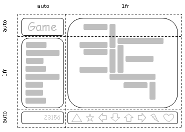
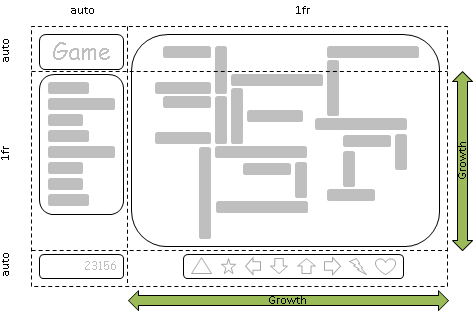
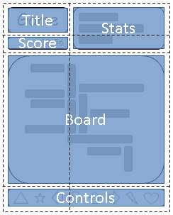
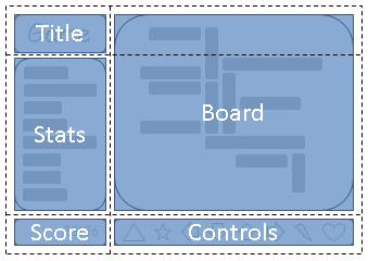


