1. 序論
~INFORMATIVE図形( shape )は、 CSS 値として利用できる任意の幾何を定義する。 この仕様は、要素の`浮動区画$の幾何を制御する,各種~propを定義する。 `shape-outside$p ~propは、図形~値を利用して,`浮動体$に対する`浮動区画$を定義する。 ◎ Shapes define arbitrary geometries that can be used as CSS values. This specification defines properties to control the geometry of an element’s float area. The shape-outside property uses shape values to define the float area for a float.
注記: CSS Shapes の将来の~levelでは、浮動体でない要素~上での図形の利用も許容することになる。 CSS Masking `CSS-MASKING$r, CSS Exclusions `CSS3-EXCLUSIONS$r などの他の CSS ~moduleも図形を用立て得る。 ◎ Note: Future levels of CSS Shapes will allow use of shapes on elements other than floats. Other CSS modules can make use of shapes as well, such as CSS Masking [CSS-MASKING] and CSS Exclusions [CSS3-EXCLUSIONS].
注記: CSS Shapesと CSS Exclusions の両者とも実装する~UAでは、 `shape-outside$p ~propが`排他体$に対する`排他~区画$を定義する。 ◎ Note: If a user agent implements both CSS Shapes and CSS Exclusions, the shape-outside property defines the exclusion area for an exclusion.
注記: CSS Shapes の将来の~levelでは、要素の中で内容が`回込む$図形を定義するような, `shape-inside^p ~propが定義されることになる。 ◎ Note: A future level of CSS Shapes will define a shape-inside property, which will define a shape to wrap content within the element.
1.1. ~module間の相互作用
この~moduleは、 `CSS2$r 9 章に定義される`浮動体$の特色機能を拡張する。 ◎ This module extends the float features defined in [CSS2] chapter 9.
1.2. 値
1.3. 値の~animation
【 これらの節の内容は CSS 日本語訳 共通ページ に委譲。 】
1.4. 各種用語
- `回込む@ ( wrap する)
- この仕様で利用する用語 `回込む$は、 `CSS2$r 9 章に定義されるように,内容が`浮動区画$の脇に~flowすることを~~意味する。 内容は、左浮動~boxに対しては その右~脇に,右浮動~boxに対しては その左~脇に`回込む$。 この`回込み$により、`浮動体$の`側方$に来る各~行l~boxは,`浮動区画$と~~重ならないよう,必要に応じて短縮されることになる。 ◎ This specification uses the term wrap to refer to flowing content around the sides of a float area, defined in [CSS2] chapter 9. Content wraps around the right side of a left-floated box, and content wraps around the left side of a right-floated box. One result of this wrapping is that line boxes next to a float are shortened as necessary to avoid intersections with the float area.
- `浮動区画@ ( float area )
- `浮動体$の~~周りに内容が`回込む$ときに利用される区画。 浮動体の挙動を定める規則にて,内容がどこへ~flowするかを決定するときは、`浮動区画$の各~側が利用される。 既定では、`浮動区画$は,浮動体の`~margin~box$になる(注意: `margin-box$v 値による`浮動区画$は、 `border-radius$p による`曲げ$も含むので, これとは異なり得る)。 この仕様の `shape-outside$p ~propを利用すれば、矩形状でない任意の`浮動区画$を定義できる。 ◎ The area used for wrapping content around a float element. The rules for float behavior use the sides of the float area to determine where content flows. By default, the float area is the float element’s margin box (note this can be different than the float area produced by the margin-box value, which includes border-radius curvature). This specification’s shape-outside property can be used to define an arbitrary, non-rectangular float area.
2. ~box~modelと浮動体の挙動との関係
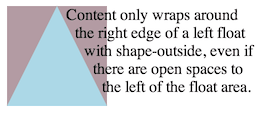
行内~flow内容を`浮動体$の外側に`回込ませる$ために利用する境界は、図形を利用して定義できるが、実際の~box~modelを変更することはない。 要素に指定されている[ ~margin / ~border / ~padding ]は、 `CSS3BOX$r ~moduleに則って算出され, 描画されることになる。 また、`浮動区画$を図形で定義しても,`浮動体$の位置決めと堆積-法は影響されない。 ◎ While the boundaries used for wrapping inline flow content outside a float can be defined using shapes, the actual box model does not change. If the element has specified margins, borders or padding they will be computed and rendered according to the [CSS3BOX] module. Also, float positioning and stacking are not affected by defining a float area with a shape.
`浮動区画$を定義する図形は,`浮動体$の`~margin~box$で切取られる。 言い換えれば、図形は【既定の】`浮動区画$を狭めるのみであり,拡げることはない。 `浮動区画$が狭められる結果、通常では浮動体により短縮されるような行l~boxが,短縮されなくなることも起こり得る。 `空の浮動区画@ (面積ゼロの区画)に対しては、どの行l~boxも短縮されなくなる 【すなわち、浮動体は空間を排他的に占めなくなる】 。 ◎ When a shape is used to define a float area, the shape is clipped to the float’s margin box. In other words, a shape can only ever reduce a float area, not increase it. A reduced float area may have no effect on some line boxes that would normally be affected by the float. An empty float area (where the shape encloses no area) has no effect on line boxes.
`浮動区画$を図形で定義することにより、通常の`浮動区画$をすべての側で狭めることが可能になるが、内容が浮動体の両~脇に`回込む$ことを許容するものではない。 `浮動体$が `shape-outside$p を伴っていても、内容が`回込める$のは,左~浮動体に対しては右~脇のみ, 右~浮動体に対しては左~脇のみに限られる。 ◎ A float area defined by a shape may reduce the normal float area on all sides, but this does not allow content to wrap on both sides of a float. Left floats with a shape-outside still only allow content wrapping on the right side, and right floats only allow wrapping on the left.
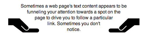
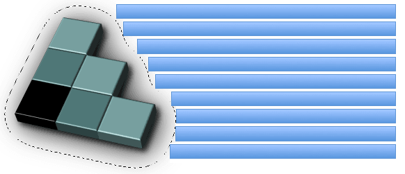
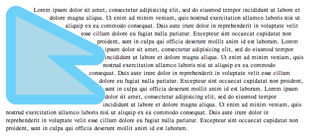
次の例では、左/右へ浮動する各 `img^e 要素には、 `shape-outside$p ~propを利用して三角形の図形が指定されている。 ◎ In the following example the left and right floating img elements specify a triangular shape using the shape-outside property.
<img class="left" src="hand.svg"/>
<img class="right" src="hand.svg"/>
<p>
  Sometimes a web page’s text content appears to be
  funneling your attention towards a spot on the page
  to drive you to follow a particular link. Sometimes
  you don’t notice.
</p>

<style type="text/css">
  .left {
    shape-outside: polygon(0 0, 100% 100%, 0 100%);
    float: left;
    width: 40%;
    height: 12ex;
    transform: scaleX(-1);
  }

  .right {
    shape-outside: polygon(100% 0, 100% 100%, 0 100%);
    float: right;
    width: 40%;
    height: 12ex;
  }

  p {
    text-align: center;
  }
</style>
どの図形も`浮動体$の`~margin~box$で切取られるので、上の左~浮動体にこの図形を追加しても,結果の描画は同じになる。 ◎ Since shapes are clipped to the float’s margin box, adding this shape to the left float above would result in the same rendering.
shape-outside: polygon(0 0, 500% 500%, 0 500%);
面積ゼロの図形に対しては、`空の浮動区画$が作成されることになる。 `回込み$において考慮されるのは,`浮動区画$のみなので、浮動体に下のいずれの図形が適用されても,行内~内容は浮動体の~box全体に重なるように~flowすることも許容されることになる。 ◎ A shape with no extent will create a float area with no extent. Because wrapping only considers the float area, either shape below applied to a float will allow inline content to flow through all of the float’s box.
shape-outside: inset(50% 50% 50% 50%);
shape-outside: inset(150% 150% 0% 0%);
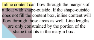
`shape-outside$p により,`浮動区画$の 左/右 両~脇を~~空けるように区画を作成できる。 次の事例では、内容が`回込める$のは,依然として浮動体の片方の脇のみになる。 図では、図形は水色に, 図形の外側の内容~区画は藤色に描画されている。 ◎ A shape-outside can create open areas on both the left and right of a float area. Content still wraps only on one side of a float in this case. In the picture, the shape is rendered in blue, and the content area outside the shape in mauve.
shape-outside: polygon(50px 0px, 100px 100px, 0px 100px);
次の~style付けは、浮動体の内容~区画よりずっと小さい図形を作成し,浮動体に上端~marginを追加している。 図では、[ 図形は水色, 図形の外側の内容~区画は藤色, 浮動-~boxの~margin区画は黄色 ]に描画されている。 行内~内容は、図形のみを`回込む$ようになり,残りの~margin区画に重なる。 ◎ The following styling creates a shape much smaller than the float’s content area, and adds a margin-top to the float. In the picture, the shape is rendered in blue, the content area outside the shape in mauve, and the margin area of the float box in yellow. The inline content only wraps around the shape, and otherwise overlays the rest of the float margin box.
.float-left {
  shape-outside: polygon(0% 50%, 50% 100%, 0 100%);
  float: left;
  width: 100px;
  height: 100px;
  margin-top: 20px;
}
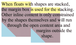
次の図は、 2 つの浮動体が互いに`側方$に堆積された場合にあり得る結果を示す。 各~浮動体は、`浮動区画$ではなく,自身の`~margin~box$を利用して位置されることに注意。 ◎ The next picture shows a possible result if two of these floats were stacked next to each other. Note that the floats are positioned using their margin boxes, not the float area.
3. 基本~図形
`basic-shape@t 型は、下に述べる基本~図形~関数を利用して指定できる。 この構文を利用して図形を定義するときの `基準box@ は、 `basic-shape$t 値を利用する各~propにて定義される。 図形に対する座標系の原点は、`基準box$の左上~隅になる — ここで, x-軸は~~右向き, y-軸は下向きである。 百分率で表されるすべての長さは、`基準box$の使用~sizeから解決される。 ◎ The <basic-shape> type can be specified using basic shape functions. When using this syntax to define shapes, the reference box is defined by each property that uses <basic-shape> values. The coordinate system for the shape has its origin on the top-left corner of the reference box with the x-axis running to the right and the y-axis running downwards. All the lengths expressed in percentages are resolved from the used dimensions of the reference box.
3.1. ~supportされる図形
次の図形が~supportされる。 すべての `basic-shape$t 値は、`関数記法$を利用し,`値~定義~構文$を利用して,ここに定義される。 ◎ The following shapes are supported. All <basic-shape> values use functional notation and are defined here using the Value Definition Syntax.
- `inset@f = inset( `length-percentage$t{1,4} [round `~border-radius$t]? )
-
内方へ~offsetされた矩形を定義する。 ◎ Defines an inset rectangle.
- 1 〜 4 個の `length-percentage$t 引数は、[ `基準box$の各~側からの~inset(内方への~offset) ]を`時計回りに設定する$。 ◎ When all of the first four arguments are supplied they represent the top, right, bottom and left offsets from the reference box inward that define the positions of the edges of the inset rectangle. These arguments follow the syntax of the margin shorthand, that let you set all four insets with one, two or four values.
- `~border-radius$t 引数(省略可)は、 `border-radius$p 略式~prop構文を利用して,~offsetされた矩形の各~隅の丸めを定義する。 ◎ The optional <‘border-radius’> argument(s) define rounded corners for the inset rectangle using the border-radius shorthand syntax.
- いずれかの次元において、両側の[ 内方への~offset ]の合計が`基準box$の使用~size以上になる場合(左, 右とも 75% など)、図形の面積はゼロになり,結果は`空の浮動区画$になる。 ◎ A pair of insets in either dimension that add up to more than the used dimension (such as left and right insets of 75% apiece) define a shape enclosing no area. For this specification, this results in an empty float area.
- `circle@f = circle( `shape-radius$t? [at `position$t]? )
-
真円を定義する。 ◎ ↓
- `shape-radius^t 引数は、真円の半径を表現する。 負の値は無効。 半径~zeroの場合、図形の面積はゼロになり,結果は`空の浮動区画$になる。 百分率~値は、`基準box$の使用[ 横幅, 縦幅 ]から,式[ √( 横幅の 2 乗 + 縦幅の 2 乗 ) ÷ √ 2 ]を基準に解決される。 ◎ The shape-radius argument represents r, the radius of the circle. Negative values are invalid. A radius of zero defines a shape enclosing no area, which results in an empty float area. A percentage value here is resolved from the used width and height of the reference box as sqrt(width2+height2)/sqrt(2).
- `position$t 引数は、真円の中心を定義する。 省略-時の既定は `center^v (`基準box$の中心)になる。 ◎ The position argument defines the center of the circle. This defaults to center if omitted.
- `ellipse@f = ellipse( `shape-radius$t{2}? [at `position$t]? )
-
楕円を定義する。
- 2 個の `shape-radius^t 引数は、順に,楕円の[ x-軸, y-軸 ]半径を表現する。 いずれも,負の値は無効。 半径~zeroの場合、図形の面積はゼロになり,結果は`空の浮動区画$になる。 各~引数に対する百分率~値は、順に,`基準box$の使用[ 横幅, 縦幅 ]に対し解決される。 ◎ The shape-radius arguments represent rx and ry, the x-axis and y-axis radii of the ellipse, in that order. Negative values for either radius are invalid. If either radius is zero this defines a shape enclosing no area, which results in an empty float area. Percentage values here are resolved against the used width (for the rx value) and the used height (for the ry value) of the reference box.
- `position^t 引数は、楕円の中心を定義する。 省略-時の既定は `center^v (`基準box$の中心)になる。 ◎ The position argument defines the center of the ellipse. This defaults to center if omitted.
- `polygon@f = polygon( `fill-rule$t?, [`length-percentage$t `length-percentage$t]# )
-
多角形を定義する。
- `nonzero$v, `evenodd$v いずれかをとり得る `fill-rule@t 引数は、多角形の内部域を決定する規則に利用される — 詳細は SVG の `fill-rule$p ~propを見よ。 省略-時の既定は `nonzero$v 。 ◎ <fill-rule> - The filling rule used to determine the interior of the polygon. See fill-rule property in SVG for details. Possible values are nonzero or evenodd. Default value when omitted is nonzero.
- ~list内の各[ `length-percentage$t 引数~pair ]は、多角形の各~頂点を順々に与える[ x, y ]座標を表現する。 ◎ Each pair argument in the list represents xi and yi - the x and y axis coordinates of the i-th vertex of the polygon.
- ~UAは、この~listの最後の頂点から最初の頂点へ接続して多角形を閉じ~MUST。 ◎ The UA must close a polygon by connecting the last vertex with the first vertex of the list.
- 面積ゼロの — すなわち,内部域が空になる(例えば頂点が 2 個以下の) — 多角形に対する結果は、`空の浮動区画$になる。 ◎ At least three vertices are required to define a polygon with an area. This means that (for this specification) polygons with less than three vertices (or with three or more vertices arranged to enclose no area) result in an empty float area.
上で定義されていない各~引数は、次で定義される: ◎ The arguments not defined above are defined as follows:
- `shape-radius@t = `length-percentage$t | `closest-side$v | `farthest-side$v
-
真円/楕円 に対する半径を定義する。 省略-時の既定の値は, `closest-side^v 。 ◎ Defines a radius for a circle or ellipse. If omitted it defaults to closest-side.
- `closest-side@v
- 図形の中心から `基準box$の最も近い側までの長さを利用する。 真円に対しては、両~次元にて最も近い側になる。 楕円に対しては、各~半径に対し,その次元にて最も近い側になる。 ◎ closest-side uses the length from the center of the shape to the closest side of the reference box. For circles, this is the closest side in any dimension. For ellipses, this is the closest side in the radius dimension.
- `farthest-side@v
- 図形の中心から `基準box$の最も遠い側までの長さを利用する。 真円に対しては、両~次元にて最も遠い側になる。 楕円に対しては、各~半径に対し,その次元にて最も遠い側になる。 ◎ farthest-side uses the length from the center of the shape to the farthest side of the reference box. For circles, this is the farthest side in any dimension. For ellipses, this is the farthest side in the radius dimension.
3.2. 基本~図形の算出値
`basic-shape$t 関数の算出値は、次の例外を除いて指定値のままになる: ◎ The values in a <basic-shape> function are computed as specified, with these exceptions:
- 省略-時の値は含まれ、その既定の値に算出される。 ◎ Omitted values are included and compute to their defaults.
- `circle$f / `ellipse$f における `position$t 値は、左上 原点からの~offset~pair(横方向, 縦方向の順)に算出され、それぞれは,絶対~長さと百分率の組合せとして与えられる。 ◎ A <position> value in circle() or ellipse() is computed as a pair of offsets (horizontal then vertical) from the top left origin, each given as a combination of an absolute length and a percentage.
- `inset$f における `~border-radius$t 値は、 8 個すべての[ `length$t / `percentage$t ]値に展開された~listとして算出される。 ◎ A <border-radius> value in inset() is computed as an expanded list of all eight <length> or percentage values.
3.3. 基本~図形の直列化
`basic-shape$t 関数を直列化するときは、それらの個々の文法に従う — その際には:
- 文法による順序を利用し、
- 可能な所では `calc^f 式を避け、
- `calc^f 変形を避け、
- 意味を変えずに省略できる所では 成分を省略して、
- 空白区切りの~tokenは単独の~spaceで連結して、
- 直列化される各~commaには単独の~spaceを後続させる。
`ellipse$f / `circle$f 内の `position$t 値(省略-時の既定も含む)を直列化するときは:
- その 2-値~形または 4-値~形のみに直列化し、
- `calc^f なしに表せるときは 2-値~形が選好され、
- 原点は左上が選好され,~zero長さよりも 0% が選好される。
`position$t に与える~offsetを伴わない~keywordは、百分率の~~代用なので,百分率に転換する: ◎ Since <position> keywords stand in for percentages, keywords without an offset turn into percentages.
入力: circle(at left bottom)

結果: "circle(at 0% 100%)"
成分の省略は,既定の値が直列化に現れないことを意味する。 ただし、 `position$t は常に 2-値~形か 4-値~形を利用するので、既定の `position$t は省略されない: ◎ Omitting components means that some default values do not show up in the serialization. But since <position> always uses the 2- or 4-value form, a default <position> is not omitted.
入力: circle(closest-side at center)

結果: "circle(at 50% 50%)"
文法による順序を利用するとは、 `position$t 値は,常に[ 横方向, 縦方向 ]成分の順に与えることを意味する: ◎ Using grammar order means that <position> values always give horizontal components first, then vertical.
入力: circle(at bottom left)

結果: "circle(at 0% 100%)"
`calc^f 式を避けるとは、 `position$t 値は, `calc^f 式を利用して 2-値~形に単純化できるときでも, 4-値~形に直列化され~MUSTことを意味する: ◎ Avoiding calc() expressions means that some <position> values that could be simplified to the 2-value form must be serialized in 4-value form instead.
入力: circle(at right 5px bottom 10px)

結果: "circle(at right 5px bottom 10px)"

次ではなく: "circle(at calc(100% - 5px) calc(100% - 10px))"
`calc^f 式の変形を避けるとは、指定値(または算出値)において `calc^f 式が `calc^f 形のままにされ~MUST場合は、式を別の原点で再構成したり 簡約することなく,そのまま利用することを意味する: ◎ Avoiding calc() transformations means that if a specified (or computed) calc() must stay in calc() form, it will be used as-is, not reformulated with a different origin or reduced.
入力: bottom calc(10% + 5px)

結果: "bottom calc(10% + 5px)"

次ではなく: "top calc(90% - 5px)"
次でもなく: "calc(90% - 5px)"
~zero長さより 0% が選好されるとは、省略された~offsetを給するときにそうし~MUSTことを意味する: ◎ Preferring 0% over a zero length comes up when you must supply an omitted offset.
入力: circle(at right 5px top)

結果: "circle(at right 5px top 0%)"
左上の原点が選好されるとは、( `calc^f を避けれるときは)百分率~offsetに対しては左上~隅を原点にとって正規化することを意味する: ◎ Preferring left and top origins means that some percentage offsets will normalize to those origins (when calc can be avoided).
入力: circle(at right 5% top 0px)

結果: "circle(at 95% 0%)"
3.4. 基本~図形の補間
2 つの基本~図形の合間で補間するときには、以下の規則が適用される。 互いの図形~関数の引数たちは、`単純~listとして$補間される。 ~listの各~値は、可能な所では,`長さ, 百分率, または calc 式として$補間される。 値がその型でなくても,一致するならば(両~listの同じ~list位置に `nonzero$v が見出されたときなど)、~list全体は補間できる。 ◎ For interpolating between one basic shape and a second, the rules below are applied. The values in the shape functions interpolate as a simple list. The list values interpolate as length, percentage, or calc where possible. If list values are not one of those types but are identical (such as finding nonzero in the same list position in both lists) those values do interpolate.
- 両~図形とも同じ`基準box$を利用してい~MUST。 ◎ Both shapes must use the same reference box.
-
両~図形とも同じ型の図形~関数であって,次のいずれかに該当する場合、互いの図形~関数の各~引数の合間を補間する: ◎ ↓
- 型は `ellipse$f, `circle$f いずれかであって, かつ いずれの半径にも[ `closest-side$v / `farthest-side$v ]~keywordは利用されていない。 ◎ If both shapes are the same type, that type is ellipse() or circle(), and none of the radii use the closest-side or farthest-side keywords, interpolate between each value in the shape functions.
- `inset$f 型である。 ◎ If both shapes are of type inset(), interpolate between each value in the shape functions.
- `polygon$f 型であって,両~多角形の頂点~数, `fill-rule$t は同じ。 ◎ If both shapes are of type polygon(), both polygons have the same number of vertices, and use the same <fill-rule>, interpolate between each value in the shape functions.
- 他のすべての事例に対しては、補間は指定されない。 ◎ In all other cases no interpolation is specified.
4. 画像による図形
~source `image$t を指定して図形を定義する仕方もある。 この場合の図形は、指定された画像の~alpha~channelから算出される。 図形は、指定された画像の[ 不透明度( ~alpha )が `shape-image-threshold$p 値で指定される閾値より大きい画素 ]で占められる~~領域として,何本かの~pathで封入される区画に算出される。 そのような画素が無ければ,`空の浮動区画$になる。 `shape-image-threshold$p が指定されていない場合の初期値は `0.0^v と見なされる。 ◎ Another way of defining shapes is by specifying a source <image> whose alpha channel is used to compute the shape. The shape is computed to be the path or paths that enclose the area(s) where the opacity of the specified image is greater than the shape-image-threshold value. The absence of any pixels with an alpha value greater than the specified threshold results in an empty float area. If the shape-image-threshold is not specified, the initial value to be considered is 0.0.
画像は、それが[ `内容~box$の使用~sizeと同じ横幅&縦幅が指定されている,`置換~要素$ ]であったかのように~sizeされ,位置される。 ◎ The image is sized and positioned as if it were a replaced element whose specified width and height are the same as the element’s used content box size.
~animationを伴う画像~形式( GIF など)に対しては、最初の~frameが利用される。 ◎ For animated raster image formats (such as GIF), the first frame of the animation sequence is used.
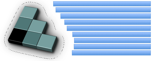
段落の左へ浮動している画像。 画像は、透明な背景の上に CSS ~logoの三次元版を示す。 ~logoは ~alpha~channelを利用する影を持つ。 ◎ An image is floating to the left of a paragraph. The image shows the 3D version of the CSS logo over a transparent background. The logo has a shadow using an alpha-channel.
画像は、自身の`浮動区画$を `shape-outside$p ~propを通して定義する。 ◎ The image defines its float area through the shape-outside property.
<p>
  <img id="CSSlogo" src="CSS-logo1s.png"/>
  blah blah blah blah...
</p>

<style>
  #CSSlogo {
    float: left;
    shape-outside: attr(src url);
    shape-image-threshold: 0.1;
  }
</style>
この例の `shape-outside$p ~propは、 属性~参照を用いて `img^e 要素の `src^c 属性による URL を再利用している。 ◎ The shape-outside property re-uses the url from the src attribute of the img element.
画像を表示しつつ,その`浮動区画$に対し異なる画像を利用することも、全く可能である。 ◎ It is perfectly possible to display an image and use a different image for its float area.
下の図では、 CSS ~logoの~~周りの破線が~alpha~channelによる閾値を表現している。 段落の各~行lは、次の 3 通りの仕方で開始させられる: ◎ In the figure below, the alpha-channel threshold is represented by the dotted line around the CSS logo. ◎ It’s then possible to affect where the lines of the paragraph start in three ways:
- 画像~内の~alpha~channelを改変する ◎ Modifying the alpha channel in the image
- `shape-image-threshold$p ~prop値を変更する ◎ Changing the value of the shape-image-threshold property
- `shape-margin$p ~prop値を変更する(次節の例を見よ) ◎ Changing the value of the shape-margin property (see example 8)
5. ~box値による図形
図形は CSS ~box~model に定義される各種 辺への~~参照として定義することもできる。 各~辺は、 `border-radius$p の使用~値による`曲げ$ `CSS3BG$r も含む。 `shape-box$t 値の構文は、 `margin-box$v も値にとれるよう, `box$t 値を拡張する: ◎ Shapes can be defined by reference to edges in the CSS Box Model. These edges include border-radius curvature [CSS3BG] from the used border-radius values. The <shape-box> value extends the <box> value to include margin-box. Its syntax is:
`shape-box@t = `box$t | `margin-box$v
各種~値の定義は: ◎ The definitions of the values are:
- `margin-box@v
-
この値は、`~margin辺$に封入される図形を定義する。 この図形の隅の両~半径は、対応する[ `border-radius$p 値を `半径^V / `margin-*^p 値を `~margin^V ]と記すとき、次で決定される:
- `比率^V = ( `半径^V ÷ `~margin^V ) が 1 より大きい場合: ( `半径^V + `~margin^V ) になる。
- `比率^V が 1 より小さい場合: ( `半径^V + ( `~margin^V × (1 + (( `比率^V − 1 ) の 3 乗 ) ) ) ) になる。
- `border-box@v
- `~border辺$に封入される図形 を定義する。 この図形は、~borderの外縁に対する 通常の[ 半径による~borderの形状付け規則 ]すべてに従う。 ◎ The border-box value defines the shape enclosed by the outside border edge. This shape follows all of the normal border radius shaping rules for the outside of the border.
- `padding-box@v
- `~padding辺$に封入される図形を定義する。 この図形は、~borderの内縁に対する 通常の[ 半径による~borderの形状付け規則 ]すべてに従う。 ◎ The padding-box value defines the shape enclosed by the outside padding edge. This shape follows all of the normal border radius shaping rules for the inside of the border.
- `content-box@v
- `内容~辺$に封入される図形を定義する。 この~boxの各~隅の半径は max ( 0, `border-radius^p − `border-width^p − `padding^p ) で与えられる。 ◎ The content-box value defines the shape enclosed by the outside content edge. Each corner radius of this box is the larger of 0 or border-radius - border-width - padding.
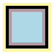
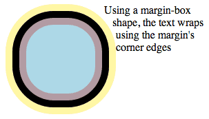
下に与える 100px 正方形の[ ~padding, ~border, ~margin ]はいずれも 10px とする。 定義される図形は、~box値に応じて,次で与えられる: ◎ Given the 100px square below with 10px padding, border and margins, the box values define these shapes:
- `margin-box$v
- 黄色~画素すべてを包含している図形 ◎ margin-box: the shape containing all of the yellow pixels
- `border-box$v
- 黒色~画素すべてを包含している図形 ◎ border-box: the shape containing all of the black pixels
- `padding-box$v
- 藤色~画素すべてを包含している図形 ◎ padding-box: the shape containing all of the mauve pixels
- `content-box$v
- 水色~画素すべてを包含している図形 ◎ content-box: the shape containing all of the blue pixels
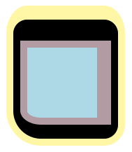
同じ定義は、同じ 100px 正方形に対し,次の様に[ ~padding, ~border, ~margin ]~propがより複雑にされた例にも適用される: ◎ And the same definitions apply to a more complex example with the same 100px square, but with these border, padding and margin properties:
border-radius: 20px 20px 20px 40px;
border-width: 30px 10px 20px 10px;
padding: 10px 20px 10px 10px;
margin: 20px 10px 10px 10px;
通常の浮動体に対する回込みと `margin-box$v 値により定義される図形に対する回込みとの間の相違は、 `margin-box$v 図形が隅の形状付けを含む点にある。 100px 正方形~boxの[ ~padding, ~border, ~margin ]は いずれも `10px^v にされ, `border-radius$p は `60px^v にされているとする。 これを左~浮動体にしたとき、内容は 通常は次の様に回込む: ◎ The difference between normal float wrapping and wrapping around the shape defined by the margin-box value is that the margin-box shape includes corner shaping. Take the 100px square with 10px padding, border and margins, but with a border-radius of 60px. If you make a left float out of it, content normally wraps in this manner:
浮動体に `margin-box$v 図形を追加した場合、内容は `margin-box$v の丸められた隅を回込む。 ◎ If you add a margin-box shape to the float, then content wraps around the rounded margin-box corners.
shape-outside: margin-box;
6. 図形の宣言-法
図形は、 `shape-outside$p ~propで宣言され, `shape-margin$p ~propによる改変も伴い得る。 `shape-outside$p, `shape-margin$p ~propで定義される図形は、浮動体の`浮動区画$の幾何を変更する。 ◎ Shapes are declared with the shape-outside property, with possible modifications from the shape-margin property. The shape defined by the shape-outside and shape-margin properties changes the geometry of a float element’s float area.
6.1. 浮動区画の図形: `shape-outside^p ~prop
◎名 `shape-outside@p ◎値 `none$v | [ `basic-shape$t || `shape-box$t ] | `image$t ◎初 `none$v ◎適 `浮動体$ ◎継 されない ◎百 受容しない ◎算 `basic-shape$t に対しては 基本~図形の算出値 節に従う。 `image$t に対する URL は絶対~化される。 他は指定された値のまま。 ◎ as defined for <basic-shape> (with <shape-box> following, if supplied), the <image> with its URI made absolute, otherwise as specified. ◎順 文法に従う ◎ア `basic-shape$t に対しては 基本~図形の補間 節に従う。 他の値は不可。 ◎ as specified for <basic-shape>, otherwise no ◎表終各種~値の意味は: ◎ The values of this property have the following meanings:
- `none@v
- `浮動区画$は影響されない。 ◎ The float area is unaffected.
- `shape-box$t
- 図形は、 `margin-box$v, `border-box$v, `padding-box$v, `content-box$v いずれかに基づいて, `border-radius$p による`曲げ$も含め,対応する~boxを利用して算出される — `background-clip$p `CSS3BG$r と類似的に。 ◎ If one of these values is specified by itself the shape is computed based on one of margin-box, border-box, padding-box or content-box which use their respective boxes including curvature from border-radius, similar to background-clip [CSS3BG].
- `basic-shape$t
- 図形は、 `inset$f, `circle$f, `ellipse$f, `polygon$f のいずれかに基づいて算出される。 `shape-box$t も給された場合、それが `basic-shape$t 関数の`基準box$を定義する。 給されなかった場合の既定の`基準box$は、 `margin-box$v になる。 ◎ The shape is computed based on the values of one of inset(), circle(), ellipse() or polygon(). If a <shape-box> is also supplied, this defines the reference box for the <basic-shape> function. If <shape-box> is not supplied, then the reference box defaults to margin-box.
- `image$t
- 図形は、指定された `image$t の~alpha~channelから `shape-image-threshold$p にて定義されるように抽出され、それに基づいて算出される。 ◎ The shape is extracted and computed based on the alpha channel of the specified <image> as defined by shape-image-threshold.
-
~UAは、 `shape-outside$p 値~内のどの URL に対しても、次を用いる下で CORS もあり得る~fetch `HTML5$r を利用し~MUST:
- "Anonymous" mode を利用する
- referrer source は~stylesheetの URL に設定する
- origin は 包含している文書の URL に設定する
この結果が~network~errorになった場合、妥当な~fallback画像が無ければ,値 `none$v が指定されたかのようになる。
◎ User agents must use the potentially CORS-enabled fetch method defined by the [HTML5] specification for all URLs in a shape-outside value. When fetching, user agents must use "Anonymous" mode, set the referrer source to the stylesheet’s URL and set the origin to the URL of the containing document. If this results in network errors such that there is no valid fallback image, the effect is as if the value none had been specified.
6.2. 画像~内で図形を成す画素を選ぶ: `shape-image-threshold$p ~prop
`shape-image-threshold$p は、利用する図形を画像から抽出するときに利用される ~alpha~channelの閾値を定義する。 例えば値 `0.5^v は、図形は 50% より不透明な画素すべてを封入することを意味する。 ◎ The shape-image-threshold defines the alpha channel threshold used to extract the shape using an image. A value of 0.5 means that the shape will enclose all the pixels that are more than 50% opaque.
◎名 `shape-image-threshold@p ◎値 `number$vt ◎初 `0.0^v ◎適 `浮動体$ ◎継 されない ◎百 受容しない ◎算 指定された `number$t を,範囲 0.0 〜 1.0 に切詰めた結果 ◎ The same as the specified value after clipping the <number> to the range [0.0,1.0] ◎順 文法に従う ◎ア `実数として$ ◎表終各種~値の意味は: ◎ The values of this property have the following meanings:
- `number$t
- 画像から図形を抽出するときに利用する閾値を設定する。 図形は、~alpha値がこの閾値より大きい画素で定義される。 範囲 0.0 (全~透明)〜 1.0 (全~不透明)の外側の閾値は、この範囲に切詰められる。 ◎ Sets the threshold used for extracting a shape from an image. The shape is defined by the pixels whose alpha value is greater than the threshold. A threshold value outside the range 0.0 (fully transparent) to 1.0 (fully opaque) will be clamped to this range.
注記: CSS Shapes の将来の~levelでは、画像の~alpha~dataの代わりに輝度~dataを利用する 切替え~~機能を定義し得る。 そうなった場合、 `shape-image-threshold$p による閾値は,切替え状態に依存して~alphaまたは輝度を適用するように拡張されることになる。 ◎ Note: A future level of CSS Shapes may define a switch to use the luminance data from an image instead of the alpha data. When this happens, shape-image-threshold will be extended to apply its threshold to either alpha or luminance, depending on the switch state.
6.3. 図形の拡幅: `shape-margin$p ~prop
`shape-margin$p ~propは、 `shape-outside$p に~marginを追加する。 これは、[ 元の図形の外周から外方に[ `shape-margin$p による距離 ]以内の地点すべてを含むような,最小の図形を定義する。 この~propは、負の値はとれない。 ◎ The shape-margin property adds a margin to a shape-outside. This defines a new shape that is the smallest contour (in the shrink-wrap sense) that includes all the points that are the shape-margin distance outward in the perpendicular direction from a point on the underlying shape. Note that at points where a perpendicular is not defined (e.g. sharp points) take all points on the circle centered at the point and with a radius of shape-margin. This property takes only non-negative values.
◎名 `shape-margin@p ◎値 `length$vt | `percentage$vt ◎初 `0^v ◎適 `浮動体$ ◎継 されない ◎百 受容しない ◎算 指定値 — ただし長さは絶対~化される ◎ as specified, but with lengths made absolute ◎順 文法に従う ◎ア `長さ, 百分率, または calc 式として$ ◎表終- `length$t
- 図形の~marginを,所与の `length$t に設定する。 ◎ Sets the margin of the shape to the <length>.
- `percentage$t
- 図形の~marginを,要素の包含塊の横幅に対する百分率に設定する。 ◎ Sets the margin of the shape to a percentage of the width of the element’s containing block.
多角形の `shape-outside$p からの~offsetを作成するような `shape-margin$p 。 薄い水色の区画は、~size `100px^v 平方の浮動体に入る図形を示す。 濃い水色の区画は、 `10px^v 分の~offsetを示す。 ◎ A shape-margin creating an offset from a polygonal shape-outside. The lighter blue area shows the shape in a 100x100px float, and the darker blue area shows the 10px offset.
.float {
  shape-outside: polygon(10px 10px, 90px 50px, 40px 50px, 90px 90px, 10px 90px);
  shape-margin: 10px;
}
`shape-margin$p が 画像による図形 節 の例の CSS ~logoに追加されたならば、図形を`回込んで$いる行l~boxたちは,更に短縮される。 ◎ If shape-margin is added to the CSS logo from example 6, the line boxes wrapping around the shape are shortened further.
#CSSlogo { shape-margin: 35px; }
謝辞
この仕様に~~協力された、次の方々に:
This specification is made possible by input from Andrei Bucur, Alexandru Chiculita, Elika Etemad, Arron Eicholz, Sylvain Galineau, Daniel Glazman, Arno Gourdol, Zoltan Horvath, Chris Jones, Bem Jones-Bey, Marcus Mielke, Alex Mogilevsky, Hans Muller, Mihnea Ovidenie, Virgil Palanciuc, Robert Sanderson, Dirk Schulze, Peter Sorotokin, Bear Travis, Eugene Veselov, Stephen Zilles and the CSS Working Group members.
変更~log
【 この節の和訳は省略する。 】