19: HTML tables
11th October 2012: Material moved to webplatform.org
The Opera web standards curriculum has now been moved to the docs section of the W3C webplatform.org site. Go there to find updated versions of these docs, and much more besides!
12th April 2012: This article is obsolete
The web standards curriculum has been donated to the W3C web education community group, to become part of a much bigger educational resource. It is constantly being updated so that it remains current with modern web design practices and technologies. To find the most up-to-date web standards curriculum, visit the web education community group Wiki. Please make changes to this Wiki yourself, or suggest changes to Chris Mills, who is also the chair of the web education community group.
Introduction
“Ack!”—how do you use web standards to organize reams of data? The very idea of tons of nested elements needed to get all the data into nice little rows and boxes ought to put your brain into “Ack!” mode, but there is a solution—tables to the rescue!
In web design tables are a good way to organize data into a tabular form. In other words, think of tables, charts, and other information graphics that help you to see and process a great deal of information in a summary that allows you to compare and contrast different pieces of data. You see them all the time on websites, whether they are giving a summary or comparison of political election results, sports statistics, price comparisons, size charts, or other data.
Back in the Jurassic Age of the Internet before CSS was popularised as a method of separating the presentation from structure of the HTML, tables were used as a way to lay out web pages—to create columns, boxes, and generally arrange the content. This is the wrong way to go about it; tables for layout resulted in bloated, messy pages with tons of nested tables—larger file sizes, hard to maintain, hard to modify after the fact. You’ll still see sites like this on the Web, but rest assured that these days you should just use tables for what they are designed for—tabular data—and use CSS to control layout.
In this article I will cover how to use HTML tables properly—the structure is as follows:
- The most basic table
- Adding some more features
- Structuring the table further
- CSS to the rescue: a better looking table
- Summary
- Further reading
- Exercise questions
The most basic table
I will start with the semantic HTML code required to render a basic table—this particular example compares recent volcanic eruptions in the Pacific region of North America. I like volcanos and when I was a kid, I convinced my mom to take me to several of these volcanos on our summer road trips to visit Grandma. I dearly hoped that one of the Pacific Northwest volcanos would erupt while we were on holiday, but to no avail. The first table looks like so:
<table>
    <tr>
        <td>Volcano Name</td>
        <td>Location</td>
        <td>Last Major Eruption</td>
        <td>Type of Eruption</td>
    </tr>
    <tr>
        <td>Mt. Lassen</td>
        <td>California</td>
        <td>1914-17</td>
        <td>Explosive Eruption</td>
    </tr>
    <tr>
        <td>Mt. Hood</td>
        <td>Oregon</td>
        <td>1790s</td>
        <td>Pyroclastic flows and Mudflows</td>
    </tr>
    <tr>
        <td>Mt .St. Helens</td>
        <td>Washington</td>
        <td>1980</td>
        <td>Explosive Eruption</td>
    </tr>
</table>
This code renders as follows:
| Volcano Name | Location | Last Major Eruption | Type of Eruption |
| Mt. Lassen | California | 1914-17 | Explosive Eruption |
| Mt. Hood | Oregon | 1790s | Pyroclastic flows and Mudflows |
| Mt .St. Helens | Washington | 1980 | Explosive Eruption |
Let’s start by breaking down the HTML markup used in the above code:
<table></table>: The table is necessary to indicate to the browser that you wish to arrange the content in a tabular fashion.<tr></tr>: Thetrelement establishes a table row. This allows the browser to organize any content between the<tr>and</tr>tags in a horizontal fashion, or all in a row.<td></td>: Thetdelement defines the table cell or each individual space for content within the row. Only use as manytdtable cells as needed for actual data. Don’t use emptytdcells for white space or padding—you use CSS to create any white space or padding needed, as this is not only a good way to separate presentation from structure but it also makes the table easier to understand for people with visual impairments who are using screenreaders to read the table contents out to them.
Note that the basic elements must be nested as follows:
<table>
    <tr>
        <td>content</td>
        <td>content</td>
        <td>content</td>
    </tr>
</table>
To order them in another fashion will cause the browser to spit up the equivalent of an internet hair ball and render the table in a very odd fashion if at all.
Adding some more features
Now the basic table is in place, you can add some slightly more complex table features—first, I will add a caption and Table headers to help improve the data both in terms of semantics and legibility for screen readers. The updated table markup looks like so:
<table>
    <caption>Recent Major Volcanic Eruptions in the Pacific Northwest</caption>
    <tr>
        <th>Volcano Name</th>
        <th>Location</th>
        <th>Last Major Eruption</th>
        <th>Type of Eruption</th>
    </tr>
    <tr>
        <td>Mt. Lassen</td>
        <td>California</td>
        <td>1914-17</td>
        <td>Explosive Eruption</td>
    </tr>
    <tr>
        <td>Mt. Hood</td>
        <td>Oregon</td>
        <td>1790s</td>
        <td>Pyroclastic flows and Mudflows</td>
    </tr>
    <tr>
        <td>Mt. St. Helens</td>
        <td>Washington</td>
        <td>1980</td>
        <td>Explosive Eruption</td>
    </tr>
</table>
This code is rendered as:
| Volcano Name | Location | Last Major Eruption | Type of Eruption |
|---|---|---|---|
| Mt. Lassen | California | 1914-17 | Explosive Eruption |
| Mt. Hood | Oregon | 1790s | Pyroclastic flows and Mudflows |
| Mt. St. Helens | Washington | 1980 | Explosive Eruption |
The new elements used here are:
<caption></caption>: Thecaptionelement allows you to title the table data. Most browsers will center the caption and render it the same width as the table, unless one chooses to use CSS to align the text differently.<th></th>: Thethelement delineates the content between the tag as the table head titles for each column. This is useful not just to help semantically describe what the function of this content is, but it also helps render it more accurately in a variety of browsers and devices. The above example is the most stripped down way to use thethelement.
Structuring the table further
As a final step in structuring our table, I will define header and body table sections, add a footer and define the scope of row and column headings. I will also add a summary attribute to describe the table contents. The final markup looks like so:
<table summary="a summary of recent major volcanic eruptions in the Pacific Northwest">
    <caption>Recent Major Volcanic Eruptions in the Pacific Northwest</caption>
    <thead>
        <tr>
            <th scope="col">Volcano Name</th>
            <th scope="col">Location</th>
            <th scope="col">Last Major Eruption</th>
            <th scope="col">Type of Eruption</th>
        </tr>
    </thead>
    <tfoot>
        <tr>
            <td colspan="4">Compiled in 2008 by Ms Jen</td>
        </tr>
    </tfoot>
    <tbody>
        <tr>
            <th scope="row">Mt. Lassen</th>
            <td>California</td>
            <td>1914-17</td>
            <td>Explosive Eruption</td>
        </tr>
        <tr>
            <th scope="row">Mt. Hood</th>
            <td>Oregon</td>
            <td>1790s</td>
            <td>Pyroclastic flows and Mudflows</td>
        </tr>
        <tr>
            <th scope="row">Mt. St. Helens</th>
            <td>Washington</td>
            <td>1980</td>
            <td>Explosive Eruption</td>
        </tr>
    </tbody>
</table>
This table code looks like so in a browser:
| Volcano Name | Location | Last Major Eruption | Type of Eruption |
|---|---|---|---|
| Compiled in 2008 by Ms Jen | |||
| Mt. Lassen | California | 1914-17 | Explosive Eruption |
| Mt. Hood | Oregon | 1790s | Pyroclastic flows and Mudflows |
| Mt. St. Helens | Washington | 1980 | Explosive Eruption |
The new elements/attributes are as follows:
- The
thead,tbodyandtfootelements: These define the table’s header, body and footer respectively. Unless you are coding a really complex table with many columns and rows of data, using these may be overkill. In a complex table, however, using them can not only structure the content for the coder’s sake, but also for browsers and other devices. - The
colspanandrowspanattributes: Thecolspanattribute creates a table cell that will span more than one column. In the case of the above footer, I wanted the one table cell to span the whole width of the table, thus I told it that it was to span four columns. Alternately, you can add a table cellrowspanattribute that will allow the table cell to span x amount of rows, for example<td rowspan="3">. - The
summaryattribute: This attribute is used to define a summary of the table contents, for use by screenreaders (notice that you didn’t see it on the rendered version of the table above.) Note that in the older WC3 recommendations, WCAG 1.0 and HTML 4.0, it says you can use thesummaryattribute as detailed above. In newer drafts of the specs however, thesummaryattribute is not mentioned. Whether to still use thesummaryattribute seems undecided, so for now we at the Web Standards Curriculum have agreed that it is safe to still use it. After all, it doesn’t cause anything to break, and it confers accessibility advantages. - The
scopeattribute: You may also have noticed thescopeattributes in thethtags, and the fact that I have defined the volcano names as headings too, inside the data rows! This is perfectly allowable, but anyway, I digress. Thescopeattribute can be used in thethelement to tell screen readers that thethcontent is the title for a column or a row. Thescopeattribute is only used in thethelement.
CSS to the rescue: a better looking table
The above listed elements and attributes are all that is necessary to code a good data table. Now the HTML structure is in place, let’s look at some simple CSS to make the table look a bit nicer:
body {
	background: #ffffff;
	margin: 0;
	padding: 20px;
	line-height: 1.4em;
	font-family: tahoma, arial, sans-serif;
	font-size: 62.5%;
}

table {
	width: 80%;
	margin: 0;
	background: #FFFFFF;
	border: 1px solid #333333;
	border-collapse: collapse;
}

td, th {
	border-bottom: 1px solid #333333;
	padding: 6px 16px;
	text-align: left;
}

th {
	background: #EEEEEE;
}

caption {
	background: #E0E0E0;
	margin: 0;
	border: 1px solid #333333;
	border-bottom: none;
	padding: 6px 16px;
	font-weight: bold;
}
When applied to our final table markup, the table looks as seen in Figure 1. You can also check out the example live here.
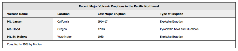
Figure 1: The table now looks a lot more visually appealing.
Oooh... Look, much better. You can choose to style the table anyway you want, but the above provides a baseline to work with. You’ll learn a lot more about styling tables with CSS later in the course, but for now I’ll just briefly break down what each section of this CSS is doing:
body: In the above CSS, I have added properties to set the margin (to zero in this case), padding to give a little room, background color (white), font size and family, as well as the line height to also give a little breathing room. You can download the code for this example here—try altering the properties in the CSS file to see how things change.table: borders have been added using the CSS border declaration. To make this work correctly, I also had to set theborder-collapseproperty tocollapse, to reset the border values in the table and allow theborder-bottomto be a straight rule line across the whole row rather than being broken up at the end of each table cell. I chose awidthof 80% for this example (this makes the table extend across 80% of the screen width; the table will change width relative to any change made to the browser window width).thandtd: In the above example CSS, I have set the text alignment to be left, but you could set it to center or even give the variousthandtdelements class names and then use the CSS to have more control over each row or column (in the row case, you would give thetrelement tag a class name). I also gave both thethandtda bit of padding to open up the rows and allow for greater readability. In the case of thethselector above, I set another color as to differentiate the headings from the rest of the table.caption: If you do not set CSS properties for thecaptionselector, then it does not have a border and is the same background color as the whole page even though the HTML markup for the caption is within thetabletag. Thus, in the above example I have given the caption a border (with no bottom border, as the border in the table already provided it), a different background color and bold type to set the caption apart from the table header row.
Summary
In this article I have gone through all you need to know to create effective HTML data tables. That’s a wrap! I’ll leave you with some pertinent thoughts:
- It is important that tables are correctly coded to be readable by a variety web browsers, mobile, accessible, and other devices. Table HTML is best kept to a minimum, and you should use CSS to style the tables. You’ll learn a lot more about CSS later on in the course.
- Tables can be accessible to mobile devices and users that use screen reading software by keeping the code clean, using attributes such as scope and summary as well as the caption element to help announce clearly and semantically what the respective sections are for. Also important for accessibility is to not use empty table cells for spacing (use CSS for this instead).
Further reading
- W3C HTML 4 Tables Recommendation
- W3C CSS 2 tables recommendation
- Roger Johansson’s “Bring on the Tables”
Exercise questions
- Start by coding a simple table with only the 3 main table elements:
table,tr, andtd. Save it and view it in a browser. - Much like the second example above, add a caption, header, and footer to your table. How does that change what you see in the browser?
- What can you do to make your table more accessible to screen readers and hand held devices?
- Now create a CSS file. Try styling the borders, padding, and cell spacing of your table with only CSS and no attributes in your HTML markup. Add background color and style the fonts.
Have fun.
About the author

A web designer/developer by trade, a photographer, moblogger and professional art weirdo for the love of it, Ms. Jen started her art and design career in the high chair with her love of personal food art and food wall art at the age of 11 months. She taught herself HTML in 1996 when a computer snob said that an artist could not learn to code and has been fully in love with all things web design ever since.
Ms. Jen is the owner and founder of Black Phoebe Designs, a web & mobile design firm. Ms. Jen has has a Masters degree in Computer Science and Multimedia Systems from Trinity College in Dublin, Ireland, and taught web design at an LA area university from 2001–2005. She has participated in two Nokia mobile blogging projects, Wasabi Lifeblog (2004–2005) and the Nokia Urbanista Diaries (2008). Ms. Jen can always be found online at blackphoebe.com or blackphoebe.mobi.
This article is licensed under a Creative Commons Attribution, Non Commercial - Share Alike 2.5 license.
Comments
The forum archive of this article is still available on My Opera.
No new comments accepted.