26: Accessibility testing
11th October 2012: Material moved to webplatform.org
The Opera web standards curriculum has now been moved to the docs section of the W3C webplatform.org site. Go there to find updated versions of these docs, and much more besides!
12th April 2012: This article is obsolete
The web standards curriculum has been donated to the W3C web education community group, to become part of a much bigger educational resource. It is constantly being updated so that it remains current with modern web design practices and technologies. To find the most up-to-date web standards curriculum, visit the web education community group Wiki. Please make changes to this Wiki yourself, or suggest changes to Chris Mills, who is also the chair of the web education community group.
Stella Systems have made a wonderful video that uses the text from the first part of this article as spoken word dialog, along with fantastic illustrations, and English and Russian subtitles. Watch the video on youtube. Thanks to Dmitry Nechiporenko, Anton Pashchenko, Lucy Stepanovska and Leonid Strorozhuk for this.
Introduction
When you create a web site, accessibility—making the web site usable by everyone, regardless of their ability or disability—should always be a central concern. So far in this course accessibility has always been implicit in all the examples you’ve seen, even if you didn’t realise it; in this article I’ll now look at accessibility explicitly, so you can understand fully what it is, why it is important, how to ensure that sites are accessible, and what guidelines exist to define accesible sites. The table of contents is as follows:
- What is accessibility?
- Why is accessibility important?
- Designing with accessibility in mind
- Interoperability requirements
- Features of an acessible web page
- Standards for accessibility
- Summary
- Exercise questions
Before I look specifically at accessibility on the web, let’s start by looking at accessibility in general terms—after all, accessibility isn’t just a concern associated with web sites; it is potentially a concern with every service, object or technology you’ll come across in life.
Note that an associated topic to learn about is WAI ARIA—the Web Accessibility Initiative’s Accessible Rich Internet Applications initiative, which is basically a methodology to allow the creation of more accessible Ajax/JavaScript-powered applications. You can find a great introductory article covering ARIA on dev.opera.com.
What is Accessibility?
Look around. Hopefully you will see some other people; if you don’t, why not take a quick walk? You’d probably enjoy it and it would do you good. None of the people you will see around you are the same—some have brown hair, some don’t. Some have blue eyes, some don’t. Some wear glasses, some don’t. None of us are completely alike. Some differences like hair or eye colour are cosmetic—they don’t significantly affect the way we live our lives. Some differences, like wearing glasses, do. Accessibility is a simple thing, a philosophy, although in some countries it is also part of the law.
Accessibility is treating everyone, no matter what their ability, the same.
I realise that this statement is open to interpretation. Most discussions of accessibility first talk about disability. This implies that people with a disability deserve special treatment. This isn’t what accessibility is about—it’s actually a symptom of the way people have traditionally built buildings, web sites, and pretty much everything else in fact.
When you build things with the assumption that everyone is the same as you, then they will always be wrong for some other people. People assume accessibility is about helping people with disabilities because retrofitted accessibility is very obvious in our societies. For example, a lot of buildings that started life with only steps have suddenly sprouted cheap ugly ramps. However, accessibility has long been a feature of military design. Why? because it is often critical for survival—at high g-forces jet fighter pilots can’t do the same things they can do on the ground. If aircraft designers didn’t take the needs of pilots in both high and low gravity environments into account then there would be a lot more plane crashes.
So, what does this mean for web site developers? The short answer is that you need to try to be more aware of the needs of the entire audience that might look at your site. A longer answer might require you to learn a little about the differing levels of ability people can have, and how they use computers. By applying the techniques outlined in this curriculum and other related articles you can create sites that work with many forms of interaction. Your web sites will be usable by people whether they:
- Are blind or severely visually impaired, and listen to web sites using a screen reader, or feel them on a braille display.
- Are shortsighted, and blow them up to 200% font size.
- Have motor disabilities so can’t use their hands to manipulate a mouse, and therefore use a pointing stick to manipulate the keyboard, or an eye pointer to manipulate the web site.
- Use trackballs, or other more unusual types of computer control system.
Don’t worry about the specific details of these interactions— we’ll go through those step by step next.
Why is Accessibility important?
Accessibility is important for one big reason and a whole lot of little ones. The main one is that we are all different and yet we all have an equal right to use web sites, but there are lots of other reasons why you should make accessibility considerations a part of how you build web sites:
- In some countries it’s the law.
- You don’t want to exclude any potential customers/visitors from using your site.
- Accessible sites tend to rank higher on search engines.
- You are demonstrating good ethics—something that customers will value.
- Once you build web sites with web standards it hardly requires any extra effort to make it accessible, which gives so many benefits; there is also a lot of crossover between sites being more accessible, and sites being more compatible with mobile phone browsers—another circumstance that makes web site harder to use, although for different reasons. In fact, some work has been done on analysing the relationship between web accessibility and mobile web development best practices—see the WAI "Web Content Accessibility and Mobile Web" page for more.
- Techniques that help people with disabilities benefit all users.
Now I will move on to look at some of these points in more detail.
The legalities of accessibility
Note: it’s important to understand the basics of the legal stuff but unless you are a lawyer and really know what you are talking about, you should take extreme care giving an opinion about legal issues.
In the UK, under the DDA, it is illegal to discriminate against disabled people when recruiting and employing people, and providing services or education. Discrimination is defined as not making “reasonable adjustments” to support everyone, regarldess of (dis)ability. This applies of course to making services or education available via the medium of web sites.
In the USA and European Union there are also requirements for Governmental web sites. In the USA, federal government (and some state government) web sites are expected to abide by Section 508. Section 508 is a document that tries to define what the minimum requirements are to achieve accessiblity. Section 508 covers more than just web sites; it also deals with any other technology that might be used by a federal employee. In Europe the European Commission has recognised the W3C’s Web Accessibility Initiative (WAI) and recommended it for use with all member states. The WAI produces guidelines for web sites, web authoring tool manufacturers and web browsers (for example, the WCAG, which I’ll look at later on.)
Potential Markets
When you only make web sites (or anything else) for one specific type of person you are excluding other types of people even if you don’t realise it, and these people can easily add up to a significant (if not a majority) market share. In 2000 the UK supermarket chain Tesco started a project to make a separate version of their online grocery site specifically targetting people with visual impairments. It was noted by Julie Howell of the RNIB that “Work undertaken by Tesco.com to make their home grocery service more accessible to blind customers has resulted in revenue in excess of £13m per annum, revenue that simply wasn’t available to the company when the web site was inaccessible to blind customers.
” So if Tesco hadn’t considered people with visual impairments they would have been missing out on a market of customers that was worth at least £13 million.
The core lesson here is that people of all abilities need the same services; groceries, taxis, electricity; and enjoy the same things; films, music, bars. Assuming that someone’s personal situation in life changes their ability or desire to participate in all aspects of society has been shown to be a mistake time and time again.
Search Engines
Search engines are not people. Often when people build web sites they do it without considering how they are going to be found on Google, Yahoo, etc. Search engines are just computer programs, and they can only use information they can understand to index your site. This makes them much like the screen readers that a person with a visual impairment might use.
The most obvious example of how this affects web design is images. Computers display images by having a list of what colour every pixel is and sending that information to the monitor. If you put an image on a web page that contains some text, for example a logo, the computer has no idea what that text says or even that the image contains text. In HTML the image element contains a way to describe in text the contents of an image, the alt attribute. You should provide text to describe all non-decorative images on your site, and you certainly shouldn’t represent whole paragraphs of text as images (or Flash for that matter)—blind people and search engines won’t have a clue what the text says! As a result, your search engine ranking (ie how easy it is to find your web site using search engines such as Google) will suffer and you’ll be needlessly missing out on a valuable market.
Ethics and branding
While everyone should support Accessibility, it doesn’t mean that everyone does. By supporting accessibility you are acting in the best interests of the community. This is something you can be proud of—showing that you care about everyone in society can only enhance a brand image. As professionals it’s our job to try and produce the best quality output we can. In a society that values us as individuals it’s important to not exclude someone because they have different needs.
By making responsible choices in policy and genuinely demonstrating that you are implementing those policies you can create an extremely positive brand image. Companies that show that they care about their customers will retain much more loyalty than those that don’t.
Designing with Accessibility in mind
The key to accessibility is thinking about a problem and knowing you are going to solve it for more than one kind of user. If you try to treat accessibility like something you can bolt on at the end then you will get a nasty-bolted-on-at-the-end thing. It’ll take longer, won’t work as well and look damned ugly.
The best way to achieve a well-engineered solution is to design with all the requirements in mind from the start. This doesn’t mean you shouldn’t change your plan or add some things you missed, but you should try to be aware of what the complete problem you are trying to design for is. In the case of web sites this means creating a solution usable by all your users including those who may not be able to use a mouse, or a keyboard, or a monitor, etc.
Interoperability requirements
Interoperability requirements are especially likely to vary from situation to situation.
New technology is often introduced without support for accessibility. For example, Microsoft’s new Silverlight plugin does not expose information via the accessibility APIs used by screen readers and other assistive technology, although such support is planned for the future.
Where support is theoretically present it can take time for assistive technology to make use of it. Newer screen readers work much better with JavaScript-triggered updates to HTML structures than older screen readers, for instance.
Even when long-established, accessibility support may continue to differ across platforms. For example, the Adobe Flash Player plugin has long exposed information to the Windows accessibility API, but not to the Apple or GNOME equivalents.
There also tends to be a lag between the arrival of supporting technology and its wide distribution. Whereas browsers and plugins nowadays tend to be free, whereas mainstream assistive technology can be very expensive. For example, one of the most popular screen readers is Freedom Scientific’s JAWS for Windows. A new version comes out roughly every year. JAWS Professional retails for $1,095, and even if you spend $200 to get a Software Maintenance Agreement for the next two versions, upgrades will still cost $500 or more. Consequently, although the latest release is version 9, you can still find lots of JAWS users using older versions.
So when you aim to build websites for the public Web, you need to take some account of interoperability with a highly varying client-side user/technology combination. There are four approaches:
- Progressively enhance your web site, testing for support as you go.
- Allow users to turn off problematic enhancements.
- Provide alternate versions with the same content or functionality.
- Advise your clients on what technologies they need to support and give examples of companies that do support those technologies.
Within intranets, backwards compatibility and variety is less of a concern. A given organization might be able to guarantee that all employees with disabilities will have access to assistive technology with decent support for DHTML, for example. In such circumstances, and with proper testing with the provided assistive technology, it would be reasonable to treat JavaScript as a baseline.
Forward compatibility and cross-platform compatibility are still issues however, so open, standard technologies should be preferred over proprietary, non-standard technologies.
For example, you might be developing an intranet training application for a large corporation. They have asked you to ensure the application is accessible, but have not specified a standard to which you must conform. You speak to their IT department and find out that everyone has the latest version of Internet Explorer, with JavaScript enabled, Flash installed and enabled, and will be provided with modern assistive technology they need to support those items. Now, even if the company moves to Unix-based platform, there will be assistive technology that supports JavaScript, but Flash text and controls are only accessible on Windows. You can safely make scripting and Flash a baseline requirement for your application. But you decide to only use Flash for playing video, and to build the control sets for the Flash video from web standards, since Flash controls are only accessible to assistive technology on the Windows platform. That way, the application would still be accessible even if the company migrated to Unix.
Organizational IT policies may change, and the best attempts to make JavaScript functionality operable and exploit the accessibility feature-sets of plugins may fail, so even if you have a technology baseline progressive enhancement from a core HTML layer is still a good idea.
Features of an accessible web page
In this section I will go through the different accessible features of a web site—that is, what an accessible web site should contain. I’ll explain each one in detail.
Semantic structure
One of the foundations of web standards is the use of semantic structure in HTML. Semantic structure is also extremely important for accessibility. This is because it provides the framework for the information on the page. When people can’t see the visual style of the page, the semantic structure helps to indicate a number of things to them. It can indicate their position in the heirarchy of the document and the ways they can interact with the different elements of the page, as well as providing emphasis to textual content in the right places.
A good example of how the semantic stucture of a document is important to accessiblity is navigation. A well structured navigation menu is a list of items. You can mark this up as an HTML list:
<ul>
  <li>Menu Item 1</li>
  <li>Menu Item 2</li>
  <li>Menu Item 3</li>
</ul>
By having navigation menus structured as lists it is easy to let someone using a screen reader, who can’t see the list, know it’s a list. This is because their screen reader tells them it’s a list. If you don’t use list markup then the screen reader has no way of knowing it's a list and telling the user.
You can find more information on how to use the correct semantics in your HTML in many of the earlier articles in the course, mainly the ones that cover HTML.
Alternative content
As mentioned in the section about search engines, ensuring that there is an accessible alternative to content and navigation is essential. Text is considered the universal currency of content with one caveat, as you’ll see below. Text can be easily read aloud by a screen reader, made bigger or smaller, have its contrast easily altered and many other transformations. It’s because it is so easy to manipulate text that more exotic forms of content should have a text-based alternative to them. Some formats, like the newer versions of Flash, have text access built into them so that the textual content within them can be accessed directly without needing to provide an alternative for the whole medium.
The one disability group that a text alternative can’t necessarily support is people with cognitive disabilities. The difficulty with supporting people with cognitive disabilities is that often they require different content, rather than the same content in a different medium. This is not to suggest you shouldn’t try. Simplifying the language and terminology used on your site benefits everyone. Groups like the Plain Language Commission have been advocating a “plain speech” approach to the material companies use to inform their customers of important information such as legal requirements and terms and conditions. They provide a plain english lexicon containing terms that can be used to help communicate effectively using the simplest language possible.
How should you implement text alternatives on your site? The first step is to identify things that aren’t already text. In HTML there are only so many things that aren’t already text. Images are the most obvious ones. Here is an example of an accessible use of an image:
<p>An interesting piece of art is Michelangelo’s “God creates Adam”
<img src="images/adam.jpg" alt="A painting of a man reaching up to touch God’s hand
reaching down. It is cracked with age." longdesc="adam.html">.</p>
The image in this example is an integral part of the content. The alt attribute contains a short description of the image for people (or search engines) that might not be able to see the image correctly. The longdesc attribute allows you to link to an HTML page containing a full description of the image. This is generally only used to describe complex images that are used as central content. It also suffer from poor support in browsers. Most of the time you will only use the alt attribute.
When images are used for things other than content, such as navigation, or purely visual decoration you should treat them differently from content images. Images used to make buttons or page navigation look more attractive should have an alt attribute that matches the text in the image. The alt attribute simply functions as an easy way to allow the computer to read the text contained in the image (and hence read it to the user of a screen reader).
In the case of purely decorative images, images used for tracking adverts, or any other image that a user wouldn’t be expected to be interested in or interact with, you should set the alt attribute to be empty. This does not mean omitting the attribute but setting alt="". This is because of a tactic screen readers have used to help their users cope with very inaccessible pages. When an image doesn’t have an alt attribute, especially when it’s part of a link, the screen reader reads the URL of the image to the user. This is so they can guess what the image is from the URL, for example if the image is named something like add_to_cart.gif. Therefore, you should set alt="" on images that you know the user won’t be interested in, so that screenreaders won’t read out every image’s URL, which could be rather frustrating for the screen reader user.
Not all forms of content are as simple as an image. More complex media like Flash (Flash files can be whole web sites in themselves) or movies require more complex descriptions. The most recent versions of Flash allow you to provide text alternatives for the items within the Flash movie, just like in HTML.
Defining interaction
A lot of today’s web involves the use of technologies in addition to HTML. Even something as basic as CSS can be used in ways that make a page or interaction much less accessible. The key to accessibility in interaction is starting with the simplest interactions and using those as the building blocks of more complex interactions.
Note that the point of this example is to make you think about the role different things on web pages have. To ensure that they are accessible, they must be semantically sound in terms of both the HTML elements used, and the visual metaphor used. If you find this confusing, then reread the example a few times, and also look a few menus and other web page components, while thinking about not only if the correct HTML is used, but also if the look and feel of the component successfully makes sense in terms of what its functionality is. You wouldn’t expect a web page visitor to search using a text box labeled “enter your mail address to sign up for this newsletter”, nor would you expect a sighted visitor to be able to find content of interest if all the headings were styled just like regular text (similarly, you wouldn’t expect a blind user to find content of interest if all the “headings” were actually just paragraphs made to look bigger using CSS or font elements).
A good example of this is the commonly used visual metaphor of tabs. The tab metaphor is drawn from ring binders indexed by topic. This has been translated to computers to allow a single area on the screen to display the information from various topics represented by tabs connected to that area—you can see a good example of tabs on dev.opera.com—look at them at the top of the page. So far it is all reasonably simple. The problem lies in the technologies used to create tabs—they are often implemented using JavaScript.
As soon as tabs are used as part of an interaction more complex than allowing the user to select the information the original metaphor has been broken, but often the same code is still used to represent the tabs. In the example below the HTML shows what a tab control that displays information looks like:
<div class="tabcontrol">
  <div class="hd">
    <ul>
      <li><a href="#dogs" class="selected">Dogs</a></li>
      <li><a href="#cats">Cats</a></li>
      <li><a href="#fish">Fish</a></li>
    </ul>
  </div>
  <div class="bd">
    <p id="dogs" class="selected">Some information about dogs. The dogs tab is the default tab.</p>
    <p id="cats">Some information about cats.</p>
    <p id="fish">Some information about fish.</p>
  </div>
</div>
In this example the selected class would be used to specify which tab needs to show the “tab to the front” graphic, for example check out the “Articles” tab at the top of this page which uses this method.
This structure is fine for informational content. In this example, the class of selected would be used to signify which tab is the active tab, ie, the one that is open and displaying its information; the others would be closed (ie, their paragraphs hidden) until their corresponding links are clicked on. The dogs tab is the default active tab, as shown in Figure 1.

Figure 1: A simple tab control showing the dogs tab, the default, active.
Once another link is clicked on (as shown in Figure 2) JavaScript would then be used to dynamically move the class="selected" to that link, at which point style would be applied to that tab to display it, and the one that was previously displayed would be hidden.

Figure 2: Now a different link has been clicked on, its corresponding tab becomes active.
you will find real working examples of this kind of control in some of the later JavaScript chapters, to be published soon.
It has also become common to use tabs to allow users to select different kinds of searches. In this case the concept starts to break down if you try to reuse the style of code from the previous example:
<div class="tabcontrol">
  <div class="hd">
    <ul>
      <li><a href="#dogs" class="selected">Dogs</a></li>
      <li><a href="#cats">Cats</a></li>
      <li><a href="#fish">Fish</a></li>
    </ul>
  </div>
  <div class="bd">
    <form id="dogs" class="selected" action="search.html" method="GET"><div><label for="dogsearch"><input type="text" name="dogsearch" id="dogsearch"><input type="submit" value="Search for Dogs"></div></form>
    <form id="cats" action="search.html" method="GET"><div><label for="catsearch"><input type="text" name="catsearch" id="catsearch"><input type="submit" value="Search for cats"></div></form>
    <form id="fish" action="search.html" method="GET"><div><label for="fishsearch"><input type="text" name="fishsearch" id="fishsearch"><input type="submit" value="Search for fish"></div></form>
  </div>
</div>
Employing the same code structure no longer makes sense—in this case you get the same form elements repeated again and again in order to fit into the concept of replacing content, which is a waste of markup. Instead of thinking visually it’s important to think about the interaction itself. In this example, rather than selecting new information to view the tabs you should be changing the interaction the user has with the search form. In effect the only thing a tab should be doing is selecting what type of animal the user is searching for. If you put this into practice you can create a much better interaction for all users of the site, with cleaner, easier to maintain markup:
<form action="search.html" method="GET">
  <fieldset>
    <legend>Search within:</legend>
      <ul>
        <li><label for="dogs">Dogs</label><input id="dogs" type="radio" name="animal" value="dog" checked></li>
        <li><label for="cats">Cats</label><input id="cats" type="radio" name="animal" value="cat"></li>
        <li><label for="fish">Fish</label><input id="fish" type="radio" name="animal" value="fish"></li>
      </ul>
    </fieldset>
  <input type="text" id="searchfield" name="search">
  <input type="submit" value="Search">
</form>
By creating the interaction first, the markup is cleaner and all users of the site get the best experience possible. When we started by extending a visual metaphor we quickly broke the interaction and created some horrible markup based on the assumptions of the previous example. Had we been using AJAX to insert the content instead of having it all on the page, it would have been even worse. Then users without JavaScript would have had to load an entirely new page to get a search form for cats or fish. By thinking about the basic interaction first (rather than the visuals) you can simplify the problem. Now we can still maintain a tab metaphor (albeit with a bit of styling and script) while only using one form for all the searches.
This is the core to understanding how to do accessible interaction. One of the great things about HTML is that the hard work of figuring out how to make the interactions in HTML accessible has already been done. As long as you don’t use the technologies on top of HTML to break the metaphor you can make most things work for most people without much effort.
Standards for Accessibility
In this section I will review some of the standards and guidelines available that aim to define web accessibility, and help web developers to create accessible sites. Most of these systems include some kind of check list system so developers can check how their sites match up to different accessibility criteria.
Web Content Accessibility Guidelines 1.0
The W3C is one of the primary standards bodies on the internet. Their Web Accessibility Initiative (WAI) published the first version of their guidelines for making web sites accessible in May 1999. The Web Content Accessibility Guidlines (WCAG) are the most widely used standard for Accessibility on the Web. The use of WCAG 1.0 has been suggested or mandated by a number of governmental bodies including the EU and the Italian government.
WCAG 1.0 is a set of 14 Guidelines that try to encapsulate the goals necessary to achieving an accessible page. Within each guideline are a number of checkpoints, which are the real meat of the document. While the guidelines explain the concepts the authors had in mind, the checkpoints are what are used to validate conformance. Each of the checkpoints are ranked from priority 1 to priority 3, to illustrate how important they are. In order to conform to WCAG 1.0 you must complete every priority 1 checkpoint. Adhering to all of the priority 1 checkpoints gives you a conformance rating of “A”. If you meet all the priorty 2 checkpoints as well then you conform to “AA”. Should you meet all the priority 1, 2 and 3 checkpoints then you would conform to “AAA”, which is the highest rating.
In reality WCAG 1.0 is a little old-fashioned. A lot of companies start by conforming to level “A” or “AA” and then look to add other guidelines such as the RNIB’s See it Right. WCAG 1.0 is a good starting point, but you should be looking towards some of the newer standards, especially if you use a lot of JavaScript, or other technologies that matured after 1999, when the WCAG 1.0 was released.
Another important thing to note about the WCAG 1.0 standard is it was designed to be part of a suite of 3 documents. Another one covered “User Agents”, which describes browsers (like Opera) and any extra technology people might need to use the web (like screen readers). The third covered authoring tools such as Dreamweaver or content management systems—it aims to try to make these tools do more of the work of making pages accessible. Unfortunately this vision hasn’t played out and the only standard out of the 3 to be widely adopted was WCAG 1.0. This means that often the expectations of WCAG 1.0 regarding user agents aren’t met, and very little of the burden of making web sites accessible is taken off you by authoring tools. This doesn’t mean you shouldn’t use WCAG 1.0; it simply means that it only meets part of accessiblity and is not a complete solution.
Web Content Accessibility Guidelines 2.0
Since publishing WCAG 1.0, the W3C has been working on WCAG 2.0. This updated version of the standard is still in draft at the time of writing. Subject to the process of the W3C it will probably be a published standard by early 2009.
WCAG 2.0 is slightly different in it attempts to be more technology-agnostic than WCAG 1.0, ie it could be applied to HTML, CSS, Flash, etc. WCAG 2.0 is based on 4 principles for accessibility. These are:
- Perceivable
- People can access the content through a medium available to them. For example people who can’t see should be able to hear the content
- Operable
- People can interact with the web application or content.
- Understandable
- The content and user interface is understood by the people who are using it.
- Robust
- Any solution provided should be using widely available on different platforms or systems. This is to stop people inventing solutions that the majority of people wouldn’t be able to use because the hardware/software is restricted or prohibitively expensive.
It’s important to note that web sites aren’t expected to fulfill all of these requirements. The technology a user has should do some of the work too. For example it is expected that a screen reader will read pages to people who need it, rather than every web site providing an audio version of the content. However, the web site is expected to provide pages that can be read using common screen reading technology in order to make this possible. This difference is important, as it’s the difference between a web site with an “accessibility widgets” (like a button to make the fonts a bit bigger) and a web page that will work in a multitude of different situations (eg varying browsers and devices that would be impossible to anticipate).
WCAG 2.0 also differs from WCAG 1.0 in the approach to technology. Since the standard is more technology-agnostic and deals with concepts about accessibility rather than concrete technical details it’s important to pay attension to the surrounding documents to the standard. The “standard” document of WCAG 2.0 will provide the understanding but the “techniques” document provides solid implementable pieces of information for the developer. This is broken up into “general” techniques (technology ambiguous) and specifics for individual W3C technologies. The W3C doesn’t write documents for proprietary technologies so you’ll have to find techniques for technologies like Flash and Silverlight from other sources.
Section 508
Section 508 is an extension to the American Workforce Rehabilitation Act of 1973. The version of Section 508 that became law in 1998 created a process that must be followed during US Federal government procurement. This means that all government agencies in the USA that are funded by federal money must comply with the process and guidelines set down in Section 508. These guidelines cover both web accessiblity and other accessibility issues relating to computers and electronic communication. Whatever else you might have heard, there is no federal law mandating the use of Section 508 beyond the organisations described above. However, some US states and companies use Section 508 to define “accessibility” for their own procurement processes.
The part of Section 508 that covers web accessibility is Subpart B § 1194.22. Clause 1194.22 is split into 16 requirements labeled a-p. The first 11 requirements (a through k) are stated as being directly equivalent to parts of WCAG 1.0. The requirements and their equivalents in WCAG 1.0 are listed in a reference table in the section 508 document. All the other requirements of Section 508 should be met by WCAG 2.0 with one exception. Requirement m refers to Section 508 Subpart B § 1194.21. This requirement has a partial equivelent in the Robust
principle of WCAG 2.0.
As of the time of writing of this article there was an ongoing investigation in to a new version of section 508 by the Telecommunications and Electronic and Information Technology Advisory Committee (TEITAC). TEITAC presented its findings to the assessment board for Section 508 in April 2008.
Other standards
Another important standard being developed by the W3C is the WAI-ARIA standard. This stands for Web Accessibility Initiative—Accessible Rich Internet Applications. It is a suite of documents that defines how to make complex web applications that use technologies like HTML, JavaScript and AJAX accessible. This standard is officially supported by the upcoming/current versions of most of the major browsers in the market place: Opera 9.5+, Internet Explorer 8+ and Firefox 3+.
There are many other standards for web accessibility too numerous to go into much detail about. The W3C maintain an excellent list of international policies relating to web accessibility—this is a great resource to help find the policy documents relating to your local government.
Summary
Accessibility is an important topic for both economic and social reasons. It is not a feature of a web site, but a measure of the quality it was built with. If you consider your site's audience as you are building it (and before) you will build more accessible pages with all the benefits that this brings. There are a number of well-known guidelines to help you—by conforming to those guidelines you can ensure that what you have built meets expert criteria in making your pages accessible.
Exercise questions
- Give 3 reasons why it’s important to build accessible web sites.
- Use the internet to research the accessiblity laws in your country and make a list of any laws that you think would apply to your web sites. Make sure you include if they ask you to use any web standards such as WCAG or Section 508.
- Explain how accessibility is important to search engine optimisation.
- Create an example of an accessible use of alternative content using some of your own content, such as a photo.
- Use the internet to research how you would make a technology like Flash or Silverlight accessible and write a comparison between making them accessible, and how you make HTML accessible.
- Explain how you would design an interaction on a web page to be accessible. Create the step by step instructions for creating a tree control (you don’t actually have to make it).
About the author

Tom Hughes-Croucher has been working in the Internet industry since he has been working. He has contributed to a number of standards on Web technology for standards bodies such as the World Wide Web Consortium (W3C) and the British Standards Institute (BSI). More recently he worked in the Digital Music business providing digital music solutions to well known UK brands like Tesco, Three telecom and Channel 4.
Tom now works for Yahoo! as a technical evangelist. Specialising in front-end web technology and RESTful web services he likes to promote best practice wherever he can. Before that he looked after the European Frontpages serving many millions of European visitors a month—he just doesn’t find scaling scary any more.
Introduction
Web accessibility testing is a subset of usability testing where the users under consideration have disabilities that affect how they use the web. The end goal, in both usability and accessiblity, is to discover how easily people can use a web site and feed that information back into improving future designs and implementations.
Accessibility evaluation is more formalized than usability testing generally. Laws and public opinion frown upon discriminating against people with disabilities. In order to be fair to all, governments and other organizations try to adhere to various web accessibility standards, such as the US federal government’s Section 508 legislation and the W3C’s Web Content Accessibility Guidelines (WCAG).
However, it is important to distinguish between complying with a standard and maximizing the accessibility of a web site. Ideally, the two would be the same, but any given standard may fail to:
- address the needs of people with all disabilities.
- balance the needs of people with differing disabilities.
- match those needs to optimal techniques.
- use clear language to express needs or techniques.
Such weaknesses can lead those with good intentions astray and may be exploited by those seeking to rubberstamp inaccessible products.
Moreover, web accessibility is a goal, not a yes/no setting. It is a nexus of human needs and technology. As our understanding of human needs evolves and as technology adapts to those needs, accessibility requirements will change as well and current standards will be outdated. Different websites, and different webs, serve different needs with different technology. Voice chat like Skype is great for the blind, whereas video chat is a boon for sign language users.
Disabilities pose special challenges when working out how easy a product is to use, because they can introduce additional experience gaps between users and evaluators. Accessibility evaluation must take account of what it is like to experience the web with different senses and cognitive abilities and of the various unusual configuration options and specialist software that enable web access to people with particular disabilities.
If you are trying to evaluate the usability or accessibility of your web site, putting yourself in the place of a film-loving teenager or a 50-year old bank manager using your site is difficult, even before disabilities are considered. But what if the film-loving teenager is deaf and needs captions for the films she watches? What if the 50-year old bank manager is blind and uses special technology (like a screen reader) which is unfamiliar to the evaluator in order to interact with his desktop environment and web browser?
Accessibility guidelines and tools help bridge these experience gaps. However, they are a supplement, not a replacement, for empathic imagination, technical ingenuity, and talking to users.
In this article, I will discuss approaches to evaluating web accessibility, both from the perspective of establishing formal compliance and from the perspective of maximizing accessibility. The article’s structure is as follows:
- When should testing be done?
- Understanding your requirements
- Who should test?
- Expert testing
- User testing
- Communicating the results of accessibility testing
- Summary
- Exercise questions
When should testing be done?
“Test early, test often” is an old software engineering saying. Tacking on testing at the end of the development process has two risks:
- Projects tend to run over-time and over-budget. Testing is often rushed, omitted, or ignored thanks to such pressures.
- It is more work to fix problems discovered late in a process than to do things right from the start.
So to ensure quality and save time and money, accessibility evaluations should start right at the beginning of product design and be included in subsequent development iterations through to final delivery.
Understanding your requirements
Before you begin to evaluate a project for accessibility, you need to determine what the key requirements are for that project, given its environment, intended audience, and resources. Some requirements will be set by third parties like governments and clients; some you may be able to choose for yourself.
External requirements
Often requirements come from external sources, such as:
- Governments. This typically takes the form of general legislation against discriminating against people with disabilities, rather than mandating a particular standard or enumerating precise conformance requirements. An important exception is when legislation enforces a particular standard for public sector. For example, Section 508 is a piece of US federal legislation, which mandates that websites produced for federal agencies must conform to at least a specific set of defined requirements. WAI’s Policies Relating to Web Accessibility page provides a partial list of similar legislation. But to get an authoritative statement of the obligations in your jurisdiction, consult a lawyer.
- Customer policies. For example, Shell currently try to ensure their websites conform to the "Double-A" conformance level of WCAG 1.0, so if you were developing a website for Shell you would need to meet (at least) the same standard.
- Marketing utility. Compliance with a particular standard, such as Section 508, might help sell a project to clients concerned about accessibility.
- Internal accessibility policies at your organization. For example, projects produced by the BBC need to comply with the BBC's Accessibility Guidelines v1.3.
The details of conformance
It is important to get as much clarity about external requirements as possible. Some accessibility standards have more than one possible level or type of conformance, so it is particularly important to nail down which is required. For example, WCAG 1.0 has three conformance levels:
- People with some disabilities “will find it impossible to access information” in a document that does not pass level “A”.
- People with some disabilities “will find it difficult to access information” in a document that does not pass level “Double-A”.
- People with some disabilities “will find it somewhat difficult to access information” in a document that does not pass level “Triple-A”.
Draft WCAG 2.0 has three levels too, but the conformance possibilities are more complicated. Where a resource is part of a series of resources presenting a process (eg product discovery, selection, checkout, and purchase confirmation for an online store), the conformance level for all resources in the series is that of the resource with the lowest level.
Conformance claims must be based on “accessibility-supported” content technology. To be an accessibility-supported content technology, a technology must:
- Have been demonstrated to work with users’ assistive technology.
- Have user agents (browsers, plugins, etc.) that work with the users' assistive technology and are available to users with disabilities at no cost above that for a user without a disability.
Note that within an intranet setting, you might be able to guarantee that such user agents would be available to users whereas you cannot guarantee the same thing on the World Wide Web. For example, an application might be usable without any commercial technology, but only be accessible to screen readers with a commercial plugin for which the organization has a site licence. That application could conform to WCAG 2.0 when deployed on the organization’s intranet, but not when deployed on the public Web.
WCAG 2.0 also allows more limited statements of conformance. An inaccessible resource can conform if an accessible alternative is provided. Publishers can make a statement of partial conformance where content is aggregated from other sources.
Exceeding expectations
Determining external requirements should only be the beginning of the process; they should be treated as a minimum set of requirements to which further goals should be added to maximize accessibility. As the person evaluating accessibility, it is your role to raise additional accessibility concerns, as you are the subject expert.
You may need to distinguish the two when delivering a final report. For example, a customer brief for an online supermarket might mention that they want a store accessible to blind users. Given the intended audience, you should also evaluate whether the store is accessible to users with other disabilities.
Note that external requirements for compliance with a particular standard do not necessarily prevent best practice guidelines from other standards being applied. For example, you might be evaluating a website for a web federal agency intended for use by senior citizens and be required to comply with Section 508. Section 508 stipulates that:
§ 1194.22 (c) Web pages shall be designed so that all information conveyed with color is also available without color, for example from context or markup.
This provision helps users who know how to customize the presentation of web content, but doesn’t maximize the accessibility of the default presentation of that content to the target audience by ensuring that there is sufficient contrast between suggested colors. Fortunately, there’s nothing stopping a web site from fulfilling this requirement but also meeting the following Level provisions from the Web Content Accessibility Guidelines 2.0 draft:
1.4.3 Contrast (Minimum): Text and images of text have a contrast ratio of at least 5:1, except for the following: (Level AA)
- Large Print: Large-scale text and large-scale images of text have a contrast ratio of at least 3:1;
- Incidental: Text or images of text that are part of an inactive user interface component, that are pure decoration, that are incidental text in an image, or that are not visible to anyone, have no minimum contrast requirement.
Note: Success Criteria 1.4.3 and 1.4.6 can be met via a contrast control available on or from the page.
1.4.6 Contrast (Enhanced): Text and images of text have a contrast ratio of at least 7:1, except for the following: (Level AAA)
- Large Print: Large-scale text and large-scale images of text have a contrast ratio of at least 5:1;
- Incidental: Text or images of text that are part of an inactive user interface component, that are pure decoration, that are incidental text in an image, or that are not visible to anyone, have no minimum contrast requirement.
Note: Success Criteria 1.4.3 and 1.4.6 can be met via a contrast control available on or from the page.
By contrast control, the criteria means that you should provide a way of changing the colours to a high-contrast variation. To test the contrast of colour schemes, you can use the colour contrast analyser from Juicystudio.
WCAG 2.0 is being designed to have a high degree of backwards compatibility with other standards, especially WCAG 1.0 and Section 508.
The importance of the user interface
Consider the special importance of making the user interface of a web site accessible. Even if content is not available in a suitable form, an accessible user interface may help users identify content of interest and seek external help in converting it to a form they can use. For example, a hard-of-hearing individual might be pointed to a video of a talk on a video-sharing site without captions. Because the URL uniquely identifies that video and because they can still use the player to see the video however they could submit it to a third party, such as the free Project readOn service, for captioning.
Personas with disabilities
An ideal approach is to build key disabilities for your project right into your other user personas: fictional users that act as archetypes for how particular types of users would use a web site. Let us say you are evaluating prototypes for a video sharing site and your personas include:
- 23-year-old James Smith, who is football-mad and especially wants to share sporting highlights with friends.
- 34-year-old Sarah Maddison is a working mom who might not normally have time for a video sharing site. But her three-year old daughter is really keen on watching videos, and Sarah wants to sit and help her find suitable videos she wants to watch.
You can take these personas and incorporate disabilities including (for example):
- Impaired vision.
- Colorblindness.
- Blindness.
- Deafness.
- Hard-of-hearing.
- Deafblindness.
- Epilepsy.
- Dyslexia.
For example, you might decide that James is also deaf and wants commentary on match videos to be captioned, and Sarah has poor eyesight and struggles to read fancy fonts and tiny text. These personas guide your rejection of prototypes that fail to include the facility for closed captions in the video player, or use elaborate text headings that would require images.
The WAI’s How People with Disablities Use the Web and Shawn Lawton Henry’s Just Ask: Integrating Accessibility Throughout Design contain some more example disability-inflected personas to get you started.
It shouldn’t need saying, but don’t assume people with disabilities are interchangeable. Disability is an incredibly varied phenomenon, and on top of that people with disabilities have all the variety that people without disabilities have, differing (for example) in gender, age, interests, values, and skills (perhaps most relevantly, in their computing expertise).
Again, comparing products against accessibility guidelines can help fill in the gaps that your personas do not cover. For example, perhaps you’re following WCAG 2.0 with the video sharing site, but your personas don’t include a user with epilepsy. Nonetheless, you read Guideline 2.3 (“Seizures: Do not design content in a way that is known to cause seizures”) and decide that the system needs to be able to screen uploaded videos for flashing before displaying them.
Choosing an accessibility standard
If you need to choose an accessibility standard in order to manage web accessibility concerns across a team or in simply to guide you while testing, I’d advise looking at WCAG 2.0 because it:
- is designed around core human needs that are applicable to technologies other than HTML and CSS (such as Flash).
- carefully documents the reasoning for each conformance criterion.
- suggests practical techniques for meeting conformance criteria using current technologies.
- ensures each provision is testable.
- incorporates more recent research than current alternatives.
- is designed to be broadly compatible with existing accessibility standards.
- will be an international standard.
You can cite compliance with a specific draft of WCAG 2.0; for marketing purposes however it is best to also seek compliance with finished standards like Section 508 and WCAG 1.0 as well as that draft.
The spirit of the law
When testing against guidelines, it’s important to keep in mind the underlying rationale for any specific technical guidance: to comply with the spirit, not just the letter, of the law.
Here’s a cautionary tale. Section 508 (§ 1194.22) includes a requirement that says: “A text equivalent for every non-text element shall be provided (eg, via alt, longdesc or in element content).” Likewise WCAG 1.0 includes a checkpoint that reads:
Provide a text equivalent for every non-text element (eg, via alt, longdesc, or in element content). This includes: images, graphical representations of text (including symbols), image map regions, animations (eg, animated GIFs), applets and programmatic objects, ascii art, frames, scripts, images used as list bullets, spacers, graphical buttons, sounds (played with or without user interaction), stand-alone audio files, audio tracks of video, and video.
Unfortunately, many people reading such guidance misunderstand what a genuine text equivalent for a spacer and decorative elements should be, and produce markup like this:
<img alt="fancy border" src="fancy-border.gif" border="0">
In fact, since these images convey no new information and have no functionality, the right text equivalent for those images would be an empty string (alt=""), which causes the screenreader to just skip over the alt attribute and not read it out. It is very annoying for a screenreader user to have to listen to text such as "fancy border" read out over and over again, when it does not provide them with any useful information.
WCAG 2.0 tries to be clearer. The equivalent guideline says: “All non-text content has a text alternative that presents equivalent information, except for the situations listed below”. One of those situations is: “Decoration, Formatting, Invisible: If it is pure decoration, or used only for visual formatting, or if it is not presented to users, then it is implemented in a way that it can be ignored by assistive technology.” Equally importantly, WCAG 2.0 tries to detail the reasoning behind the guideline:
The purpose of this guideline is to ensure that all non-text content is also available in text. “Text” refers to electronic text, not an image of text. Electronic text has the unique advantage that it is presentation neutral. That is, it can be rendered visually, auditorily, tactilely, or by any combination. As a result, information rendered in electronic text can be presented in whatever form best meets the needs of the user. It can also be easily enlarged, spoken in a voice that is easy to understand, or rendered in whatever tactile form best meets the needs of a user.
Who should test?
There are basically two groups who conduct testing: experts and users.
Expert testing is important because experts understand how the underlying web technologies interact, can act as a clearing house for knowledge about different user groups, and have the inclination to learn dedicated testing tools.
User testing is crucial because users are the real experts in their own abilities and their own assistive technology. User testing can also reveal usability gaps between more and less technical users, and between people who are familiar with the web site in question (such as the expert testers themselves) and people who aren’t (new users).
A web developer who knows how to use a screen reader is unlikely to explore a site the same as a regular screen reader user; screen reader users who program their own scripts are unlikely to explore the site using the same strategies as screen reader users who just do ordinary computing tasks like writing emails.
Knowledge gained in user testing is fed back into the expert testing process the next time testing is performed (either in another testing iteration on the same project, or a different project entirely). User testing also has a more subtle advantage. By humanizing accessibility and bringing developers together with end users, it can increase the motivation to build accessible websites.
Expert testing
There are four components to expert testing:
- Tool-guided evaluation: where a tool looks for accessibility problems and presents them to the evaluator (this would include accessibility checkers and code linters).
- Screening: where the expert simulates an end-user experience of the web site. Often you don’t need to look very far to find accessibility problems. You might do no more than load the page in your browser and notice the text is very hard to read.
- Tool-based inspection: where the evaluator uses a tool to probe how the various bits of a web site are working together.
- Code review: where the evaluator looks directly at the code and assets of a web site to scour for problems.
While beginners may be especially dependent on tool-guided evaluation, evaluators of all levels of experience can benefit from each component. Even beginners can spot img elements without text equivalents in HTML markup, and as you get more experienced, you will get quicker at spotting problems before you progress to more rigorous testing. For experts on larger projects, it may not be feasible to manually review all client-side code or inspect all parts of a website, but a tool-guided evaluation can find areas of particular trouble that deserve a closer look. Also, human evaluators may overlook things that a machine evaluation would have caught.
Unfortunately, although there are lots of accessibility tools, most of them are flawed in one way or another. For example, one tool that lists headings in HTML documents makes the error of not including alt text from img elements. Just as you should keep the spirit of the law in mind with standards compliance, so you should keep it in mind when using tools. Before complaining to someone about an accessibility problem, make sure it is a genuine issue not a tool error.
Semi-automated accessibility checkers
Once the first-glance problems have been fixed, a good next step is to throw the page at a semi-automated accessibility checker tool. If you are evaluating compliance with a particular standard, you will probably want to pick one that is designed for use with that standard.
If you’re evaluating compliance with Section 508 or WCAG 1.0, Cynthia Says is a reasonable choice. If you're testing against German BITV 1.0 Level 2, the Italian Stanca Act, or the WCAG 2.0 draft, the only current option is the experimental AChecker (formerly ATRC Web Accessibility Checker).
Such tools have significant limitations. There is no such thing as fully automated accessibility testing. For example, given the primitive nature of current artificial intelligence, a computer program cannot have the final say in whether some text is a genuine equivalent for a photograph in context. Even with areas that can theoretically be fully automated, checker programmers may err in their interpretation of accessibility guidelines and lose the spirit of the law amongst its letters.
Good tools inspect the page for accessibility problems and produce a list of things they judge to be errors and other things they judge worth human investigation. For example, if Cynthia Says finds an img element with alt="", it will issue a warning (not an error!) instructing the user to “verify that this image is only used for spacing or design and has no meaning.” If the correct text equivalent for that image is an empty string, you should move on to the next error or warning.
Perhaps the biggest advantage of accessibility checkers is that if you choose one, such as TAW 3, that can be run against multiple URLs, you can find pages in large collections that are likely to require closer inspection.
Structural inspectors
Many inspection tools are designed to probe structures of web content. Structures, in simple terms, define what the components of a web site are and how they relate to one another. For example, in the HTML document object model (DOM), text can be designated as a label for a form field using the label element. Browsers parse the HTML into a document object model. The browser associates various behaviour with particular components. For example, if you click the label of a checkbox, it will normally get checked.
Desktop environments and applications support interactivity with screen readers, speech recognition software, and other assistive technology by providing a similar structure that represents the content and functionality available in the visual presentation. On Windows, the main structural system is called Microsoft Active Accessibility (MSAA), or UI Automation on Vista. For example, a dialog has a series of related children, such as its title, its fields, its buttons, and their labels.
Typical assistive technology mostly deals with the browsers’ and plugins’ representation of web content in terms of these structural systems rather than processing web document object models directly.
There are inspectors for both desktop-level structures and web-level object models. On the desktop-level side of things, OS X comes with Accessibility Inspector and Accessibility Verifier. Microsoft provides inspector tools for Microsoft Active Accessibility 2.0 and Microsoft Active Accessibility 1.3. Accerciser is available for the GNOME assistive technology-SPI API.
Tools for poking at the (X)HTML document object model include DOM Inspectors as seen in Opera Dragonfly and Firebug and accessibility tool bundles like the Web Accessibility Toolbar for Internet Explorer and Opera and the ICITA Firefox Accessibility Toolbar.
DOM inspectors show you the tree of elements and attributes and text constructed out of the (X)HTML serialization, whereas web accessibility inspectors abstract particular components or relationships and list them. For example, they might list all fields with their labels or all headings or all links.
Digging into the accessibility model should not normally be necessary for (X)HTML, though you might also want to investigate that layer if you think a browser is representing a correct (X)HTML structure incorrectly to assistive technology. Instead, you will normally be checking (X)HTML structures directly.
Not all content can be inspected with DOM or web accessibility inspectors. Inspecting what is exposed to the desktop-level accessibility structures is important for checking what plugin content (media players, Flash content, and Java applets) is being exposed to assistive technology that uses those accessibility models.
In general, you should check that all controls are exposed in the model with the appropriate role (eg text boxes are text boxes, buttons are buttons), and the necessary properties.
Screening and using end-user assistive technology
Screening involves emulating the experiences of people with disabilities while testing. This might take the form of using assistive technology to interact with a site or attempting to restrict one's abilities in some manner. For example:
- Using a mouthstick to press keys while testing keyboard accessibility.
- Viewing a page with the Vischeck simulator, which attempts to present the page, images included, as people with different forms of colorblindness see it.
- Turning off a monitor while using a screen reader in conjunction with a browser.
Screening can help build developer appreciation for the needs of people with disabilities and can reveal fundamental design flaws. Use of assistive technology can clear up certain misconceptions about how they do and don’t support and interact with web standards. For example, popular screen readers do not use styles suggested for the aural or braille CSS media types, instead attempting to represent the screen type presented by the visual browsers with which they interact.
Using assistive technology is not a task to be taken lightly, since a good understanding of how to use such systems may require a degree of immersion and training. There’s a serious risk of creating new misconceptions. Developers might struggle to do something with a screen reader and assume that reflects a failing in the screen reader, when it really reflects their inexpertise with the tool. They might try to use the tool the wrong way, for example trying to read a page in sequence where a real screen reader user would hop around it using headings and other elements looking for points of interest. Or alternatively, they might fail to read the screen properly. Reading through a page you can see or know well with a screen reader is very different from exploring a brand new site you cannot see.
Use of assistive technology needs to be accompanied by experience of how everyday users employ the technology and conclusions drawn from such use should ideally be confirmed with expert users. On the whole, beginners are better off leaving use of assistive technology to user testers.
Detailed inspection
Once all genuine problems identified by your chosen checker tool have been fixed, you can move on to manual testing, probing, and review of the project.
WCAG 2.0 splits its best practice criterion into four principles. Content and functionality must be:
- Perceivable (for example, images should have text equivalents).
- Operable (for example, it should be possible to interact with a web site without a mouse and navigate it with a screen reader).
- Understandable (for example, copy should not be more complicated than it needs to be and the web site should operate in a predictable manner).
- Robust (for example, web sites should work interoperably with different user agents and navigation should be consistent).
In this section, I shall present some examples of how expert testers can evaluate how far content matches up to these principles. Please note this section is not intended as a substitute for a review of WCAG and its techniques.
Perceivability
One subset of perceivability problems revolves around the provision of alternative media of various types. You can test for text equivalents by turning off images and multimedia in your browser and looking at the page. But you’ll need to take special care with the img and input elements. Normally, you are advised to give all purely decorative images blank alt attributes (alt="") so that the screenreader will just skip them. However, in the case of:
- Images that are the sole content of links
- Form buttons
When these elements are given alt="" attributes, screen readers will commonly treat the image or button as if the alt="" atribute is missing, and attempt to provide one (for example, by reading out the URL of the image).
Therefore in these particular circumstances you must ensure that images inside links or buttons have an alt attribute that describes the link destination or button action, even though this is slightly repetitive.
Testing for equivalents synchronized with multimedia, such as captions and audio descriptions, can be done by digging into the preferences for your media player to turn on accessibility settings.
Another group of perceivability problems concerns the styling of the page. There are three areas to investigate here:
- Is the suggested presentation of the page reasonably accessible? For example, is there sufficient color contrast? Is the text comfortably large? In addition to squinting at the page yourself, you can use a tool such as Juicy Studio CSS Analyser to check background and foreground color combinations against formulae that purport to measure legibility.
- Can publisher suggestions for presentation be safely mixed with common user preferences aimed at making content more legible, like increased font size, zoom, and different default colors? Try increasing the text size by about 2–5 steps; don’t worry if the results are not pixel perfect but do worry if the layout is so broken it renders the content hard to read. Try changing your color preferences and see what happens. If publisher CSS sets colors, it should explicitly set background and foreground together to ensure that the combination of unusual preferences and publisher styles do not result in unreadable or invisible text. Popular browsers allow users to enforce their own color preferences and turn off CSS background images. When you try this yourself, it can reveal misconceived CSS image replacement techniques that hide text off-screen, since the image will not be loaded but the text will still be invisible.
- If publisher suggestions for presentation are discarded, is all the information communicated by such suggestions preserved in the web content for use by the default stylings of the user agent or user styling? Try turning off CSS and inspecting the document object model to check that headings are marked as headings and tables are used for tabulated data not layout.
Operability
Health and safety is a crucial, though rarely considered, part of making a website operable. But flashing content risks triggering fits in photosensitive epileptics. You can take a screen capture of your website in use and feed it into the Trace Center Photosensitive Epilepsy Analysis Tool (PEAT) to test if it has flashing content likely to pose a danger to your users. Obviously, this is an especially big concern if you are creating a video sharing website. At the product design stage, you might look at including an automated screening process for uploads.
Beyond that, a good way to test the operability of websites is simply to try to see if you can access all essential content and functionality with different devices:
- Try using your site with just the keyboard. Is current focus always clearly indicated? Can all functionality be accessed by keyboard?
- Try using your site with a touchscreen device.
- Try navigating your webpage with voice commands using Opera for Windows and its Voice add-on, or Windows Vista Speech Recognition and Internet Explorer. (Note: dictation-quality commercial speech recognition has recently been introduced to Mac OS X in the form of MacSpeech Dictate, but there is currently no equivalent on the free *nix platforms.)
Screen readers and other assistive technology can make use of the semantic structure of (X)HTML to correctly associate content and to enable navigation of content. For example, screen readers can allow users to jump to the next occurrence of headings or other element type, or they can list all occurrences of a certain type. Correct use of label and legend elements allows assistive technology to associate labels with the correct form fields; correct use of th elements and header, scope, and axis attributes allows it to associate table headings with table data cells. Semantic structure may be evaluated with a document object model (DOM) inspector like the one found in Opera Dragonfly. Accessibility inspection tools like the Firefox Accessibility Extension can make such tasks easier by, for example, listing the headings on the page, or listing the attributes of form fields (quickly showing which ones are missing associated labels). See Figure 1 for an example.
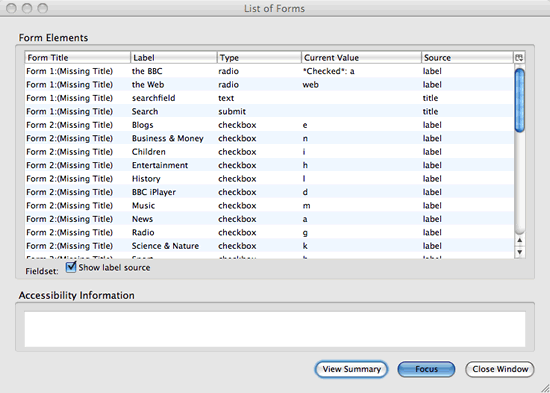
Figure 1: Screenshot of Firefox Accessibility Extension’s forms information window with the new BBC homepage.
Understandability
Assessing comprehensibility is even more subjective that testing legibility. Unless an evaluator is new to a project or is a professional editor, they are probably not the best person to evaluate whether copy is as understandable as possible. You can however use Juicy Studio’s Readability Test tool to get a rough idea of how simple your site's copy is.
Some aspects are highly objectively testable however, such as whether content has language metadata that allows (for example) screen readers and voice browsers to read content with the correct pronunciation. With HTML, you could use a DOM inspector to check for the presence of a lang attribute for the document and each change of language.
Keep an eye out for inconsistencies in web sites, both in terms of internal consistency and predictability from common web conventions. Screen magnifier users who only see part of a page at a time rely heavily on such consistency in order to know where to look to find given content and functionality.
Robustness
Testing whether content is robust involves checking that technologies are being correctly used. At a very basic level, you can run markup and code through linters such as:
Next, you can review code in depth to check that features are used correctly. For example, you can check that HTML native controls are used rather than faking controls with meaningless elements and JavaScript, and that JavaScript uses feature detection rather than browser sniffing where possible.
Then you can test in multiple user agents and assistive technologies, checking the site is perceivable, operable, and understandable whatever combination of publisher CSS, JavaScript, and plugins are enabled or disabled.
The most common problem is probably obtrusive JavaScript, like anchors and buttons that are in the unscripted markup of the page but depend on JavaScript to actually do anything. But there are more subtle problems that arise from overly close coupling of JavaScript with other layers in the technology stack. For example, JavaScript might apply CSS display: none; to hide content, but what happens when publisher CSS is not applied?
Another example is multimedia controls. Often, when plugin content is included, the plugin’s native user interface is disabled and the plugin is instead controlled by scripted HTML widgets. When the plugin content is only added via JavaScript after JavaScript-based plugin detection, this is fine. But sometimes plugin content is included in the pre-scripted state of the page. In such cases, it is worth checking not only that a fallback has been included in case a handling plugin is not available, but also that the native user interface of the plugin is not disabled unless JavaScript is available. If the former is not the case, then users will not see the fallback content at all; if the latter is not true then users will see the plugin but not be able to control it.
User testing
No amount of developer inspection and screening can substitute for the raw clash between a user and a web site. Given the difficulties of understanding all the subtle interactions between web content and assistive technology and the difficulties of approximating the experience of users with disabilities, this goes double for users with disabilities. If at all possible, you should test your site with real users with disabilities. This can be done on a large and expensive scale, but do not underestimate the benefits of doing even small-scale user testing.
Recruiting testers
Testers can be found in the same way as you find candidates for usability testing generally (eg through advertising and recruitment agencies). Your local disability organizations should be able to suggest appropriate forums for recruiting test subjects.
Testing is real work and should ideally be compensated as such. A rate of around 70 USD for an hour’s testing is fairly common for user testing.
Having said that you may be able to find people who will test smaller projects for free. There will be people with disabilities among your friends, relatives, and colleagues. In addition, there are online discussion groups dedicated to software accessibility issues, such as:
- WebAIM Accessibility Discussion List.
- Web Accessibility Initative Interest Group Mailing List: a forum for discussion of issues relating to Web accessibility.
- British Computer Association of the Blind mailing list: for discussing Information Communication Technologies (ICT) for visually impaired people.
- Magnifiers Yahoo! Group.
- jfw@freelists.org: A mailing list for users of the JAWS screen reader.
- GW-Info: A mailing list for users of the GW Micro Window-Eyes screen reader.
- Dolphin software users Yahoo! Group.
- NVDA users mailing list.
- Thunder users mailing list.
- discuss@macvisionaries.com: A list about use of OS X by the blind.
- macvoiceover@freelists.org: Apple VoiceOver users.
- Blinux-list: A list about the use of Linux by people who are blind and visually impaired.
- GNOME Orca users.
- Ai Squared Forums: Including users of the popular ZoomText magnifier.
- Deaf-Macs Yahoo! Group: For deaf, hard-of-hearing, and Usher or deafblind Mac Users.
- deaf-uk-technology Yahoo! Group: Deaf-related technology discussion.
Such groups typically welcome questions from web developers about the accessibility of their sites or particular techniques.
Practical considerations
Remember that the test environment itself needs to be accessible. For example, if you are preparing written test materials, you need to be prepared to offer these in alternative forms. The logistics of replicating the user’s browsing environment at your normal testing location are complicated, so it may be more realistic to test at the user’s home. Failing that, even completely remote testing can be valuable.
One particular consideration that is probably even more important for users with disabilities than other users is what technology they are familiar with. Assistive technology can add many layers of complexities to their computing experience, creating a big divide between novice computer users and old-hands, and dividing users into communities who might be very adept with their own setup but highly disorientated by unfamiliar technology. (Think of how hard users without disabilities that affect their use of computers find it to switch between Mac and PC!)
If you take a longtime user of the Window-Eyes screen reader, sit him in front of an unfamiliar machine with the JAWS screen reader installed and ask him to test a website, it’s going to be very difficult to distinguish his problems with JAWS from his problems with your website. Given the significant differences between versions and given how users often customize their setup, it may be difficult even if you provide Window-Eyes! For this reason, unless you are specifically testing how well your website’s accessibility will hold up in unfamiliar settings (eg in libraries or friends’ computers), it is best to allow users to test with their own setup or something as close as possible to it.
Likewise, unless you specifically want to test novice users or expert users, you should aim to select users who have around a year’s familiarity with using their current setup to access the web. Both assistive technology and the conventions of the web itself are non-trivial to learn. With novice users you will not know whether problems arise from your site or are intrinsic to the learning process, and experts may have tricks up their sleeves that others don’t.
Choosing tasks
It’s incredibly instructive even to observe users simply exploring a website. As with any other user testing:
- Try setting the users some specific tasks to accomplish.
- Ask them what they think and listen to what they say.
- Pay attention to what they do, because that may differ from what they say: stated preference is a poor guide to performance.
When you design a site, you need to focus on the transactions users want to make with your site rather than the particular controls they need to use. Likewise, when accessibility testing, the tasks you set should (at least initially) reflect the real goals of a visitor using the site, rather than being focused on their interactions with particular controls. These transactions will typically be similar for people with and without disabilities.
For example, if you are testing a video sharing site for accessibility, do not begin by asking them if they can use particular controls (“That’s the volume slider. Can you adjust the volume?”). Instead, give them scenarios and ask them to achieve key user tasks. For example:
- Browse videos and choose one to play.
- Search for a video.
- Upload a video.
- Pause the video, play the video, mute the video, unmute the video, rewind the video and play it again.
- Rate a video.
- Share a video with a friend.
This way, you are likely to uncover lots of problems you had not anticipated. For example, a screen reader user might not be able to find the search box or the controls for the video. Conversely, users might have navigational strategies for dealing with the web you do not even know about.
Interpreting the results
In an ideal world, we could test every possible combination and get feedback from everybody. But in reality, time and money will limit user testing. Given this, feedback can be a double-edged sword. While it can teach you an enormous amount, there is a real danger of attaching too much weight to one person’s view, which may not be representative of the greater target audience. For example, some screen reader users tend to be looking for an experience streamlined for blind users; others are keen to know everything about the site that their sighted friends and colleagues see.
This is where accessibility standards like WCAG really come into their own. By following such guidelines, you can increase your chances of getting a foundation of accessibility even for user groups you are not able to test.
When you do observe a problem, analyse its causes. For example, your video sharing site includes a page showing popular videos in a data table, with columns including a still, a title, uploaded date, last played date, and overall rating, and arranged in row groups by category of video. In user testing, a screen reader user has trouble using the data table. This could reflect:
- A problem with the site code. For example, maybe the developers constructed a data table from meaningless
divelements rather than using proper data table markup. Here the appropriate action would be to recode the table. - Inexpertise on the part of the user. For example, a JAWS user might be unfamiliar with JAWS’s features for navigating and reading data tables. Here an appropriate action might be to provide additional documentation or hints for less expert users. If expert users do not make ideal test subjects, they make great consultants on points such as this.
- A problem with the user agent. For example, Safari exposes data tables to the Apple accessibility model as a series of layout boxes rather than as a set of data relationships. Here appropriate actions would include reporting the bug to the user agent vendor or developers, researching a technique that does work in the user agent, or noting the limitation in documentation and suggesting alternative user agents that do work with your web site.
- A problem with the screen reader. For example, the developers might have shortened long table headers using the
abbrattribute, but the screen reader might not provide a user interface for reading the shortened version. Here appropriate actions would include reporting the bug to the screen reader vendor or developers, and might be to find a technique that does work in the screen reader, or to note the limitation in documentation and suggest an alternative tool or navigation strategy that does work.
Communicating the results of accessibility testing
When communicating the results of accessibility evaluation, document precisely what was evaluated. If you tested conformance with a particular standard, be specific about exactly where conformance has succeeded and failed. Whenever raising a problem, make sure to put it in real, human terms and explain how the problem might adversely affect users. Describe how to reproduce the problem and test for its resolution. Suggest practical techniques for achieving conformance or improving accessibility.
For example, you might report a problem with the video sharing website like this:
- Problem: The dropdown menu cannot be opened without using a mouse to hover over top menu items, and the keyboard focus disappears off-screen as you tab through the menu.
- How to reproduce: Open the page in your browser and attempt to reach a subitem of the menu using the keyboard alone.
- Explanation: Web navigation should be device-independent, so that users using devices other than mice—such as blind users or users with motor disabilities—can access content and functionality. Currently, such users can not access the items in submenus and sighted users using the keyboard may be confused when the focus indicator disappears.
- Conformance implications: Keyboard operability is a requirement for WCAG 1.0 and WCAG 2.0 Level “A” compliance (see WCAG 1.0 Guideline 9 and WCAG 2.0 Guideline 2.1).
- Suggested remedies: When JavaScript is not available, use a simple list of links to subpages for each sublist of navigation. On sub pages, present the main navigation followed by the sublist. When JavaScript is available, remove the sublist from the DOM and add sublists for each menu item on the
clickevent, which can be triggered by keyboards, mice, speech recognition, and touch screens alike.
Summary
Not every webpage will receive an accessibility evaluation by experts and a suite of paid test subjects. But any web developer can learn the principles of accessibility, attempt to implement those principles in their code, and submit the results of their labours to user mailing lists to learn of further problems, and so feed new knowledge back into future development.
Exercise questions
- Try navigating a complex site of your choice without using the mouse. What difficulties do you encounter? How could the developers of the site help you?
- Turn off CSS and do your normal browsing for a day. What problems do you encounter?
- Turn off JavaScript and do your normal browsing for a day. What problems do you encounter?
- Pick a favourite site, design some personas for the site, then evaluate its conformance with WCAG 1.0 and general accessibility as an expert tester. Design a user testing plan for a site, and include recruit requirements and tasks to test. Write up a report on how it could improve its accessibility.
About the author

Original photo credit: Ben Ward
After studying a selection of medieval kings, eighteenth-century scientists, and other historical eccentrics at university, Benjamin Hawkes-Lewis somehow ended up working as a Web Developer at Yahoo!, much to his ongoing delight. His favourite things include a decent meal shared with friends, a good film in the cinema, lazing on the grass in the sunshine, and solving difficult problems by reference to primary sources, first principles, and empirical evidence.
This article is licensed under a Creative Commons Attribution, Non Commercial - Share Alike 2.5 license.
Comments
The forum archive of this article is still available on My Opera.
No new comments accepted.