A CSS-only scrollable timeline, Part 1
Introduction
It is quite surprising that very few tools for creating timelines exist, and those on offer typically use Flash or proprietary JavaScript and don't offer much in the way of customization.
Timelines offer a great way to present data and, combined with people's natural inclinations towards chronologically ordered data, hold enormous potential. In this article we will go through the basics of creating a simple timeline involving absolutely no Flash or JavaScript — only HTML and CSS.
Contents:
- Structure
- Making the table scrollable and adding style
- Entering information onto the timeline
- Styling and positioning the entries
- Animated expanding entries
- Supporting information and Final polishing
- Summary
Structure
In terms of marking up the timeline, I decided that the choice came down to either an HTML <table>, or a series of nested <div> elements. We have to take into account the simplicity and semantics of the markup, accessibility and ease of styling.
Tables seem to win out here. Tables are obviously far more semantically rich than nested divisions, and therefore easier to style without having to resort to presentational classes and IDs. Also, as suggested by the W3C, from an accessibility point of view tables are friendlier to screen readers.
Creating the table
By combining various CSS effects we can create a timeline with a stable and easily modifiable structure and visuals. We will start by creating the grid, comprised of a table with 7 rows and 5 columns (you can obviously use as many as you like when adapting this to your own projects). The only content we will include for now is the timeline years, in the table header row.
<!DOCTYPE html>

<html lang="en">
<head>
  <title>Timeline</title>
</head>
  <body>
<div id="timeline">
  <table>
    <thead>
      <tr>
        <th>1998</th>
        <th>1999</th>
        <th>2000</th>
        <th>2001</th>
        <th>2002</th>
      </tr>
    </thead>
    <tbody>
      <tr>
        <td></td>
        <td></td>
        <td></td>
        <td></td>
        <td></td>
      </tr>
      <tr>
        <td></td>
        <td></td>
        <td></td>
        <td></td>
        <td></td>
      </tr>
      <tr>
        <td></td>
        <td></td>
        <td></td>
        <td></td>
    	<td></td>
      </tr>
      <tr>
        <td></td>
        <td></td>
        <td></td>
        <td></td>
        <td></td>
      </tr>
      <tr>
        <td></td>
        <td></td>
        <td></td>
        <td></td>
        <td></td>
      </tr>
      <tr>
        <td></td>
        <td></td>
        <td></td>
        <td></td>
        <td></td>
      </tr>
    </tbody>
  </table>
</div>
  </body>
</html>
The initial styling is simple, with a declaration for the width of the entire table that will automatically fit all columns. In terms of height the <table> tag often behaves unpredictably — the safest way around this is to set the height of both the <td> and <th> elements.
/*TABLE*/
table {
  width:1200px;
}

/*CELLS AND HEADER*/
td, th {
  padding:0;
  height:22px;
  border: 1px solid #222;
}
You can see the basic table demo running live — this will look something like Figure 1.
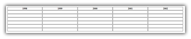
Figure 1: Our basic table with minimal styling.
Making the table scrollable and adding style
Probably the most important feature of the timeline is its ability to be scrolled horizontally with a scrollbar at the bottom. This requires the insertion of a new container around the table. The styling of this new container can be found below:
#timeline {
  width:800px;
  overflow:hidden;
  overflow-x:scroll;
  position:relative;
}
We set the width of the outer container to 800 pixels but it can be any number that is lower than the width of the <table> element — this sets the amount of content that is immediately visible without any scrolling. The two overflow properties ensure that only horizontal scrolling will be available.
Next up, the border between table cells looks terrible and nothing like a grid, but this is easily fixable by setting border-collapse:collapse; on the <table> element. we also style the <th> elements so they look more distinct, and apply some general styling to all table cells, resulting in the grid looking neat and less obtrusive:
td, th {
  padding:0;
  height:22px;
  border: 1px solid #b4ced8;
}

th {
  font:bold 14px "Trebuchet MS", sans-serif;
  color:#4f6b72;
  letter-spacing:2px;
  text-align:center;
  background:#cae3ed;
}
You can test the neat styled table live; Figure 2 shows how it should look.
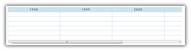
Figure 2: Our table styling now looks much better.
Entering information onto the timeline
Positioning entries on our table should be done with minimum hassle and maximum stylability. To do this we will place the entries (paragraphs, images or whatever) into <div> elements. This is semantically ok, very stable even when changing the width or height of the entire grid, and we are able to use the <div> to position the entries anywhere we want for visual effect, stretch them outside their containing table cells, and still have them remain accessible. A typical entry looks like this:
<td><div><p>This starts in the middle of 1999</p></div></td>For now we will add some styles to these entries to make them behave consistently:
/*BOXES*/
td div {
  float:left;
  height:0;
}

td div p {
  margin:0;
  text-align:center;
  cursor:default;
  font-size:14px;
  padding:2px;
}
You can see the new timeline example with basic entries added running live; it should look like Figure 3:
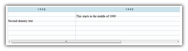
Figure 3: The timeline now has entries added.
Styling and positioning the entries
One slight problem at the moment is that the width of each table column is different depending on the content inside it. This is easily fixable by setting table-layout:fixed; on the <table> element.
With this problem solved, we will now give the <div> and <p> elements some classes for styling purposes and an ID for positioning and width. The height of the boxes is automatic and depends on the amount of content each <div> has. The updated HTML for each entry is something like the following:
<td><div id="one"><p class="girly">This starts in the middle of 1999</p></div></td>The new CSS looks like so:
/*BOX GROUPS*/

.girly {
  background:#fdd;
  border:1px solid #e084ad;
  color:#db6483;
  -moz-border-radius:10px;
  border-radius:10px;
  font-family:Verdana;
}

.blueish {
  background:#b1c7ef;
  border:1px solid #8487ad;
  font-family:Georgia;
}

.elegant {
  background:#fffdce;
  border:1px solid #845700;
  color:#8f5600;
  -moz-border-radius:3px;
  border-radius:3px;
  font-family:Georgia;
}

/*INDIVIDUAL BOXES*/

#one {
  width:260%;
  margin-left:50%;
}

#two {
  width:100%;
  margin-left:38%;
}

#three {
  width:150%;
  margin-left:10%;
}

#four {
  width:100%;
}
Note that we are giving classes to the <p> elements for styling, and IDs to the containing <div> elements for positioning.
The last few CSS styles apply different widths and positions to different entries, relative to their containing table cells. The percentages are calculated in terms of the containing cell dimensions. For example, the entry with ID one has a margin-left of 50% applied to it so it will start from the middle of the cell it was positioned in initially; the width of 260% means that it will expand to 2.6 times the length of a standard table cell. An easy way to remember this is to think that 100% is equal to one period of the timeline (in our case it is a year).
You can test a demo of the timeline with styled entries live; it should look like Figure 4.
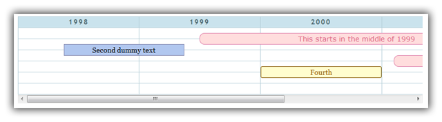
Figure 4: Our entries are now styled much more nicely, and stretched across different amounts of time on the timeline.
Animated expanding entries
Now is the time to add some animation to our entries so that they look more slick. We will make a single box smoothly expand when hovered over or given focus. The first thing to do is put enough content inside the entries so we can see the effect occur. Next we add classes to our entry content of tiprows1, tiprows2, etc. depending on how tall we want them to expend to:
<td><div id="one"><p class="girly tiprows1">This starts in the middle of 1999<span>the animation sure looks slick</span></p></div></td>These classes are styled as follows in the CSS. Note the use of simple CSS3 transitions to provide the animation:
/*TIP CONTENT*/

td div p span {
  position:relative;
  text-align:center;
  height:0;
  display:block;
  overflow:hidden;
}

/*TIP ANIMATIONS*/

td div span {
  -webkit-transition:0.4s;
  -moz-transition:0.4s;
  -o-transition:0.4s;
  transition:0.4s;
}

/*TIP SIZES*/

.tiprows1:hover span {
  height:1.2em;
}

.tiprows2:hover span {
  height:2.4em; /*add 1.2em for each new row if more rows are needed*/
}
You may ask why we can't just use display:none; for the tooltip and then display it on hover/focus, thus making the height calculate itself automatically and not require different classes for different tooltip sizes? The problem with this approach is that it will not display any animation because browsers need a beginning and end point of every property they animate. Having an automatically calculated height will chop and/or break any animation. In addition, content that is set to display:none; isn't visible by screenreaders.
You can test the animated timeline entries demo yourself.
Supporting information and Final polishing
No timeline should be without supporting information — in this final section we will add two <h3> headings that will serve as a header and a legend and an <abbr> element in each entry that will show the corresponding start and end date. The dates will show above the entry, and we will mark them up in the hCalendar microformat so that you can see more accurately what the date span of each entry is. In addition, I have used the h2vx service from Technorati to add a link to the page that when clicked, extracts the entries as an .ics files that could then be imported into a calendar app such as iCal, Mozilla Sunbird or even Google Calendar. Sample hCalendar markup is given below:
<abbr>
  <time datetime="1999-06-01" class="dtstart value-title" title="1999-06-01">July 1st, 1999</time>
  to
  <time datetime="2002-02-04" class="dtend value-title" title="2002-02-04">February 4th, 2002</time>
</abbr>
Adter that we add the class "summary" to the paragraph element to meet the minimum requirements of the hCalendar microformat for content. Then the styling comes:
/*DATES*/

td div abbr {
  font:bold 11px "Trebuchet MS", sans-serif;
  padding:0 3px;
  margin-left:8px;
  border:1px solid #777;
  border-bottom:0;
  border-radius:3px 3px 0 0;
  background:rgba(255,255,255,0.7);
}
Finally, to give the users the ability to export the events as an .ics file:
<p><a href="javascript:void(location.href='http://feeds.technorati.com/events/'+escape(location.href))">Download these events</a> to your calendar.</p>
You can check what percentages correspond to your dates in this dates as percentages list.
The legend consists of divs that inherit the style of the entries they are describing. Nothing special is required to style these two elements, except some spacing and font sizing:
/*HEADER AND LEGEND*/

h3	{
  margin:10px 0;
}

#legend > div	{
  font-weight:normal;
  display:inline;
  font-size:70%;
  margin:0 5px;
}
In addition to this styling, some borders and shadows have been added to make the timeline stand out more. Notice that we have increased the table width (not the container) by 50% (from 1200px to 1800px) and still the width and position of every box is the same in relative terms. You can change one number and everything else will size and reposition itself to behave like you wanted it to.
We will add one more function to the timeline to enhance accessibility. Some people cannot or choose not use a mouse. We will therefore make the timeline keyboard accessible, assigning the Tab button as the control to switch between timeline entries. To do this we first add the tabindex="x" attribute to the <p> of each entry. The "x" should be a positive integer, and be different in each case, and the order the entries are number in will denote the order of selection when you press Tab. Here is how the code looks:
<p class="girly tiprows1 summary" tabindex="2">Currently this solution works nicely when switching between the entries, but cycling through them does not expand them. To correct this we will simply modify the selector that controls the hover animation to include the focus pseudo-class as well, so we end up with this:
.tiprows1:hover span, .tiprows1:focus spanYou can test the final table example live; it should look like Figure 5.
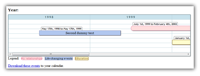
Figure 5: Our final timeline example in all its glory.
Summary
In this article we have created a timeline with semantic, accessible markup, and elegant CSS. The timeline itself is not a work of art but its purpose is to demonstrate what is possible. The next part of the article will focus on practical applications of the timeline, and giving it a more appealing visual style.
All popular browsers except Firefox (3.6) and IE (all versions) support the entry animation. On browsers that don't support the necessary CSS transition, the full entries will still display on hover, but it won't look as good.
This article is licensed under a Creative Commons Attribution 3.0 Unported license.
Comments
The forum archive of this article is still available on My Opera.
No new comments accepted.