Opera Skinning part 2: Skinning examples
9th October 2012: This article is obsolete
Opera 12 and above support a new, simplified form of skinning. See our tutorial on how to make themes (skins) for Opera.
Pages: 1/5: Introduction — 2/5: Skinning examples — 3/5: Skin.ini explained — 4/5: skin.ini element reference — 5/5: tips & tricks
Introduction
This part introduces you to the skin settings file, skin.ini, by taking you through some common examples of how to change various parts of the Opera skin. Part 3 of the article series will provide a fairly exhaustive reference showing what all the different elements inside skin.ini do, but I thought looking at some examples first would be a more effective way to learn the art of manipulating skin.ini.
Most of the examples in this part will edit the styling of the toolbar buttons, and were chosen because the elements they affect are always visible in the default setups and have most of the attributes you’re going to want to commonly change. In Opera’s default setup you'll find several toolbar buttons without text in the address bar (Previous, Next, Reload, …) and some toolbar buttons with text in the main bar that can be enabled in “View > Toolbars”. I’ll be looking at manipulating a number of these in the examples below. For the changes to take effect in these examples you need to save the skin.ini file and any graphics you changed, re-zip the skin package, copy it back to the appropriate place, and then restart Opera and reapply the skin.
Index
- Setting the text color on toolbar buttons
- Background color
- Borders
- Padding & margin on toolbar buttons
- Spacing
- Type BoxStretch/BoxTitle
- States (.hover / .attention / .selected / .pressed)
- Positions (.bottom / .left / .top / .right)
- Cloning
- Child elements
- Icons
- Large Images
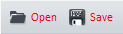
Setting the text color on toolbar buttons
In this first example you’ll change the text color of toolbar buttons. This will influence all buttons on toolbars like mainbar, addressbar, mail toolbar, or panels.
Open skin.ini and find the section [Toolbar Button Skin]. There’s no text color set, so you have to add the
Text Color = option first. The color value is specified as a hex value with a leading “#”.
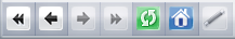
Add the line Text Color = #FF0000 to cause the text to become red:
[Toolbar Button Skin]
Text Color    = #FF0000
The toolbar buttons should now look like this:
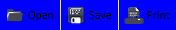
Background color
To set an elements background color you need to add the option Color = to the section controlling that element, and specify the color using a hex value. If Color isn’t set Opera makes the element transparent, causing the background from the element below to shine through.
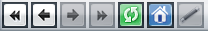
In the [Toolbar Button Skin] section set Color = to “#0000FF” to add a blue background, as follows:
[Toolbar Button Skin]
Color      = #0000FF
This should have the folowing effect:
Borders
To add a border to an element you have to add two options:
Border =sets the border width, the default value being “0” (which means no border). Bear in mind that the border will start at the edge of the element and grow inwards — setting a border width of 10 won’t make the element any bigger; it will just start to cover up the element graphic.- The second option,
Border Color =, sets the border color. As withText Color, the color is specified as a hex value.
Try it yourself — add the following 2 lines to the [Toolbar Button Skin] section to set a 1 pixel blue border for all toolbar buttons:
Border     = 1
Border Color    = #0000FF
After applying these changes your buttons should look like this:
To add more complex borders you can use images — how to do this is described later in this document.
Padding & margin on toolbar buttons
Paddings set the distance between an elements borders and its content; margins set the distance between an elements border and the next element. They work in the same way to the same properties of the HTML box model.
Both paddings and margins are set for all 4 directions (Top, Right, Bottom, Left) independently. The default value is 0, and the range of values that can be set isn’t limited to any particular bounds. Negative values are also allowed.
For demonstration purposes setting paddings and margins to high values will work best, as this ensures that they will be easily visible, so that’s what we will do in this example. The section [Toolbar Button Skin] already has 5 of the 8 parameters set so only the missing 3 ones need to be added. Set the value for Padding Top = to “20” and Margin Right = to “10”, as shown below:
[Toolbar Button Skin]
Padding Left        = 4
Padding Top         = 20
Padding Right       = 6
Padding Bottom      = 5
Margin Right        = 10
Margin Left         = 0
Margin Top          = 0
Margin Bottom       = 0
You should now be able to see a big space at the top (the padding), inside the blue border, and a smaller spacing between the buttons, outside the blue border:
To learn more about these settings, have a look at the detailed explanations of padding and margin in the next article.
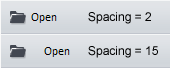
Spacing
After having learnt how paddings and margins influence the distances on the inside and outside of the border, you’ll now set the spacing between a button’s image and its text. To do this, you add the option Spacing = and set the distance in pixels.
This option automatically adds some spacing where needed. If you set Opera’s Image Style setting (see the Toolbars tab inside Tools > Appearence) to “Images only”, then spacing is completly ignored. If on the other hand you set it to “Image and text below” it’s added below the image, and if it’s set to “Images and text on right” it’s added to the right of the image.
In the standard Opera skin Spacing = is set to “2” for [Toolbar Button Skin]; go ahead and change that value to “15” to make it more visible, as shown below:
[Toolbar Button Skin]
Spacing      = 15
This results in a change like the following:
Type BoxStretch/BoxTitle
While working with Opera you might already have noticed that toolbar button backgrounds change when you hover over them. While this could have been done using the parameters to set border and background colors it is in fact done using images.
To be able to use images as element backgrounds you first have to define the elements Type =. The type most commonly used types Opera’s standard skin are BoxStretch and BoxTile:
-
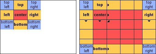
In
BoxTileelements you set a total of nine images:- One image per corner —
Corner Topleft,Corner Topright,Corner Bottomright,Corner Bottomleft. These are fixed in position in the corners of the element. - One image per border —
Tile Left,Tile Top,Tile Right,Tile Bottom. These are repeated to fill the space along each edge of the element. - One center image that is repeated to fill the empty room left in the middle of the element —
Tile Center.
These images are demonstrated by the following:
If you have a look at the
[Toolbar Button Skin.pressed]section in skin.ini, you’ll notice the following code:[Toolbar Button Skin.pressed] Type = BoxTile Tile Center = selector_button/selector_selected.png Tile Left = border/simple_border.png Tile Top = border/simple_border.png Tile Right = border/simple_border.png Tile Bottom = border/simple_border.png Corner Topleft = border/simple_border.png Corner Topright = border/simple_border.png Corner Bottomright = border/simple_border.png Corner Bottomleft = border/simple_border.png
As you can see, all corners and borders in the default skin use the same image —
border/simple_border.png;Tile Center =uses a different one.Let’s do something interesting — copy these 10 lines to the
[Toolbar Button Skin]section to style the toolbar buttons in normal state — the skin should now look like this:
If you remove the 4 lines that style the borders (Tile Left, Tile Top, Tile Right, Tile Bottom), then reload the skin you’ll notice that only the corners and the center of the image stay colored, and the borders become transparent:
The area that is left transparent is determined by the existing images. In this example the corner images are 1 x 1 px, thus the room reserved for borders is 1px in height for the top and bottom borders and 1px in width for the left and right borders. If the corner images were 5px high and 2px, wide the height reserved for top and bottom borders would be 5px but the width reserved for left and right borders would only be 2px.
The same goes for removing the corner images, thus it’s always important to create corner and border images to match each other. It isn’t so important for the center image, as that will always be tiled to fill the room left in the middle.
In
BoxStretchyou only set one image which is then stretched automatically to fit. This stretching ignores a specified border and is only applied to the middle of the image.The image is specified as
Tile Center, and the size of the border not to be stretched is specified in pixels under theStretchBorderproperty, as indicated by the dotted line in the following figure: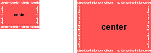
The address bar background is drawn using a BoxStretch skin with
StretchBorderset to “3”. This is because the left-most three pixels of the image contain a shadow-like gradient:[Addressbar Skin] Fallback version = 3 Type = BoxStretch StretchBorder = 3 Tile Center = backgrounds/addressbar.png
By setting
StretchBorder = 0you stretch that gradient as well:
- One image per corner —
These two types both have their pros and cons, and which one is suited better depends on the situation. Most elements that can be styled with BoxTile can also be styled with BoxStretch, and the latter is often fast to create as you need only one image instead of nine.
For an explanation of the other types check out the types section in article 3.
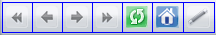
States (.hover / .attention / .selected / .pressed / .open)
Reading the above section about Types, you might have noticed the mention of [Toolbar Button Skin.hover]. Adding .hover to a section’s name tells Opera to use this element only when you hover your mouse over it.
The parameters used to define properties of the states are the same as you use for any other element.
The hover state is drawn on top of the normal state, so if you use elements with transparency for the .hover state the normal one will still shine through.
The same goes for all other states. The available states are .hover, .pressed (used when they are actually clicked on), .selected (used when the element is selected, eg by a keyboard shortcut), .disabled (for example used for the Wand button if Opera doesn’t have login information stored for the site), .attention (for instance used to indicate a tab that just finished loading and for the trash bin in the tab bar when a popup was blocked) and .open.
As states are drawn on top of the normal state you don’t need to specify paddings and margins again, unless you want to change them for that state.
Note that not every element supports all states.
Positions (.bottom / .left / .top / .right)
Similar to the states mentioned above, there are also location indicators. These are used to style toolbars and their contents depending on their position. In Opera’s standard skin you’ll notice that the tabs look different depending on whether you have the tab bar placed at the top or the bottom. This is because the tabs are styled using [Pagebar Button Skin.bottom] if the tab bar is placed at the bottom, and [Pagebar Button Skin] for the other 3 possible placements.
If a location-specific element is available, Opera will use that one, otherwise it’ll fall back to the non-specific one.
Let’s add a new style for styling the tab bar when it’s placed on the right of the user interface. To do this, you first have to add the corresponding section to skin.ini — [Pagebar Skin.right]. Please note that [Tabs Skin] is not used for styling tab bar, but for the tab buttons in dialogs.
In this newly created section, specify the type to be used and the images as follows:
[Pagebar Skin.right]
Type      = BoxTile
Tile Center    = backgrounds\dialog.png
After adding this section to your skin and moving the tab bar to the right of the user interface it should look like this:
As you can see, the “New tab” button doesn’t look like an arrow anymore — that’s because the [Pagebar Floating Skin.right] section is empty. To give it back its arrow look copy the options from [Pagebar Floating Skin] to [Pagebar Floating Skin.right]:
[Pagebar Floating Skin.right]
Type            = BoxTileHorizontal
Tile Left       = backgrounds/pagebar_floating_left.png
Tile Center     = backgrounds/pagebar_floating_center.png
Tile Right      = backgrounds/pagebar_floating_right.png
Padding Top     = 0
Padding Bottom  = 0
Padding Right   = 0
Padding Left    = 0
Margin Left     = 0
Margin Top      = 0
Margin Bottom   = 0
Margin Right    = -23
When you’ve finished, the tab bar will look like this:
Cloning
If you want several elements to look the same you don’t have to specify all parameters for each one independently — instead you can do it once and tell Opera to copy those parameters for other elements. This is done using the Clone = option.
As its value it takes the name of the element you want to clone the information from, omitting the square brackets. To make the normal state of toolbar buttons look as if they were hovered you’d replace the default [Toolbar Button Skin] with this:
[Toolbar Button Skin]
Clone        = Toolbar Button Skin.hover
The buttons should then look like this:
While Clone = copies all parameters from one element to another one, you can still overwrite them by adding the Clone option to the specific element you’re copying to, for example:
[Toolbar Button Skin]
Clone         = Toolbar Button Skin.hover
Tile Center   = backgrounds/pagebar.png
Margin Right  = 3
This would have the following effect:
Child elements
Another popular option is Child0 =. This option creates an element inside the element you specify it in. The child is resized to fill its parent element’s content. If there are borders or corners set, the area they occupy won’t be filled, just like with “Tile Center” in Type = BoxTile.
For the next example you’ll add a child element to the dialog buttons. As the dialog button element is cloned to other elements like dropdown buttons and scrollbar buttons, those elements will also be influenced.
Find the [Push Button Skin] section and add the line Child0 = Reload to it. This should make the buttons in dialogs look like this:
You can add multiple children to an element — the first one is called Child0 =, the second one Child1 =, and so on.
Icons
You might already have wondered how to tell Opera which image to use for the icons used in toolbars and other places. The “Reload” icon mentioned in the previous example doesn’t have a section of its own, so how is it defined?
Towards the end of skin.ini you’ll find the [Images] and [Boxes] sections. These are special sections that don’t work the same way as the ones you’ve got to know so far — every line in those sections creates a new element with one image assigned to it.
The Panel Search = buttons/search.png line creates a Panel Search element and assigns the “search.png” image found in the “buttons” directory to it. When used, this image will be displayed as is, thus it won’t be resized or repeated (tiled) in any way.
Instead of using this short way of creating elements you could also do it like this; bear in mind however that this is not recommended, and only mentioned to aid your understanding:
[Panel Search]
Type         = Image
Tile Center  = buttons/search.png
Width        = 22
Height       = 22
Large Images
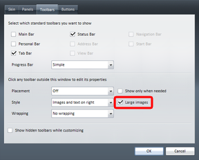
A nice feature that isn’t used in Opera’s default skin is the ability to specify an icon in two different sizes. This enables users to choose whether they want to use smaller images to save screen space or larger ones that are often nicer as they have more details.
Before you can start using large images you have to tell Opera you’re using them in the skin by adding the line Large images = 1 in [Options] section. This will make Opera show a “Large images” checkbox in the “Appearance” dialog that can be set independently for each toolbar:
After adding that option you can now specify the elements. That’s done by adding .large to the element you want a large version of. To create a large version of the “Reload” button you’d add Reload.large = large_buttons/reload.png to the [Images] section where “large_buttons” would be a folder containing larger versions of the images.
You can add large image versions for other elements in the same way, for example [Toolbar button skin.large] for large versions of the [Toolbar button skin] images.
Please note that unlike states and positions there’s no fallback element for large images!
Pages: 1/5: Introduction — 2/5: Skinning examples — 3/5: Skin.ini explained — 4/5: skin.ini element reference — 5/5: tips & tricks
a href=This article is licensed under a Creative Commons Attribution, Non Commercial - Share Alike 2.5 license.
Comments
The forum archive of this article is still available on My Opera.
No new comments accepted.