This portfolio was built by me
-
FitCharts
An exploration of Material Design in a fitness app.

User Experience

User Interface

"Shadowing" but for effort
In any of my hobbies, one thing I love to see is measurable progress. Racing games have this concept called "shadowing" where you can see your car drive the prior lap around a course as a transparent overlay. Your goal is to beat your shadow around the track. I decided to try and take this concept an apply it to a fitness tracking app.
A material exercise
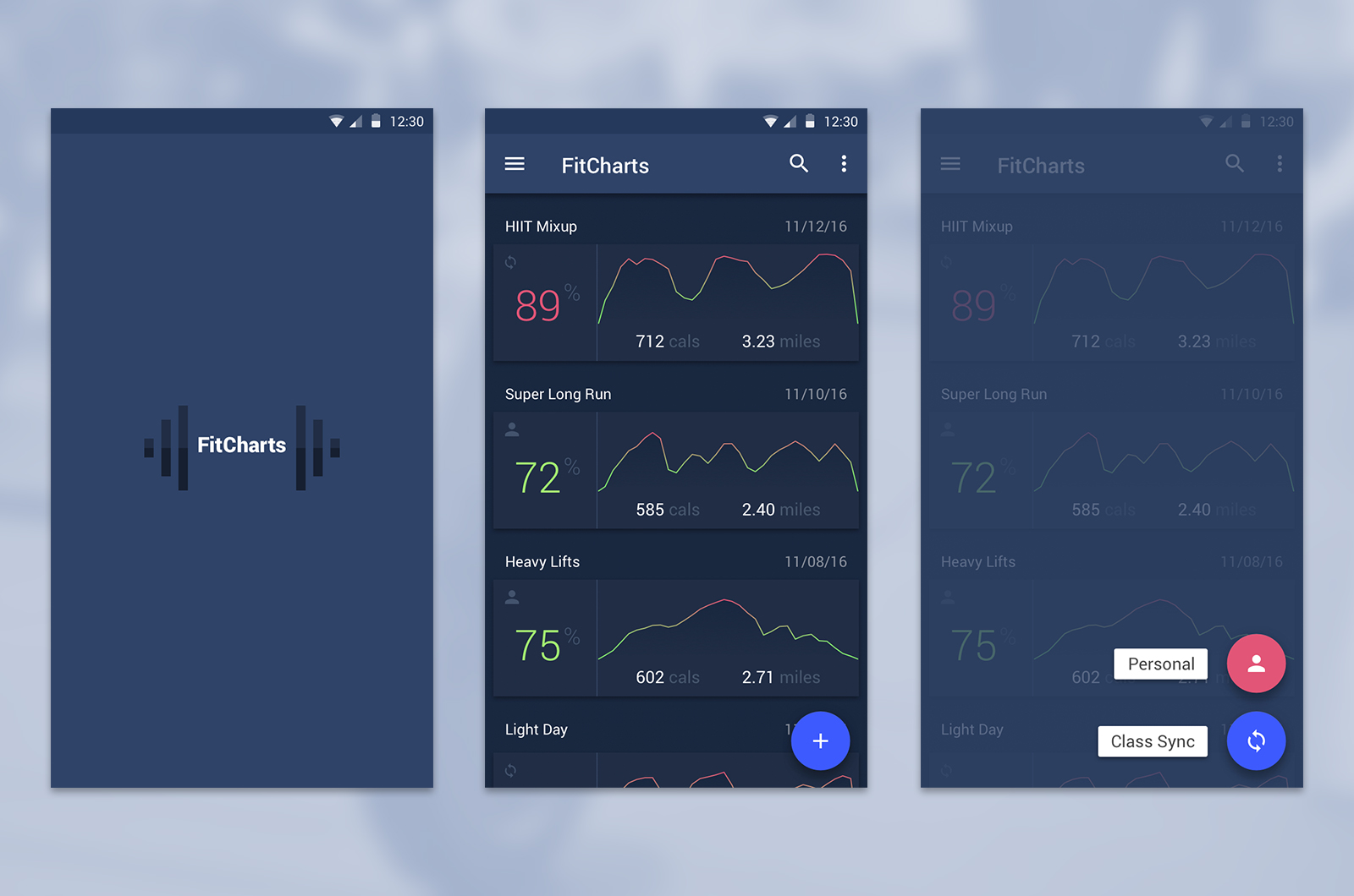
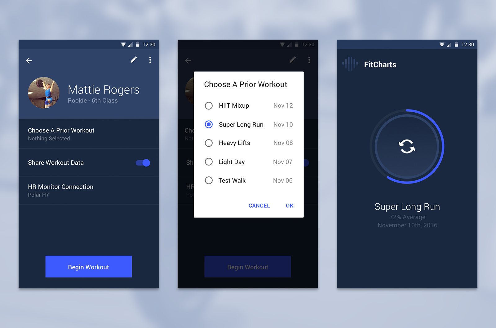
Pun very much intended. This project was a personal project to flex Material Design muscles and explore this concept of shadow workouts. I was focused on navigation and interaction patterns, and the core of the workout experience.

Measuring Effort
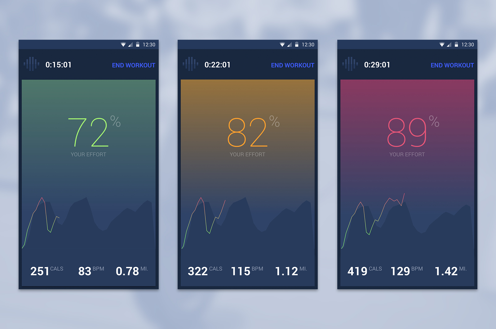
This app experience revolves around a heart rate monitor being connected, kinda like a class at Orange Theory. The app records your workout by a "percentage of effort". Effort is determined by some pretty basic indicators of fitness such as age, height, weight, and resting heart rate to get a baseline VO2 max. Once the VO2 max has been calculated, we put it on a scale that correlates to your heartrate. When you run, lift, and are otherwise active during a workout, your heartrate gives you an relative measure of how much effort you are putting in.

The Workout Experience
While you are working out, you are able to see your effort from a past workout along a timeline. I took the live data and laid it on top of the prior workout's data. In this way, you can see when you will need big pushes of effort to keep up, and you can pick out weak spots in the "shadow" that you may want to capitalize on. Displaying effort in this way gives in-the-moment inspiration and continually pushes you to be better over the course of the whole workout.
