This portfolio was built by me
-
Forge Conference
I helped start a tech conference in Phildelphia in 2014. Check out the old site here.

User Experience

User Interface

Responsive Considerations

An overview of Forge Conference.
A project while working with O3 World
Forge was a conference that sought to hear from top designers and developers, from the digital experiences that we use on a daily basis.
Start at the beginning. Let's create a brand.
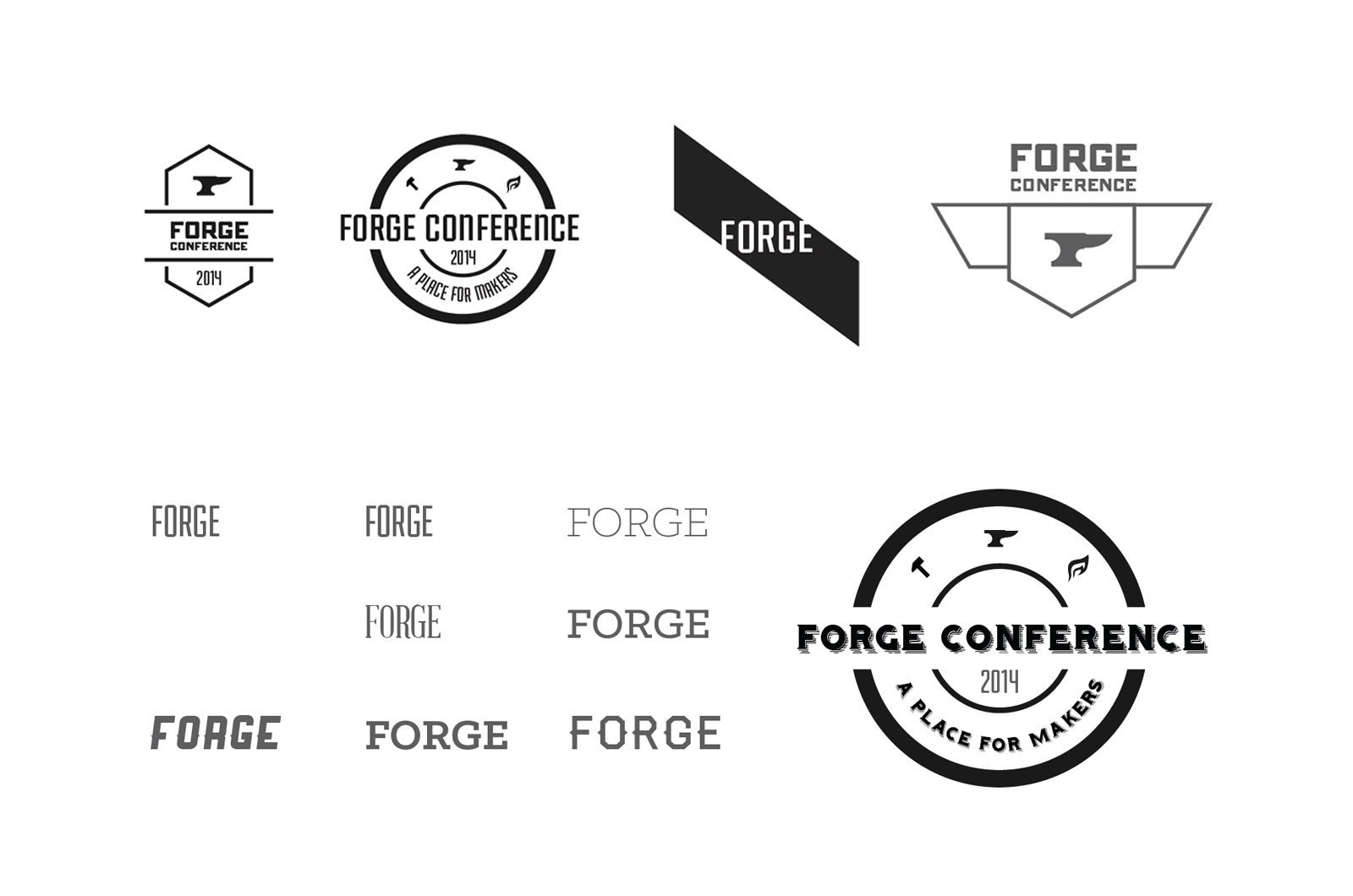
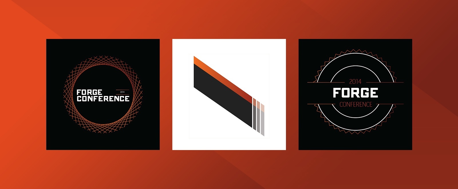
A small group of O3 World employees started organizing the event. We came to a consensus on a name, tone, and theme pretty quickly. I personally took the lead on creative direction for the conference creating the logo, color scheme, site design, and collateral. Here's a look at the beginning stages of the brand creation process.
Simplify. Then simplify some more.
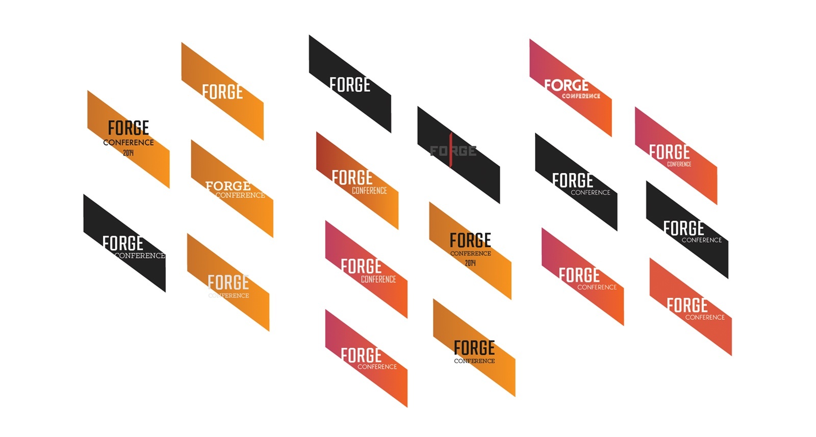
As a group, we liked the direction of what we are calling "the slab" of metal with "Forge" knocked out in type. We decided to explore more typography and color options from this point.
The result.
We eventually decided on a simpler version of the logo, going with a solid color. It would make for greater consistency overall, moving forward with web and print materials. After all the deliberation, we ended up with this as our logo for the conference:
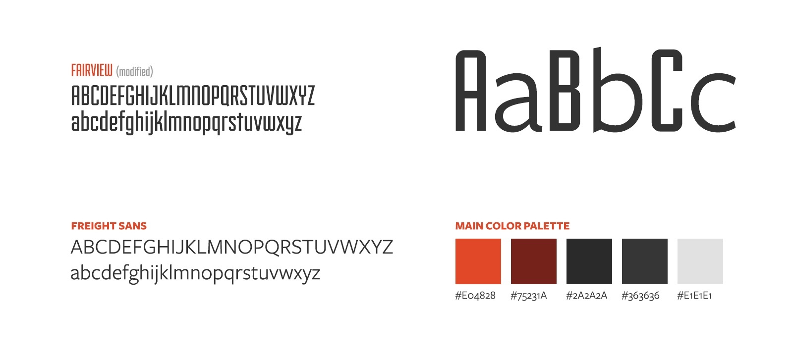

Creating the surrounding bits.
Once we decided on our logo, it was time to create some of the more fun items. Icon sets, and speaker invites, information sheets, and all the collateral still to come for the day of the event.
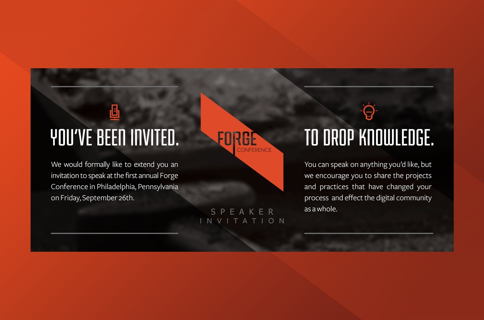
Plan for all the things.
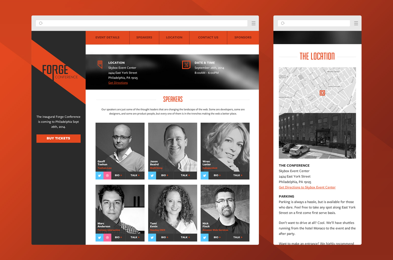
We started the website like any other project at O3 World, with wireframes. The conference site had to be modern, lightweight, informative, and accessible as it was our main promotional piece, and the hub of activity where users would make the decision to buy a ticket. With this in mind, I set out in Balsamiq, putting together some ideas. I landed on a persistent sidebar with the option to buy tickets at any time in the process, and present information with an order of importance on the right.
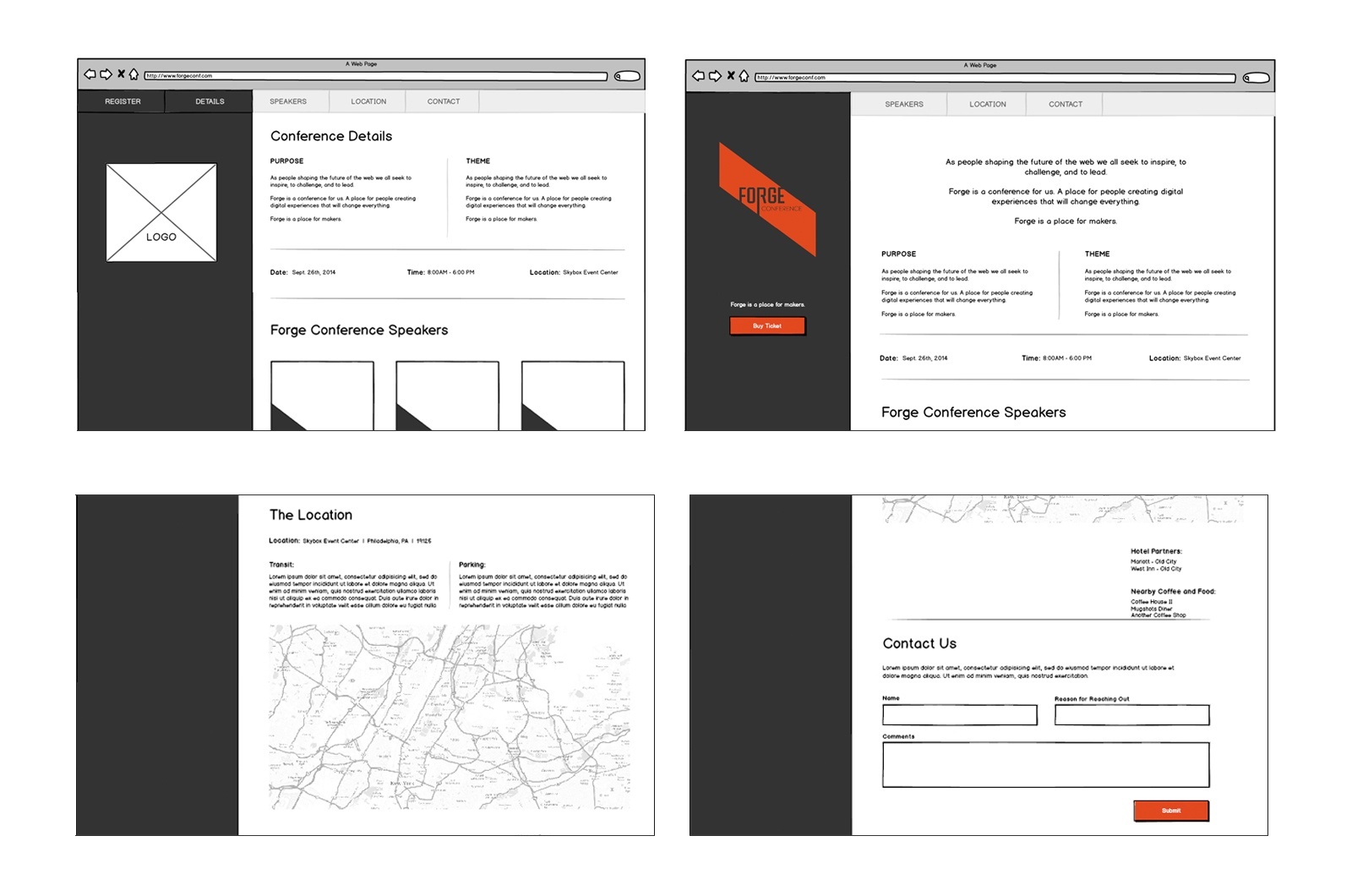
Responsive all the things.
It is obvious that the site had to be responsive and retina from the very beginning. Our target demographic used a variety of devices to access the web, and we had to be prepared for any one of them. The site is fully responsive, and knowing that the site had to eventually translate into mobile guided the majority of my design decisions in planning the layouts and how the content was structured.
