This portfolio was built by me
-
xfinity xFi - v.1
internet.xfinity.com.

User Experience

User Interface

Responsive Screens

Cloud-enabled router settings make securing your WiFi easy.
For a year and a half I worked on the beta of "Xfinity Internet" now known as xFi. Xfinity xFi is a responsive web portal and mobile app for customers to view and control their home WiFi networks from anywhere.
I worked on this project creating user flows, new features, UI design, and helping development teams implement.
Planning components early
I jumped into the project and there was already some structure in place. What was bogging down the designs was inconsistencies in how we presented the main functions of the product. There had to be a consolidation of design patterns that could be reusued in multiple instances. In this case, we thought about what common interactions would span multiple areas of the product and developed components around those. We came up with a a few key objects and actions that are commonly accessible:
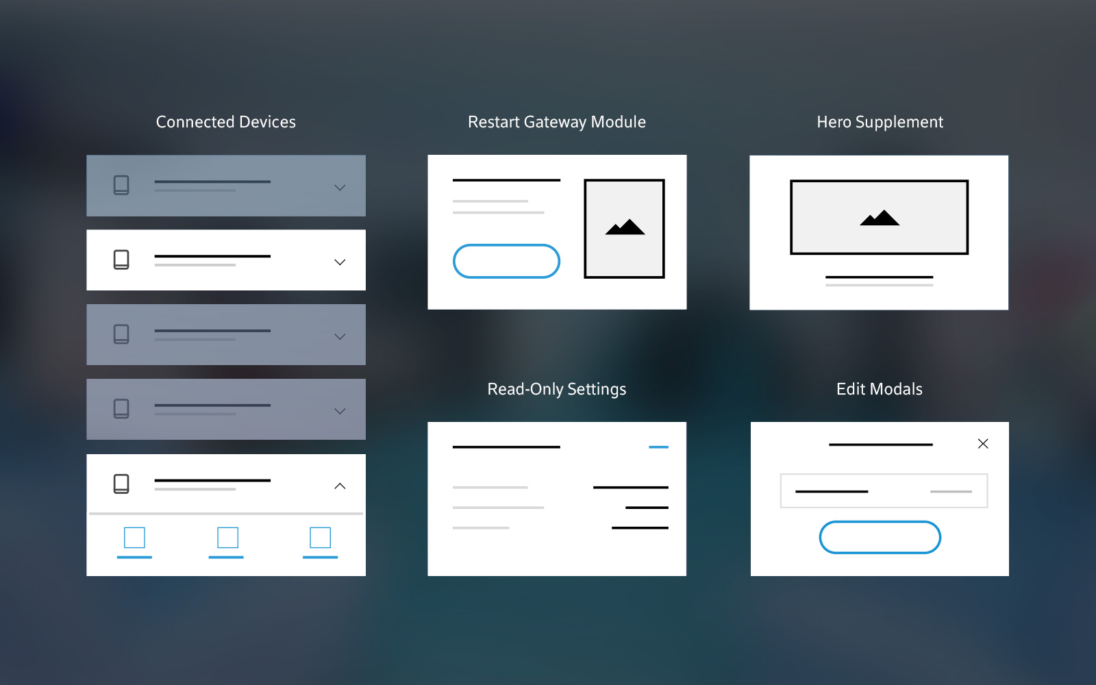
Setting consistent interaction patterns
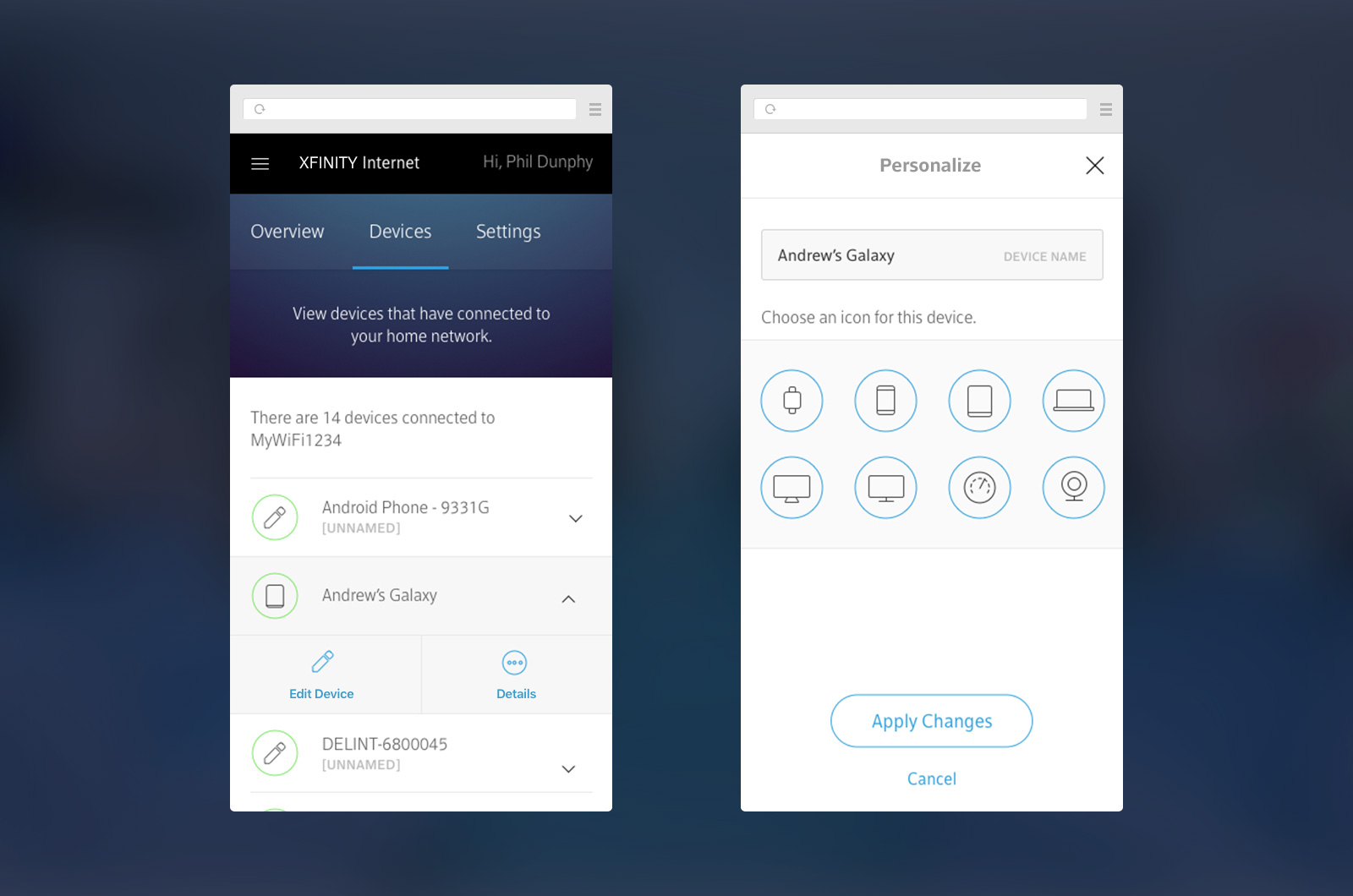
Routers have a lot of settings. Some are complex, some are simple, but all of them need desgin help. The design accounted for the restriction of the API calls to the gateway itself, limiting user interaction to a single grouping of settings through a modal. This helped improved clarity and honed focus on the tasks the user was trying to accomplish.
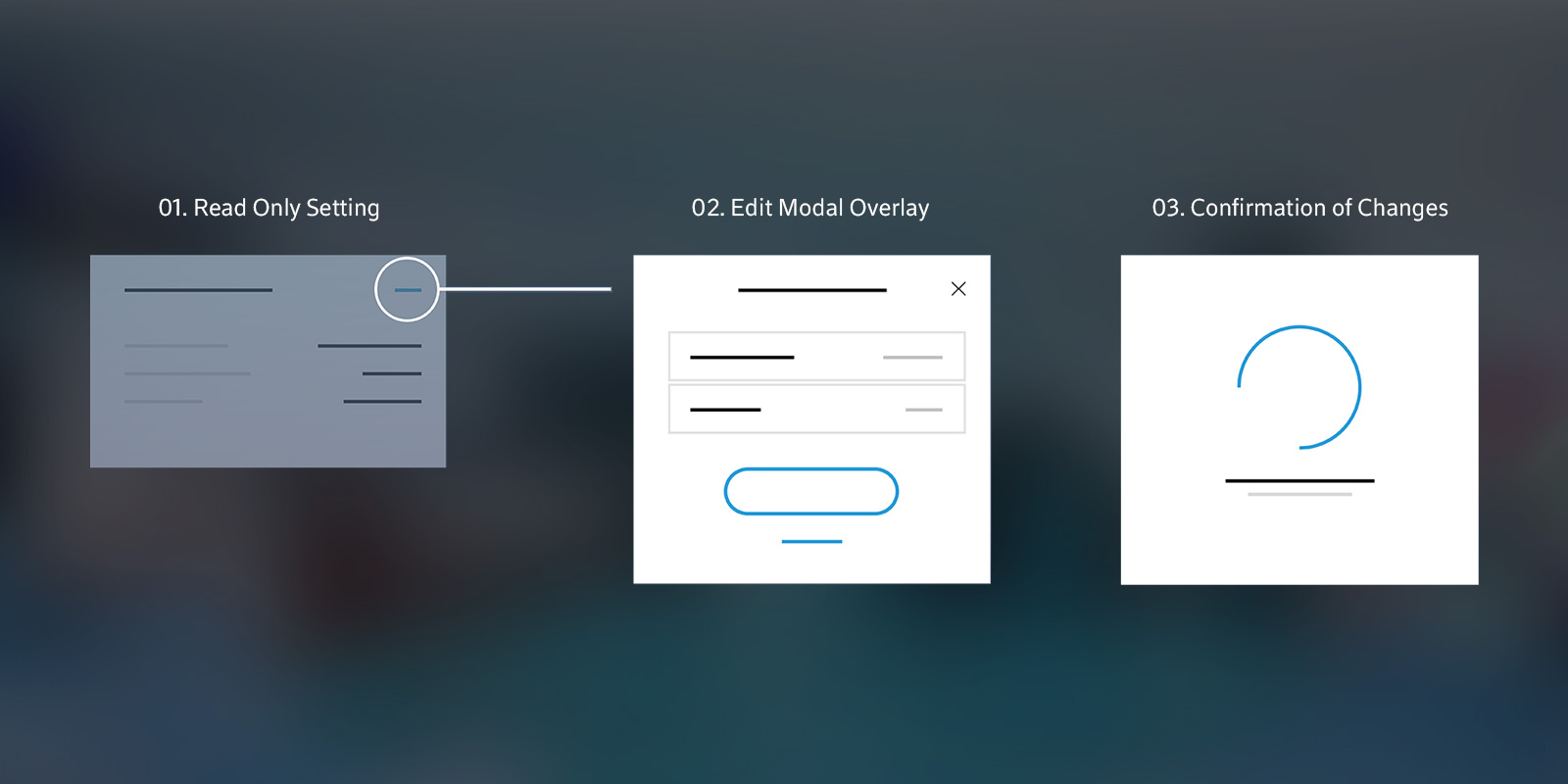
Evolution of the visual design
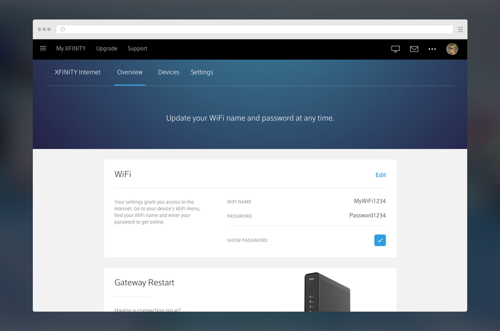
Comcast is in the midst of overhauling it's visual language on all products to match more closely to the X1 TV platform. This means a move towards darker blues, blurred background images, and subtle gradients.
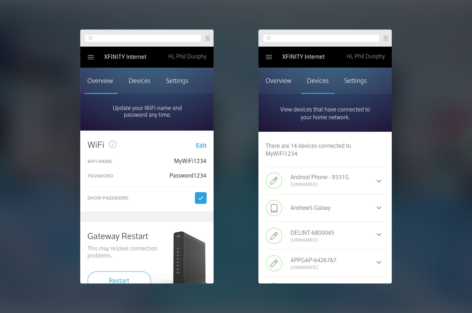
Early designs matching the X1 design language.
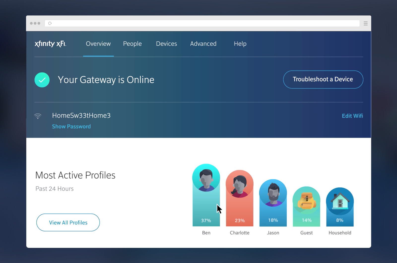
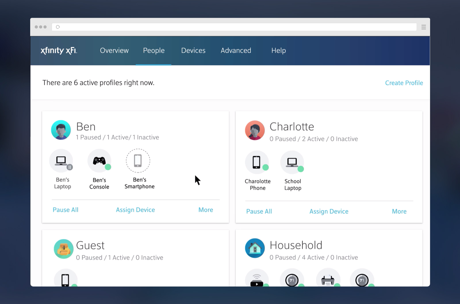
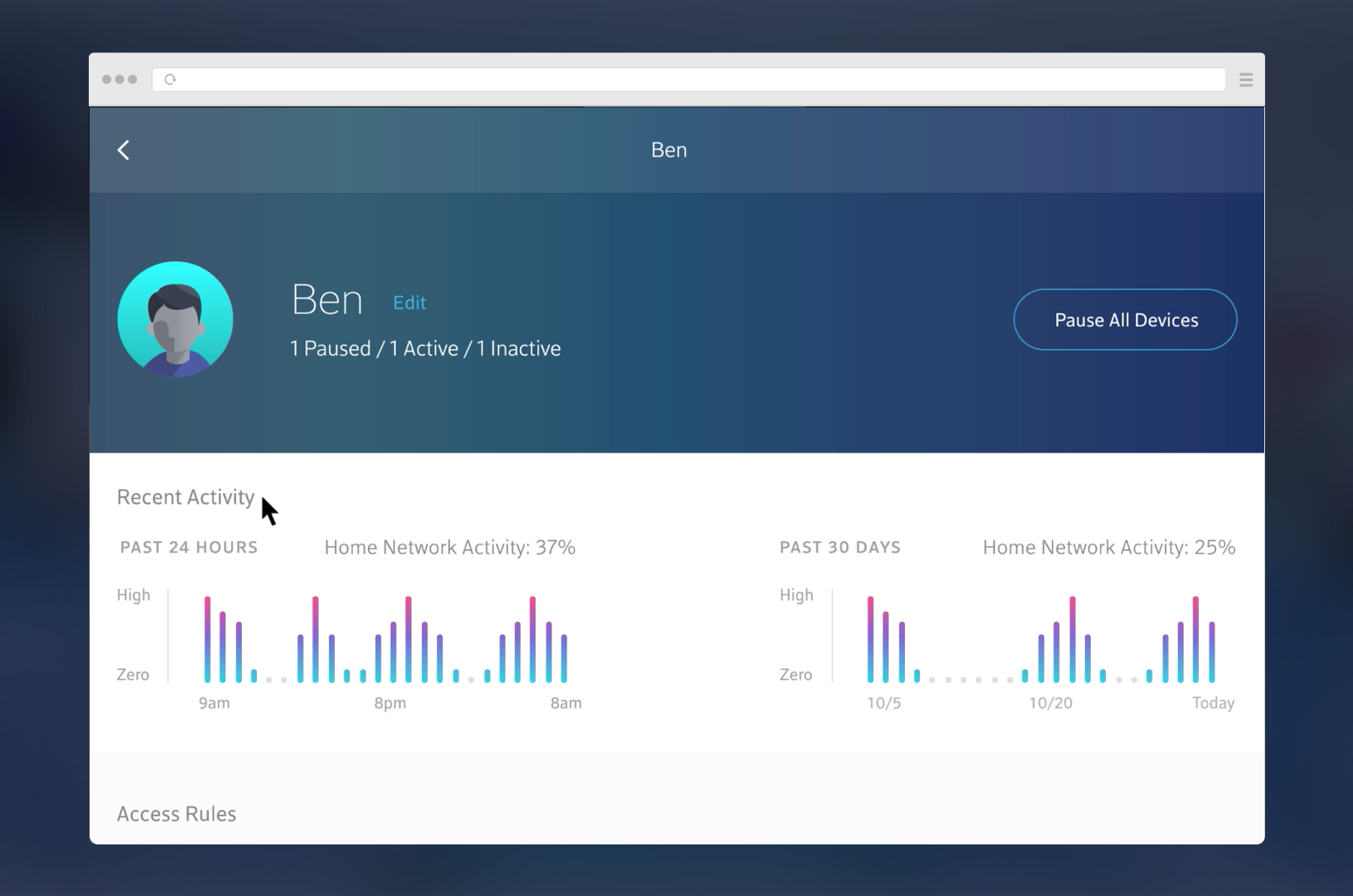
We added a "People" concept for logical device groupings as the UI
continued to evolve with bolder colors and playful illustrations.
