This portfolio was built by me
-
Smiota Mailroom
Check out the company's offerings on their website.

User Experience

User Interface

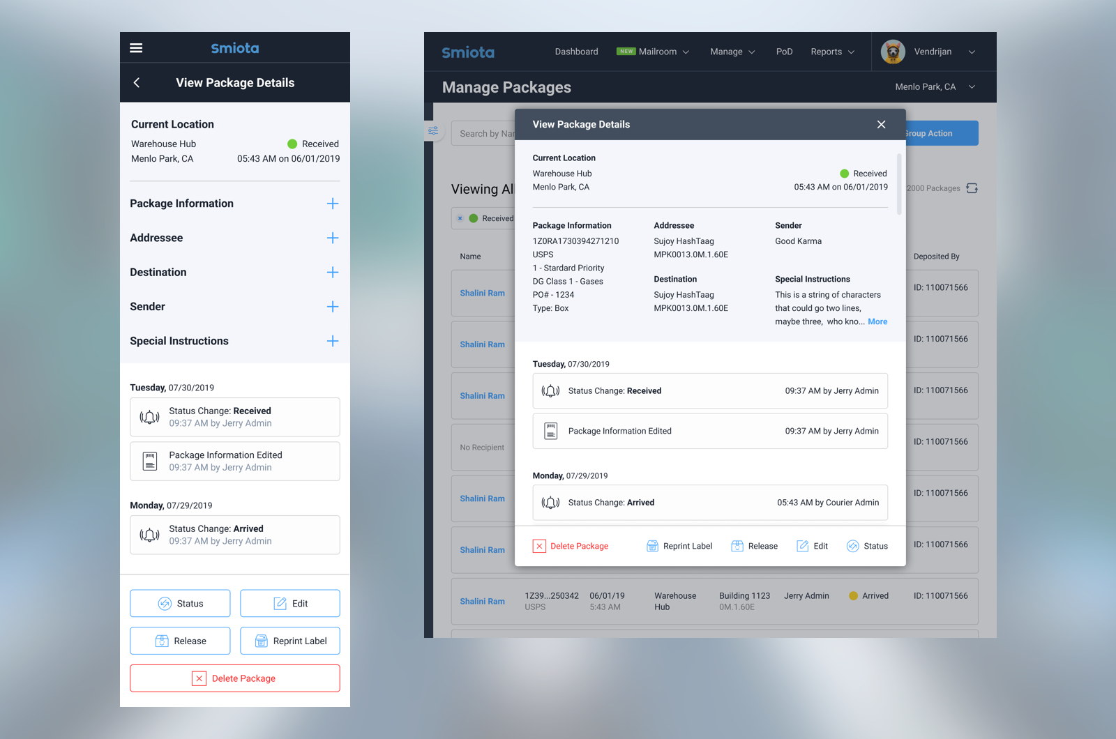
Responsive Screens

Tracking packages at every touchpoint
Smiota is a startup that offers package tracking and storage solutions for apartment buildings, colleges, and medium to large scale businesses.
"Client Configurations"
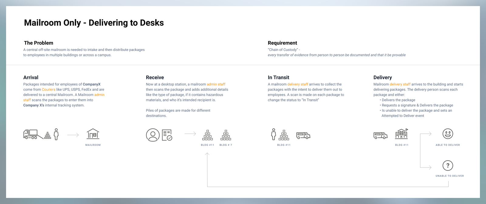
I explored the many ways that Smiota was serving their customers and I ended up finding 6 "configuration types" that they were supporting, with a bunch of smaller customizations tailored to each client. For the purposes of the Mailroom update, we decided to focus on the large scale business configuration:
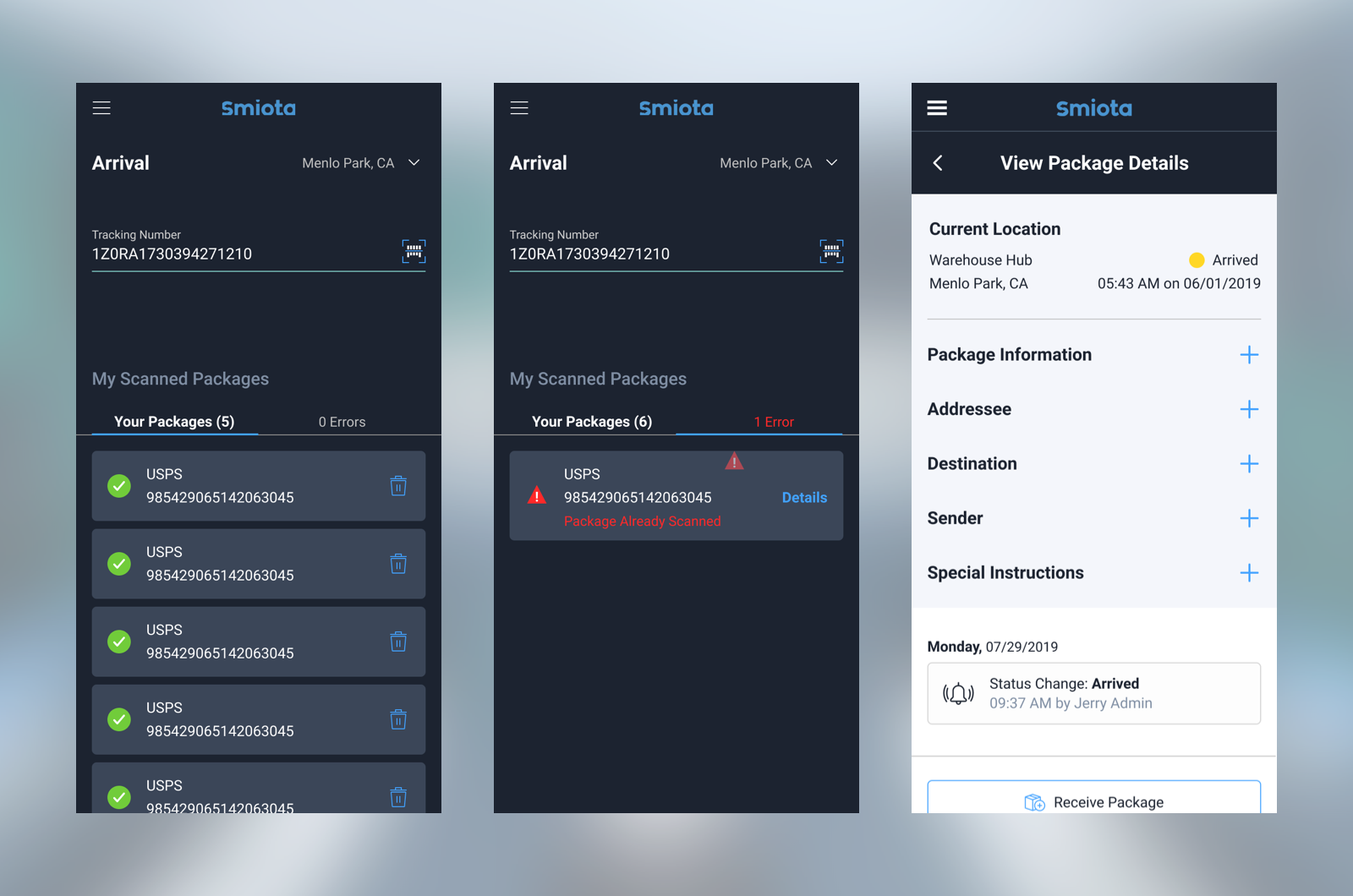
Package Arrival
Getting packages off the truck and into the system as quickly as possible is the goal here. We developed an interaction that stores the package data locally in the browser and tries to sync to a server on a 2 second interval. In this way, an employee can focus on the task of scanning all the packages, and worry less about whether or not they are operating a piece of software correctly.
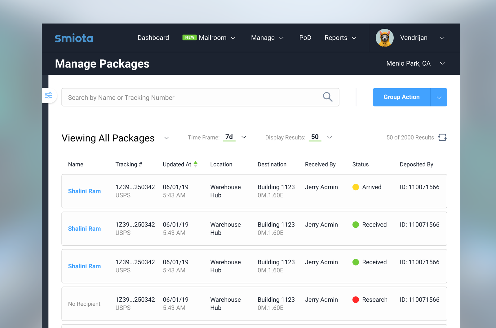
Management
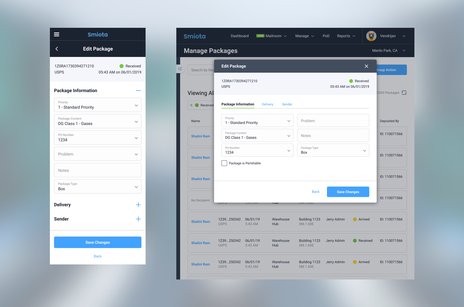
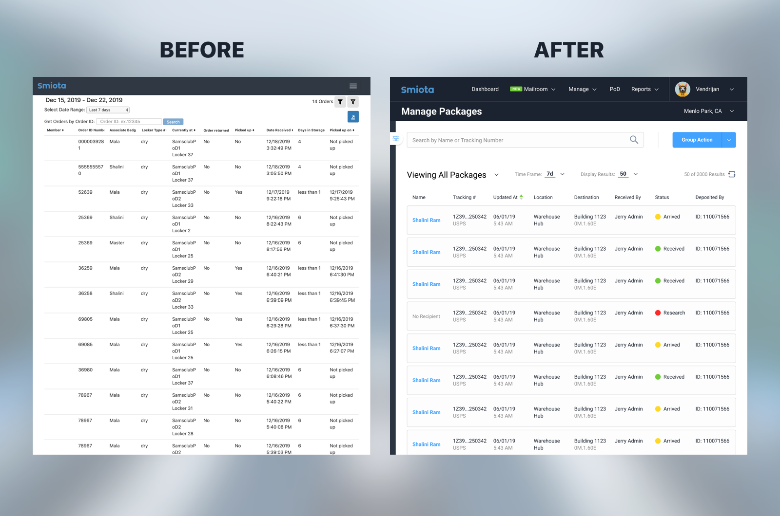
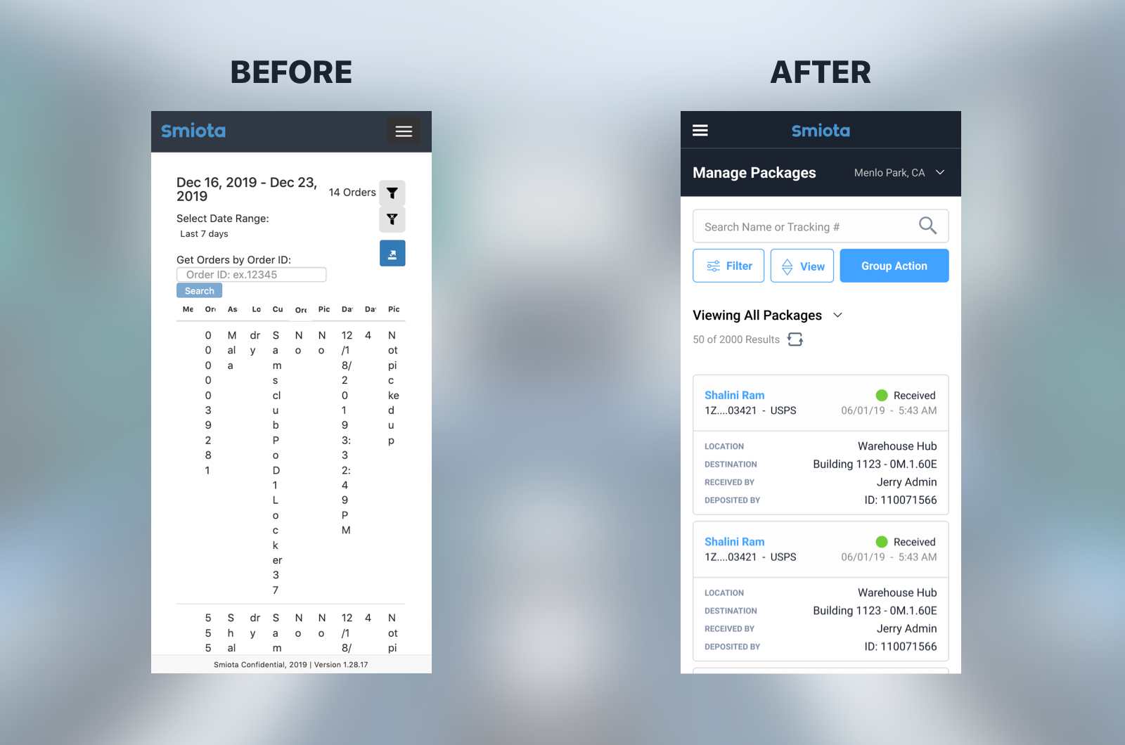
The main driving forces behind the redesign were, improving the clarity of where the user was in the app, clarifying what it is they were looking at, and honing their focus on their current task. We overhauled the app with titles on every page, easier to scan table rows, explicit actions, and modals for focused work.
Releasing a Package
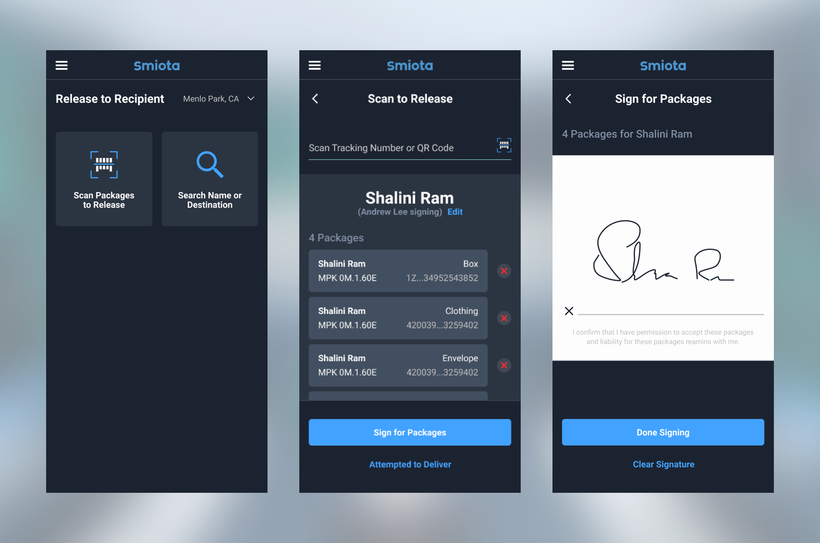
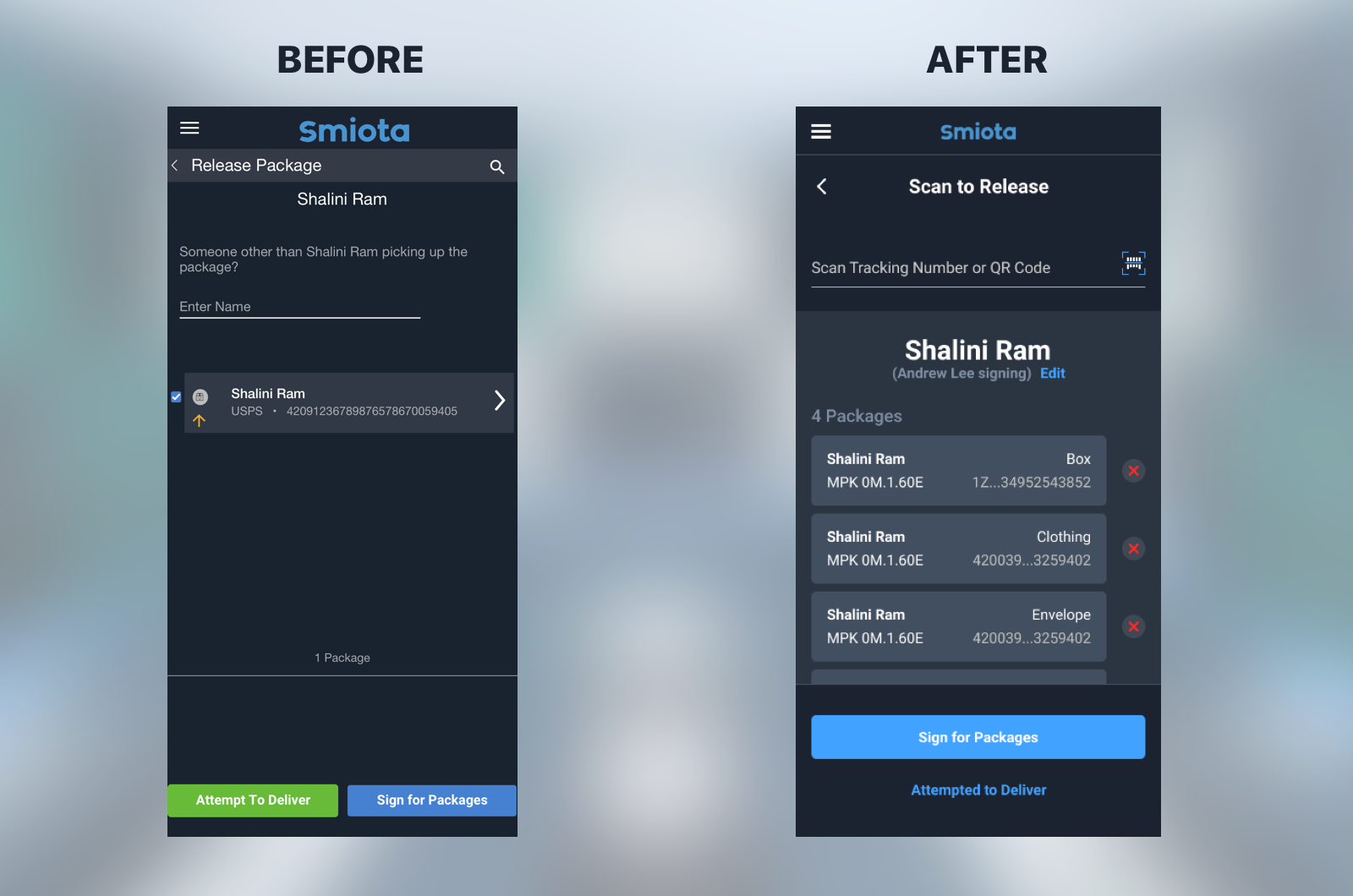
Visual clarity around releasing a package was largely improved and the process was simplified. The delivery staff is able to bulk release packages when searching by name, or scan individual packages for higher accuracy.
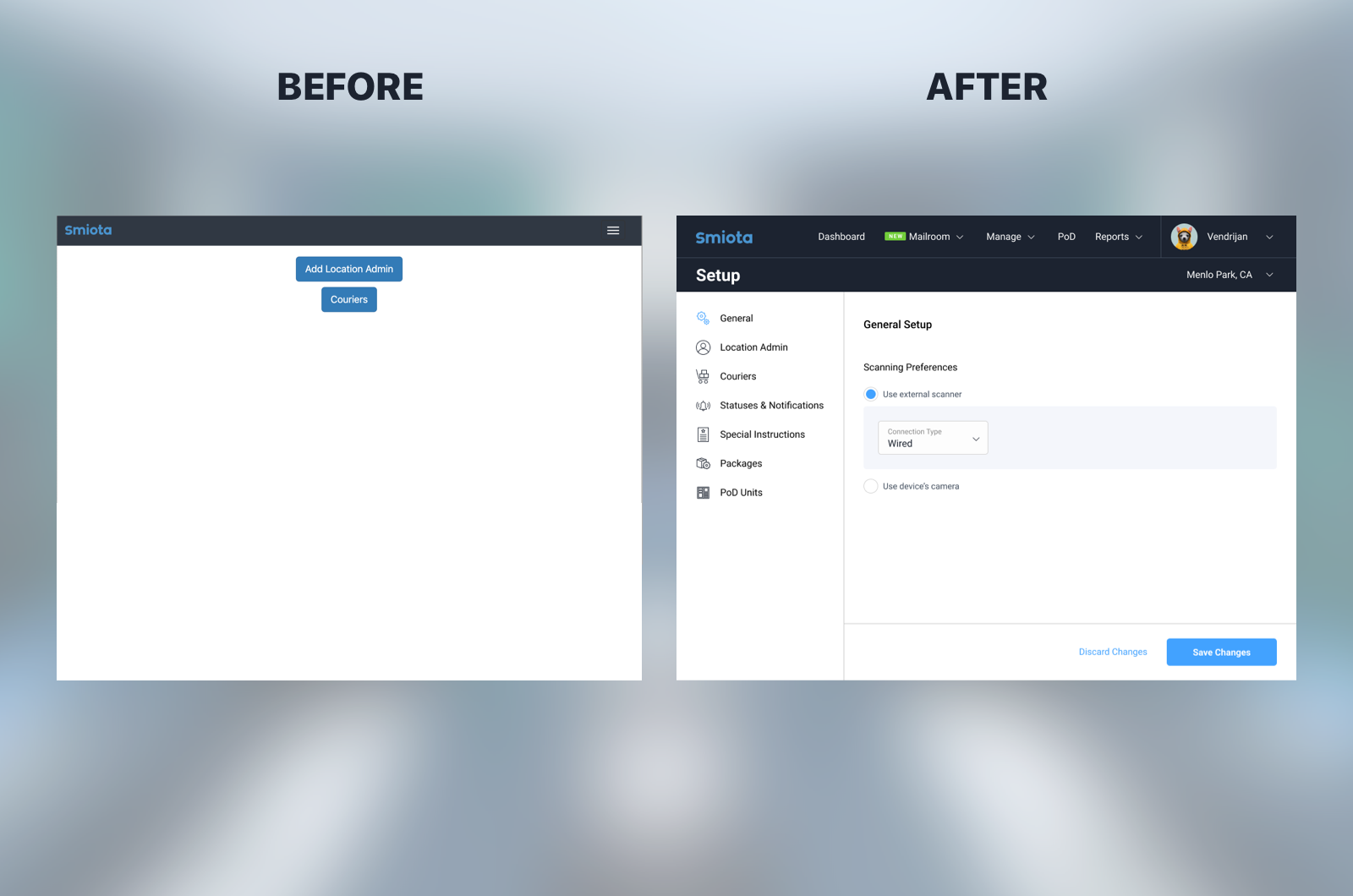
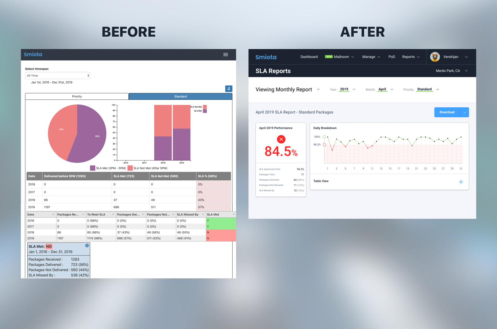
Before and After
Here's some more updates of items across the app:
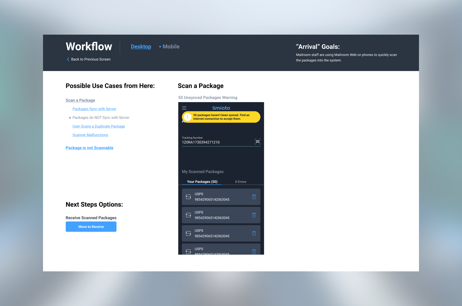
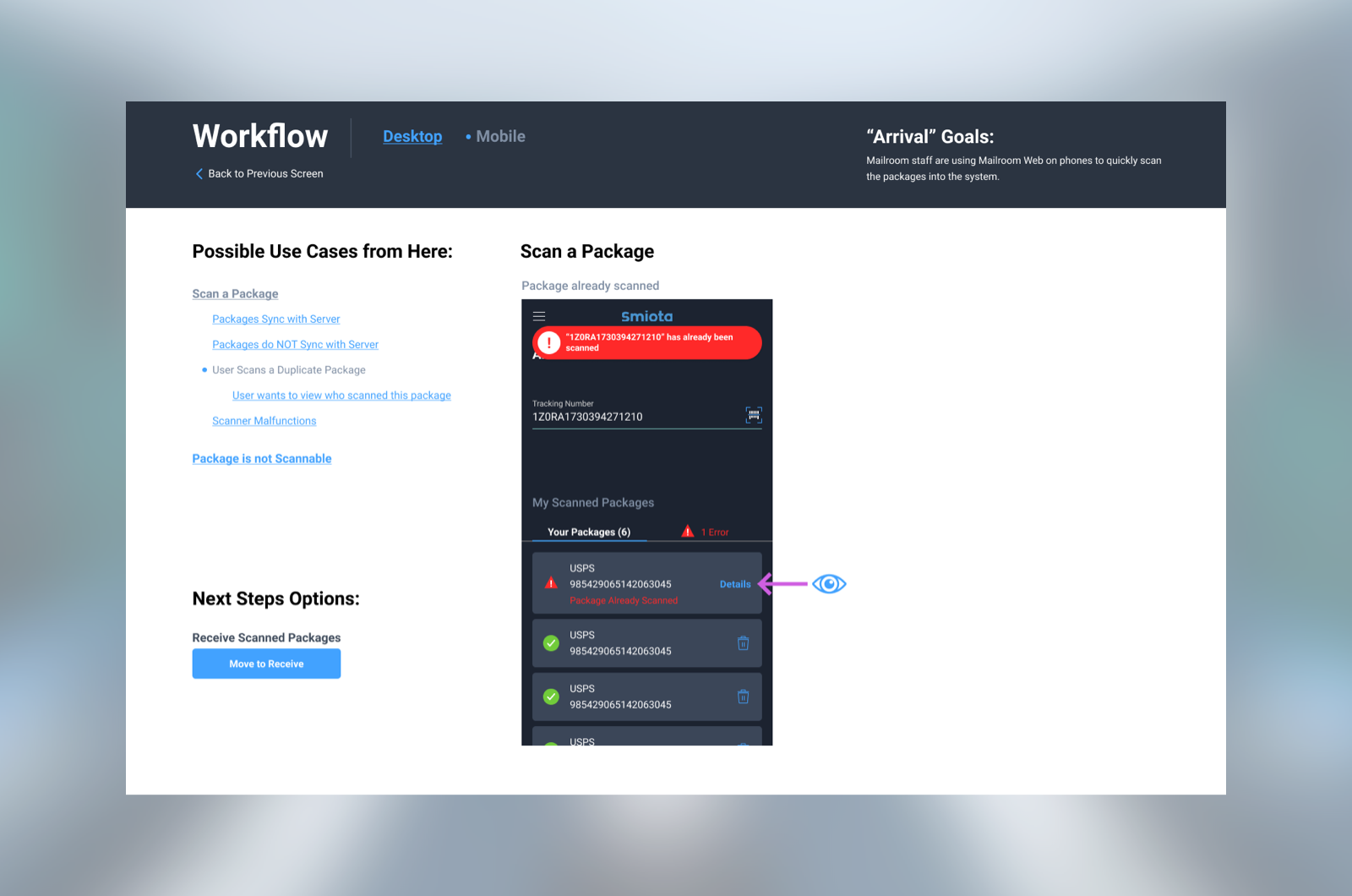
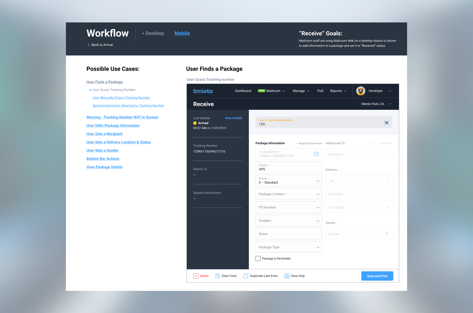
Visually documenting use cases
One thing I find in most organizations is, people cannot keep every use case in their head. When situations arise in different parts of the workflow, it can get really confusing really quickly. I started this documentation system inside of my Figma working file, to help keep everyone on track.
Many hats were worn
Startup culture is fast paced and hectic. I've influenced product strategy, helped find effective ways to scale the solution, documented use cases, learned the technical limitations of the system, talked directly to customers, and pitched new features in sales calls. Many situations in the project have pushed me beyond being just a designer.
