This portfolio was built by me
-
Mastercard Design
An internal working tool for the Digital Payments UX team.

User Experience

Design Tools
A deep dive into Sketch connected components
About a year after the SRC project started, Mastercard decided to throw many more resources at it. This meant that the UX working team doubled without any plan or process in place.
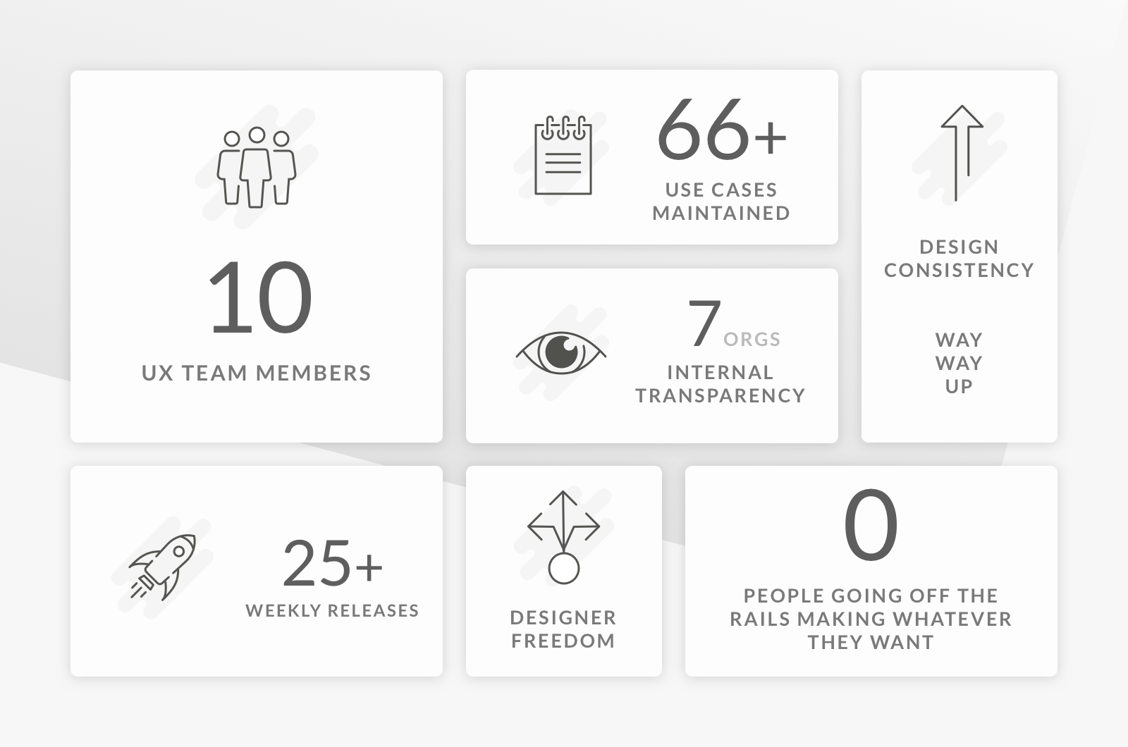
The UX team members were going to their meetings to discuss the progress, functionality, use cases and concerns with many different stakeholders. This led to many versions of the same information, and a patchwork quilt of designs done by the 8 UX designers and 2 content designers.
I helped set up a working file and design process to help control the flow of bad information, reduce errors, and improve consistency across our group.
Workflow
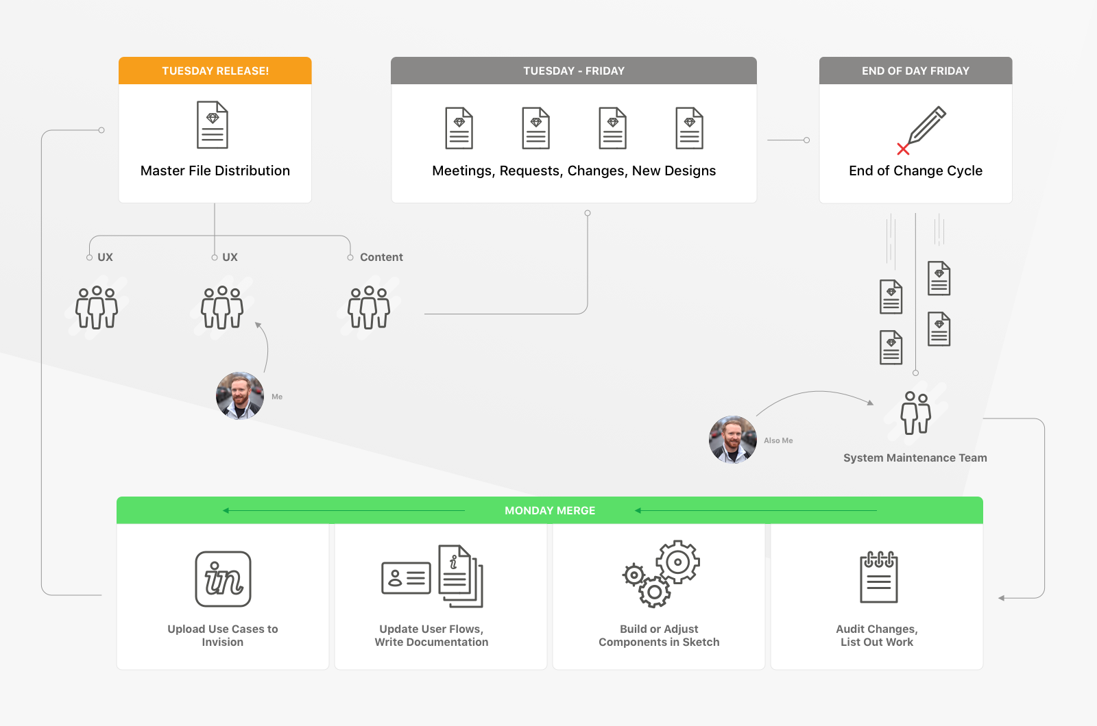
It took a few weeks to work out the pace and expectations of the UX team, and also the expectations of stakeholders across the company. We ended up with what I call a "Gatekeeper" workflow. This is great because it allows individual freedom to designers without them having to adjust any of thier current processes. The gatekeepers build and maintain the changes of the system, and consistency errors are reduced to 1-2 people.
Atomic Design
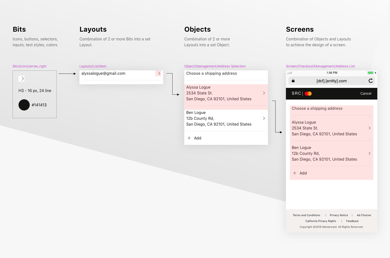
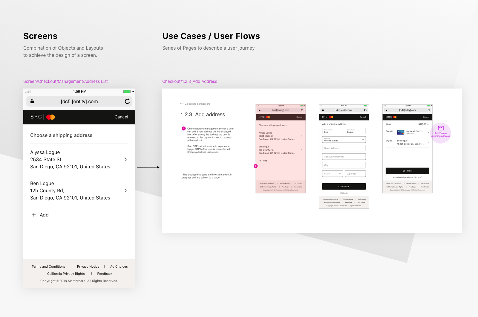
I read up on Atomic Design by Brad Frost and decided that using that type of system would help solve a lot of our consistency errors. I did a two week trial run with the system and introduced some workflow ideas to everyone on the team. I renamed the levels that the components roll up through, because the atom to molecule analogy just didn't resonate with my coworkers. We ended up with, Bits -> Layouts -> Objects -> Templates -> Screens. After 2 months, all of the design work from the past year was running on the new system.
Consistency
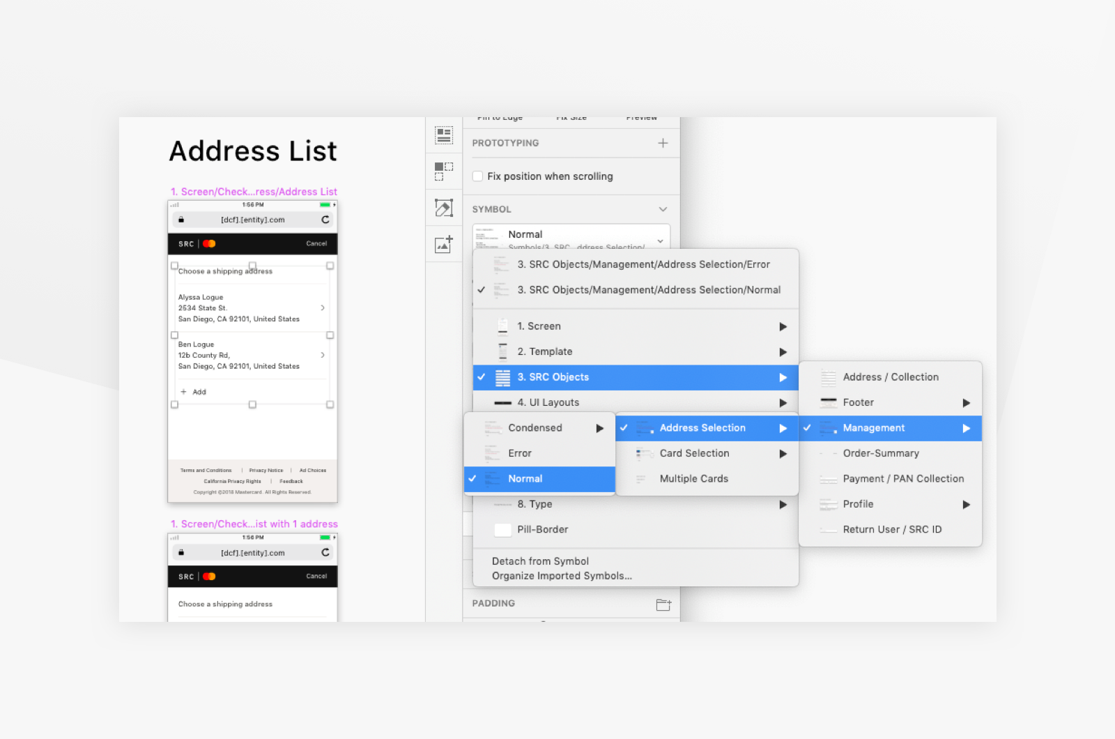
One of the things we had to think about was how we were going to organize the components. Setting up the structure of the file with the flexibility to add and expand your components and patterns is key. We grouped things relative to the functionality in the project. For instance, account management patterns pop up across many different entry points, so grouping those Objects made sense instead of making duplicates for each each unique entry point.
We added an additional level to this where we put the Screens into User flows to send outward to Product Managers, Product Owners, Architecture, Development Teams, Executives, EMV Co, and other UX Teams.
Use Case Navigator
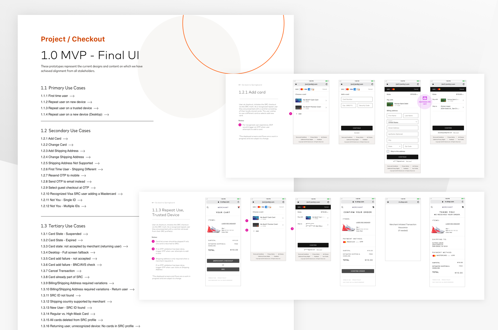
Sending out work to that many teams means that you get back so much feedback. Use cases are brought up from development concerns all the way through executive concerns. We created a use case navigator in Invision and prioritized each one for release schedules.
This is how we maintained more than 66 use cases at the same time, and kept duplicate and incorrect information to a minimum. If you didn't see it on the use case navigator, then it wasn't getting built.
Everyone on the same page
Gatekeeping the flow of information can be really useful when you keep running into duplicate work or consistency issues. It solved a lot of problems for our team, and the partners we worked with. Everyone could see the latest approved design work, all the use cases were documented and available, and people felt comfortable bringing their concerns to the table and working through specific problems with the product.
The atomic design system is also really great when you are needing high consistency. Locking down the styles and patterns should not come early in the design process, but it's a godsend once the styles have been defined. I suggest trying it out.
