geoplot.cartogram
-
geoplot.cartogram(df, projection=None, scale=None, limits=(0.2, 1), scale_func=None, trace=True, trace_kwargs=None, hue=None, categorical=False, scheme=None, k=5, cmap='viridis', vmin=None, vmax=None, legend=False, legend_values=None, legend_labels=None, legend_kwargs=None, legend_var='scale', extent=None, figsize=(8, 6), ax=None, **kwargs)¶ This plot scales the size of polygonal inputs based on the value of a particular data parameter.
Parameters: - df (GeoDataFrame) – The data being plotted.
- projection (geoplot.crs object instance, optional) – A geographic projection. Must be an instance of an object in the
geoplot.crsmodule, e.g.geoplot.crs.PlateCarree(). This parameter is optional: if left unspecified, a pure unprojectedmatplotlibobject will be returned. For more information refer to the tutorial page on projections. - scale (str or iterable) – A data column whose values will be used to scale the points.
- limits ((min, max) tuple, optional) – The minimum and maximum limits against which the shape will be scaled. Ignored if
scaleis not specified. - scale_func (ufunc, optional) – The function used to scale point sizes. This should be a factory function of two variables, the minimum and maximum values in the dataset, which returns a scaling function which will be applied to the rest of the data. Defaults to a linear scale. A demo is available in the example gallery.
- trace (boolean, optional) – Whether or not to include a trace of the polygon’s original outline in the plot result.
- trace_kwargs (dict, optional) – If
traceis set toTrue, this parameter can be used to adjust the properties of the trace outline. This parameter is ignored if trace isFalse. - hue (None, Series, GeoSeries, iterable, or str, optional) – A data column whose values are to be colorized. Defaults to None, in which case no colormap will be applied.
- categorical (boolean, optional) – Specify this variable to be
Trueifhuepoints to a categorical variable. Defaults to False. Ignored ifhueis set to None or not specified. - scheme (None or {"Quantiles"|"Equal_interval"|"Fisher_Jenks"}, optional) – The scheme which will be used to determine categorical bins for the
huechoropleth. Ifhueis left unspecified or set to None this variable is ignored. - k (int or None, optional) – If
hueis specified andcategoricalis False, this number, set to 5 by default, will determine how many bins will exist in the output visualization. Ifhueis specified and this variable is set toNone, a continuous colormap will be used. Ifhueis left unspecified or set to None this variable is ignored. - cmap (matplotlib color, optional) – The matplotlib colormap to be applied to this dataset (ref). This parameter is ignored if
hueis not specified. - vmin (float, optional) – The value that “bottoms out” the colormap. Data column entries whose value is below this level will be colored the same threshold value. Defaults to the minimum value in the dataset.
- vmax (float, optional) – The value that “tops out” the colormap. Data column entries whose value is above this level will be colored the same threshold value. Defaults to the maximum value in the dataset.
- legend (boolean, optional) – Whether or not to include a legend in the output plot.
- legend_values (list, optional) – Equal intervals will be used for the “points” in the legend by default. However, particularly if your scale is non-linear, oftentimes this isn’t what you want. If this variable is provided as well, the values included in the input will be used by the legend instead.
- legend_labels (list, optional) – If a legend is specified, this parameter can be used to control what names will be attached to the values.
- legend_var ("hue" or "scale", optional) – The name of the visual variable for which a legend will be displayed. Does nothing if
legendis False or multiple variables aren’t used simultaneously. - legend_kwargs (dict, optional) –
Keyword arguments to be passed to the underlying
matplotlib.pyplot.legendinstance (ref). - extent (None or (minx, maxx, miny, maxy), optional) – If this parameter is unset
geoplotwill calculate the plot limits. If an extrema tuple is passed, that input will be used instead. - figsize (tuple, optional) – An (x, y) tuple passed to
matplotlib.figurewhich sets the size, in inches, of the resultant plot. Defaults to (8, 6), thematplotlibdefault global. - ax (AxesSubplot or GeoAxesSubplot instance, optional) – A
matplotlib.axes.AxesSubplotorcartopy.mpl.geoaxes.GeoAxesSubplotinstance onto which this plot will be graphed. If this parameter is left undefined a new axis will be created and used instead. - kwargs (dict, optional) –
Keyword arguments to be passed to the underlying
matplotlib.patches.Polygoninstances (ref).
Returns: The axis object with the plot on it.
Return type: GeoAxesSubplot instance
Examples
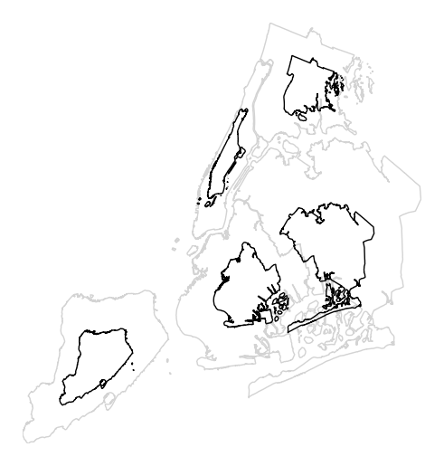
A cartogram is a plot type which ingests a series of enclosed shapes (
shapelyPolygonorMultiPolygonentities, in thegeoplotexample) and spits out a view of these shapes in which area is distorted according to the size of some parameter of interest. These are two types of cartograms, contiguous and non-contiguous ones; only the former is implemented ingeoplotat the moment.A basic cartogram specifies data, a projection, and a
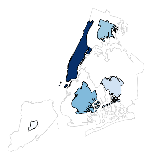
scaleparameter.import geoplot as gplt import geoplot.crs as gcrs gplt.cartogram(boroughs, scale='Population Density', projection=gcrs.AlbersEqualArea())
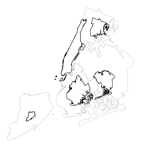
The gray outline can be turned off by specifying
trace, and a legend can be added by specifyinglegend.gplt.cartogram(boroughs, scale='Population Density', projection=gcrs.AlbersEqualArea(), trace=False, legend=True)
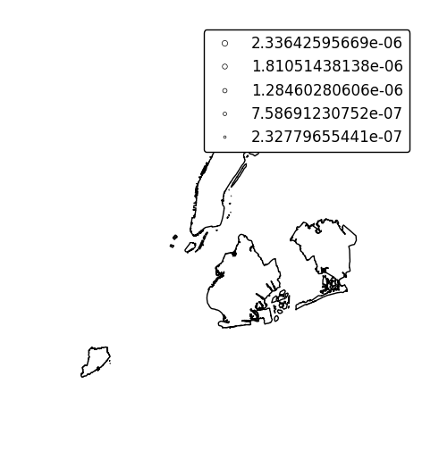
Keyword arguments can be passed to the legend using the
legend_kwargsargument. These arguments, often necessary to properly position the legend, will be passed to the underlying `matplotlib Legend instance http://matplotlib.org/api/legend_api.html#matplotlib.legend.Legend`_.gplt.cartogram(boroughs, scale='Population Density', projection=gcrs.AlbersEqualArea(), trace=False, legend=True, legend_kwargs={'loc': 'upper left'})
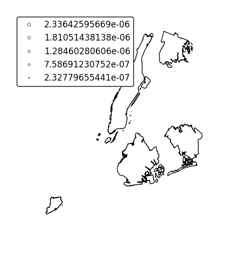
Specify an alternative legend display using the
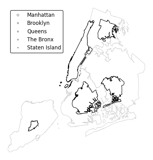
legend_valuesandlegend_labelsparameters.gplt.cartogram(boroughs, scale='Population Density', projection=gcrs.AlbersEqualArea(), legend=True, legend_values=[2.32779655e-07, 6.39683197e-07, 1.01364661e-06, 1.17380941e-06, 2.33642596e-06][::-1], legend_labels=['Manhattan', 'Brooklyn', 'Queens', 'The Bronx', 'Staten Island'], legend_kwargs={'loc': 'upper left'})
Additional arguments to
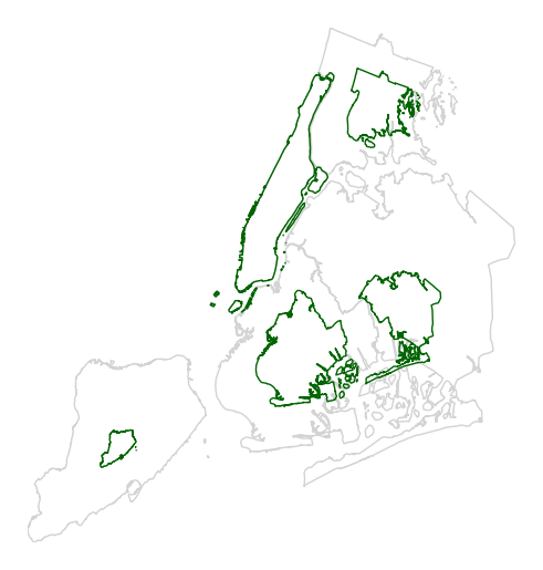
cartogramwill be interpreted as keyword arguments for the scaled polygons, using matplotlib Polygon patch rules.gplt.cartogram(boroughs, scale='Population Density', projection=gcrs.AlbersEqualArea(), edgecolor='darkgreen')
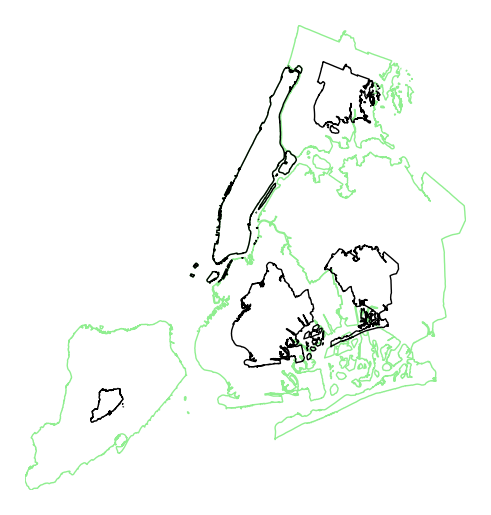
Manipulate the outlines use the
trace_kwargsargument, which accepts the same matplotlib Polygon patch parameters.gplt.cartogram(boroughs, scale='Population Density', projection=gcrs.AlbersEqualArea(), trace_kwargs={'edgecolor': 'lightgreen'})
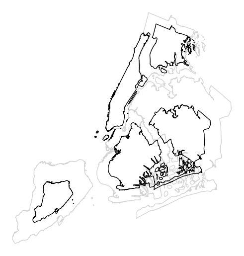
By default, the polygons will be scaled according to the data such that the minimum value is scaled by a factor of 0.2 while the largest value is left unchanged. Adjust this using the
limitsparameter.gplt.cartogram(boroughs, scale='Population Density', projection=gcrs.AlbersEqualArea(), limits=(0.5, 1))
The default scaling function is linear: an observations at the midpoint of two others will be exactly midway between them in size. To specify an alternative scaling function, use the
scale_funcparameter. This should be a factory function of two variables which, when given the maximum and minimum of the dataset, returns a scaling function which will be applied to the rest of the data. A demo is available in the example gallery.def trivial_scale(minval, maxval): def scalar(val): return 0.5 return scalar gplt.cartogram(boroughs, scale='Population Density', projection=gcrs.AlbersEqualArea(), limits=(0.5, 1), scale_func=trivial_scale)
cartogramalso provides the samehuevisual variable parameters provided by e.g.pointplot. Although it’s possible forhueandscaleto refer to different aspects of the data, it’s strongly recommended to use the same data column for both. For more information onhue-related arguments, refer to e.g. thepointplotdocumentation.gplt.cartogram(boroughs, scale='Population Density', projection=gcrs.AlbersEqualArea(), hue='Population Density', k=None, cmap='Blues')