geoplot.sankey
-
geoplot.sankey(*args, projection=None, start=None, end=None, path=None, hue=None, categorical=False, scheme=None, k=5, cmap='viridis', vmin=None, vmax=None, legend=False, legend_kwargs=None, legend_labels=None, legend_values=None, legend_var=None, extent=None, figsize=(8, 6), ax=None, scale=None, limits=(1, 5), scale_func=None, **kwargs)¶ A geospatial Sankey diagram (flow map).
Parameters: - df (GeoDataFrame, optional.) – The data being plotted. This parameter is optional - it is not needed if
startandend(andhue, if provided) are iterables. - projection (geoplot.crs object instance, optional) – A geographic projection. Must be an instance of an object in the
geoplot.crsmodule, e.g.geoplot.crs.PlateCarree(). This parameter is optional: if left unspecified, a pure unprojectedmatplotlibobject will be returned. For more information refer to the tutorial page on projections. - start (str or iterable) – Linear starting points: either the name of a column in
dfor a self-contained iterable. This parameter is required. - end (str or iterable) – Linear ending points: either the name of a column in
dfor a self-contained iterable. This parameter is required. - path (geoplot.crs object instance or iterable, optional) – If this parameter is provided as an iterable, it is assumed to contain the lines that the user wishes to
draw to connect the points. If this parameter is provided as a projection, that projection will be used for
determining how the line is plotted. The default is
ccrs.Geodetic(), which means that the true shortest path will be plotted (great circle distance); any other choice of projection will result in what the shortest path is in that projection instead. - hue (None, Series, GeoSeries, iterable, or str, optional) – A data column whose values are to be colorized. Defaults to None, in which case no colormap will be applied.
- categorical (boolean, optional) – Specify this variable to be
Trueifhuepoints to a categorical variable. Defaults to False. Ignored ifhueis set to None or not specified. - scheme (None or {"Quantiles"|"Equal_interval"|"Fisher_Jenks"}, optional) – The scheme which will be used to determine categorical bins for the
huechoropleth. Ifhueis left unspecified or set to None this variable is ignored. - k (int or None, optional) – If
hueis specified andcategoricalis False, this number, set to 5 by default, will determine how many bins will exist in the output visualization. Ifhueis specified and this variable is set toNone, a continuous colormap will be used. Ifhueis left unspecified or set to None this variable is ignored. - cmap (matplotlib color, optional) – The matplotlib colormap to be applied to this dataset (ref). This parameter is ignored if
hueis not specified. - vmin (float, optional) – The value that “bottoms out” the colormap. Data column entries whose value is below this level will be colored the same threshold value. Defaults to the minimum value in the dataset.
- vmax (float, optional) – The value that “tops out” the colormap. Data column entries whose value is above this level will be colored the same threshold value. Defaults to the maximum value in the dataset.
- scale (str or iterable, optional) – A data column whose values will be used to scale the points. Defaults to None, in which case no scaling will be applied.
- limits ((min, max) tuple, optional) – The minimum and maximum limits against which the shape will be scaled. Ignored if
scaleis not specified. - scale_func (ufunc, optional) – The function used to scale point sizes. This should be a factory function of two variables, the minimum and maximum values in the dataset, which returns a scaling function which will be applied to the rest of the data. Defaults to a linear scale. A demo is available in the example gallery.
- legend (boolean, optional) – Whether or not to include a legend in the output plot. This parameter will not work if neither
huenorscaleis unspecified. - legend_values (list, optional) – Equal intervals will be used for the “points” in the legend by default. However, particularly if your scale is non-linear, oftentimes this isn’t what you want. If this variable is provided as well, the values included in the input will be used by the legend instead.
- legend_labels (list, optional) – If a legend is specified, this parameter can be used to control what names will be attached to the values.
- legend_var ("hue" or "scale", optional) – The name of the visual variable for which a legend will be displayed. Does nothing if
legendis False or multiple variables aren’t used simultaneously. - legend_kwargs (dict, optional) –
Keyword arguments to be passed to the underlying
matplotlib.pyplot.legendinstance (ref). - extent (None or (minx, maxx, miny, maxy), optional) – If this parameter is unset
geoplotwill calculate the plot limits. If an extrema tuple is passed, that input will be used instead. - figsize (tuple, optional) – An (x, y) tuple passed to
matplotlib.figurewhich sets the size, in inches, of the resultant plot. Defaults to (8, 6), thematplotlibdefault global. - ax (AxesSubplot or GeoAxesSubplot instance, optional) – A
matplotlib.axes.AxesSubplotorcartopy.mpl.geoaxes.GeoAxesSubplotinstance onto which this plot will be graphed. If this parameter is left undefined a new axis will be created and used instead. - kwargs (dict, optional) –
Keyword arguments to be passed to the underlying
matplotlib.lines.Line2Dinstances (ref).
Returns: The axis object with the plot on it.
Return type: AxesSubplot or GeoAxesSubplot instance
Examples
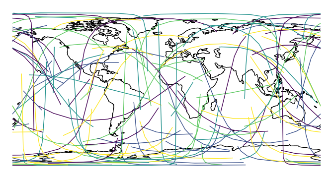
A Sankey diagram is a type of plot useful for visualizing flow through a network. Minard’s diagram of Napolean’s ill-fated invasion of Russia is a classical example. A Sankey diagram is useful when you wish to show movement within a network (a graph): traffic load a road network, for example, or typical airport traffic patterns.
This plot type is unusual amongst
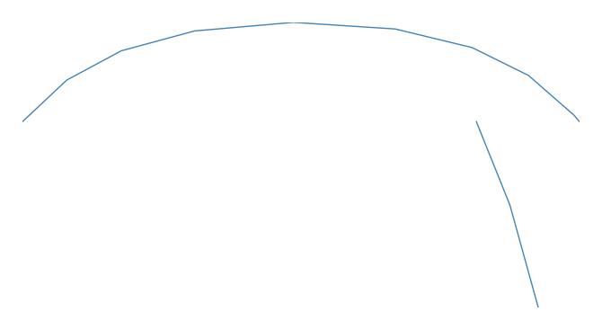
geoplottypes in that it is meant for two columns of geography, resulting in a slightly different API. A basicsankeyspecifies data,startpoints,endpoints, and, optionally, a projection.import geoplot as gplt import geoplot.crs as gcrs gplt.sankey(mock_data, start='origin', end='destination', projection=gcrs.PlateCarree())
However, Sankey diagrams need additional geospatial context to be interpretable. In this case (and for the remainder of the examples) we will provide this by overlaying world geometry.
ax = gplt.sankey(mock_data, start='origin', end='destination', projection=gcrs.PlateCarree())
ax.coastlines()
This function is very
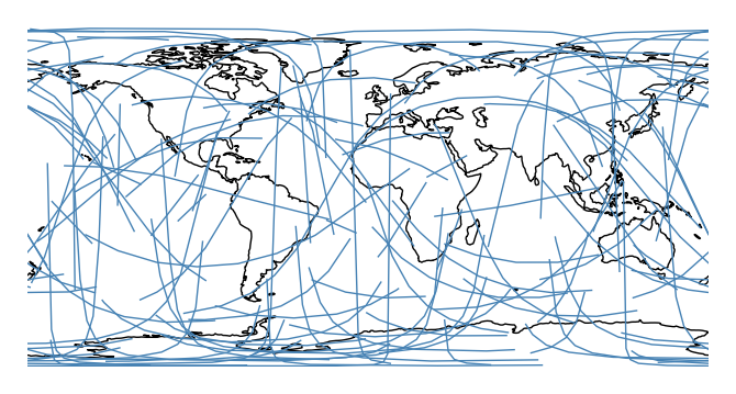
seaborn-like in that the usualdfargument is optional. If geometries are provided as independent iterables it can be dropped.ax = gplt.sankey(projection=gcrs.PlateCarree(), start=network['from'], end=network['to']) ax.set_global() ax.coastlines()
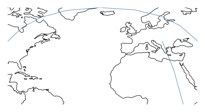
You may be wondering why the lines are curved. By default, the paths followed by the plot are the actual shortest paths between those two points, in the spherical sense. This is known as great circle distance. We can see this clearly in an ortographic projection.
ax = gplt.sankey(projection=gcrs.Orthographic(), start=network['from'], end=network['to'],
         extent=(-180, 180, -90, 90))
ax.set_global()
ax.coastlines()
ax.outline_patch.set_visible(True)

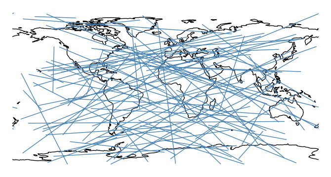
Plot using a different distance metric, pass it as an argument to the
pathparameter. Awkwardly,cartopycrsobjects (notgeoplotones) are required.import cartopy.ccrs as ccrs ax = gplt.sankey(projection=gcrs.PlateCarree(), start=network['from'], end=network['to'], path=ccrs.PlateCarree()) ax.set_global() ax.coastlines()
One of the most powerful
sankeyfeatures is that if your data has custom paths, you can use those instead with thepathparameter.gplt.sankey(dc, path=dc.geometry, projection=gcrs.AlbersEqualArea(), scale='aadt', limits=(0.1, 10))
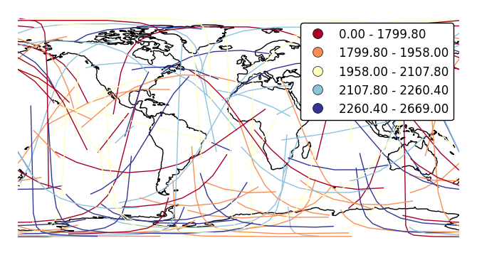
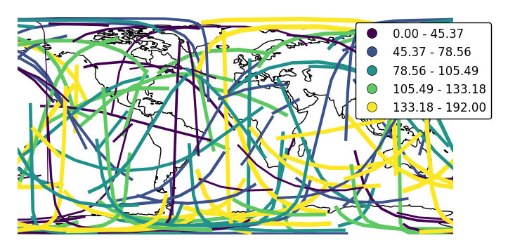
The
hueparameter colorizes paths based on data.ax = gplt.sankey(network, projection=gcrs.PlateCarree(), start='from', end='to', path=PlateCarree(), hue='mock_variable') ax.set_global() ax.coastlines()
cmapchanges the colormap.ax = gplt.sankey(network, projection=gcrs.PlateCarree(), start='from', end='to', hue='mock_variable', cmap='RdYlBu') ax.set_global() ax.coastlines()

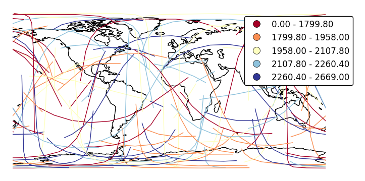
legendadds a legend.ax = gplt.sankey(network, projection=gcrs.PlateCarree(), start='from', end='to', hue='mock_variable', cmap='RdYlBu', legend=True) ax.set_global() ax.coastlines()
Pass keyword arguments to the legend with
legend_kwargs. This is often necessary for positioning.ax = gplt.sankey(network, projection=gcrs.PlateCarree(), start='from', end='to', hue='mock_variable', cmap='RdYlBu', legend=True, legend_kwargs={'bbox_to_anchor': (1.4, 1.0)}) ax.set_global() ax.coastlines()
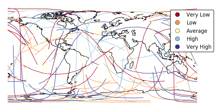
Specify custom legend labels with
legend_labels.ax = gplt.sankey(network, projection=gcrs.PlateCarree(), start='from', end='to', hue='mock_variable', cmap='RdYlBu', legend=True, legend_kwargs={'bbox_to_anchor': (1.25, 1.0)}, legend_labels=['Very Low', 'Low', 'Average', 'High', 'Very High']) ax.set_global() ax.coastlines()
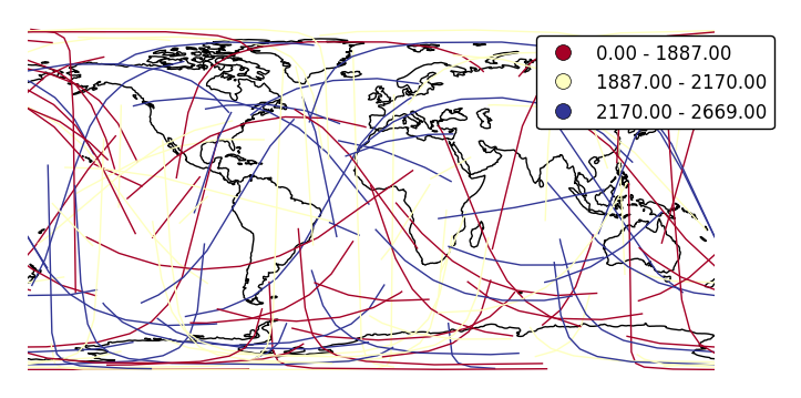
Change the number of bins with
k.ax = gplt.sankey(network, projection=gcrs.PlateCarree(), start='from', end='to', hue='mock_variable', cmap='RdYlBu', legend=True, legend_kwargs={'bbox_to_anchor': (1.25, 1.0)}, k=3) ax.set_global() ax.coastlines()
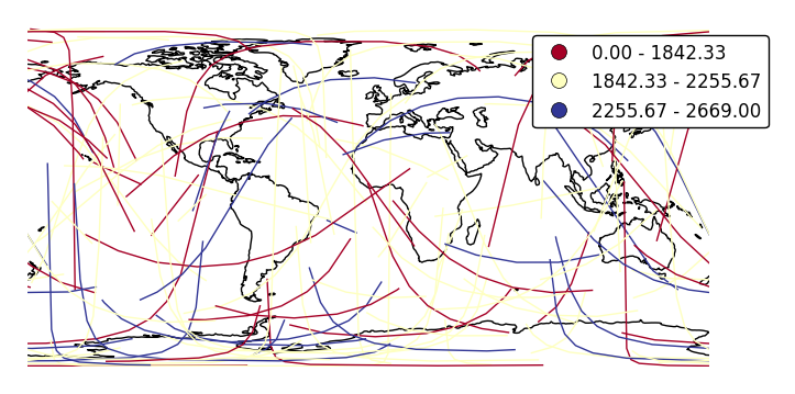
Change the binning sceme with
scheme.ax = gplt.sankey(network, projection=gcrs.PlateCarree(), start='from', end='to', hue='mock_variable', cmap='RdYlBu', legend=True, legend_kwargs={'bbox_to_anchor': (1.25, 1.0)}, k=3, scheme='equal_interval') ax.set_global() ax.coastlines()
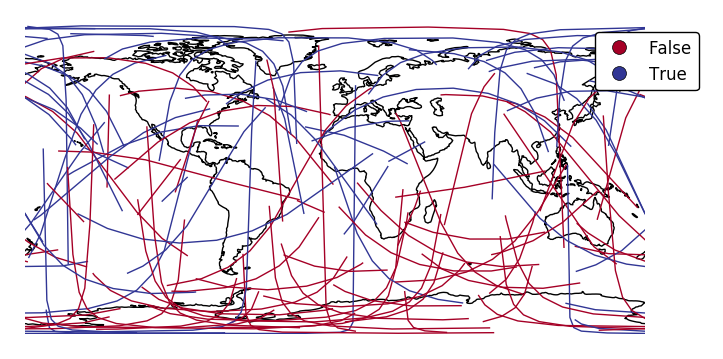
If your variable of interest is already categorical, specify
categorical=Trueto use the labels in your dataset directly.ax = gplt.sankey(network, projection=gcrs.PlateCarree(), start='from', end='to', hue='above_meridian', cmap='RdYlBu', legend=True, legend_kwargs={'bbox_to_anchor': (1.2, 1.0)}, categorical=True) ax.set_global() ax.coastlines()
scalecan be used to enablelinewidthas a visual variable.ax = gplt.sankey(network, projection=gcrs.PlateCarree(), start='from', end='to', scale='mock_data', legend=True, legend_kwargs={'bbox_to_anchor': (1.2, 1.0)}, color='lightblue') ax.set_global() ax.coastlines()
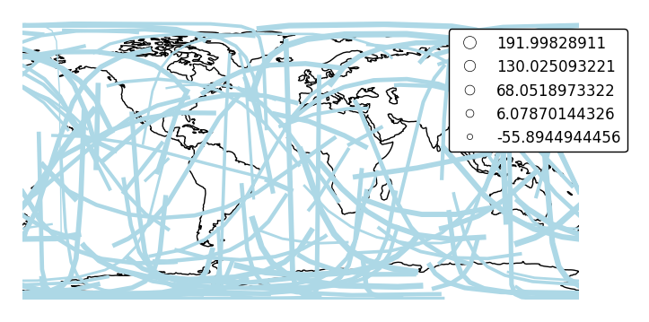
By default, the polygons will be scaled according to the data such that the minimum value is scaled by a factor of 0.2 while the largest value is left unchanged. Adjust this using the
limitsparameter.ax = gplt.sankey(network, projection=gcrs.PlateCarree(), start='from', end='to', scale='mock_data', limits=(1, 3), legend=True, legend_kwargs={'bbox_to_anchor': (1.2, 1.0)}, color='lightblue') ax.set_global() ax.coastlines()
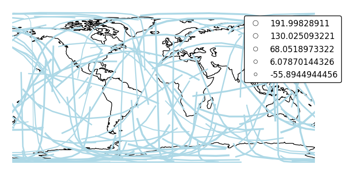
The default scaling function is a linear one. You can change the scaling function to whatever you want by specifying a
scale_funcinput. This should be a factory function of two variables which, when given the maximum and minimum of the dataset, returns a scaling function which will be applied to the rest of the data.def trivial_scale(minval, maxval): def scalar(val): return 2 return scalar ax = gplt.sankey(network, projection=gcrs.PlateCarree(), start='from', end='to', scale='mock_data', scale_func=trivial_scale, legend=True, legend_kwargs={'bbox_to_anchor': (1.1, 1.0)}, color='lightblue') ax.set_global() ax.coastlines()
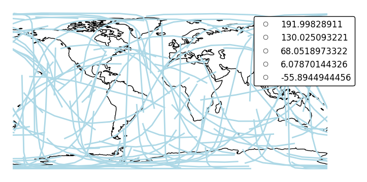
In case more than one visual variable is used, control which one appears in the legend using
legend_var.ax = gplt.sankey(network, projection=gcrs.PlateCarree(), start='from', end='to', scale='mock_data', legend=True, legend_kwargs={'bbox_to_anchor': (1.1, 1.0)}, hue='mock_data', legend_var="hue") ax.set_global() ax.coastlines()
- df (GeoDataFrame, optional.) – The data being plotted. This parameter is optional - it is not needed if