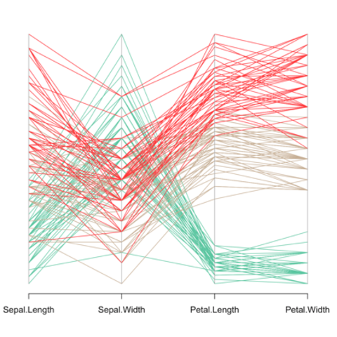
This is the Parallel Coordinates chart section of the gallery. If you want to know more about this kind of chart, visit data-to-viz.com. If you're looking for a simple way to implement it in d3.js, pick an example below.
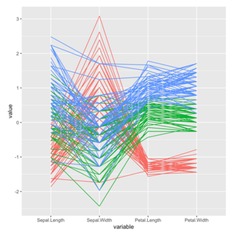
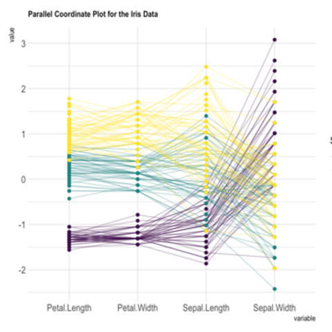
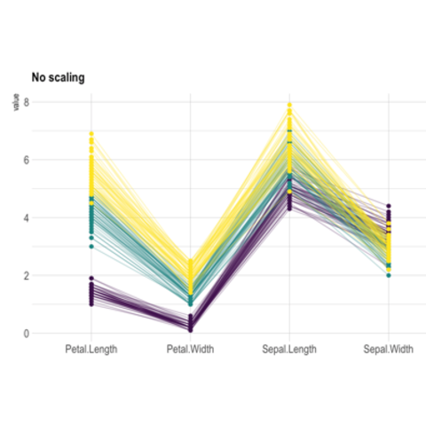
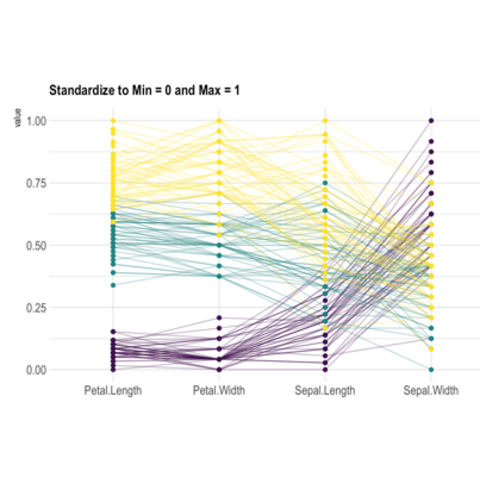
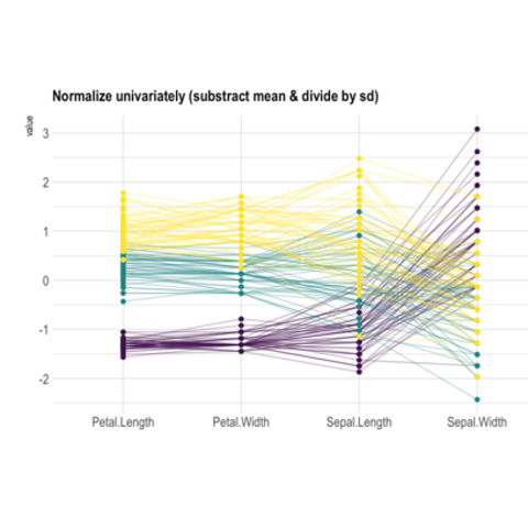
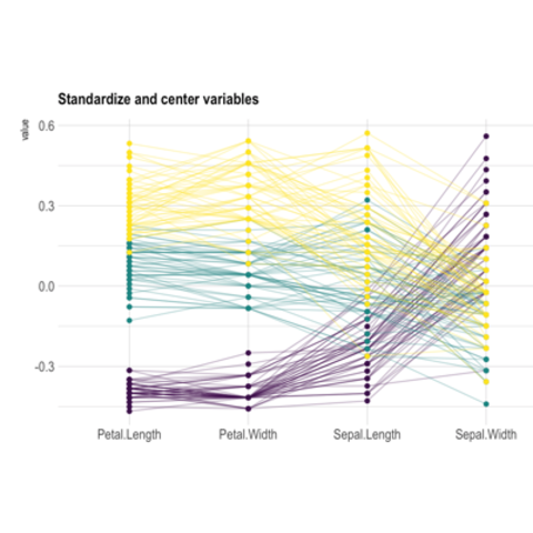
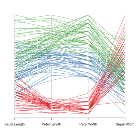
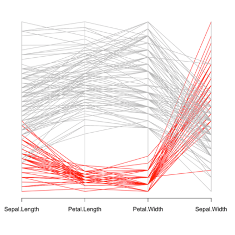
Scaling variable is a crucial step to build a proper parallel
coordinates chart. It transforms the raw data to a new scale that is
common with other variables, and thus allow to compare them. The
ggally package offers a scale option that
computes the most common types of scaling:
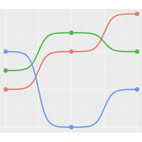
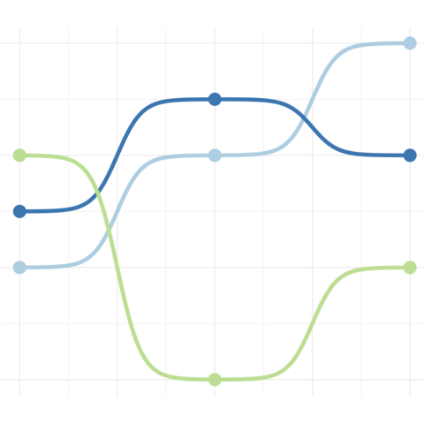
ggbump
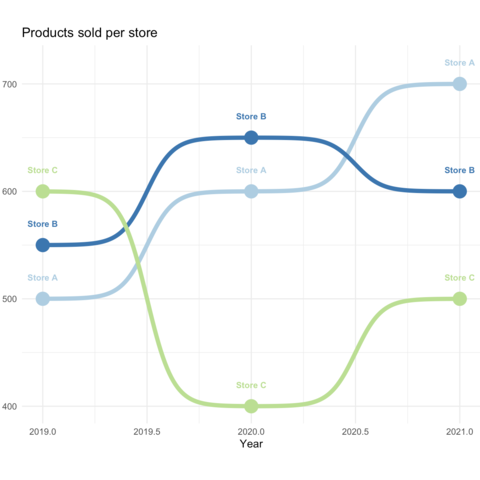
A bump chart is a variation of the parallel coordinate plot.
It visualizes the rank order and changes in rank of categorical data over an ordered dimension, while a parallel coordinate chart displays relationships between multiple variables for each data point using parallel axes.
In R, the ggbump package makes it a breeze to build one as shown in the following examples:
The web is full of astonishing R charts made by awesome bloggers. The R graph gallery tries to display some of the best creations and explain how their source code works. If you want to display your work here, please drop me a word or even better, submit a Pull Request!
Related chart types