About
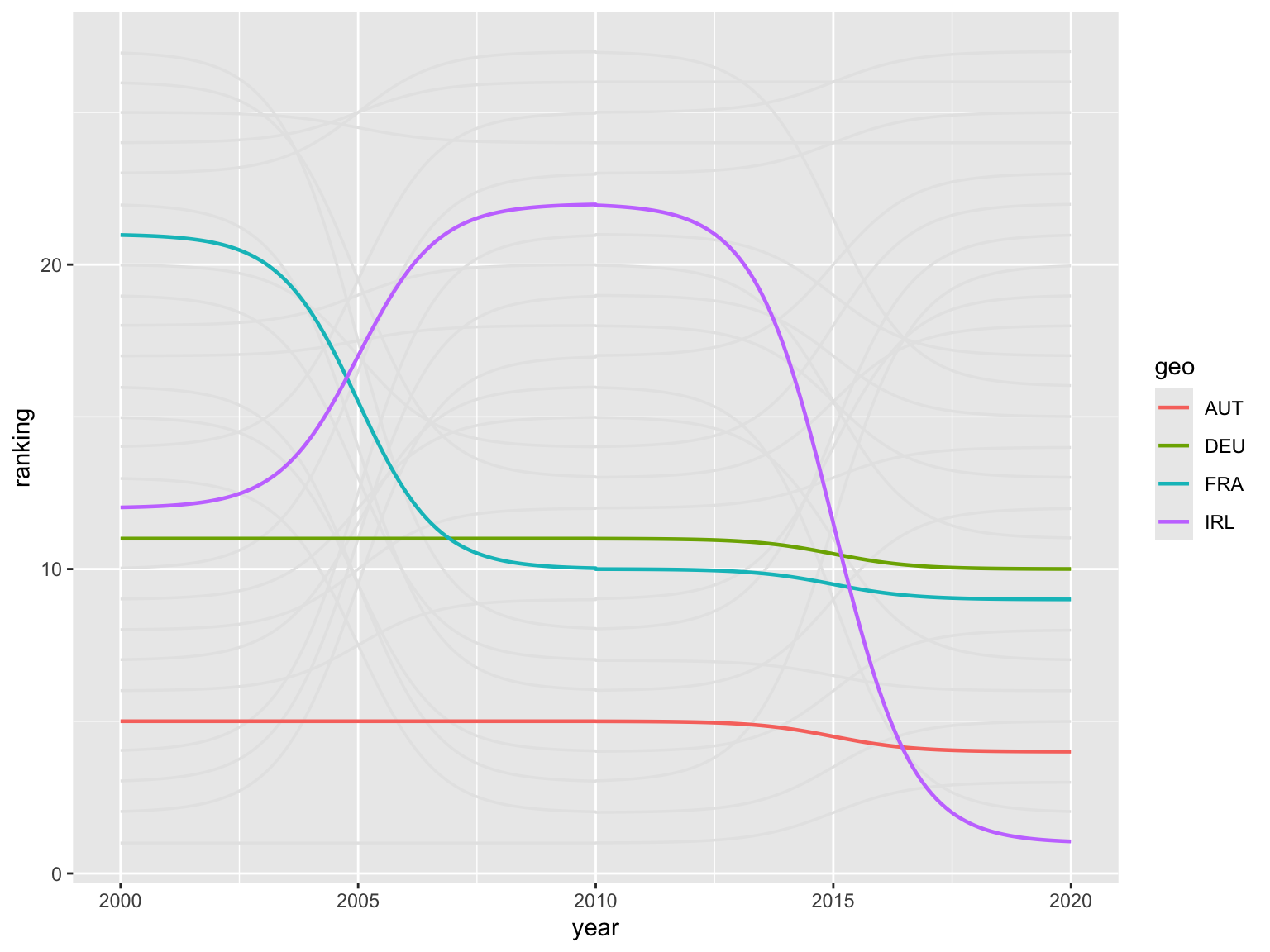
This chart is about highlighting specific lines in a bump chart. The chart shows the ranking of European countries according to their share of gross fixed capital formation (GFCF) in % of GDP.
This bump chart is the work of Matthias Schnetzer. Thanks to him for sharing his work!
Libraries
This chart requires a few libraries, especially the
ggbump package. This package
provides a geom_bump() function that allows to
build ggbump charts easily.
Install it with install.packages("ggbump").
Dataset
The dataset is retrieved from the rdbnomics package and
is from the AMECO database.
It contains the share of gross fixed capital formation (GFCF) in % of GDP for a selection of European countries. The data is available for the years 2000, 2010 and 2020.
This pre-processing step is necessary to
rank the countries according to their share of GFCF
in % of GDP. The rank() function is used to create a
ranking variable for each year.
The countrycode() function is used to convert the ISO3
country codes to country names in German.
allcty <- codelist |> filter(!is.na(eu28)) |> pull(iso3c) |> tolower()

gfcf_private <- rdb(provider_code = "AMECO", dataset_code = "UIGP",
             dimensions = list(geo = allcty, unit = "mrd-ecu-eur"))
gdp <- rdb(provider_code = "AMECO", dataset_code = "UVGD",
           dimensions = list(geo = allcty, unit = "mrd-ecu-eur"))

data <- bind_rows(gfcf_private, gdp) |>
  mutate(variable = case_when(
    str_detect(dataset_name, "private") ~ "GFCF_p",
    TRUE ~ "GDP")) |>
  select(geo, variable, period, value) |>
  pivot_wider(names_from = variable, values_from = value) |>
  mutate(share_p = GFCF_p/GDP*100, year = year(period), geo = toupper(geo))

ranked <- data |>
  filter(year %in% c(2000, 2010, 2020)) |>
  mutate(ranking = rank(desc(share_p), ties.method = "first"), .by = year) |>
  mutate(ctry = countrycode(geo, "iso3c", "country.name.de"),
         ctry = ifelse(geo == "CZE", "Tschechien", ctry))

selected <- c("AUT", "DEU", "IRL", "FRA")
Simple bump plot
Let’s start by creating a simple bump plot. The
geom_bump() function is used to create the chart. The
smooth argument is used to
control the smoothness of the lines.
ranked |>
  ggplot(aes(x = year, y = ranking, group = geo)) +
  geom_bump(linewidth = 0.6, color = "gray90", smooth = 6) +
  geom_bump(aes(color = geo), linewidth = 0.8, smooth = 6,
                    data = ~. |> filter(geo %in% selected))
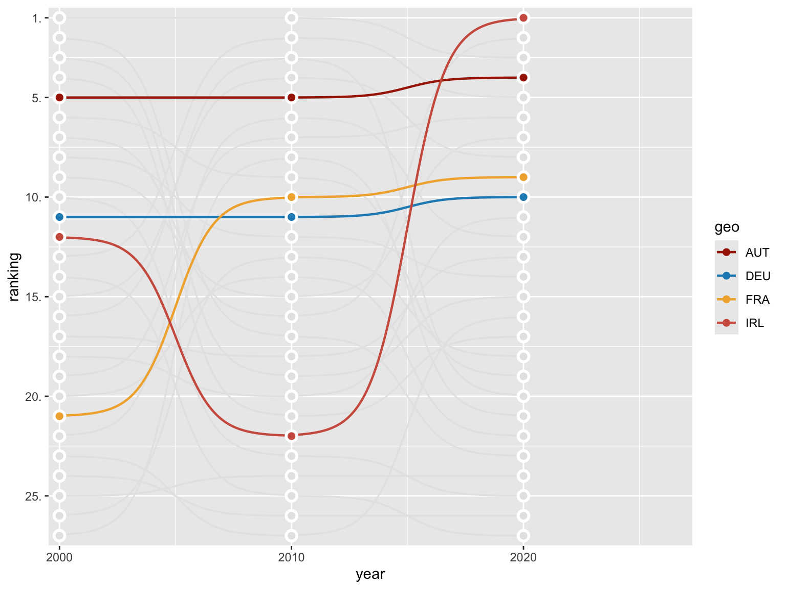
Change order and add individual points
The geom_point() function is utilized to add
individual points to the chart, while the
geom_text() function is employed to add
labels to the chart.
The slice_max() function is used to select the
top country for each year. The
filter() function is used to select the countries that
are highlighted in the chart.
ranked |>
  ggplot(aes(x = year, y = ranking, group = geo)) +
  geom_bump(linewidth = 0.6, color = "gray90", smooth = 6) +
  geom_bump(aes(color = geo), linewidth = 0.8, smooth = 6,
                    data = ~. |> filter(geo %in% selected)) +
  geom_point(color = "white", size = 4) +
  geom_point(color = "gray90", size = 2) +
  geom_point(aes(color = geo), size = 2,
             data = ~. |> filter(geo %in% selected)) +
  geom_text(aes(label = ctry), x = 2021, hjust = 0,
            color = "gray50", family = "Roboto Condensed", size = 3.5,
            data = ranked |> slice_max(year, by = geo) |>
              filter(!geo %in% selected)) +
  geom_text(aes(label = ctry), x = 2021, hjust = 0,
            color = "black", family = "Roboto Condensed", size = 3.5,
            data = ranked |> slice_max(year, by = geo) |>
              filter(geo %in% selected)) +
  scale_color_manual(values = met.brewer("Juarez")) +
  scale_x_continuous(limits = c(1999.8, 2027), expand = c(0.01,0),
                     breaks = c(2000, 2010, 2020)) +
  scale_y_reverse(breaks = c(25,20,15,10,5,1), expand = c(0.02,0),
                  labels = number_format(suffix = "."))
Change theme and add annotations
The theme_minimal() function is employed to alter the
chart’s theme. Conversely, the
theme() function is utilized to eliminate
grid lines and the legend.
The labs() function is designed to incorporate a
title, subtitle, and
caption into the chart.
plot <- ranked |>
  ggplot(aes(x = year, y = ranking, group = geo)) +
  geom_bump(linewidth = 0.6, color = "gray90", smooth = 6) +
  geom_bump(aes(color = geo), linewidth = 0.8, smooth = 6,
                    data = ~. |> filter(geo %in% selected)) +
  geom_point(color = "white", size = 4) +
  geom_point(color = "gray90", size = 2) +
  geom_point(aes(color = geo), size = 2,
             data = ~. |> filter(geo %in% selected)) +
  geom_text(aes(label = ctry), x = 2021, hjust = 0,
            color = "gray50", family = "Roboto Condensed", size = 3.5,
            data = ranked |> slice_max(year, by = geo) |>
              filter(!geo %in% selected)) +
  geom_text(aes(label = ctry), x = 2021, hjust = 0,
            color = "black", family = "Roboto Condensed", size = 3.5,
            data = ranked |> slice_max(year, by = geo) |>
              filter(geo %in% selected)) +
  scale_color_manual(values = met.brewer("Juarez")) +
  scale_x_continuous(limits = c(1999.8, 2027), expand = c(0.01,0),
                     breaks = c(2000, 2010, 2020)) +
  scale_y_reverse(breaks = c(25,20,15,10,5,1), expand = c(0.02,0),
                  labels = number_format(suffix = ".")) +
  labs(x = NULL, y = NULL,
       title = toupper("Investitionstätigkeit in der EU"),
       subtitle = "Ranking nach Bruttoanlageinvestitionen in % des BIP",
       caption = "Anm.: Investionen des privaten Sektors. Daten: AMECO Grafik: @matschnetzer") +
  theme_minimal(base_family = "Roboto Condensed", base_size = 12) +
  theme(legend.position = "none",
        panel.grid = element_blank(),
        plot.title.position = "plot",
        plot.title = element_text(size = 14, hjust = .5),
        plot.subtitle = element_text(size = 10, hjust = .5),
        plot.caption = element_text(size = 8))

ggsave("img/graph/web-bump-plot-with-highlights.png", width = 4, height = 8, dpi = 320, bg = "white")
Going further
You might be interested in:
- learning how to use the ggbump package
- the basics of bump plots
- how to customize bump plots