Packages
In order to create this chart, we need to load the following packages, as well as some fonts:
Dataset
The data consists of two geojson files: one containing the neighborhoods of Barcelona and the other containing the city’s boundary. Additionally, a CSV file containing population data for each neighborhood is loaded.
The neighborhood and population data are merged into a single data
frame, and the total population is divided by 100 to represent each
dot as 100 people. A custom function called
get_dot_density() is applied to generate random sample
points within each neighborhood based on its population, resulting in
a data frame of longitude and latitude coordinates for each dot.
# Loading geojson of Barcelona's neighborhoods
barris <- st_read("https://raw.githubusercontent.com/lau-cloud/30DayChartChallenge2024/main/10_physical/0301040100_Barris_UNITATS_ADM.json",
  stringsAsFactors = FALSE,
  as_tibble = TRUE
)
## Reading layer `0301040100_Barris_UNITATS_ADM' from data source
## `https://raw.githubusercontent.com/lau-cloud/30DayChartChallenge2024/main/10_physical/0301040100_Barris_UNITATS_ADM.json'
## using driver `GeoJSON'
## Simple feature collection with 73 features and 48 fields
## Geometry type: MULTIPOLYGON
## Dimension: XY
## Bounding box: xmin: 2.052333 ymin: 41.31704 xmax: 2.228045 ymax: 41.4683
## Geodetic CRS: WGS 84# Loading geojson of Barcelona's boundary
perfil <- st_read("https://raw.githubusercontent.com/lau-cloud/30DayChartChallenge2024/main/10_physical/0301040100_TermeMunicipal_UNITATS_ADM.json",
stringsAsFactors = FALSE,
as_tibble = TRUE
)## Reading layer `0301040100_TermeMunicipal_UNITATS_ADM' from data source
## `https://raw.githubusercontent.com/lau-cloud/30DayChartChallenge2024/main/10_physical/0301040100_TermeMunicipal_UNITATS_ADM.json'
## using driver `GeoJSON'
## Simple feature collection with 1 feature and 46 fields
## Geometry type: MULTIPOLYGON
## Dimension: XY
## Bounding box: xmin: 2.052333 ymin: 41.31704 xmax: 2.228045 ymax: 41.4683
## Geodetic CRS: WGS 84pop_barris <- read.csv("https://raw.githubusercontent.com/lau-cloud/30DayChartChallenge2024/main/10_physical/10_physical.csv")
names(barris)[29] <- "barri"
df <- barris |>
left_join(pop_barris, by = "barri")
# Dividing number by 100 (each dot is 100 people)
df_100 <- df |>
mutate(total_100 = total / 100)
# Applying Milos function
get_dot_density <- function() {
num_dots <- ceiling(dplyr::select(as.data.frame(df_100), total_100))
deu_dots <- map_df(
names(num_dots),
~ sf::st_sample(df_100, size = num_dots[, .x], type = "random") |>
sf::st_cast("POINT") |>
sf::st_coordinates() |>
as_tibble() |>
setNames(c("long", "lat"))
)
return(deu_dots)
}
deu_dots <- get_dot_density()Simple density plot
We start by creating a simple density plot without much customization.
It mainly relies on the geom_sf() function from the
sf package
ggplot(deu_dots) +
  geom_point(
    data = deu_dots, aes(x = long, y = lat),
    color = "#A0153E", size = .7, alpha = .3
  ) +
  geom_sf(
    data = barris, fill = "transparent",
    color = "white", linewidth = .6
  ) +
  geom_sf(data = perfil, fill = "transparent", color = "black", linewidth = 0.6)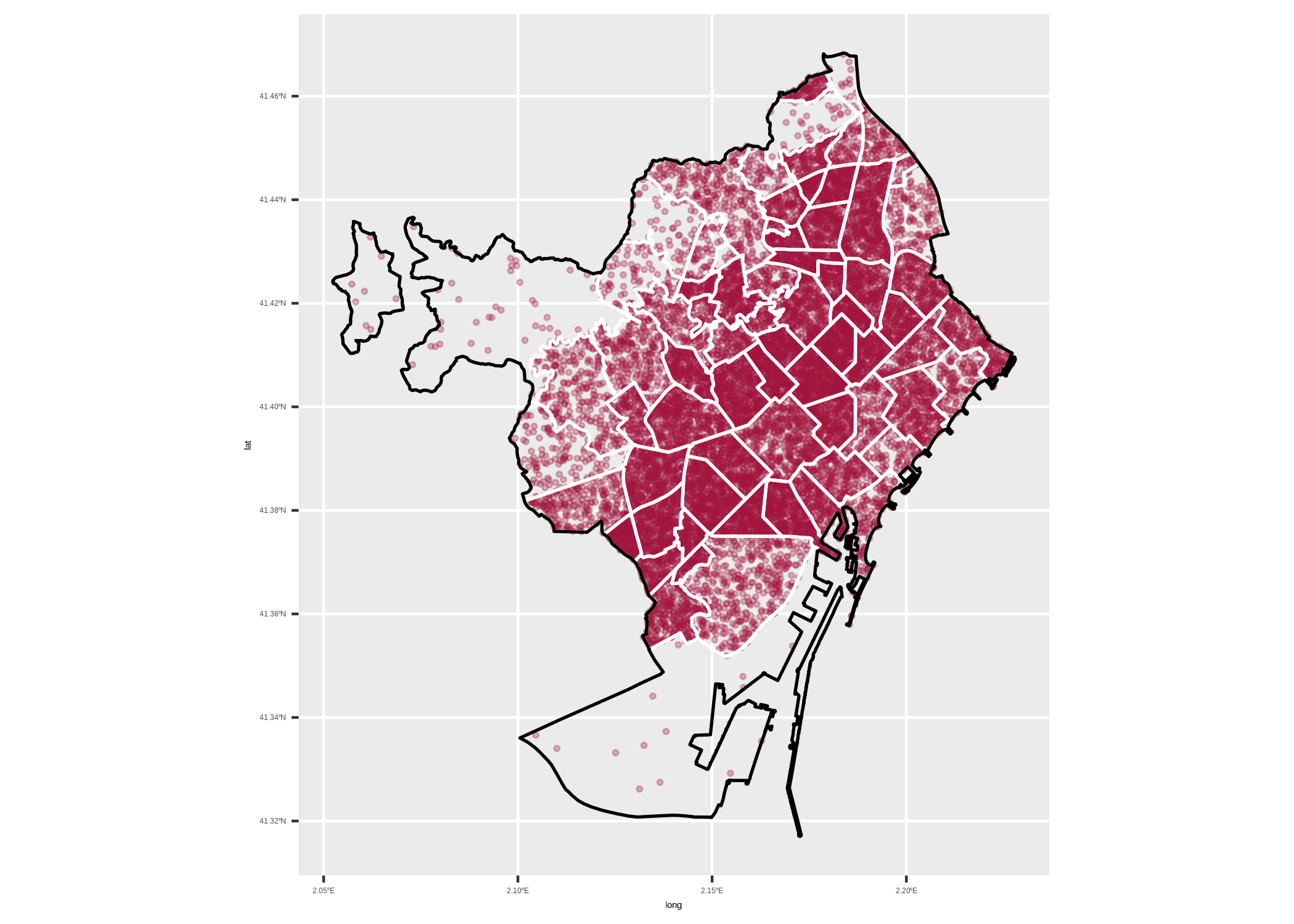
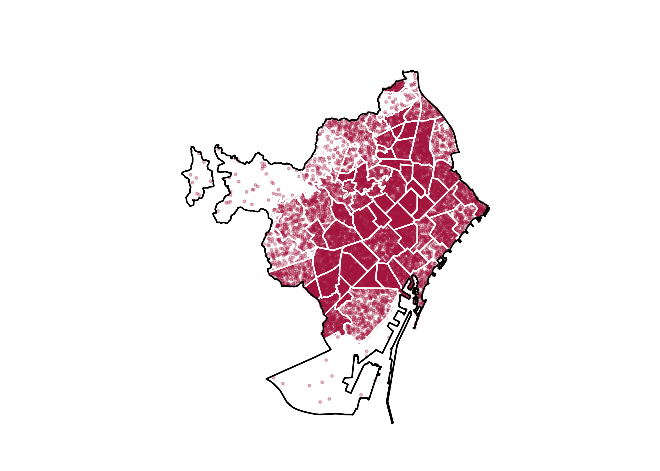
Improve theme and remove unused labels
Now we have our core of the chart, we can improve it:
- use the
theme_minimal() - remove most labels
ggplot(deu_dots) +
  geom_point(
    data = deu_dots, aes(x = long, y = lat),
    color = "#A0153E", size = .7, alpha = .3
  ) +
  geom_sf(
    data = barris, fill = "transparent",
    color = "white", linewidth = .6
  ) +
  labs(
    y = "",
    subtitle = "",
    x = "",
    title = "",
    caption = ""
  ) +
  theme_minimal() +
  geom_sf(data = perfil, fill = "transparent", color = "black", linewidth = 0.6) +
  theme(
    panel.grid = element_blank(),
    axis.text = element_blank(),
    plot.title = element_text(
      hjust = 0.5, family = "abril", size = 22,
      lineheight = 1.1,
      margin = margin(10, 0, 10, 0)
    ),
    plot.subtitle = element_text(
      hjust = 0.5,
      size = 12, color = "darkgrey"
    ),
    plot.caption = element_text(color = "grey", hjust = 0.7, size = 12)
  )
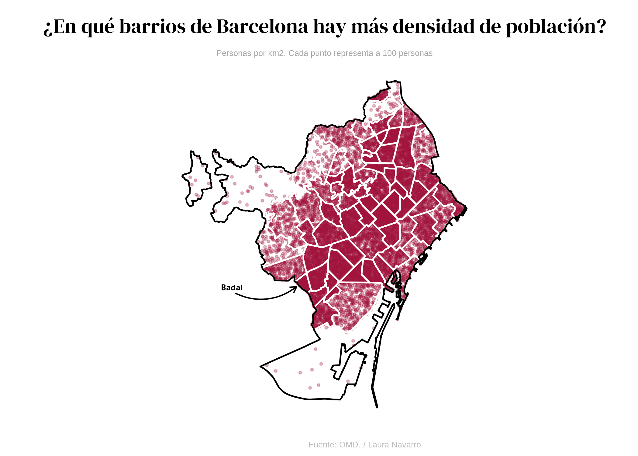
Final plot
Then we add the title, subtitle and an arrow to highlight
Badal with the annotate() function:
ggplot(deu_dots) +
  geom_point(
    data = deu_dots, aes(x = long, y = lat),
    color = "#A0153E", size = .7, alpha = .3
  ) +
  labs(
    y = "",
    subtitle = "",
    x = "",
    title = "",
    caption = ""
  ) +
  geom_sf(
    data = barris, fill = "transparent",
    color = "white", linewidth = .6
  ) +
  theme_minimal() +
  geom_sf(data = perfil, fill = "transparent", color = "black", linewidth = 0.6) +
  labs(
    fill = NULL, colour = NULL,
    title = "¿En qué barrios de Barcelona hay más densidad de población?",
    subtitle = "Personas por km2. Cada punto representa a 100 personas",
    caption = "Fuente: OMD. / Laura Navarro"
  ) +
  theme(
    panel.grid = element_blank(),
    axis.text = element_blank(),
    plot.title = element_text(
      hjust = 0.5, family = "abril", size = 50,
      lineheight = 1.1,
      margin = margin(10, 0, 10, 0)
    ),
    plot.subtitle = element_text(
      hjust = 0.5,
      size = 20, color = "darkgrey"
    ),
    plot.caption = element_text(color = "grey", hjust = 0.7, size = 20)
  ) +
  annotate("text",
    x = c(2.083), y = c(41.3728),
    label = c("Badal"), color = "black",
    size = 8, family = "tawa", hjust = 0.5, fontface = "bold"
  ) +
  annotate(
    geom = "curve", x = 2.085, y = 41.37, xend = 2.123, yend = 41.373,
    curvature = .3, arrow = arrow(length = unit(2, "mm"))
  )
Going further
You might be interested in:
- this beautiful choropleth map about Brazil
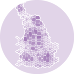
- how to create a dorling cartogram, a variation of the bubble map
- how to create a density map in the style of Jacques Bertin