Most basic pie chart with pie()
R natively offers the pie() function that builds pie charts. The input is just a numeric variable, each value providing the value of a group of the piechart.
Important note: pie chart are widely known as a bad way to visualize information. Check this post for reasons and alternatives.
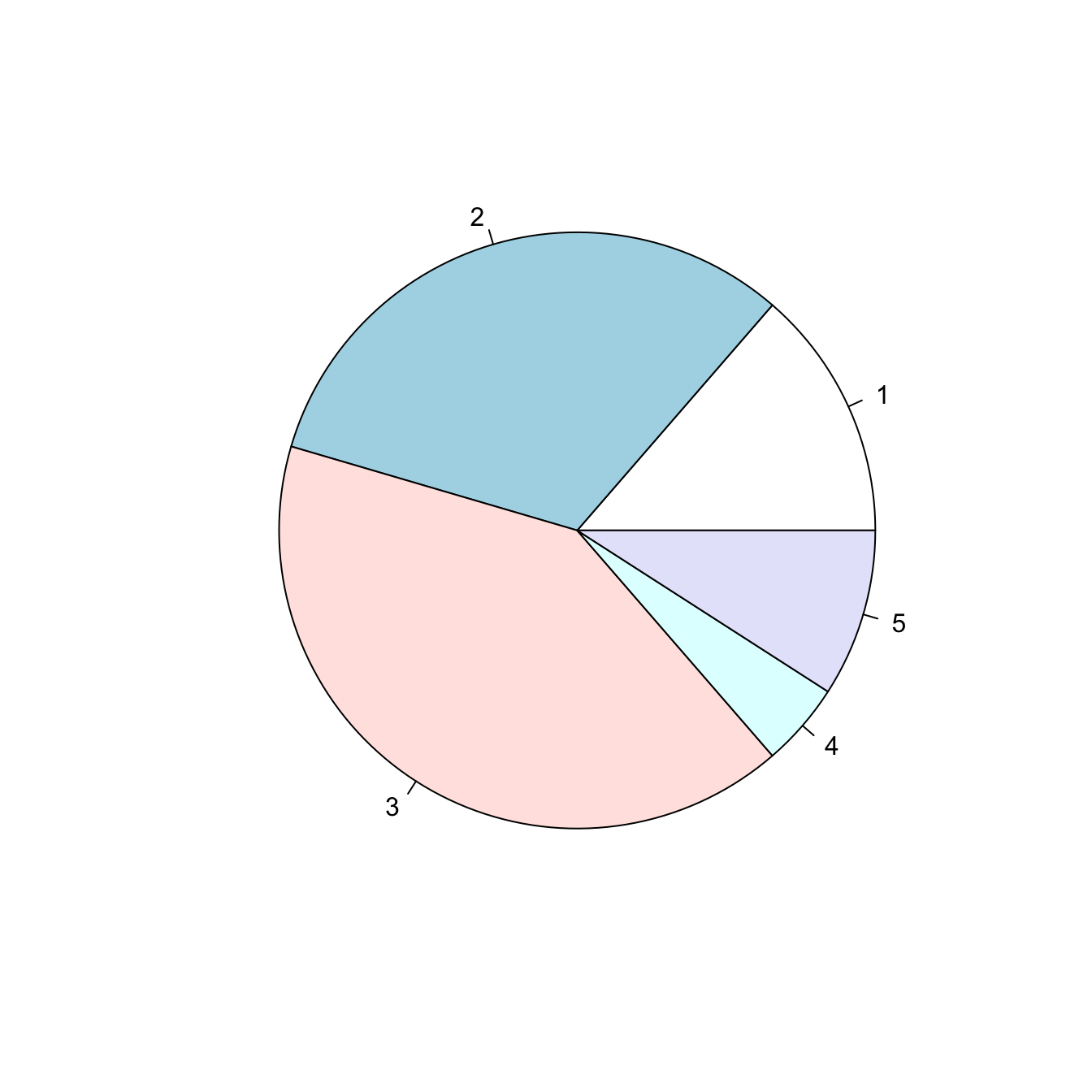
# Create Data
Prop <- c(3,7,9,1,2)

# Make the default Pie Plot
pie(Prop)
Change labels with labels
Provide a vector of labels to the labels argument to add names to piechart groups:
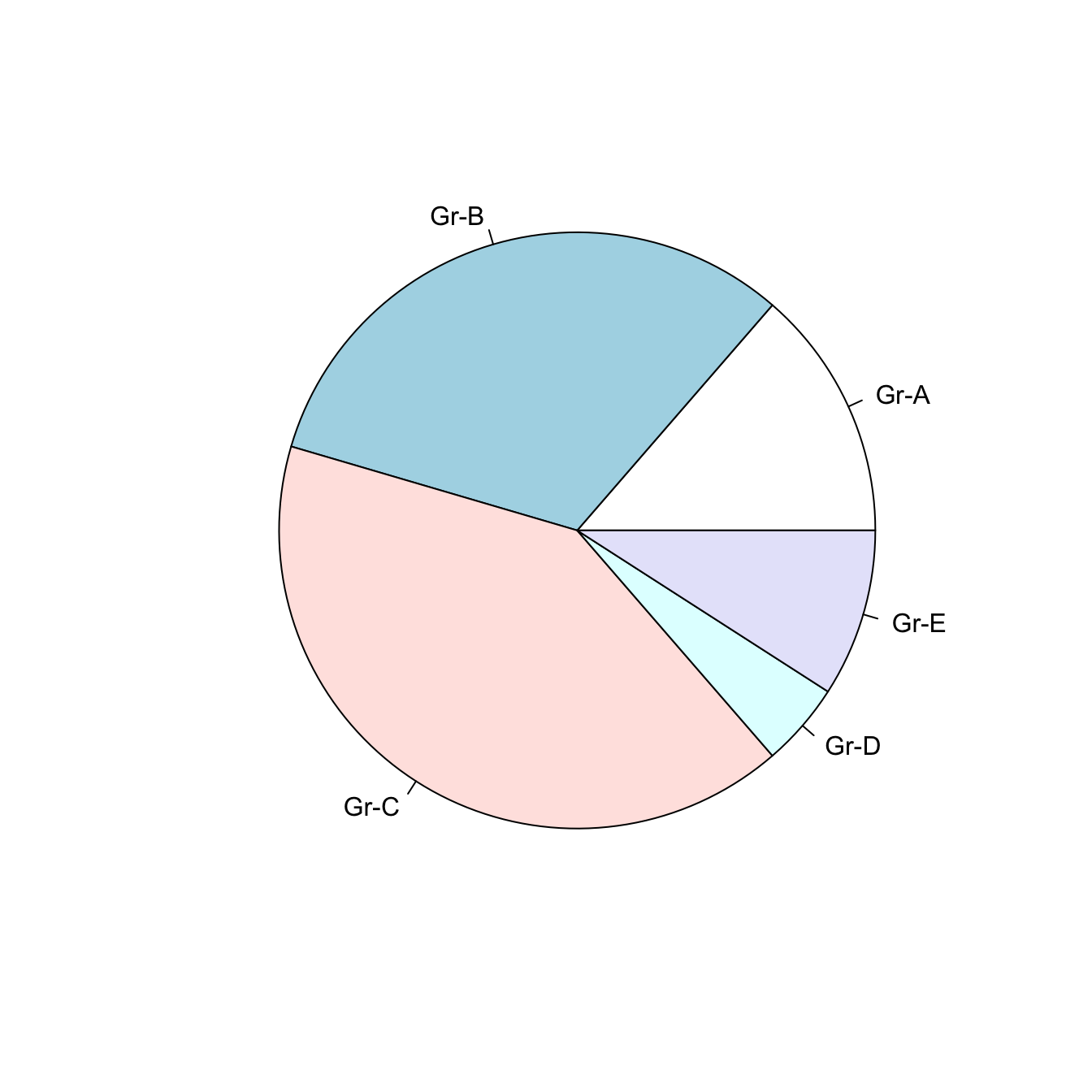
# You can also custom the labels:
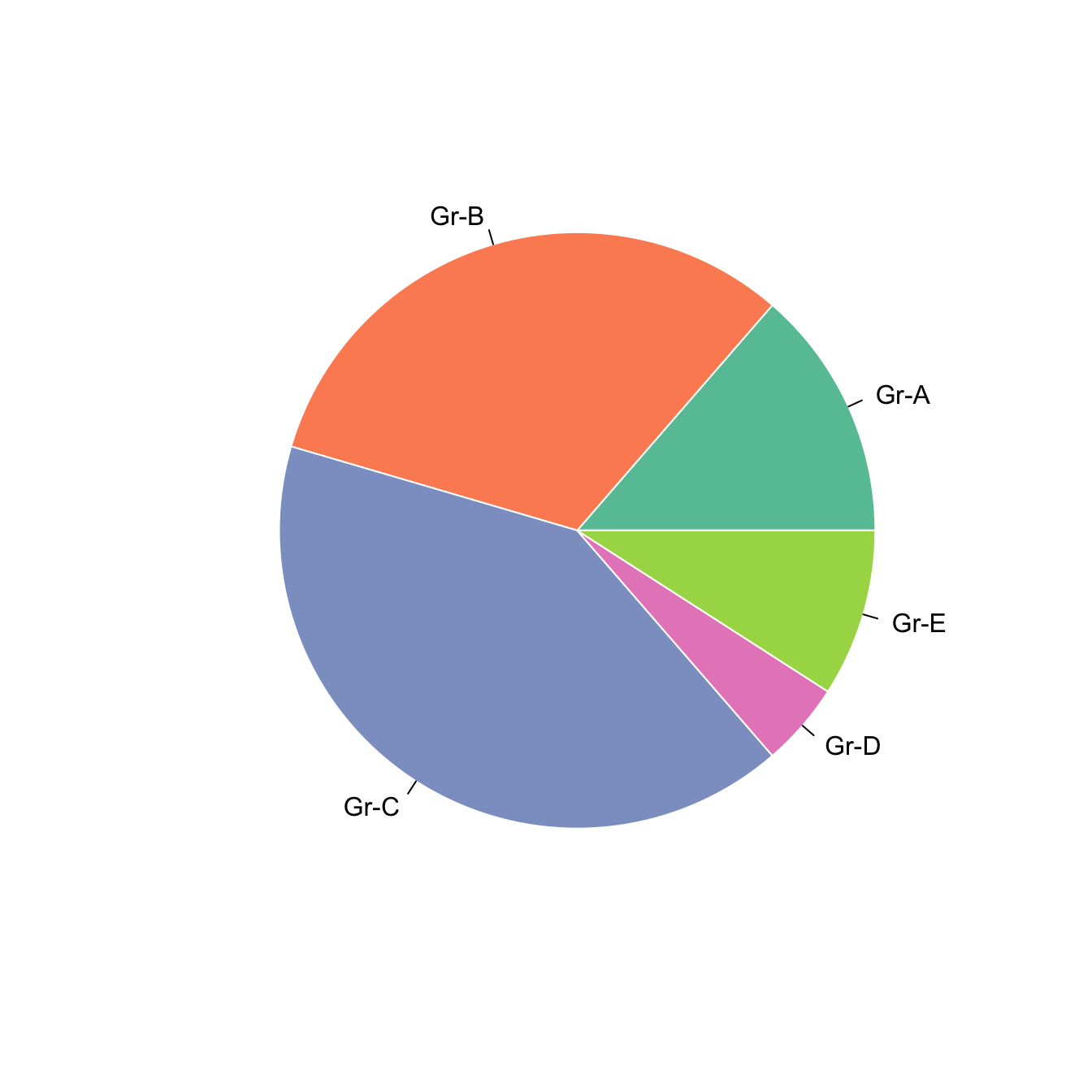
pie(Prop , labels = c("Gr-A","Gr-B","Gr-C","Gr-D","Gr-E"))Non-circular piechart with edges
Decrease the value of the edges argument to get angles around your piechart.
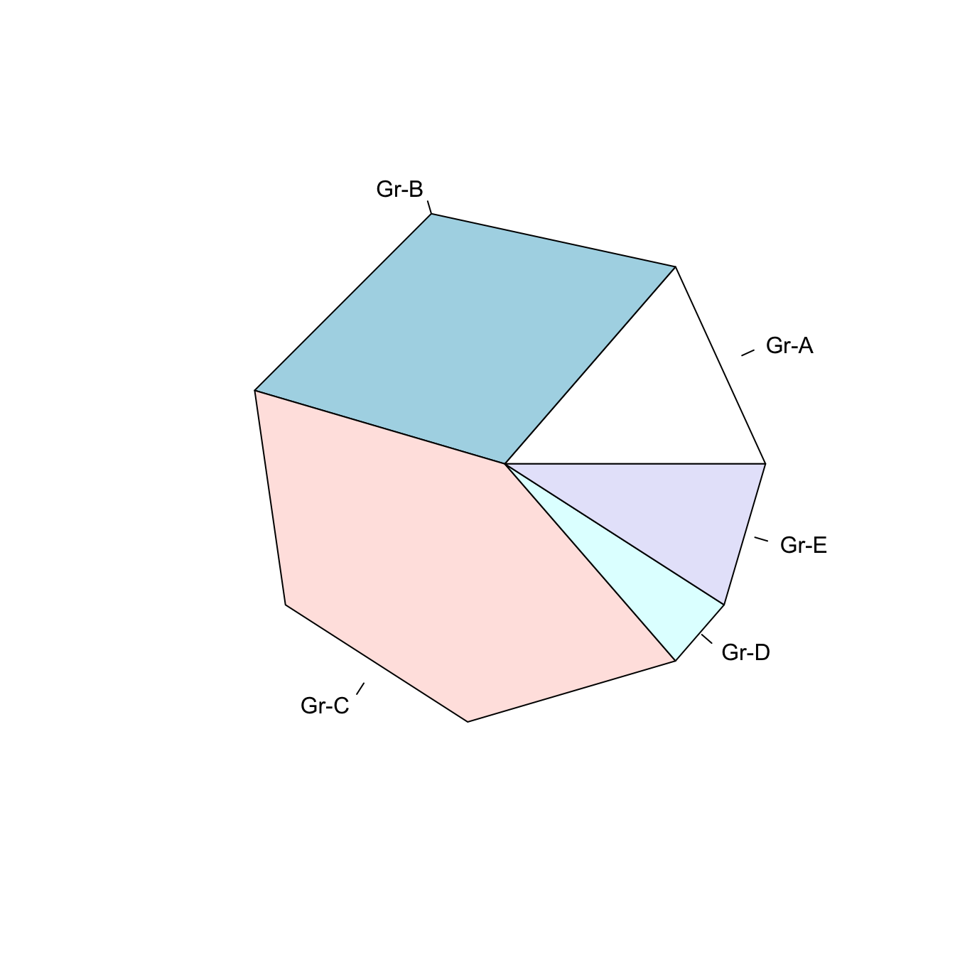
# If you give a low value to the "edge" argument, you go from something circular to a shape with edges
pie(Prop , labels = c("Gr-A","Gr-B","Gr-C","Gr-D","Gr-E") , edges=10)
Add stripes with density
The density arguments adds stripes.
You can control the angle of those stripes with angle.
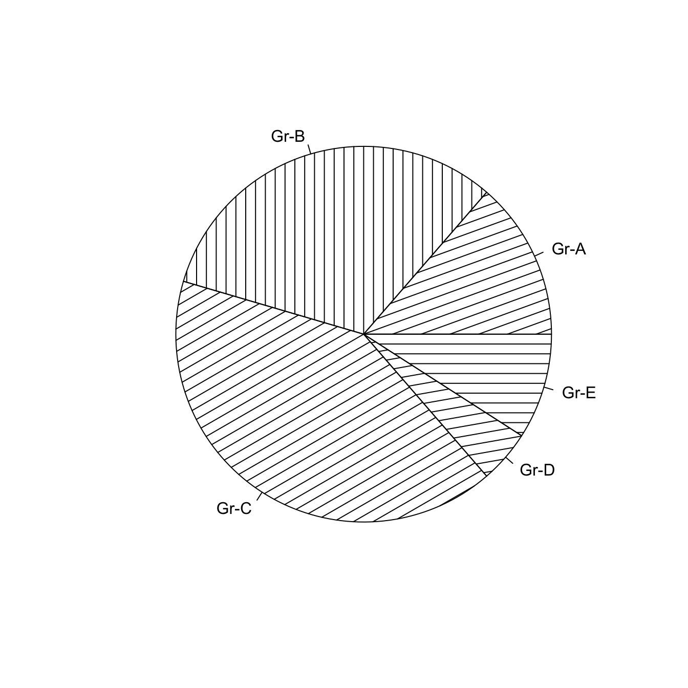
# The density arguments adds stripes. You can control the angle of this lines with "angle"
pie(Prop , labels = c("Gr-A","Gr-B","Gr-C","Gr-D","Gr-E") , density=10 , angle=c(20,90,30,10,0))
Color with col and border
Change group color with col, and border color with border.
Here, the RcolorBrewer package is used to build a nice color palette.
# Prepare a color palette. Here with R color brewer:
library(RColorBrewer)
myPalette <- brewer.pal(5, "Set2")

# You can change the border of each area with the classical parameters:
pie(Prop , labels = c("Gr-A","Gr-B","Gr-C","Gr-D","Gr-E"), border="white", col=myPalette )