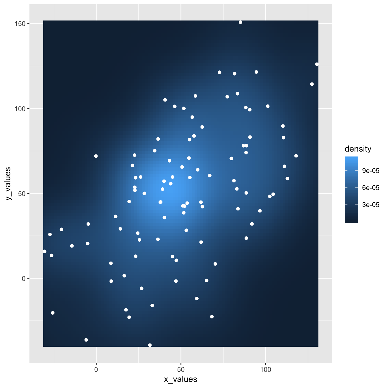
This plot extends the concepts described in the 2d density chart with ggplot2 document. It simply illustrates that a scatterplot can be added on top of the 2d density chart.
Thanks Christian Jacob for this submission.

# library
library(ggplot2)

# data
sample_data <- data.frame(x_values = 1:100 + rnorm(100,sd=20), y_values = 1:100 + rnorm(100,sd=27))

#plot
ggplot(sample_data, aes(x_values, y_values)) +
  stat_density2d(geom="tile", aes(fill = ..density..), contour = FALSE) +
  geom_point(colour = "white")


