Date format - falling in ♥ with lubridate.Building time series requires the time variable to be at the
dateformat. The first step of your analysis must be to double check that R read your data correctly, i.e. at thedateformat. This is possible thanks to thestr()function:Getting this
dateformat can be a pain, and thelubridatepackage is such a life saver. It offers several function which name are composed by 3 letters: year (y), month (m) and day (d). Example:

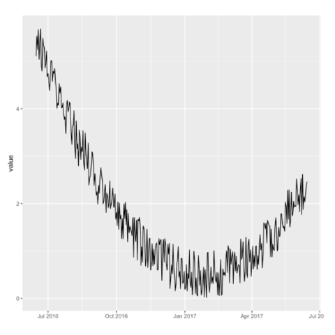
ggplot2ggplot2 offers great features when it comes to visualize time series. The date format will be recognized automatically, resulting in neat X axis labels. The scale_x_data() makes it a breeze to customize those labels. Last but not least, plotly can turn the resulting chart interactive in one more line of code.
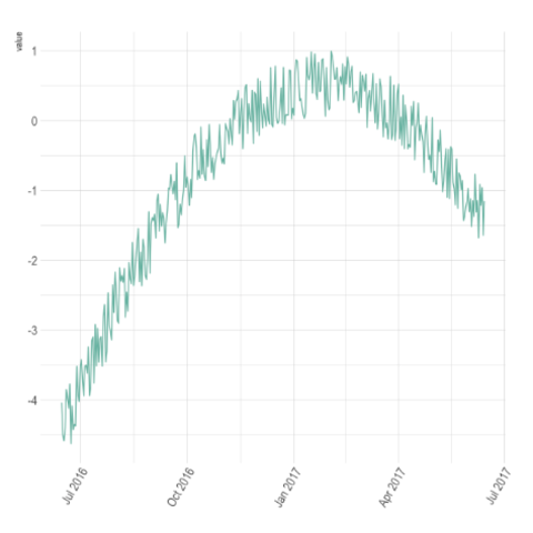
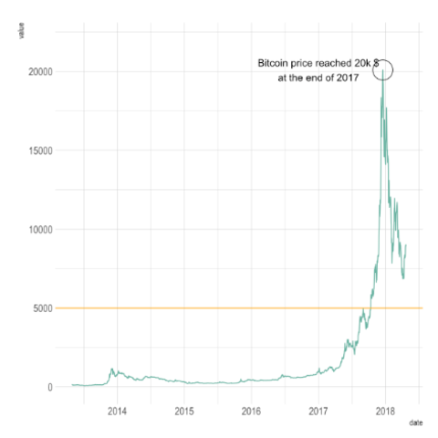
plotlyThe ggplotly() function of the plotly library makes it a breeze to build an interactive version. Try to hover circles to get a tooltip, or select an area of interest for zooming. Double click to reinitialize.
dygraphThe dygraphs package is a html widget. It allows to make interactive time series chart: you can zoom and hover data points to get additional information. Start by reading the chart #316 for quick introduction and input description. Then, the graph #317 gives an overview of the different types of charts that are offered. To go further, check the graph #318 (interactive version below).
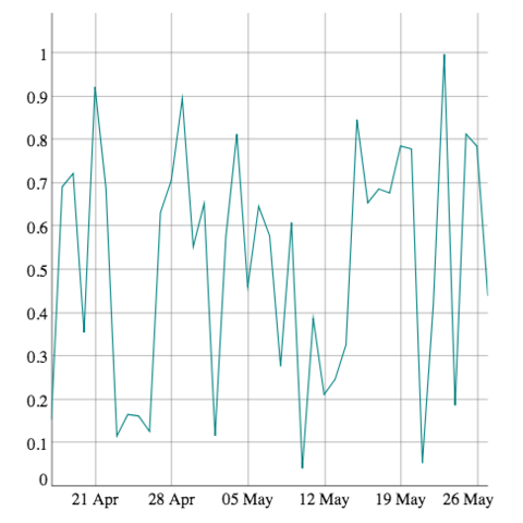
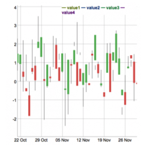
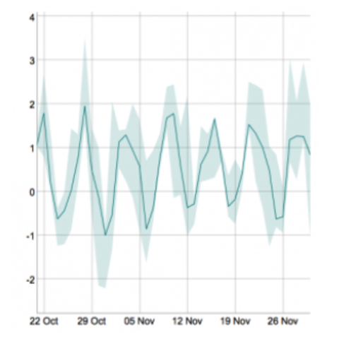
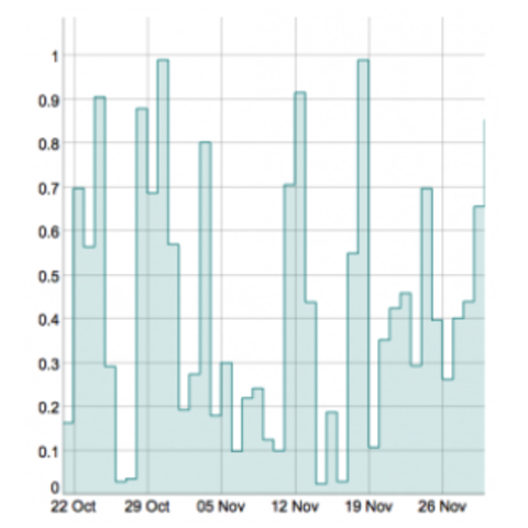
The dygraph package offers zooming, hovering, minimaps and much more. Try it on the example below!
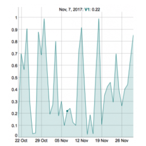
Heatmaps can be a very good alternative to visualize time series, especially when the time frame you study is repeating, like weeks. Here is a customized example, but visit the heatmap section for more.
Code Heatmap section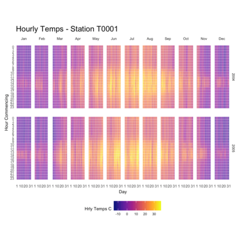
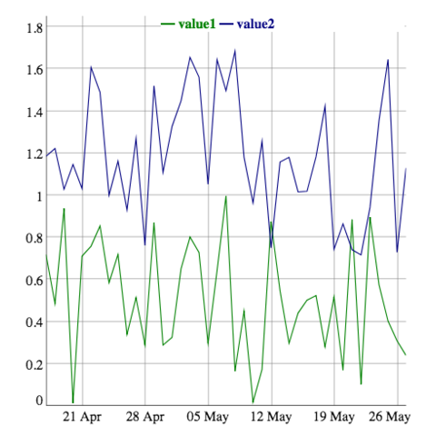
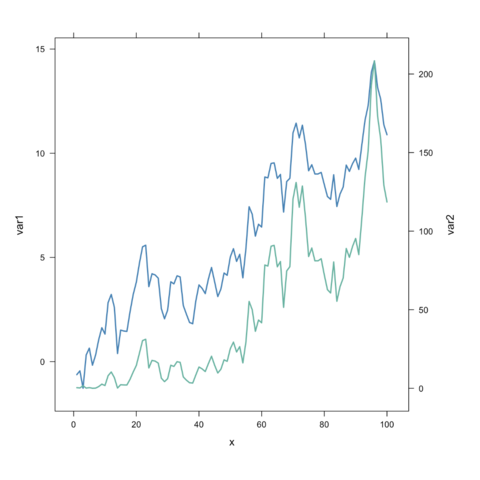
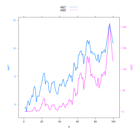
latticeExtraWarning: a dual Y axis line chart represents the evolution of 2 series, each plotted according to its own Y scale. This kind of chart must be avoided, since playing with Y axis limits can lead to completely different conclusions. Visit data-to-viz for more info.
Why you should avoid it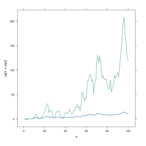
Related chart types