A CSS-only scrollable timeline, Part 2
Introduction
This article will focus on a few practical ways to improve the timeline we built in the first part of the article with a brand new "framework". We will use CSS3 extensively and improve cross-browser compatibility.
Contents:
- Building a timeline CV
- Time gaps and improved layout
- Structuring and styling the elements
- Eye candy
- Milestones introduced
- Dates and positioning
- BONUS - Porsche Timeline
- Summary
Building a timeline CV
A personal employment/experience timeline can be an extremely useful addition to an online portfolio or CV/résumé. Showing an employer what you have done in your academic/professional life through a nicely styled timeline allows you to get the information across clearly while also showing off your CSS creativity. Because of its horizontal left-to-right structure it feels more natural than dates and months in typical CVs (which are ordered chronologically or reverse-chronologically depending on where you are in the world).
We are going to use a completely new structure from the previous article to create a scrollable CV.
<div id="timeline">
  <div id="main">
    <div class="year">
      <h2>2003</h2>
    </div>
    <div class="year">
      <h2>2004</h2>
    </div>
    <div class="year">
      <h2>2005</h2>
    </div>
    <div class="year">
      <h2>2006</h2>
    </div>
    <div class="year">
      <h2>2007</h2>
    </div>
    <div class="year">
      <h2>2008</h2>
    </div>
    <div class="year">
      <h2>2009</h2>
    </div>
    <div class="year">
      <h2>2010</h2>
    </div>
  </div>
</div>
See the basic first iteration from which we start, it should look like Figure 1.
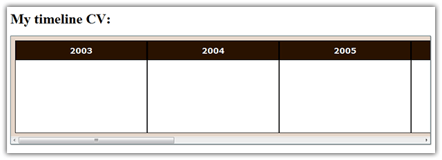
Figure 1: The basic timeline has almost no functionality now but is structurally sound.
Time gaps and improved layout
You might want to hide some spans of time in the timeline, because nothing interesting occurs in those periods. This is best done by leaving empty space between the years and putting an ellipsis denoting a purposeful omission of something.
In terms of the code this can easily be achieved with a single class. In this example we want to add a gap after the first and third columns, so we will style it like so:
.gap {
  display: block;
  margin-right: 22px;
}

.gap h2::after {
  content: "...";
  position: absolute;
  margin-left: 125px;
  color: #000;
}
We will also put horizontal zebra stripes on the timeline with a simple line of code using an advanced CSS3 selector:
.year:nth-child(even) {
  background: #f9f6f3;
}
To further style the timeline we will add visual hint for the beginning and the end with some rounded corners:
.year:first-child {
  -moz-border-radius: 30px 0 0 30px;
  border-radius: 30px 0 0 30px;
}

.year:last-child {
  -moz-border-radius: 0 30px 30px 0;
  border-radius: 0 30px 30px 0;
}

.year:first-child h2 {
  -moz-border-radius: 26px 0 0 0;
  border-radius: 29px 0 0 0;
}

.year:last-child h2 {
  -moz-border-radius: 0 26px 0 0;
  border-radius: 0 29px 0 0;
}
We are setting a different border radius for the inner heading to avoid the border-radius background bleed bug: this currently seems to be the only way of fixing it for all browsers.
Now the timeline has a neater look and feel. Test the second iteration live here or just have a look at it in Figure 2.
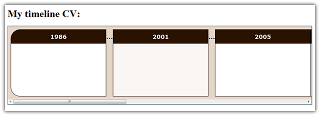
Figure 2: The gaps look natural and are easy to notice and understand.
Structuring and styling the elements
Below is some sample markup of a single entry in the timeline. The most substantial difference from the first article is the fact that now the containing div has the id, all the classes and the tabindex attribute. We do this because it will allow us to position the elements automatically according to the date (see the "Dates and Positioning" section.) Note that for our integration of the hCalendar microformat we are already adding vevent and summary classes.
<div id="school" class="education one-row vevent" tabindex="2">
  <p class="summary">
    Ohio High School
    <span>Studied business and economics</span>
  </p>
</div>
In this section we will improve on the styling of these entries in several ways so that when an element is hovered over or focused on it will stay on top of the other elements. In addition, everything has fancier styling making use of some modern CSS3 functions while becoming even more compatible with older browsers like IE7.
/*ELEMENTS*/
.year div {
  float: left;
  height: 0;
  width: 100%;
  position: relative;
}

.year div p, #legend div {
  margin: 0;
  position: relative;
  z-index: 1;
  text-align: center;
  cursor: default;
  border: 1px solid #402607;
  font: 18px Georgia, serif;
  padding: 2px;
  -moz-border-radius: 4px;
  border-radius: 4px;

  -webkit-box-shadow: 1px 1px 2px rgba(0,0,0,0.5),
  inset 0 10px rgba(255,255,255,0.2),
  inset 0 10px 10px rgba(255,255,255,0.25),
  inset 0 -3px 20px rgba(0,0,0,0.3);

  -moz-box-shadow: 1px 1px 2px rgba(0,0,0,0.5),
  inset 0 10px rgba(255,255,255,0.2),
  inset 0 10px 20px rgba(255,255,255,0.25),
  inset 0 -3px 30px rgba(0,0,0,0.3);

  box-shadow: 1px 1px 2px rgba(0,0,0,0.5),
  inset 0 10px rgba(255,255,255,0.2),
  inset 0 10px 10px rgba(255,255,255,0.25),
  inset 0 -3px 20px rgba(0,0,0,0.3);
}

.year div:hover, .year div:focus {
  z-index:2;
}

.education p, #legend .education {
  background: #fff5b7;
  color: #523100;
}

.work p, #legend .work {
  background:#deae2d;
  color:#000;
}
For more information on advanced effects with CSS3 shadows check out Beautiful UI styling with CSS3 text shadow, box shadow and border radius, by Jan Henrik Helmers.
Next we will define the length of the elements in percentages. As before, 100% width is one year no matter how many pixels wide the timeline is. The positioning of the elements no longer needs to be defined by hand as it will be done automatically with some input in the "Dates and Positioning" section. Below are just two examples.
/*INDIVIDUAL ELEMENTS*/
#school p {
  width: 88%;
}

#college p {
  width: 365%;
}
Now we set the height for the tips that expand below the elements in the timeline.
/*TIPS*/
.year div p span {
  position: relative;
  height: 0;
  opacity: 0;
  display: block;
  overflow: hidden;
}

.year div:hover p span, .year div:focus p span {
  opacity: 1;
}

.year div.one-row:hover p span, .year div.one-row:focus p span {
  height: 1.2em;
}

.year div.two-rows:hover p span, .year div.two-rows:focus p span {
  height: 2.4em;
}
Finally, we will define the row/level only on elements that will not lay on the first row, the class is added to the containing div, and the general style is simply this:
.level2 {
  top: 42px;
}

.level3 {
  top: 84px;
}
Test the third iteration live, or view it in Figure 3.
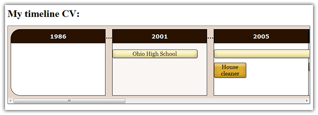
Figure 3: The timeline is filled with elements with different and advanced visuals.
Eye candy
Next I want to add a smooth transition to the timeline entries so that when they are hovered over, the box expands and after that we see a fade-in of the tooltip text. To achieve this I borrowed some techniques from CSS3 transitions and 2D transforms. Please read it if you need to catch up with the basics of 2D transforms and transitions.
We will use the shorthand transition property to set the elements' animations in such a way that on hover they will first expand to the desired size and then, after a very short delay, the tooltip's text will fade in. Since only the text has a variable opacity we will add a delay only to the opacity transition. The height transition will start immediately.
/*ANIMATIONS*/
.year div, .year div p, .year div p span {
  -webkit-transition: opacity .4s .25s, width .2s, z-index .2s, height .2s;
  -o-transition: opacity .4s .25s, width .2s, height .2s;
  -moz-transition: opacity .4s .25s, width .2s, height .2s;
  transition: opacity .4s .25s, width .2s, height .2s;
}
The z-index property in the webkit code seems to fix a bug with the expansion of tips.
We will also add a legend—this will add more clarity to the timeline. Here's the markup for it:
<div id="legend">
  Legend:
  <div class="work">Work experience</div>
  <div class="education">Education</div>
</div>
Then we style it a bit:
/*LEGEND*/
#legend {
  margin-top: 20px;
}

#legend div {
  display: inline;
  margin: 0 6px;
}
You can test the new animated example with a legend here or view it below.
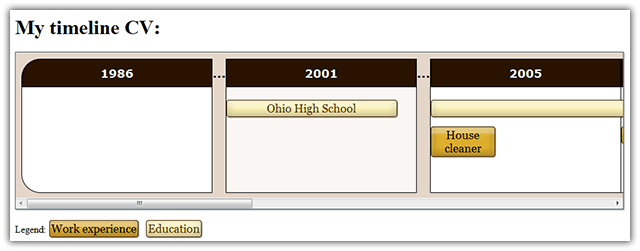
Figure 4: There is a legend added and some nice animations.
Milestones introduced
Timelines are not only about processes that take place within a specific period of time—there are also events that take place at a single specific point in time, which we call milestones. In this section we will add several milestones to the markup. Basically they are very similar to events, but with no duration and a start date only. In addition, they require a little more markup. They also have a distinctive color, a small rectangular size, and a symbol that gives a hint about the content of the milestone. This is what the HTML markup for a milestone looks like:
<div id="birth" class="milestone two-rows vevent" tabindex="1">
<p class="summary">
☺
<span>I was born</span>
</p>
</div>
And this is the CSS we will style it with:
.milestone p, #legend .milestone {
  background: #852525;
  color: #fff;
  width: 25px;
}

.milestone p:first-letter {
  font: 25px Georgia, serif;
}.milestone p:first-letter has been set to equal the width of .milestone p. This is done to create a stronger visual effect.The plan is to make a box wide enough only for one symbol (a list of unicode symbols is available at Wikipedia), which will denote a milestone. The information contained in the <span> will be available upon hovering over the element as with normal events.
To get this working, we need to define a width for each expanded milestone. Since the width depends only on the text we will define it manually in pixels.
#birth:hover p, #birth:focus p {
  width: 50px;
}
A few paragraphs ago we added a width property in the animation functions - this was to have a smooth animation for the horizontal expansion of the milestones only.
This step is now finished and you can play around with the timeline populated with milestones here.
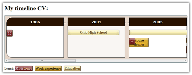
Figure 5: The milestones add color and much needed functionality.
Dates and positioning
We will now add exportable date information about all events and milestones as we did in part 1 of this article, only now we will use some advanced techniques to clean up the code and make it more semantic and logical.
Adding date information about a single entry is very simple. In the HTML code below we have added only two <abbr> elements—everything else is as it was before. For events without duration (milestones) we will need only the first <abbr> element with the dtstart class.
<div id="school" class="education one-row vevent" tabindex="2">
<abbr class="dtstart value" title="2001-08-06"> </abbr>
<p class="summary">
Ohio High School
<span>Studied business and economics</span>
</p>
<abbr class="dtend value" title="2005-07-02"> </abbr>
</div>Now comes the most interesting part! With the use of advanced attribute selectors, we will position each event and the corresponding dates to a predefined position, depending on the starting month of the event. Below is the code for just the first two months:
.dtstart[title*="-01-"], .dtstart[title*="-01-"]~p, .dtstart[title*="-01-"]~p~.dtend {
  margin-left: 4.2%;
}

.dtstart[title*="-02-"], .dtstart[title*="-02-"]~p, .dtstart[title*="-02-"]~p~.dtend {
margin-left: 12.5%;
}
Then we will style the dates. Everything here is pretty straightforward except for the part where we transform the title of an element into visible text using generated content. Read Divya Manian's CSS generated content techniques article for more insight into the matter.
/*DATES*/
.dtstart::after, .dtend::after {
  font: bold 10px Verdana, sans-serif;
  color: #000;
  background: rgba(255,255,255,0.7);
  margin: 0;
  padding: 0;
  z-index: 1;
  white-space: nowrap;
  position: relative;
  overflow: hidden;
  border: 1px solid #888;
  -moz-border-radius: 2px;
  border-radius: 2px;
  height: 1.2em;
  width: 30px;
  opacity: 0;
}

.dtstart, .dtend {
  border-bottom: 0;
  position: absolute;
  height: 0;
  margin: 0;
  padding: 0;
}

.dtend {
  margin-top: -1.4em;
}

.vevent:hover .dtend, .vevent:focus .dtend {
  position: absolute;
  height: 0;
  margin: 0;
  padding: 0;
  margin-top: 0;
}

.year .dtstart::after {
  position: absolute;
  top: -1.4em;
}

.year .dtend::after {
  position: absolute;
  bottom: -1.4em;
}
With the code above in place, the start and end times of events and the start date of milestones appear smoothly when hovering over or focusing on the entries. We can do even more by adding content depending on the type of entry we have, which we will insert using CSS to avoid any duplication of data resulting in more code.
.education:hover .dtstart::after, .education:focus .dtstart::after {
  content: "Studied from "attr(title);
  opacity: 1;
  width: auto;
}

.work:hover .dtstart::after, .work:focus .dtstart::after {
  content: "Worked from "attr(title);
  opacity: 1;
  width: auto;
}

.milestone:hover .dtstart::after, .milestone:focus .dtstart::after {
  content: "Event occured on "attr(title);
  opacity: 1;
  width: auto;
}

.year div:hover .dtend::after, .year div:focus .dtend::after {
  content: "to "attr(title);
  opacity: 1;
  width: auto;
}
In the actual example that follows all this content is duplicated almost identically because IE8 doesn't understand the two semicolons for pseudo-elements and needs only one semicolon.
Lastly, we will add the magical link at the bottom that exports the hCalendar information that we have.
Our CV timeline is now complete! Test the FINAL version live, or see what it looks like in Figure 6.
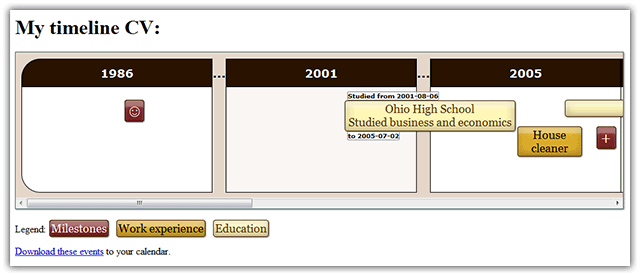
Figure 6: The finished product now looks better than ever with the milestones and the dates as additional information.
BONUS - Porsche Timeline
Provided below is a very brief section covering how to create another timeline. Its purpose is to showcase what can be achieved with this method when mixed with other techniques.
The timeline we are going to create lists several Porsche car models by their years of manufacture and also provides a picture for every model. I have used Porsche information from Wikipedia to populate the example.
The image of each car model will be absolutely positioned in the upper right corner of the timeline, the font is a custom one, you can download the custom font from designgraphics.com. If you need EOT fonts (for IE support) you can use the ttf2eot tool for converting TTF fonts to EOT. Another new thing is having a fixed first column that divides the car models into three classes — be aware that they are not really accurate, but are good enough for the purposes of the showcase. Finally, we will add an element in the last cell of the timeline table with zero width and zero height but with an picture of Ferdinand Porsche for an image — this picture will be shown if the upper half of the timeline is hovered. Give the final Porsche timeline a try, and see it in action in Figure 6.
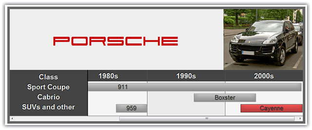
Figure 6: The end demo with a lot of styling and some CSS3 functions and properties implemented.
Summary
The timeline CV offers great flexibility and can be adapted to match any visual style of any website. In addition, its basic functionality is supported in all modern browsers plus Internet Explorer 7 and 8 (IE7 doesn't show the dates).
We have completed the final Porsche timeline in just 150 lines of code. The approach we have used here can be used not only for a timeline with pictures but a creatively styled fully-functional gallery. Feel free to experiment with and modify the code of any of the examples above for your particular needs.
This article is licensed under a Creative Commons Attribution 3.0 Unported license.
Comments
The forum archive of this article is still available on My Opera.
No new comments accepted.