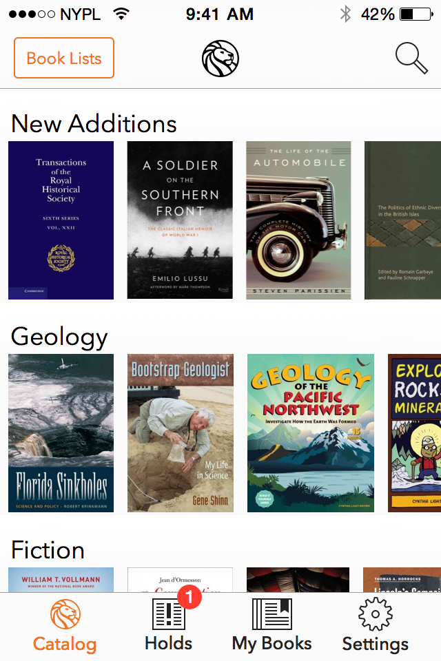
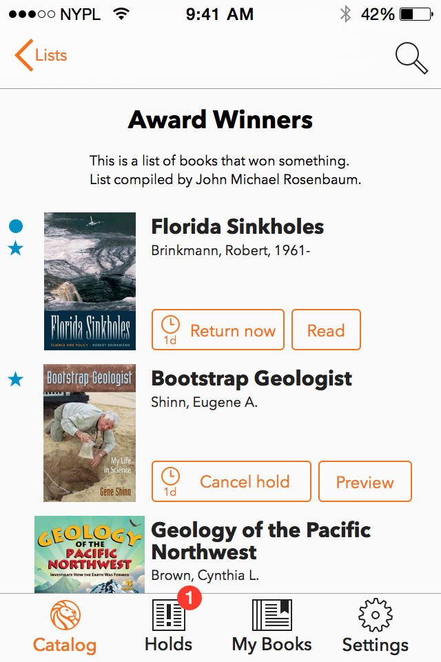
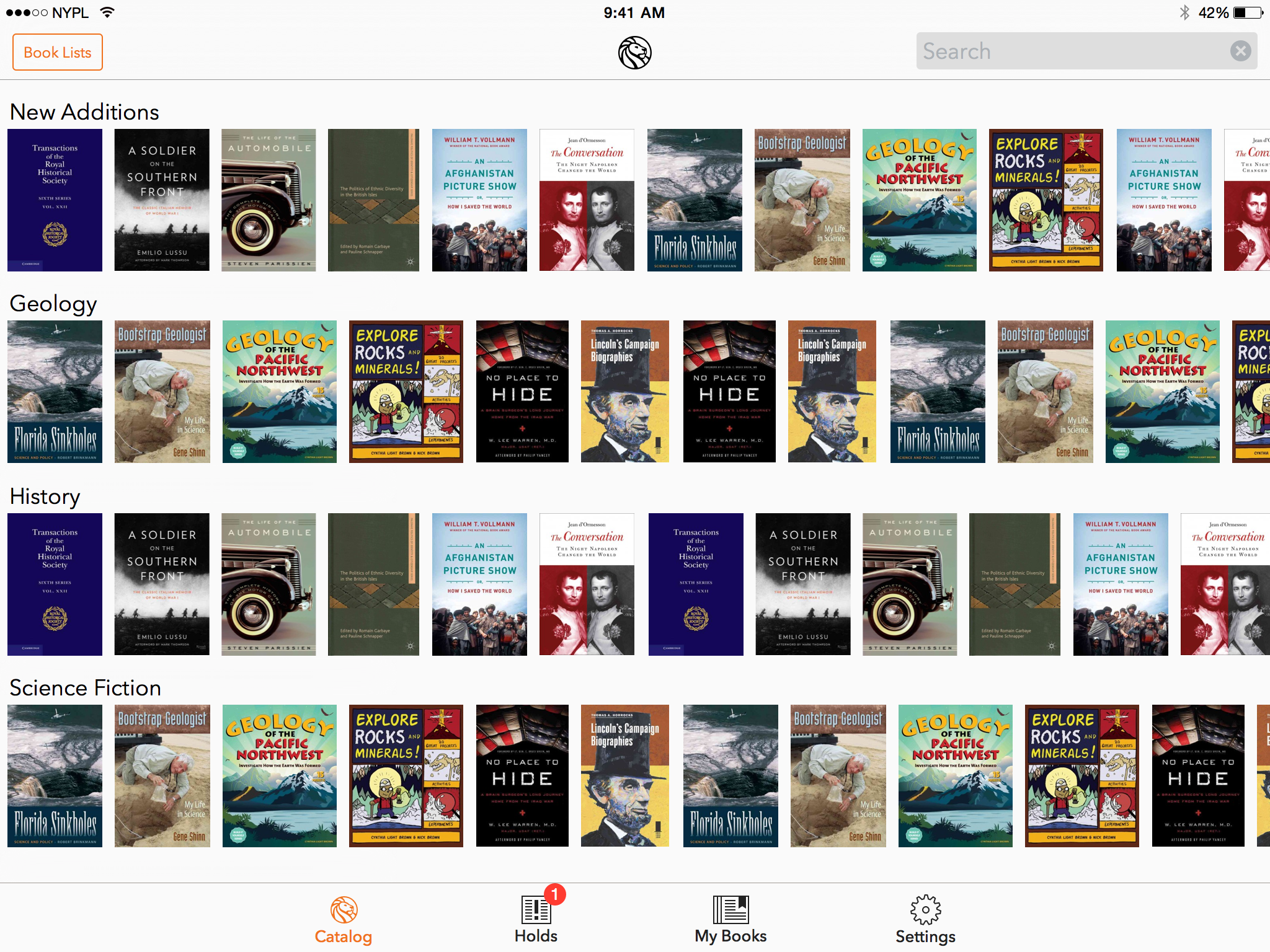
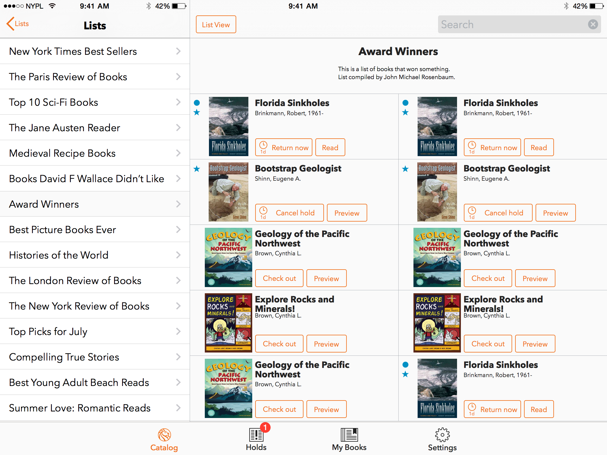
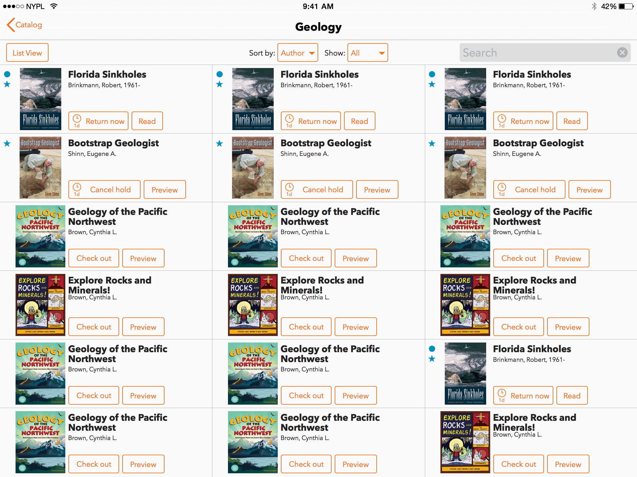
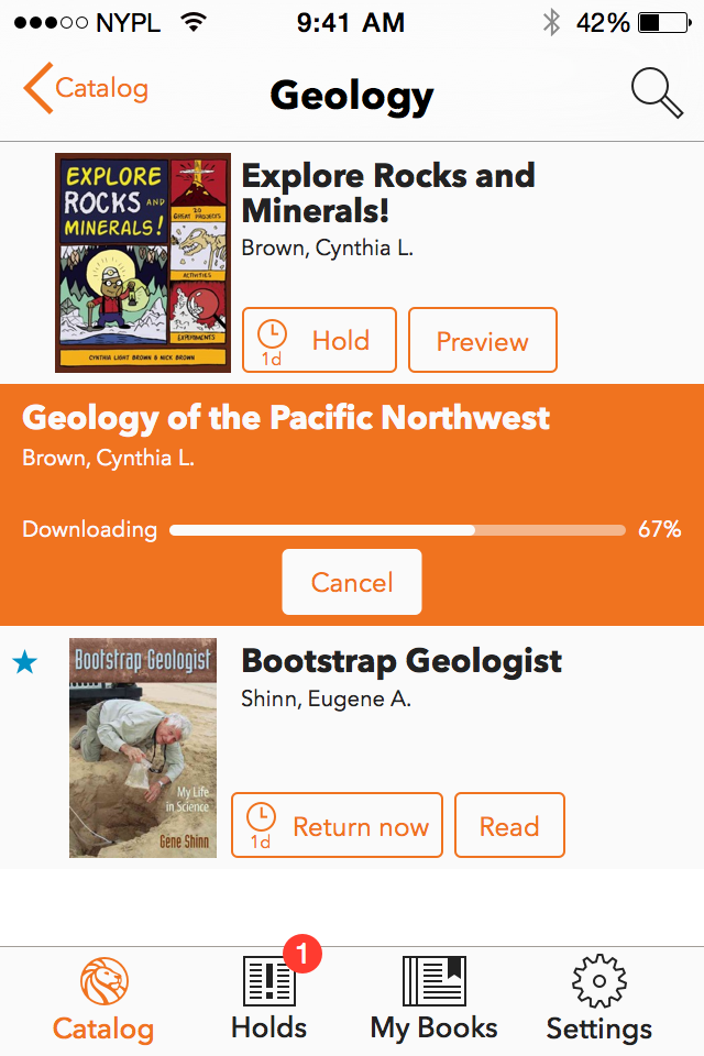
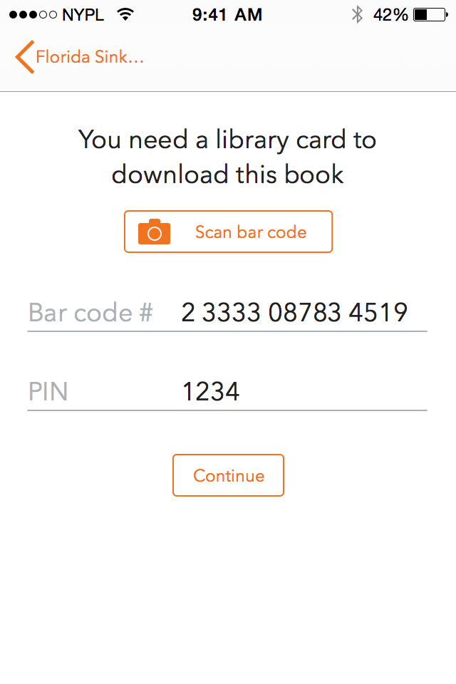
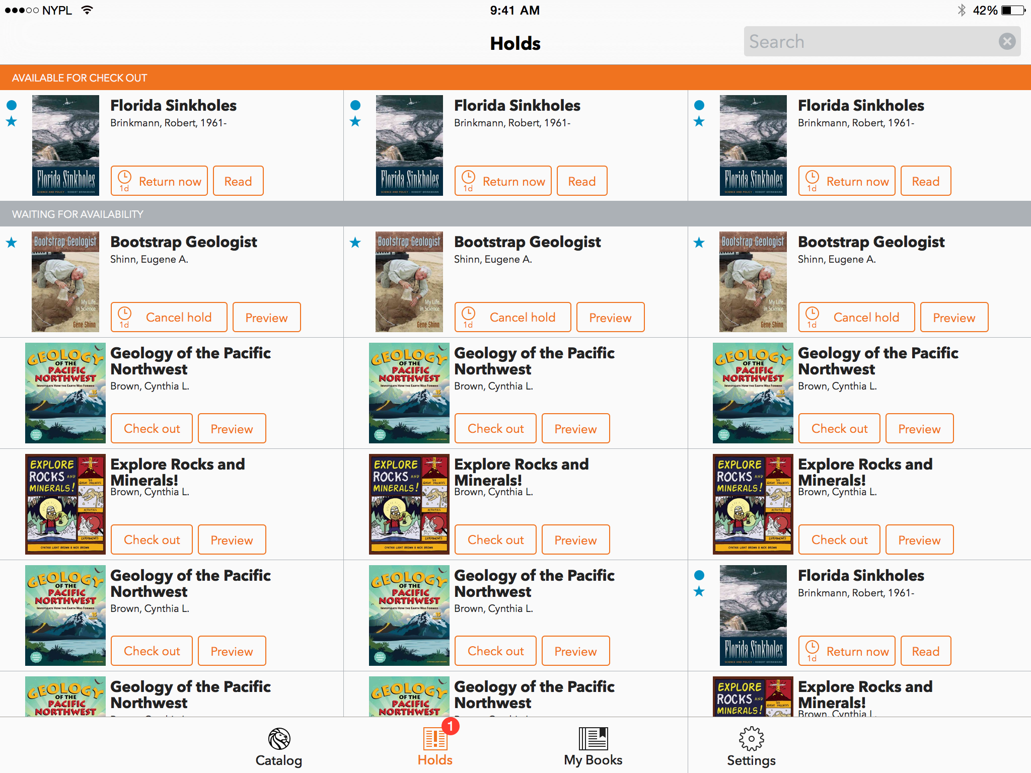
Simple un-pretentious design
The SimplyE application is designed to organize the tasks required to find, borrow and read and eBook from the library. In doing so the interface had to be utilitarian in design while preserving the visual appeal expected of a quality mobile applications. For library lending, there is less need for supperficial interaction and display in order to sell the user on the content. The content itself is the product so that the application should fall away in order to showcase the collection and curatorial strength of the library.
The mobile app interface aims to get out of the way and let readers easily find, borrow and read the books they want.
Maurico Giraldo
Prototype User Interaction
Find a Book: Discovery
The process of finding something to read is typically framed as a process of
- Recommendation
- Browse
- Search
The process of discovery we believe always starts with recommendation. Whether a user comes to the library to search for a specific title or author, the intent is informed by some prior recommendation or suggestion regarding the work, or author. The less informed method of discovery can be guided by expert recommendation of a librarian or the user’s awareness of their book preferences through browse paths to collections of books. When users come to the library, they have ready access to librarians to assist them in their discovery. This expert extracts information from the user and guides the user to content in which they can browse collections or directs them to the particular title they are looking for. In commercial bookstores or online books stores, self-guided browsing experiences are facilitated by highly curated collections and navigation schemes and queues based on genre, appeal and popularity.
Smart Phone
Tablet
Borrow
The process of borrowing a book from the library "digitally" is cumbersome. However, buying a book commercially is simple from a user perspective. This stems from online book stores having an unlimited supply. Libraries have forced scarcity and must elegantly deal with this issue. To reduce the complexity, we remove the choices from this transaction stream. First, we standardize packaging (EPUB3) and remove alternate digital format decisions. Second, automatically eliminate transaction options if they are irrelevant and only present options and information needed. Third, allow users to "shop" before executing a check requirement (e.g. entering their library card if or signing in.)
Smart Phone
Tablet
Read
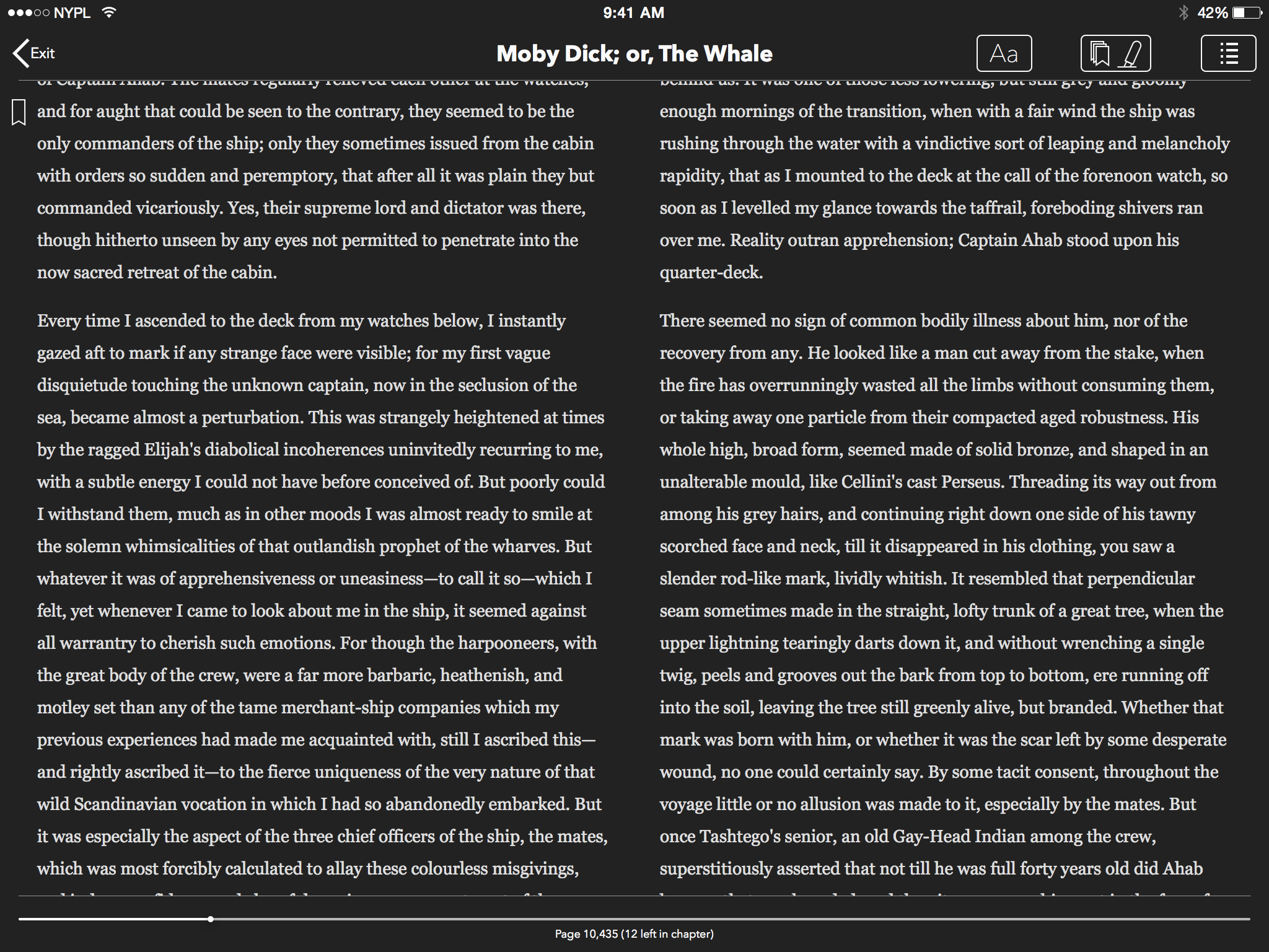
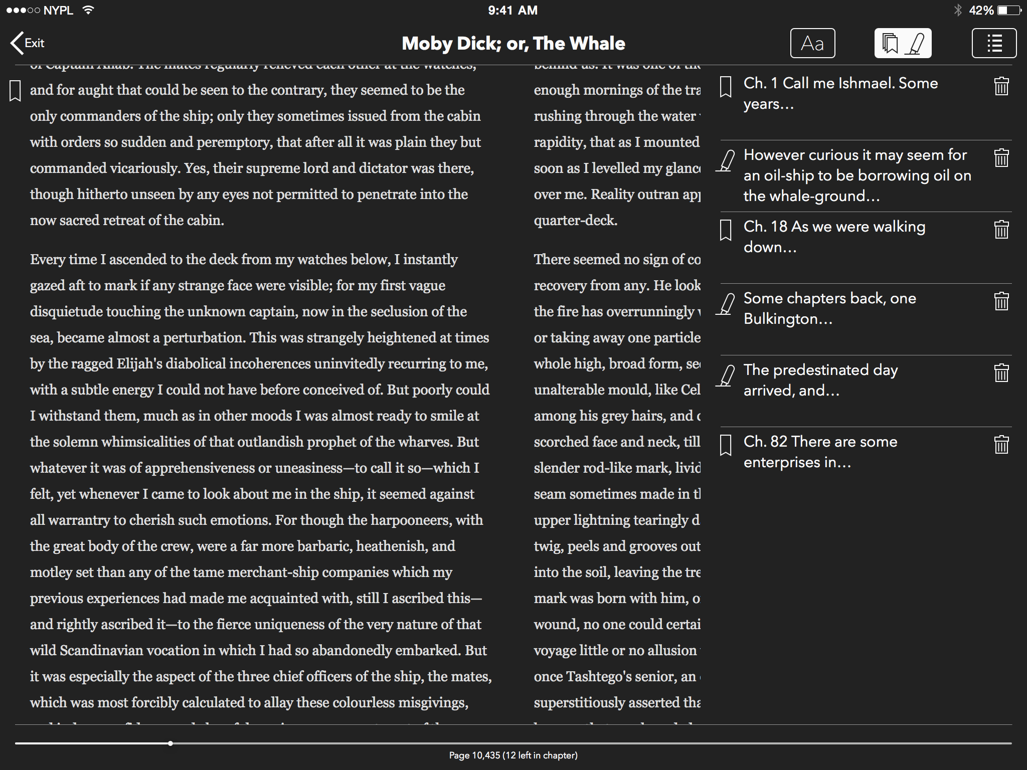
The reading of experience for libraries in regards to eBooks is not unlike that of commercial applications. However, we believe that pure consumption of the content over the user's interaction with the content should be better facilitated. This requires adoption of EPUB3. The EPUB3 format requires additional media types beyond text to be exposed to the readers such as audio, video, and Math ML to be displayed. Additionally, users may want to comment or highlight and annotate content they are researching, referencing or sharing with others. Social features are important for building readers communities and recommending content.
Smart Phone
Tablet
SimplyE iOS implementation version 1.0
For NYPL, SimplyE was styled to relfect its standard color pallet and incorporate its library icon. The application also took advantage of two optional features for Card Applications and HelpStack integration with Desk.com ticket management for in app help with AskNYPL.
-
 Browse
Browse
Browse
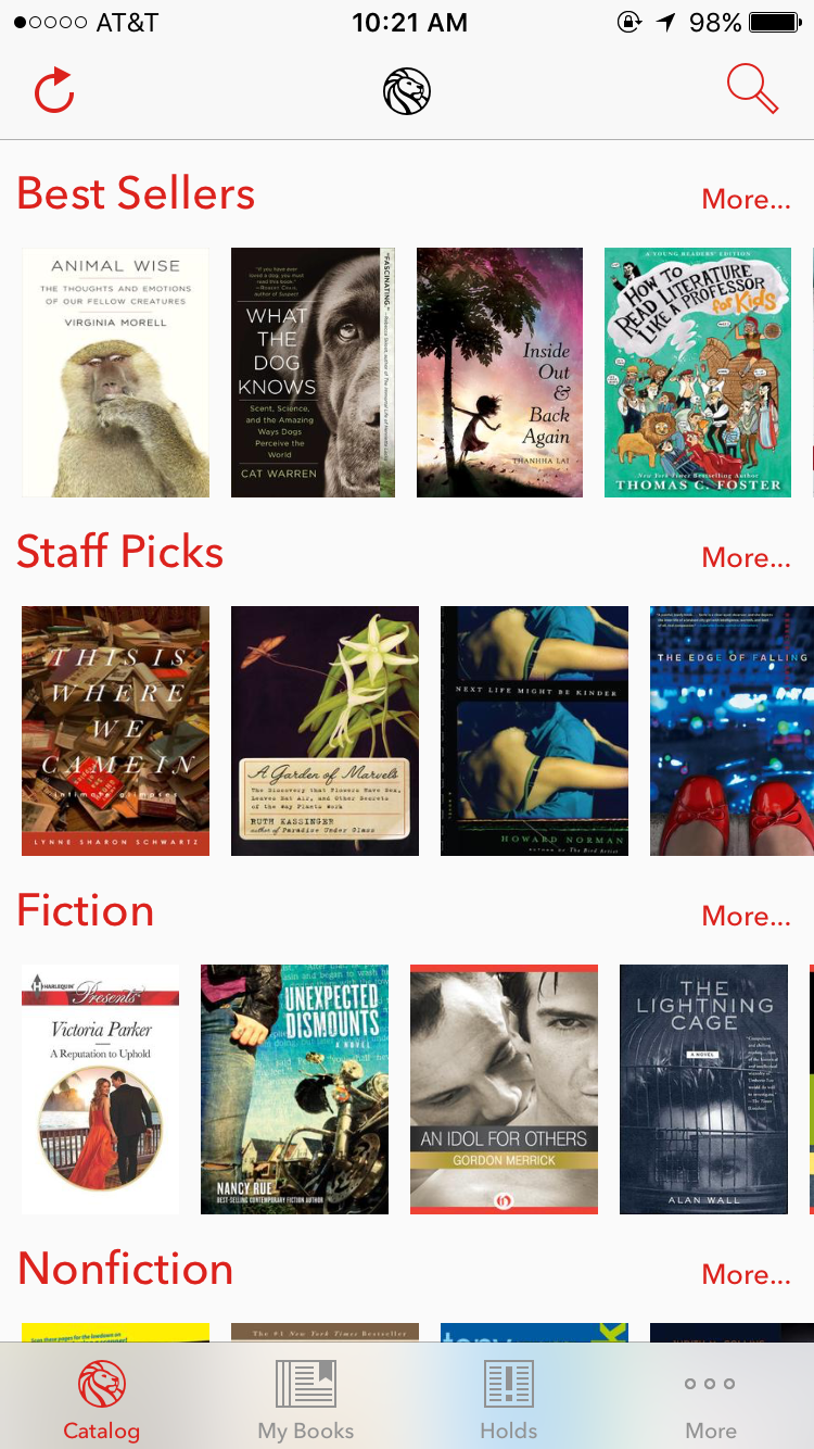
Browse the Catalog
- Swipe left and right on the NetFlix style lanes to see popular and available titles
- Swipe up and down to view more catagories
- Tap the category heading or More... to see more books in the category
- Tap the refresh in the upper left to update the view of titles
-
 Browse
Browse
Browse
Browse the Catalog: Best Sellers
- Swipe up and down to scroll through the list of best sellers available at the library
- Tap the cover to read more about the book
-
 Search
Search
Search
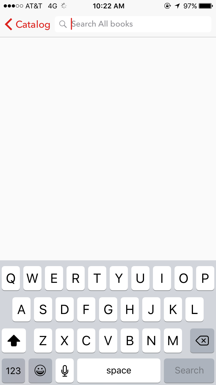
Search the Catalog
- Tap the the search icon in the upper right to search for a particular title.
- Type in title in the search bar or the author's name.
NOTE: The search is global if searching from the catalog.
-
 Borrow
Borrow
Borrow
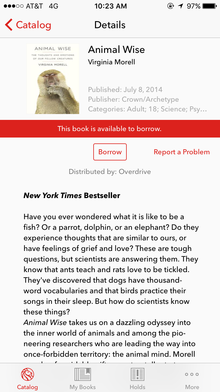
Borrow
- When you find a book you want to read tap the Get or Borrow button.
NOTE: If the book is not a available the a Hold button will be avialable If a book is already borrowed or is unlicensed (Public Domain or Open Acces) a Download button will be displayed.
-
 Borrow
Borrow
Borrow
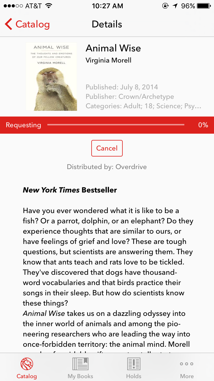
Borrow
- Tap Cancel to cancel download if desired
-
 Read
Read
Read
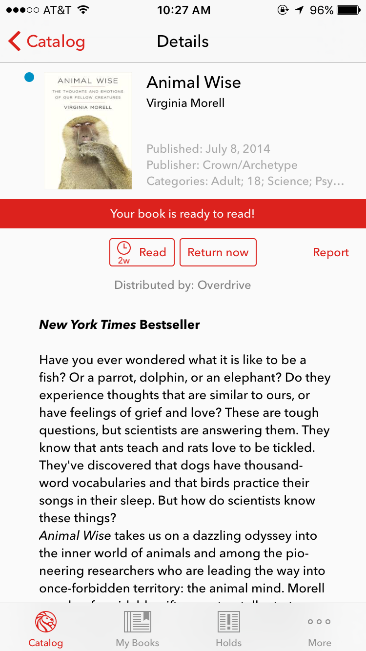
Read
Read
- Tap Read to open books
- Tap Return Now to end loan if desired
NOTE: A blue dot will display next to cover if it has yet to be opened.
-
 Read
Read
Read
Read
Read
- Swipe left or right to advance page by page through the book OR
- Tap left for right edge of the book to move throught the book
-
 Read
Read
Read
Read
Read
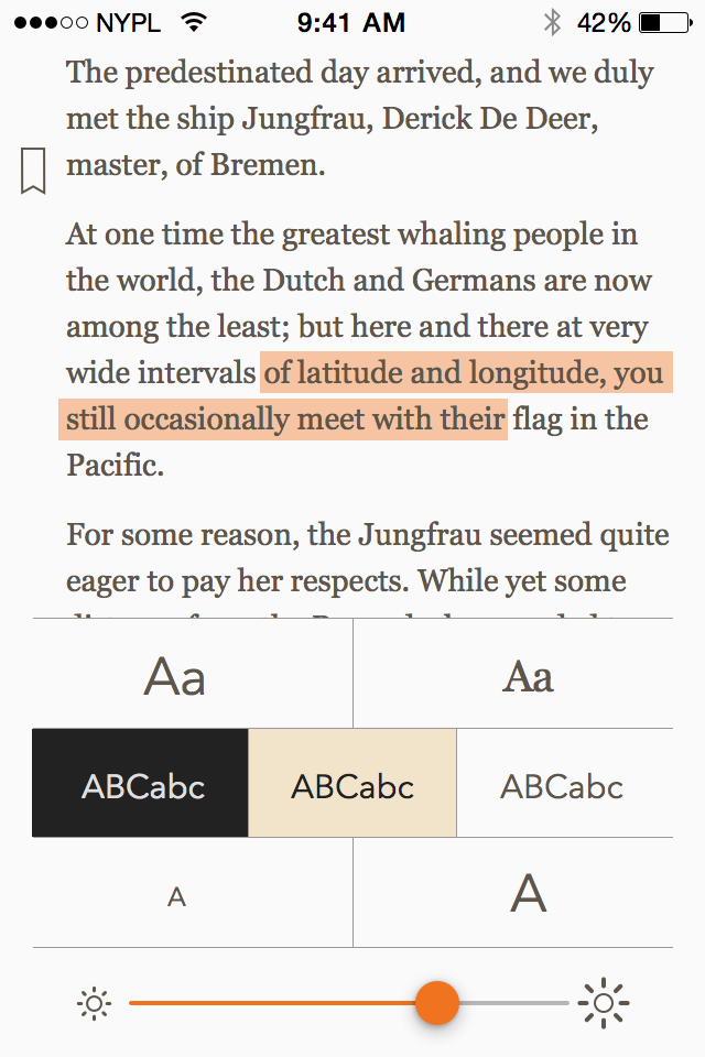
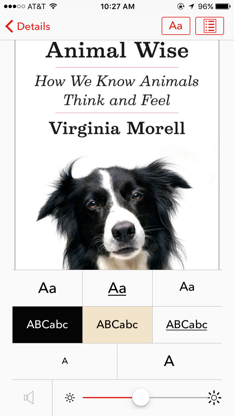
- Tap screen to display Menu Bar
- Tap Font Icon to adjust text font, size, and contrast and display brightness
-
 Read
Read
Read
Read
Read
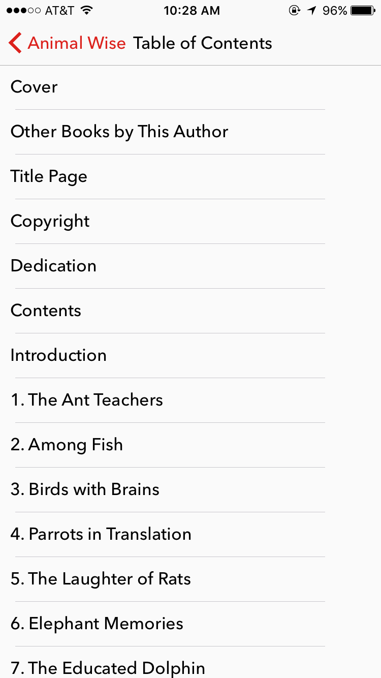
- Tap screen to display Menu
- Tap TOC Icon to acces the Table of Contents
- Tap TOC section desired to naviage to the desired location
-
 Borrow
Borrow
Borrow
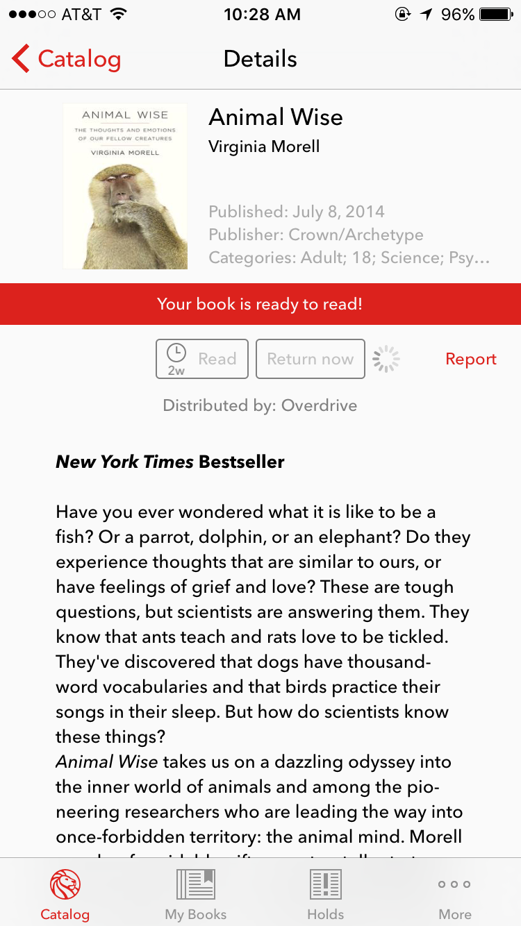
Return Book
-
 Borrow
Borrow
Borrow
Tap Cancel to stop download if needed
-
 Log In/Out
Log In/Out
Log In/Out
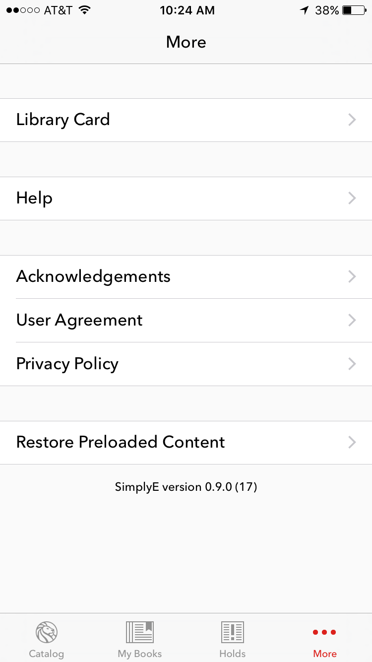
- From the More Tab
- Tap Library Card
-
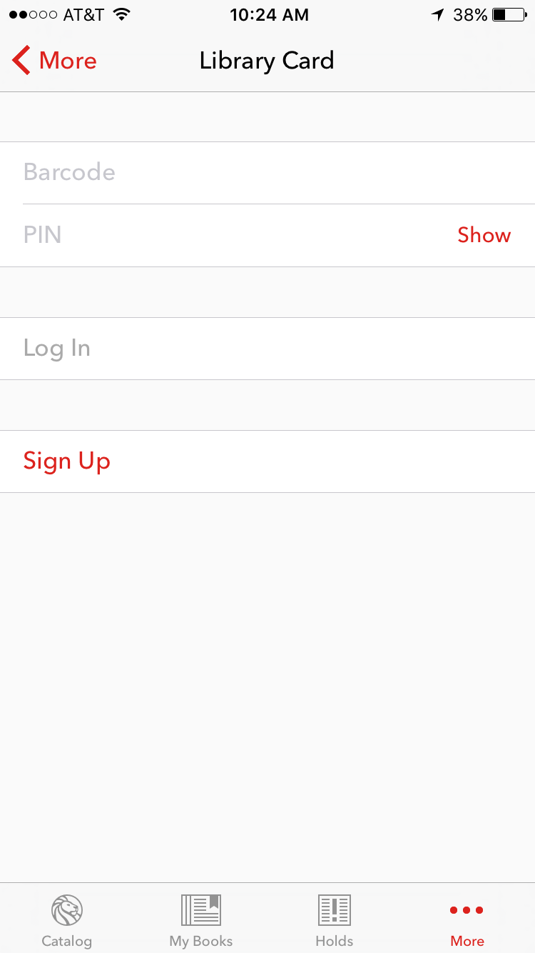 Log In/Out
Log In/Out
Log In/Out
- Tap into the respective feild and the touch keyboard will display
-
 Log In/Out
Log In/Out
Log In/Out
- Enter your Barcode and PIN into the respective feilds
- Tap Log In to verify and sign in or Log Out to sign out.
-
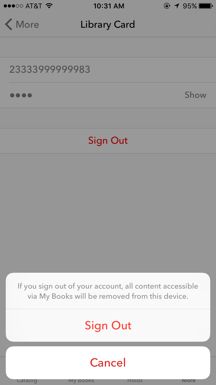 Log In/Out
Log In/Out
Log In/Out
- Tap Sign Out
- Confirm Sign Out
Optional integrations
There are three integrations that libraries can take advantage of. The first two are a ticket management system provided for by Zenddesk Learn more here OR Desk.com Learn more here. The third integration is a card application app prviding patrons the ability to apply for a card in the app and get immediate access to content.
-
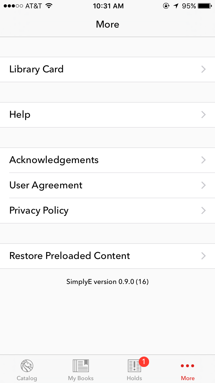 Optional: Help
Help
FAQs
- From the More Tab
- Tap Help to see FAQs, How-To guides or submit an issue
-
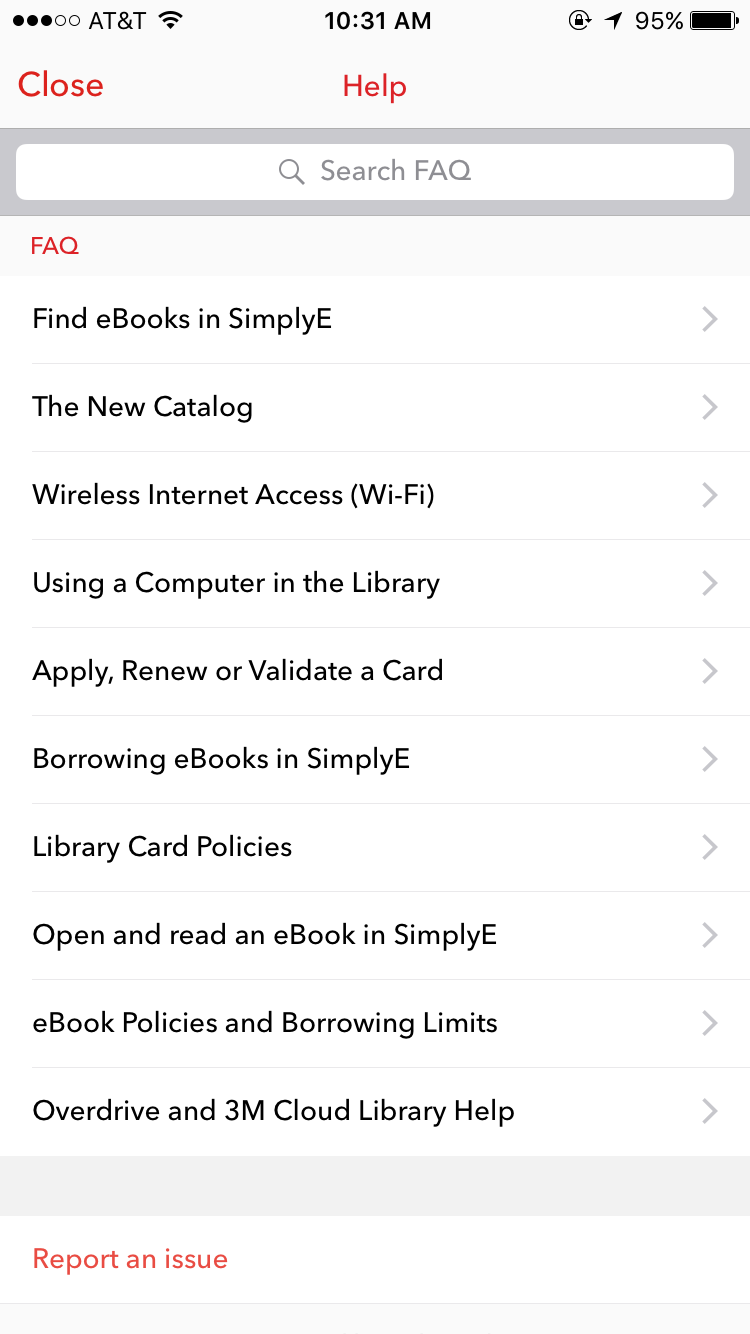 Optional: Help
Help
FAQs
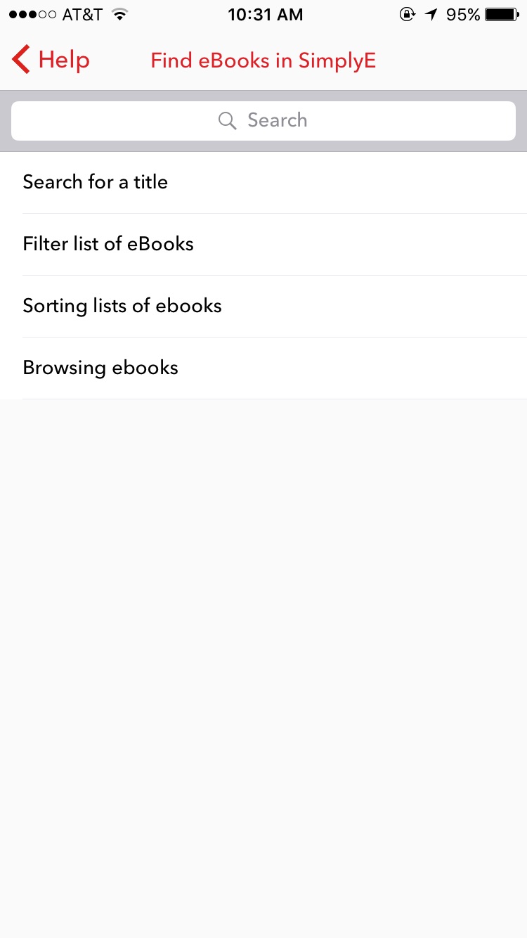
- Tap on a particular topic under FAQs
-
 Optional: Help
Help
FAQs
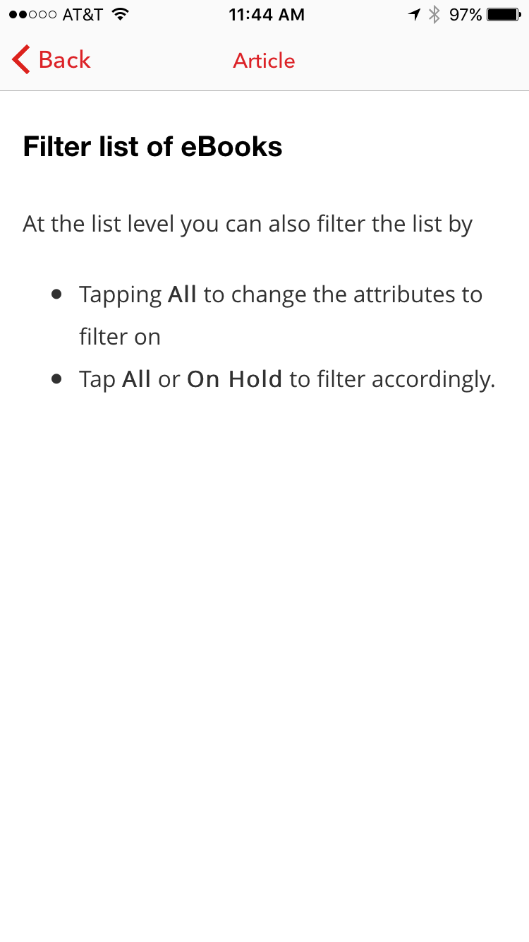
- Tap on the different FAQ Topics to see relevant information and instructions
-
 Optional: Help
Help
FAQ
- Tap on Issue to submit and issues
-
 Optional: Help
Help
Submit Issue
- Tap on Issue to submit and issues
-
 Optional: Help
Help
Submit Issue
- Enter the requested contact information
-
 Optional: Help
Help
Submit Issue
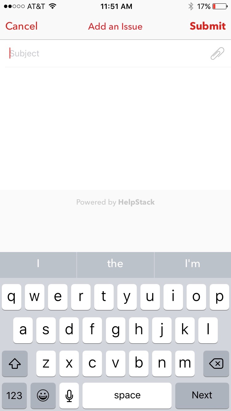
- Enter the issue and details about the issue encountered
-
 Optional: Sign Up
Optional: Sign Up
Optional: Sign Up
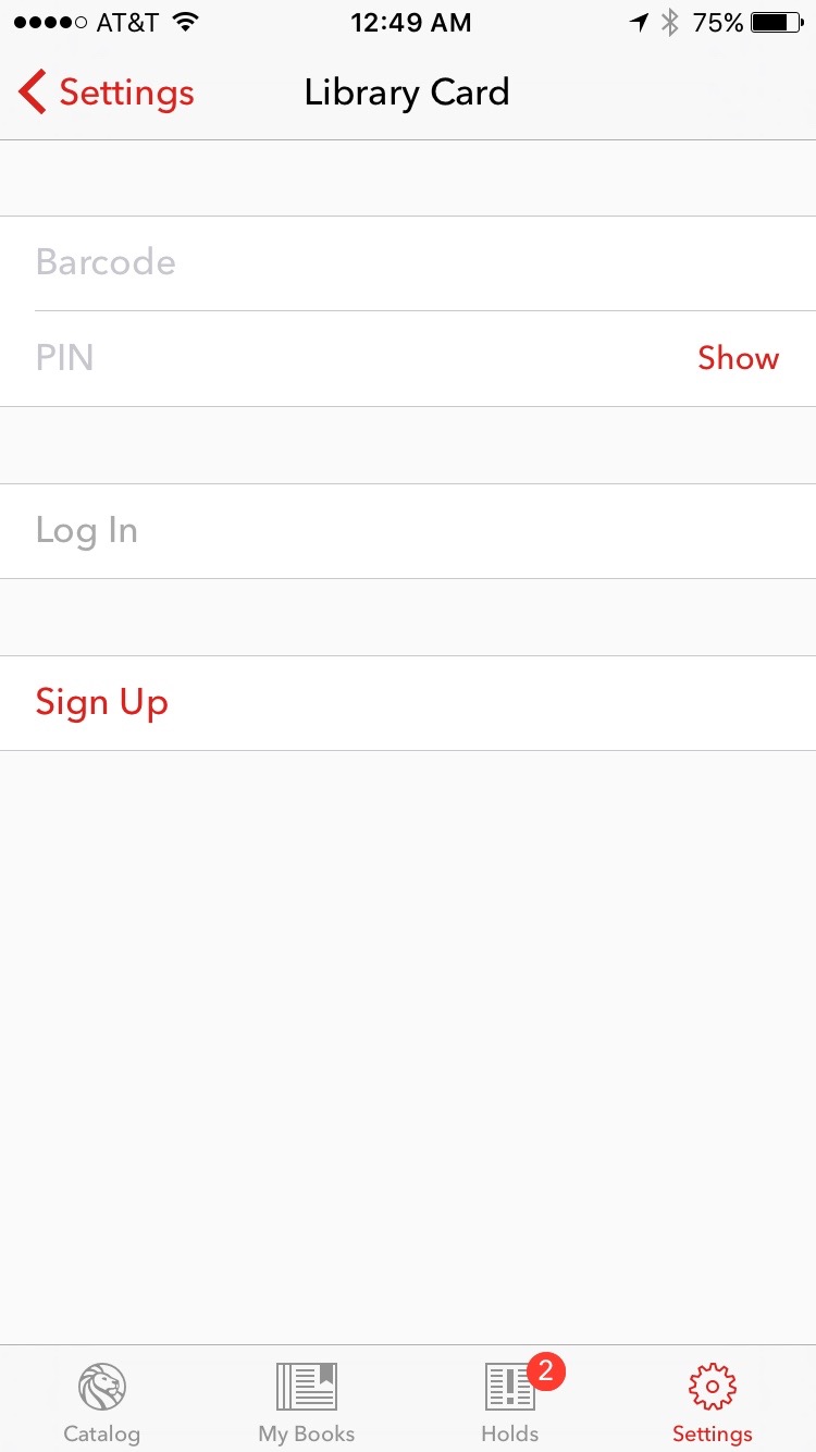
From the More Tab, Tap Library Card
-
 Optional: Sign Up
Optional: Sign Up
Optional: Sign Up
Tap Sign Up to apply for a Library Barcode and PIN
-
 Optional: Sign Up
Optional: Sign Up
Optional: Sign Up
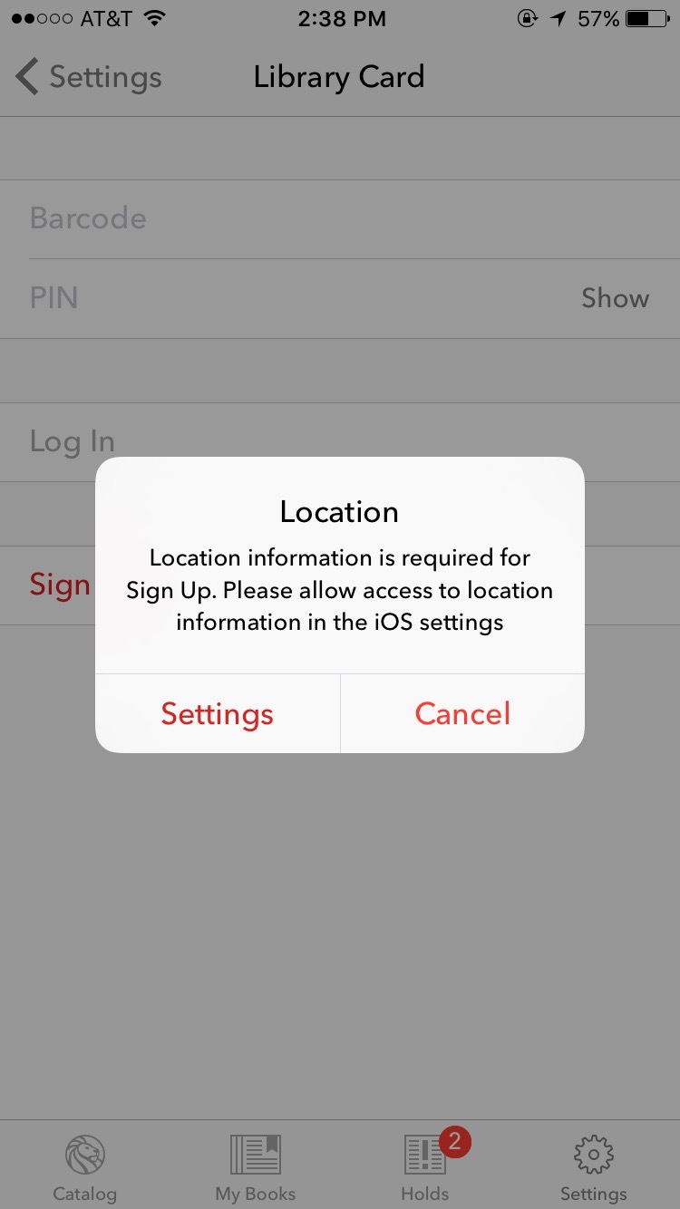
Tap Settgins to allow the access the application permision to access function on your iOS device needed to provide as part of the application process.
-
 Optional: Sign Up
Optional: Sign Up
Optional: Sign Up
Settings
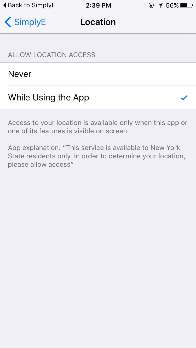
Tap Location
-
 Optional: Sign Up
Optional: Sign Up
Optional: Sign Up
Settings
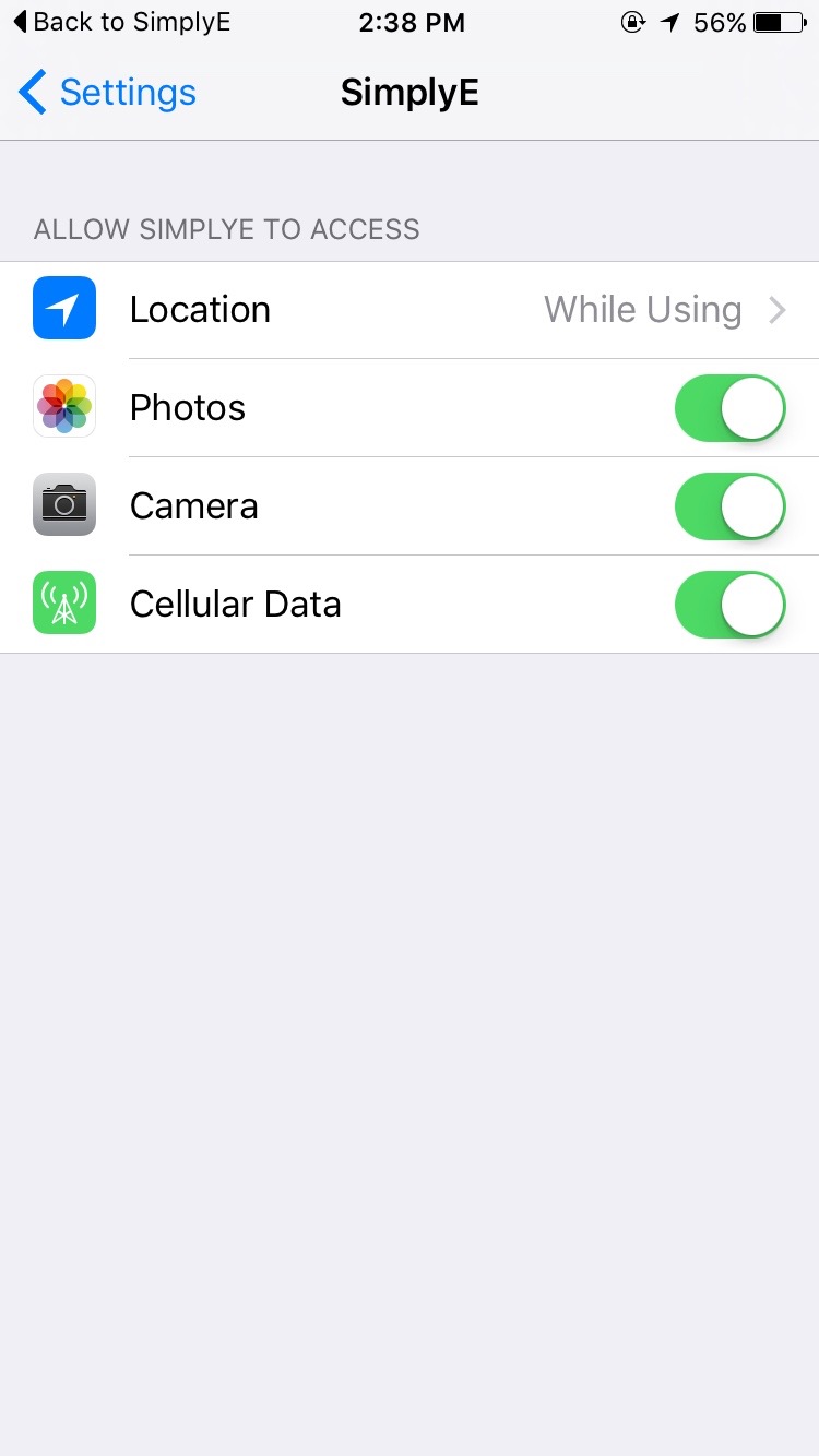
Select "While using the app."
-
 Optional: Sign Up
Optional: Sign Up
Optional: Sign Up
Settings
Tap Settings to return to SimplyE.
-
 Optional: Sign Up
Optional: Sign Up
Optional: Sign Up
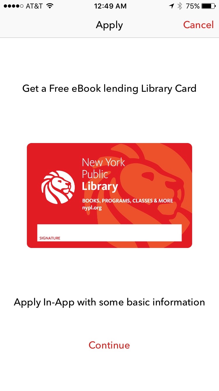
Tap Continue.
-
 Optional: Sign Up
Optional: Sign Up
Optional: Sign Up
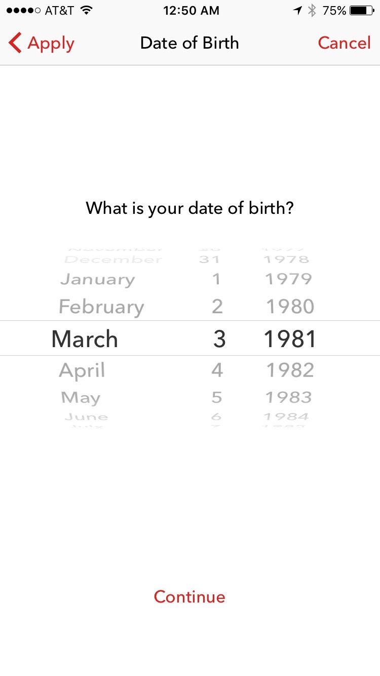
Tap Allow to let the app confirm you are in New York.
-
 Optional: Sign Up
Optional: Sign Up
Optional: Sign Up
Tap Allow to let the app confirm you are in New York.
-
 Optional: Sign Up
Optional: Sign Up
Optional: Sign Up
Tap Allow to let the app confirm you are in New York.
-
 Optional: Sign Up
Optional: Sign Up
Optional: Sign Up
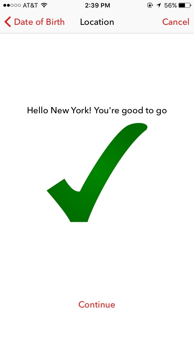
Tap Allow to let the app confirm you are in New York.
-
 Optional: Sign Up
Optional: Sign Up
Optional: Sign Up
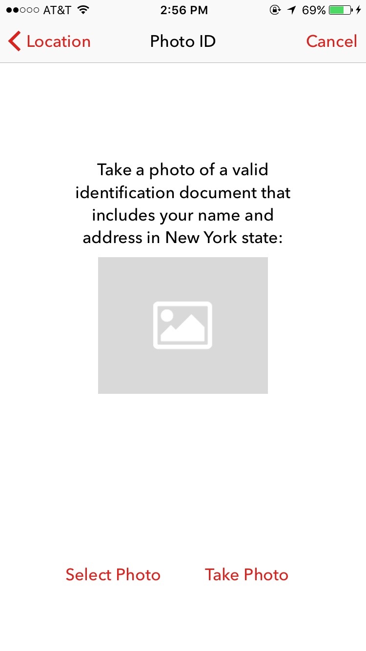
Tap Allow to let the app confirm you are in New York.
-
 Optional: Sign Up
Optional: Sign Up
Optional: Sign Up
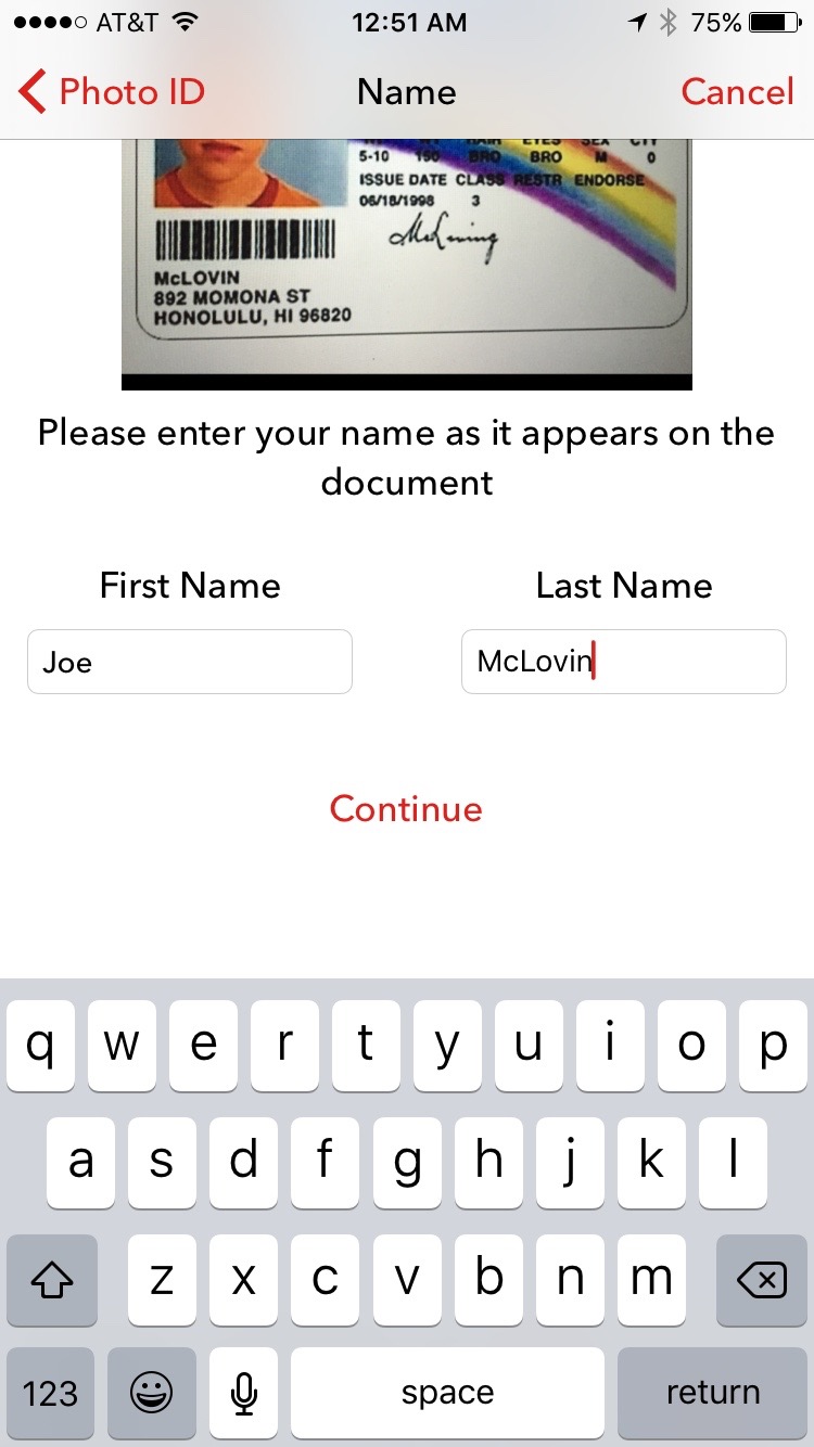
Tap Allow to let the app confirm you are in New York.
-
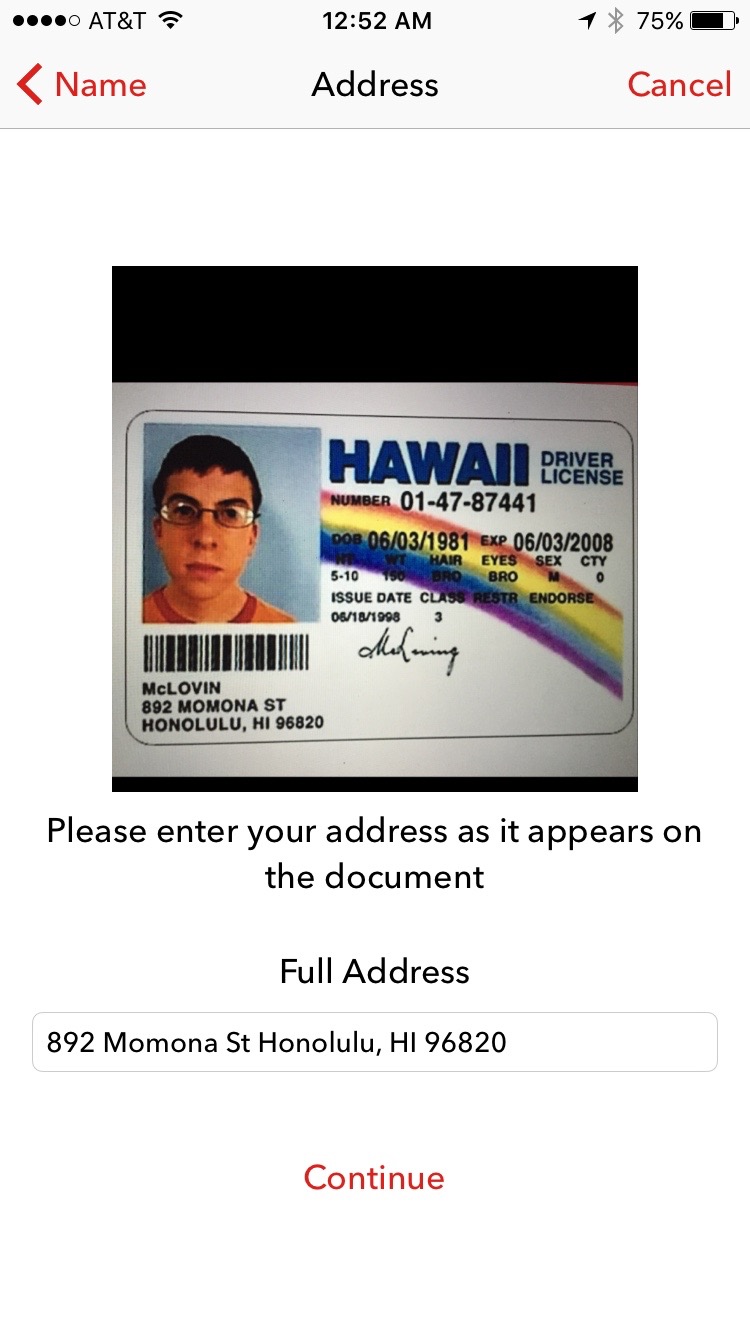 Optional: Sign Up
Optional: Sign Up
Optional: Sign Up
Tap Allow to let the app confirm you are in New York.
-
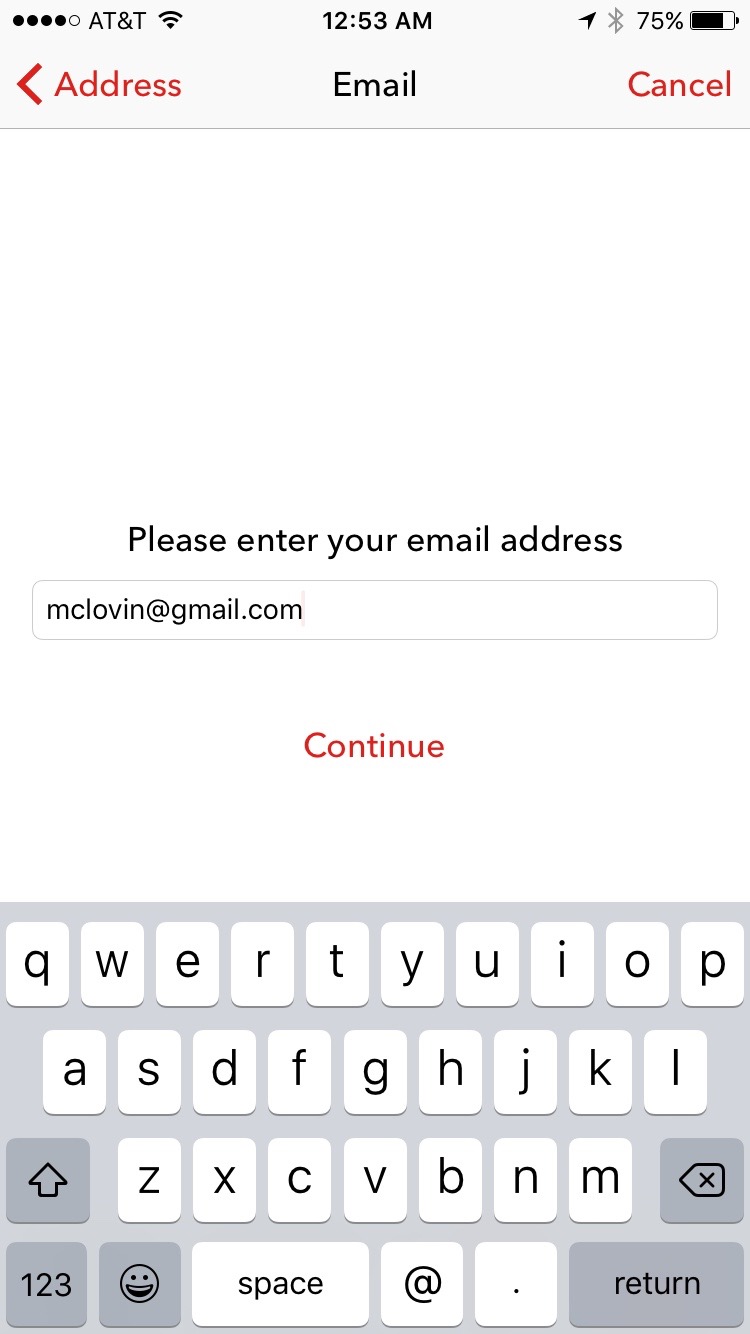 Optional: Sign Up
Optional: Sign Up
Optional: Sign Up
Tap Allow to let the app confirm you are in New York.
-
 Optional: Sign Up
Optional: Sign Up
Optional: Sign Up
Tap Allow to let the app confirm you are in New York.
-
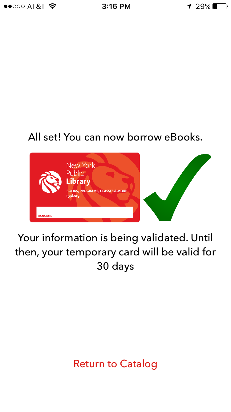 Optional: Sign Up
Optional: Sign Up
Optional: Sign Up
Tap Return to Catalog to exit.
