![[Stable]](figures/lifecycle-stable.svg)
Graphical and numerical visualization of a correlation matrix
Usage
corr_plot(
  .data,
  ...,
  col.by = NULL,
  upper = "corr",
  lower = "scatter",
  decimal.mark = ".",
  axis.labels = FALSE,
  show.labels.in = "show",
  size.axis.label = 12,
  size.varnames = 12,
  col.varnames = "black",
  diag = TRUE,
  diag.type = "histogram",
  bins = 20,
  col.diag = "gray",
  alpha.diag = 1,
  col.up.panel = "gray",
  col.lw.panel = "gray",
  col.dia.panel = "gray",
  prob = 0.05,
  col.sign = "green",
  alpha.sign = 0.15,
  lab.position = "tr",
  progress = NULL,
  smooth = FALSE,
  col.smooth = "red",
  confint = TRUE,
  size.point = 1,
  shape.point = 19,
  alpha.point = 0.7,
  fill.point = NULL,
  col.point = "black",
  size.line = 0.5,
  minsize = 2,
  maxsize = 3,
  pan.spacing = 0.15,
  digits = 2,
  export = FALSE,
  file.type = "pdf",
  file.name = NULL,
  width = 8,
  height = 7,
  resolution = 300
)
Arguments
- .data
The data. Should, preferentially, contain numeric variables only. If
.datahas factor-columns, these columns will be deleted with a warning message.- ...
Variables to use in the correlation. If no variable is informed all the numeric variables from
.dataare used.- col.by
A categorical variable to map the color of the points by. Defaults to
NULL.- upper
The visualization method for the upper triangular correlation matrix. Must be one of
'corr'(numeric values),'scatter'(the scatterplot for each pairwise combination), orNULLto set a blank diagonal.- lower
The visualization method for the lower triangular correlation matrix. Must be one of
'corr'(numeric values),'scatter'(the scatterplot for each pairwise combination), orNULLto set a blank diagonal.- decimal.mark
The decimal mark. Defaults to
".".- axis.labels
Should the axis labels be shown in the plot? Set to
FALSE.- show.labels.in
Where to show the axis labels. Defaults to "show" bottom and left. Use "diag" to show the labels on the diagonal. In this case, the diagonal layer (boxplot, density or histogram) will be overwritten.
- size.axis.label
The size of the text for axis labels if
axis.labels = TRUE. Defaults to 12.- size.varnames
The size of the text for variable names. Defaults to 12.
- col.varnames
The color of the text for variable names. Defaults to "black".
- diag
Should the diagonal be shown?
- diag.type
The type of plot to show in the diagonal if
diag TRUE. It must be one of the 'histogram' (to show an histogram), 'density' to show the Kernel density, or 'boxplot' (to show a boxplot).- bins
The number of bins, Defaults to 20.
- col.diag
If
diag = TRUEthendiagcolis the color for the distribution. Set to gray.- alpha.diag
Alpha-transparency scale (0-1) to make the diagonal plot transparent. 0 = fully transparent; 1 = full color. Set to 0.15
- col.up.panel, col.lw.panel, col.dia.panel
The color for the upper, lower, and diagonal panels, respectively. Set to 'gray'.
- prob
The probability of error. Significant correlations will be highlighted with '', '', and '' (0.05, 0.01, and 0.001, respectively). Scatterplots with significant correlations may be color-highlighted.
- col.sign
The color that will highlight the significant correlations. Set to 'green'.
- alpha.sign
Alpha-transparency scale (0-1) to make the plot area transparent. 0 = fully transparent; 1 = full color. Set to 0.15
- lab.position
The position that the labels will appear. Set to
'tr', i.e., the legends will appear in the top and right of the plot. Other allowed options are'tl'(top and left),'br'(bottom and right),'bl'(bottom and left).- progress
NULL(default) for a progress bar in interactive sessions with more than 15 plots,TRUEfor a progress bar,FALSEfor no progress bar.- smooth
Should a linear smooth line be shown in the scatterplots? Set to
FALSE.- col.smooth
The color for the smooth line.
- confint
Should a confidence band be shown with the smooth line? Set to
TRUE.- size.point
The size of the points in the plot. Set to
0.5.- shape.point
The shape of the point, set to
1.- alpha.point
Alpha-transparency scale (0-1) to make the points transparent. 0 = fully transparent; 1 = full color. Set to 0.7
- fill.point
The color to fill the points. Valid argument if points are between 21 and 25.
- col.point
The color for the edge of the point, set to
black.- size.line
The size of the line (smooth and diagonal).
- minsize
The size of the letter that will represent the smallest correlation coefficient.
- maxsize
The size of the letter that will represent the largest correlation coefficient.
- pan.spacing
The space between the panels. Set to 0.15.
- digits
The number of digits to show in the plot.
- export
Logical argument. If
TRUE, then the plot is exported to the current directory.- file.type
The format of the file if
export = TRUE. Set to'pdf'. Other possible values are*.tiffusingfile.type = 'tiff'.- file.name
The name of the plot when exported. Set to
NULL, i.e., automatically.- width
The width of the plot, set to
8.- height
The height of the plot, set to
7.- resolution
The resolution of the plot if
file.type = 'tiff'is used. Set to300(300 dpi).
Author
Tiago Olivoto tiagoolivoto@gmail.com
Examples
# \donttest{
library(metan)
dataset <- data_ge2 %>% select_cols(1:7)
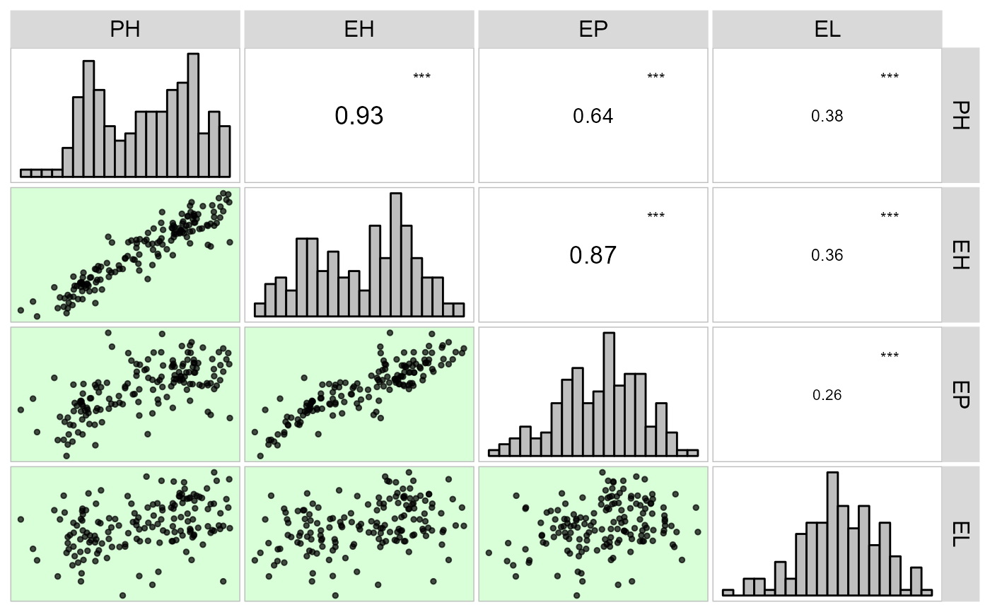
# Default plot setting
corr_plot(dataset)
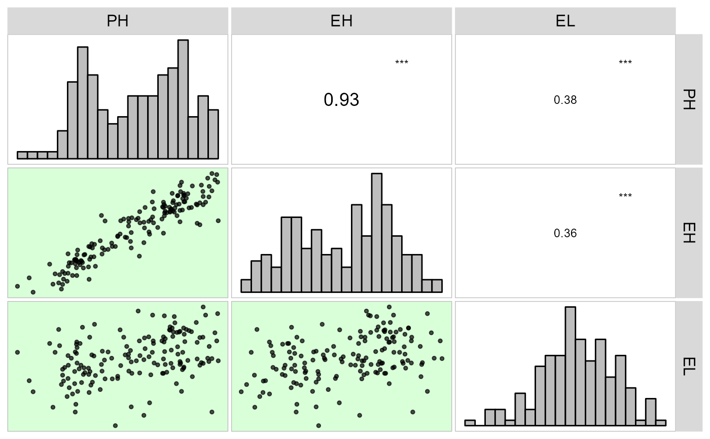
 # Chosing variables to be correlated
corr_plot(dataset, PH, EH, EL)
# Chosing variables to be correlated
corr_plot(dataset, PH, EH, EL)
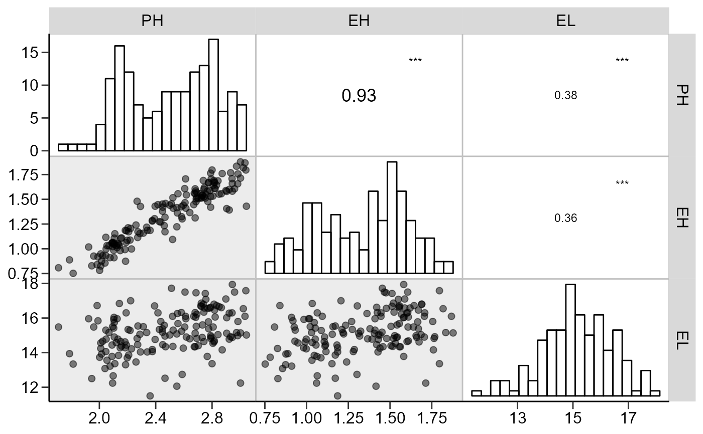
 # Axis labels, similar to the function pairs()
# Gray scale
corr_plot(dataset, PH, EH, EL,
shape.point = 19,
size.point = 2,
alpha.point = 0.5,
alpha.diag = 0,
pan.spacing = 0,
col.sign = 'gray',
alpha.sign = 0.3,
axis.labels = TRUE)
# Axis labels, similar to the function pairs()
# Gray scale
corr_plot(dataset, PH, EH, EL,
shape.point = 19,
size.point = 2,
alpha.point = 0.5,
alpha.diag = 0,
pan.spacing = 0,
col.sign = 'gray',
alpha.sign = 0.3,
axis.labels = TRUE)
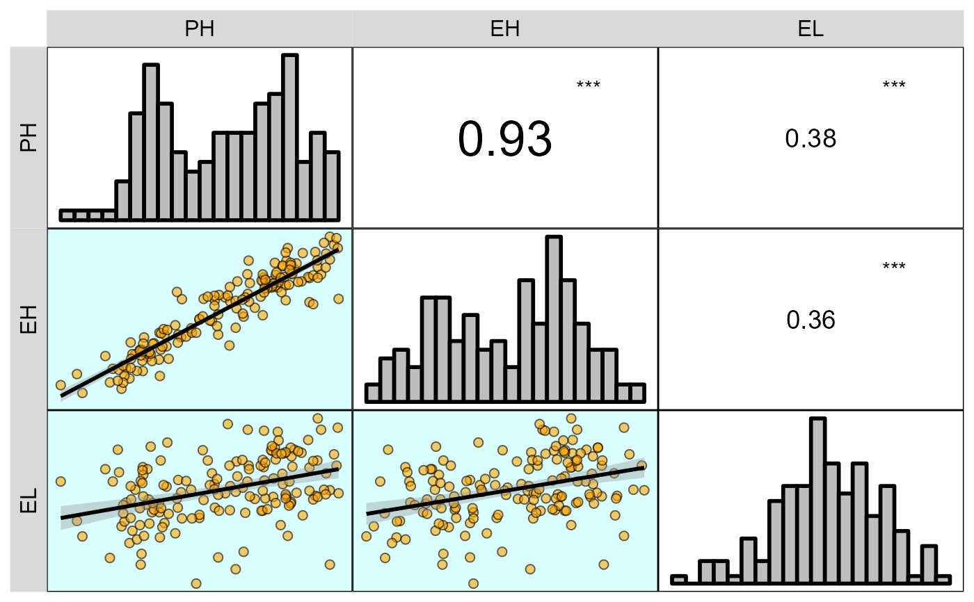
 corr_plot(dataset, PH, EH, EL,
prob = 0.01,
shape.point = 21,
col.point = 'black',
fill.point = 'orange',
size.point = 2,
alpha.point = 0.6,
maxsize = 4,
minsize = 2,
smooth = TRUE,
size.line = 1,
col.smooth = 'black',
col.sign = 'cyan',
col.up.panel = 'black',
col.lw.panel = 'black',
col.dia.panel = 'black',
pan.spacing = 0,
lab.position = 'tl')
corr_plot(dataset, PH, EH, EL,
prob = 0.01,
shape.point = 21,
col.point = 'black',
fill.point = 'orange',
size.point = 2,
alpha.point = 0.6,
maxsize = 4,
minsize = 2,
smooth = TRUE,
size.line = 1,
col.smooth = 'black',
col.sign = 'cyan',
col.up.panel = 'black',
col.lw.panel = 'black',
col.dia.panel = 'black',
pan.spacing = 0,
lab.position = 'tl')
 # }
# }