![[Stable]](figures/lifecycle-stable.svg)
plot_lines()Creates a line plot based on one quantitative factor and one numeric variable. It can be used to show the results of a one-way trial with quantitative treatments.plot_factlines()Creates a line plot based on: one categorical and one quantitative factor and one numeric variable. It can be used to show the results of a two-way trial with qualitative-quantitative treatment structure.
Usage
plot_lines(
  .data,
  x,
  y,
  fit,
  level = 0.95,
  confidence = TRUE,
  xlab = NULL,
  ylab = NULL,
  n.dodge = 1,
  check.overlap = FALSE,
  col = "red",
  alpha = 0.2,
  size.shape = 1.5,
  size.line = 1,
  size.text = 12,
  fontfam = "sans",
  plot_theme = theme_metan()
)

plot_factlines(
  .data,
  x,
  y,
  group,
  fit,
  level = 0.95,
  confidence = TRUE,
  xlab = NULL,
  ylab = NULL,
  n.dodge = 1,
  check.overlap = FALSE,
  legend.position = "bottom",
  grid = FALSE,
  scales = "free",
  col = TRUE,
  alpha = 0.2,
  size.shape = 1.5,
  size.line = 1,
  size.text = 12,
  fontfam = "sans",
  plot_theme = theme_metan()
)
Arguments
- .data
The data set
- x, y
The variables to be mapped to the
xandyaxes, respectively.- fit
The polynomial degree to use. It must be between 1 (linear fit) to 4 (fourth-order polynomial regression.). In
plot_factlines(), iffitis a lenth 1 vector, i.e., 1, the fitted curves of all levels ingroupwill be fitted with polynomial degreefit. To use a different polynomial degree for each level ingroup, use a numeric vector with the same length of the variable ingroup.- level
The fonfidence level. Defaults to
0.05.- confidence
Display confidence interval around smooth? (TRUE by default)
- xlab, ylab
The labels of the axes x and y, respectively. Defaults to
NULL.- n.dodge
The number of rows that should be used to render the x labels. This is useful for displaying labels that would otherwise overlap.
- check.overlap
Silently remove overlapping labels, (recursively) prioritizing the first, last, and middle labels.
- col
The colour to be used in the line plot and points.
- alpha
The alpha for the color in confidence band
- size.shape
The size for the shape in plot
- size.line
The size for the line in the plot
- size.text
The size of the text
- fontfam
The family of the font text.
- plot_theme
The graphical theme of the plot. Default is
plot_theme = theme_metan(). For more details, seeggplot2::theme().- group
The grouping variable. Valid for
plot_factlines()only.- legend.position
Valid argument for
plot_factlines. The position of the legend. Defaults to 'bottom'.- grid
Valid argument for
plot_factlines. Logical argument. IfTRUEthen a grid will be created.- scales
Valid argument for
plot_factlines. Ifgrid = TRUEscales controls how the scales are in the plot. Possible values are'free'(default),'fixed','free_x'or'free_y'.
Author
Tiago Olivoto tiagoolivoto@gmail.com
Examples
# \donttest{
library(metan)
# One-way line plot
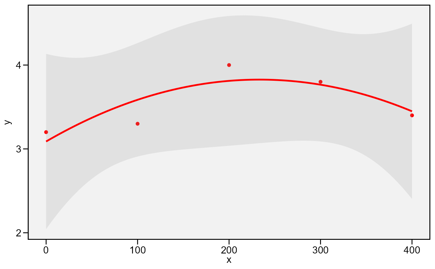
df1 <- data.frame(group = "A",
x = c(0, 100, 200, 300, 400),
y = c(3.2, 3.3, 4.0, 3.8, 3.4))
plot_lines(df1, x, y, fit = 2)
 # Two-way line plot
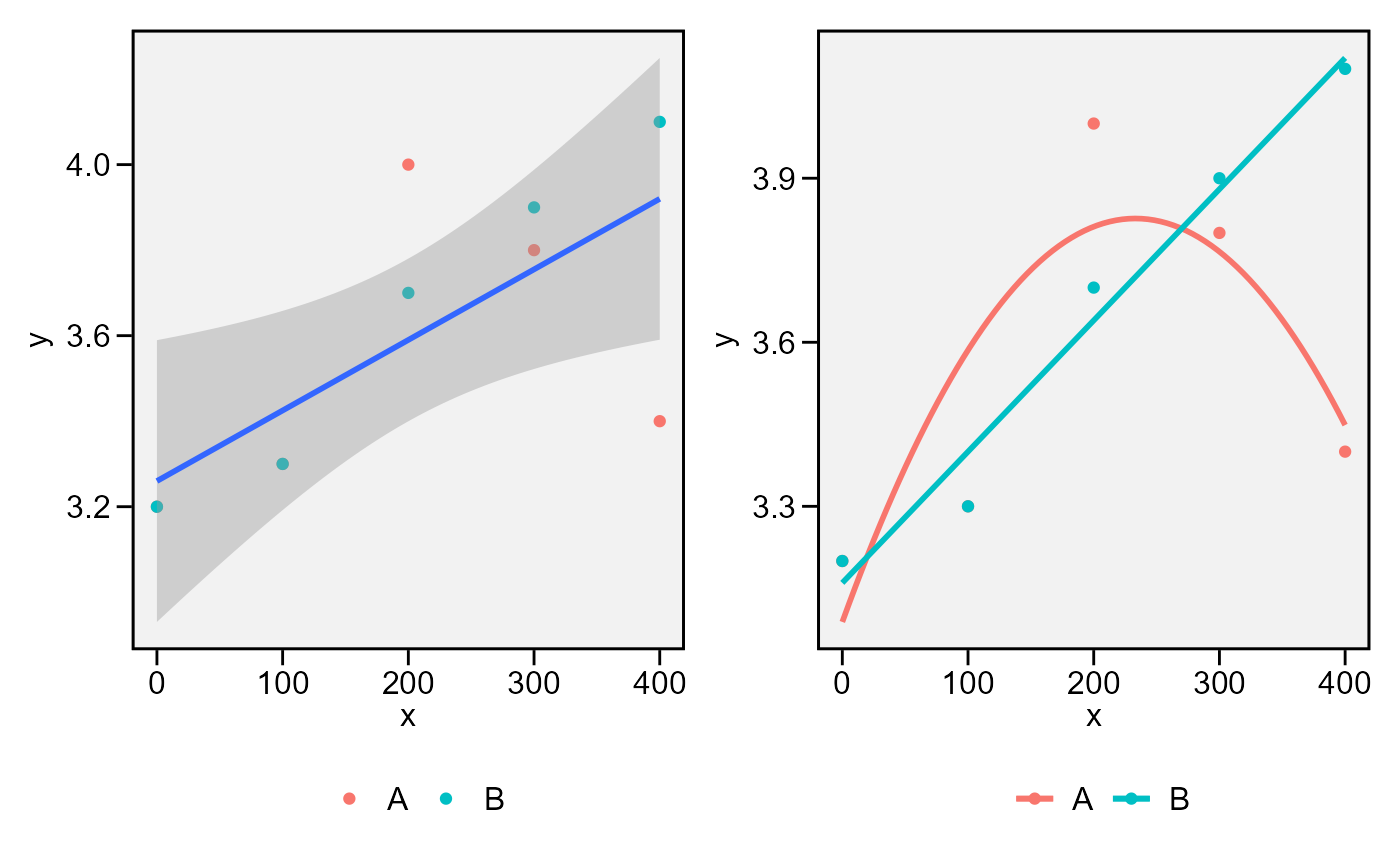
df2 <- data.frame(group = "B",
x = c(0, 100, 200, 300, 400),
y = c(3.2, 3.3, 3.7, 3.9, 4.1))
facts <- rbind(df1, df2)
p1 <- plot_factlines(facts, x, y, group = group, fit = 1)
p2 <- plot_factlines(facts,
x = x,
y = y,
group = group,
fit = c(2, 1),
confidence = FALSE)
arrange_ggplot(p1, p2)
# Two-way line plot
df2 <- data.frame(group = "B",
x = c(0, 100, 200, 300, 400),
y = c(3.2, 3.3, 3.7, 3.9, 4.1))
facts <- rbind(df1, df2)
p1 <- plot_factlines(facts, x, y, group = group, fit = 1)
p2 <- plot_factlines(facts,
x = x,
y = y,
group = group,
fit = c(2, 1),
confidence = FALSE)
arrange_ggplot(p1, p2)
 # }
# }