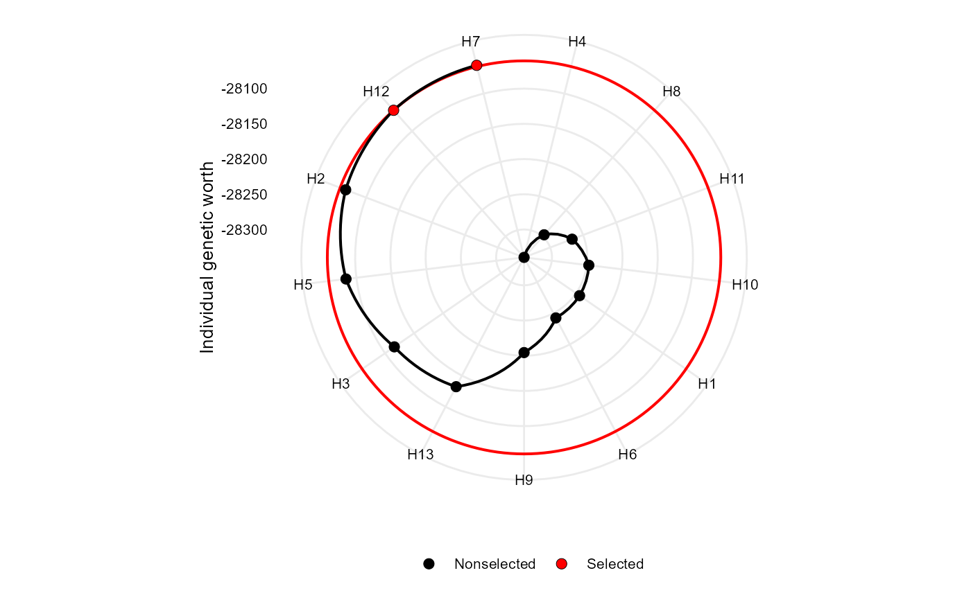
Makes a radar plot showing the individual genetic worth for the Smith-Hazel index
Usage
# S3 method for sh
plot(
  x,
  SI = 15,
  radar = TRUE,
  arrange.label = FALSE,
  size.point = 2.5,
  size.line = 0.7,
  size.text = 10,
  col.sel = "red",
  col.nonsel = "black",
  ...
)
Arguments
- x
An object of class
sh- SI
An integer (0-100). The selection intensity in percentage of the total number of genotypes.
- radar
Logical argument. If true (default) a radar plot is generated after using
coord_polar().- arrange.label
Logical argument. If
TRUE, the labels are arranged to avoid text overlapping. This becomes useful when the number of genotypes is large, say, more than 30.- size.point
The size of the point in graphic. Defaults to 2.5.
- size.line
The size of the line in graphic. Defaults to 0.7.
- size.text
The size for the text in the plot. Defaults to 10.
- col.sel
The colour for selected genotypes. Defaults to
"red".- col.nonsel
The colour for nonselected genotypes. Defaults to
"black".- ...
Other arguments to be passed from ggplot2::theme().
Author
Tiago Olivoto tiagoolivoto@gmail.com
Examples
# \donttest{
library(metan)
vcov <- covcor_design(data_g, GEN, REP, everything())
means <- as.matrix(vcov$means)
pcov <- vcov$phen_cov
gcov <- vcov$geno_cov

index <- Smith_Hazel(means, pcov = pcov, gcov = gcov, weights = rep(1, 15))
plot(index)

# }
# }