Packages
In order to create this chart, we need to load the following packages, as well as some fonts:
Dataset
The data consists of a CSV file containing information about parking
areas in Barcelona, which is loaded into a data frame called
data. The data is then filtered to include
only rows with TIPUS_TRAM equal to
“AZL”, “VR”, or “VM”, and the results are stored in the
tram_AZL, tram_VR, and
tram_DUM data frames, respectively.
Additionally, a geojson file containing the
boundaries of Barcelona’s districts is loaded into a data frame called
districts.
data <- read.csv("https://raw.githubusercontent.com/lau-cloud/30DayMapChallenge/main/parking_areas/TRAMS.csv", sep = ",", header = T)

# Loading Barcelona's district boundaries
districts <- st_read("https://raw.githubusercontent.com/lau-cloud/30DayMapChallenge/main/parking_areas/0301040100_Districtes_UNITATS_ADM.json",
  stringsAsFactors = FALSE,
  as_tibble = TRUE
)
## Reading layer `0301040100_Districtes_UNITATS_ADM' from data source
## `https://raw.githubusercontent.com/lau-cloud/30DayMapChallenge/main/parking_areas/0301040100_Districtes_UNITATS_ADM.json'
## using driver `GeoJSON'
## Simple feature collection with 10 features and 48 fields
## Geometry type: MULTIPOLYGON
## Dimension: XY
## Bounding box: xmin: 2.052333 ymin: 41.31704 xmax: 2.228045 ymax: 41.4683
## Geodetic CRS: WGS 84Only one map: blue zone
We start by creating a single map using the blue zone only. It mainly
relies on the geom_sf() function from the
sf package and the
geom_hex() function.
mapa_AZL <- ggplot() +
  geom_hex(
    data = tram_AZL, aes(x = LONGITUD_I, y = LATITUD_I),
    color = "white", alpha = 0.8, bins = 35
  ) +
  geom_sf(
    data = districts, fill = "transparent",
    color = "black", linewidth = .25
  ) +
  labs(
    title = "Blue Zone",
    caption = ""
  ) +
  theme_void() +
  scale_fill_gradient(
    low = "#D1F0E5",
    high = "#306D75",
    breaks = c(1, 20, 40),
    name = "Blue spaces",
    guide = guide_legend(keyheight = unit(2.5, units = "mm"), keywidth = unit(10, units = "mm"), label.position = "bottom", title.position = "top", nrow = 1)
  ) +
  theme(
    legend.position = "bottom",
    legend.title = element_text(color = "black", size = 8),
    text = element_text(color = "black"),
    plot.subtitle = element_text(hjust = 0.5, size = 8, color = "black"),
    plot.title = element_text(hjust = 0.5, size = 30, family = "tawa"),
    plot.caption = element_text(hjust = 1, size = 15, color = "black")
  )

mapa_AZL
Only one map: green zone
Now we create the same chart but using the green zone only. The code is pretty much the same as above:
mapa_VR <- ggplot() +
  geom_hex(
    data = tram_VR, aes(x = LONGITUD_I, y = LATITUD_I),
    color = "white", alpha = 0.8, bins = 35
  ) +
  geom_sf(
    data = districts, fill = "transparent",
    color = "black", linewidth = .25
  ) +
  labs(
    title = "Green Zone",
    caption = ""
  ) +
  theme_void() +
  scale_fill_gradient(
    low = "#E1FCC1",
    high = "#5DAA01",
    breaks = c(1, 60, 120),
    name = "Green spaces",
    guide = guide_legend(keyheight = unit(2.5, units = "mm"), keywidth = unit(10, units = "mm"), label.position = "bottom", title.position = "top", nrow = 1)
  ) +
  theme(
    legend.position = "bottom",
    legend.title = element_text(color = "black", size = 8),
    text = element_text(color = "black"),
    plot.subtitle = element_text(hjust = 0.5, size = 8, color = "black"),
    plot.title = element_text(hjust = 0.5, size = 30, family = "tawa"),
    plot.caption = element_text(hjust = 0.5, size = 15, color = "black")
  )

mapa_VR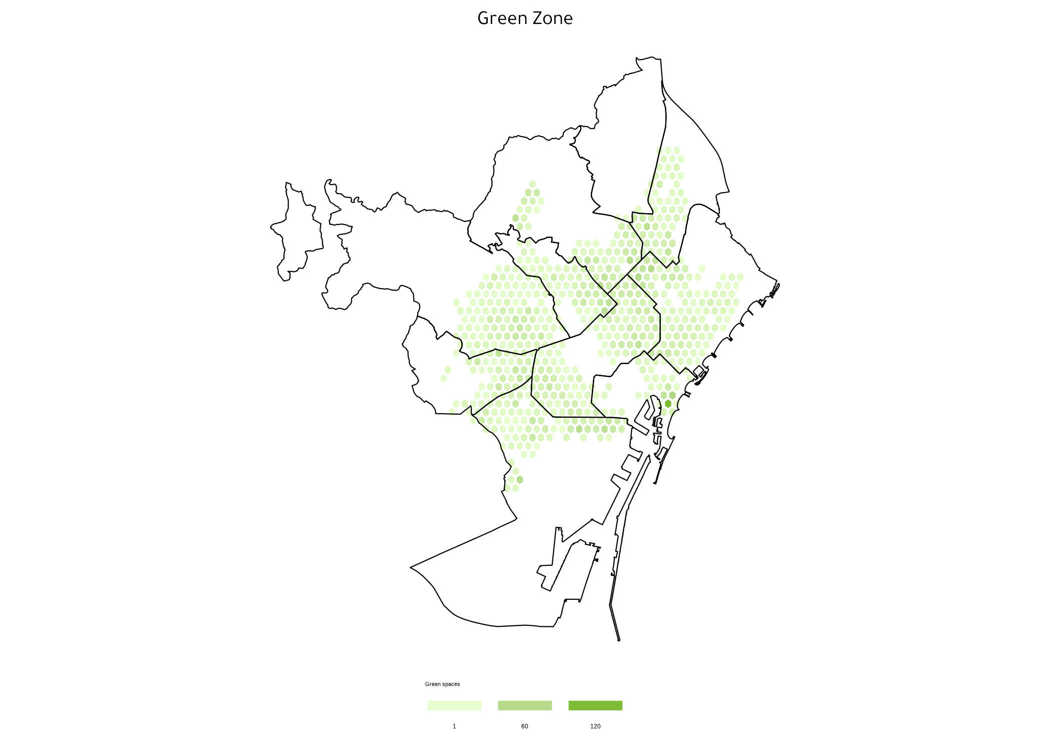
Only one map: red zone
Now we create the same chart but using the red zone only. The code is pretty much the same as above:
mapa_DUM <- ggplot() +
  geom_hex(
    data = tram_DUM, aes(x = LONGITUD_I, y = LATITUD_I),
    color = "white", alpha = 0.8, bins = 35
  ) +
  geom_sf(
    data = districts, fill = "transparent",
    color = "black", linewidth = .25
  ) +
  labs(
    title = "Urban Distribution of Goods Zone"
  ) +
  theme_void() +
  scale_fill_gradient(
    low = "#FFD2D2",
    high = "#CD0000",
    breaks = c(1, 12, 25),
    name = "DUM spaces",
    guide = guide_legend(keyheight = unit(2.5, units = "mm"), keywidth = unit(10, units = "mm"), label.position = "bottom", title.position = "top", nrow = 1)
  ) +
  theme(
    legend.position = "bottom",
    legend.title = element_text(color = "black", size = 8),
    text = element_text(color = "black"),
    plot.subtitle = element_text(hjust = 0.5, size = 8, color = "black"),
    plot.title = element_text(hjust = 0.5, size = 30, family = "tawa"),
    plot.caption = element_text(hjust = 1, size = 15, color = "black")
  )

mapa_DUM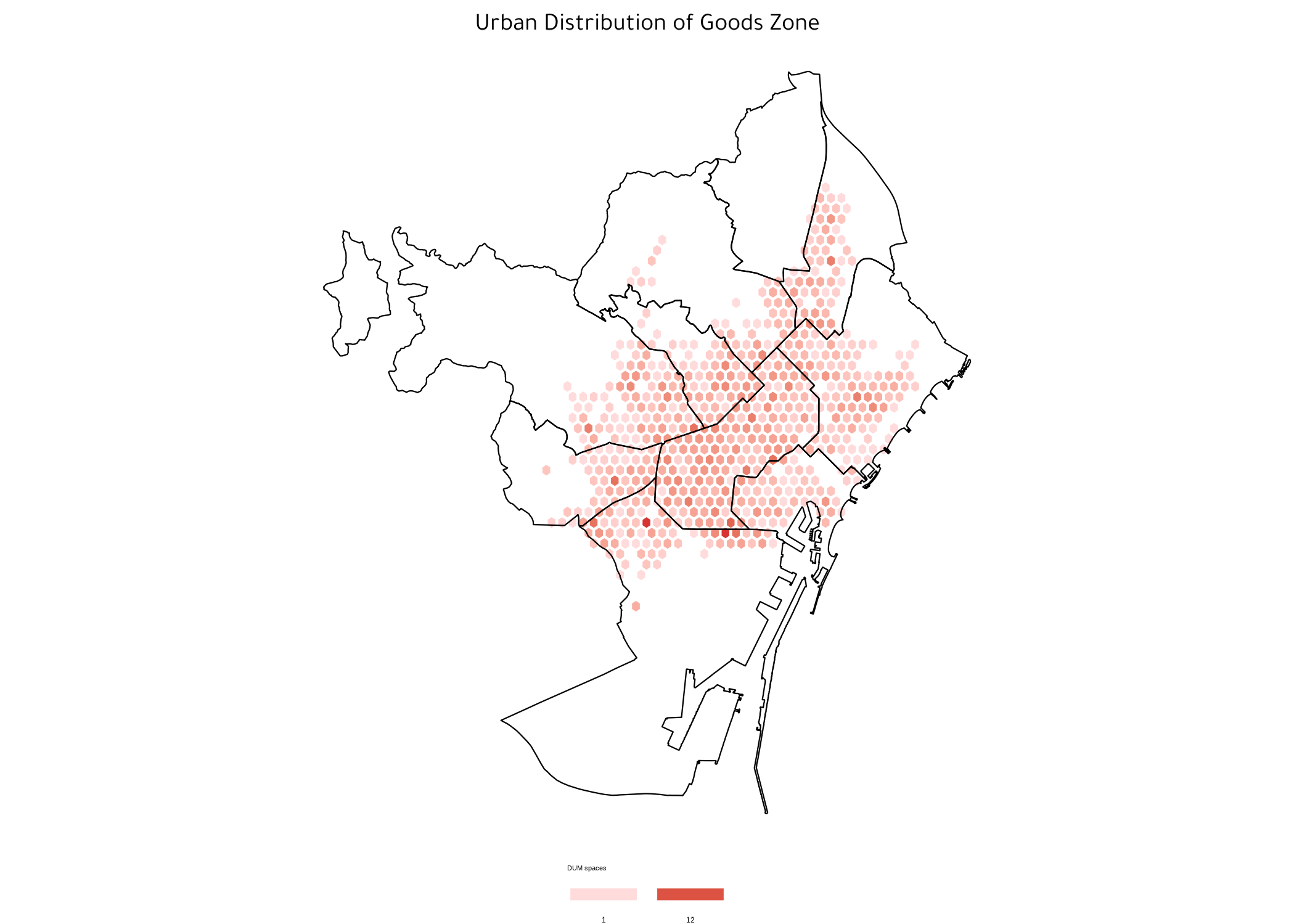
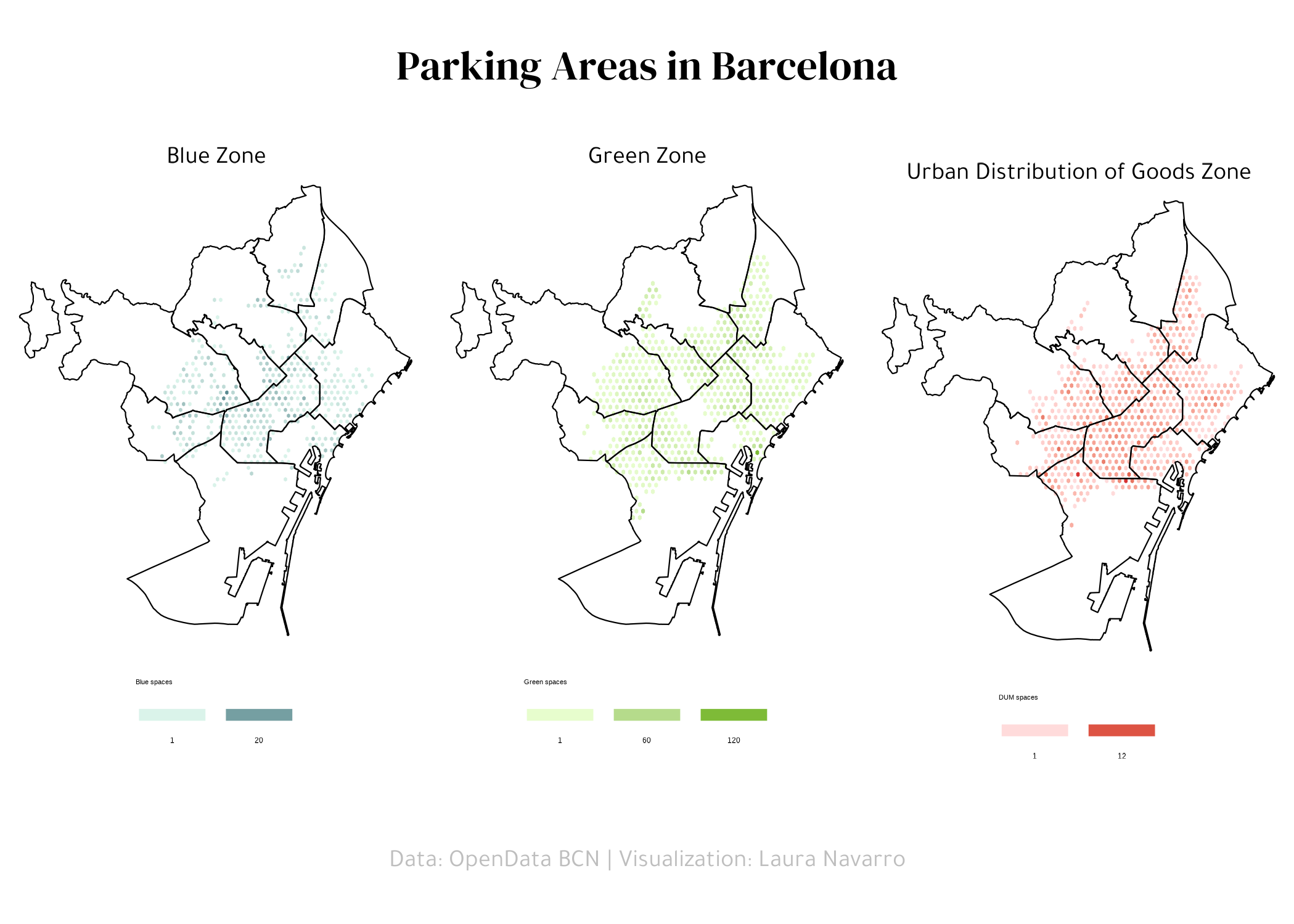
Combine plots
Now that we have the charts that we needed, we can
concatenate them into a single one thanks to the
plot_grid() function:
# Title
ggdraw() +
  draw_text("Parking Areas in Barcelona",
    size = 50, family = "abril", fontface = "bold"
  ) -> header_plot

# Caption
ggdraw() +
  draw_text("Data: OpenData BCN | Visualization: Laura Navarro",
    size = 30, family = "tawa", color = "grey", hjust = 0.5
  ) -> caption_plot

# Grid plots
grid_plots <- plot_grid(
  mapa_AZL,
  mapa_VR,
  mapa_DUM,
  nrow = 1,
  ncol = 3
)

# Final plot
plot_grid(

  header_plot,
  grid_plots,
  caption_plot,

  ## plot settings
  nrow = 3,
  ncol = 1,
  rel_heights = c(1, 5, 1)
)
Going further
You might be interested in:
- this beautiful ridgeline plot about rental prices
- how to create a small multiple line chart
- how to mix time series and facetting