Monitoring Forecast Models in Production With R
Monitoring a forecast model in production means checking, on a schedule, whether the forecasts it still produces stay accurate, unbiased, and well-calibrated as real values arrive, and raising an alert the moment they stop.
Training a forecasting model is the easy part. The hard part starts the day it goes live and quietly begins to age. This tutorial builds a complete monitoring system in plain R, step by step, so you can catch a decaying model before it costs you a bad decision. We work entirely from a forecast log using base R plus a little dplyr, so everything runs in the code blocks below with nothing to install.
Why do forecast models quietly rot after you deploy them?
A model that scored beautifully in testing can decay the moment it is live, and the scary part is that it keeps producing confident-looking numbers the whole time. The world shifts under it: a demand drop, a new competitor, a pricing change, a broken data feed. Seasonality moves. The forecasts drift further from reality every month, and because nothing crashes, nobody notices until a bad decision has already been made. Monitoring is the smoke detector that goes off first.
Let's make that concrete. In production you keep a forecast log: one row per period, storing the value the model predicted, its uncertainty interval, and later, the actual value that arrived. Here is such a log for a model that has been live for two years. We build it inline so the whole tutorial runs, but in practice these columns come straight from your pipeline's saved output.
Look at the last four rows. The model is calling for values near 1000 to 1096, but the actuals coming in are only 922 to 1014. The most recent forecast missed by 82 units, and every recent actual sits below its own lower bound. The model has clearly stopped tracking reality, yet on its own it would happily keep forecasting forever.
That gap is exactly what monitoring exists to catch. The rest of this tutorial turns this log into a set of automatic health checks. The whole process is a loop: score every forecast as actuals arrive, decide whether the model is still healthy, and either keep it or retrain.
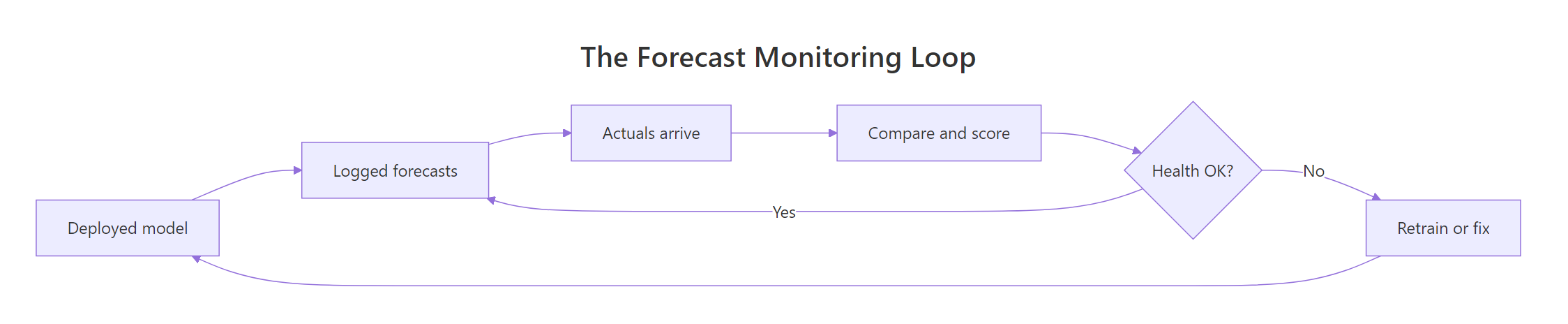
Figure 1: The monitoring loop. Score every forecast as actuals arrive, then keep or retrain.
One property of forecasting makes this loop special. You cannot score a forecast until the truth shows up, and for a 12-month-ahead forecast that can be a year away. So monitoring is retrospective: you match each forecast to the actual that eventually lands, then update your health metrics. That is why a saved log matters so much.
Try it: Compute the error for the very first month in the log, defined as the actual value minus the forecast.
Click to reveal solution
Explanation: In month one the actual was 1019 and the forecast was 1049, so the error is 1019 minus 1049, which is -30. A negative error means the model predicted more than actually happened.
How do you measure whether the latest forecasts are still accurate?
Accuracy monitoring starts with one number per period: the forecast error, the actual minus the forecast. From that single column, every accuracy metric follows. Let's add three helper columns to the log so we can work with them: the raw error, its absolute value (how far off, ignoring direction), and the percentage error (the miss relative to the actual).
The slice(c(1:3, 22:24)) call shows the first three and last three months side by side. Early on, the absolute errors are tiny (30, 0, 11). By the end they are huge (55, 99, 82). The pct_error column is added here too; we will use it in the exercises. The story of degradation is already visible, but eyeballing a table does not scale, so let's summarize it into standard metrics.
Three metrics do most of the work. MAE (mean absolute error) is the average of the absolute errors, in the same units as your data. RMSE (root mean squared error) is similar but squares the errors first, so it punishes big misses harder. MAPE (mean absolute percentage error) expresses the miss as a percentage, which makes it easy to compare across series of different sizes.
If you build models with the fable package, you do not have to compute these by hand for a one-time check. Its accuracy() function returns them in a single call. Here it is on a short demonstration series, fitting an exponential smoothing model on a training window and scoring it on a 12-month holdout.
One line gives you MAE, RMSE, and a fourth metric, MASE (mean absolute scaled error). MASE compares your model to a simple seasonal-naive baseline: below 1 means you beat the baseline, above 1 means you did worse. Here it is 1.18, a hair worse than naive on this sample. We come back to that benchmarking idea near the end.
To watch accuracy over time rather than as one lump sum, use a rolling window: recompute MAE over only the most recent months, then slide the window forward. A trailing 6-month MAE reacts to recent behavior while smoothing out single-month noise. We write a tiny helper for it, because it is a pattern you will reuse for every rolling metric in this tutorial.
The roll_mean() helper averages the trailing k values and returns NA until it has enough history. Reading down the roll_mae column tells the whole story at a glance: the rolling MAE sits near 13 to 15 through 2024, then climbs to 29, 63, and finally 73 across 2025. The model's typical miss roughly quintupled.
That is your first monitoring signal. A rolling MAE that is trending sharply upward, and now sits far above its calm baseline, is the clearest evidence that a model has stopped working.
Try it: Recompute the rolling MAE with a 3-month window instead of 6, then read the value at the final month.
Click to reveal solution
Explanation: A shorter window averages only the last three absolute errors (55, 99, 82), giving 78.7. Shorter windows react faster to change but are noisier; longer windows are steadier but slower to sound the alarm.
Is the model consistently over- or under-forecasting?
Accuracy alone can hide a serious problem. A model can have a middling average error yet lean the same way every single month, always a little high or always a little low. That systematic lean is called bias, and it is dangerous because it compounds. Think of a clock that is always five minutes fast: individually each reading looks fine, but you keep showing up early.
Bias is just the mean error (not the mean absolute error). If the average error is near zero, the misses cancel out and the model is unbiased. If it drifts away from zero, the model has a consistent direction. The classic production tool for watching this is the tracking signal: the running sum of errors divided by the running mean absolute deviation. It answers "how many typical errors of accumulated bias have we piled up?"
cumsum(error) accumulates every error into a running total (the rsfe), and dividing by the running mean absolute deviation rescales it into "typical errors" of bias. Through 2024 the tracking signal hovers between -0.5 and 0.9: the positive and negative errors cancel, so no bias. From early 2025 it plunges to -6, -12, -16, and -20. The which() line pinpoints the first breach: February 2025.
The convention is to alarm when the tracking signal moves outside roughly plus or minus 4. Our signal blows past -4 in February 2025 and keeps falling. The persistently negative value tells you the direction, too: the model is over-forecasting, predicting more than reality delivers, month after month.
If you want the formula behind the number, here it is. Skip to the next section if you just want the code, the running sum is all you really need.
$$\text{Tracking signal}_t = \frac{\sum_{i=1}^{t} e_i}{\frac{1}{t}\sum_{i=1}^{t} \lvert e_i \rvert}$$
Where:
- $e_i = \text{actual}_i - \text{forecast}_i$, the error at period $i$
- the numerator is the running sum of errors, which grows when errors share a sign
- the denominator is the mean absolute deviation, the average size of a miss
Try it: Compute the model's mean error over the last 6 months (rows 19 to 24). A large negative value confirms it is over-forecasting.
Click to reveal solution
Explanation: Over the final half-year the model's errors average -72.7, meaning it over-forecasts by about 73 units every month. A bias that large will wreck any decision built on top of it, such as inventory or staffing plans.
How do you turn error tracking into an automatic alarm?
Charts and tracking signals are great when you watch one series. But production teams forecast hundreds or thousands of series, and no human is going to eyeball them all every morning. You need a rule that fires by itself. This is where statistical process control comes in, the same math factories use to catch a machine drifting out of spec.
The workhorse is the CUSUM chart (cumulative sum). It accumulates how far each error strays from a target, and it trips an alarm when that running sum crosses a decision limit. Two settings control it: a slack value k that lets small, normal wobbles pass without accumulating, and a limit h that defines "too far." Because a stale model here over-forecasts (negative errors), we track the downward-accumulating side.
Before running it, we calibrate on the calm early period: what does a normal error spread look like? We estimate that from the first six months and use it to standardize every later error, so the CUSUM speaks in units of typical error size.
The loop is the heart of it. Each month it takes the previous cumulative sum, subtracts the standardized error and the slack, and floors the result at zero so quiet periods reset toward zero instead of drifting. While errors are small and balanced, Slo stays near zero. Once the model starts over-forecasting, the negative errors feed it and it climbs fast, crossing the limit of 4 in February 2025.
That is the same month the tracking signal flagged, which is reassuring: two independent methods agree the break happened at the start of 2025. The difference is that the CUSUM is a single boolean rule you can run unattended across every series in your portfolio.
Here is the recursion in symbols, for the lower (over-forecasting) side:
$$S^{-}_t = \max\!\left(0,\; S^{-}_{t-1} - \frac{e_t - \mu_0}{\sigma_0} - k\right), \quad \text{alarm when } S^{-}_t > h$$
Where:
- $\mu_0$ is the target error, which is 0 for an unbiased model
- $\sigma_0$ is the calibrated normal error spread (here 19.45)
- $k$ is the slack (0.5) and $h$ is the decision limit (4)
A picture makes the alarm obvious. Plotting the cumulative sum against its limit shows exactly when the process left control.
The blue line hugs zero for the first year, then lifts off in early 2025 and shoots past the red limit, staying above it for the rest of the window. That sustained breach, not a single spike, is the signature of a real regime change rather than a one-off bad month.
Try it: The cusum_lo column is already computed. Using a stricter limit of 6 instead of 4, find the first month the alarm trips.
Click to reveal solution
Explanation: A higher limit needs more accumulated evidence, so the alarm fires two months later, in April 2025 instead of February. That is the core trade-off in any alarm: a stricter limit means fewer false alarms but slower detection.
Are the prediction intervals still trustworthy?
So far we have judged the point forecast, the single predicted number. But a good forecast also comes with an interval that says how uncertain it is, and that interval can rot independently. An 80% prediction interval makes a promise: about 80% of the time, the actual value should land inside it. Checking whether it keeps that promise is called measuring coverage.
Coverage is simple to compute: mark each month as a hit if the actual fell between the lower and upper bounds, then average those hits. Do it on a rolling window and you can watch calibration drift just like accuracy.
The in_interval column is a simple TRUE/FALSE test, and averaging it gives the coverage rate. Overall coverage across the two years is 0.50, but the rolling column shows that average is misleading. Through 2024 the rolling coverage sits near 0.83 to 1.0, close to or above the 80% target. Across 2025 it collapses to 0.17, then 0, and stays there.
That collapse is a distinct failure from the rising MAE. It says the model's intervals have become dangerously overconfident: they promise to contain the truth 80% of the time but now contain it almost never. Anyone using those intervals for risk planning, safety stock, or capacity, is being told the future is far more certain than it is.
Try it: What fraction of actuals fell inside the interval during the second year only (rows 13 to 24)?
Click to reveal solution
Explanation: In the second year only 8% of actuals landed inside an interval that was supposed to hold 80%. An interval that overconfident is worse than no interval at all, because it invites false confidence.
When should you actually retrain the model?
Every signal so far points to the same thing: something is wrong. But "wrong" is not the same as "retrain now," and retraining on every wobble is its own mistake: it is expensive, it can chase noise, and a fresh model is not automatically better. You need a principled bar. The cleanest one is to ask a blunt question: is the model still beating a dumb baseline?
The baseline for seasonal data is seasonal naive: just predict what happened one full season ago. If your sophisticated model cannot beat "same month last year" on recent data, it has lost its edge. We measure that with a relative MAE: the model's recent MAE divided by the baseline's. Below 1 means the model still wins, above 1 means a naive rule would serve you better.
We build the seasonal-naive forecast by shifting the actuals forward 12 months, then compare average absolute errors over the second year. The relative MAE is 2.36, meaning the deployed model is now about two and a third times worse than simply repeating last year's value. When a model loses to seasonal naive that badly, retraining is no longer optional.
Rather than lean on any single signal, combine them. Each check we built catches a different failure mode, so a combined trigger fires when any of them crosses its line. We assemble them into one named vector so the verdict is auditable.
Each element is a plain yes/no test: has the rolling MAE at least doubled from its best, did the tracking signal breach 4, did the CUSUM alarm, has coverage fallen below 0.6, is the model beaten by naive. Every one is TRUE, so any(signals) returns TRUE and the trigger fires. Keeping the individual flags visible matters, because the vector tells you not just that you should retrain but why.

Figure 2: Four independent health checks feed one retraining decision.
Try it: Add a rule that flags when the most recent rolling coverage drops below 0.5. Does it fire?
Click to reveal solution
Explanation: The latest rolling coverage is 0, which is below 0.5, so the rule returns TRUE. You could drop this straight into the signals vector as one more independent check.
Putting it together: a reusable monitoring function
Scattered snippets are fine for learning, but production wants one function you can call on any forecast log and schedule to run automatically. Let's fold every check into monitor_forecasts(). It takes the four log columns and returns a tidy report: one row per period, with the rolling accuracy, coverage, bias, and CUSUM, plus a status column that reads ALERT the moment either the tracking signal or the CUSUM crosses its limit.
The function just packages the exact calculations from earlier sections into one place, so the report reproduces every number we found: rolling MAE in the 50s to 70s, coverage collapsed to near zero, tracking signal past -10, and CUSUM climbing well beyond the limit. Every one of the final eight months carries an ALERT.
Now the payoff. A monitoring system should tell you not just that a model failed, but exactly when the failure began. Two short lines extract that.
The monitor first raised an ALERT at period 14, February 2025, and any() confirms the model needs attention. In a real pipeline you would run monitor_forecasts() on a schedule (a cron job, an Airflow task, or a step in your batch-forecasting run) and route any ALERT to a dashboard or a message to the on-call analyst. The whole system is now one function call away.
Try it: Re-run the monitor with a shorter 3-month window, then read the final row's rolling MAE.
Click to reveal solution
Explanation: With a 3-month window the final rolling MAE is 78.7 instead of 72.7, because a shorter window weights the most recent, largest misses more heavily. The function stayed the same; you only changed one argument.
Practice Exercises
These combine several ideas from the tutorial. Each runs in the same session as the code above, so log_tbl, roll_mean(), sigma0, and report are all available. Distinct variable names keep your work from overwriting the tutorial state.
Exercise 1: Add a rolling percentage-error monitor
Using the pct_error column already in log_tbl, build a rolling 6-month MAPE column named roll_mape, then count how many months exceed a 5% threshold. Show the value at months 6, 12, 18, and 24.
Click to reveal solution
Explanation: Rolling MAPE stays near 1.3% while the model is healthy, then climbs above 6% once it decays. Seven months breach the 5% line, all in the degraded stretch. MAPE is handy for reporting to non-technical stakeholders because a percentage needs no units.
Exercise 2: Watch the other side with an upper CUSUM
Our CUSUM only watched for over-forecasting. Build the upper-side CUSUM that would catch under-forecasting (errors drifting positive), using the same sigma0 and slack k = 0.5. Report its maximum value and whether it ever alarms.
Click to reveal solution
Explanation: The upper CUSUM peaks at 0.59 and never approaches the limit of 4, correctly reporting no under-forecasting. In production you run both sides at once, so a drift in either direction is caught.
Exercise 3: Report the first alerting date
Write a function first_alert(report, dates) that returns the calendar date of the first ALERT in a monitoring report, or NA if the model was healthy throughout. Run it on report with log_tbl$date.
Click to reveal solution
Explanation: The function finds the first ALERT row, returns its date, and guards against a clean report by returning NA when there is no alert. Turning a monitor into a single actionable date like this is what makes it useful on a dashboard.
Frequently Asked Questions
How often should I run forecast monitoring?
Tie the cadence to how often new actuals arrive. For a monthly series you recompute the checks each month as the new actual lands; for daily data you run them daily. Because a forecast can only be scored once its actual shows up, monitoring naturally runs on the same clock as your data. It is still worth pairing that with a scheduled review, say once a quarter, so a slow drift never goes unnoticed during a quiet stretch.
What is the difference between a tracking signal and a CUSUM chart?
Both watch accumulated bias, but they are tuned differently. The tracking signal divides the running sum of errors by the average size of a miss and alarms outside about plus or minus 4, which makes it easy to read at a glance. The CUSUM standardizes each error, adds a slack term so small wobbles do not build up, and floors at zero, which makes it quicker to catch a small sustained shift and simple to run unattended across many series. On a large break the two agree, as both flagged February 2025 in this tutorial.
My CUSUM fires too many false alarms. What should I change?
Raise the decision limit h toward 5, or widen the slack k so more of the normal error spread is ignored before the sum starts to climb. A subtler cause is a badly calibrated sigma0: if you estimate the normal spread from a stretch that was already drifting, every later error looks small and the chart turns jumpy or numb. Re-estimate sigma0 from a genuinely stable period of history.
Can I monitor a model that outputs only point forecasts, with no intervals?
Yes. Every check except coverage reads only the actual and forecast columns, so rolling accuracy, the tracking signal, the CUSUM, and the seasonal-naive benchmark all keep working. Coverage is the single signal that needs the lower and upper bounds, so a point-only pipeline just drops it. If your model can produce intervals, keep coverage, because it catches an overconfidence failure that the point-error checks miss.
Does this work for machine-learning forecasts, not just ARIMA or ETS?
Yes, and that is the reason everything runs off a forecast log. Each check reads only the actual, forecast, lower, and upper columns, so it does not care whether those numbers came from ETS, Prophet, or a gradient-boosted model. Monitoring built this way stays model-agnostic by construction.
Summary
Monitoring turns a deployed forecast model from a black box you hope still works into a system that tells you the moment it stops. Everything runs off one forecast log of actuals, forecasts, and intervals, and each check catches a different failure mode.
| Check | R measure | Red flag |
|---|---|---|
| Accuracy | Rolling MAE, RMSE, MAPE | Rolling error trending sharply up |
| Bias | Mean error, tracking signal | Tracking signal outside plus or minus 4 |
| Alerting | CUSUM control chart | Cumulative sum crosses the limit h |
| Calibration | Interval coverage rate | Coverage far below the interval's promise |
| Benchmark | Relative MAE vs seasonal naive | Ratio above 1 (beaten by naive) |
| Decision | Combined trigger + monitor_forecasts() |
Any signal fires; then retrain |
The most important habit is to watch these continuously, not once. A single backtest tells you a model was good on the day you built it. Monitoring tells you whether it is still good today.
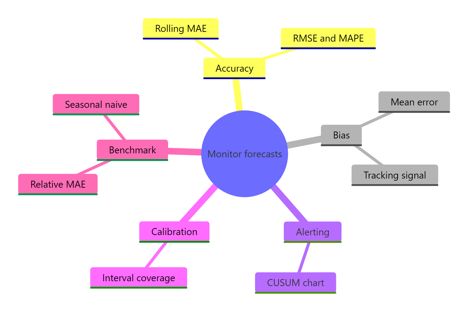
Figure 3: The forecast monitoring toolkit at a glance.
References
- Hyndman, R.J. & Athanasopoulos, G. Forecasting: Principles and Practice (3rd ed.), Chapter 5: Evaluating forecast accuracy. Link
- fabletools documentation.
accuracy(): Evaluate accuracy of a forecast or model. Link - O'Hara-Wild, M., Hyndman, R.J. et al. Tidy forecasting principles, Forecast evaluation. Link
- NIST/SEMATECH e-Handbook of Statistical Methods, CUSUM control charts. Link
- Gardner, E.S. (1983). Automatic monitoring of forecast errors. Journal of Forecasting, 2(1). Link
- Arthur.ai. Detecting unexpected drift in time series features. Link
- Hyndman, R.J. forecast package reference. Link
Continue Learning
- Forecast Accuracy in R - the full set of point and scaled error metrics, and how to interpret each one.
- Backtesting Forecasts in R - evaluate a model on rolling origins before you deploy, the pre-production companion to monitoring.
- Batch Forecasting in R - forecast hundreds of series at once, the natural place to bolt on the monitoring function from this tutorial.