Forecast Hundreds of Series Automatically in R
Batch forecasting means fitting a forecasting model to many time series at once instead of one at a time. In R the fable framework does it in a single model() call over a table that knows which rows belong to which series, and this page builds the whole workflow from scratch: from one command, to reading every forecast, to letting each series pick its own best model automatically. Everything runs on 8 real Australian retail series, and every number you see was measured, not guessed.
How do you forecast many series without writing a loop?
If you have ever had to forecast more than one thing, you know the usual shape of the code. You write a loop. For each product, each store, each region, you pull out that one series, fit a model, save the forecast, then move to the next. It works, but it is slow to write, easy to break, and it buries the interesting part (the forecasts) under a pile of bookkeeping.
There is a cleaner way. If your data sits in a table that knows which rows belong to which series, you can fit and forecast every series with a single command. Here is that command working on 8 retail series before we explain any of the pieces.
Read what came back. aus_retail is a dataset of Australian retail turnover that ships with the tsibbledata package. We kept one industry (cafes and restaurants) across all 8 states, and trimmed the history to 2015 onward. That left 8 separate series. The model(ets = ETS(Turnover)) step fitted an exponential smoothing model to each one, and forecast(h = "2 years") asked each fitted model for the next 24 months. The result is a single tidy table of 192 rows, which is 8 series times 24 months, with a .model column naming the model and a Turnover column holding each forecast as a probability distribution.
Nowhere did we write a loop or juggle an index by hand. The table carried the series identity for us, so one line of modeling code applied to all 8 series at the same time. That is the whole idea of batch forecasting, and the rest of this page unpacks how it works and how far it scales.
Try it: The starter below fits a seasonal naive model to every series but stops there, so it prints the fitted models instead of forecasts. Add the forecasting step to get a one-year forecast for all 8 series.
Click to reveal solution
Explanation: forecast(h = "1 year") turns each fitted model into 12 future rows. With 8 series that is 96 rows in total, produced by the same single command.
What is a keyed tsibble, and why does it make this automatic?
The part that makes this work is the table type. Classic forecasting tools in R use a ts object, which is a bare numeric vector with a start date and a season length attached. A ts object holds exactly one series, and it drops that time structure as soon as you manipulate it with a normal data verb like filter(). The fable framework replaces it with a tsibble, which is a data frame that knows two special things: which column is time (the index), and which column or columns identify a series (the key).
The key is what powers batch forecasting. Let us look at the full dataset before we sliced it, so you can see the key at work.
The header tells the story. Key: State, Industry [152] means the combination of state and industry marks a series, and there are 152 of them packed into this one table. n_keys() confirms the count, and key_vars() names the two columns that form the key. Every one of those 152 series has its own history stacked in the same data frame, kept apart only by the key.
filter(), mutate(), select() and friends all work, and the key travels along automatically. That is why the slice we made at the top is still a valid multi-series table, ready to forecast.To keep every code block on this page quick, we work with the 8-series slice rather than all 152. Nothing about the modeling code would change for the full set; only the running time grows. Here is the slice, with its key showing exactly 8 series.
Think of the key as the instruction "treat each group as its own series". When you later call model(), fable reads the key, splits the table into its 8 groups behind the scenes, fits your model separately inside each group, and stitches the results back into one table. You never manage the split yourself. That is the difference between one command and one command per series: the key does the splitting for you.
Try it: Each series in retail covers the same 48 months (2015 through 2018). Confirm it for one state by counting the rows for Tasmania. The starter isolates the state but does not count yet.
Click to reveal solution
Explanation: Filtering to one state leaves a single-series tsibble, and nrow() shows 48 months. Every series in the slice has the same length here, though fable is happy to forecast series of different lengths too.
How do you fit a model to every series in one command?
Now we build the real workflow. Because we want to judge our forecasts honestly later, we hold back the most recent year of data as a test set and train only on what came before. Splitting a tsibble by time is a one-liner with filter_index().
With the training data in hand, we fit three models at once. SNAIVE is the seasonal naive baseline, where the forecast for next July is simply last July; it is the bar every serious model must clear. ETS is exponential smoothing, which tracks a level, a trend and a season. ARIMA models each series through its own past values and past errors. We ask for all three in one model() call.
What came back is called a mable, short for model table. It has one row per series and one column per model, so this one holds 24 fitted models (8 series times 3 model types) in a single object. The pipeline in Figure 1 shows where the mable sits: model() turns the data table into a mable, and later verbs walk it forward.

Figure 1: Each fable verb runs once and applies to every series in the table.
Look closely at the cells, because they reveal the automatic part. We never told fable which ETS or ARIMA to use. Writing ETS(Turnover) with nothing on the right of the response told it to search the family and keep the best fit for that series, and ARIMA(Turnover) did the same. That is why the cells differ from row to row: New South Wales landed on ETS(A,A,A) while Northern Territory got ETS(M,N,N), and every state has its own ARIMA order. Each series was tuned on its own, automatically, inside the same command.
model() call is also the slowest step on the page, since it is doing all that searching; give it a moment to run.The mable behaves like any table. You can pull each series' fitted statistics with glance(), which returns one row per series per model.
Each series has its own fitted numbers. The NA values for SNAIVE are expected, because the seasonal naive method has no likelihood to score, so information criteria like AICc do not apply to it. We will judge the models on held-out accuracy instead, which is fairer across model types anyway.
Try it: You can read a single fitted model in full with report(). The starter selects the ETS column for all states, which is one step too broad. Narrow it to one column and one state, then report it.
Click to reveal solution
Explanation: report() needs a single model, so you first select one column and one series. It prints the chosen ARIMA order, its coefficients and its fit statistics, exactly as if you had modeled that one series on its own.
How do you read the forecasts and their uncertainty?
A mable is not a forecast yet, it is a set of fitted models. To get forecasts, pass the whole mable to forecast() with a horizon. Because the mable holds every series and every model, one call produces every forecast.
The result is a fable, a forecast table. Its 288 rows are 8 series times 3 models times 12 months. The Turnover column is not a single number but a distribution written as N(mean, variance), so each forecast carries its own uncertainty. The .mean column, hidden at the far right, is the point forecast pulled out of that distribution for convenience.
Point forecasts alone hide the risk. To see a prediction interval, pipe the fable through hilo(), which turns a distribution into a low-high band at the confidence level you ask for.
Each row now shows the expected turnover and the range the model is 95 percent sure it falls within. For January 2018 the point forecast is about 890 and the band runs from roughly 852 to 927, which is the honest way to report a forecast: a center plus a spread.
Numbers land better as a picture. Because a fable is a data frame, you can plot it with ordinary ggplot2. Here we draw the history and the three forecasts for two of the states side by side.
Run it and you get two panels, one per state, each showing the grey history and three coloured forecast lines fanning into 2018. You can immediately see that the models disagree, and that some track the seasonal shape better than others. Which raises the real question: with three candidates per series, how do you decide which one to trust?
Try it: Business reports often use an 80 percent band rather than 95. The starter filters the fable to the ARIMA forecasts for Victoria. Add an hilo() step at the 80 percent level and select the interval column.
Click to reveal solution
Explanation: The 80 percent band is narrower than the 95 percent one, because you are asking the model to be certain about a smaller range. Same fable, same hilo() verb, just a different level.
How do you pick the best model for each series automatically?
This is where batch forecasting pays off. We held back the last 12 months, so we can compare each forecast against what actually happened and score it. The accuracy() function lines each forecast up with the matching month in the real data (which is why we pass the full retail table, not just the test slice) and scores the entire fable at once, returning one row per series per model.
Two of its columns are built for comparing across different series: MASE and RMSSE. Both are scaled errors, meaning they divide a model's error by the error of the naive baseline on that series. A value below 1 means the model beat the naive forecast; above 1 means it lost to it. Because the scaling cancels out the size of each series, you can compare a tiny territory against a huge state fairly.
Already you can see the models trading places. In the Capital Territory the naive baseline wins with an RMSSE of 0.660, while in New South Wales the ETS model wins at 0.387. No single model is best everywhere. That is normal, and it is exactly why fitting several and comparing them per series pays off.
To turn this table into a decision, group by the series and keep the row with the lowest error. slice_min() does the picking.
Every series now carries its own winner, chosen by the data rather than by you. Figure 2 shows the small pipeline each series went through to get here.

Figure 2: Every series is scored on held-out months and keeps its own lowest-error model.
Count the winners and the point of the whole exercise jumps out.
The naive baseline won 4 of the 8 series, while ETS and ARIMA took 2 each. Read that honestly: on this data the fancy models beat the simple one only half the time. If you had forced one model onto all 8 series, you would have been wrong for at least half of them. Selecting per series is not a nicety here, it is the difference between a good forecast and a mediocre one, and the batch workflow makes it automatic.
group_by() plus slice_min(), not a research project. This scales to thousands of series without another line of logic.Try it: Before trusting per-series selection, it helps to know how each model does on average. The starter groups the scores by model. Add a summarise() that computes the mean RMSSE, then sort to see the overall ranking.
Click to reveal solution
Explanation: On average the three models are close, with the naive baseline barely ahead. That average hides the real story: per-series selection does better than any of these single numbers, because it takes the winner in each series rather than one model's average.
What happens when a series is too short or broken?
At scale, some series will not cooperate. A shop that opened last month has almost no history. A sensor that dropped out leaves a wall of missing values. In a hand-written loop, one such series throws an error and can halt the whole run. fable is built for the batch case, so it handles a failed fit gracefully: it marks that series with a null model and keeps going with the rest.
Let us force the problem. We build a tiny panel with one healthy series and one that is almost entirely missing, then fit a model to both.
Store A fitted fine. Store B, which has only two real data points, could not be fitted, so its cell reads <NULL model> rather than crashing the run. The batch survived one bad series, which is exactly the behavior you want when you are fitting hundreds at a time.
You still need to know which series failed, so you can handle them. is_null_model() tests a fitted model, and mapping it across the column flags every failure.
Speed matters once the series count climbs. Because each series is fitted independently, the work splits cleanly across CPU cores. The tidyverts tools cooperate with the future package: add library(future) and plan(multisession) before your model() call, and the same one command spreads the fits across your cores with no other change. That is the payoff of the batch design; scaling up is a configuration line, not a rewrite.
plan(multisession, workers = 4) before model() runs the per-series fits on four cores at once, and because the series are independent there is nothing to coordinate. Fit time drops roughly in proportion to the cores you give it.Try it: For a big batch you often just want a count of failures. The starter adds the null flag to the mable. Finish it by summarising the flag into a single count of failed series.
Click to reveal solution
Explanation: Summing a logical column counts the TRUE values, so n_failed reports how many series in the batch produced a null model. One failed here, which matches the flag table above.
Complete Example: Forecast Every Series With Its Own Best Model
Here is the whole workflow end to end, reusing the retail slice and the best table of per-series winners we built earlier. We refit all three models on the full history (not just the training window), forecast every series a year ahead, then keep only each series' chosen model with a semi_join(). The result is one forecast per series, each from the model that proved best for it, produced automatically.
Each state now has a January 2019 forecast from its own winning model: the Capital Territory keeps its naive forecast, New South Wales its ETS, Victoria its ARIMA. The whole thing is a handful of verbs, and it would read identically if retail held 152 series or 152,000. That is what "forecast hundreds of series automatically" means in practice.
Practice Exercises
These build on the objects created above (acc, best, fc). Use distinct variable names so you do not overwrite the tutorial's state.
Exercise 1: Measure the payoff of per-series selection
Per-series selection should beat committing to one model for everyone. Compare the mean RMSSE you would get from the single best model overall against the mean RMSSE from the per-series winners in best.
Click to reveal solution
Explanation: The best single model averages 0.762, while picking the winner for each series averages 0.550. That drop is the concrete value of per-series selection: a better forecast for free, from models you already fitted.
Exercise 2: How often does ETS beat the baseline?
A good sanity check on any model is how often it beats the naive baseline. Using acc, reshape the MASE scores so each series has one row with a column per model, then count in how many series ETS beat SNAIVE.
Click to reveal solution
Explanation: pivot_wider() puts each model's MASE in its own column, so a row-wise comparison is easy. ETS beat the naive baseline in 4 of the 8 series, which lines up with the winner tally from the tutorial.
Exercise 3: Assemble the chosen-model forecast for the test window
Instead of the future forecast from the Complete Example, build the held-out forecast (the 2018 test months in fc) using only each series' selected model. Then confirm each series contributes exactly 12 months.
Click to reveal solution
Explanation: The semi_join() keeps only the rows whose series-and-model pair appears in best, which is exactly each series' winner. Every series contributes its 12 test months, giving you a clean per-series forecast table.
Frequently Asked Questions
Is batch forecasting the same as a global forecasting model? No, and the difference matters. Batch forecasting fits a separate model to each series (many local models, run by one command). A global forecasting model instead trains one model on the stacked history of all series so they share what they learn. Batch is the right default when your series behave differently; global shines when you have thousands of short, similar series. See the linked posts below to compare them.
How many series can this handle? As many as your memory and patience allow. The code is identical for 8 or 8,000 series; only run time grows, and it grows roughly in line with the series count. For large panels, turn on parallelism with future and consider fitting cheaper models first to triage.
Do all my series need the same length or the same dates? No. A tsibble happily holds series of different lengths and start dates. Each series is fitted on whatever history it has. Series that are too short simply return a null model, which you can flag and handle.
Which accuracy measure should I use to compare series? Use a scaled measure like MASE or RMSSE. Plain errors like RMSE are on each series' own scale, so a big series would dominate the comparison. Scaled measures divide by the naive baseline, which puts every series on the same footing.
Can I mix in other models like Prophet or a neural network? Yes. Any model with a fable interface slots into the same model() call as another named argument, and it flows through forecast() and accuracy() unchanged. Some of those models rely on packages that run outside the browser, so try them in a local R session.
Summary
Batch forecasting turns "forecast every series" from a loop into a short chain of table operations. The key column in a tsibble does the per-series splitting, model() fits every series at once, forecast() and accuracy() carry the whole batch forward, and a group_by() picks the best model for each series automatically.
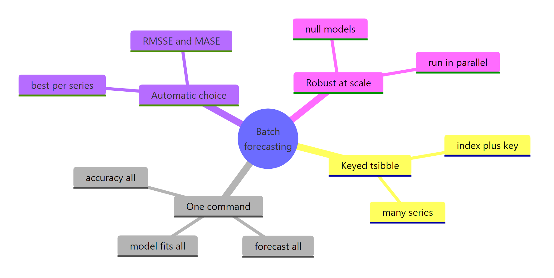
Figure 3: The batch forecasting workflow at a glance.
| Step | Verb | What it does across all series |
|---|---|---|
| Structure | as_tsibble(), key |
Marks which rows form each series |
| Fit | model() |
Fits every model to every series, one row per series |
| Forecast | forecast(h = ) |
Produces a distribution per series per horizon |
| Evaluate | accuracy() |
Scores each series and model on held-out data |
| Select | group_by() + slice_min() |
Keeps each series' lowest-error model |
| Harden | is_null_model() |
Flags series that could not be fitted |
The headline lesson from the data: no single model won more than half the series, so letting each series choose its own model measurably improved the forecasts, and the batch workflow made that choice automatic.
References
- Hyndman, R.J., & Athanasopoulos, G. Forecasting: Principles and Practice, 3rd edition. Chapter 13, Forecasting many series. Link
- fable package documentation, tidyverts. Link
- tsibble package documentation, tidyverts. Link
- fabletools reference, including
accuracy()andis_null_model(). Link - O'Hara-Wild, M., Hyndman, R.J., & Wang, E. tsibbledata: Diverse Datasets for tsibble. Link
- Hyndman, R.J. Tidy forecasting in R. Link
- Australian Bureau of Statistics, Retail Trade, Australia (source of
aus_retail). Link
Continue Learning
- fable in R: Tidy Time Series Forecasting with tsibble - the framework this page builds on, explained from the single-series basics up.
- Global Forecasting Models in R - the other way to forecast many series, where one model learns across all of them.
- Forecast Accuracy in R - a deeper look at MASE, RMSSE and the other measures used to pick winners here.