Trending Google Analytics sessions
Example 1: Trending Google Analytics sessions
We first load the libraries we will need later, authenticate with Google, and set the View Id we want to pull data from.
library(googleAnalyticsR)
library(knitr)
ga_auth()

## replace with your own Google Analytics View Id
view_id <- 81416156
This is the actual API call. We take advantage of Google Analytics v4’s pivot function, to do some data transformation for us:
## get data, use pivot to get columns of medium sessions
trend_data <- google_analytics_4(view_id,
                                 date_range = c(Sys.Date() - 400, Sys.Date()),
                                 dimensions = c("date"),
                                 metrics = "sessions",
                                 pivots = pivot_ga4("medium","sessions"),
                                 max = -1)

## Note the medium columns created by the pivot
kable(head(trend_data))| date | sessions | medium.referral.sessions | medium..none..sessions | medium.social.sessions |
|---|---|---|---|---|
| 2015-08-07 | 76 | 19 | 12 | 0 |
| 2015-08-08 | 37 | 4 | 10 | 0 |
| 2015-08-09 | 48 | 11 | 8 | 0 |
| 2015-08-10 | 192 | 73 | 59 | 0 |
| 2015-08-11 | 81 | 18 | 20 | 0 |
| 2015-08-12 | 68 | 18 | 7 | 0 |
Now we have the data, we transform it a little to a format suitable for the plot functions:
## format the names
names(trend_data)
## [1] "date" "sessions"
## [3] "medium.referral.sessions" "medium..none..sessions"
## [5] "medium.social.sessions"names(trend_data) <- c("Date","Total","Referral","Direct","Social")
## check the data R classes
## This time all look good - Date objects for date and numeric for the metrics
str(trend_data)## 'data.frame': 401 obs. of 5 variables:
## $ Date : Date, format: "2015-08-07" "2015-08-08" ...
## $ Total : num 76 37 48 192 81 68 64 87 35 32 ...
## $ Referral: num 19 4 11 73 18 18 20 33 12 11 ...
## $ Direct : num 12 10 8 59 20 7 9 15 6 5 ...
## $ Social : num 0 0 0 0 0 0 0 0 0 0 ...
## - attr(*, "totals")=List of 1
## ..$ :List of 1
## .. ..$ sessions: chr "34563"
## - attr(*, "minimums")=List of 1
## ..$ :List of 1
## .. ..$ sessions: chr "15"
## - attr(*, "maximums")=List of 1
## ..$ :List of 1
## .. ..$ sessions: chr "640"
## - attr(*, "rowCount")= int 401Looks good to try some plots:
Base plots
Good for quick explorations, but takes arcane work to make presentable for final publication
## make a time-series object
trend_ts <- ts(trend_data[-1], frequency = 7)
plot(Total ~ Date, data = trend_data, type = "l")
axis(1, trend_data$Date, format(trend_data$Date, "%b"))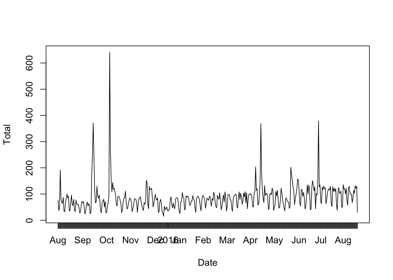
ggplot
You need to learn the syntax, but its more consistent than base R’s.
You slowly build up your plot via geoms, and the end results can be very professional looking.
library(ggplot2)
library(reshape2)
##
## Attaching package: 'reshape2'## The following object is masked from 'package:tidyr':
##
## smiths## change data into 'long' format
trend_long <- melt(trend_data, id = "Date")
head(trend_long)## Date variable value
## 1 2015-08-07 Total 76
## 2 2015-08-08 Total 37
## 3 2015-08-09 Total 48
## 4 2015-08-10 Total 192
## 5 2015-08-11 Total 81
## 6 2015-08-12 Total 68## build up the plot
gg <- ggplot(trend_long, aes(x = Date, y = value, group = variable)) + theme_minimal()
gg <- gg + geom_line(aes(colour = variable))
gg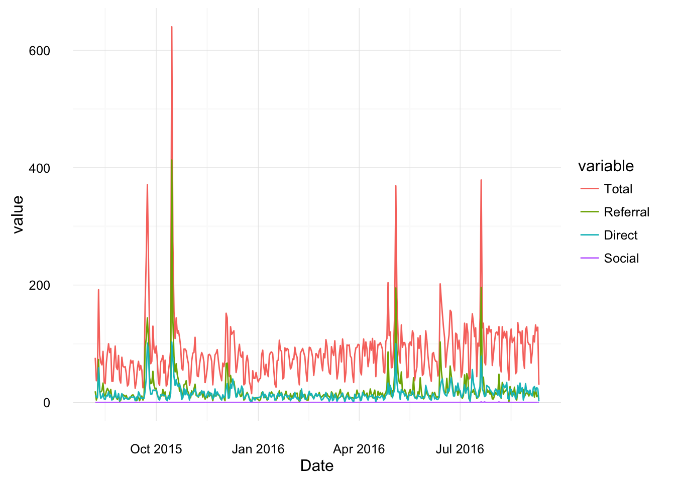
highcharter (example of htmlwidgets)
Uses JavaScript libraries to render your data. Only works in HTML, but fancy and interactive.
library(highcharter)
library(reshape2)

## change data into 'long' format
trend_long <- melt(trend_data, id = "Date")
hchart(trend_long, type = "line", x = Date, y = value, group = variable)