Energy Load Forecasting in R: an End-to-End Case Study
Energy load forecasting in R turns a grid's demand history and a weather forecast into an hour-by-hour prediction of tomorrow's electricity load. This is a full short-term load forecasting case study, run the way a utility's analytics team would run it: audit sub-daily data, explore its daily and weekly cycles and the U-shaped temperature response, engineer degree-day and calendar features, fit and backtest five models, then hand the scheduling desk a defensible day-ahead forecast. Every step uses the tidyverts stack (tsibble, feasts, fable), and every block runs in your browser.
What decision does an energy load forecast feed, and what does getting it wrong cost?
Picture yourself on the operations desk at AuroraGrid, a regional utility that keeps the lights on across the state of Victoria. Every afternoon you commit to tomorrow's generation and buy any shortfall on the day-ahead market. That commitment rests on one number for each hour: how many megawatts the state will draw. Get it right and the grid runs cheaply. Get it wrong and one of two bills lands on your desk.
The two bills are not the same size, and that asymmetry is the whole reason this job matters. Buy too much power and you sell the surplus back at a small loss, a few tens of dollars per megawatt-hour. Buy too little on a scorching afternoon and you cover the gap on the spot market, where the price spikes toward the market cap, which sat near A$13,000 per megawatt-hour in 2014, more than two hundred times a quiet off-peak price of about A$50. A shortfall at the peak can also mean shedding load, which is a polite phrase for switching off suburbs. So the cost of under-forecasting a hot day dwarfs the cost of over-forecasting a mild one.
That is why "how hot will it be tomorrow" is the most valuable question on the desk. Here is the payoff we are building toward, shown before we explain a single line: forecasting the load for a record-breaking 43-degree day, once with a plain "same as last week" rule and once with a model that reads the temperature forecast. We load three years of real half-hourly demand for Victoria, roll it up to hourly, and score both approaches on the day they mattered most.
Read the two rows and the case study makes itself. On that 43-degree day, repeating last week's load was off by 2,646 megawatts on average, a 33% miss, because the previous week was mild. The temperature-aware model, reading the same weather forecast a meteorologist would hand the desk, cut that error to 1,261 megawatts, a 13% miss. Halving the error on the single hardest day of the year is worth millions when the shortfall settles at cap prices. Everything else in this tutorial exists to earn the right to trust that second number.
The data is real. It is the vic_elec series that ships with the tsibbledata package: half-hourly electricity demand and temperature for the whole state of Victoria, 2012 through 2014. We treat AuroraGrid as the operator of that grid, so the megawatt figures are state-scale, but the workflow is identical whether you forecast a state, a substation, or a single large factory.
An engagement like this always moves through the same eight phases, and the rest of the tutorial walks them in order.

Figure 1: The eight phases of an end-to-end load-forecasting engagement.
Try it: The desk also wants the single peak hour, because that is when the market is tightest. Adapt the block to forecast tomorrow's load with the temperature model alone, then pull out the hour with the highest predicted demand.
Click to reveal solution
Explanation: The model expects the peak near 3pm at about 7,574 megawatts, far above a mild day's 5,500. The actual peak that day reached 9,313 megawatts, so even the good model under-calls a record heat event, a limitation we diagnose later in the tournament.
Is the hourly load data clean enough to model?
A forecast is only as honest as the data beneath it, so the first real job is an audit. Sub-daily energy data has its own traps that monthly sales data never shows: clock changes, sensor dropouts, and demand spikes that are real events rather than errors. We check four things: how much history we hold, whether the calendar has holes, whether the numbers sit on a sensible scale, and whether anything looks like a data fault.
We already built elec in the opening block by rolling the raw half-hourly readings up to hourly load with index_by() and summarise(). Modelling hourly instead of half-hourly halves the number of rows with no loss of the patterns that matter for day-ahead scheduling, which clears in hourly blocks anyway. Start by looking at the object itself.
The header carries the vital facts. This is a tsibble, a data frame that knows its Hour column is time. The [1h] is the interval, one hour between rows, and <Australia/Melbourne> is the timezone, which will matter in a moment. Demand is in megawatts, temperature in degrees Celsius. Twenty-six thousand hourly readings across three years is a generous amount of history.
Now the checks that catch problems. A demand series can hide missing hours, a feed outage or a dead sensor, that quietly break a model. We count the rows, confirm the span, look for missing values, and ask count_gaps() whether any expected hour is absent.
Both checks come back clean: 26,304 hours from the start of 2012 to the end of 2014, no missing demand, and a zero-row gap table, which means every hour between the first and last is present. On a messier series you would repair it with fill_gaps() before modelling.
There is one sub-daily gotcha that a naive gap check misses, and it hides in the timezone. Twice a year the clocks change for daylight saving. On the spring-forward day an hour vanishes, and on the fall-back day an hour repeats. Because our index is in local Melbourne time, some days do not have 24 hours. We can see it by counting hours per day.
Six days over three years break the 24-hour rule: three April days with 25 hours (clocks fall back) and three October days with 23 hours (clocks spring forward). This is not a data error, it is the calendar, and it is exactly why a load model built on local time needs a season term that tolerates the odd short or long day rather than assuming a rigid 24-hour block.
Finally, scale and outliers. A quick five-number summary tells us whether the megawatt figures are plausible and flags any wild values.
Demand runs from about 2,860 megawatts in the small hours to 9,313 at the top. The maximum is more than three times the minimum, a huge swing, and that top value is the record heat afternoon from the opening block.
Try it: A load series should never be zero or negative. Confirm the minimum demand is comfortably positive and that no value is missing, in one summary.
Click to reveal solution
Explanation: The floor is 2,864 megawatts and nothing is missing, so the series is physically sensible: a grid always draws some power, even at 4am.
What patterns hide in hourly electricity demand?
The audit told us the data is trustworthy. Now we explore its structure, because the shape of a load series decides which models can fit it. Electricity demand is one of the most patterned series in all of forecasting, and we will pull out three layers: how much of it is season versus trend, what the daily and weekly shapes look like, and how the calendar bends them. Each view changes a modelling decision.
Start with a single summary. The feat_stl() feature from feasts runs a decomposition under the hood and reports the strength of the trend and the strength of the daily season, each on a 0-to-1 scale where 1 means "dominates completely".
A daily seasonal strength of 0.887 is enormous. It says the within-day pattern, the rise and fall between 4am and 6pm, is the single biggest feature of the series, even ahead of the slow trend at 0.851. That one number rules out any model that cannot handle strong seasonality and tells us the daily cycle is the thing to nail.
To see that daily cycle, look at a short slice of the raw series. A fortnight of hourly load shows both rhythms at once.
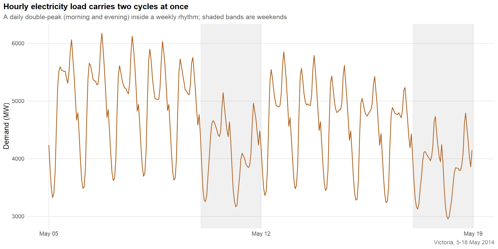
Figure 2: Hourly load carries a daily double-peak inside a weekly rhythm.
Two patterns stack on top of each other. Within each day, demand traces a double hump: a morning shoulder as the state wakes and switches on, and a taller evening peak as people come home. Across each week, the five weekdays sit higher than the shaded weekends. That is two seasonal periods in one series, a daily cycle of 24 hours and a weekly cycle of 168 hours, which is what makes sub-daily load harder than the monthly sales you may have forecast before.
To see the daily shape on its own, overlay one line per day. The gg_season() helper from feasts wraps every day onto a common 24-hour axis.
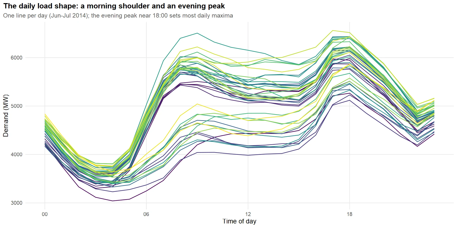
Figure 3: The daily load shape: a morning shoulder and an evening peak.
Every day traces the same path: a trough around 4am, a climb to a morning shoulder near 9am, a midday plateau, and the day's high near 6pm before the evening wind-down. The lines fan apart in the afternoon because that is when weather does its work, some days far hotter than others, but the skeleton is remarkably stable. A stable daily shape is exactly what you want, because it means the model can learn one profile and reuse it.
Now the calendar. The audit already gave us a workday flag (a weekday that is not a public holiday). Averaging the demand within each day type shows how much the calendar moves the load.
A workday averages 4,895 megawatts, about 17% above a weekend and 20% above a public holiday. Offices, factories and schools switch on together on weekday mornings, and that block of business load is the difference. The three day types also draw slightly different shapes, which the picture makes clear.
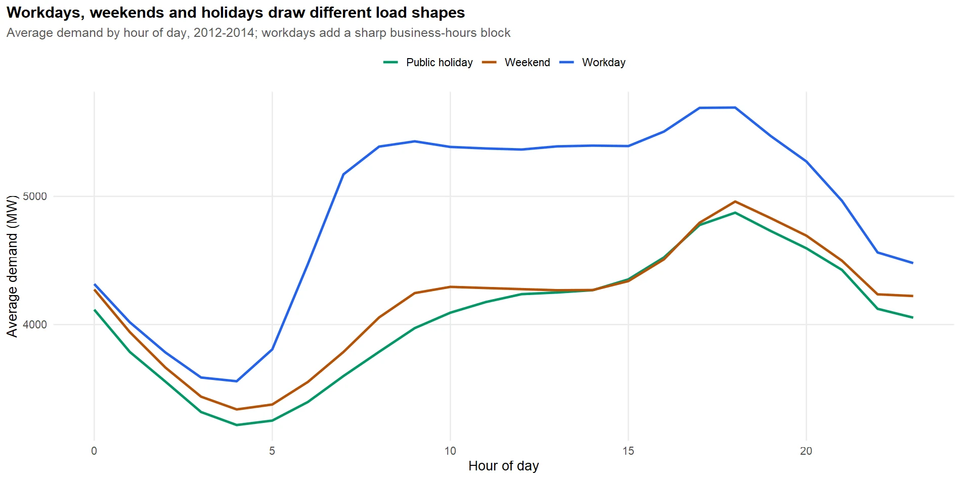
Figure 4: Workdays, weekends and holidays draw different load shapes.
The workday line sits above the other two through the whole business day and carries a sharper morning shoulder; weekends and holidays are lower and flatter, waking later. This tells us a good model needs more than a smooth weekly wave; it needs to know whether tomorrow is a working day.
Try it: The feasts package can also wrap the data onto a weekly axis. Draw the weekly-scale seasonal plot to see the weekday-to-weekend drop directly.
Click to reveal solution
Explanation: Switching period = "week" wraps the series onto a Monday-to-Sunday axis. Each line is one week, and you can read the weekday plateau falling away into the weekend, the same 17% drop the table quantified.
Why does temperature bend the load curve?
The seasonal shapes explain the calm days. The wild days, the ones that decide the year, are driven by weather. Electricity load and temperature have one of the most important nonlinear relationships in applied forecasting, and understanding its shape is what separates a load model from a generic time series model.
The cleanest way to see the relationship is to group demand into temperature bands and read the average load in each.
Read the mean-demand column and the shape jumps out. Demand bottoms out at about 4,525 megawatts in the mild 12-to-18 band, ticks up slightly in the cold, then explodes on the hot side: 5,177 at 24 to 30 degrees, 6,357 at 30 to 36, and 7,906 above 36. The last band is built from only 102 hours across three years, but those 102 hours are precisely the peaks that break the budget. Plotting every hour draws the same shape as a smooth curve.
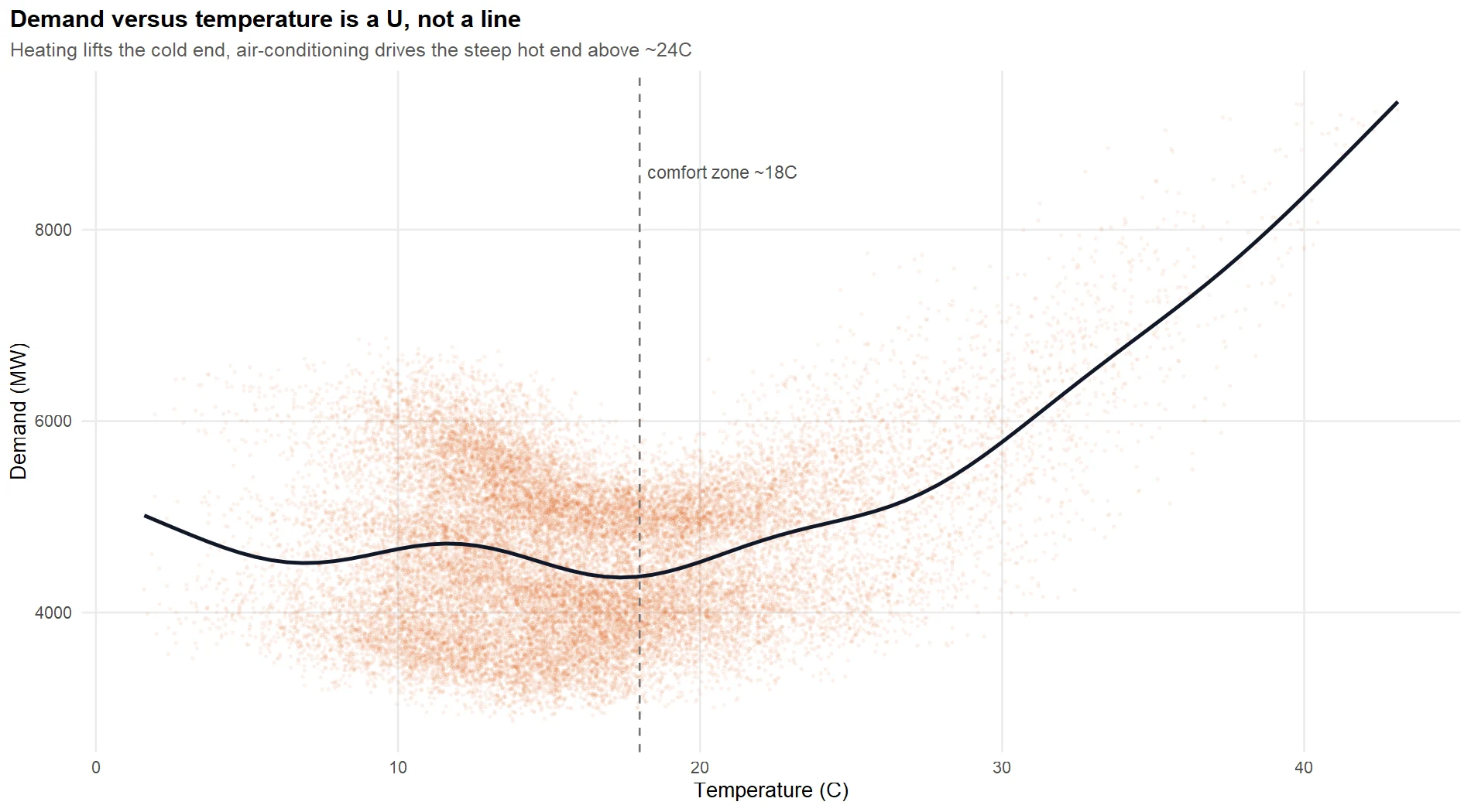
Figure 5: Demand versus temperature is a U, not a line.
The relationship is a U, not a straight line. Demand is lowest in the mild middle, around 18 degrees, where nobody needs to heat or cool. As it gets colder, heaters switch on and demand climbs gently. As it gets hotter, air-conditioners switch on and demand climbs steeply, far more steeply than the heating side, until a 43-degree afternoon pushes the state past 9,000 megawatts. The two arms of the U are driven by different appliances, and the cooling arm is the dangerous one, because a hot-day forecast is exquisitely sensitive to the temperature it assumes.
To confirm the season and the weather are separable, decompose a few weeks with STL, telling it to fit both a daily and a weekly season.
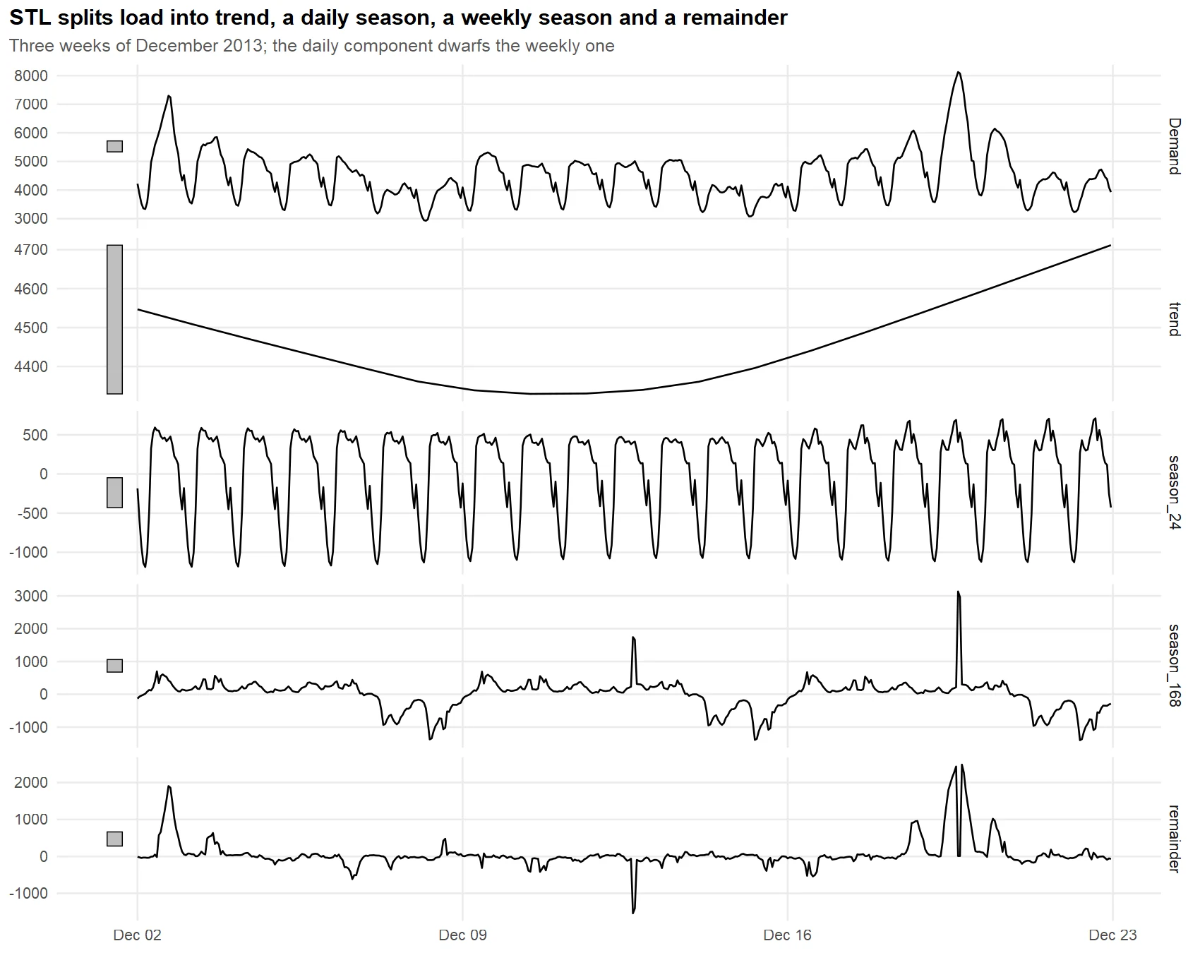
Figure 6: STL splits load into trend, a daily and a weekly season, and a remainder.
STL pulls the series apart into a gentle trend, a big daily season (the season_24 panel, swinging plus or minus 1,000 megawatts), a smaller weekly season (season_168), and a remainder. Notice the remainder is small and flat most of the time but jumps on a couple of days. Those jumps are the weather, the part no fixed seasonal pattern can explain, and they are exactly what temperature features are for.
Try it: A straight line through the U fits badly. Show that the demand correlates more strongly with distance from the 18-degree comfort point than with raw temperature.
Click to reveal solution
Explanation: Raw temperature correlates only 0.26 with demand, because the cold and hot arms of the U pull in opposite directions and cancel. Distance from 18 degrees correlates 0.33, higher, because it treats both arms as "further from comfort means more load". This is the numeric fingerprint of the U shape.
How do you turn weather and the calendar into model features?
The EDA handed us a shopping list: two seasonal cycles, a calendar effect, and a U-shaped temperature response. Now we turn each into a column the models can use. Good features are where a load forecast is won or lost, because they encode the physics the model cannot discover on its own.
In the opening block we quietly used three engineered columns. Here is what they are, plus one more that captures a subtlety of heat.
The temperature response is the star, and we encode its U shape with two degree-hour variables. Cooling degree-hours, cool, measure how far above 18 degrees it is (zero when it is cool), and drive the air-conditioning arm. Heating degree-hours, heat, measure how far below 18 it is, and drive the heating arm. Splitting the U at its base like this lets a straight-line regression bend, because each arm gets its own slope.
Heat also lingers. On the third day of a heatwave, buildings have soaked up warmth and demand runs higher than the same temperature on day one. We capture that memory with cool_lag, yesterday's cooling degree-hours at the same hour.
Look at the record 3pm hour: 42.8 degrees gives 24.8 cooling degree-hours and zero heating degree-hours, and cool_lag of 19.5 says yesterday was hot too, so heat has been building. The workday flag confirms it was a Thursday. Those four columns, plus the seasonal terms below, are the model's entire view of the world.
That leaves the two seasonal cycles. We could add a dummy variable for every hour of the day and every hour of the week, but that is 24 plus 168 columns of clutter. Instead we use Fourier terms, a handful of sine and cosine waves that trace a smooth repeating shape with far fewer parameters. In fable, fourier(period = 24, K = 6) draws the daily cycle with six wave pairs and fourier(period = 168, K = 3) draws the weekly cycle with three.
Try it: We built cooling degree-hours; now build the heating side and confirm both make sense. Count how many hours the state spent heating versus cooling, and find the coldest reading.
Click to reveal solution
Explanation: The coldest hour was 16.4 degrees below the 18-degree base (about 1.6 degrees Celsius). Victoria spent far more hours heating (17,778) than cooling (8,455), which fits a temperate climate, but the cooling hours, though fewer, contain the extreme peaks.
Which forecasting strategies suit sub-daily load?
We now know the shape of the problem: two strong seasonal cycles, a workday effect, and a steep U-shaped temperature response. That points to a short list of strategies, and a good forecaster tries several rather than betting on one. We fit five genuinely different models, each a plausible answer to this specific problem, and at least two of them handle the multiple seasonality head-on.
First split the history. We train on everything up to 12 January 2014 and hold out the week of 13 to 19 January, the heatwave week, as our first test. No model gets to see the days it will be judged on. The filter_index() helper selects rows by date: a two-sided "2013-11-01" ~ "2014-01-19" keeps every hour between those two dates, and a one-sided ~ "2014-01-12" keeps everything up to and including that day.
Each model earns its place for a reason:
- Seasonal naive repeats the load from the same hour one week ago. It is the honest benchmark: if a model cannot beat "same time last week", it is not worth deploying.
- Harmonic regression is a linear model with the two Fourier blocks, the degree-hour features, and the workday flag. It is transparent, so you can read the effect of every driver, and it handles both seasons through the Fourier terms.
- Dynamic harmonic regression takes that same regression and lets ARIMA errors model whatever autocorrelation is left over, so a miss in one hour informs the next. The
PDQ(0,0,0)switches off ARIMA's own seasonal machinery, because the Fourier terms already carry the seasonality. - STL hybrid decomposes the load into its two seasons and a seasonally adjusted remainder, forecasts that smooth remainder with exponential smoothing, then adds the seasons back. It handles multiple seasonality through the decomposition rather than through the regression.
- Combination averages the three model-based forecasts, because blending models that make different errors often beats any one of them.
All five fit in one model() call, and the combination is built by averaging the three model columns.
The result is a mable, a table of fitted models, one per strategy. Each label tells a story. The harmonic model is a plain TSLM. The dynamic harmonic model came back as LM w/ ARIMA(2,0,1) errors, meaning the search found that a second-order autoregressive, first-order moving-average error process mops up the leftover hour-to-hour correlation. The STL hybrid is flagged as a decomposition model.
The harmonic regression is the transparent one, so use it to read the drivers straight off the coefficients. Because the model is linear in the features, each coefficient is a megawatts-per-unit effect.
These four numbers are the physics of the grid in plain sight, and every one is significant beyond doubt. Each cooling degree-hour adds 79.6 megawatts of demand, so a jump from 18 to 40 degrees adds roughly 22 times 80, about 1,750 megawatts, from air-conditioning alone. Each heating degree-hour adds 65.2 megawatts. Yesterday's heat adds another 34.4 megawatts per lagged cooling degree-hour, confirming that heat carries over. And a working day adds a flat 711 megawatts of business load. A stakeholder needs no statistics to act on "every degree above 18 adds about 80 megawatts".
Try it: How much is temperature actually worth? Fit the harmonic model with and without the temperature features on the training set, forecast the heatwave week, and compare their errors.
Click to reveal solution
Explanation: Dropping temperature nearly doubles the error over the heatwave week, from 1,111 to 2,130 megawatts. The Fourier seasons and the workday flag alone cannot see a heatwave coming; the degree-hour features are what make the model earn its keep.
Which model actually wins on data it has not seen?
Five models are fitted. Now comes the honest part: judging them on data they never saw. This is the step that decides whether a forecasting project succeeds, because a model that hugs the training data can still forecast the future terribly. We judge in three ways: a first look at the heatwave week, a proper rolling backtest across many days, and a check that the prediction intervals can be trusted.
Start with the heatwave hold-out. We forecast the week of 13 to 19 January, feeding each model the actual temperatures for that week, and score them with accuracy().
The transparent harmonic regression wins outright at 1,111 megawatts, because it reads temperature and the heatwave was all about temperature. Seasonal naive and the STL hybrid, the two models with no view of the weather, land at the bottom near 2,100 megawatts, because "last week" and "the usual season" both said "mild". Interestingly the dynamic harmonic model, which fit the training data best, forecast worse than the plain harmonic here: over a seven-day horizon through a regime shift, its short-term error dynamics add little and can overshoot. A picture makes the gap vivid.
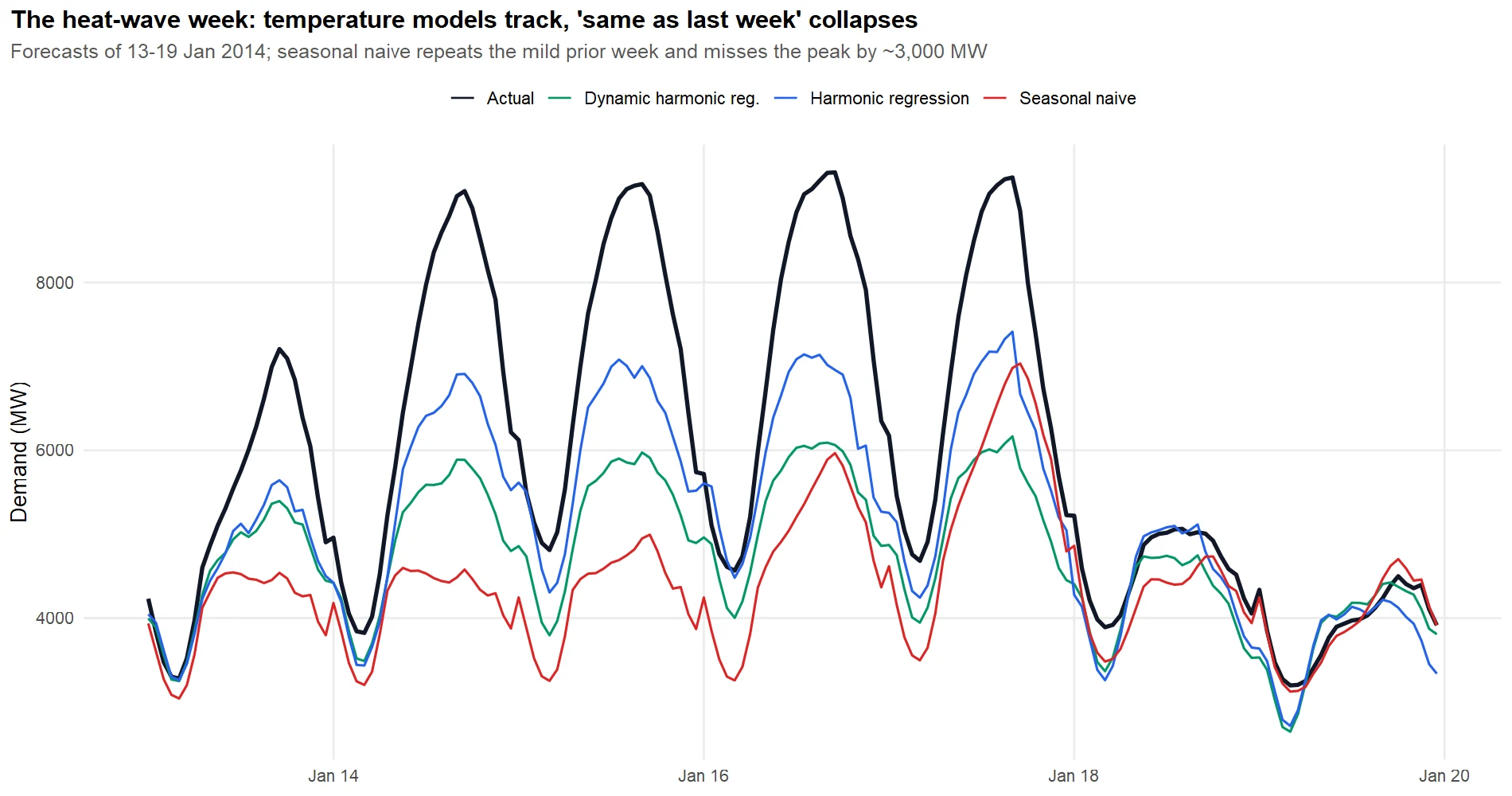
Figure 7: The heat-wave week: temperature models track, "same as last week" collapses.
The black actual line spikes above 9,000 megawatts on the hot days; the temperature models (blue and green) climb with it, while the seasonal naive line (red) stays flat near 6,000, repeating the mild prior week and missing the peak by roughly 3,000 megawatts. But look at the calm weekend on the right, where all the lines converge. A single week hides a more nuanced story, so break the error down day by day.
Read the two columns against each other and the crossover jumps out. Through the hot days of 14 to 17 January the temperature model crushes seasonal naive, halving the error or better. But on the cool weekend of 18 and 19 January the gap closes, and on the 19th seasonal naive actually wins (114 versus 376), because that quiet Sunday really did look like the previous Sunday. The bar chart shows the whole week at a glance.
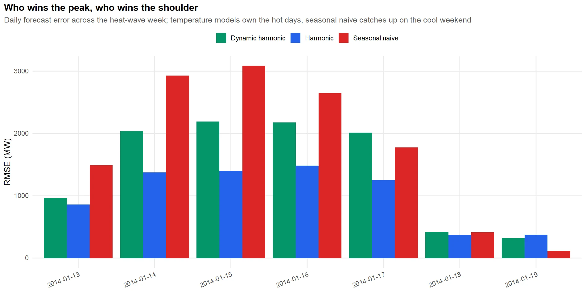
Figure 8: Who wins the peak, who wins the shoulder.
That is the real lesson of a tournament: no model owns every day. Temperature models own the peaks; the naive rule is fine on quiet days. To choose one model to deploy, we cannot rely on a single week, so we run a rolling backtest. We step an origin forward through January, and at each origin we refit every model on the previous six weeks and forecast the next day, the day-ahead horizon the desk actually uses. This is the slowest block in the tutorial, because it refits every model at ten different origins.
Across ten forecast days the picture holds: the temperature models average a day-ahead error near 500 megawatts (about 7.6% for harmonic), while seasonal naive is three times worse at 1,533. Day-ahead, you should always use a model. But averaging over hot and mild days together hides which model to reach for on which day, so split the backtest by conditions.
Now the two temperature models split the work. On mild days the dynamic harmonic model wins (281 versus 370), because when nothing dramatic is happening, its short-term error correction shaves the last bit off a routine forecast. On hot days the plain harmonic wins by a wide margin (741 versus 1,548), because during a fast temperature swing the ARIMA error dynamics chase the wrong signal, while the transparent regression just follows the thermometer. This is the kind of nuance that only a conditioned backtest reveals.
Point accuracy is only half the job. The desk sizes its reserve from the prediction interval, so an interval that lies about its own uncertainty is dangerous even when the point forecast is good. Check how often the actual load fell inside each model's stated 80% and 95% bands over the heatwave week.
Every model badly under-covers. Harmonic's 95% band, which should contain the truth 95% of the time, caught only 57% of the actual hours, and its 80% band only 41%. The reason is instructive: the intervals were estimated from ordinary weeks, and a record heatwave is far more variable than an ordinary week, so bands calibrated on calm data are far too narrow exactly when the risk is highest.
There is one more honesty check. Even the winning harmonic model has a worst day, and it is worth diagnosing. Its largest daily error over the heatwave week was on 16 January, the day of the record 9,313-megawatt peak. The model under-called that peak because two forces compound at the extreme: the temperature response, though bent, still underestimates how fast demand accelerates past 40 degrees, and heat had been accumulating for days in a way a single lagged term only partly captures. The failure is not random; it is the model reaching the edge of what its features can express.
Try it: Different error measures can reorder a ranking. Rank the three backtested models by MAPE instead of RMSE and confirm the winner does not change.
Click to reveal solution
Explanation: The order is unchanged: harmonic on top, then dynamic harmonic, then seasonal naive far behind. When two different error measures agree on the ranking, you can trust it is not an artefact of one metric.
What do you tell the people who buy the power?
This section is for the people who never see a line of R: the traders and schedulers who turn the forecast into purchase orders. It should read on its own, so here is the whole engagement in plain language.
The recommendation, in one sentence: deploy the temperature-aware harmonic regression as the day-ahead workhorse, lean on the dynamic harmonic model on calm days, and keep "same as last week" only as a sanity check. The decision rule is small enough to pin above the desk.
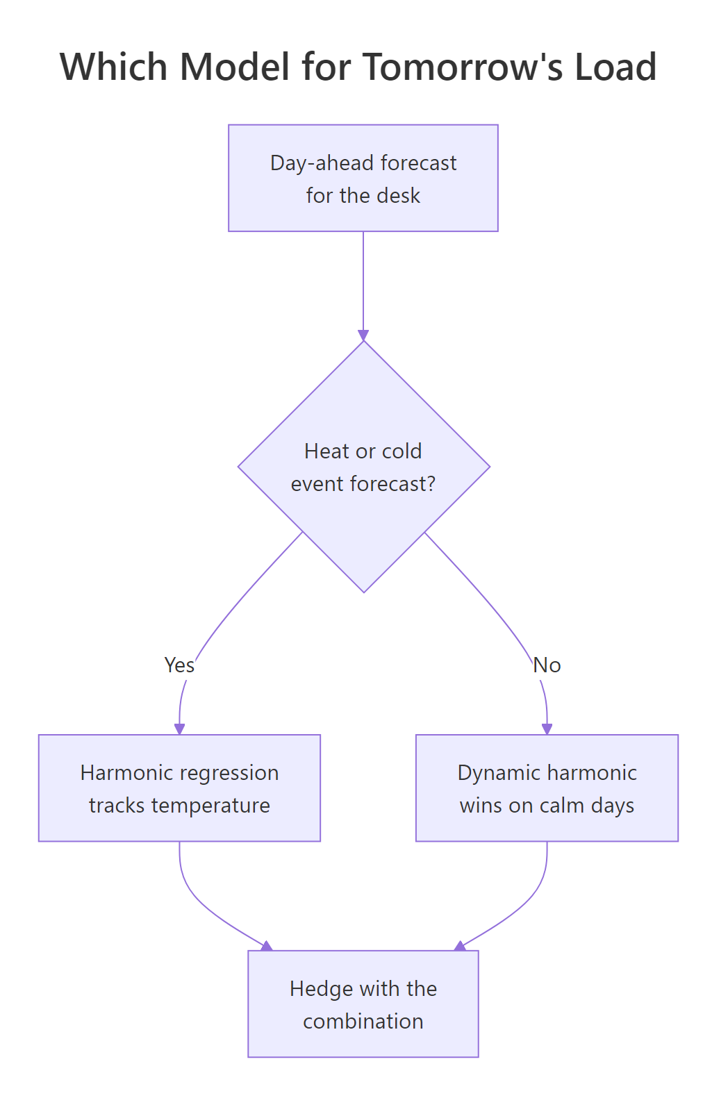
Figure 9: Which model to run for tomorrow's load.
The quantified impact is the headline. Across the January backtest, the temperature model cut the day-ahead error from the naive rule's 1,533 megawatts to 481, a reduction of about 1,000 megawatts of average miss.
Here is what those numbers mean for the business, with no jargon:
| What the desk asks | What the forecast says |
|---|---|
| How good is the day-ahead number? | Off by about 7.6% on average, versus 24% for the old rule. |
| Where does it help most? | On hot days, where it halves the peak miss that costs the most. |
| What is the peak error worth? | Cutting a 3,000 megawatt peak miss to 1,500 avoids buying that gap at cap prices. |
| Which model runs tomorrow? | Harmonic if heat or cold is forecast, dynamic harmonic on calm days. |
The top three caveats, stated up front. The first is the one that keeps forecasters awake: the model runs on a weather forecast, not the real weather. In this case study we fed it the actual temperatures; in production tomorrow's temperature is itself a forecast, and its error flows straight into the load forecast. We can measure that sensitivity by shifting the temperatures the model sees.
A weather forecast that is 2 degrees too cool lifts the load error from 1,111 to 1,227 megawatts, and worse than the size of the miss is its direction: under-calling the heat makes the load model under-forecast demand right before a peak, which is the expensive, lights-out direction. (The 2-degrees-too-warm row looks better here only because the model already under-shoots the record peak, so a warm bias accidentally compensates this one week; do not read it as "warm is safe".) The second caveat is the interval problem from the tournament: the bands are too narrow in extremes. The third is structural change, covered next.
Try it: How bad is a really poor weather forecast? Reuse the score_temp() helper to see the error when the temperature forecast is 3 degrees too cool.
Click to reveal solution
Explanation: A 3-degree-too-cool forecast pushes the error to 1,285 megawatts, up from 1,111 with perfect weather. The load forecast inherits the weather forecast's error, which is why load forecasters watch the meteorology as closely as their own model.
What happens after the forecast goes live?
Shipping the model is the start of the job, not the end. A forecast that was sharp in January drifts as the grid changes, so you watch it and refit on a schedule. The core idea is simple: keep scoring the live model against what actually happened, and raise a flag when its error crosses a limit you set in advance. Here is that check, wrapped so we can point it at any week.
On a normal February week the model runs at 7.1% error, under our 8% limit, so it is in control. Point the same check at the January heatwave and it behaves exactly as a monitor should.
The heatwave week comes back at 12.5% and flips to "investigate". That is the monitor earning its keep: it catches the exact conditions where the model is weakest, prompting a human to add reserve rather than trust the machine blindly. In production you would run this every day on the newest actuals.
What breaks a load model first? Three things, roughly in order. New load, such as the electric-vehicle chargers and data centres that did not exist when the model was trained, slowly lifts the whole curve. Rooftop solar is the sharpest structural break: as households generate their own midday power, the daytime demand the grid sees sags and can even invert the classic shape, so a model trained before mass solar adoption will over-forecast midday. And genuine one-off breaks, a new tariff, a major plant closure, shift the level in a way no smooth model absorbs.
Two r-statistics.co chapters carry this forward: Forecast Monitoring in R builds the full monitoring dashboard this check only hints at, and Detecting Structural Breaks in R shows how to spot the solar-driven and tariff-driven shifts before they wreck your accuracy.
Try it: A tighter operation might demand a stricter limit. Rerun the calm-week check with an 8% limit lowered to 6% and see whether the model still passes.
Click to reveal solution
Explanation: At a 6% limit the same 7.1% week now reads "investigate". Where you set the limit is a business call: a tighter limit catches drift sooner but raises more false alarms, so pick it from the cost of a missed forecast, not from a textbook.
Practice Exercises
These capstone problems put the whole engagement to work. Each runs in the same session as the tutorial, so the objects above are available. Try each before opening the solution.
Exercise 1: Does temperature still win in winter?
The heatwave crowned the temperature model, but summer is its best case. Rerun the tournament on a winter week instead. Train on data up to 13 July 2013 and forecast the week of 14 to 20 July, comparing seasonal naive against the harmonic model. Does temperature still help when there is no heat spike?
Click to reveal solution
Explanation: Temperature still wins (229 versus 428), but the whole contest plays out at a much lower error, under 4% for the winner, because a calm winter week is far more predictable than a heatwave. The model earns its biggest margins in the extremes, but it is never worse than the naive rule.
Exercise 2: Degree-days or a quadratic curve?
We modelled the U-shaped temperature response with piecewise degree-hours. A common alternative is a quadratic: Temperature + I(Temperature^2). Fit both versions of the harmonic model on the training set, forecast the heatwave week, and see which handles the extreme better. Which would you ship?
Click to reveal solution
Explanation: The two are close, and the quadratic actually edges out on RMSE here (942 versus 1,111), because its upward curvature extrapolates the record peak a little more aggressively. The degree-hours version is fractionally better on MAPE and, crucially, far more interpretable ("80 megawatts per cooling degree" versus two abstract quadratic coefficients). This is a real trade-off: pick the quadratic if you only care about the number, the degree-hours if a stakeholder must understand it.
Exercise 3: Turn the forecast into a reserve level
Operations does not want a distribution, it wants a single number to plan the peak around. From the harmonic forecast of the heatwave week, find the hour with the highest 95% upper bound and report the expected load, the level to plan for, and the reserve margin between them.
Click to reveal solution
Explanation: The model expects a 7,414 megawatt peak near 4pm on 17 January and, at the 95% level, says to plan for 8,159, a reserve of 745 megawatts. Remember the tournament's warning: because the intervals under-cover in extremes, on a forecast heatwave you would treat even this as a floor and add more by hand.
Complete Example
Here is the entire engagement compressed into one runnable script: load the real demand history, roll it to hourly, build the features, fit the three headline strategies, forecast the heatwave week, and rank them. This is the skeleton you would adapt for any new load series.
From four numbered steps you have a ranked, weather-aware set of day-ahead forecasts. Swapping in a different region, a longer horizon, or an extra model is a one-line change to this skeleton, which is the real payoff of doing energy load forecasting the tidyverts way.
Frequently asked questions
How much history do you need to forecast electricity load? For an hourly series with daily and weekly cycles, a few months captures the seasonal shapes, but you want at least a full year so the model sees both summer cooling and winter heating. This case study trained on a rolling six-week window for day-ahead forecasts, which keeps the model current with the season, and used two to three years for the exploratory analysis. Too little history and the temperature response is estimated from too few hot days.
Which model is best for energy load forecasting? There is no single winner. On this data the temperature-aware harmonic regression won overall, but the dynamic harmonic model was better on calm days and seasonal naive was competitive on quiet weekends. That is why the workflow runs a tournament and splits it by conditions rather than crowning one model. Fit several, backtest across many days, and let the numbers pick per situation.
Why aggregate to hourly instead of forecasting the raw half-hourly data? Day-ahead scheduling and procurement clear in hourly blocks, so hourly is the decision-relevant resolution, and it halves the data with no loss of the daily and weekly patterns that matter. If your decision genuinely needs half-hourly granularity, keep it and raise the Fourier orders to period = 48 and period = 336; the workflow is otherwise identical.
Should I use degree-days or a quadratic for temperature? Both bend the load curve into its U shape and perform similarly, as Exercise 2 shows. Degree-hours (cooling and heating split at a comfort temperature) are more interpretable, because each coefficient is a clean megawatts-per-degree effect a stakeholder can act on. A quadratic can extrapolate extreme heat slightly more aggressively. Pick degree-hours when the model must be explained, the quadratic when only accuracy matters.
How much does the weather forecast affect the load forecast? A lot, and it is the biggest risk in production. Feeding the model a temperature forecast that was 2 degrees too cool raised the load error from about 1,111 to 1,227 megawatts and, worse, biased the load estimate downward right before a peak. The load forecast can only be as good as the weather forecast it consumes, so a load-forecasting team watches the meteorology as closely as its own model.
What do MAPE and MASE mean for a load forecast? MAPE is the average error as a percent of actual demand, so 7.6% means the forecast is off by about 7.6% on a typical hour, which is easy to explain to a stakeholder. MASE scales the error against the seasonal naive benchmark, so a MASE above 1 means a model did worse than "same time last week" on the metric's in-sample baseline. Report MAPE and megawatt RMSE to the business, and use MASE as a unit-free way to compare across series.
Summary
An end-to-end energy load forecast is a sequence of decisions, not a single model call. The table maps each phase of the engagement to what it produces.
| Phase | What you do | What it produces |
|---|---|---|
| Business brief | Name the decision and the asymmetric cost | A target: the day-ahead forecast |
| Data audit | Check coverage, gaps, DST, scale | A trustworthy hourly tsibble |
| EDA | Measure seasons, calendar, temperature | The features the model needs |
| Feature build | Degree-hours, lag, workday, Fourier | Columns that encode the physics |
| Portfolio | Fit five different strategies | Candidate models to compare |
| Tournament | Rolling backtest by condition + intervals | A defensible, situational model choice |
| Executive summary | Translate to megawatts and a rule | A forecast the desk can act on |
| Production | Monitor, refit, watch for solar | A forecast that stays honest |
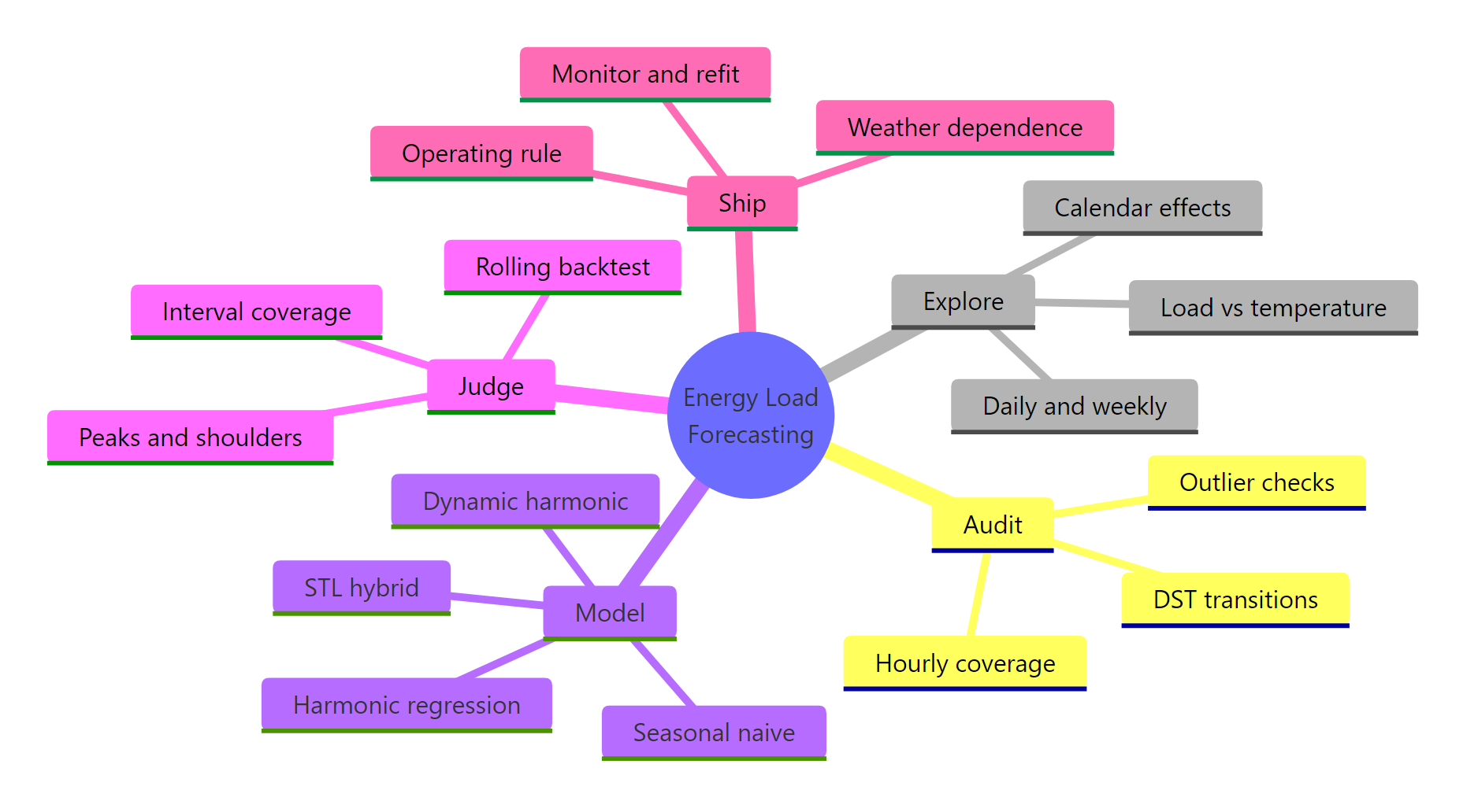
Figure 10: The whole engagement at a glance.
The one idea to carry away: the model is the easy part. The value is in framing the asymmetric cost, auditing sub-daily data for its own traps, encoding the U-shaped temperature response as features, backtesting honestly across hot and mild days, checking that the interval is trustworthy and not just the point, and being frank that the whole thing rides on a weather forecast. Do those well and a transparent harmonic regression becomes a forecast a grid can schedule against.
References
- Hyndman, R.J., & Athanasopoulos, G. - Forecasting: Principles and Practice, 3rd ed. Section 12.1: Complex seasonality. Link
- Hyndman, R.J., & Athanasopoulos, G. - Forecasting: Principles and Practice, 3rd ed. Chapter 10: Dynamic regression models. Link
- Hyndman, R.J., & Athanasopoulos, G. - Forecasting: Principles and Practice, 3rd ed. Section 5.10: Time series cross-validation. Link
- fable documentation - Forecasting models for tidy time series. Link
- feasts documentation - Feature extraction and statistics for time series. Link
- tsibbledata documentation - vic_elec: Half-hourly electricity demand for Victoria, Australia. Link
- Australian Energy Market Commission - how the National Electricity Market works, including the spot-market price cap that makes an under-forecast so costly. Link
Continue learning on this site:
- Dynamic Regression in R - a deeper look at ARIMA models with external covariates, the engine behind the dynamic harmonic model.
- Time Series Cross-Validation in R - the rolling-origin backtesting that decided this tournament, in full.
- Forecast Monitoring in R - build the production dashboard that watches a deployed load forecast for drift.