Retail Demand Forecasting in R: an End-to-End Case Study
Retail demand forecasting in R means turning a store's sales history into a defensible order-book number: you audit the data, explore its trend and seasonality, fit and backtest several models, then hand operations a forecast with a safety-stock band. This is a full case study, run the way a consulting team would run it for a client, from the business brief to the production hand-off. Every step uses the tidyverts stack (tsibble, feasts, fable), and every block runs in your browser.
What decision does a retail demand forecast actually feed?
Imagine you are the demand analyst at Southern Cross, a department-store chain. Every month you sign off on the stock orders that hit the shelves eight to twelve weeks later. Order too little and December shoppers find empty racks, which is lost sales you never recover. Order too much and January turns into a round of deep markdowns, clearing surplus stock at a loss. Your forecast is the single number that tips that decision one way or the other.
The stakes are large because December is not a normal month. In this business a quiet month turns over around A$350 million; last December it was A$724 million. Miss that December by just 5% and you are staring at either A$36 million of empty shelves or A$36 million of stock to clear at a discount. That is the cost of a wrong forecast, in dollars a category manager feels.
So before we touch a model, here is the deliverable we are building toward: the forecast for next December's order book. Our data runs through December 2018, so "next December" is December 2019. In a few lines we can load the real sales history, fit a seasonal model, and read off the number.
That one row is the whole engagement in miniature. The model expects December 2019 turnover of about A$735 million, and it is 95% confident the true figure lands between A$675 million and A$799 million. The point forecast sizes the base order; the upper bound sizes the safety stock. Everything else in this tutorial exists to earn the right to hand that number to operations with a straight face.
The data comes from the Australian Bureau of Statistics: monthly turnover for all Victorian department stores (series A3349641R). We treat it as the demand signal for our fictional chain, so the dollar figures are category-scale, but the workflow is identical whether you forecast a chain, a store, or a single product line.
An engagement like this always moves through the same seven phases, and the rest of the tutorial follows them in order.

Figure 1: The seven phases of an end-to-end forecasting engagement.
Try it: The November order matters almost as much as December. Change the target month in the payoff block to forecast November 2019 instead, and read off the point and upper bound.
Click to reveal solution
Explanation: November clears about A$437 million, roughly 60% of December's volume. The build-up to Christmas starts in November, which is why the two months carry the year's biggest orders.
What do you check before you trust the data?
A forecast is only as honest as the data under it, so the first real job is an audit. You are looking for four things: how much history you have, whether the calendar has holes in it, whether the numbers are on a sensible scale, and whether anything looks like a data error rather than real demand. Skip this and you will happily fit a beautiful model to a broken series.
Start by looking at the object itself. Our data is a tsibble, which is a data frame that knows one of its columns is time. That time column is the index, and its spacing (here, one month) is the interval.
The header tells you almost everything: 168 monthly rows, indexed by Month, with turnover in the second column. That [1M] is the interval, one month between rows. Fourteen years of monthly history is a comfortable amount to model with.
Now the checks that actually catch problems. A demand series can hide missing months (a store that closed, a data-feed outage) that quietly break seasonal models. The count_gaps() function from tsibble reports any implicit gaps in the calendar, and a simple sum finds missing values.
Both checks come back clean: 168 months from January 2005 to December 2018, no missing values, and a zero-row gap table, which means every month between the first and last is present. This is a well-behaved series. On a messier one you would fill gaps with fill_gaps() and decide how to handle the missing values before modeling.
Fourteen Decembers (one per year) are flagged as holiday months, and the other 154 are regular. We will not feed this column to the models as a separate variable, because the seasonal term in each model already carries a December effect. Instead we use it to keep the audit honest and, later, to read the size of the December effect straight off a fitted regression.
With the checks passed, look at the whole series at once. A single line chart tells you more about a demand signal than any summary table.
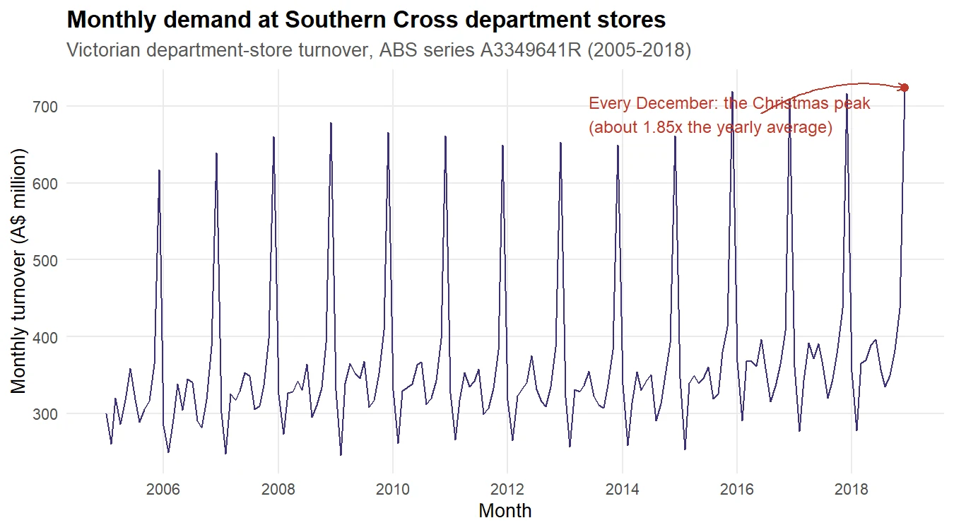
Figure 2: Monthly demand with the recurring December Christmas peak.
Three features jump out, and each one shapes the modeling to come. First, the level drifts upward over the years, so there is a trend. Second, every single December spikes to almost double the surrounding months, so there is a strong yearly season. Third, the size of that December spike grows as the overall level grows, which is the tell-tale sign that we should model on a log scale, where a percentage swing is a constant distance.
Try it: Confirm the series really has no gaps a second way, by counting how many of the 168 rows fall in December. If the calendar is complete, you should find exactly 14.
Click to reveal solution
Explanation: Fourteen Decembers across fourteen complete years confirms the calendar has no holes, which matches the zero-row gap table from the audit.
What does the demand actually look like?
The audit told us the data is trustworthy. Now we explore its structure, because the shape of a series decides which models can fit it. We will look at three things: how much of the signal is trend versus season, what the seasonal shape looks like across years, and how big the December driver really is. Each view will change a modeling decision.
Start with a number that summarizes the whole series. The feat_stl() feature from feasts runs an STL decomposition under the hood and reports the strength of the trend and the strength of the seasonality, each on a 0-to-1 scale where 1 means "dominates completely".
A seasonal strength of 0.991 is about as high as this measure ever gets. It says the yearly pattern is the overwhelming feature of this series, far more than the trend at 0.773. That single fact rules out any model that cannot handle strong seasonality and puts the season front and centre for everything that follows.
To see those two components pulled apart, decompose the log series with STL. STL splits the data into a smooth trend, a repeating seasonal pattern, and a remainder that holds whatever is left.
Each row now carries the observed log value split into trend, season_year, and remainder columns. Plotting all four panels makes the split obvious.
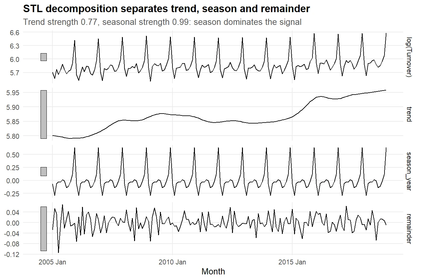
Figure 3: STL splits the log series into trend, season and remainder.
Read the panels top to bottom. The trend panel rises gently, then flattens after 2013. The season panel is enormous and perfectly regular, dwarfing the trend, which is exactly what the strength number warned us about. The remainder panel is tiny and patternless, which is good news: it means trend plus season explains almost all of the demand, leaving little unexplained noise. A model that nails the trend and the season will be a strong model here.
Next, look at the seasonal shape itself. Overlaying one line per year shows whether the pattern is stable, and where in the calendar the action happens.
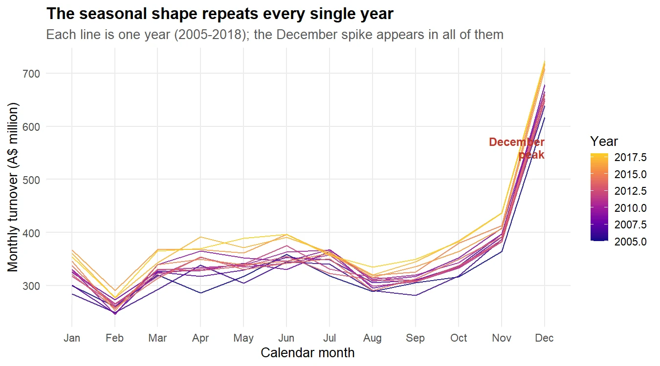
Figure 4: The seasonal shape repeats every year, peaking in December.
Every year traces the same path: a dip in February, a plateau through winter, and a steep climb from October into a December spike. The lines are stacked in colour order, with later years sitting higher, which is the trend showing through. The shape barely changes from year to year, and a stable seasonal shape is exactly what you want, because it means last year's pattern is a reliable guide to next year's.
dept |> gg_season(Turnover) produces the same seasonal view without the manual reshaping, and gg_subseries() gives a companion view with one panel per month.Finally, quantify the driver. The single most useful EDA number for this business is how much bigger December is than an average month. We compute the average turnover per calendar month and compare each to the overall average.
December averages A$672 million against an all-month average of about A$363 million, a lift of 1.85 times, or 85% above a normal month. November is a distant second at 1.1 times. The bar chart below makes the gap unmistakable.
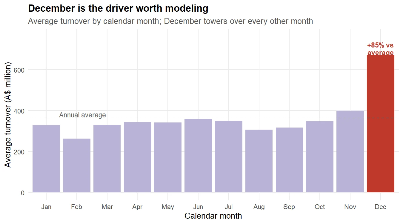
Figure 5: December turnover runs about 85% above the annual average.
This is the driver every model must reproduce. It also justifies the log transform one more time: an 85% December lift is a multiplicative effect, and logs turn multiplicative effects into additive ones that seasonal models handle cleanly.
Try it: December is the peak, but February is the trough. Adapt the lift calculation to find February's multiplier. Is it as far below average as December is above?
Click to reveal solution
Explanation: February runs at 0.72 times the average, 28% below a normal month. The peak is far more extreme than the trough (85% up versus 28% down), which is typical of retail: Christmas adds a huge spike, while the quiet months only dip modestly.
Which forecasting strategies are worth trying?
We now know the shape of the problem: a strong, stable yearly season riding on a gentle trend, best handled on the log scale. That knowledge points to a short list of candidate strategies, and a good forecaster tries several rather than betting on one. We will fit five genuinely different models, each a plausible answer to this specific problem.
Before fitting anything, split the history. We train on everything up to the end of 2016 and hold out 2017 and 2018 as a first test, so no model gets to see the two years we will judge it on.
Now the portfolio. Each model earns its place for a reason:
- Seasonal naive simply repeats last year's value for each month. It is the honest benchmark: if a fancy model cannot beat "same as last year", the fancy model is not worth deploying.
- ETS (exponential smoothing) tracks a slowly changing level, trend, and season, giving more weight to recent months. It suits a series whose pattern drifts gradually, which ours does.
- ARIMA models the correlations between a month and its recent and year-ago neighbours. It is the natural counterpart to ETS and often wins on strongly seasonal data.
- Regression (TSLM) fits a straight-line trend plus a dummy for each calendar month. The December dummy is, in effect, our promotional-lift term, and the model is transparent: you can read the size of every seasonal effect straight off its coefficients.
- Ensemble averages the ETS, ARIMA, and regression forecasts. Combining models often beats any single one, because their errors partly cancel.
All five fit in one model() call, and the ensemble is built by averaging the three model-based columns.
The result is a mable (a model table) with one column per strategy. Notice how much each label tells you. ETS(A,A,A) means additive error, trend, and season. The ARIMA search landed on a seasonal model with drift. Let us read that ARIMA in full, since it is our most complex fit.
The label ARIMA(1,0,2)(0,1,1)[12] w/ drift reads as a seasonal ARIMA: the second bracket took one seasonal difference (the 1 in the middle) to remove the yearly pattern, and [12] confirms a twelve-month season. The w/ drift means it lets the forecast keep climbing with the trend rather than flattening out. You do not need to hand-tune any of this; the search found it.
The regression model is the transparent one, so use it to put a number on the December driver we saw in EDA. Its December coefficient is on the log scale, so exponentiating it turns it back into a multiplier.
The regression says December multiplies the baseline month by 2.04, and the p-value of 1.41e-78 means that effect is about as certain as statistics ever gets. That squares with the 1.85 lift we measured in EDA (the regression compares December to the January baseline, not to the annual average, which is why its multiplier is a touch higher). The model has learned exactly the driver we found by eye.
Try it: ETS can also damp its trend, so the forecast levels off instead of climbing forever. Add a damped-trend ETS to the portfolio and confirm it fits without error.
Click to reveal solution
Explanation: trend("Ad") forces an additive damped trend, shown as ETS(A,Ad,A). Damping is useful when you doubt a trend will continue at full strength, which matters more at long horizons than short ones.
Which model actually wins on data it hasn't seen?
Five models are fitted. Now comes the honest part: judging them on data they never saw. This is the step that decides whether a forecasting project succeeds, because a model that fits the training data closely can still forecast the future terribly. We will judge in three ways: a first look on the hold-out, a proper rolling backtest, and a check that the prediction intervals are trustworthy.
Start with the simple hold-out. We forecast the 24 held-out months and score each model with accuracy(). The headline measures are MAPE (average error as a percent), MAE (average error in dollars), and MASE (error scaled against the seasonal naive, where below 1 means "better than repeating last year").
On this split ETS looks like the clear winner, at a MASE of 0.699 and a MAPE of 2.62%. But hold that thought. A single two-year window is one roll of the dice: ETS may simply have suited 2017 and 2018. The regression (tslm) even scores above 1, meaning it did worse than the naive benchmark on this stretch. To trust any ranking, we need to test each model over many different starting points.
That is what rolling-origin cross-validation does. We start with ten years of data, forecast the next twelve months, then step the origin forward six months and repeat, over and over. Each model is scored across nine different forecast origins, so a single lucky window cannot flatter it. The stretch_tsibble() function builds those expanding windows for us.
Read this table by column, because it tells a different story at each horizon. One month ahead, seasonal naive is untouchable (MASE 0.59): next month usually looks like the same month last year, so the simplest rule wins. Three months ahead, ARIMA takes the lead (0.57) with the ensemble close behind. But look at the long horizons: at twelve months the regression collapses to 1.75, the worst of any cell, because its straight-line trend keeps extrapolating past where demand actually flattened. The picture is clearer as a chart.
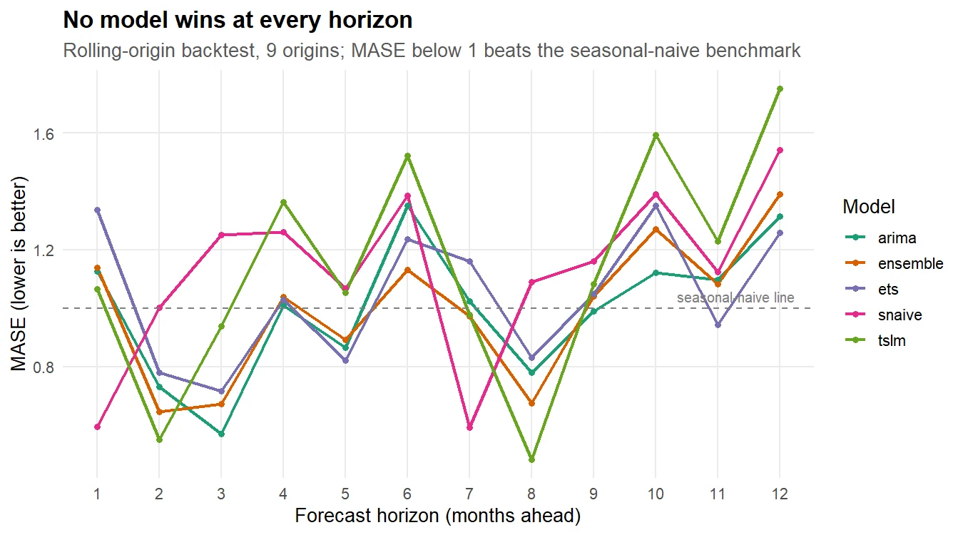
Figure 6: Rolling-origin backtest: no model wins at every horizon.
No single model owns every horizon, which is normal and important. To pick one model to deploy, average the error over all twelve horizons and all nine origins into one honest number per model.
Across the full backtest the ensemble and ARIMA are neck and neck at the top, both around a MASE of 0.99 and an average miss of A$13.4 million a month. ETS, which looked dominant on the single hold-out, drops to third once it faces many origins. That reversal is exactly why we backtest.
Point accuracy is only half the story. Operations sizes safety stock from the prediction interval, so an interval whose stated range does not match the real uncertainty is dangerous even if the point forecast is good. We check two things: the Winkler score (which rewards intervals that are both narrow and honest, lower is better) and the empirical coverage (of the months that fell inside the 95% interval, we want about 95%).
Now the recommendation writes itself. ARIMA has the best Winkler score and a coverage of 96%, almost exactly the 95% it promises, so its intervals are both tight and honest. ETS covers everything (100%), meaning its intervals are wider than they need to be, wasteful for safety stock. And the ensemble, which tied ARIMA on point accuracy, has a broken interval: a Winkler of 500 and 0% coverage.
That warning settles the choice. The ensemble and ARIMA are tied on the number that sizes the order, but only ARIMA gives a trustworthy band to size the safety stock. So ARIMA is our production model: near-best point accuracy and the best-calibrated intervals in the field.
Try it: RMSE punishes big misses more harshly than MAE does. Re-rank the overall backtest by RMSE instead of MASE and see whether the top two change.
Click to reveal solution
Explanation: ARIMA and the ensemble still hold the top two spots on RMSE, which reassures us the choice is not an artefact of one error measure. The lower ranks shuffle a little because RMSE weights the large December misses more heavily than MASE does.
What do you tell the people who place the orders?
This section is for the people who never see a line of R: the category managers and the operations team who turn the forecast into purchase orders. It should read on its own, so here is the whole engagement in plain language.
The recommendation, in one sentence: deploy the seasonal ARIMA model for the monthly order book, and keep "same as last month" only as a sanity check for the very next month.
To produce the numbers operations actually needs, we refit that ARIMA on all of the history and forecast the full 2019 order year, with a safety-stock band.
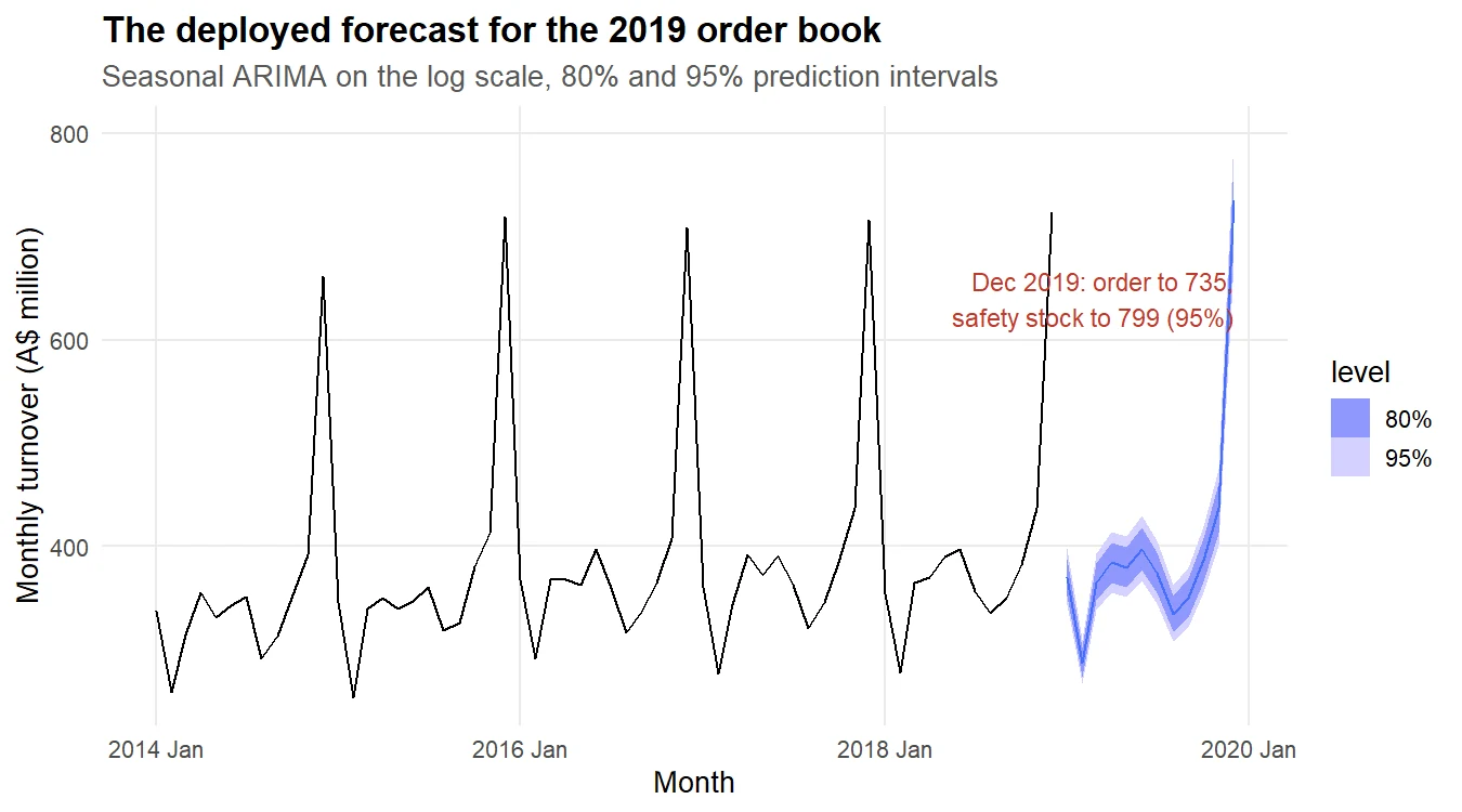
Figure 7: The deployed seasonal ARIMA forecast for the 2019 order book.
Here is what those numbers mean for the business, with no statistics jargon:
| What you asked | What the forecast says |
|---|---|
| How big is the December order? | Plan for about A$735 million of demand. |
| How much safety stock on top? | Hold up to A$799 million, an 8.7% buffer, to cover a strong Christmas. |
| How accurate is this, really? | In backtests the model misses by about A$13.4 million in an average month. |
| Is that better than what we do now? | Yes: the "same as last year" rule misses by about A$15.1 million, so this is roughly A$20 million a year of stock moved to the right side of the order. |
The decision rule for operations: each month, order to the model's point forecast, and hold safety stock up to the 95% upper bound for that month. For the fast-moving peak months of November and December, review the order by hand as well, because the cost of being wrong is highest there.
The top three caveats, stated up front:
- The forecast assumes 2019 looks broadly like the recent past. A new competitor, a store opening, or an economic shock is not in the data and will not be in the forecast.
- The safety-stock band covers normal year-to-year variation, not a one-off surprise. Treat the upper bound as a planning level, not a guarantee.
- This is a chain-level (category-level) forecast. Individual stores and product lines are noisier and need their own treatment, covered in the next section.
Try it: Operations also wants the January number, because that is when the markdowns happen. Adapt the order-book block to show January and February 2019 instead of November and December.
Click to reveal solution
Explanation: Demand drops sharply after Christmas, from A$735 million in December to A$370 million in January and a A$287 million trough in February. Ordering to those lower numbers is how you avoid the January markdown pile.
What happens after the forecast goes live?
Shipping the model is not the end of the job; it is the start of the maintenance. A forecast that was accurate in 2018 can quietly drift out of calibration as the business changes, so you monitor it and refit on a schedule.
The core monitoring idea is simple: keep scoring the live model against what actually happened, and raise a flag when its error drifts past a threshold you set in advance. Here is that check in miniature, comparing the deployed model's backtest error against a control limit.
A MASE of 0.9 sits comfortably under our 1.2 control limit, so the model is in control. In production you would run this check every month on the newest actuals; the first time the status flips to "investigate", you refit or dig into what changed. A sensible refit cadence for monthly retail data is to re-estimate the model every quarter, and immediately after any known structural change such as a big store opening.
Two r-statistics.co chapters carry this forward: Forecast Monitoring in R builds the full monitoring dashboard this check hints at, and Forecast Reconciliation in R and Hierarchical Time Series in R show how to make store, region, and chain forecasts agree.
Try it: A tighter business might set a stricter control limit. Change the threshold from 1.2 to 1.0 and see whether the deployed model still passes.
Click to reveal solution
Explanation: At a MASE of 0.9 the model still passes even under the stricter 1.0 limit, because it beats the seasonal-naive baseline over the two-year test. Where you set the limit is a business call: tighter limits catch drift sooner but raise more false alarms.
Practice Exercises
These capstone problems put the whole engagement to work. Each runs in the same session as the tutorial, so the variables above are available. Try each before opening the solution.
Exercise 1: Does ARIMA win on a different store?
Our tournament crowned ARIMA on Victoria's department stores. Rerun the core of it on Queensland department stores: filter the series, train through 2016, forecast 24 months, and rank seasonal naive, ETS, and ARIMA by MASE. Does the same model win?
Click to reveal solution
Explanation: On Queensland the ranking flips: ETS edges ARIMA, though both comfortably beat seasonal naive. The lesson is that the best model is series-specific, which is exactly why you run the tournament for each series rather than assuming one winner everywhere.
Exercise 2: Add a dynamic-regression model
A dynamic regression combines a trend-plus-season regression with ARIMA errors, so it should, in theory, get the best of both. Fit ARIMA(log(Turnover) ~ trend() + season()) alongside the plain ARIMA on the Victorian training set, forecast the hold-out, and see which ranks higher. Does the extra structure help here?
Click to reveal solution
Explanation: The plain ARIMA wins. Forcing a deterministic trend and seasonal dummies into the regression part actually hurts here, because the automatic ARIMA already captures the season more flexibly through its seasonal difference. More structure is not always better.
Exercise 3: Turn the interval into an order quantity
Operations wants a single order number for December 2019 that covers demand four years in five (an 80% service level). From final_fc, extract the December 2019 point forecast and its 80% upper bound, and report the point, the order-with-buffer, and the buffer as a percentage.
Click to reveal solution
Explanation: An 80% service level asks for A$776 million, a 5.6% buffer over the A$735 million point forecast. Compare that to the 8.7% buffer the 95% level demanded: the higher the service level you promise, the more safety stock you must carry, which is the core inventory trade-off.
Complete Example
Here is the entire engagement compressed into one runnable script: load the real sales history, split it, fit the five-model portfolio, backtest it, and rank the models. This is the skeleton you would adapt for any new demand series.
From four numbered steps you have a ranked, backtested set of forecasts. Swapping in a different series, a longer horizon, or an extra model is a one-line change to this skeleton, which is the real payoff of doing retail demand forecasting the tidyverts way.
Frequently asked questions
How much sales history do you need to forecast retail demand? For a monthly series with a yearly season, aim for at least three or four complete years so the model can see the seasonal pattern repeat; more is better. This case study used fourteen years, which is comfortable. With only one or two years a seasonal model has too few Decembers to learn from, and you should lean on the seasonal naive benchmark until more history builds up.
Which model is best for retail demand forecasting? There is no single winner. On the Victorian series the seasonal ARIMA and the ensemble tied at the top; on the Queensland series in the exercises, ETS edged ahead. That is why the workflow runs a tournament for each series rather than assuming one model wins everywhere. Fit several models, backtest them across many origins, then let the numbers pick.
Why forecast on the log scale instead of the raw sales figures? Retail demand is multiplicative: the December spike grows in dollars as the overall level of the business grows. Taking the logarithm turns that percentage effect into a constant additive one, which the seasonal models handle cleanly, and it keeps the prediction intervals from dropping below zero in the quiet months.
How do I choose the safety-stock level? Pick the service level you want to promise, then read the matching upper bound off the forecast. A 95% upper bound covers all but about one year in twenty and asks for a larger buffer; an 80% bound covers four years in five with a smaller buffer. Exercise 3 works both out for December: an 8.7% buffer at the 95% level versus 5.6% at the 80% level. A higher service level costs more stock, which is the core inventory trade-off.
Can I use this workflow for a single store or product instead of a whole chain? Yes, the steps are identical: audit, explore, fit a portfolio, backtest, then deploy. Individual stores and products are noisier than the chain total, so expect wider intervals and a larger role for the seasonal naive benchmark. If you forecast many of them separately, reconcile the forecasts so the store numbers add up to the chain number.
What does a MASE below 1 actually mean? MASE scales a model's average error against the seasonal naive forecast, which simply repeats the value from twelve months ago. A MASE below 1 means the model beats that "same month last year" rule; above 1 means it does worse. It is a fair yardstick because it is unit-free and always compares against the simplest sensible baseline.
Summary
An end-to-end retail demand forecast is a sequence of decisions, not a single model call. The table maps each phase of the engagement to what it produces.
| Phase | What you do | What it produces |
|---|---|---|
| Business brief | Name the decision and the cost of a miss | A target: the order-book forecast |
| Data audit | Check coverage, gaps, scale, outliers | Trustworthy data, a clean tsibble |
| EDA | Measure trend, season, and the driver | The log scale and a season-first model |
| Portfolio | Fit five different strategies | Candidate models to compare |
| Tournament | Rolling-origin backtest + intervals | A defensible model choice |
| Executive summary | Translate to dollars and a rule | An order rule operations can follow |
| Production | Monitor, refit, reconcile | A forecast that stays honest |
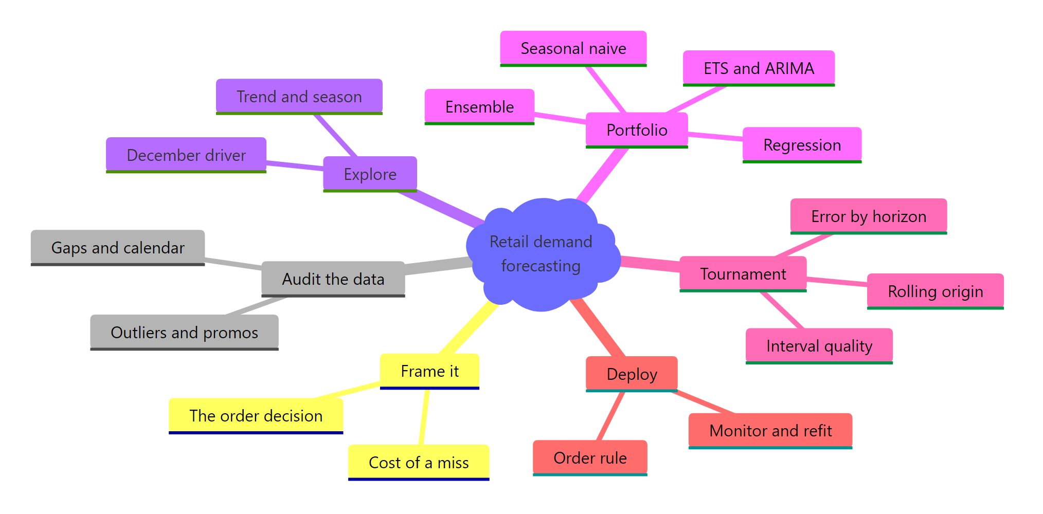
Figure 8: The whole engagement at a glance.
The one idea to carry away: the model is the easy part. The value is in framing the decision, auditing the data, backtesting honestly across many origins, checking that the interval is trustworthy and not just the point, and translating all of it into an order rule someone can act on. Do those well and a plain seasonal ARIMA becomes a forecast a business can bet its inventory on.
References
- Hyndman, R.J., & Athanasopoulos, G. - Forecasting: Principles and Practice, 3rd ed. Chapter 5: The forecaster's toolbox. Link
- Hyndman, R.J., & Athanasopoulos, G. - Forecasting: Principles and Practice, 3rd ed. Section 5.10: Time series cross-validation. Link
- Hyndman, R.J., & Athanasopoulos, G. - Forecasting: Principles and Practice, 3rd ed. Section 5.8: Evaluating point forecast and interval accuracy. Link
- Hyndman, R.J., & Athanasopoulos, G. - Forecasting: Principles and Practice, 3rd ed. Section 13.4: Forecast combinations. Link
- fable documentation - Forecasting models for tidy time series. Link
- feasts documentation - Feature extraction and statistics for time series. Link
- tsibble documentation - Tidy temporal data frames and tools. Link
- Australian Bureau of Statistics - Retail Trade, Australia (series A3349641R, via the tsibbledata package). Link
Continue Learning
- Time Series Cross-Validation in R - a deeper look at rolling-origin backtesting, the technique that decided this tournament.
- Combining Forecasts in R - how to build ensembles that improve on single models, and how to handle their prediction intervals properly.
- Forecast Monitoring in R - build the production dashboard that watches a deployed forecast for drift.