gganimate in R: Animated ggplot2 Charts that Ship
gganimate is an R package that extends ggplot2: you build a normal chart, add one transition line, and it animates the plot across time or categories, then exports it as a GIF or a video you can drop into a slide or a report.
How do you turn a ggplot2 chart into an animation?
If you can make a ggplot2 chart, you are one line away from an animation. gganimate does not replace anything you know. You write the same ggplot() call, then add a transition function that tells the chart how to move. Let's start from a plain static chart and animate it.
We will use economics, a dataset that ships with ggplot2. It tracks US economic numbers by month, and we care about one column: unemploy, the number of unemployed people. Before we plot anything, let's glance at the data so you know exactly what we are working with. Press Run.
Each row is one month, from mid-1967 onward. Now here is that same data as a static line chart. Press Run to draw it.
That is an ordinary ggplot2 line chart. Nothing moves yet. Now the fun part. To make that line draw itself over time, we add exactly one function, transition_reveal(date), which tells gganimate to reveal the line in date order.
gganimate and gifski packages, so copy the animation blocks into RStudio or the R console. Install them once with install.packages(c("gganimate", "gifski")).library(gganimate)
p <- ggplot(economics, aes(x = date, y = unemploy)) +
geom_line(color = "#2c6fbb", linewidth = 0.8)
# The only new line: reveal the data in date order
p + transition_reveal(date)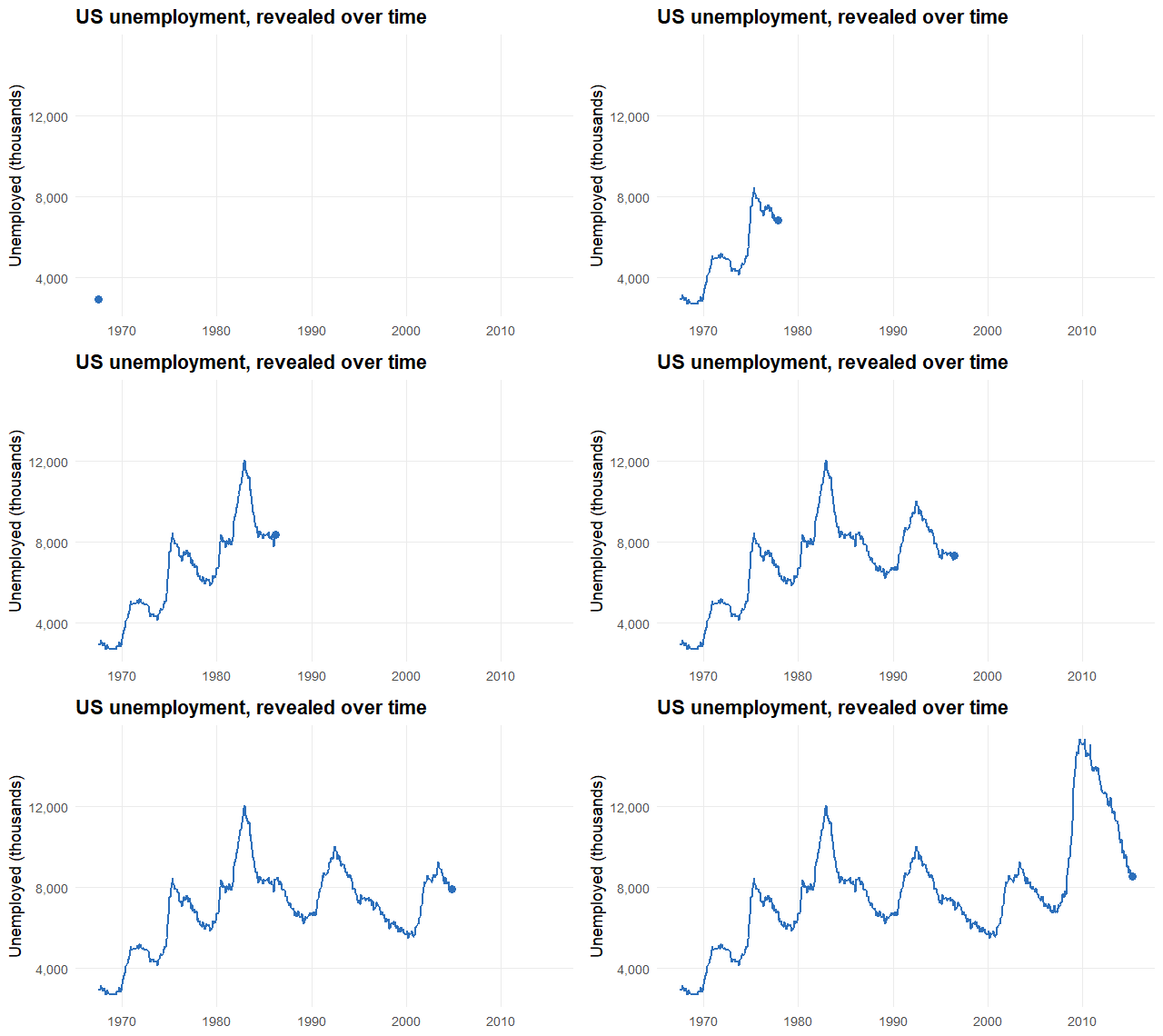
Figure 1: The same chart, now drawing itself over time with a single call to transition_reveal(). This is the animation the code above produces.
Let's walk through what changed. We stored the static chart in p, exactly the plot you ran above. Then p + transition_reveal(date) added a transition layer, the same way you would add + geom_point(). The date argument tells gganimate to order the reveal by month, so the line grows from 1967 to 2015. When you print that object in R, gganimate renders it into the GIF you see.
The takeaway: an animation is a static ggplot plus a transition. You did not learn a new plotting system, you added one verb. That is the whole idea, and every example below follows the same shape.
The four steps you just did, static chart to transition to render to file, are the entire gganimate pipeline. Here it is at a glance.
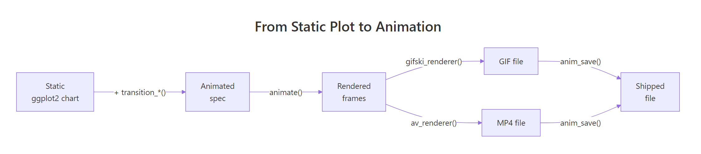
Figure 2: The gganimate pipeline. Start from a static ggplot, add a transition, render the frames, and save a GIF or MP4.
Try it: The economics data also has a psavert column (the personal savings rate). Write the transition line that reveals a chart of psavert over date.
library(gganimate)

p_savings <- ggplot(economics, aes(x = date, y = psavert)) +
  geom_line(color = "#1a9e77", linewidth = 0.8)

# Add the one transition line that reveals it over time:
Click to reveal solution
p_savings + transition_reveal(date)Explanation: The pattern never changes. Build the static line chart, then add transition_reveal(date) so the savings-rate line draws itself in date order.
What is actually happening when a chart animates?
Here is the mental model that makes everything else click. An animation is a flipbook. It is a stack of still images, called frames, shown fast enough that your eye sees motion. gganimate's job is to build those frames for you and stitch them together.
You only give gganimate a few real positions, called states. For the unemployment chart, a state is "the line up to March 1990" or "the line up to April 1990." gganimate then fills in the frames between your states so the motion looks smooth. That filling-in is called tweening (short for "in-betweening").

Figure 3: You supply the real data states. gganimate tweens the frames in between, then plays them fast to create motion.
To tween, gganimate needs to know which point in one frame is the same thing as a point in the next frame. This is called object identity, and it is the single most common thing beginners miss. Imagine animating three countries over ten years. gganimate has to know that "France in 1990" should glide to "France in 1991," not jump to Brazil. If it guesses wrong, points teleport and flicker.
You tell gganimate about identity with the group aesthetic. When you write aes(group = country), you are saying "rows with the same country are the same object across frames, so tween them together." Many geoms set a sensible group automatically, but when motion looks chaotic, a missing group is almost always why.
Before anything moves, it helps to see what separate states look like as still charts. Here we split economics into two decades and draw them side by side. Each panel is a state you could animate between.
Those two panels are two frozen states. An animation would show one, then smoothly morph to the other. That is all a transition does: it decides which column defines your states and hands the tweening to gganimate.
group = country makes each country glide to its own next position instead of jumping to a different one. Chaotic, flickering animations are almost always a missing group.Try it: Give each era its own color so you can see the two groups clearly. Add color = era inside aes().
Click to reveal solution
Explanation: Mapping color = era splits the points into two visible groups. In a real animation, that same grouping variable is what tells gganimate which points belong together across frames.
Which transition function should you use, and how?
gganimate gives you a small set of transition functions, and picking the right one is mostly about answering a single question: what changes from frame to frame? Use the guide below, then read the four workhorses that follow.
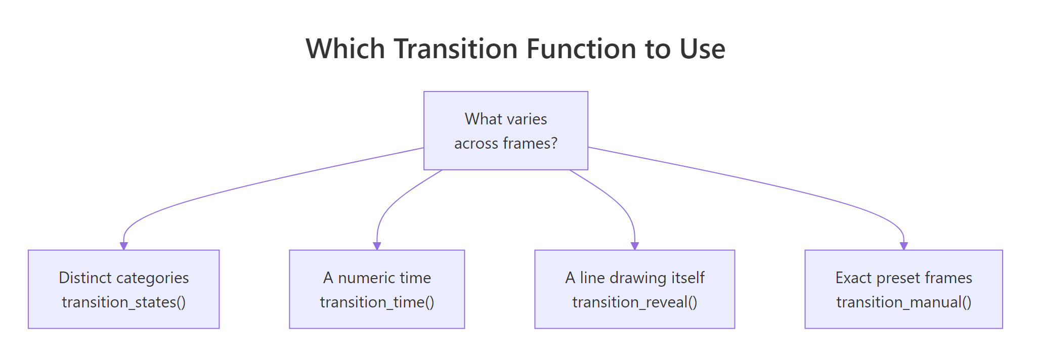
Figure 4: Choose a transition by what varies across frames. Categories, numeric time, a self-drawing line, or exact preset frames.
For the next two examples we switch to gapminder, a famous dataset of life expectancy, population, and income for many countries across years. It is not built into ggplot2, so install it once with install.packages("gapminder") and run these blocks locally.
library(gapminder)

head(gapminder, 5)
#> # A tibble: 5 × 6
#>   country     continent  year lifeExp      pop gdpPercap
#>   <fct>       <fct>     <int>   <dbl>    <int>     <dbl>
#> 1 Afghanistan Asia       1952    28.8  8425333      779.
#> 2 Afghanistan Asia       1957    30.3  9240934      821.
#> 3 Afghanistan Asia       1962    32.0 10267083      853.
#> 4 Afghanistan Asia       1967    34.0 11537966      836.
#> 5 Afghanistan Asia       1972    36.1 13079460      740.
transition_reveal(): a line that draws itself
You already met this one. transition_reveal(time_variable) progressively draws data in order of a time variable, keeping everything revealed so far on screen. It is the right choice for line charts and trends, like the unemployment reveal in the first section. Reach for it whenever the story is "watch this line build up over time."
transition_states(): step between categories
Use transition_states() when your frames are distinct categories or snapshots, such as one bar chart per year. gganimate pauses on each state, then tweens to the next. Let's animate the average life expectancy of each continent, one frame per year.
First we compute the averages for a single year so you can see the shape of the data. This is what one frame is built from.
library(dplyr)

gapminder |>
  filter(year == 2007) |>
  group_by(continent) |>
  summarise(mean_life = round(mean(lifeExp), 1))
#> # A tibble: 5 × 2
#>   continent mean_life
#>   <fct>         <dbl>
#> 1 Africa         54.8
#> 2 Americas       73.6
#> 3 Asia           70.7
#> 4 Europe         77.6
#> 5 Oceania        80.7
Now we let the year vary. transition_states(year) treats each year as a state and animates the bars between them. The {closest_state} token in the title is a label variable: gganimate swaps in the current year as the animation plays.
One new call appears in this block: animate(). Back in the first section we just printed the plot object and let gganimate render it. Printing still works and renders at gganimate's default size, but wrapping the plot in animate() lets you set the output dimensions now, and the frame count and speed later (the rendering section covers all of those controls).
library(gganimate)

life_by_continent <- gapminder |>
  group_by(year, continent) |>
  summarise(mean_life = mean(lifeExp), .groups = "drop")

bars <- ggplot(life_by_continent,
               aes(x = continent, y = mean_life, fill = continent)) +
  geom_col(show.legend = FALSE) +
  labs(title = "Mean life expectancy by continent: {closest_state}",
       x = NULL, y = "Years") +
  transition_states(year, transition_length = 2, state_length = 1)

animate(bars, width = 620, height = 380)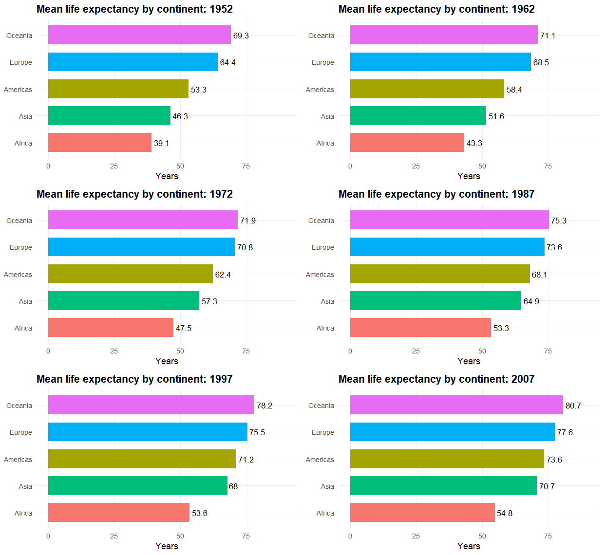
Figure 5: transition_states() steps through one bar chart per year, tweening the bar heights between states.
Two arguments shape the pacing. transition_length is how long the bars spend moving between years, and state_length is how long they hold still on each year. Both are relative weights, not seconds, so transition_length = 2, state_length = 1 means the bars spend twice as long moving as resting. The {closest_state} label keeps the year in sync with the bars.
transition_time(): move through continuous time
When your time variable is a real number, like a year or a timestamp, transition_time() is smoother than states because it treats time as continuous. This is the classic gapminder bubble chart: each country is a bubble, and they drift as the years roll forward.
Notice group = country. That is the object-identity rule from the last section in action: it tells gganimate that a bubble in 1952 and the same country's bubble in 1957 are the same object, so it glides instead of jumping. The {frame_time} label shows the current year.
library(gganimate)
library(scales)

bubbles <- ggplot(gapminder,
                  aes(x = gdpPercap, y = lifeExp, size = pop,
                      color = continent, group = country)) +
  geom_point(alpha = 0.75) +
  scale_x_log10(labels = comma) +
  scale_size(range = c(2, 15), guide = "none") +
  labs(title = "Year: {frame_time}",
       x = "GDP per capita (log scale)", y = "Life expectancy") +
  transition_time(year)

animate(bubbles, width = 620, height = 420)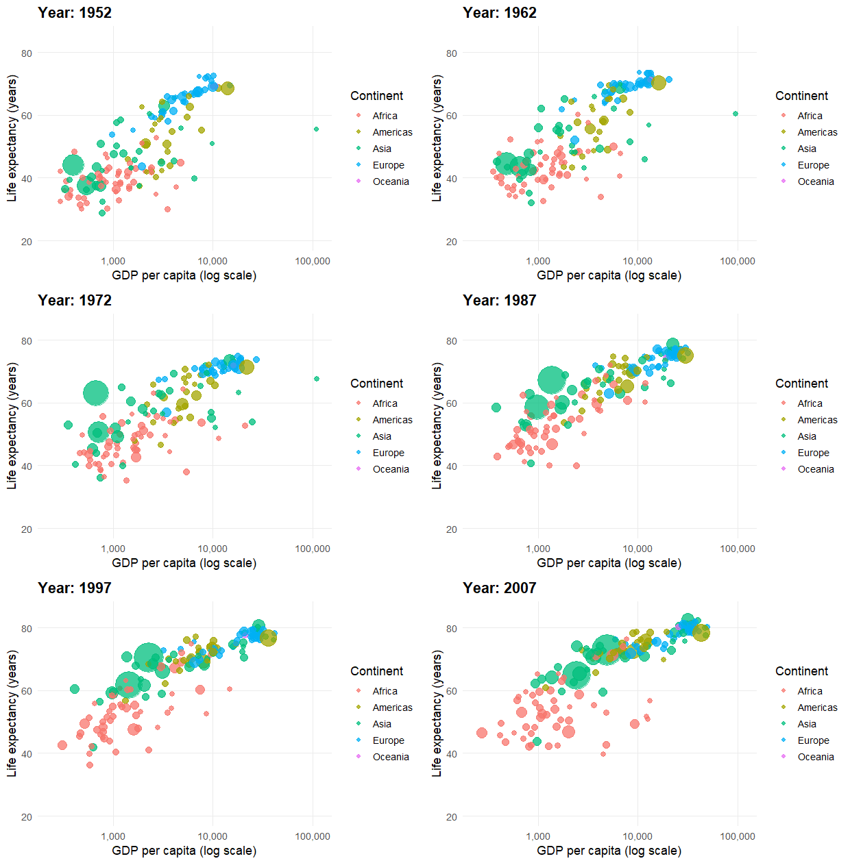
Figure 6: transition_time() treats year as a continuous number, so the bubbles drift smoothly. group = country keeps each bubble's identity across frames.
The bubbles sweep up and to the right as decades pass, showing incomes and lifespans rising together. Because year is numeric, gganimate can place a frame at any moment between two years, which is what makes the motion feel continuous rather than stepped.
transition_manual(): exact preset frames
Sometimes you do not want any tweening at all. You want frame 1 to be exactly this, frame 2 to be exactly that, with no interpolation. transition_manual() shows one frame per value of your variable and does not fill anything in between. It is handy for flipping through pre-made snapshots or images.
ggplot(gapminder, aes(gdpPercap, lifeExp, color = continent)) +
  geom_point(alpha = 0.7) +
  scale_x_log10() +
  transition_manual(year)
Try it: You have a bubble chart built with transition_states(year). Switch it to continuous time so the motion is smooth instead of stepped.
plot_states <- ggplot(gapminder,
                      aes(gdpPercap, lifeExp, size = pop,
                          color = continent, group = country)) +
  geom_point() +
  scale_x_log10() +
  transition_states(year)

# Rewrite the last line to use continuous time instead:
Click to reveal solution
plot_time <- ggplot(gapminder,
                    aes(gdpPercap, lifeExp, size = pop,
                        color = continent, group = country)) +
  geom_point() +
  scale_x_log10() +
  transition_time(year)
Explanation: Because year is a number, transition_time(year) interpolates between years for continuous motion. transition_states(year) would instead pause on each year and treat them as separate snapshots.
How do you control motion and polish the look?
The defaults look fine, but a few helpers turn a rough animation into a polished one. Each is a layer you add, just like a transition.
ease_aes() controls the feel of the motion. By default it is linear (constant speed). Swap in ease_aes("cubic-in-out") for a gentle start and stop, or ease_aes("bounce-out") for a playful bounce. Objects that enter or leave between frames can be styled too: enter_fade() fades new points in, and exit_shrink() shrinks departing ones so they do not just blink out.
To leave a trail behind moving points, add a shadow. shadow_wake() draws a fading tail behind each object, which makes the bubble chart read like motion streaks. Here is the bubble chart with easing and a wake applied.
library(gganimate)

bubbles +
  ease_aes("cubic-in-out") +
  enter_fade() +
  exit_shrink() +
  shadow_wake(wake_length = 0.1)
There is one polish step that matters more than all the others: fixing your scales. If a bubble's size or an axis range is recomputed for each frame, the chart will jitter because the reference keeps changing. The fix is to pin the scales so every frame shares the same axes and the same size mapping. To do that you need the full range of your data, so check it first.
With those numbers you can set fixed limits, for example scale_y_continuous(limits = c(2685, 15352)), so the y axis never rescales mid-animation. In the bubble chart, scale_size(range = c(2, 15)) plays the same role for bubble sizes: it maps population to size once, for all frames, so a country's bubble stays a consistent size as it moves.
nframes such as animate(p, nframes = 20). Bump it back up only when you are happy with how it looks.Try it: Take the bars animation from earlier and give it a smooth start and stop with cubic easing.
# Add one easing layer to bars so the motion accelerates and decelerates:
bars
Click to reveal solution
bars + ease_aes("cubic-in-out")Explanation: ease_aes("cubic-in-out") makes the bars ease into and out of each transition rather than moving at a constant speed, which reads as more natural motion.
How do you render and export an animation that ships?
An animation is useless if you cannot save it. animate() renders the frames, and anim_save() writes them to a file. The key is understanding three numbers that decide length and smoothness: nframes, fps, and duration.
They are tied by simple arithmetic. Duration in seconds equals the number of frames divided by the frame rate. Set any two and the third follows.
So 100 frames at 20 frames per second plays for 5 seconds. More nframes means smoother motion, higher fps means it plays faster.
You control resolution with width, height, and res. The res argument is the one people forget: raising it makes text and points crisp instead of pixelated, which matters most on high-resolution screens.
To choose the output format, you pick a renderer. gifski_renderer() produces a GIF, the universal format that plays anywhere. av_renderer() produces an MP4 video, which is smaller and sharper for long or complex animations but needs the av package installed. Here is a full render-and-save.
library(gganimate)

final <- animate(
  bubbles,
  nframes  = 150,
  fps      = 25,
  width    = 700,
  height   = 450,
  res      = 100,
  renderer = gifski_renderer()
)

anim_save("gapminder.gif", animation = final)

# Same animation as an MP4 (needs install.packages("av")):
# animate(bubbles, renderer = av_renderer("gapminder.mp4"))av_renderer() is far smaller and crisper for long or detailed animations, so prefer it when file size or sharpness matters.Try it: You want a 6-second animation with 150 frames. Compute the frame rate (fps) you should pass to animate().
Click to reveal solution
Explanation: Since duration equals frames divided by fps, fps equals frames divided by duration, so 150 frames over 6 seconds is 25 frames per second.
Why does your animation look wrong, and how do you fix it?
Most gganimate problems fall into a handful of patterns. Here is a field guide to the ones you will actually hit.
| Symptom | Likely cause | Fix |
|---|---|---|
| Nothing animates | No transition added, or you printed the plot without animate() |
Add a transition_*() layer and call animate() |
| "could not find function gifski_renderer" | The gifski package is not installed |
install.packages("gifski") |
| Points teleport or flicker | Missing object identity | Add group = for the thing that persists |
| Axes or bubbles jump every frame | Scales recomputed per frame | Pin scales with fixed limits and scale_size() |
| Blurry or pixelated output | Resolution too low | Raise res, width, and height in animate() |
| File is huge | Too many frames or dimensions too large | Fewer nframes, smaller size, or export MP4 |
The flicker case is worth repeating because it catches everyone. If your moving points seem to be reborn each frame instead of gliding, gganimate has lost track of which point is which. The cure is always the same: give it a group aesthetic naming the variable that stays constant across frames.
group, gganimate cannot match a point in one frame to the same point in the next, so objects jump around instead of moving smoothly. Whenever motion looks chaotic, add group = for the identity variable before changing anything else.Try it: This bubble animation flickers because gganimate cannot track each country. Add the one aesthetic that fixes it.
ggplot(gapminder, aes(gdpPercap, lifeExp, size = pop, color = continent)) +
  geom_point() +
  scale_x_log10() +
  transition_time(year)
Click to reveal solution
ggplot(gapminder, aes(gdpPercap, lifeExp, size = pop,
                      color = continent, group = country)) +
  geom_point() +
  scale_x_log10() +
  transition_time(year)
Explanation: Adding group = country tells gganimate that each country is one persistent bubble, so it tweens smoothly between years instead of redrawing scattered points every frame.
Complete Example
Let's put every step together into one workflow you can run start to finish. We take the economics data, build a polished static line chart, reveal it over time, ease the motion, pin the y axis so it does not jump, render at a decent resolution, and save both a GIF and an MP4. Run this in your local R session.
library(ggplot2)
library(gganimate)

# 1. A polished static chart
p <- ggplot(economics, aes(x = date, y = unemploy)) +
  geom_line(color = "#2c6fbb", linewidth = 1) +
  scale_y_continuous(limits = c(2685, 15352)) +   # fixed axis, no jumping
  labs(title = "US unemployment over time",
       x = NULL, y = "Unemployed (thousands)") +
  theme_minimal(base_size = 13)

# 2. Animate: reveal over time, with smooth easing
anim <- p +
  transition_reveal(date) +
  ease_aes("cubic-in-out")

# 3. Render at a shareable size and resolution
final <- animate(anim, nframes = 120, fps = 20,
                 width = 700, height = 400, res = 100,
                 renderer = gifski_renderer())

# 4. Save it (GIF for sharing, MP4 for quality)
anim_save("unemployment.gif", animation = final)
# animate(anim, renderer = av_renderer("unemployment.mp4"))
Figure 7: The end-to-end result. A static ggplot, revealed over time, eased, and rendered to a shareable file.
Every line here is something you met earlier: the static chart, the transition, the easing, the fixed scale, the render settings, and the save. That is the complete gganimate recipe.
Practice Exercises
Work these in your local R session with gganimate installed. Each combines several ideas from the tutorial. Try them before opening the solutions.
Exercise 1: Reveal the savings rate with a title
Build a static line chart of psavert (personal savings rate) over date from economics, give it a title, and animate it so the line reveals over time.
Click to reveal solution
library(gganimate)

ggplot(economics, aes(x = date, y = psavert)) +
  geom_line(color = "#1a9e77", linewidth = 0.9) +
  labs(title = "US personal savings rate", x = NULL, y = "Percent") +
  transition_reveal(date)
Explanation: The static chart is a normal ggplot with a title. Adding transition_reveal(date) reveals the line in date order, the same pattern as the very first example.
Exercise 2: Animate a category race and fix its identity
Using gapminder, animate the mean gdpPercap of each continent across years as bars. Pick the right transition for categorical snapshots, keep the current year in the title, and make the motion ease smoothly.
library(dplyr)
library(gganimate)

gdp_by_continent <- gapminder |>
  group_by(year, continent) |>
  summarise(mean_gdp = mean(gdpPercap), .groups = "drop")

# Build a geom_col chart, add the right transition for yearly snapshots,
# put {closest_state} in the title, and ease the motion.
Click to reveal solution
ggplot(gdp_by_continent, aes(continent, mean_gdp, fill = continent)) +
  geom_col(show.legend = FALSE) +
  labs(title = "Mean GDP per capita: {closest_state}", x = NULL, y = "GDP per capita") +
  transition_states(year, transition_length = 2, state_length = 1) +
  ease_aes("cubic-in-out")
Explanation: Years are discrete snapshots, so transition_states() is the right choice. {closest_state} prints the current year, and ease_aes("cubic-in-out") gives the bars a smooth start and stop.
Exercise 3: Export the same animation twice
You have an animation object called anim. You want a crisp 8-second GIF at 20 frames per second, then the same animation as an MP4. First compute how many frames an 8-second clip at 20 fps needs, then write the two export calls.
Click to reveal solution
library(gganimate)

# Crisp GIF
final <- animate(anim, nframes = 160, fps = 20,
                 width = 700, height = 450, res = 100,
                 renderer = gifski_renderer())
anim_save("chart.gif", animation = final)

# Same animation as MP4 (needs install.packages("av"))
animate(anim, nframes = 160, fps = 20,
        width = 700, height = 450, res = 100,
        renderer = av_renderer("chart.mp4"))
Explanation: Duration equals frames over fps, so frames equals fps times duration: 20 times 8 is 160. You render once with gifski_renderer() for the GIF and once with av_renderer() for the MP4, reusing the same frame settings.
Frequently Asked Questions
Why is my gganimate animation so slow to render?
Rendering draws one image per frame and then stitches them together, so a 150-frame animation builds your chart 150 times. While you are tuning colors, easing, or labels, pass a small nframes such as 20 so each render is quick, and only raise it for the final version. For long or detailed animations, an MP4 from av_renderer() is faster to write and much smaller than a GIF.
Do I have to use gifski, or can I export an MP4 instead?
gifski_renderer() produces a GIF and needs the gifski package; if you see "could not find function gifski_renderer", install it with install.packages("gifski"). For an MP4, use av_renderer("out.mp4"), which needs the av package. GIF is the safe default for sharing anywhere, while MP4 is smaller and sharper for longer clips.
Where does anim_save() save the animation file?
anim_save("chart.gif") writes to your current working directory unless you pass a full path such as anim_save("~/plots/chart.gif"). Run getwd() to see where that is, or setwd() to change it before saving.
Can gganimate animate any ggplot2 chart?
Yes. Any chart you can build with ggplot() can be animated, because a transition is just another layer you add on top. You only need a column that defines what changes from frame to frame, such as a time or category variable, and, for charts where objects move, a group aesthetic so each object keeps its identity across frames.
Summary
gganimate turns any ggplot2 chart into an animation by adding a transition layer, then rendering the frames to a file. Here is the whole toolkit in one place.
| To do this | Use this |
|---|---|
| Reveal a line over time | transition_reveal(time) |
| Step between categories or snapshots | transition_states(var) |
| Move smoothly over numeric time | transition_time(time) |
| Show exact preset frames, no tweening | transition_manual(var) |
| Keep object identity across frames | group = aesthetic |
| Control the feel of motion | ease_aes() |
| Style entering and leaving objects | enter_*(), exit_*() |
| Leave a trail behind motion | shadow_wake(), shadow_mark() |
| Show the current frame in a title | {frame_time}, {closest_state} |
| Render and save | animate(), anim_save() |
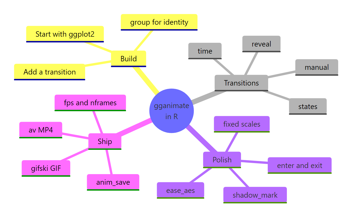
Figure 8: The gganimate workflow at a glance, from building a chart to shipping a file.
The single idea to remember: you already know ggplot2, and gganimate is just one more layer on top. Build the static chart, add the transition that matches what changes across frames, set group so objects keep their identity, then render and save. Everything else is polish.
References
- Pedersen, T. L. and Robinson, D. gganimate: A Grammar of Animated Graphics. Official site and Getting Started guide. Link
- gganimate reference: animate(). Link
- gganimate reference manual (CRAN). Link
- Animate ggplots with gganimate: Cheat Sheet (Posit). Link
- Wickham, H. ggplot2: Elegant Graphics for Data Analysis. Link
- Ooms, J. gifski: Highest Quality GIF Encoder (CRAN). Link
- Ooms, J. av: Working with Audio and Video in R (CRAN), for MP4 output. Link
- gganimate source and issues (GitHub). Link
Continue Learning
- ggplot2 Tutorial: How to Make Any Plot in R: master the static grammar of graphics that every gganimate animation is built on.
- ggplot2 Themes: Build Your Own House Style: the theming skills that make your animations look polished and on-brand.
- ggplot2 to plotly: Interactive Charts in One Line: compare animation with interactivity, where the reader hovers and explores rather than watches.