Recreating Three Professional Charts in R: a Case Study
A professional chart is not built from a different tool than a default one. It is a default chart with a handful of deliberate decisions made about hierarchy, colour and annotation. In this case study you rebuild three genuinely different published-chart styles from scratch in ggplot2, on real public data, and you learn the decision behind every layer. Every chart runs as interactive code in your browser, so you can change a value and rebuild it on the spot.
What separates a professional chart from a default one?
Open any newspaper graphics desk or a well-designed business dashboard and the charts look effortless. They are not. Each one is a plain ggplot underneath, dressed by a short list of choices: what to emphasise, what to mute, what to label, and what to leave out. Defaults are not wrong, they are just unfinished. This chapter rebuilds three real chart styles, and at each step it names the decision a professional would make and why.
We work in base ggplot2 with the tidyverse for data shaping, and nothing exotic, so every chart reproduces anywhere R runs. The first thing a professional does is fix a small palette, because colour is the loudest signal on a chart and the easiest to overspend. We pick four colours and give each a job.
The palette is a named vector, so later we can ask for a colour by its job, pal[["highlight"]], instead of pasting a hex code and hoping we remember which orange we meant. Naming colours by role, not by hue, is the habit that keeps a whole project consistent.
The second reusable piece is a theme: one function that controls every mark on the chart that is not the data itself. Fonts, grid lines, the background, the caption colour. We define it once and reuse it for all three charts, so they read as a family.
We start from theme_minimal() because it already drops the grey panel that print does not want, then we soften the text to near-black, thin the grid to a whisper, and left-align the title over the whole plot. We use the plain sans family so the code renders everywhere; later you will see how to swap in a branded typeface for the final export.
With the kit in place, every chart follows the same build order. You shape the data, add the marks (the geoms), set the scales that map data to the page, write the labels and annotation, and finish with the theme. Keeping that order in your head stops you from fiddling with fonts before the data even reads correctly.

Figure 1: The order to build any chart in, from data on the left to the styling on the right.
Try it: Make a copy of the palette called ex_pal and change its highlight colour to a deep blue, "#1f5f8b", then print it. Using a copy keeps the original pal intact for the charts that follow.
Click to reveal solution
Explanation: Because the palette is a named vector, you reassign one element by its name and the other three are untouched. Working on ex_pal rather than pal means the tutorial's charts keep their original burnt-orange highlight.
How do you build a dense small-multiples panel?
The first style is the small-multiples panel: the same chart drawn many times, once per group, in a tight grid. It is the honest way to show a pattern that repeats across dozens of categories, because the eye compares shapes rather than untangling a bowl of overlapping lines. What makes a good one work is discipline: identical, minimal encoding in every panel, and each panel free to use the vertical scale that suits it.
Our data is real. The txhousing dataset that ships with ggplot2 records monthly home sales for Texas cities from the Texas A&M Real Estate Center. We total each city's sales by year, keep twelve well-known metros, and stop at 2014 so every year is complete. We also lock the city order, so the biggest metros lead the grid.
Each row is now one metro in one year with a single number, homes_sold. That tidy shape, one row per panel-point, is exactly what facet_wrap() wants. Before we plot, let's confirm there is a story worth telling by reading Houston's crash and recovery in three numbers.
Houston sold about 81,000 homes in 2006, fell to 60,000 by 2009 as the financial crisis hit, then climbed back past its old peak by 2014. That rise, fall and recovery is the shape we want every panel to show. Now for the naive version: one line per city, faceted, with nothing else.
Run it and you meet the small-multiples trap. Because facet_wrap() shares one vertical scale by default, Houston's tall numbers stretch the axis, and every smaller metro flattens into a line hugging the floor. You can see Houston, and almost nothing else. The fix is to let each panel choose its own y-scale, add a light band to mark the downturn years as shared context, and clean the rest with our theme.
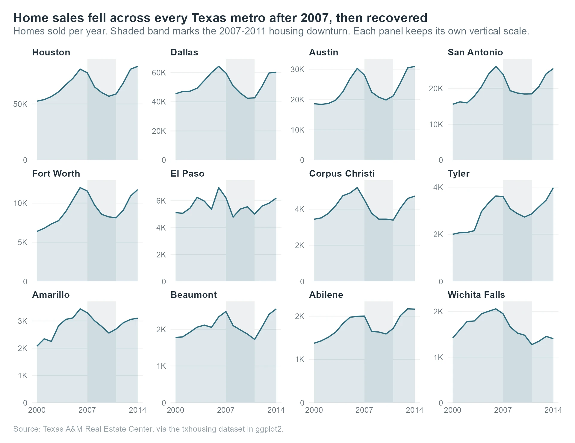
Figure 2: The finished small-multiples panel. Every metro repeats the same downturn-and-recovery shape at its own scale.
Walk through what changed. The annotate("rect", ...) draws one grey band across the 2007 to 2011 downturn in every panel, so the crash years are marked once and read everywhere. Setting scales = "free_y" is the decision that saves the chart: now Wichita Falls, with a few thousand sales, gets the same vertical room as Houston with eighty thousand. The label_number(scale_cut = cut_short_scale()) call turns 80000 into a clean "80K", and pretty_breaks(3) keeps each panel to three tidy gridlines instead of a cluttered ladder.
The result reads at two speeds. Glance at it and the whole state dips together in the shaded years, then rises out of it. Look closer and each metro tells its own version: Houston and Austin blow past their old peaks, while Wichita Falls never fully recovers. A single shared-scale chart would have hidden all of that. The comparison below shows exactly what the free scale buys you.
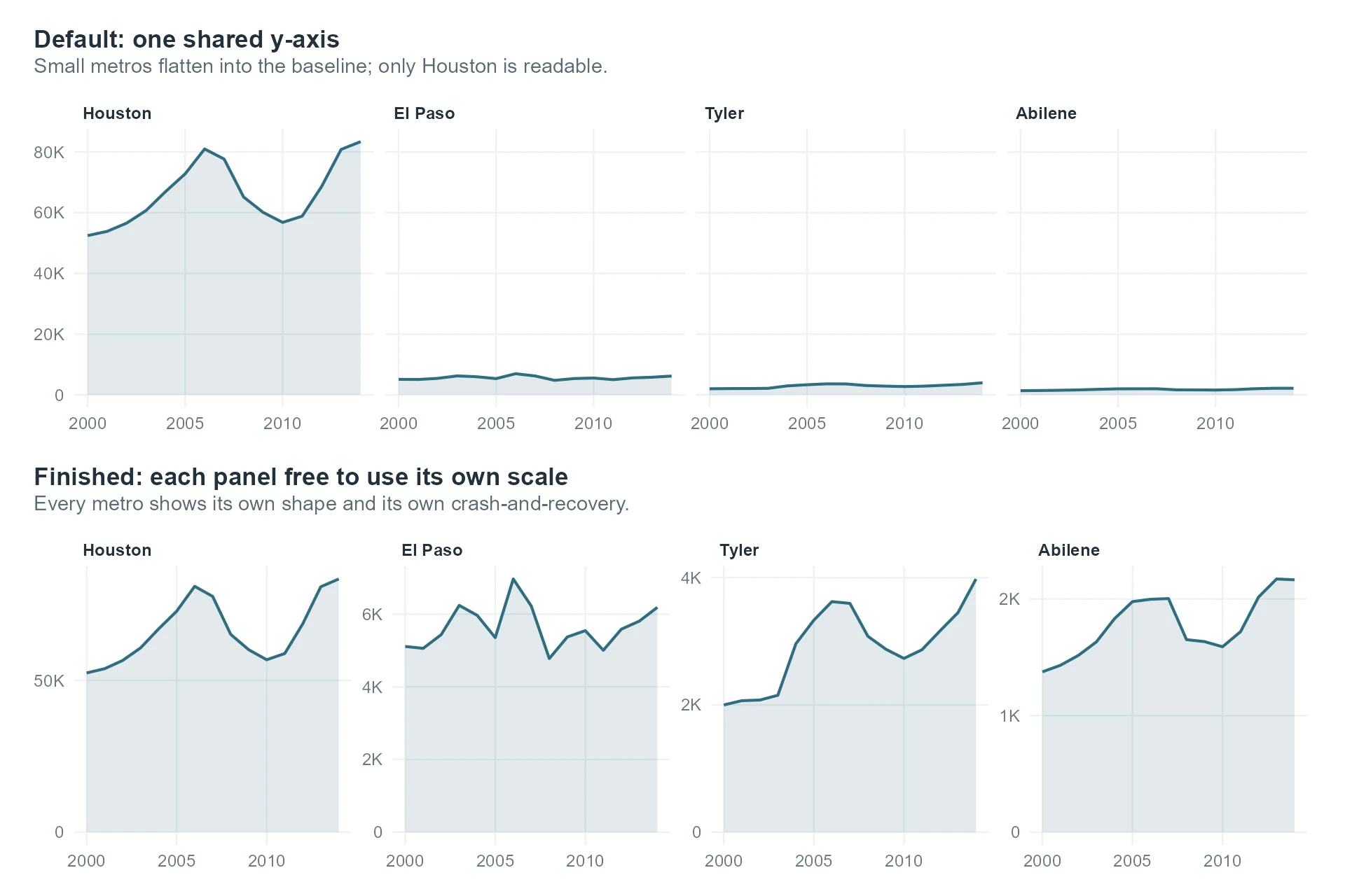
Figure 3: A shared y-axis hides the small metros; a free y-axis gives every one its own shape.
scales = "free_y" whenever the groups differ in size and the shape, not the absolute level, is the story.Craft notes for this chart. Three decisions carried it: freeing the y-scale so every panel is legible, repeating one calm colour and one thin line in every panel so the grid reads as a set, and marking the downturn with a single shared band instead of twelve separate labels. The traps it avoids are the shared axis that crushes small metros, and the temptation to give each of the twelve metros its own colour, which would turn a clean grid into a rainbow with no added meaning.
Try it: Feel the problem for yourself. Rebuild a stripped-down panel but set scales = "fixed" and watch the small metros collapse.
Click to reveal solution
Explanation: With scales = "fixed", Houston's large values set the axis for all twelve panels, so the smaller metros press flat against the bottom. Switching that one argument to "free_y" is the entire difference between a chart that hides its data and one that reveals it.
How do you build an annotated line chart that tells one story?
The second style is the annotated line chart: several series over time where one line is the story and the rest are context. The professional move is to stop treating every line as equal. You highlight one in colour, mute the others to grey, and label the lines directly at their ends so the reader never has to bounce between a legend and the chart.
Our data is EuStockMarkets, a built-in record of daily closing prices for four major European indices from 1991 to 1998: Germany's DAX, Switzerland's SMI, France's CAC and the UK's FTSE. Raw prices are not comparable, because each index starts at a different level, so we rebase every series to 100 at the start. Then a value of 200 means "doubled", whatever the index.
There is the story in one table. Every index rose, but Switzerland's SMI ended at 457, a 357% gain that left the others far behind, while France and the UK roughly doubled. That gap is what the chart must make obvious the instant someone looks at it. To highlight one line, we split the data into the lead series and the rest, and we pre-compute where each end label should sit.
Splitting the frame lets us draw the grey lines and the coloured line as separate layers, each with its own fixed colour. The ends table holds one row per index at the final date, with a ready-made label like "SMI 457". Because CAC and FTSE finish almost on top of each other at 225 and 223, we nudge their labels apart by hand with label_y, so the text never overlaps. First, though, the default, so you can feel the difference.
Four lines, four colours of equal weight, and a legend off to the side. Nothing is wrong, and nothing is emphasised, so the reader has to work: match a colour to the legend, find the line again, repeat. That handoff between legend and chart is friction, and friction loses readers. Now the finished version, where colour and labels do the pointing for them.
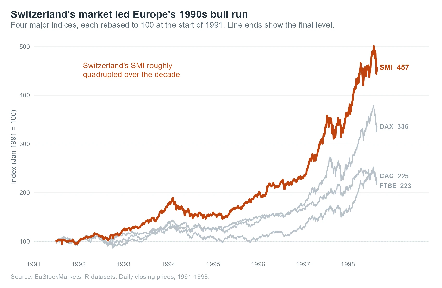
Figure 4: The finished annotated line chart. One coloured line carries the story; the rest are quiet context.
Read how the layers stack. The dashed geom_hline at 100 is the "no change" baseline, so any line above it has grown. We draw eu_context first in grey and eu_lead second in orange, so the highlighted line sits on top and reads as the foreground. The two geom_text layers put each index's name and final value right at the end of its line, which is why the chart needs no legend at all. The annotate("text", ...) call adds one sentence of interpretation in the same highlight colour, tying the words to the line they describe.
Set that beside the default and the difference is not decoration, it is comprehension. The default asks the reader to decode; the finished chart hands them the point.
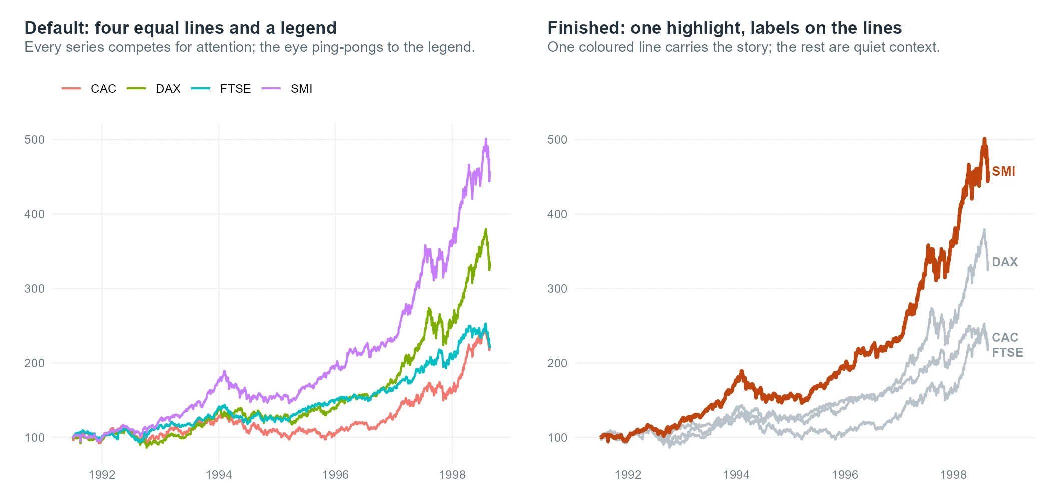
Figure 5: A legend to decode versus one highlighted line with labels sitting on the data.
Craft notes for this chart. The three decisions: rebasing to 100 so the series are comparable at all, highlighting one line while greying the rest, and labelling on the lines rather than in a legend. The traps avoided are the legend hunt and the four-equal-colours spaghetti, both of which spread the reader's attention thin instead of pointing it at the one line that matters.
Try it: Change which line is the hero. Highlight the DAX instead of the SMI by splitting the data on "DAX", and draw it over the grey context.
Click to reveal solution
Explanation: The highlight technique is data-driven, not hard-coded. You choose the hero simply by which rows land in the lead frame, so pointing the spotlight at a different series is a one-word change from "SMI" to "DAX".
How do you build a diverging comparison chart?
The third style is the diverging bar chart: a ranked comparison where each category is measured against a meaningful centre, and bars spread left and right of a zero line. It answers "who is above and who is below?" at a glance. The craft is in the categorical layout: sort the bars by value, centre them on a real baseline, and use just two colours to split the two sides.
Our data is USArrests, the 1973 rates of arrest per 100,000 residents in each US state, from the World Almanac. The raw assault numbers are not comparable across a reader's intuition, so we standardise them into a z-score: how many standard deviations each state sits above or below the national average. A z-score of +1 means "one standard deviation above average".
Each state now has a z and a side label. North Carolina and Florida sit almost two standard deviations above the national average, and the side column will drive the two-colour split. The tibble::rownames_to_column("state") step matters because the state names live in the row names of USArrests, and a chart needs them as a real column. Here is the naive default.
It is a mess, and instructively so. The states run alphabetically, so Alabama sits next to Alaska for no reason a reader cares about, the bars all start at zero on raw counts, and fifty vertical labels crush together along the bottom. You cannot see who is high or low without reading every bar. The finished version fixes all three problems: sort by value, centre on the average, and colour by side.
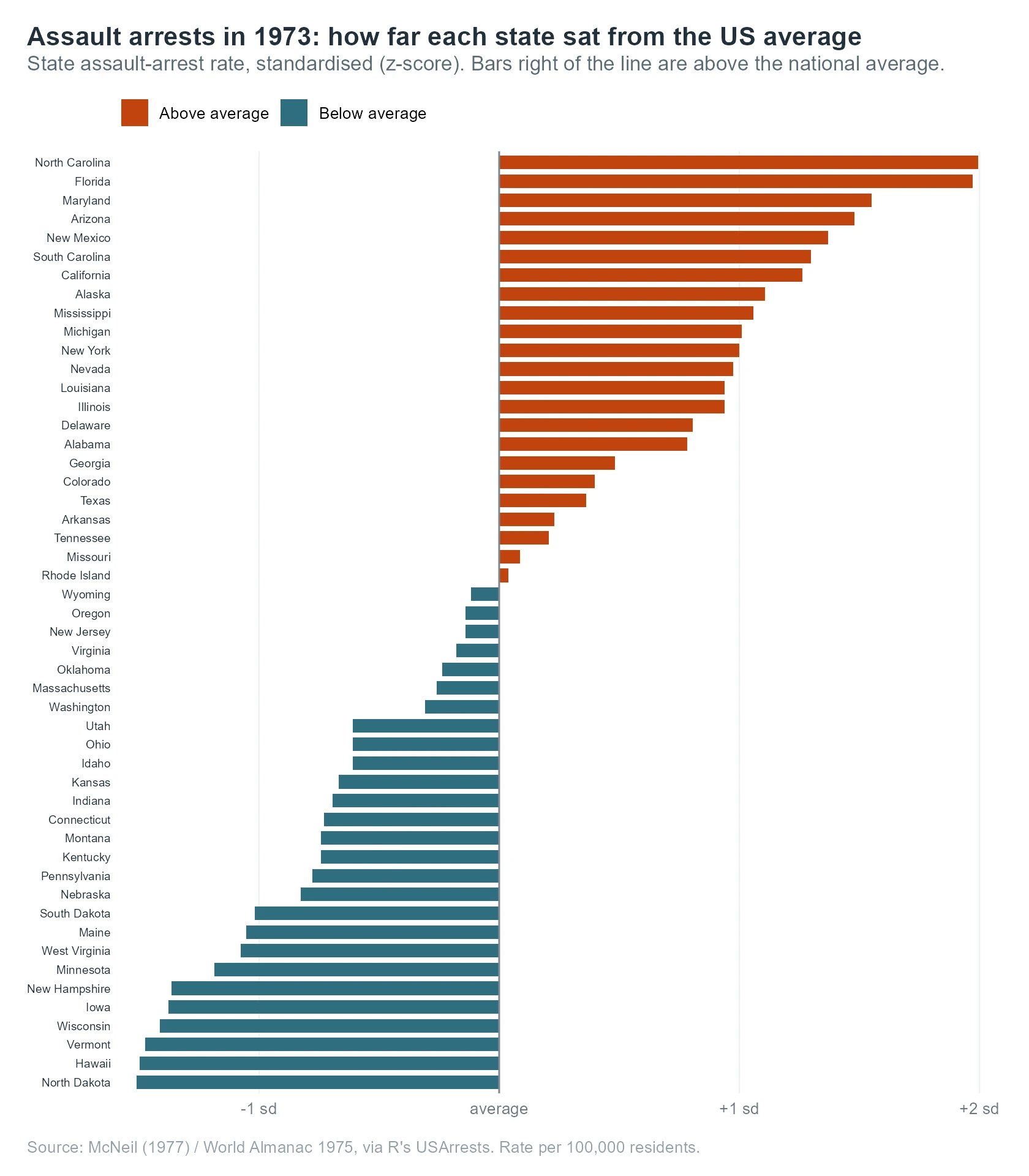
Figure 6: The finished diverging chart. States are ranked around the national average, with two colours splitting above from below.
Look at how the layout carries the meaning. Putting z on the x-axis and reorder(state, z) on the y-axis sorts the bars from most above average at the top to most below at the bottom, so the ranking is the shape of the chart. The geom_vline at zero is the reference every bar is measured against, and relabelling the axis ticks as "average" and "+1 sd" tells the reader what zero and one actually mean. The two-colour scale_fill_manual splits the country in half at a glance, without inventing fifty separate colours.
Against the default, the difference is meaning versus noise.
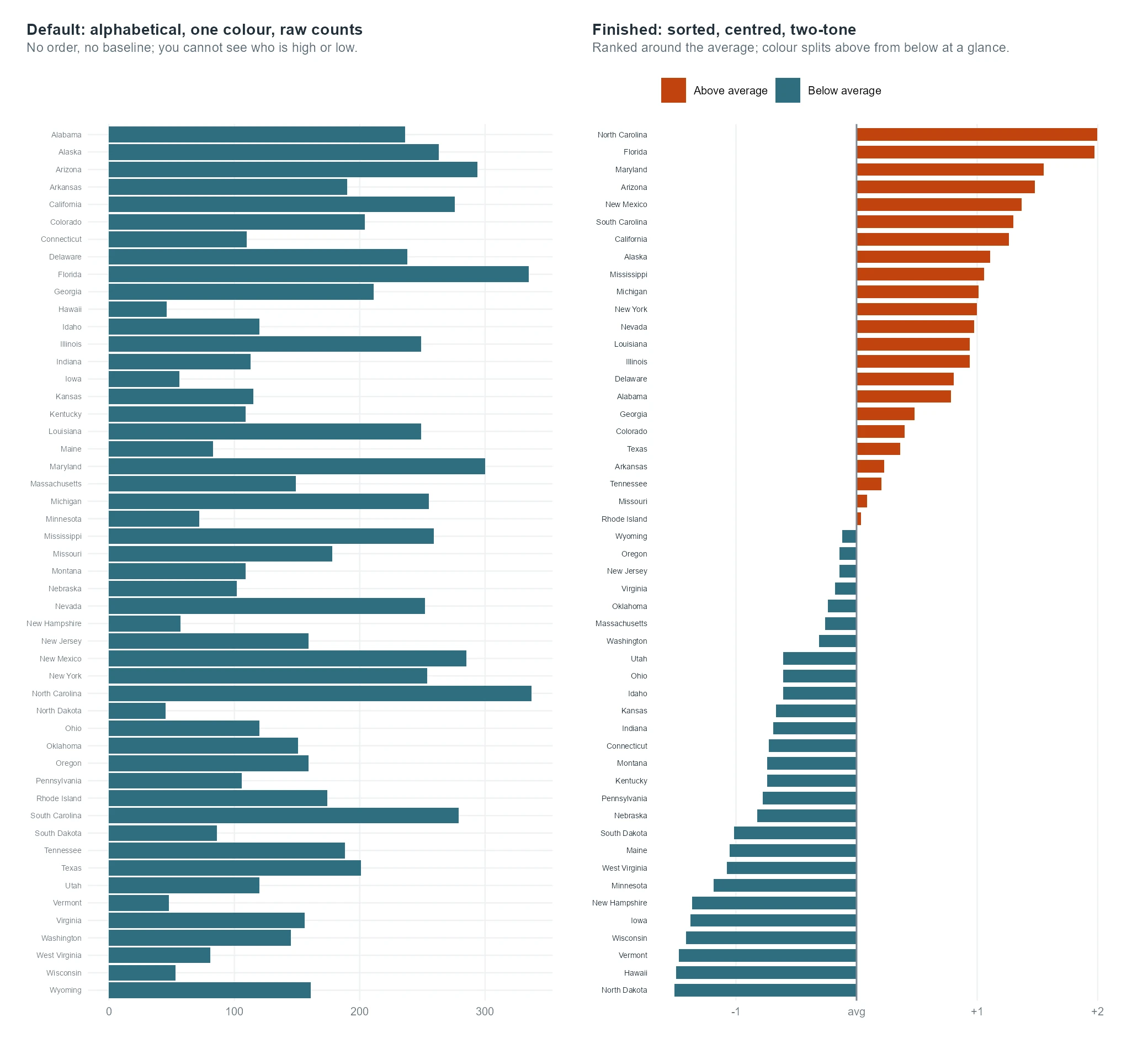
Figure 7: Alphabetical raw bars tell you nothing; sorted, centred, two-tone bars tell you everything.
Craft notes for this chart. The three decisions: standardising to a shared ruler so lengths are comparable, sorting the categories by value so the ranking reads instantly, and using two tones plus a zero line so above and below split cleanly. The traps avoided are a truncated baseline that would exaggerate the differences, and a fifty-colour palette that would add visual noise without adding meaning.
Try it: Swap the crime. Rebuild the diverging chart on the Murder column instead of Assault, reusing div_cols.
Click to reveal solution
Explanation: The whole recipe is portable. You change only the column inside the z-score, and the sort, the centre and the two-colour split all still work, because they were written to depend on z and side rather than on any one variable.
Which traps make a chart lie?
The same three professional habits, honest scales, restrained colour and clear reference points, also protect you from the ways a chart can mislead. Three traps account for most misleading charts, and it is worth seeing at least one of them happen. The most common is the truncated axis: starting a bar chart's value axis somewhere above zero, which stretches small differences into dramatic ones.
Run it and 2014 towers over 2011, as if sales had multiplied. They did not. By starting the axis at 20,000 rather than 0, we chopped off the shared base of every bar and left only the small differences on top, then blew those up to fill the panel. The honest version starts at zero.
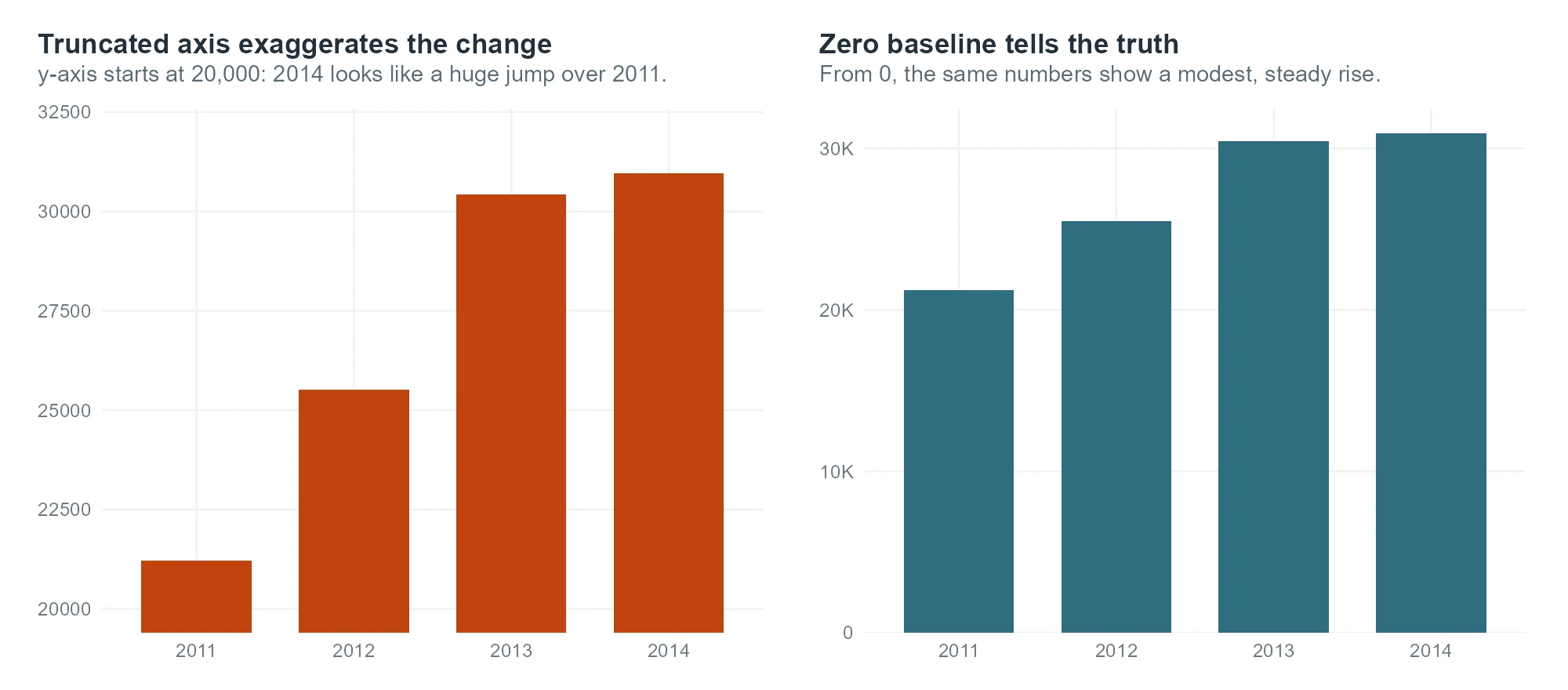
Figure 8: The same four numbers. A truncated axis manufactures a dramatic jump; a zero baseline shows the modest truth.
The other two traps are quieter. Dual axes, two different y-scales on the left and right of one chart, let you slide two unrelated series until they appear to move together, manufacturing a correlation that is really just your choice of scales. When you must compare two different units, use two stacked panels instead. And rainbow palettes, a different hue for every category, imply an order that hue does not carry, so a reader cannot tell which colour is "more". Use one accent against grey, as we did with the indices, or an ordered scale that runs light to dark when the categories genuinely rank.
Try it: Make the truncation worse. Push the lower limit up to 28,000 and watch the exaggeration grow.
Click to reveal solution
Explanation: The higher the axis floor, the smaller the slice of real data on show, and the more that slice is stretched to fill the panel. At a floor of 28,000, a rise of a few percent looks like a doubling, which is exactly the distortion a zero baseline prevents.
The complete recipe: one theme, three charts
The real payoff of the last few sections is that you never build the kit twice. The block below is self-contained: it loads the tools, defines the palette and a compact theme, then builds a finished diverging chart on a brand-new variable, the share of each state that is urban. Lift it into any project, point it at your own data, and the house style comes along for free.
Nothing in that block is specific to arrests or stock prices. It is the palette, the theme and the diverging pattern, aimed at a new column. That portability is the point: the effort you spent designing the kit pays out on every future chart, not just this one.
Once a chart is right on screen, the last step is exporting it at the size and resolution a report or print job needs. ggsave() handles that: give it a size and a resolution, and it writes the file.
The dpi = 300 is the usual floor for print, and fixing the size in inches means text keeps its intended proportion when the figure lands on the page. We wrote to a temporary folder here so nothing clutters your project, but in practice you would save to a named figures/ file.
One last detail is fonts. The theme uses the generic sans family on purpose, so the code renders anywhere with no missing-font errors. For a branded typeface in your final export, register the font locally with the showtext package, then set base_family in the theme. That step needs a font installed on your own machine, so it runs in your local RStudio rather than in the browser.
# Run this in your own RStudio session (needs a font installed locally)
library(showtext)
font_add_google("Inter", "inter")   # or font_add() for a local .ttf
showtext_auto()

# then point the theme at it
theme_pub_branded <- function() theme_pub(base_family = "inter")Try it: Aim the kit at yet another column. Change UrbanPop to Rape in the recipe and rebuild, and the whole chart re-sorts around the new average.
Click to reveal solution
Explanation: Because the recipe depends only on a computed z and side, swapping the source column is all it takes. The kit does the rest, which is exactly what a reusable system is for.
The 12-question pre-ship checklist
Before any chart leaves your hands, run it past these twelve questions. They are the same decisions this case study made, turned into a checklist you can reuse on every graphic.
- Message. Can you state, in one sentence, the single thing this chart is for?
- One story. Does one element clearly carry that message, rather than everything competing at once?
- Hierarchy. Is the most important thing the most visually prominent, in size, weight or colour?
- Honest axis. Do bars start at zero, and does no axis truncation exaggerate a difference?
- Colour restraint. Are you using one accent against grey, or an ordered scale, rather than a rainbow?
- Direct labels. Have you labelled series on the chart instead of forcing the reader into a legend?
- Sorted categories. Are categories ordered by value or by a meaningful sequence, never alphabetically by accident?
- Readable text. Is every label legible at the final size, with a font that has a safe fallback?
- Reference points. Is there a baseline, average line or annotation that tells the reader what "normal" is?
- Source and caption. Does the chart name its data source and say what the numbers are?
- Export spec. Is it saved at the right size and at least 300 DPI for the medium it ships in?
- The stranger test. Would someone who has never seen the data understand the point within five seconds?
Practice Exercises
These combine several ideas from the case study. Try each before opening the solution. They use their own variable names so they will not disturb the objects from the tutorial.
Exercise 1: A median-price small-multiples panel
Build a small-multiples panel from txhousing showing the median sale price over time for six metros: Houston, Dallas, Austin, San Antonio, Fort Worth and El Paso. Use scales = "free_y" and theme_pub(). Store the working data in my_prices.
Click to reveal solution
Explanation: The pattern is identical to the sales panel: filter to the groups you want, plot one line per panel, and free the y-scale so each metro's price range is legible. Reusing theme_pub() means this chart already matches the rest of your work.
Exercise 2: Highlight the worst performer
Rebuild the rebased European-index line chart, but this time highlight the weakest index instead of the strongest, and add a direct label at its end. The weakest is the one with the lowest final value. Store the highlighted frame in my_lead.
Click to reveal solution
Explanation: The highlight logic does not care whether the hero is the best or the worst performer. You choose the story by which rows go into the lead frame, then colour and a direct label do the pointing, exactly as they did for the SMI.
Exercise 3: A diverging chart with the extremes labelled
Build a diverging bar chart of the urban-population z-score by state (as in the recipe), but add value labels only to the five most urban states, so the extremes are called out without cluttering all fifty bars. Store the data in my_urban.
Click to reveal solution
Explanation: Labelling only head(my_urban, 5) calls out the extremes while leaving the other bars clean, which is a common newsroom compromise between a fully labelled chart and a bare one. The reader gets the headline numbers without fifty competing labels.
Frequently asked questions
How many groups is too many for a small-multiples panel?
Small multiples stay readable up to a few dozen panels, as long as every panel keeps the same simple encoding. Past that the panels get too small to read, so show only the most important groups or summarise the rest into an "other" panel. This post used twelve metros, which fits comfortably in a four-column grid.
Should I always use free scales for small multiples?
No. Free scales are right when the shape of each group is the story and the groups differ a lot in size, as the Texas metros did. But a free y-axis hides how much bigger one group is than another, so when the absolute magnitudes are the point of the comparison, keep a shared scale. The choice follows the question you are asking, not a fixed rule.
How do I label lines directly instead of using a legend?
Build a small table with one row per series at its final x-position, then add a geom_text layer that draws each label there in the line's own colour. Nudge any overlapping labels apart by hand, the way we separated CAC and FTSE. Once every line is labelled at its end, you can drop the legend entirely.
How do I keep the same style across every chart in a project?
Put your colours in one named vector and every non-data styling choice in one theme function, then call that function on each plot. Because the styling lives in a single place, changing a colour or a font size updates every chart at once, and new charts start already on-brand.
What size and resolution should I export a chart at?
Use ggsave() with the size fixed in inches and the resolution set to at least 300 DPI for anything printed. Fixing the size in inches keeps text at its intended proportion on the page, and 300 DPI is the usual floor for print quality. A figure that will only ever appear on screen can use a lower DPI.
Summary
Recreating a professional chart is not about a secret geom or a magic package. It is about making a short list of decisions on purpose, in the same order every time: shape the data, choose the marks, set honest scales, add the labels and annotation that carry the message, and finish with a consistent theme.
| Chart style | The decision that carried it | The trap it avoids |
|---|---|---|
| Small multiples | Free the y-scale so every panel is legible | A shared scale that flattens small groups |
| Annotated line | Highlight one line, label it directly | A legend hunt and four competing colours |
| Diverging bars | Sort, centre and split into two tones | A truncated baseline and a rainbow palette |
The three habits worth carrying into every chart you make are these: keep your scales honest, so a bar starts at zero and no axis exaggerates; spend colour like it is scarce, one accent against grey; and label the data directly so the reader never has to decode. Build those into a reusable palette and theme, and your charts will look deliberate because they will be.
References
- Wickham, H., Navarro, D., and Pedersen, T. L. ggplot2: Elegant Graphics for Data Analysis (3e), Annotations. Link - the reference for the
geom_textandannotate()layers used to label the lines and shade the recession band. - ggplot2 documentation. facet_wrap(): wrap a 1d ribbon of panels into 2d. Link - the full argument list for faceting, including the
scales = "free_y"option that rescued the small-multiples panel. - scales package. Label and transform functions for ggplot2 scales. Link - documents
label_number,cut_short_scaleandpretty_breaks, the axis-formatting helpers used throughout. - The R Graph Gallery. Diverging bar plot recreated from a New York Times chart. Link - a worked recreation of a real diverging bar chart, close to the one built here.
- The R Graph Gallery. Line chart with labels at the end of each line. Link - a step-by-step version of the direct-labelling technique behind the annotated line chart.
- Wilke, C. O. Fundamentals of Data Visualization. Link - the theory behind honest scales, colour restraint and small multiples, freely readable online.
- Cairo, A. The Truthful Art: Data, Charts, and Maps for Communication. New Riders (2016). Link - a careful treatment of the truncated-axis and dual-axis traps covered in the final section.
Continue Learning
- A Publication Figure System in R: an End-to-End Case Study - build the reusable theme, palette and scales this chapter leans on into a full figure system.
- Publication-Ready ggplot2 Figures: The Checklist - the per-figure checklist of fonts, sizes and DPI that turns a draft into a journal-ready figure.
- ggplot2 Themes: From theme_classic to Your Own House Style - a deeper look at every theme element you can control when you design a house style.