Population Pyramids and Diverging Bars in ggplot2
A diverging bar chart puts a meaningful center in the middle of the axis and lets bars grow both ways from it, so a single glance tells you which items sit above the center and which sit below. A population pyramid is the very same idea with two groups drawn back to back. This tutorial builds both from scratch with base R for the data and ggplot2 for the graphics, plus dplyr for a few tidy calculations, so you finish knowing exactly why every line is there.
What makes a bar chart "diverge", and when do you need one?
An ordinary bar chart starts every bar at zero and grows in one direction, which answers the question "how big?" A diverging bar chart is different: it fixes a meaningful center, such as an average or a true zero, and lets each bar grow left or right from that center. That small change swaps the question to "which side, and by how much?" The shared idea behind everything in this post is that a population pyramid is just a diverging bar chart where the two directions stand for two groups instead of above and below.
Let's make that concrete right away with a data set you already have. The built-in mtcars table lists 32 cars and their fuel economy in miles per gallon. We will measure each car against the fleet average, so cars above average lean one way and thirsty cars below average lean the other.
The |> between each step is R's pipe: it takes the result on its left and hands it to the function on its right, so the code reads top to bottom as a single flow. We pulled the car names out of the row names into a real model column, then added two new columns. mpg_z rescales each car's mileage into a "distance from average" number that we will explain properly in the next section, and type simply records whether that distance is above zero or below it. Sorting by mpg_z means the thirstiest cars sit at the top of the table, and every one of these six is below average, so type reads "below" all the way down.
Now the payoff. We hand ggplot2 the model on one axis, the centered mileage on the other, and the type column as the fill color, then flip the whole thing sideways so the long car names are readable.
Press Run and a diverging bar chart appears. Bars for above-average cars point right, bars for below-average cars point left, and the two colors split the fleet at the center line. geom_col() draws a bar whose length is the value you give it, reorder(model, mpg_z) sorts the cars by their score so the chart reads like a ranking, and coord_flip() swaps the axes so the bars run horizontally. That is the entire skeleton, and every chart in this tutorial is a variation on it.
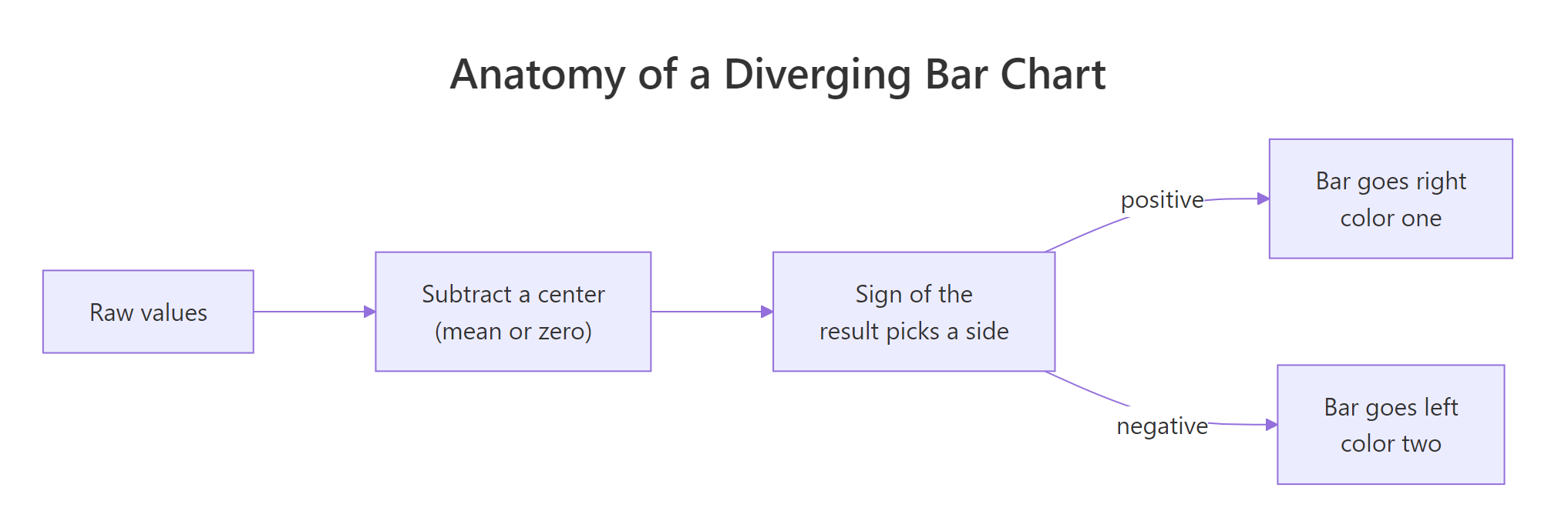
Figure 1: Every diverging bar chart follows the same four moves from raw value to a two-sided bar.
Try it: The chart's top bar is the most fuel-efficient car. Reproduce that single row in a table by sorting cars from the highest mpg_z down and keeping the first row.
Click to reveal solution
Explanation: arrange(desc(mpg_z)) sorts from most above-average to most below-average, and head(1) keeps the leader. The Toyota Corolla sits 2.29 standard deviations above the fleet average.
How do you turn raw numbers into a centered scale?
A diverging chart needs a center, and choosing that center is the real work. The most useful center for comparisons is the average, so we ask each value not "how many miles per gallon?" but "how far from the average, in a fair unit?" Subtracting the mean moves the center to zero, and dividing by the standard deviation puts everything on a common scale of "spreads away from the mean." That combined move is called a z-score, and it is exactly what mpg_z holds.
First, let's see the two ingredients the z-score is built from: the fleet average and the fleet spread.
The average car does about 20.09 mpg, and the standard deviation, a measure of how spread out the values are, is 6.03 mpg. So a car at 26.12 mpg is one standard deviation above average and scores a z of +1, while a car at 14.06 mpg is one below and scores -1. If you like the formula, here it is, and you can safely skip to the next paragraph if you do not.
$$z_i = \frac{x_i - \bar{x}}{s}$$
Where:
- $z_i$ = the standardized score for car $i$ (how many standard deviations from the mean)
- $x_i$ = the car's original mileage in mpg
- $\bar{x}$ = the mean mileage across all cars
- $s$ = the standard deviation of the mileage
You do not strictly need the standard deviation to draw a diverging chart. Plain mpg - mean(mpg) would center the data just fine. The z-score adds one thing: because it divides by the spread, the numbers become comparable across totally different measurements, so the same chart recipe works whether the values are mileage or rainfall.
One more thing worth checking is the balance of the two sides. It is tempting to assume "above average" and "below average" split the group in half, but that is only true for a perfectly symmetric spread.
Fourteen cars land above the average and eighteen below it. The average is pulled up by a few very efficient cars, so more than half the fleet sits just under it. That is normal, and it is a good reason to label the sides honestly rather than call them "the top half" and "the bottom half."
Try it: Confirm you understand the z-score by computing one by hand. Using the fleet mean of 20.09 and standard deviation of 6.03, work out the z-score for a car that gets 25 mpg, rounded to two decimal places.
Click to reveal solution
Explanation: Subtract the mean to center the value, then divide by the standard deviation to scale it. A 25 mpg car sits 0.81 standard deviations above the fleet average, so it would draw a short bar on the "above" side.
How do you build the diverging bar chart step by step?
The bare chart from section one works, but it leaves ggplot2 to pick default colors and axis labels. Let's turn it into something you would put in a report by controlling three things: the colors for each side, the text on the axes and the overall theme. We build it as one pipeline of layers, and each layer does one job.
Run it and the chart tells a clear story. geom_col(width = 0.7) slims the bars so they do not touch. scale_fill_manual() assigns a blue to the above-average cars and an orange to the thirsty ones, and its labels argument rewrites the legend text into plain English. labs() sets a title, blanks the crowded model axis with x = NULL, and names the value axis so readers know it shows a z-score. theme_minimal() strips the gray background for a cleaner look.
Notice how much the reorder() from earlier is doing here. Without it the cars would appear in data order and the chart would look like noise. With it, the bars fan out smoothly from the most below-average car to the most above-average one, which is what makes a diverging bar chart pleasant to read.
reorder(category, value) inside aes() so the longest bars sit at one end and the eye can follow the gradient across the center line.Try it: Give the chart your own title and a simpler value-axis label. Start from the base chart below and add a labs() layer.
Click to reveal solution
Explanation: Every ggplot2 chart is layers joined by +, so you extend an existing plot just by adding another layer. Here labs() supplies a title and renames the value axis.
How do you turn diverging bars into a cleaner lollipop?
Bars are solid blocks of ink, and when you have many categories that ink can feel heavy. A diverging lollipop chart shows the same information with far less of it: a thin line from the center out to a dot marks each value. The dot lands exactly where the bar would have ended, so the reading is identical while the chart looks far less crowded.
You build a lollipop from two layers instead of one. A segment draws the stick from the center line out to the value, and a point caps it with the dot.
The geom_segment() layer needs a start point and an end point. We anchor every stick at y = 0, the center line, and send it out to yend = mpg_z, the car's score, while xend = model keeps each stick lined up with its own car. Then geom_point(size = 3) drops a dot at the tip. Because the color now applies to lines and dots rather than filled areas, we switch from fill to colour and from scale_fill_manual() to scale_colour_manual(). Everything else, including the center-out layout, is unchanged.
Try it: Make the dots easier to see by enlarging them. Redraw the lollipop with the points set to size = 5.
Click to reveal solution
Explanation: size controls the dot radius. Larger dots read better in a slide or a small figure, while smaller dots suit a dense chart with many categories.
How do you build a population pyramid from two groups?
Now we use the same center-out idea for its most famous job. A population pyramid stacks age bands up the middle and draws one group's bars to the left and another group's to the right, so you can compare the shape of two populations at a glance. The classic version splits a population by gender, and that is what we will build.
The key move is a trick you can reuse anywhere: to send a group's bars to the left, you make that group's numbers negative. First we need some data, one row per age band per group.
These are made-up figures in thousands of people, chosen so the shape looks like a real population that thins out with age. The age column is stored as a factor with its levels set in the order we listed them, which matters because text sorts alphabetically and would otherwise put "10-19" before "0-9" on the axis. Each of the nine age bands appears twice, once for each gender.
Next comes the negation. We add a signed column that keeps the female counts as they are but flips the male counts negative, which is what will push the male bars to the left of center.
Look at the 20-29 band. The real counts in count are both positive and untouched, so the true numbers are safe. The new signed column carries the same magnitude but a negative sign for males, and that sign is the only thing that decides which way the bar points. With that column in hand, the pyramid is the ordinary bar recipe again: age on one axis, the signed count on the other, gender as the fill.
Run it and the pyramid shape appears, male bars reaching left and female bars reaching right from a shared center. It works, but look closely at the bottom axis: it shows negative numbers like -2000 on the male side, because that is literally what we plotted. We will fix that eyesore in the next section.
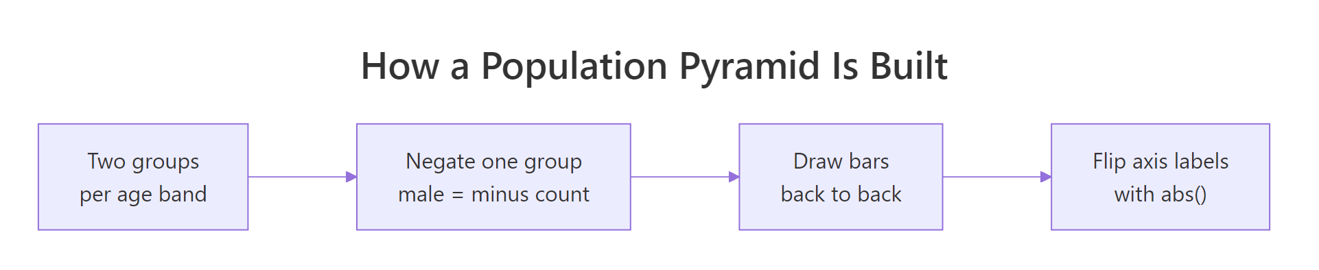
Figure 2: A population pyramid is built by negating one group, drawing back to back, then flipping the labels positive.
count, and only ever negate a separate copy for plotting, so your totals, labels, and later calculations still use the real, positive numbers.Try it: Inspect the oldest band the same way we inspected 20-29. Filter pop to the "80+" age band and print both rows so you can see the signed values.
Click to reveal solution
Explanation: In the oldest band the male count of 400 becomes -400 in signed while the female 650 stays positive, so the male bar points left and the (longer) female bar points right.
How do you fix the negative axis labels on a pyramid?
The negative tick labels are the one rough edge left, and the fix is a two-parter. We rewrite the labels so both sides read as positive people-counts, and we force the axis to be symmetric so the pyramid sits centered rather than lopsided. Both live inside a single scale_y_continuous() call.
The labels argument takes a small function that ggplot2 runs on each tick value. Ours calls abs() to drop the minus sign so -2000 prints as 2000, and wraps it in scales::comma() to add a thousands separator for readability. The limits argument sets the axis to run from minus the largest count to plus the largest count, which guarantees the two sides are mirror images. The scale_fill_manual() line just swaps in a clearer blue and red for the two genders.
That is a finished, honest pyramid. The axis reads in real people on both sides even though the male bars were plotted from negative numbers under the hood.
Try it: See the label trick in isolation. Apply abs() to a vector of tick values that includes negatives and watch the signs disappear.
Click to reveal solution
Explanation: abs() returns the distance of each number from zero, so negatives become positive and zero stays zero. That is exactly what turns the left half of the pyramid axis from -2000 back into 2000.
Complete Example
Here is the whole idea in one block you can copy and adapt. It builds the polished pyramid, adds the raw count beside each bar with geom_text(), and nudges those labels outward so the male labels sit to the left of their bars and the female labels to the right. It reuses the pop table from earlier, so run the pyramid sections above first.
This pulls together every move from the tutorial. The bars are positioned by the signed counts, the axis labels are flipped positive with abs() and comma-formatted, the limits are stretched slightly to -1.15 and 1.15 times the largest count so the text labels have room, and geom_text() prints the true count values next to each bar. The hjust uses ifelse() to push each side's labels away from the center. Swap in your own two-group data and you have a reusable pyramid.
Practice Exercises
These combine several ideas from the tutorial. Try each one before opening the solution, and use the distinct ex_ variable names so your practice code does not overwrite the tutorial data.
Exercise 1: Center on the median instead of the mean
The mean gets dragged around by extreme values. The median, the middle value, does not. Rebuild the car data centering mpg on its median rather than its mean, label each car above or below, then count how many cars sit above the median.
Click to reveal solution
Explanation: Centering on the median splits the group more evenly than the mean did, 15 above and 17 below, because the median is not pulled by the few very efficient cars. Only the choice of center changed; the diverging recipe is identical.
Exercise 2: A diverging bar of the gender gap
Turn the pyramid data back into a plain diverging bar chart. For each age band compute the gap, meaning female count minus male count, color the bar by the sign of that gap, then draw it with coord_flip(). Bands where women outnumber men should point one way, and bands where men lead should point the other.
Click to reveal solution
Explanation: The gap is already a signed number, so it needs no negation trick. Younger bands lean toward men and older bands toward women, which is the same demographic story the pyramid told, now shown as one diverging bar per band.
Exercise 3: A compact lollipop of the extremes
A 32-car lollipop is busy. Keep only the five most below-average cars and the five most above-average, then draw a small diverging lollipop of just those ten. Because cars is already sorted from most below to most above, the ends of the table are exactly the extremes you want.
Click to reveal solution
Explanation: head(cars, 5) grabs the thirstiest cars and tail(cars, 5) the most efficient, and rbind() stacks them into one ten-row table. The lollipop then shows only the memorable extremes, which is often clearer than plotting every category.
Frequently Asked Questions
Should I use geom_bar() or geom_col() for these charts? Use geom_col(). It draws a bar whose height is the value you supply, which is what you want when you have already computed a z-score or a count. geom_bar() counts rows for you and is meant for raw, uncounted data, so it would need stat = "identity" to behave like geom_col().
Why do I make one group's values negative? Negating a value flips the direction its bar points. In a pyramid, sending the male counts negative pushes their bars to the left of the center line while the positive female counts stay on the right, which produces the back-to-back shape. Keep a separate positive column for the real numbers.
How do I draw the pyramid vertically instead of horizontally? Drop coord_flip(). The bars will then run up and down with age along the bottom axis. Horizontal is the traditional pyramid look and keeps long age labels readable, but vertical works fine for short labels.
Do population pyramids have to be male versus female? No. The technique compares any two groups across the same set of categories, such as two countries, two years or two survey waves. Put one group's values negative and the other positive, and the back-to-back chart works the same way.
How do I add a gap or a center label between the two sides? Widen the axis with the limits argument so there is empty space near zero, then add an annotate() or a second geom_text() layer at the center. Keeping the limits symmetric, as we did, is what makes room for a tidy center strip.
Summary
A diverging bar chart and a population pyramid are the same construction with different centers. Once you can center a value, color it by side, and flip the axis, you can build either one.
| Move | What it does | Key code |
|---|---|---|
| Center the values | Subtract a mean or set a true zero so bars grow both ways | mpg - mean(mpg) |
| Color by side | Split above from below, or group A from group B | scale_fill_manual() |
| Point bars two ways | Negate one group so its bars go left | if_else(g == "Male", -count, count) |
| Read the axis honestly | Rewrite negative ticks as positive counts | labels = function(x) abs(x) |
Use a diverging bar chart when you rank many items around one average. Reach for a lollipop when the bars feel heavy and you want the same message with less ink. Build a population pyramid when you compare two groups across shared categories such as age bands.
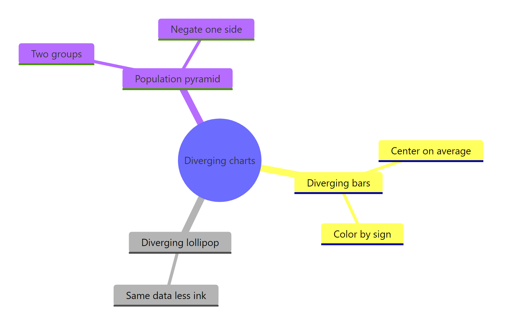
Figure 3: The three diverging charts in this tutorial and the idea each one adds.
References
- ggplot2 documentation. Bars and columns:
geom_bar()andgeom_col(). Link - ggplot2 documentation. Cartesian coordinates with flipped axes:
coord_flip(). Link - ggplot2 documentation. Continuous position scales and the
labelsargument. Link - dplyr documentation. Creating and transforming columns with
mutate(). Link - Chang, W. R Graphics Cookbook, 2nd Edition. Link
- R CHARTS. Diverging bar chart in ggplot2, worked examples. Link
- Population pyramid, background and interpretation. Wikipedia. Link
Continue Learning
- Lollipop Chart in R: Go deeper on the stick-and-dot chart you met here, including one-sided rankings and labeling.
- Dumbbell and Slope Charts in R: Two more ways to show a difference between two values per category.
- Bump Charts in R: Track how a ranking of several groups shifts over time.