Text Labels in ggplot2: geom_text, geom_label and ggrepel
A text label prints a data point's name right on the chart, so the reader sees which point is which without hunting through a legend. In ggplot2 you make one by mapping a column to the label aesthetic, then adding geom_text() for plain words, geom_label() for words in a tidy box, or a ggrepel geom when the labels start to collide.
This tutorial builds all three from scratch. You will label a handful of points, box those labels for busy backgrounds, style and nudge them into place, thin out a crowded chart, and finally let the ggrepel package space every label apart automatically with neat leader lines. Everything uses the tidyverse (ggplot2 with a little dplyr, plus ggrepel at the end), the code runs right here in your browser, and every output you see is the real result of running the block. If you can read a scatter plot, you already know enough to begin.
How do you add a text label with geom_text()?
A labelled point needs two things: a place to sit and a word to show. The place comes from the same x and y you already give every ggplot. The word comes from a new mapping, aes(label = ...), which hands one piece of text to each row of your data. That single idea is the whole foundation, so let's see it work before we pick it apart.
We will use mtcars, a small dataset of 32 cars that ships with R, so there is nothing to download. The car names live in the row names rather than in a normal column, so our first job is to copy them into a real column called car that ggplot can map to. Let's do that and look at the result.
Each row is one car, with its miles per gallon (mpg), weight in thousands of pounds (wt), horsepower (hp), and cylinder count (cyl). The new car column holds the name we want to print on the chart.
Labelling all 32 cars at once would be a mess, and later we will fix exactly that mess. For now, let's start clean with just the six most fuel-efficient cars so the idea is easy to see. We sort by mpg in descending order and keep the top six.
Now the payoff. We plot weight against fuel economy with geom_point(), then add a geom_text() layer whose only new job is to map car to the label aesthetic. Watch how each point gains its own name.
Run it and every point now carries the car's name printed on top of it. The geom_point() layer draws the dots, and geom_text() draws the words at the exact same wt and mpg coordinates. The one line that matters is aes(label = car): it tells ggplot to read the car column and stamp each row's value at that row's position.
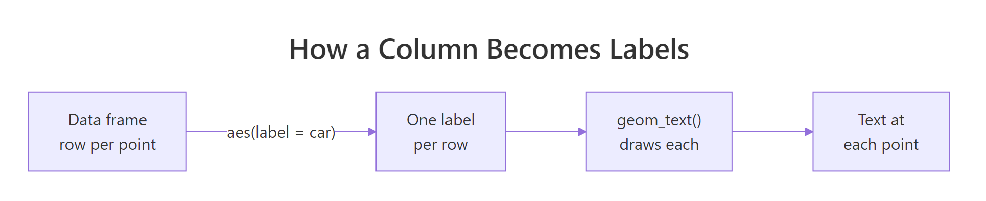
Figure 1: Mapping a column to the label aesthetic gives one label per row, drawn at each point.
You can see the catch already: the text sits right on top of the dots, centred over each point, so the words and the markers overlap and both get harder to read. Fixing that placement is the next few sections. But the mechanism is now yours, and it never changes.
label and ggplot draws that row's text at that row's x and y. Every function in this tutorial, boxes and repelling included, is just a different way of drawing those same mapped labels.Try it: The labels sit centred on the points. Add vjust = -0.6 to the geom_text() call to lift every label just above its dot, so the words and points stop overlapping.
Click to reveal solution
Explanation: vjust sets the vertical anchor of the text. A negative value pushes the label upward, off the dot, so the point stays visible underneath. We will unpack vjust properly in the styling section.
What is the difference between geom_text() and geom_label()?
geom_text() prints bare words. That is perfect on a plain white background, but the moment your labels sit over gridlines, other points, or a coloured fill, they get hard to read. geom_label() solves this by drawing each label inside a small rounded rectangle, a little card that separates the text from whatever is behind it.
The swap is a one-word change: replace geom_text with geom_label and keep the exact same aes(label = car) mapping. Let's see the same six cars again, now boxed.
Each name now sits in its own white card with a thin border. The card gives the text a solid backing, which is exactly what you want when the plot behind it is busy. The trade is space: boxes are bigger than bare words, so they crowd faster.
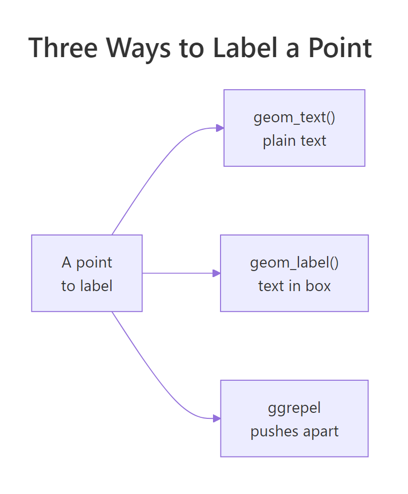
Figure 2: geom_text draws plain text, geom_label boxes it, and ggrepel spaces labels apart.
The card itself is stylable. A handful of arguments unique to geom_label() control how it looks, and the most useful ones are worth knowing.
| Argument | What it controls |
|---|---|
fill |
The background colour of the box |
colour |
The colour of the text (and border) |
label.padding |
The space between the text and the box edge |
label.r |
The corner radius (how rounded the box is) |
alpha |
The box transparency, from 0 (clear) to 1 (solid) |
Let's tune all of them at once so you can see each effect. We give the box a soft blue fill, dark blue text, a touch more padding, gently rounded corners, and a hint of transparency so anything behind it is not fully hidden.
The result is a set of clean, readable cards that would survive being dropped onto a coloured or cluttered plot. Notice that fill, label.padding, and label.r sit outside aes(): they are fixed styling for every box, not values read from a column, so they go straight into the geom_label() call as plain arguments.
geom_text() is cleaner; over gridlines, dense points, or a fill, the boxed geom_label() wins.Try it: Give the box a soft yellow fill (#fff3cd) and make it slightly see-through with alpha = 0.85, so the gridlines faintly show through.
Click to reveal solution
Explanation: fill sets the card colour and alpha sets how solid it is. A value near 0.85 keeps the text legible while letting the plot faintly through, which stops the boxes from feeling like opaque stickers.
How do you style and position label text?
Text labels take the same styling arguments whether they are boxed or bare. Three cover almost everything: size sets the text size, colour sets its colour, and fontface picks the weight, one of "plain", "bold", "italic", or "bold.italic". Because these are fixed styles rather than data, they go outside aes(). Let's make the labels bold, red, and a little larger.
Every name is now bold red and sits just above its point. That handles how the text looks. The harder question is where it sits, and for that you need hjust and vjust.
Think of every label as pinned to its point by an anchor. hjust slides the text left or right relative to that anchor, and vjust slides it up or down. Both take a number from 0 to 1, and it helps to read them as "which part of the text sits on the point."
| Value | hjust (horizontal) |
vjust (vertical) |
|---|---|---|
| 0 | Left edge on the point (text runs right) | Bottom on the point (text runs up) |
| 0.5 | Centred on the point | Centred on the point |
| 1 | Right edge on the point (text runs left) | Top on the point (text runs down) |
Values just outside 0 to 1, like the -0.6 we used earlier, push the text a little further off the point in that direction. That is why vjust = -0.6 lifts a label clear of its dot. Let's use hjust = 0 to left-anchor the labels so they run rightward, then add a small nudge_x so they start a hair to the right of each point instead of on top of it.
The labels now sit to the right of their points and read cleanly outward. Two different tools did two different jobs here, and the distinction matters. hjust = 0 changed how the text is anchored to its point, and nudge_x = 0.08 shifted the whole label a fixed distance across the x axis. The xlim(1.5, 3.2) call simply widens the plot so the rightmost labels do not run off the edge.
Try it: Lift every label a fixed amount above its point using nudge_y = 1.2 instead of vjust. Notice how the labels move up together by the same distance.
Click to reveal solution
Explanation: nudge_y shifts every label up the y axis by 1.2 units (here, 1.2 miles per gallon). Because it moves all labels by the same fixed amount, the spacing between them and their points stays even.
How do you stop labels from piling up?
Everything so far used six carefully chosen cars. Real charts are rarely that kind. The instant you try to label all 32 cars, the names overlap so heavily that the chart becomes unreadable. There are two cheap fixes to try before reaching for a package, and it is worth seeing both.
The first is check_overlap = TRUE, a built-in argument of geom_text(). It walks through the labels and skips drawing any that would collide with one already placed. Let's throw the full dataset at it.
The plot is readable, but look closely and many cars have no label at all. That is check_overlap doing its job: when two labels would touch, it keeps the first and quietly drops the second.
The second fix puts you back in control: only label the points that matter. Most of the time you do not want all 32 names, you want the interesting few. The pattern is to filter your data down to those rows, then add a geom_text() layer that reads from that smaller table using its own data = argument. Let's pick out the genuinely thrifty cars, those above 28 miles per gallon.
Four cars clear the bar. Now we draw all 32 points in grey for context, then label only those four by pointing a second geom_text() layer at the to_label table. The base layer uses the full cars data; the text layer overrides it with data = to_label.
The chart stays uncluttered, every point is still visible for context, and the four names you care about stand out. This layered approach, a full background plus a labelled subset, is the single most useful labelling habit you can build. It is how most polished, real-world charts get made.
Try it: Make the four labelled cars pop by also drawing them as larger red points. Add a second geom_point() layer that reads from to_label, with colour = "#c0392b" and size = 2.5, before the text layer.
Click to reveal solution
Explanation: The second geom_point() layer redraws just the four filtered cars in red on top of the grey base, and the matching red text ties name to marker. Layering separate data = subsets like this is how you direct the reader's eye.
How does ggrepel space labels out automatically?
Filtering and check_overlap only go so far. When you truly need many labels on one plot and cannot afford to lose any, the answer is the ggrepel package. It adds two drop-in replacements, geom_text_repel() and geom_label_repel(), that nudge every label away from its neighbours and from the points, then draw a thin leader line connecting each label back to where it belongs.
Load the package once, then use geom_text_repel() exactly like geom_text(). One extra step matters: ggrepel uses a dash of randomness to search for a non-overlapping arrangement, so calling set.seed() first locks in the same layout every time you run the code.
All 32 names now sit in clear space, each tethered to its point by a faint line. No label lands on another, and nothing was silently dropped. This is the payoff check_overlap could not give you: every label kept, every one readable.
A few arguments control how hard ggrepel pushes and how the leader lines look. These are the ones you will actually reach for.
| Argument | What it does |
|---|---|
box.padding |
How much empty space to keep around each label |
point.padding |
How far to keep labels from the points themselves |
min.segment.length |
Shortest leader line to draw (set to 0 to always draw one) |
segment.color |
Colour of the leader lines |
max.overlaps |
How many labels to allow before dropping the rest |
seed |
Fixes the layout, an alternative to a separate set.seed() |
set.seed() first, or passing seed = to the geom, freezes one good layout so your figure is reproducible.Boxed repelling works the same way through geom_label_repel(). Let's combine it with the subset trick from the last section: draw all points, but repel-label only the four efficient cars, with padded boxes and a visible leader line to each.
Each of the four cars gets a soft blue card, pushed clear of its point and joined to it by a short grey line. Because we set min.segment.length = 0, every label draws a connector even when it sits close to its point, which removes any doubt about which label belongs to which dot.
max.overlaps (we used 12 above) or, better, filter to fewer labels. A chart that needs 30 repelled labels usually needs a different design, not a higher limit.Try it: On a horsepower versus fuel-economy plot, repel-label only the muscle cars with more than 200 horsepower. Filter inside the layer with data = filter(cars, hp > 200) and remember to set a seed.
Click to reveal solution
Explanation: Filtering inside the layer's data = keeps the base scatter intact while labelling only the high-horsepower cars. geom_text_repel() then spaces those few names apart and links each to its point, no manual nudging required.
Putting It All Together: A Highlighted, Labelled Scatter
Let's combine every idea into one publication-style chart: a full scatter for context, the standout cars picked out in red and sized by horsepower, boxed repelled labels for just those standouts, and a clean theme. First we choose the cars to highlight, the very efficient or the very powerful, then build the plot in layers.
Six cars make the cut: four thrifty ones and two powerful ones. Now we assemble the final figure. Every technique from this tutorial appears here, layered from background to foreground.
The chart reads at a glance: grey dots give the full picture, red dots mark the cars that matter, their sizes encode horsepower, and the repelled red cards name each one without a single collision. That is the whole workflow, a grey base plus a labelled, highlighted subset, which is how most finished charts with labels are actually built.
Practice Exercises
These pull together the pieces above. Each starter block runs as-is so you can build up from it. Distinct variable names keep your work from clashing with the tutorial's.
Exercise 1: Label the three heaviest cars
On a scatter of weight (wt) against horsepower (hp) for all cars, label only the three heaviest cars using boxed labels. Sort by wt, keep the top three in a table called heaviest, then add a geom_label() layer that reads from it.
Click to reveal solution
Explanation: arrange(desc(wt)) |> head(3) grabs the three heaviest cars. Pointing geom_label() at that subset with data = heaviest labels only those three while the full scatter stays as grey context.
Exercise 2: Space out the muscle cars with ggrepel
Plot horsepower against fuel economy for all cars, then use geom_text_repel() to label every car with more than 200 horsepower. Give the labels breathing room with box.padding = 0.5, always draw a leader line with min.segment.length = 0, and set a seed so the layout is reproducible.
Click to reveal solution
Explanation: Seven cars clear 200 horsepower. geom_text_repel() spreads their names into open space and draws a connector to each point, while box.padding keeps the labels from crowding. The seed guarantees the same tidy arrangement on every run.
Exercise 3: Colour and label the efficient cars
Colour every point by whether its mpg is above 25, then repel-label only the efficient cars in a matching green. Build a helper column with mutate(efficient = mpg > 25), map colour = efficient, and label the efficient subset with geom_text_repel().
Click to reveal solution
Explanation: The efficient column splits the cars into two colour groups, scale_colour_manual() paints the inefficient ones grey and the efficient ones green, and geom_text_repel() labels only the green group. Setting the label colour outside aes() keeps the text green to match its points.
Frequently Asked Questions
When should I use annotate() instead of geom_text()?
Use geom_text() when the labels come from your data, one per row. Use annotate("text", x = ..., y = ..., label = "...") when you want to place a single fixed piece of text, like a caption or a note, at a specific spot. The giveaway is the source: a column means geom_text(), a hand-typed string at a chosen position means annotate().
Why does every label show the same text?
Almost always because the label argument sits outside aes(). Writing geom_text(label = car) treats car as one fixed value, so every point gets the same thing. It must be geom_text(aes(label = car)) so ggplot reads the column row by row.
How do I label points with formatted numbers, like percentages?
Build the label text inside the aes() mapping. For example, aes(label = paste0(mpg, " mpg")) prints "21 mpg" at each point, and the scales package helps for money or percentages, as in aes(label = scales::dollar(price)). Any expression that returns one string per row works as a label.
My labels get cut off at the plot edge. How do I fix it?
The label extends past the panel because the axis stops right at the point. Widen the axis with xlim() or ylim(), or add breathing room with scale_x_continuous(expand = expansion(mult = 0.1)). The ggrepel geoms also pull labels inward automatically, which sidesteps the problem entirely.
Summary
Text labels turn anonymous points into a chart your reader can name at a glance. The mechanism never changes, aes(label = column), and the three geoms simply draw those mapped labels in different ways.
| Function | What it adds | Reach for it when |
|---|---|---|
geom_text() |
Plain text at each point | The background is clean and simple |
geom_label() |
Text inside a filled box | The background is busy and text needs backing |
geom_text_repel() |
Plain text, auto-spaced with leader lines | Many labels would otherwise overlap |
geom_label_repel() |
Boxed text, auto-spaced with leader lines | Overlapping labels also need a solid backing |
The habits that make labels look professional are the same across all four: label a filtered subset rather than every point, move labels off their markers with nudge_x, nudge_y, hjust, and vjust, and set a seed before any repel geom so the layout stays put.
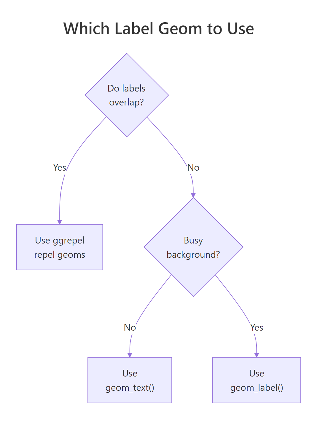
Figure 3: A quick decision guide for choosing between the three labelling geoms.
References
- ggplot2 documentation. geom_text() and geom_label() reference. Link
- Slowikowski, K. ggrepel: Examples vignette. Link
- Slowikowski, K. ggrepel package source and documentation (GitHub). Link
- Wickham, H., Cetinkaya-Rundel, M., & Grolemund, G. R for Data Science, 2nd Edition. Communication chapter (annotations). Link
- Wickham, H. ggplot2: Elegant Graphics for Data Analysis. Annotations. Link
- r-charts. Text annotations in ggplot2. Link
Continue Learning
- ggplot2 Labels and Annotations - Add titles, subtitles, axis labels, and one-off annotations to round out your charts.
- ggplot2 Scatter Plots - Master the point layer that these labels sit on, including colour, size, and shape mappings.
- ggplot2 Aesthetics: Map Data to Visuals - Go deeper on
aes(), the mapping engine behind thelabelaesthetic you used throughout this tutorial.