The ggplot2 stat System: What Every Geom Computes
In ggplot2, every layer runs a hidden step called a stat that reshapes your data before a geom draws it. That stat is why geom_bar() can show bar heights you never calculated, and why a boxplot knows your quartiles. Once you can see what each stat computes, ggplot2 stops feeling like magic and starts feeling like a pipeline you control.
What does a ggplot2 geom actually do before it draws?
Here is a small mystery that trips up almost everyone. You hand geom_bar() a single categorical column, no y values at all, and it draws bars with different heights. Nobody typed those heights. So where did the numbers come from? The answer is a quiet computation step, run automatically inside the layer, called a statistical transformation, or "stat" for short.
Let's see the mystery and solve it in the same breath. We use mpg, a built-in dataset of 234 car models that ships with ggplot2, and look at how many cars fall into each drive train category (drv is 4 for four-wheel drive, f for front-wheel, r for rear-wheel). This tutorial uses base ggplot2 plus dplyr for the occasional cross-check, and everything runs directly in your browser. The tool that solves the mystery is layer_data(): it returns the exact table the geom received after the stat finished, so we can read what the stat computed.
We gave the plot an x aesthetic and nothing else, yet three bars appear at different heights (the tallest is front-wheel drive), and layer_data() shows why. The stat created a count column (103, 106, 25) that was never in your raw data, and that column became each bar's height. It also created prop (the proportion within a group) and width. The x values show as 1, 2, 3 because ggplot2 places the three categories at those axis positions.
Every ggplot2 layer is built from four parts working in order: your data, a stat that transforms it, a geom that draws the transformed result, and a position adjustment that nudges overlapping shapes apart. The part beginners miss is the stat, because it usually runs silently. geom_bar() quietly attaches a counting stat, and that stat turns your 234 raw rows into a tiny three-row table of counts before a single rectangle is drawn.

Figure 1: Inside every layer the stat transforms your data before the geom draws it.
We can confirm those counts are real by computing them the plain dplyr way. If the numbers match, we have proven the stat is just doing a count() for us behind the scenes.
Identical: 103, 106, and 25. The bar chart's heights are exactly count(mpg, drv), produced automatically by the stat attached to geom_bar().
Try it: Draw a bar chart of the class column from mpg (car type: compact, suv, and so on), then use layer_data() to read the count the stat computed for each class. There are seven classes.
Click to reveal solution
Explanation: geom_bar() attaches the counting stat, which turns the seven class groups into the seven counts above. count(mpg, class) reproduces the same numbers, confirming the bar heights came from a stat.
How can you see what a stat computed? (layer_data)
You just met layer_data(), and it is the single most useful tool for understanding stats. Think of it as an x-ray: it shows you the finished layer, meaning the data table exactly as the geom received it after the stat ran. Any time you are unsure what a geom is drawing, x-ray it.
A boxplot is the perfect example, because it looks simple but hides a lot of arithmetic. When you draw a boxplot, a stat computes a five-number summary for each group: the lower whisker, the lower hinge (25th percentile), the median, the upper hinge (75th percentile), and the upper whisker. Let's build one for highway mileage by drive train, then x-ray it.
The plot shows three boxes. Now let's see the numbers the stat calculated to draw them. We pick the columns that map to the visible parts of each box.
Read the first row, drive train 4 (four-wheel drive). Its box stretches from a lower hinge of 17 to an upper hinge of 22, with a median line at 18, and whiskers reaching down to 12 and up to 28. Every one of those numbers was computed by the boxplot's stat from the raw hwy values. The geom just drew rectangles and lines at the positions the stat handed it.
Try it: Using the boxplot p_box you just built, read off which drive train has the highest median highway mileage. Print just the x and middle columns to make it easy.
Click to reveal solution
Explanation: The middle column is the computed median for each group. Row 2 (x = 2, which is front-wheel drive f) has the highest median at 28 mpg. The stat computed each median; you only read it back.
Which stat does each geom use by default?
Every geom ships with a default stat, and every stat ships with a default geom. That pairing is what makes ggplot2 feel effortless: you call geom_bar() and the right computation just happens. Understanding these defaults is the key to predicting what any geom will draw.
Here are the most common pairings. Each geom in this table runs its default stat automatically unless you tell it otherwise.
| Geom | Default stat | What the stat computes |
|---|---|---|
geom_point() |
stat_identity |
Nothing, draws x and y as given |
geom_line() |
stat_identity |
Nothing, connects x and y as given |
geom_col() |
stat_identity |
Nothing, you supply the bar heights |
geom_bar() |
stat_count |
Count of rows per x category |
geom_histogram() |
stat_bin |
Count of rows per x bin |
geom_freqpoly() |
stat_bin |
Same bins as a histogram, drawn as a line |
geom_boxplot() |
stat_boxplot |
Five-number summary plus outliers |
geom_violin() |
stat_ydensity |
Kernel density per group |
geom_density() |
stat_density |
Smoothed density curve |
geom_smooth() |
stat_smooth |
Fitted trend line and confidence band |
geom_count() |
stat_sum |
Number of points at each location |
Notice that several geoms default to stat_identity. That is the "do nothing" stat: it passes your data straight through without changing it. When you use geom_point(), the x and y you mapped are the x and y that get drawn, untouched.
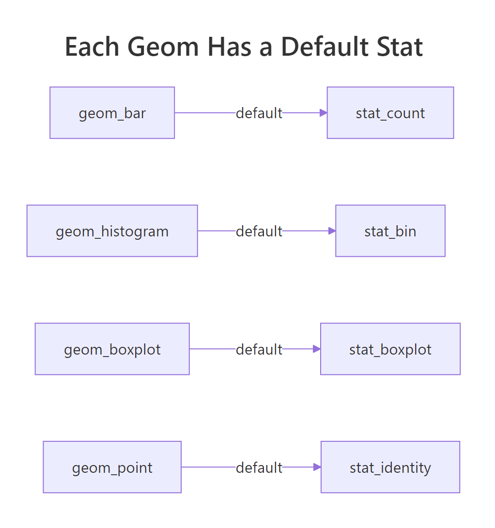
Figure 2: Each geom ships with a default stat that runs unless you override it.
You can override any geom's default stat with the stat argument. The most famous case is turning geom_bar() off its counting behavior. If you already have summarised heights, you set stat = "identity" so the geom draws them as-is instead of counting. Let's prove that geom_bar(stat = "identity") and geom_col() are two names for the same thing.
Both charts are identical. geom_col() is simply a convenient shortcut for geom_bar(stat = "identity"). The moment you switch the stat to identity, the geom stops counting and just draws the n column you gave it.
Try it: The mpg dataset has a cyl column (number of cylinders). Count how many cars have each cylinder value, then draw those counts as bars using an identity stat so ggplot2 does not count again.
Click to reveal solution
Explanation: Because cyl_counts already holds the heights in column n, we switch off counting with stat = "identity". If we had used a plain geom_bar() here, it would have counted the four summary rows and drawn four bars of height 1.
What does stat_bin compute for a histogram?
A histogram is the clearest case of a geom that is almost entirely stat. There is nothing to draw until the stat slices the x axis into equal-width bins and counts how many observations fall into each one. The geom then draws one rectangle per bin. That slicing-and-counting is the job of stat_bin.
Let's build a histogram of highway mileage. We set binwidth = 5, meaning each bar spans a 5-mpg range, so the bins are easy to read.
Now x-ray it. The bin stat produces a rich table: for each bin it reports the center (x), the edges (xmin, xmax), the count of observations, and the density (count rescaled so the bars would integrate to 1).
Read the fourth row: the bin from 22.5 to 27.5 mpg is centered at 25 and holds 81 cars, the busiest range in the data. Every bar's height in the plot is one of these count values. The bin stat also computed a density column for each bin, which we will put to use in the next section.
The stat_bin transformation exposes several computed variables you can tap into: count (observations per bin), density (count scaled to a probability density), ncount (count scaled so the tallest bar is 1), and ndensity (density scaled the same way). By default the geom uses count for the bar heights, because raw counts are the most natural thing to read.
Try it: Rebuild the highway-mileage histogram with a wider binwidth of 10, then use layer_data() to see how many bins you end up with. Wider bins mean fewer bars.
Click to reveal solution
Explanation: Doubling the bin width from 5 to 10 collapses the data into just four bins instead of eight. The stat recomputed everything: the busiest bin now spans 15 to 25 mpg and holds 116 cars. Bin width is the single most important choice you make with a histogram, because it changes what the stat computes.
How do you use a stat's other outputs? (after_stat)
So far we have let each geom use its stat's default output: geom_bar() used count, the histogram used count. But you saw that stats compute several variables, not just one. What if you want the geom to draw a different one, like proportions instead of raw counts? That is exactly what after_stat() is for.
Picture the layer as a two-stage pipeline. In the first stage, before the stat runs, your aes() mapping picks which raw columns to feed in. In the second stage, after the stat runs, its computed variables become available, and after_stat() reaches into that second stage to grab one. The name is literal: it means "map this aesthetic using a value computed after the stat has run".

Figure 3: after_stat() reaches back for a variable the stat computed and hands it to the geom.
Let's turn our count bar chart into a proportion bar chart. We map the y aesthetic to after_stat(prop), telling the bar to use the computed proportion for its height instead of the count. We also set group = 1, and you will see in a moment why that matters.
Now the bars sum to 1 instead of showing raw counts. Let's x-ray the layer to see the proportions the stat computed.
The prop column now reads 0.44, 0.45, and 0.11: front-wheel drive makes up about 45 percent of the cars. Compare this to the very first x-ray in this tutorial, where prop was 1 for every bar. The difference is group = 1. Without it, ggplot2 treats each bar as its own group, so each bar is 100 percent of itself and every proportion is 1. Setting group = 1 tells ggplot2 to treat all bars as one group, so the proportions are computed across the whole dataset.
Try it: Make a bar chart showing the proportion of cars in each class, using after_stat(prop). Remember the group = 1 trick so the proportions are computed across all classes.
Click to reveal solution
Explanation: The proportions now sum to 1 across the seven classes. SUV (x = 7) is the largest group at about 26 percent, while the 2-seater (x = 1) is just 2 percent. after_stat(prop) pulled the computed proportion out of the counting stat, and group = 1 made those proportions relative to the whole dataset.
Can you run your own function as a stat? (stat_summary)
The built-in stats cover counting, binning, and density, but sometimes you want a summary they do not offer, like the mean of each group. Rather than summarise your data by hand first, you can hand ggplot2 a function and let it run as the stat. That is what stat_summary() does: it is the bring-your-own-function escape hatch of the stat system.
Let's plot the mean highway mileage for each drive train. We pass fun = mean so the stat applies mean() to the hwy values in each group, and geom = "point" so it draws the result as a dot.
Three dots appear, one per drive train, each sitting at that group's mean mileage. Let's x-ray the layer and confirm those means with a plain dplyr calculation side by side.
The stat's y values (19.17, 28.16, 21.00) match dplyr's group means exactly. stat_summary() ran mean() for us, grouped by drv, without a separate summarise step.
You are not limited to a single number per group. If your function returns three values (a center plus a lower and upper bound), the stat can draw an interval. The built-in helper mean_se does exactly this: it returns the mean and the mean plus or minus one standard error (a small number that says how precisely the group mean is estimated). Paired with a pointrange geom, it draws a dot with a whisker.
Now each row carries a y (the mean) plus a ymin and ymax (the standard-error interval). The pointrange geom draws a dot at y with a line from ymin to ymax. The stat did the arithmetic; the geom drew the shape.
Try it: Plot the median highway mileage per drive train as points, using stat_summary() with fun = median. It is the same pattern as the mean example, with one word changed.
Click to reveal solution
Explanation: Swapping mean for median is the only change. The stat now runs median() on each group's hwy values. Notice the medians (18, 28, 21) differ slightly from the means (19.17, 28.16, 21.00), which tells you the distributions are a little skewed.
Putting It All Together: A Complete Example
Let's finish with a chart that uses three ideas from this tutorial at once: a counting stat for bar heights, after_stat() to convert those counts to proportions, and a second geom that reuses the same stat to add percentage labels. The goal is a clean, labelled proportion bar chart of drive trains.
The trick to the labels is that geom_text() can run the same counting stat as the bars. We set stat = "count" on the text layer and map its label to after_stat(prop), formatted as a percentage. Both layers compute the same proportions independently, so the labels always sit at the right height.
The result reads at a glance: front-wheel drive is 45 percent of the cars, four-wheel drive 44 percent, and rear-wheel drive just 11 percent. No summarise step, no manual math. Two geoms shared one counting stat, and after_stat(prop) turned raw counts into the proportions and the labels. That is the stat system doing the heavy lifting for you.
Practice Exercises
These exercises combine several ideas from the tutorial. Try each one before opening the solution. To avoid overwriting the variables above, the solutions use fresh names.
Exercise 1: Summarise, then draw with an identity stat
Compute the mean highway mileage for each class in mpg with dplyr, save it to class_hwy, then draw those means as a bar chart. Because you already have the heights, you must switch the bar geom off its default counting stat.
Click to reveal solution
Explanation: The summarise step produces the seven mean values. Because class_hwy already holds heights in mean_hwy, we set stat = "identity" so the geom draws them directly. A plain geom_bar() would have counted the seven summary rows and drawn seven bars of height 1.
Exercise 2: A percentage bar chart with after_stat
Draw a bar chart where each drive train's bar height is its share of all cars, expressed as a proportion. Do not summarise the data first. Instead, map the y aesthetic to a variable the counting stat computes, and remember the group trick so the proportions are relative to the whole dataset.
Click to reveal solution
Explanation: after_stat(prop) pulls the proportion out of the counting stat, and group = 1 makes it relative to all 234 cars. The three proportions (0.44, 0.45, 0.11) sum to 1. This is the standard recipe for a relative-frequency bar chart in ggplot2.
Exercise 3: Bring your own summary function
Write a function that takes a numeric vector and returns a one-row data frame with y (the mean), ymin (mean minus one standard deviation), and ymax (mean plus one standard deviation). Then feed it to stat_summary() with fun.data to draw a pointrange of highway mileage by drive train.
Click to reveal solution
Explanation: Your mean_sd function returns three numbers per group, which is exactly the shape fun.data expects. The stat runs it on each drive train's hwy values, and the pointrange geom draws a dot at y with a line spanning ymin to ymax. You just built a custom stat without writing any ggplot2 internals.
Frequently Asked Questions
What is the difference between a stat and a geom in ggplot2?
A geom is the shape that gets drawn: a bar, a point, a line. A stat is the computation that runs first and decides what numbers those shapes represent. geom_bar() draws rectangles, but its stat (stat_count) is what counts the rows to set each rectangle's height. Every layer has both: the stat transforms your data, then the geom draws the result.
Why are all my proportion bars showing a height of 1 (100 percent)?
This is the most common after_stat(prop) surprise. By default ggplot2 treats each bar as its own group, and each bar is 100 percent of itself, so every proportion comes out as 1. Add group = 1 inside aes() to tell ggplot2 to treat all the bars as a single group. The proportions are then computed across the whole dataset, so they sum to 1.
How do I find out which computed variables a stat provides?
Two ways. Open the stat's help page (for example ?stat_bin) and read its "Computed variables" section, which lists every column the stat makes. Or call layer_data() on a finished plot and look at the column names: every computed variable is a column in that table, so you can discover them by inspection.
When should I use geom_bar() versus geom_col()?
Use geom_bar() when you want ggplot2 to count rows for you: one categorical column goes in, bar heights come out. Use geom_col() when your data already holds the heights you want, in a numeric column. geom_col() is exactly geom_bar(stat = "identity"), which switches off the counting stat so the geom draws the numbers you supply.
What replaced the old ..count.. and ..prop.. notation?
Older ggplot2 code wrote aes(y = ..count..) or aes(y = ..prop..), with two dots on each side, to reach a computed variable. That syntax still runs but is retired. Write after_stat(count) and after_stat(prop) instead, which say plainly that the value comes from after the stat has run.
Summary
The stat system is the computation step that turns raw rows into the shapes you see. Once you know it is there, every geom becomes predictable: ask what its stat computes, and you know what it will draw.
| Concept | What to remember |
|---|---|
| Stat | The computation step that runs inside every layer before the geom draws |
| Default stat | Each geom has one: geom_bar counts, geom_histogram bins, geom_point does nothing |
stat_identity |
The "do nothing" stat, used by geom_point, geom_line, and geom_col |
layer_data() |
X-rays a finished layer to reveal the exact table the geom received |
| Computed variables | Extra columns a stat makes, such as count, prop, density |
after_stat() |
Maps an aesthetic to a computed variable, like y = after_stat(prop) |
stat = "identity" |
Overrides a geom's default stat so it draws values you supply |
stat_summary() |
Runs your own function as a stat, using fun or fun.data |
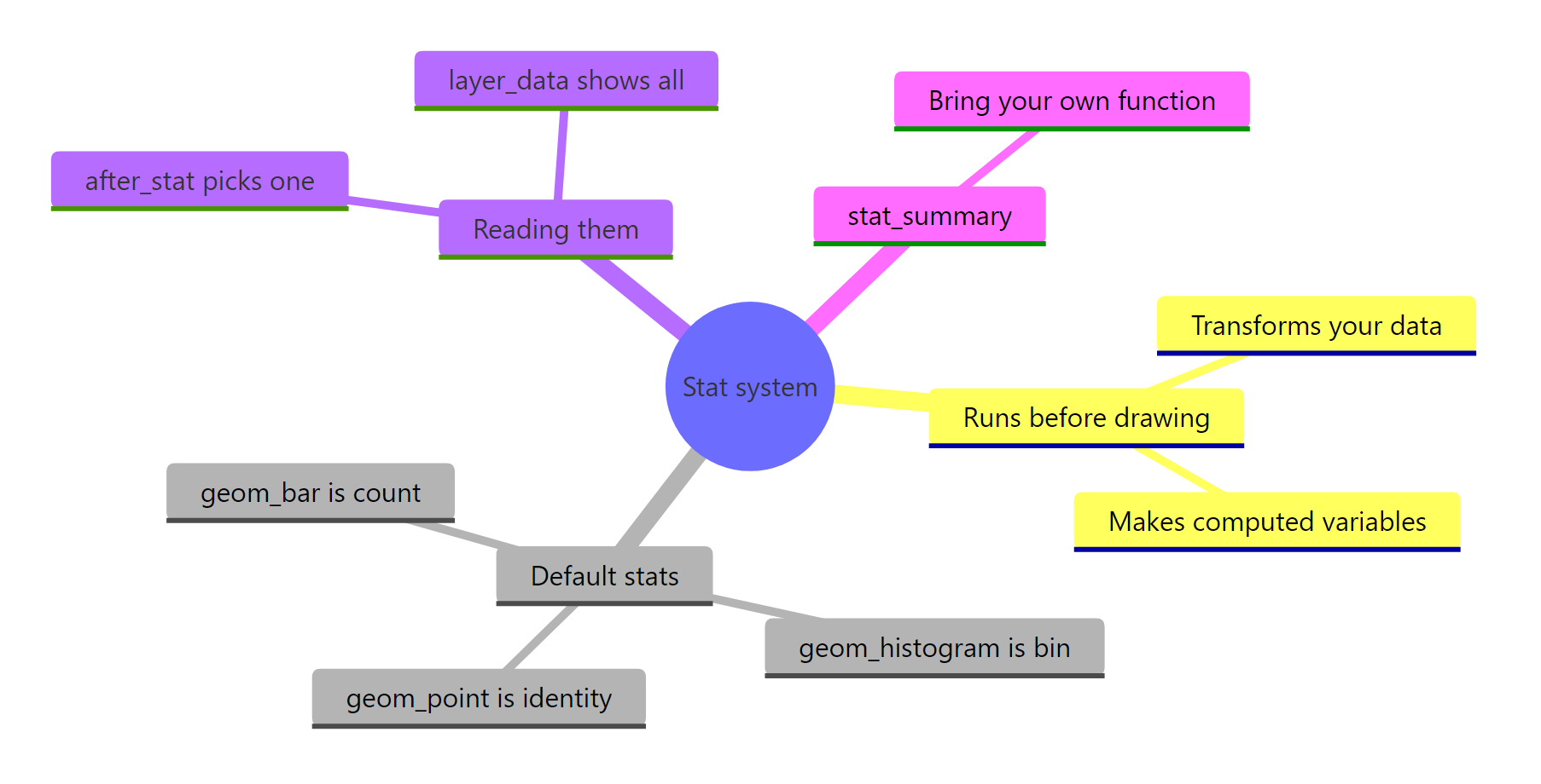
Figure 4: The ggplot2 stat system at a glance.
The next time a geom surprises you, do not guess. Call layer_data() and read exactly what its stat computed. That single habit will make ggplot2 feel transparent instead of magical.
References
- Wickham, H., Navarro, D., & Pedersen, T. L., ggplot2: Elegant Graphics for Data Analysis (3e), Chapter 13: Build a plot layer by layer. Link
- Wickham, H., Navarro, D., & Pedersen, T. L., ggplot2: Elegant Graphics for Data Analysis (3e), Chapter 5: Statistical summaries. Link
- ggplot2 documentation, Layer statistical transformations (stat reference index). Link
- ggplot2 documentation,
after_stat(),after_scale(), andstage(). Link - ggplot2 documentation,
stat_bin()computed variables reference. Link - ggplot2 documentation,
stat_summary()reference. Link - R Core Team & ggplot2,
mpgdataset documentation. Link
Continue Learning
- The Grammar of Graphics, the layered theory behind ggplot2, and where the stat fits among data, aesthetics, geoms, and scales.
- geom_smooth() in ggplot2, a close look at one specific stat,
stat_smooth, which fits a trend line and confidence band. - Distribution Charts in ggplot2, histograms, density curves, and boxplots in practice, all powered by the stats you met here.