Error Bars in ggplot2: geom_errorbar, pointrange, crossbar
Error bars show the uncertainty around a summary value such as a group mean. In ggplot2 you draw them by computing the interval yourself, then mapping ymin and ymax to a geom like geom_errorbar(), geom_pointrange(), or geom_crossbar().
How do you add error bars to a ggplot2 chart?
Here is the one thing that trips up nearly every beginner: ggplot2 never calculates the error interval for you. Unlike a bar height, which geom_bar() can count on its own, an error bar needs two numbers you supply, a lower bound and an upper bound. So every error bar chart starts the same way, by boiling raw data down to a small summary table of means and spreads.
Let's do exactly that with ToothGrowth, a built-in dataset that records the tooth length of 60 guinea pigs given vitamin C at three doses. We use dplyr to compute, for each dose, the sample size, the mean length, the standard deviation, and the standard error (more on that last one shortly). This tutorial uses base ggplot2 and dplyr throughout, both run directly in your browser.
Read the table one row at a time. At a dose of 0.5 mg/day, the 20 guinea pigs in that group had a mean tooth length of 10.6, and the values spread out with a standard deviation of 4.50. The se column, the standard error, is just sd / sqrt(n). (The .groups = "drop" argument just returns a plain, ungrouped table, so later steps treat the result as ordinary data.) Those mean and se columns are the raw material for every chart in this tutorial. This is the recipe in miniature: summarise first, plot second.

Figure 1: The two-step recipe: summarise your data, then map the interval to a geom.
Now we hand those numbers to ggplot2. We plot the mean at each dose and draw an error bar reaching one standard error above and below it. geom_pointrange() is the tidiest way to show this: it draws the point (the mean) and the interval (the bar) in a single layer.
Notice how the interval is built inside aes(): ymin = mean - se and ymax = mean + se. You are doing the arithmetic, and ggplot2 is just drawing the lines you asked for. The mean climbs from about 10 to 26 as the dose rises, and the short bars tell you each mean is measured fairly precisely. That combination, a clear trend plus a sense of confidence in it, is exactly what an error bar is for.
Try it: Build a summary table like tg_summary, but group by supp (the supplement type, OJ or VC) instead of dose. You should end up with two rows.
Click to reveal solution
Explanation: Swapping dose for supp in group_by() regroups the same 60 rows into two supplement groups of 30 each. The recipe does not change, only the grouping variable does.
What is the geom_errorbar() function and how does it work?
geom_errorbar() draws the classic "I-beam", a vertical line with a small horizontal cap at each end. It is the most recognisable error bar style and the one people usually mean when they say "add error bars". It needs three aesthetics: an x position, a ymin, and a ymax.
The most common pattern is a bar chart with error bars on top. We map dose to the x axis (wrapped in factor() so it is treated as three distinct categories, not a continuous number), draw the bars with geom_col(), then overlay geom_errorbar().
The width = 0.2 argument controls how wide the end caps are, as a fraction of the space between categories. Two arguments are easy to confuse here, so it is worth pinning them down. width sets the horizontal size of the caps, while linewidth sets how thick the drawn line is. Let's change both, and the colour, to see the difference.
The caps are now narrower (width = 0.15) and the line is heavier and red. Adjust width for readability: very wide caps clutter a crowded chart, while very narrow caps can be hard to see.
width argument changes the horizontal cap size, and linewidth changes the thickness of the line. If your caps look wrong, you are almost always reaching for the wrong one of these two.Try it: Copy the bar chart above and shrink the caps to almost nothing with width = 0.05. Notice how the error bars start to look like plain vertical lines.
Click to reveal solution
Explanation: With width = 0.05 the horizontal caps almost disappear, leaving thin vertical strokes. This is effectively what geom_linerange() draws, which is the next geom we will meet.
How do you use geom_pointrange, geom_linerange, and geom_crossbar?
geom_errorbar() is not your only option. ggplot2 ships four interval geoms, and they all read the same ymin and ymax aesthetics. They differ only in what they draw, so choosing between them is a matter of taste and emphasis, not new data.
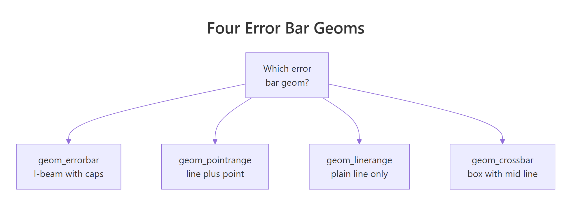
Figure 2: The four interval geoms and what each one draws.
geom_linerange() is the simplest: a plain vertical line from ymin to ymax, with no cap and no centre marker. It is often paired with geom_point() so the mean is still visible.
The line shows the interval and the blue dot marks the mean. geom_pointrange(), which we used at the very start, does both of these in one layer, so it is usually the cleaner choice when you want a point plus its interval.
geom_crossbar() takes a different approach. Instead of a thin line, it draws a hollow box spanning ymin to ymax, with a horizontal line marking the mean. It reads well when the interval itself is the focus, for example a range of plausible values rather than a precise estimate.
Each box now spans one standard error either side of the mean, and the horizontal line inside marks the mean itself. Here is a quick guide to picking the right geom.
| Geom | What it draws | Centre marker | Best for |
|---|---|---|---|
geom_errorbar() |
Vertical line with end caps | No | Bars and points, the familiar I-beam |
geom_pointrange() |
Line plus a point | Yes, a point | A mean with its interval, one clean layer |
geom_linerange() |
Plain line only | No | Minimal look, or pairing with your own point |
geom_crossbar() |
Hollow box with a middle line | Yes, a line | Emphasising the range as a band |
fatten argument for this, but fatten was deprecated in ggplot2 4.0. The current argument is middle.linewidth, which sets the thickness of the horizontal line marking the mean.Try it: Take the geom_linerange() chart above and replace geom_linerange() with geom_pointrange(). You can delete the separate geom_point() line, since pointrange draws the point for you.
Click to reveal solution
Explanation: geom_pointrange() combines the line and the point into one layer, so it replaces the geom_linerange() and geom_point() pair with a single, tidier call.
Should you use standard deviation, standard error, or a confidence interval?
This is the question that matters most, and the one most tutorials skip. The three most common error bars, standard deviation (SD), standard error (SE), and confidence interval (CI), are computed differently and answer different questions. Picking the wrong one can badly mislead your reader.
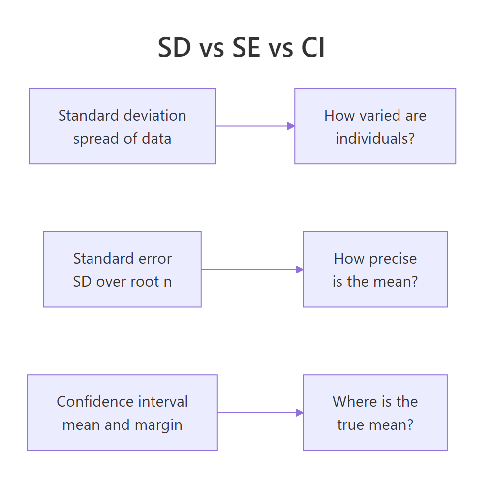
Figure 3: SD, SE, and CI each answer a different question.
Here is the plain-language version. Standard deviation measures how spread out the individual data points are; it answers "how different are the guinea pigs from each other?". Standard error measures how precisely you have pinned down the mean; it answers "if I repeated this study, how much would the mean bounce around?". A confidence interval turns that precision into a range, typically 95%, that plausibly contains the true mean.
SE and CI are built from SD, so let's compute all three side by side. We already have sd and se in tg_summary. A 95% confidence interval extends the mean by a t-multiplier times the standard error, so we add that column with qt(). We pass 0.975 to qt() because a 95% interval leaves 2.5% in each tail of the distribution (2.5% + 95% + 2.5% = 100%).
Look at the first row. The standard deviation is 4.50, the standard error is 1.01, and the 95% confidence margin is 2.11. Same data, three very different bar lengths. An SD bar would stretch about 4.5 units either side of the mean, an SE bar only about 1, and a CI bar about 2.1. If you drew SD bars but told the reader they were standard errors, you would overstate the uncertainty in the mean more than fourfold.
If you like the underlying formulas, here they are. The standard error scales the spread of the data by the square root of the sample size:
$$SE = \frac{s}{\sqrt{n}}$$
And the confidence interval widens the mean by a critical t-value times that standard error:
$$\bar{x} \pm t_{(1 - \alpha/2,\; n-1)} \times SE$$
Where:
- $s$ = the sample standard deviation
- $n$ = the number of observations in the group
- $\bar{x}$ = the group mean
- $t_{(1 - \alpha/2,\; n-1)}$ = the critical value from the t-distribution (about 2.09 for a 95% interval with 19 degrees of freedom)
If formulas are not your thing, skip them; the code above computes everything you need. Now let's plot the confidence interval so you can see it directly.
Because none of the three intervals overlap between doses, you can be confident the doses really do differ. That is the practical payoff of a confidence interval: non-overlapping bars are a quick visual signal of a real difference.
Try it: Confidence intervals do not have to be 95%. Add a ci90 column to tg_summary for a 90% interval. Hint: a 90% interval uses qt(0.95, ...) instead of qt(0.975, ...).
Click to reveal solution
Explanation: A 90% interval leaves 5% in each tail, so you pass 0.95 to qt(). The margins (1.74, 1.71, 1.46) are smaller than the 95% margins because a lower confidence level needs a narrower interval to cover the middle.
How do you add error bars to grouped and dodged charts?
Real comparisons usually have two grouping variables, not one. In ToothGrowth each dose was delivered by two supplements, orange juice (OJ) and ascorbic acid (VC). To compare them we summarise by both variables, then place the two supplement bars side by side within each dose. Side-by-side placement is called "dodging".
First, the summary. We group by supp and dose together, which gives six rows, one per supplement-and-dose combination.
Now the trap that catches everyone. When you dodge bars, the error bars must be dodged by the same amount, or they will float off to the side and sit over the wrong bar. The fix is to define one position_dodge() object and hand it to both geom_col() and geom_errorbar().
Both layers share the same pd, so every error bar lands squarely on its own bar. Notice we also match the width = 0.9 on geom_col() to the dodge width, which keeps the bars snug within each dose group.
geom_col() and geom_errorbar() use different position_dodge() widths, the error bars drift away from the bars they belong to. Define one dodge object and pass it to every layer that needs to line up.Bar charts with error bars are common, but they have a downside: the solid bar hides everything except its top, and the "dynamite plot" look is often criticised for that reason. A dodged geom_pointrange() shows the same comparison with less ink and no misleading bars.
Each dose now shows two points with their intervals, and the OJ-versus-VC gap is easy to read at a glance, especially at the lower doses where the supplements differ most.
Try it: Rebuild the dodged bar chart, but change the shared dodge width to 0.5 on both layers. Keep the two geoms in sync.
Click to reveal solution
Explanation: As long as both layers reference the same pd5, the bars and their error bars move together. Matching the geom_col() width to the dodge width keeps the paired bars from overlapping.
How do you make horizontal error bars?
Sometimes horizontal bars read better, especially with long category labels. The modern way to flip an error bar is the orientation argument. You map your value to x and your category to y, then supply xmin and xmax (instead of ymin and ymax) and set orientation = "y".
The error bars now run left to right, and the dose categories stack vertically. The orientation = "y" argument tells ggplot2 that the intervals live along the x axis for each y group.
geom_errorbarh() function, but ggplot2 4.0 deprecated it. The current approach is geom_errorbar() with xmin, xmax, and orientation = "y", which keeps everything in one consistent geom.Try it: Redraw the horizontal chart using geom_pointrange() instead of the separate point and error bar. Pointrange also accepts orientation = "y".
Click to reveal solution
Explanation: geom_pointrange() understands orientation = "y" just like geom_errorbar() does, so one layer draws the horizontal interval and its centre point together.
Putting it all together: a publication-ready error bar chart
Let's combine everything into one chart you would be happy to put in a report. We summarise ToothGrowth by supplement and dose, compute the standard error, then draw a dodged line-and-pointrange chart with a clear title, custom colours, and a clean theme. This single block runs the whole recipe from raw data to finished figure.
Every technique from this tutorial is in that chart. We summarised first, mapped ymin and ymax from the mean and standard error, used geom_pointrange() for a clean interval, dodged both the line and the pointrange by a matching width, and finished with manual colours and a title. That is the full workflow, start to end.
#D55E00 orange and #0072B2 blue) come from a colour-blind-friendly palette. When two groups sit side by side, a high-contrast pair keeps the comparison readable for every reader.Practice Exercises
These exercises combine several ideas from the tutorial. Try each one before opening the solution. They use fresh variable names (prefixed my_ or iris_) so they will not overwrite the tutorial's objects.
Exercise 1: Error bars on the iris dataset
Summarise the iris dataset to get the mean and standard error of Sepal.Length for each Species, then draw a bar chart with error bars. Save the summary to iris_summary.
Click to reveal solution
Explanation: The same recipe transfers straight to a new dataset: group, summarise mean and se, then map ymin and ymax. The three species have tight error bars because each has 50 observations.
Exercise 2: Grouped confidence intervals with pointrange
Using ToothGrowth, build a grouped geom_pointrange() chart of mean tooth length by dose, coloured by supplement, with 95% confidence interval bars. Dodge the two supplements so they do not overlap. Save your summary to my_tg.
Click to reveal solution
Explanation: The confidence margin uses the group's own sample size through df = n - 1. Dodging by 0.5 separates the OJ and VC intervals at each dose so the comparison stays readable.
Exercise 3: A line chart with error bars
Draw a line chart of mean tooth length across dose, with one line per supplement and an error bar at every point. Reuse the tg_grouped summary from earlier. Add points on top so each mean is marked, and dodge all three layers by the same small amount.
Click to reveal solution
Explanation: All three layers share pd3, so the lines, error bars, and points stay locked together within each dose. The group = supp aesthetic tells geom_line() to connect points within a supplement rather than across supplements.
Summary
Error bars in ggplot2 come down to one rule and one choice. The rule: compute your interval first, then map ymin and ymax to a geom. The choice: which geom and which interval fit your message.
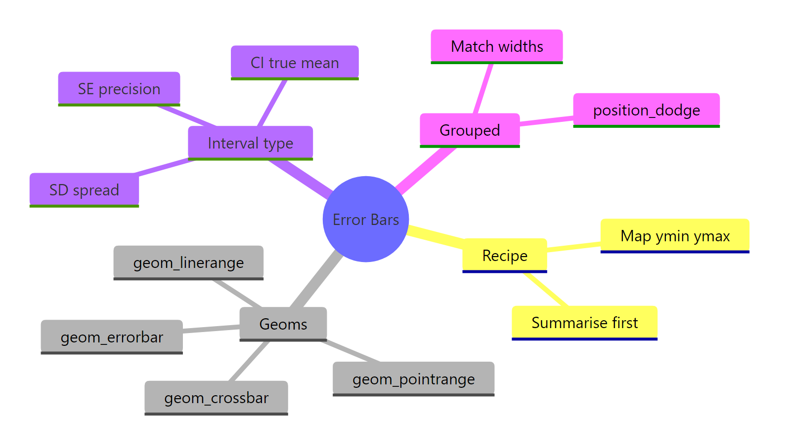
Figure 4: Overview of the error-bar workflow in ggplot2.
| Concept | Key takeaway |
|---|---|
| The recipe | Summarise to means and spreads first; ggplot2 never computes the interval for you |
geom_errorbar() |
The classic I-beam; width sets cap size, linewidth sets line thickness |
geom_pointrange() |
Point plus interval in one layer, the tidiest default |
geom_linerange() / geom_crossbar() |
Plain line, or a box with a centre line for range emphasis |
| SD vs SE vs CI | SD is data spread, SE is mean precision, CI is a plausible range for the true mean |
| Grouped charts | Give one position_dodge() to every layer so bars and error bars stay aligned |
| Horizontal bars | Use xmin, xmax, and orientation = "y"; geom_errorbarh() is deprecated |
With the summarise-then-map recipe in hand, you can add honest, well-labelled uncertainty to any ggplot2 chart.
FAQ
Why don't my error bars line up with my bars?
Almost always a dodge mismatch. When you place grouped bars side by side, geom_col() and geom_errorbar() must use the same position_dodge() width. Define one dodge object, such as pd <- position_dodge(width = 0.9), and pass it to both layers so each error bar sits on its own bar.
Should I use standard deviation or standard error for my error bars?
It depends on your message. Use standard deviation to show how spread out the raw data is, and standard error (or a confidence interval) to show how precisely you have estimated the mean. Whichever you pick, label it clearly, because the three produce very different bar lengths from the same data.
How do I add error bars to a plot without bars?
Use geom_pointrange() or geom_linerange() on a point plot. They read the same ymin and ymax aesthetics as geom_errorbar(), so you get an interval around each mean without drawing any bars. Many people prefer this because solid bars can hide the underlying data.
Why doesn't ggplot2 calculate error bars for me automatically?
Because there is no single correct interval. Standard deviation, standard error, and confidence intervals all answer different questions, so ggplot2 leaves the choice to you. You compute the interval in a summarise step, then map ymin and ymax to a geom. There is one shortcut: stat_summary(fun.data = mean_se) will add mean plus or minus one standard error straight from the raw data, but it offers only a few built-in intervals and less control, so precomputing stays the clearer default.
How do I make horizontal error bars in ggplot2?
Map your value to x and your category to y, then use xmin and xmax with orientation = "y". The old geom_errorbarh() function still exists but is deprecated, so geom_errorbar(orientation = "y") is the current approach.
References
- ggplot2 reference. Vertical intervals: lines, crossbars and errorbars. The canonical argument list for all four interval geoms used here. Link
- ggplot2 reference. position_dodge: Dodge overlapping objects side-to-side. Explains the dodge argument behind the grouped-chart alignment fix. Link
- Wickham, H., Navarro, D., and Pedersen, T. L. ggplot2: Elegant Graphics for Data Analysis, 3rd Edition. The book-length treatment of layers, aesthetics, and positions. Link
- Wickham, H., Cetinkaya-Rundel, M., and Grolemund, G. R for Data Science, 2nd Edition. Background on the dplyr group-and-summarise step every chart starts from. Link
- Cumming, G., Fidler, F., and Vaux, D. L. Error bars in experimental biology. Journal of Cell Biology (2007). Why SD, SE, and CI bars mean different things and how they are misread. Link
- R documentation. The ToothGrowth dataset. Details of the built-in dataset used throughout this tutorial. Link
Continue Learning
- ggplot2 Bar Charts: geom_bar() and geom_col() - the foundation for the bar-plus-error-bar charts in this tutorial.
- ggplot2 Line Charts - build the line layer that error bars sit on top of in time-series and dose-response plots.
- Error Bars in R: SD, SE, or CI, Done Right - a deeper look at choosing and computing the right uncertainty measure.
- ggplot2 Area Charts and Ribbons - use geom_ribbon() to show a continuous uncertainty band instead of discrete bars.