Area Charts and Ribbons in ggplot2: geom_area, geom_ribbon
An area chart fills the space between a line and a baseline so your eye reads volume, not just direction. In ggplot2 you draw one with geom_area(), and its close sibling geom_ribbon() fills the band between any two lines, an upper value and a lower value, which is exactly what a confidence interval needs.
This tutorial builds both from the ground up. You will start with a single filled series, stack several groups on top of each other, switch to proportions, and finish by shading the uncertainty around a fitted model. Every plot uses the tidyverse (ggplot2 plus a little dplyr), the code runs right here in your browser, and each output shown is the real result of running the block. If you can read a line chart, you already know enough to start.
What is an area chart, and how do you build one with geom_area()?
An area chart is a line chart with the space underneath filled in. That fill turns a thin trend line into a solid shape, which makes the reader feel the magnitude of the value at every point along the x axis. It is the natural choice when the quantity itself matters (sales, headcount, unemployment) and not only its rise and fall.
We will use economics, a monthly US economic dataset that ships inside ggplot2, so there is nothing to download. Let's load the package and look at the first few rows so you know what the columns are.
Each row is one month. We will plot date on the x axis and unemploy, the number of unemployed people in thousands, on the y axis. That gives one value per month, a perfect fit for an area chart.
Now the payoff. We map date and unemploy, then add a single geom_area() layer. The fill argument sets the interior colour and alpha controls transparency, where 1 is solid and 0 is invisible.
Run it and you get a filled blue shape that rises and falls with the economy, spiking in every recession. The top edge is exactly the line geom_line() would have drawn; geom_area() just floods everything below that line down to the baseline.
That baseline is the key to reading area charts correctly. By default geom_area() anchors the fill at zero, so the height of the shape at any month is the value itself. This is why the zero baseline matters: the filled quantity you see is the real number, measured from zero up.
Two arguments do most of the styling work. Use fill for the interior colour and colour for the outline of the top edge. A thin white outline (via colour = "white") is a common touch that makes the shape crisp.
Try it: Redraw the unemployment area with a fill colour you like, then add colour = "white" to trace a clean outline along the top edge.
Click to reveal solution
Explanation: fill colours the inside, colour colours the top edge, and linewidth sets how thick that edge line is. Keeping the outline thin and pale stops it from competing with the fill.
How do you compare several groups with a stacked area chart?
A single area chart shows one series. The moment you have several groups, say revenue split across product segments, you want to see each group and the combined total at once. That is what a stacked area chart does: it draws one area per group and stacks them, so the top edge traces the sum of everything.
To do this, ggplot2 needs your data in long (tidy) form: one row per group per time point, with a column that names the group. Let's build a small, readable dataset of yearly sales for three business segments so you can see the shape of the input.
Every row carries a year, a segment name, and a sales number. That third column, the group name, is the piece a single-series chart never had.
Now map segment to fill. That one aesthetic tells ggplot2 to split the data into one area per segment and colour each differently. Because geom_area() uses position = "stack" by default, the areas pile up instead of overlapping.
You now see three bands stacked into one solid block. Read any single band's thickness to get that segment's sales, and read the height of the whole stack to get total company sales. You can read both from the same chart.
There is one catch worth knowing: the stacking order is decided by the factor levels of segment, and by default R orders them alphabetically. You can take control by turning segment into a factor with the order you want. A common convention is to put the largest or most important group at the bottom. While we are here, we will add white borders between bands and a colour palette.
Setting the factor levels reorders the stack from the bottom up, so Services now sits at the base. The colour = "white" argument draws a clean seam between segments, and scale_fill_brewer() swaps the default colours for a coordinated blue palette.
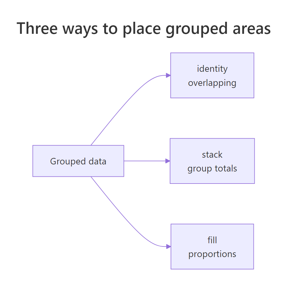
Figure 1: The position argument decides how grouped areas combine, from overlapping to stacked totals to a 100 percent fill.
Try it: Redraw the stacked chart but swap the palette to "Set2" (a friendly qualitative palette) while keeping the white seams.
Click to reveal solution
Explanation: scale_fill_brewer() picks a ColorBrewer palette by name. Qualitative palettes like "Set2" are built for categories with no natural order, which is what our segments are.
How do you show proportions with position = "fill"?
A stacked area answers "how big is each group and the total?" Sometimes you care about a different question: "what share of the whole did each group hold, year by year?" For that you want a proportional (100 percent stacked) area chart, where every column is rescaled so the segments always add up to the full height.
The change is tiny. Swap the default stacking for position = "fill", which stretches each year to reach 1.0. Then format the y axis as a percentage with scales::percent so the axis reads 0 percent to 100 percent instead of 0 to 1. The scales:: prefix borrows one function from the scales package (installed alongside ggplot2) without attaching the whole package, so there is no library(scales) call to add.
Now the total is a flat 100 percent every year, and the bands show how the mix shifts over time. The absolute numbers are gone on purpose; this chart is about relative share, so a segment can shrink here even while its raw sales grow.
To see exactly what position = "fill" computes for you, we can reproduce it by hand. Grouping by year and dividing each segment's sales by the yearly total gives the same shares ggplot2 draws. This is a good moment to bring in dplyr.
The share column is what the proportional chart plots. In 2018, Cloud was about 47 percent of sales; by 2023 it had climbed past 55 percent. That is the story the percentage axis tells at a glance.
Try it: Write a small function ex_share() that turns a vector of values into its proportions (each value divided by the sum). This is the same math position = "fill" runs internally.
Click to reveal solution
Explanation: Dividing a vector by sum(values) uses R's vectorized arithmetic to scale every element at once, so the results always add up to 1. Here Cloud's 58 is about 55 percent of the three segments' total.
What is geom_ribbon(), and how is it different from geom_area()?
So far the bottom of every filled shape has been zero. geom_ribbon() removes that restriction. It fills the band between two y values that you supply at each x: a lower edge called ymin and an upper edge called ymax. That freedom is what lets a ribbon represent a range rather than a total.
Here is the relationship in one line: an area chart is just a ribbon whose lower edge is pinned to zero. Once you see that, the whole family clicks into place.
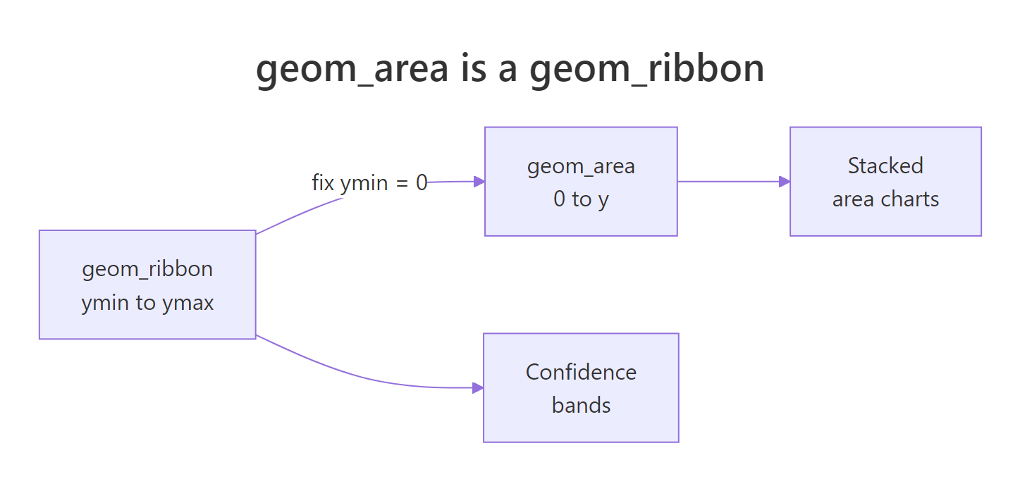
Figure 2: geom_area is just geom_ribbon with the lower edge fixed at zero.
Let's make a tiny dataset with an explicit low and high value at each x, then fill the gap. The ribbon needs ymin and ymax mapped inside aes().
The result is a floating band. It never touches zero; it simply fills the vertical distance from lo up to hi at every x. That is the shape you cannot make with geom_area() alone.
To prove the family connection, keep everything the same but set ymin = 0. The floating band drops down and becomes an ordinary area chart of hi.
Same geom, same data, one changed argument, and now it is indistinguishable from geom_area(aes(y = hi)). This is not a coincidence: internally geom_area() is defined as geom_ribbon() with ymin fixed at 0.
Try it: Widen the band by 2 units on each side, so ymin = lo - 2 and ymax = hi + 2, and give it a warmer fill colour.
Click to reveal solution
Explanation: Because ymin and ymax are ordinary expressions, you can compute the edges on the fly. Subtracting from lo and adding to hi inflates the band symmetrically.
How do you add a confidence band with geom_ribbon()?
The most common real use of geom_ribbon() is showing uncertainty. When you fit a model, the prediction is a single line, but there is a range of plausible values around it. Shading that range as a band, with the prediction line running through the middle, is the classic confidence-band picture.
Let's build one from a real model instead of made-up numbers. We will fit a straight line to the built-in cars dataset, which records how far a car needs to stop at a given speed. Then we ask predict() for a fitted value plus a lower and upper bound at each speed, using interval = "confidence".
Each row now has four numbers: the speed, the model's best estimate fit, and the interval bounds lwr and upr. Those last two are the exact ymin and ymax a ribbon wants. A 95 percent confidence interval means that if we repeated this sampling many times, the true average stopping distance would land inside the band about 95 percent of the time. The band is wider where data is sparse and narrower where it is dense.
Now plot it in three layers: the ribbon for the band, then the fitted line on top of it, then the raw points so the reader sees the actual data. Order matters here, which we will come back to.
The pale band sits closest to the blue trend line in the middle of the speed range and widens at the ends, where fewer data points make the estimate less certain. The scattered points show how the real observations spread around that trend.
Try it: Recolour the band. Change its fill to "grey80" and set alpha = 0.5 for a neutral, understated look.
Click to reveal solution
Explanation: A grey, semi-transparent band reads as "background uncertainty" and keeps attention on the coloured fit line. This is a good default for reports where the trend is the headline.
What are the most common area chart and ribbon pitfalls?
A few traps catch almost everyone the first time. Knowing them upfront saves you a confusing debugging session.
The first is overlapping instead of stacking. If you actually want several areas drawn on the same baseline (not piled up), you must set position = "identity", and then you need transparency or the front area will completely hide the ones behind it.
With identity the three areas all start at zero and overlap, and alpha = 0.4 lets you see through them. Without the transparency, only the largest segment would be visible.
Here are the traps worth keeping on a checklist:
- Stacking is the default, not overlapping.
geom_area()usesposition = "stack". If your groups look suspiciously tall, you are probably stacking when you meant to overlap. - Sort your x axis first. An area or ribbon connects points in row order, so unsorted x values produce a jagged, back-and-forth mess. Order the data by x before plotting.
- Watch the zero baseline. Because area implies "counted from zero", using it for data where zero is meaningless (like temperature or price) can mislead. A line chart is often safer there.
- Layer the ribbon under the line. Add
geom_ribbon()beforegeom_line()so the line is not covered by the band. - Too many stacked groups become unreadable. Beyond five or six bands the colours blur together. Group small categories into an "Other" bucket.
linewidth. If you are on an older install and see a warning, switch linewidth back to size. Check your version with packageVersion("ggplot2").Try it: The chart below stacks the segments so you cannot compare their individual shapes. Make all three visible on a shared baseline by adding position = "identity" and alpha = 0.5.
Click to reveal solution
Explanation: position = "identity" stops the stacking so each area is drawn from zero, and the transparency lets overlapping shapes coexist without one hiding the rest.
Putting It All Together: A Polished Stacked Area Chart
Let's combine the pieces into one publication-ready figure. We take the revenue data (already ordered as a factor from earlier), stack it, add white seams over a qualitative palette, then finish with a full set of labels on a clean theme. This is the kind of chart you could drop straight into a report.
Every element here earns its place. The stacked areas show both the segment detail and the rising total, while the white borders separate the bands. A minimal theme strips away chart clutter, and the labelled title, subtitle and caption tell the reader what they are looking at and where the data came from.
Practice Exercises
These combine what you have learned. Try each one before opening the solution. Notice that the solutions use fresh variable names (prefixed with my_) so they will not clash with the tutorial's objects if you run everything in order.
Exercise 1: Turn the revenue data into a share chart
Redraw the revenue data as a 100 percent stacked (proportional) area chart. Use position = "fill" and format the y axis as a percentage. Keep the white seams and add a title.
Click to reveal solution
Explanation: position = "fill" rescales each year to 100 percent, and scales::percent turns the 0-to-1 axis into readable percentages. The result shows how the segment mix shifts, not the raw totals.
Exercise 2: Build a confidence band from your own model
Fit a linear model of mpg on wt using the built-in mtcars dataset, predict a confidence interval across a grid of weights, then draw the band with the fit line and raw points layered on top.
Click to reveal solution
Explanation: The heavier the car, the lower the mileage, and the band shows how confident the model is about that downward line. It stays tight through the bulk of the data and widens at the extremes where cars are rarer.
Exercise 3: Shade a min-to-max range with an average line
Sometimes the band is not a confidence interval but a plain range: the lowest and highest observed values, with the mean drawn on top. Using the simulated monthly readings below, compute each month's minimum, mean and maximum, then plot a ribbon from min to max with the mean as a line.
Click to reveal solution
Explanation: summarise() collapses the five readings per month into three numbers, and geom_ribbon() fills between the monthly min and max while the line traces the mean. This pattern works for any "typical value plus spread" chart.
Frequently Asked Questions
When should I use geom_area() instead of geom_line()?
Reach for geom_area() when the quantity itself matters and zero is a meaningful floor, because the filled height makes magnitude easy to feel. Use geom_line() when you only care about the direction and shape of the trend, or when zero is far from your data and would make an area chart misleading.
What is the difference between geom_area() and geom_ribbon()?
geom_area() fills from a fixed baseline of zero up to your y value, so it is for totals and volumes. geom_ribbon() fills between a lower ymin and an upper ymax that you choose at each x, so it is for ranges like confidence intervals. Mechanically, geom_area() is geom_ribbon() with ymin locked to zero.
How do I make a 100 percent stacked (proportional) area chart?
Add position = "fill" to geom_area(). That rescales every column so the groups always sum to the full height, turning absolute values into shares. Pair it with scale_y_continuous(labels = scales::percent) so the axis reads as percentages.
Why do my stacked areas look jagged or wrong?
The two usual causes are unsorted x values and unexpected stacking. An area connects points in row order, so sort the data by the x variable first. Also remember geom_area() stacks by default; if you wanted overlapping areas, set position = "identity" and add an alpha for transparency.
How do I add a confidence interval band around a regression line?
Fit the model, then call predict() with interval = "confidence" on a grid of x values to get fit, lwr and upr columns. Draw geom_ribbon(aes(ymin = lwr, ymax = upr)) first, then geom_line(aes(y = fit)) on top. For a quick version without building the grid yourself, geom_smooth(method = "lm") draws the same band automatically.
Summary
Area charts and ribbons are one family: both fill the space between two edges, and the only question is where those edges sit. Pick the geom and position that match the question you are answering.
| Goal | Geom and setting | Key arguments |
|---|---|---|
| One series over time | geom_area() |
fill, alpha |
| Compare group totals | geom_area() with position = "stack" (default) |
fill = group |
| Compare group shares | geom_area(position = "fill") |
scale_y_continuous(labels = scales::percent) |
| Overlapping areas | geom_area(position = "identity") |
alpha for transparency |
| A range or confidence band | geom_ribbon() |
aes(ymin, ymax) |
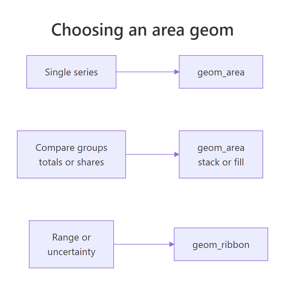
Figure 3: A quick guide to picking the right area geom for the job.
The three habits that keep these charts honest: anchor at zero only when zero means something, sort your x axis before plotting, and always draw the ribbon underneath the line it belongs to.
References
- ggplot2 documentation. Ribbons and area plots (
geom_ribbon,geom_area). Link - ggplot2 documentation. Stack overlapping objects (
position_stack,position_fill). Link - ggplot2 documentation. ColorBrewer palettes (
scale_fill_brewer). Link - Wickham, H., Navarro, D., Pedersen, T. L. ggplot2: Elegant Graphics for Data Analysis, 3rd Edition. Link
- Wickham, H., Cetinkaya-Rundel, M., Grolemund, G. R for Data Science, 2nd Edition. Link
- R Core Team.
predict.lmdocumentation (confidence and prediction intervals). Link - The R Graph Gallery. Stacked area chart with ggplot2. Link
Continue Learning
- ggplot2 Line Charts - the trend-line cousin of the area chart, and the natural next step after single-series areas.
- geom_smooth() in R - draw a fitted trend with its confidence band in one layer, using the ribbon idea automatically.
- ggplot2 Scales - go deeper on percent axes, colour palettes, and the
scale_*functions used throughout this tutorial.