ggiraph in R: Hoverable Interactive ggplot2 for the Web
ggiraph is an R package that turns a normal ggplot2 chart into an interactive web graphic. Readers hover over a point to read its exact value in a tooltip, hovering one element highlights every related element, and a click can run JavaScript. You keep writing ordinary ggplot2 code, swap in special *_interactive geoms, and wrap the result in girafe().
This tutorial assumes you can already make a basic ggplot2 chart. If you can write ggplot(data, aes(x, y)) + geom_point(), you know enough to follow along. Every ggiraph idea is explained from the ground up, and all the plain ggplot2 code runs right here in your browser so you can experiment as you read. The ggiraph pieces themselves produce a live interactive widget, so those blocks are marked to run in your own R session, where you can hover and click for real.
What is ggiraph, and how does it turn a ggplot into an interactive chart?
A static chart shows you the shape of your data, but it cannot answer "what is the exact value of that bar?" without you squinting at the axis. ggiraph fixes that. It takes a ggplot2 chart you already know how to build and layers interactivity on top, so the answer appears the moment a reader points at an element. You do not learn a new plotting system, and you do not write a line of JavaScript by hand.
Let's start with a plain chart so you have something to make interactive. We'll use the built-in mpg dataset, which records details like engine size and highway mileage for 234 car models across seven body classes. First, count how many cars fall in each class.
That car_counts table has one row per body class and a column n with the count. The |> symbol is the native R pipe: it takes the thing on its left and feeds it as the first argument to the function on its right, so mpg |> count(class) reads as "take mpg, then count by class". Now turn those counts into a bar chart.
This is standard ggplot2. geom_col() draws one bar per class, reorder(class, n) sorts the classes by count, and coord_flip() lays the bars sideways so the labels are easy to read. The chart is clear, but it is frozen. A reader cannot ask it anything.
ggiraph changes that in three small steps, shown below. You swap each geom_* for its geom_*_interactive twin, you map one or more interactive aesthetics (tooltip, data_id, or onclick), and you hand the finished plot to girafe(), which renders it as an interactive SVG that runs in any browser.

Figure 1: The three-step path from a normal ggplot2 chart to an interactive one.
Try it: Recolour the bars. Change the fill to a colour you like, such as "#55A868", and add a subtitle with labs(subtitle = "..."). Run it to see your version.
Click to reveal solution
Explanation: Only the fill value and the new subtitle changed. Everything about how ggiraph works is layered on top of this ordinary ggplot2 code, so anything you can style in a normal chart carries straight over.
How do you install ggiraph and build your first interactive chart?
ggiraph lives on CRAN, so a one-line install is all you need. Run this once in your own R session.
install.packages("ggiraph")Before we make the bar chart interactive, take a quick look at the mpg data so the tooltips we build later make sense. Each row is one car.
Now build the interactive bar chart. Compared with the static version, only two things change: geom_col becomes geom_col_interactive, and inside aes() we add two interactive aesthetics. tooltip is the text that pops up on hover, and data_id is a label ggiraph uses to know which element is which. Finally, girafe() renders it.
library(ggiraph)

interactive_bars <- ggplot(car_counts, aes(x = reorder(class, n), y = n)) +
  geom_col_interactive(
    aes(tooltip = paste0(class, ": ", n, " cars"), data_id = class),
    fill = "#4C72B0") +
  coord_flip() +
  labs(x = NULL, y = "Number of cars", title = "Cars per class")

girafe(ggobj = interactive_bars)
Run that in your own R session and hover over a bar. A dark label follows your cursor, and the bar under it lights up. The screenshot below shows exactly what you get: pointing at the SUV bar reveals "suv: 62 cars" and highlights that bar.
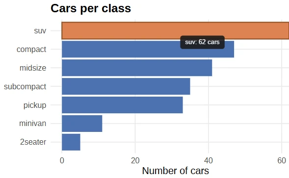
Figure 2: Hovering a bar shows its tooltip and highlights it. This is a real ggiraph chart.
So what did girafe() actually hand back? It returns an htmlwidget, the same kind of object that packages like leaflet and plotly produce. That is why a ggiraph chart drops straight into web pages and Shiny apps with no extra work.
gi <- girafe(ggobj = interactive_bars)
class(gi)
#> [1] "girafe"     "htmlwidget"
The interactivity you saw came from the two aesthetics we mapped. ggiraph gives you three of them, and each does a different job. The diagram below is the whole vocabulary you need.
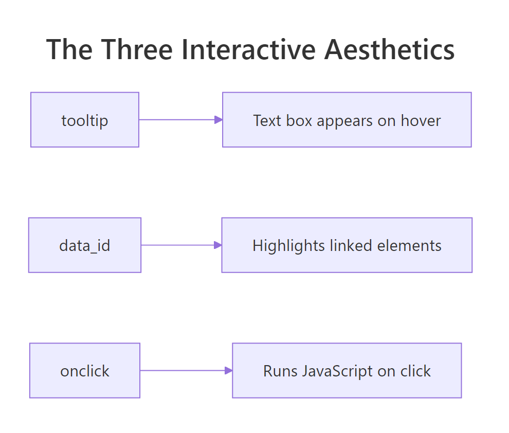
Figure 3: The three interactive aesthetics and what each one does.
Every standard geom has an interactive twin with the same name plus _interactive. Here are the ones you will reach for most.
| Static geom | Interactive twin | Typical use |
|---|---|---|
geom_point() |
geom_point_interactive() |
Scatter plots, bubble charts |
geom_col() |
geom_col_interactive() |
Bar charts |
geom_line() |
geom_line_interactive() |
Time series, trends |
geom_sf() |
geom_sf_interactive() |
Maps |
geom_tile() |
geom_tile_interactive() |
Heatmaps |
geom_col(), or you forget to wrap the plot in girafe(), you get an ordinary static chart with no hover or click. Both pieces must be present.Try it: Change the tooltip so it reads like "47 compact cars" instead of "compact: 47 cars". You only need to edit what goes inside paste0().
interactive_bars <- ggplot(car_counts, aes(x = reorder(class, n), y = n)) +
  geom_col_interactive(
    aes(tooltip = ______, data_id = class),   # rebuild the tooltip text
    fill = "#4C72B0") +
  coord_flip()

girafe(ggobj = interactive_bars)
Click to reveal solution
interactive_bars2 <- ggplot(car_counts, aes(x = reorder(class, n), y = n)) +
  geom_col_interactive(
    aes(tooltip = paste0(n, " ", class, " cars"), data_id = class),
    fill = "#4C72B0") +
  coord_flip()

girafe(ggobj = interactive_bars2)
Explanation: The tooltip is just a character string, so you build it however you like with paste0(). Here we put the count first, then the class name, then the word "cars".
How do you add hover tooltips to a chart?
The tooltip aesthetic is the single most useful feature in ggiraph, because it answers the question every reader has: "what exactly is this?" A tooltip is nothing more than a piece of text you attach to each element. Since it is a plain string, you can make it as rich as you want by pasting columns together.
Here is the pattern for building a good label. We combine a car's maker, model, and mileage into one readable sentence per row.
Each label is a compact description of one car. Now map that same expression to the tooltip aesthetic of a scatter plot. We are plotting engine size against highway mileage, colouring points by class, and giving every point a descriptive tooltip.
scatter <- ggplot(mpg, aes(x = displ, y = hwy)) +
  geom_point_interactive(
    aes(tooltip = paste0(manufacturer, " ", model, " (", hwy, " mpg)"),
        data_id = class, colour = class),
    size = 3, alpha = 0.8) +
  labs(x = "Engine size (litres)", y = "Highway mpg", colour = "Class")

girafe(ggobj = scatter)
Hover any point in your R session and you will see which car it is. That turns a cloud of anonymous dots into something you can explore one point at a time.
round(), and phrase it as you would say it out loud. A tooltip that reads "Toyota Corolla (34 mpg)" is far more useful than a bare number.By default the tooltip is a small white box. You can restyle it through girafe() using opts_tooltip(), which takes a snippet of CSS. Do not worry if you do not know CSS: the string below just sets a dark background with white text and rounded corners.
girafe(
  ggobj = scatter,
  options = list(
    opts_tooltip(css = "background:#1a1a1a; color:#fff; padding:6px 10px; border-radius:5px;")
  )
)
Try it: Build a tooltip label that shows the model and its city mileage (the cty column), for example "corolla (28 city mpg)". Fill in the blank and run it.
mpg |>
  transmute(label = ______) |>   # use model and cty
  slice(c(1, 120, 234))
Click to reveal solution
Explanation: transmute() keeps only the new label column, and paste0() glues the model name to its city mileage. You would map this same expression to tooltip inside geom_point_interactive().
How do you highlight related points when you hover?
This is what data_id is for. Every element that shares the same data_id value belongs to the same group, and when you hover any one of them, ggiraph highlights the whole group at once. In our scatter plot we set data_id = class, so hovering a single SUV lights up every SUV on the chart.
To make the effect visible, tell girafe() how highlighted and non-highlighted elements should look. opts_hover() styles the group you are pointing at, and opts_hover_inv() (short for "hover inverse") styles everything else. Here we give the hovered group a dark outline and fade all the other points to near-transparent.
girafe(
  ggobj = scatter,
  options = list(
    opts_hover(css = "stroke:#111; stroke-width:1.5px;"),
    opts_hover_inv(css = "opacity:0.15;")
  )
)
The screenshot below shows the result. Hovering one SUV point outlines every SUV and dims the rest, so a single class stands out from a busy chart.
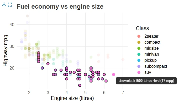
Figure 4: Hovering one SUV point highlights every SUV and fades the other classes.
data_id to a grouping column and every group becomes a hover-to-highlight cluster, even across separate panels of a faceted chart.Try it: Fade the non-hovered points even more so the highlighted class stands out harder. Change the opacity value in opts_hover_inv().
girafe(
  ggobj = scatter,
  options = list(
    opts_hover(css = "stroke:#111; stroke-width:1.5px;"),
    opts_hover_inv(css = "opacity:____;")   # try a smaller number
  )
)
Click to reveal solution
girafe(
  ggobj = scatter,
  options = list(
    opts_hover(css = "stroke:#111; stroke-width:1.5px;"),
    opts_hover_inv(css = "opacity:0.05;")
  )
)
Explanation: A lower opacity in opts_hover_inv() pushes the non-hovered points closer to invisible, so the highlighted group dominates the view. Values between 0.05 and 0.2 usually read well.
How do you make chart elements clickable?
The third aesthetic, onclick, runs a piece of JavaScript when a reader clicks an element. The most common use is to open a link, so a chart becomes a set of buttons that jump to a report or a web search. You do not need to be a JavaScript expert: you build a short string, and the browser runs it on click.
Let's make a chart of the five manufacturers with the most models. First get the counts.
Next, build the onclick string. window.open(...) is the JavaScript command that opens a new tab. We paste each manufacturer's name into a search URL, so clicking a bar searches the web for that maker. Printing one of the strings shows exactly what the browser will run.
Notice the quoting: the R string uses single quotes on the outside so the double quotes the URL needs can sit safely inside. Now map that column to onclick in the chart.
clickable <- ggplot(top_makes, aes(x = reorder(manufacturer, n), y = n)) +
  geom_col_interactive(
    aes(tooltip = paste0(n, " models"), data_id = manufacturer, onclick = onclick),
    fill = "#55A868") +
  coord_flip() +
  labs(x = NULL, y = "Number of models")

girafe(ggobj = clickable)
Run it and click any bar: a new tab opens with a search for that manufacturer. The tooltip and the click work together, since a bar can carry all three aesthetics at once.
Try it: Point the click at a different site. Change the URL so clicking a bar opens the manufacturer's Wikipedia search instead.
# edit the URL inside window.open(...)
top_makes <- top_makes |>
  mutate(onclick = paste0('window.open("https://______', manufacturer, '")'))
Click to reveal solution
top_makes <- top_makes |>
  mutate(onclick = paste0('window.open("https://en.wikipedia.org/wiki/Special:Search?search=',
                          manufacturer, '")'))

clickable2 <- ggplot(top_makes, aes(x = reorder(manufacturer, n), y = n)) +
  geom_col_interactive(
    aes(tooltip = paste0(n, " models"), data_id = manufacturer, onclick = onclick),
    fill = "#55A868") +
  coord_flip() +
  labs(x = NULL, y = "Number of models")

girafe(ggobj = clickable2)
Explanation: Only the URL inside window.open() changed. Any valid link works, so you can send clicks to a search page or to another report.
How do you control size, zoom, and selection with girafe options?
You have already met opts_tooltip(), opts_hover(), and opts_hover_inv(). girafe() accepts a whole family of these opts_* functions through its options argument, and together they control how the finished widget behaves. You pass them as a list, and each one tunes a different piece.
The block below switches on several at once: a hover colour, a styled tooltip, zoom up to five times, click-to-select points, and responsive sizing.
girafe(
  ggobj = scatter,
  width_svg = 7,
  height_svg = 5,
  options = list(
    opts_hover(css = "fill:#DD8452;"),
    opts_tooltip(css = "background:#1a1a1a; color:#fff; padding:6px 10px; border-radius:5px;"),
    opts_zoom(max = 5),
    opts_selection(type = "multiple", css = "fill:#C44E52;"),
    opts_sizing(rescale = TRUE)
  )
)
Here is what each option does, so you can pick the ones your chart needs.
| Option | What it controls |
|---|---|
opts_tooltip() |
The look of the hover tooltip (CSS) |
opts_hover() |
The style of the element you point at |
opts_hover_inv() |
The style of every other element while hovering |
opts_zoom() |
Whether readers can zoom, and how far (max) |
opts_selection() |
Click to select points, one (single) or many (multiple) |
opts_sizing() |
Whether the chart rescales to fit its container width |
The width_svg and height_svg arguments set the chart's aspect ratio in inches, while opts_sizing(rescale = TRUE) lets it shrink or grow to fill whatever space it lands in on a page.
Try it: Change how far readers can zoom. Set the max in opts_zoom() to a larger number and run it in your session.
girafe(
  ggobj = scatter,
  options = list(
    opts_zoom(max = ____)   # try 10
  )
)
Click to reveal solution
girafe(
  ggobj = scatter,
  options = list(
    opts_zoom(max = 10)
  )
)
Explanation: opts_zoom(max = 10) lets readers zoom in up to ten times using the small toolbar that ggiraph adds to the top corner of the chart. Raise it for dense charts where fine detail matters.
How do you put an interactive chart on a website, in R Markdown, or Shiny?
A ggiraph chart is an htmlwidget, so it slots into every place that already knows how to show a widget. There are three common destinations.
To publish a chart as a self-contained web page, save it with saveWidget() from the htmlwidgets package. The single file it writes bundles everything, so you can email it or drop it on any static host.
library(htmlwidgets)

gi <- girafe(ggobj = interactive_bars)
saveWidget(gi, "cars-per-class.html")
Inside an R Markdown or Quarto document, you do not need saveWidget() at all. Put the line below inside an ordinary R code chunk (the block that opens with {r} between backtick fences), and the chart renders straight into the knitted HTML.
girafe(ggobj = interactive_bars)In a Shiny app, ggiraph provides a matched pair of functions: girafeOutput() for the UI and renderGirafe() for the server. There is one bonus: when a reader selects elements with opts_selection(), Shiny receives the selected data_id values in an input named <outputId>_selected, so your app can react to clicks.
library(shiny)
library(ggiraph)

ui <- fluidPage(
  girafeOutput("plot")
)

server <- function(input, output) {
  output$plot <- renderGirafe({
    girafe(ggobj = interactive_bars)
  })
}

shinyApp(ui, server)Complete Example: an interactive fuel-economy chart
Let's pull the pieces together into one chart you would be happy to ship. We will show average highway mileage by car class, with a tooltip that spells out the number and a hover highlight, all styled to look finished.
First, summarise the data. We compute the mean highway mileage and the number of cars in each class, then sort from most to least efficient.
Now build the interactive chart on top of that summary. It uses geom_col_interactive with a descriptive tooltip and data_id, and passes a hover colour and a styled tooltip through girafe().
final_chart <- ggplot(class_summary, aes(x = reorder(class, mean_hwy), y = mean_hwy)) +
  geom_col_interactive(
    aes(tooltip = paste0(class, ": ", mean_hwy, " mpg (", n, " cars)"), data_id = class),
    fill = "#4C72B0") +
  coord_flip() +
  labs(x = NULL, y = "Mean highway mpg", title = "Fuel economy by class")

girafe(
  ggobj = final_chart,
  options = list(
    opts_hover(css = "fill:#DD8452;"),
    opts_tooltip(css = "background:#1a1a1a; color:#fff; padding:6px 10px; border-radius:5px;")
  )
)
Run this in your session and hover across the bars. Each one reports its average mileage and how many cars it represents, and the bar you point at turns orange. That is a complete, presentation-ready interactive chart built entirely from ggplot2 code plus a handful of ggiraph additions.
Practice Exercises
These exercises combine what you have learned. Try each one before opening the solution. The ggiraph pieces run in your own R session, where you can hover and click to check your work.
Exercise 1: An interactive city-versus-highway scatter
Build an interactive scatter plot of city mileage (cty) against highway mileage (hwy) from mpg. Colour the points by drivetrain (drv), show the model name in the tooltip, and set data_id = drv so hovering one point highlights all cars with the same drivetrain.
# Start from geom_point_interactive() and map tooltip, data_id, and colour.
# Write your code below:
Click to reveal solution
ex_scatter <- ggplot(mpg, aes(x = cty, y = hwy)) +
  geom_point_interactive(
    aes(tooltip = model, data_id = drv, colour = drv),
    size = 3, alpha = 0.8) +
  labs(x = "City mpg", y = "Highway mpg", colour = "Drivetrain")

girafe(
  ggobj = ex_scatter,
  options = list(opts_hover_inv(css = "opacity:0.2;"))
)
Explanation: Setting data_id = drv groups the points by drivetrain, so hovering a front-wheel-drive car highlights every front-wheel-drive car. opts_hover_inv() fades the other groups to make the effect obvious.
Exercise 2: A clickable manufacturer ranking
Build a horizontal bar chart of the ten manufacturers with the highest average highway mileage. Give each bar a tooltip showing its mileage, and an onclick that opens a web search for that manufacturer when clicked.
# Hint: summarise first, then add an onclick column with paste0(), then plot.
# Write your code below:
Click to reveal solution
Now add the onclick column and draw the chart.
make_hwy <- make_hwy |>
  mutate(onclick = paste0('window.open("https://www.google.com/search?q=', manufacturer, '")'))

ex_bars <- ggplot(make_hwy, aes(x = reorder(manufacturer, mean_hwy), y = mean_hwy)) +
  geom_col_interactive(
    aes(tooltip = paste0(mean_hwy, " mpg"), data_id = manufacturer, onclick = onclick),
    fill = "#55A868") +
  coord_flip() +
  labs(x = NULL, y = "Mean highway mpg")

girafe(ggobj = ex_bars)
Explanation: The summary gives one row per manufacturer with its mean mileage. Adding the onclick column and mapping it inside geom_col_interactive() makes every bar a clickable link, while the tooltip reports the exact number on hover.
Exercise 3: Style the whole thing
Take the chart from Exercise 2 and finish it: give it a dark styled tooltip with an orange hover colour, then turn on zoom. Finally, save the result as a standalone web page.
# Combine opts_tooltip(), opts_hover(), and opts_zoom() in girafe(options = ...).
# Then call saveWidget() on the result.
# Write your code below:
Click to reveal solution
styled <- girafe(
  ggobj = ex_bars,
  options = list(
    opts_tooltip(css = "background:#1a1a1a; color:#fff; padding:6px 10px; border-radius:5px;"),
    opts_hover(css = "fill:#DD8452;"),
    opts_zoom(max = 5)
  )
)
styled
Then save it to a file you can share:
```library(htmlwidgets)
saveWidget(styled, "manufacturer-mileage.html")
```Explanation: All three opts_* functions go in the same options list. Once you hold the girafe() result in a variable, saveWidget() turns it into a self-contained HTML file that opens in any browser.
Frequently Asked Questions
What is the difference between ggiraph and plotly? Both make ggplot2 charts interactive. ggiraph keeps you in pure ggplot2 syntax and renders an SVG, so your styling and themes come through exactly, and it integrates tightly with Shiny selections. Plotly converts a chart through ggplotly() and adds a built-in toolbar. Choose ggiraph when you want faithful ggplot2 output and precise control over hovering, highlighting and clicks.
Do I have to rewrite my whole chart to use ggiraph? No. You swap each geom_* for its geom_*_interactive version, add at least one of the tooltip, data_id, or onclick aesthetics, and wrap the plot in girafe(). The rest of your ggplot2 code stays the same.
Why is my tooltip not showing anything? Check three things: you used the _interactive geom, you mapped tooltip inside aes() rather than outside it, and you wrapped the plot in girafe(). Missing any one of these gives a static chart.
Can a single element have a tooltip and a click at the same time? Yes. Map tooltip, data_id, and onclick together inside the same aes() call, and the element will show a tooltip on hover, highlight its group on that same gesture, then run its JavaScript on click.
Does ggiraph work with facets and maps? Yes. Interactive geoms work inside facet_wrap() and facet_grid(), and a shared data_id highlights matching elements across every panel. For maps, geom_sf_interactive() makes spatial features hoverable and clickable.
Where do the interactive charts run? A ggiraph chart is a self-contained web graphic, so it runs in any modern browser: inside R Markdown or Quarto reports, in Shiny apps, or as a standalone HTML file saved with saveWidget().
Summary
| Concept | What to remember |
|---|---|
| The pattern | Swap geom_* for geom_*_interactive, add an interactive aesthetic, wrap in girafe() |
tooltip |
Text that appears on hover; build rich labels with paste0() |
data_id |
Elements sharing an id highlight together on hover |
onclick |
A JavaScript string (usually window.open(...)) that runs on click |
girafe() |
Renders the chart as an htmlwidget you can embed anywhere |
opts_* functions |
Passed via options to style tooltips, hover, zoom, selection, and sizing |
| Output | Save with saveWidget(), or embed in R Markdown, Quarto, or Shiny |
ggiraph gives you interactive charts for the price of a few small changes to code you already write. Start with a tooltip, add data_id when you want linked highlighting, reach for onclick when a chart should link somewhere, and tune the feel with the opts_* family. Because the result is a standard htmlwidget, the same chart works on a web page just as well as inside a Shiny dashboard.
References
- ggiraph package documentation, David Gohel. Link
- girafe() function reference, ggiraph. Link
- ggiraph on CRAN, package page and manual. Link
- The ggiraph book, ardata. Link
- ggplot2 documentation, tidyverse. Link
- ggiraph gallery, R Graph Gallery. Link
- htmlwidgets for R, the framework girafe builds on. Link
Continue Learning
- Combining ggplot2 with Plotly: another route to interactive charts, converting a ggplot with
ggplotly(). - Complete ggplot2 Tutorial (Part 1): build a solid ggplot2 foundation before you make it interactive.
- 25 Best ggplot2 Extensions: discover more packages that add new powers to ggplot2.