Inset Plots and Magnifier Panels in ggplot2
An inset plot is a small chart placed inside the plotting area of a larger one. A magnifier panel is a special inset that shows a zoomed-in view of a small region of the main chart, with that region marked on the full view. This tutorial builds both from scratch in ggplot2, using the patchwork companion package for placement.
What is an inset plot, and when should you reach for one?
Sometimes one chart cannot do two jobs at once. A time series might show a 40-year trend beautifully while completely burying the sharp spike you actually want your reader to notice. An inset solves this by tucking a second, smaller chart inside the first, so the big picture and the interesting detail share a single figure.
There are four common jobs an inset does well: a zoomed detail of a busy region, a context or overview map, a compact summary statistic, and a secondary distribution. A magnifier panel is the first of those, done carefully so the reader can see exactly which slice of the main chart is being enlarged.
We will build everything on one dataset so the ideas stack up instead of resetting. The economics dataset ships with ggplot2 and records United States unemployment every month from 1967 to 2015. Let's load ggplot2 and take a quick look at the two columns we care about.
Each row is one month. The date column is a proper Date, and unemploy is the number of unemployed people in thousands. That peek confirms the shape of the data before we plot it, which is always a good habit.
Now let's draw the full picture. We save the plot to p_base so we can reuse it as the background for every inset later in the tutorial.
The line rises and falls with every recession, and the tall peak near 2009 is the financial crisis. That peak is the perfect candidate for a magnifier later, because its month-to-month detail is squashed against the top of a chart that also has to show the previous 40 years.
Try it: The economics data also has a uempmed column, the median number of weeks people stayed unemployed. Swap it in for unemploy and see a different story in the same date range.
Click to reveal solution
Explanation: Only the y aesthetic changed. uempmed climbs to a striking record after 2008, which is another region worth magnifying.
How do you place an inset with patchwork's inset_element()?
The cleanest way to drop one ggplot on top of another is inset_element() from the patchwork package. You build the small plot as an ordinary ggplot, then add it to the base plot with four numbers that say where its corners go.
Those four numbers are left, bottom, right, and top, and they run from 0 to 1 across the panel. So left = 0 is the far left of the plotting area and right = 1 is the far right. Let's build a compact histogram of the unemployment values and park it in the top-left corner.
The small histogram now floats over the upper-left of the line chart, summarising how often each unemployment level occurred. Notice that p_dist uses theme_minimal(base_size = 8) so its text stays small enough to read without crowding the main plot. Shrinking the base font size is the single most useful trick for making an inset feel like a footnote rather than a competing headline.
By default those 0-to-1 positions are measured against the panel, the grey drawing area inside the axes. You can change that reference frame with align_to. Here we push the inset into the top-right and align it to the whole figure instead.
Try it: Move the same p_dist inset down into the bottom-right corner of the panel. You only need to change the four position numbers.
Click to reveal solution
Explanation: A bottom-right box needs a high left, a low bottom, and right/top near the edges. The width is right minus left and the height is top minus bottom.
How do you build a magnifier panel that zooms into a region?
A magnifier panel is the most useful inset of all, and it takes just four steps: pick a region, mark it on the main chart, build a zoomed copy of that region, and place the zoom as an inset. The figure below lays out that flow before we write the code.

Figure 1: The four steps that turn a crowded chart into a magnifier panel.
Step one is to decide what to magnify. We will zoom into the 2007 to 2010 window where unemployment spiked. Let's define that window and check the unemployment range it covers, because those numbers will size our marker rectangle.
So inside that window, unemployment runs from about 6.7 million to 15.4 million. Step two is to draw a rectangle on the main chart over exactly that box, so the reader knows which patch we are about to enlarge. The annotate("rect", ...) layer draws a single rectangle at data coordinates, and fill = NA keeps it hollow so the line shows through.
A red frame now sits around the crisis spike. Step three is to build the zoomed view itself. We plot the same data again, then use coord_cartesian() to restrict the visible x and y ranges to our window. This is the safe way to zoom.
The zoomed plot shows the crisis climb in full detail, month by month, instead of a cramped spike. It uses the whole dataset but only displays the slice inside the window.
Step four is to compose the two plots. We add the zoom as an inset over the context plot, placing it in the upper-left where the line chart has empty space.
That is a complete magnifier panel. The red rectangle tells the reader where the detail comes from, and the inset shows that detail at a comfortable size, all inside one figure that still keeps the 40-year context.
Try it: Point the magnifier at a different era. Rebuild the zoomed plot for the early-1980s recession, roughly 1980 to 1985, by changing the window dates.
Click to reveal solution
Explanation: Only the two window dates changed. Recomputing win2_y with range() keeps the y-axis snug around whatever the new window contains.
How do you make an inset without patchwork, using annotation_custom()?
You do not always need patchwork. Base ggplot2 can embed a plot with annotation_custom(), and it differs in one important way: you position the inset using your data's own units, not 0-to-1 fractions. That is handy when you want an inset anchored to a specific spot in the data, like a particular date range.
The recipe has two parts. First convert the small plot into a drawable object (a grob, short for graphical object) with ggplotGrob(), then hand that object to annotation_custom() along with xmin, xmax, ymin, and ymax in data coordinates. Because our x-axis is dates, the x limits are dates too.
The zoomed plot now sits in the region bounded by mid-1969 to early-1994 on the x-axis and 9,000 to 15,500 on the y-axis. Because the position is tied to data values, the inset stays put relative to the numbers even if you later change the axis limits.
Try it: Move the grob to the lower-right of the chart, roughly 1995 onward on the x-axis and 2,000 to 8,000 on the y-axis.
Click to reveal solution
Explanation: The four numbers are read straight off the axes. Later dates push the inset right, and smaller unemployment values push it down.
Can you add a magnifier in one line with ggforce or ggmagnify?
Once you understand the manual recipe, two extension packages can automate it. The diagram below sums up all four methods so you can pick the right one for the job.
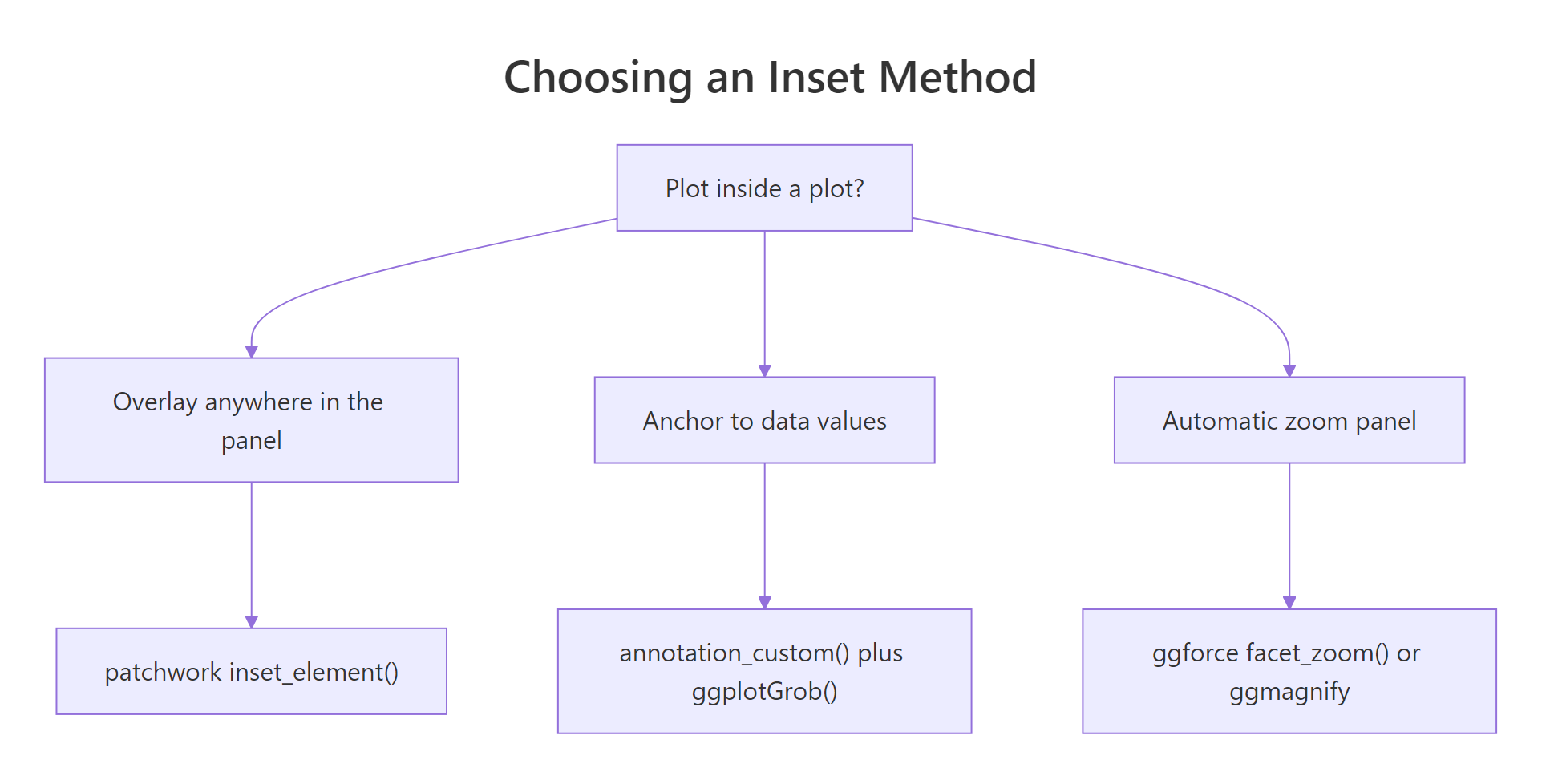
Figure 2: Pick an inset method by what you need to control.
The ggforce package adds facet_zoom(), which draws the full plot and a zoomed panel side by side and connects them automatically. You pass a condition that selects the rows to zoom into, and it handles the rest.
library(ggforce)

ggplot(economics, aes(date, unemploy)) +
  geom_line(color = "grey30") +
  facet_zoom(x = date >= as.Date("2007-01-01") & date <= as.Date("2010-06-01"))
That single facet_zoom() line produces the full series on the left and the crisis window on the right, with guide lines linking the zoomed region back to its place in the whole. It is the fastest way to get a defensible zoom for exploratory work.
The ggmagnify package goes the other way and draws a classic magnifying-glass inset directly on the plot. You give it a source region with from and a destination box with to, both as c(xmin, xmax, ymin, ymax) in data units. Here it is on the faithful geyser dataset, whose points form two tidy clusters.
library(ggmagnify)

# from = the region to magnify; to = where the inset lands (data units)
from_r <- c(1.5, 2.6, 40, 60)
to_r   <- c(3.2, 5.2, 45, 70)

ggplot(faithful, aes(eruptions, waiting)) +
  geom_point(alpha = 0.5) +
  geom_magnify(from = from_r, to = to_r, axes = "xy")
The short-eruption cluster is magnified into the empty upper-right of the plot, with lines drawn from the source box to the inset so the link is obvious. Setting axes = "xy" keeps axis ticks on the inset so readers can still read values off it.
Try it: facet_zoom() can zoom the y-axis too. Zoom into the short eruptions of faithful, the ones under 3 minutes, by conditioning on y instead of x.
library(ggforce)

# Zoom on x here; switch it to zoom on y < 3 minutes
ggplot(faithful, aes(waiting, eruptions)) +
  geom_point(alpha = 0.5) +
  facet_zoom(x = waiting > 80)
Click to reveal solution
ggplot(faithful, aes(waiting, eruptions)) +
  geom_point(alpha = 0.5) +
  facet_zoom(y = eruptions < 3)
Explanation: Swapping x = for y = tells facet_zoom() to enlarge a band of the vertical axis instead of the horizontal one.
How do you make insets and magnifiers look polished?
A working inset and a polished inset are different things. Three touches do most of the work: give the inset a solid background so the line underneath does not bleed through, add a thin border so it reads as its own panel, and drop any axis titles it does not need.
Let's take the zoomed plot from before and clean it up. We keep the axis numbers, since a magnifier is more convincing when you can read values off it, but we add a white background with a grey frame and remove the redundant axis titles.
The inset now sits crisply on top of the line chart instead of blending into it. The white fill hides the main line where the inset overlaps it, and the grey frame gives the eye a clean boundary.
By default inset_element() draws the inset on top of the base plot, which is usually what you want. If an inset ever covers data you need, move it to an emptier corner rather than fighting the layering, since a magnifier only works when the reader can see both the source and the detail.
Try it: Change the inset frame to a firebrick border on a very light background so it echoes the red marker rectangle.
Click to reveal solution
Explanation: Matching the inset frame colour to the marker rectangle visually ties the zoom to its source region, a small cue that helps the reader connect the two.
Complete Example
Let's put every idea into one figure you could drop into a report. It marks the crisis window on the full series, builds a framed detail view of that window, and places the detail as an inset, all in a single self-contained block.
This figure tells the whole story at a glance. A reader sees the long trend, spots the flagged region, and reads the crisis in detail without ever leaving the chart. Note that detail plots crisis_win directly rather than using coord_cartesian(); since the subset already contains only the window's rows, either approach draws the same line here.
Practice Exercises
These exercises combine the ideas above. Each uses fresh variable names beginning with my_ so your work never overwrites the tutorial plots.
Exercise 1: A boxplot inset on a scatter plot
Build a scatter plot of mtcars weight against miles per gallon, then add a boxplot of mpg grouped by cylinder count as an inset in the top-right corner. Save the scatter to my_main and the boxplot to my_inset.
Click to reveal solution
Explanation: The scatter carries the main relationship while the inset boxplot summarises how mileage falls as cylinders rise, a second view for free.
Exercise 2: A magnifier on the geyser data
Use the faithful dataset (eruption duration against waiting time). Mark the short-eruption cluster with a rectangle over roughly eruptions 1.5 to 2.6 and waiting 40 to 68, then add a coord_cartesian() zoom of that box as an inset in the bottom-right.
Click to reveal solution
Explanation: The rectangle and the coord_cartesian() limits use the same my_x and my_y values, so the marker and the zoom always agree.
Exercise 3: A side-by-side zoom without any inset
Sometimes a side-by-side layout reads better than an overlay. Recreate the facet_zoom() look with patchwork alone: a full faithful scatter with the cluster marked, placed next to a zoomed copy, joined with the | operator.
Click to reveal solution
Explanation: The | operator from patchwork places the two plots in one row. This layout gives the zoom its own space instead of covering the source, which suits print reports where overlap is risky.
Frequently Asked Questions
When should I use inset_element() versus annotation_custom()?
Reach for inset_element() when you want to position an inset by eye, since 0-to-1 fractions make "top-right corner" easy to express. Reach for annotation_custom() when the inset must sit at specific data values, such as a fixed date range, because it reads its position straight off the axes.
Why did coord_cartesian() zoom correctly but xlim() gave a weird result?
coord_cartesian() changes only the visible window and keeps every data point, so lines and smoothers stay true. xlim() and scale limits remove points outside the range before anything is drawn, which can chop a line short or bend a fitted curve, so they are the wrong choice for a faithful zoom.
My inset is hiding behind the main plot. What happened?
By default inset_element() draws on top, so this usually means the inset has a transparent background and the base chart is showing through. Add a solid fill with theme(plot.background = element_rect(fill = "white")), and if you built the inset with annotation_custom(), make sure its coordinates actually fall inside the panel.
Can I add more than one inset to a plot?
Yes. Chain several inset_element() calls, one per inset, and give each a different set of corners so they do not overlap. The same works for multiple annotation_custom() layers.
Do insets survive when I save the figure with ggsave()?
They do. Because the composed object is still a single plot, ggsave() writes it out like any other, though you may need a larger width and height so the inset text stays legible at the final size.
Summary
Insets and magnifiers let one figure carry both the overview and the detail. The table below sums up the tools, and the diagram recaps how they fit together.
| Method | Positioning | Best for |
|---|---|---|
inset_element() (patchwork) |
0-to-1 fractions | Overlays placed by eye |
annotation_custom() (ggplot2) |
Data units | Insets anchored to data values |
coord_cartesian() (ggplot2) |
Axis limits | The zoomed view inside a magnifier |
facet_zoom() (ggforce) |
Row condition | Fast side-by-side zoom panels |
geom_magnify() (ggmagnify) |
Data units | A classic connected magnifier |
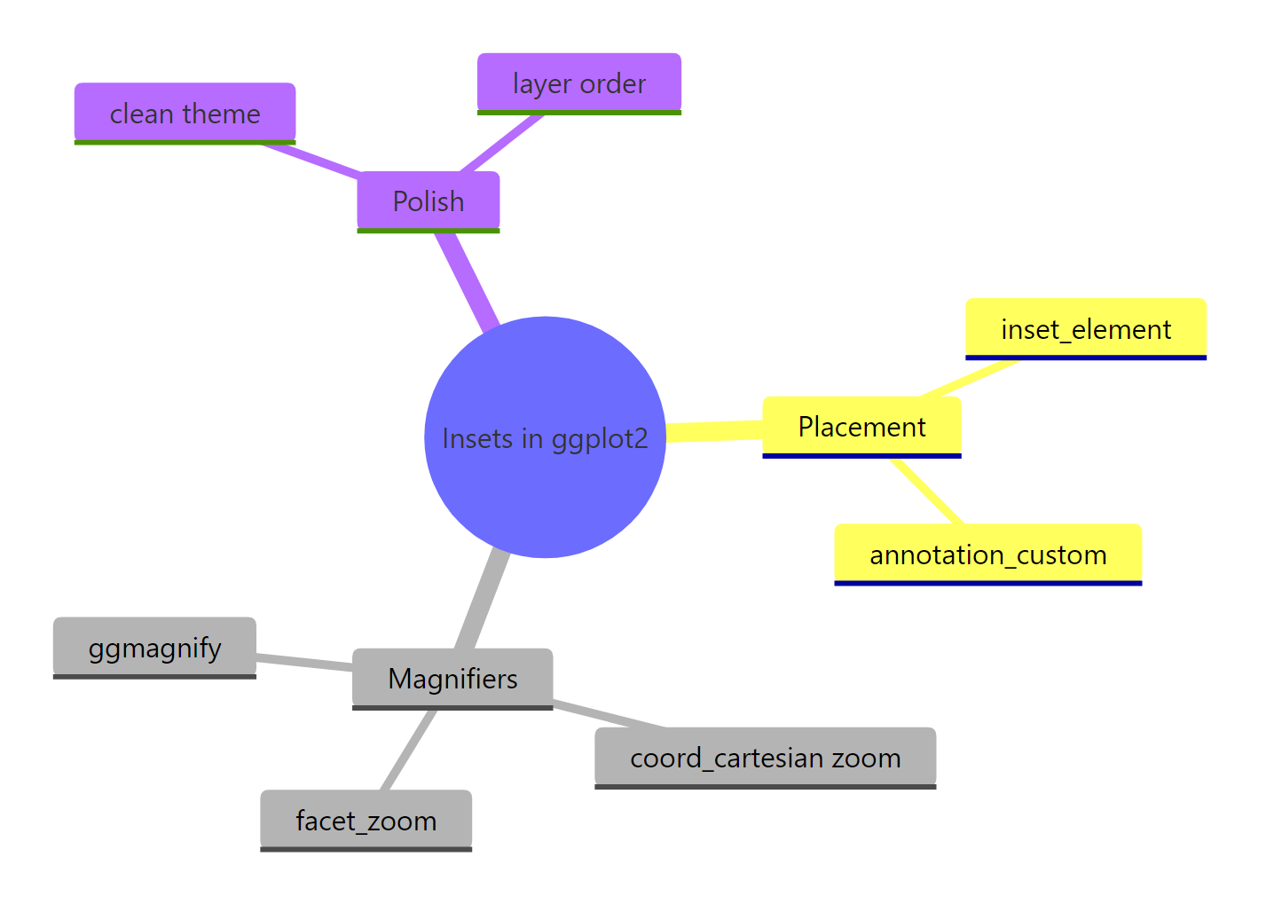
Figure 3: The tools this tutorial covers, at a glance.
The key mental model is that a magnifier is just an inset with a job: mark a region, zoom it with coord_cartesian() so no data is lost, and place the result where it does not cover the source. Get those three habits right and your insets will read clearly every time.
References
- patchwork documentation. Create an inset to be added on top of the previous plot (inset_element). Link
- ggplot2 documentation. Annotation: Custom grob (annotation_custom). Link
- ggplot2 documentation. Cartesian coordinates (coord_cartesian). Link
- Wickham, H., Navarro, D., Pedersen, T. L. ggplot2: Elegant Graphics for Data Analysis, Chapter 9: Arranging plots. Link
- ggforce documentation. facet_zoom: Facet data for zoom with context. Link
- Jones, D. ggmagnify: Create a magnified inset of part of a ggplot object. Link
- Chang, W. R Graphics Cookbook, 2nd Edition. Link
Continue Learning
- patchwork in R: Combine Multiple ggplot2 Plots - the full toolkit for arranging and overlaying plots, of which
inset_element()is one piece. - ggplot2 Labels and Annotations - master
annotate()and text layers that pair naturally with a marked magnifier region. - ggplot2 Facets - understand faceting, the idea
facet_zoom()builds on to draw its context panel. - Publication-Quality Figures in R - polish, sizing, and export tips for figures with insets that need to survive print.