Build a Complete ggplot2 Theme from Scratch
A ggplot2 theme is a single collection of settings that controls every non-data part of a plot: fonts, colours, grid lines, backgrounds, spacing, and the legend. Building one from scratch means writing a reusable function you can add to any chart for an instant, consistent house style.
This tutorial builds one complete theme step by step, using ggplot2 (part of the tidyverse). Every code block runs directly in your browser, so edit any line and re-run it to see the effect right away.
What does a ggplot2 theme actually control?
Every chart has two layers. There is the data (the points, bars, and lines you plotted) and there is everything around it (the title, the axis labels, the grid, the background, the legend). A theme owns that second layer. Change the theme and the same data looks completely different, without touching a single geom. Let us see that in action before we build our own.
We will use mpg, a dataset that ships with ggplot2. It records fuel economy for 234 cars, and we will plot engine size against highway mileage, coloured by the type of drive.
The nrow() count confirms the dataset holds 234 cars, one per point. We saved the plot to a variable called p so we can reuse it in every later block without retyping it. When you print p, ggplot2 draws it with its default look: a grey panel with white grid lines. That grey look is not baked into the data. It comes entirely from the default theme, which is called theme_grey().
How much is that default theme actually deciding for you? A theme is just a named list of settings, so we can count them.
That single number is the whole point of this tutorial. The default look you just saw is the result of over a hundred separate settings, each one describing a small part of the plot. You never see them because ggplot2 fills them in for you. When you build your own theme, you are choosing new values for the settings that matter and letting the rest stay as they are.
To prove the look lives in the theme and not the data, swap the theme for a different built-in one. theme_minimal() keeps the same points but drops the grey panel for a clean white background.
Same data, same points, completely different feel, and all it took was adding one function with +. That is what a theme gives you. Once you can write your own, every chart you make can carry the same look with a single line.
Try it: ggplot2 also ships theme_bw(), a black-and-white theme with a light border around the panel. Change the theme on plot p to see it.
Click to reveal solution
Explanation: Built-in themes are just functions you add with +. Try theme_classic() and theme_void() the same way to feel the range.
How do the four element functions work?
Built-in themes are a fine starting point, but a house style needs specifics: your title font, your grid colour, your background. You set those with theme(), and inside theme() you describe each part of the plot with one of four helper functions. Learning which function styles which part is the core skill, so let us map it out.
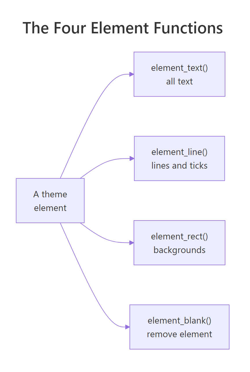
Figure 1: The four element functions and the plot parts each one styles.
Each function targets a different kind of thing. element_text() styles anything made of text. element_line() styles anything drawn as a line. element_rect() styles rectangles, which are almost always backgrounds. And element_blank() removes an element completely. Let us use each one.
We start with text. The title is a text element called plot.title, so we describe it with element_text() and set its weight, size, and colour.
Read the theme() call as a sentence: "for the plot.title element, use this text style." Inside element_text(), face = "bold" makes it bold, size = 16 sets the point size, and colour = "grey20" picks a near-black grey. The title is now heavier and darker than the default while everything else stays untouched, because we only named plot.title.
Next, lines. The grid behind the points is drawn by two elements: panel.grid.major for the main lines and panel.grid.minor for the faint ones between them. We soften the major lines with element_line() and delete the minor ones with element_blank().
element_line() takes colour and linewidth (the thickness in millimetres), so grey85 at 0.3 gives a pale, thin grid that supports the data without competing with it. element_blank() takes no arguments because its job is simply to draw nothing. The minor grid lines are gone, and the space they took is reclaimed by the panel.
Now a rectangle. The area behind the whole plot is plot.background, a rectangle we style with element_rect(). Setting fill changes its colour, and colour = NA removes the border line around it.
For a rectangle, fill is the inside colour and colour is the border. A very light grey97 gives the whole figure a soft card-like background, and colour = NA keeps it borderless. That is all four element functions: text, line, rect, and blank. Every theme you will ever write is built from these.
element_rect(fill = NA, colour = NA).Try it: Make both axis titles bold. The element that covers the x and y titles together is called axis.title.
Click to reveal solution
Explanation: axis.title covers both axis titles at once. Setting it bold once styles the x and y titles together, which is inheritance at work, the idea we cover next.
How does theme inheritance keep your code short?
You might worry that a full house style means setting a font on the title, then again on the axis text, then again on the legend, and so on for dozens of elements. It does not, because theme elements inherit from parents. Set a value once on a parent and every child picks it up unless you say otherwise.
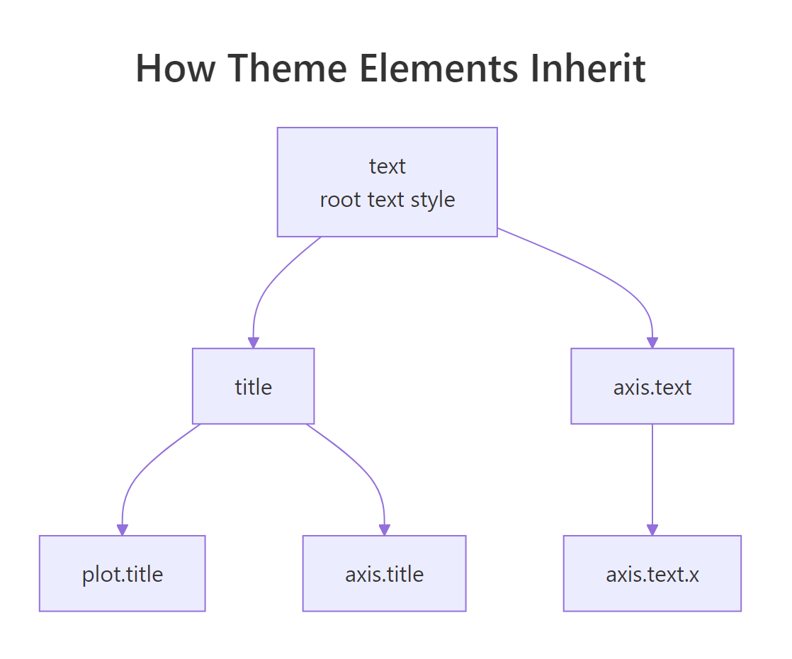
Figure 2: Theme elements inherit from a shared root, so one setting cascades to many labels.
At the top of the tree sits an element called text. It is the root style that every piece of text on the plot inherits from. We can read its defaults straight out of theme_grey().
The root text element defaults to black, with an empty family that means "use the default font." Because plot.title, axis.text, and legend.text all descend from text, changing the root changes all of them at once. Watch what happens when we set the root to navy, then override just one child back to grey.
Setting text = element_text(colour = "navy") turns the title, axis titles, and legend text navy in one line, because they all inherit from text. The second line, axis.text = element_text(colour = "grey50"), overrides just the tick labels back to grey. That is the whole model: set broad defaults high in the tree, then override the few exceptions. Your theme code stays short.
Try it: Give every label on the plot a serif font by setting the root text element. The argument for font is family, and "serif" is always available.
Click to reveal solution
Explanation: Because text is the root, one family setting flows into the title, axis labels, and legend. The safe built-in families are "sans", "serif", and "mono".
How do you turn tweaks into a reusable theme function?
So far we have added theme(...) to one plot at a time. A house style needs to be reusable: one name you can add to any chart. The answer is to wrap your tweaks in a function that returns a complete theme. Here is the pattern, and it is the heart of this tutorial.
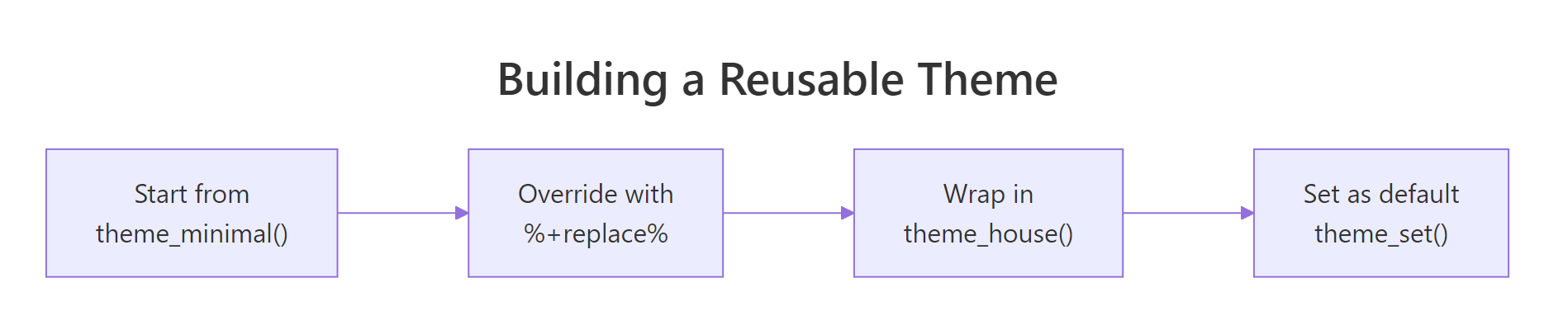
Figure 3: The four steps from a built-in theme to your own project default.
The function starts from a built-in theme so you inherit its hundred-plus sensible defaults, then replaces the handful of settings you care about. We use %+replace% to apply our overrides on top of the base theme. Two arguments make it flexible: base_size for an overall text scale, and base_family for the font.
Look at the sizes. Instead of fixed point values like size = 16, we wrote rel(1.4), which means "1.4 times the base size." Because every size is relative, the whole theme scales from the single base_size number. hjust = 0 left-aligns the title and subtitle, margin() adds breathing room, and legend.position = "top" moves the legend above the plot. The result is a clean, opinionated look you can now reuse anywhere.
The payoff of rel() shows up when you change one number. Ask for a bigger base size and the title, subtitle, axis labels, and ticks all grow together, staying in proportion.
Nothing else changed, yet every text element grew because they are all defined relative to base_size. This is why a theme built with rel() works for a slide, a report, and a thumbnail without a rewrite. You just pass a different base_size.
Two details make this a real theme rather than a loose patch, and both are worth understanding. The first is %+replace% versus +. The second is that word complete = TRUE. We can see the difference by checking a hidden flag that ggplot2 attaches to every theme.
A bare theme(...) call is a patch: it is incomplete, so ggplot2 layers it on top of whatever theme is already active. Our theme_house() is complete, so adding it replaces the active theme entirely and gives the same result on every plot. That predictability is exactly what you want from a house style.
%+replace%, writing axis.title = element_text(colour = "grey30") drops any other axis-title settings from the base theme; with +, it would keep them and change only the colour. For building a theme, %+replace% gives you cleaner, more predictable control.theme(...) without starting from a complete theme like theme_minimal(), adding your function will stack on top of the active theme instead of replacing it, and your plots will look different depending on what was set before.Try it: Copy the theme_house call and move the legend to the right side instead of the top. The setting is legend.position.
Click to reveal solution
Explanation: Because theme_house() is complete, you can still add a small theme() patch after it to tweak one plot without editing the function. This is the everyday pattern: a house theme plus the occasional one-off override.
How do you make your theme the project-wide default?
Adding + theme_house() to every plot works, but you can go one better: make it the default so every chart uses it automatically. theme_set() installs a theme as the active default for the rest of your session. It also returns the previous theme, so you can capture and restore it.
Notice the plot has no + theme_house() on it, yet it still carries the house look, because theme_set() made it the default. We saved the old default in old_theme first, then restored it at the end so the rest of this page is unaffected. In a real script you would call theme_set(theme_house()) once near the top and every plot below inherits the style.
old <- theme_set(theme_house()) stores the previous theme; calling theme_set(old) later puts everything back, which is handy in notebooks and shared sessions.There is one more piece of a true house style. Themes control the frame, but they do not set the default colour of your geoms. update_geom_defaults() does that. Here we make new points draw in a house blue by default, then restore the original so the rest of the page behaves.
Because we changed the geom default, the points came out house-blue even though we never wrote colour = "#2c7fb8" in the plot. update_geom_defaults() returns the old default, so we stored it in old_point and set it back afterwards. Pair a theme with a couple of geom defaults and your plots match your brand before you write a single aesthetic.
Try it: theme_update() patches the current default theme in place. Set theme_house() as the default, then use theme_update() to move the legend to the bottom.
Click to reveal solution
Explanation: theme_set() replaces the whole default; theme_update() changes just one part of it. Restoring old_theme at the end resets both.
How do you add house colours and fonts?
A complete house style fixes two more things: the colour palette and the font. Themes do not choose your data colours, so we handle the palette with a small helper. The cleanest approach is to store your brand colours once and wrap them in a scale function you can reuse.
We defined house_colours as a vector of five hex codes, then wrapped scale_colour_manual() in scale_colour_house() so we never retype those hex codes again. Adding both scale_colour_house() and theme_house() gives a plot that is fully on-brand: house colours for the data, house style for the frame.
If you would rather not add a scale to every plot, ggplot2 can use your palette as the global default for discrete colours through an option.
With ggplot2.discrete.colour set, the plot picked up the house palette without any scale_colour_* call. We reset the option to NULL afterwards to leave the defaults clean, but in a project script you would set it once alongside theme_set().
"sans", "serif", and "mono" that we pass through base_family.Try it: Fills need their own scale. Build scale_fill_house() the same way we built scale_colour_house(), then use it on a bar chart of drive types.
Click to reveal solution
Explanation: Colour and fill are separate aesthetics with separate scales, so a full house style usually ships both scale_colour_house() and scale_fill_house().
Complete Example
Let us put the whole workflow together. We will build a theme_report() variant for print-style reports, starting from theme_house() and replacing a couple of extra elements, then apply the one theme to two very different charts. Because both charts use the same theme, they read as a matched set.
theme_report() builds on theme_house() with %+replace%, so it inherits everything we designed earlier and only changes two things: it removes the vertical grid lines (panel.grid.major.x), which are noise on a bar chart, and it adds small x-axis ticks. The bar chart uses geom_bar(), which counts the rows in each drive category for us, so we did not have to summarise the data first.
Now the same theme_report() on a time series, using the economics dataset that ships with ggplot2. One function, a completely different chart, one consistent look.
The bar chart and the line chart share the same fonts, spacing, title style, and grid treatment because they share the same theme function. That is the entire promise of building a theme from scratch: design the look once, then apply it everywhere with a single line.
Practice Exercises
These build on theme_house, house_colours, and scale_colour_house from the tutorial, so run the earlier blocks first. Each starter block runs as written; your job is to complete the goal in the comment.
Exercise 1: Add an accent colour argument
Write theme_house_accent(base_size, accent) that starts from theme_house() and uses the accent colour for both the title text and the major grid lines. Then call it with an orange accent ("#b35806").
Click to reveal solution
Explanation: The accent argument flows into two elements at once, so one call restyles the title and grid together. Swap in any hex code to rebrand the plot instantly.
Exercise 2: Build a dark theme and set it as the default
Write theme_dark_house() using %+replace% on theme_minimal(), with a dark grey background (element_rect), light text (element_text), and faint grid lines. Set it as the default with theme_set(), draw a plot, then restore the previous default.
Click to reveal solution
Explanation: A dark theme is the same recipe with different colours: dark rectangles for the backgrounds, light text everywhere via the root text element, and brighter data colours so the points stay visible. complete = TRUE makes it a full theme you can set as the default.
Exercise 3: Assemble a brand kit
A brand kit is a theme plus a matching colour scale, used together. Combine scale_colour_house() and theme_house() on a faceted plot (one panel per drive type) so the whole small-multiple set shares your house style.
Click to reveal solution
Explanation: Faceting reuses the theme for every panel automatically, so a small-multiple chart stays perfectly consistent. Shipping the theme and the scale together is what makes a house style feel like a brand rather than a one-off plot.
Frequently Asked Questions
Why doesn't my custom theme change the plot?
The two usual causes are that you defined the function but forgot to add it to the plot with + theme_house(), or that you added a plain theme(...) patch and expected it to survive a later complete theme. Because a complete theme replaces whatever theme is active, add it once, and put any one-off theme(...) tweaks after it so they layer on top.
Should I base my theme on theme_minimal() or theme_bw()?
Either works, because %+replace% keeps every setting from the base theme that you do not override. theme_minimal() starts you from a clean, gridline-light look with no panel border; theme_bw() gives you a light border around the panel. Pick whichever is closest to the look you want so you have fewer settings to change.
What is the difference between theme_set() and theme_update()?
theme_set() replaces the entire default theme in one go, so theme_set(theme_house()) makes your whole style the default for the session. theme_update() changes only the few elements you name in the current default, leaving the rest as they are. Use theme_set() to install a theme and theme_update() for small session-wide adjustments afterward.
How do I reuse my theme across different scripts or projects?
Because theme_house() is a plain function, anything that can call a function can reuse it. For a single project, save the function (and helpers like scale_colour_house()) in one R script and source() it at the top of each analysis. To share it across many projects, put those functions in a small personal package and load it with library().
Can a theme set the colours of my points and bars?
No. A theme styles the frame around the data, never the data itself, so the colours of points and bars come from scales such as scale_colour_manual() and scale_fill_manual(), or from update_geom_defaults() for a new default geom colour. Pair your theme with a colour scale and a couple of geom defaults to get a plot that is fully on-brand.
Summary
Building a ggplot2 theme from scratch comes down to a short, repeatable recipe: start from a complete built-in theme, override the elements you care about with the four element functions, wrap it in a function that scales with base_size, and set it as your project default.
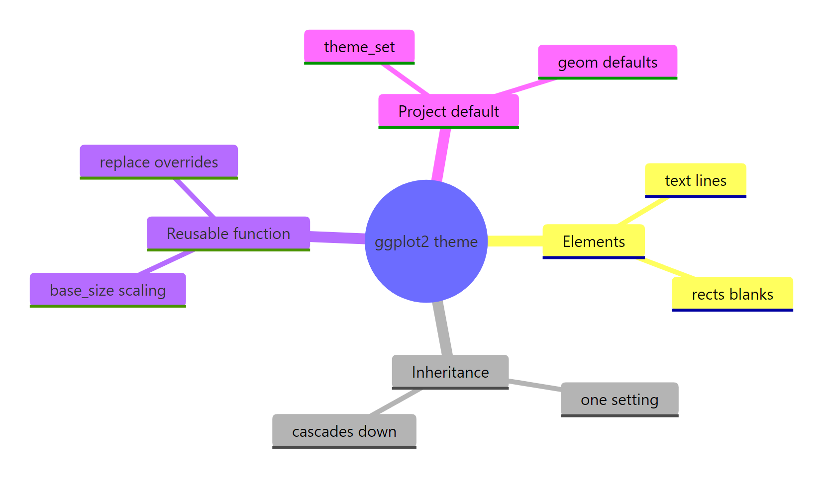
Figure 4: The pieces of a complete, reusable ggplot2 theme.
| Concept | What it does | Key call |
|---|---|---|
| Element functions | Style text, lines, and rectangles, or remove them | element_text(), element_line(), element_rect(), element_blank() |
| Inheritance | Set a value once on a parent, children follow | theme(text = element_text(...)) |
| Reusable function | Package overrides into one named style | theme_minimal() %+replace% theme(...) |
| Scalable sizing | Grow or shrink the whole theme with one number | rel() with a base_size argument |
| Complete theme | Replace the active theme instead of patching it | complete = TRUE |
| Project default | Apply your theme to every plot automatically | theme_set(), theme_update() |
| Matching colours | Fix the palette and geom defaults to your brand | scale_colour_manual(), update_geom_defaults() |
With those pieces you can turn any rough set of tweaks into a polished, reusable house style that keeps every chart in a report, a slide deck, or a package looking like it belongs together.
References
- ggplot2 documentation. Modify components of a theme (theme). Link
- ggplot2 documentation. Complete themes (theme_grey, theme_minimal, and friends). Link
- ggplot2 documentation. Theme elements (element_text, element_line, element_rect, element_blank). Link
- ggplot2 documentation. Get, set, and modify the active theme (theme_set, theme_update). Link
- ggplot2 documentation. Modify geom and stat defaults (update_geom_defaults). Link
- Wickham, H., Navarro, D., and Pedersen, T. L. ggplot2: Elegant Graphics for Data Analysis (3e), Chapter 17: Themes. Link
- tidyverse blog. ggplot2 styling. Posit (2025). Link
Continue Learning
- ggplot2 Themes: From theme_classic to Your Own Custom House Style - the reference companion to this build, covering built-in themes and legend control in depth.
- ggplot2 Colours - choose and design the palettes your house style will use.
- Custom Fonts in R Plots - install and register real typefaces so your theme can use a branded font.