Chart Annotation in R: Arrows, Highlights, Direct Labels
Chart annotation means adding your own marks to a plot, text, arrows, shaded areas, and direct labels, so the reader sees the point instantly instead of decoding it. In R you do this by stacking annotation layers onto a ggplot2 chart. This guide covers the three that carry the most weight: arrows that point at a spot, shaded highlights that emphasise a whole region, and labels placed right on the lines.
This tutorial uses ggplot2 (part of the tidyverse) with two datasets that ship with R: economics, a monthly record of the US economy, and Orange, the growth of five orange trees. Every code block runs directly in your browser, so edit any line and re-run it to watch the chart change.
What does it mean to annotate a chart?
A plain chart shows the data but not the story. It is a faithful record of every number, yet it leaves the reader to hunt for the one moment that matters. Annotation is how you do that hunting for them: you add a mark, a word, or an arrow that says "look here." Before we add anything, we need a chart to annotate, so let us build one.
We will plot US unemployment over time. The economics dataset has one row per month, and the unemploy column counts the unemployed in thousands.
The head() call confirms the shape of the data: a date column and, on the far right, unemploy. We saved the chart to a variable called p so we can reuse it in every later block without retyping it. Printing p draws a single grey line that climbs and dips across five decades. It is honest, but it does not tell you where to look.
To fix that, you add annotation layers. Here is the idea that trips up almost every beginner, so let us settle it first. There are two ways to put a mark on a ggplot chart, and they behave very differently.
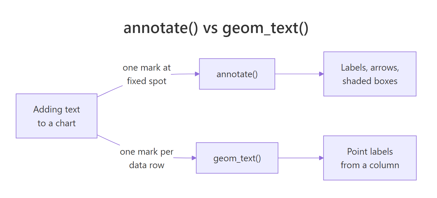
Figure 1: annotate() draws one mark at coordinates you type; geom_text() draws one mark per data row.
The right-hand path is annotate(). You hand it literal coordinates and it draws exactly one mark there, no data involved. That is what you want for a caption, an arrow, or a shaded box. Let us drop a single label onto the chart.
The first argument, "text", tells annotate() which kind of mark to draw. The x and y set where it goes, in the same units as the axes, so x is a date and y is a count. Because you typed the coordinates yourself, you get precisely one label, sitting where you asked.
Now the left-hand path, and the trap. geom_text() reads a data column and draws one mark for every row it finds. That is perfect when you genuinely want to label many points, but our data has far more rows than you would ever want as text.
aes(label = ...) where you wanted annotate() with a literal string.Just how many marks would that be on this chart? Count the rows.
If you had written geom_text(aes(label = unemploy)), ggplot2 would have stamped all 574 values onto the line, one per month, in an unreadable smear. For a caption or a single call-out, annotate() is the tool. Reserve the geoms for when the labels really do come from the data, one per point.
annotate() whenever the mark is something you are adding by hand at a fixed spot, and reach for a geom only when every row should get its own mark.Try it: Add a single text label reading "Great Recession" near the tall spike on the right, around the year 2010. Pick an x date and a y height that sit just above the peak.
Click to reveal solution
Explanation: annotate("text", ...) places the string once, at the date and height you name. Nudge y up or down until the label clears the line.
How do you point at features with arrows and curves?
A floating label leaves a small doubt: which point does it describe? An arrow removes that doubt by physically connecting the words to the spot. In ggplot2 you draw an arrow by adding a line annotation (a segment or a curve) and giving it an arrowhead. First, let us find the exact point we want to aim at: the single highest unemployment month on record.
which.max() returns the position of the largest value in unemploy, and we use it to pull out that whole row. The peak was October 2009, with 15,352 thousand people out of work. Now we have a target to point at. We draw a straight arrow from a caption to that point using annotate("segment", ...) with an arrow().
A segment needs four coordinates: x and y are where the line starts (near the caption), and xend and yend are where it ends (just above the peak, which is why we add 200 to peak$unemploy so the head does not cover the line). The arrow = arrow(...) part is what turns a plain segment into an arrow. That arrow() helper is worth understanding on its own, because its four arguments control exactly how the head looks.
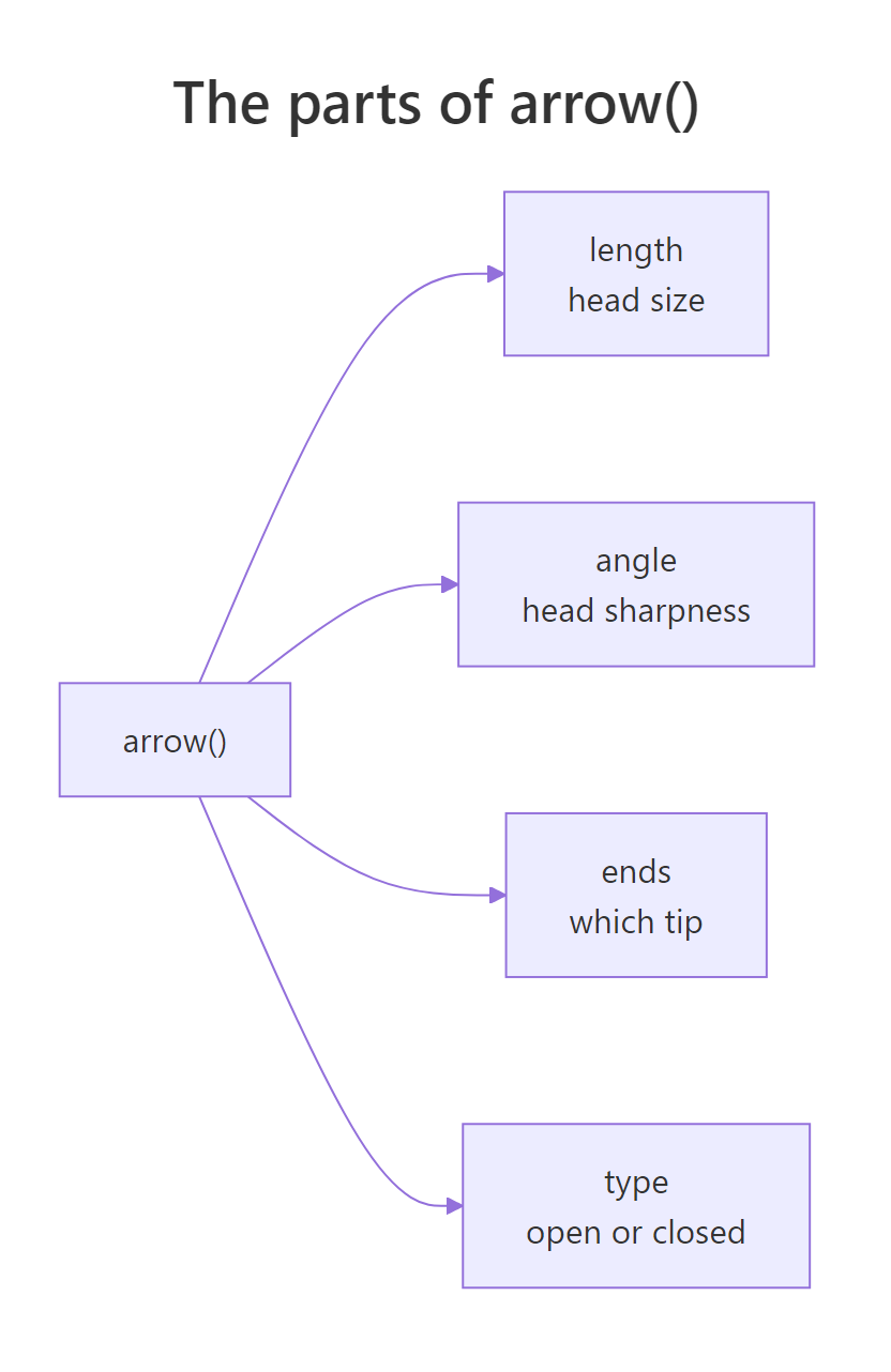
Figure 2: The four arguments of arrow() that shape an arrowhead.
Read the diagram left to right. length sets how big the head is, given as a physical size with unit() (millimetres here) rather than data units, so it stays the same on any axis. angle sets how sharp the head is. ends chooses which tip gets a head, "last", "first", or "both". And type is either "open" (two strokes) or "closed" (a filled triangle). A straight arrow is not always the cleanest option, though. When a caption sits off to the side, a gentle curve looks more deliberate. Swap "segment" for "curve" and add a curvature.
The curve annotation takes the same start and end coordinates as a segment, plus curvature to bend it. A positive value bows the line one way, a negative value the other, and 0 gives you a straight segment again. Here -0.3 arcs the arrow up and over toward the early-1980s bump, so the eye follows the curve straight to the point.
arrow(length = unit(3, "mm")) is measured in millimetres, the head keeps its size no matter how you zoom the axes, and a filled type = "closed" head reads far more clearly than open strokes at small sizes.Try it: Take the curved-arrow code and flip the bend. Change curvature = -0.3 to a positive value and watch the arc swing the other way.
Click to reveal solution
Explanation: The sign of curvature sets the direction of the bend; its size sets how deep the arc is. A positive value bows the arrow the opposite way from a negative one.
How do you highlight a region or a data subset?
Arrows point at a single spot, but sometimes the thing worth noticing is a whole stretch of the chart: a period, a threshold, a group. Highlighting handles that. The trick behind every highlight is the same: make the important part stand out by letting everything else recede. There are three everyday ways to do it, and the diagram lays them out.
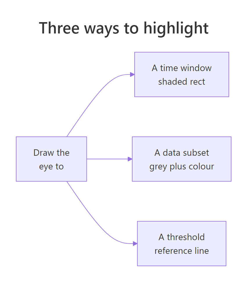
Figure 3: Three ways to draw the reader's eye: a shaded window, a recoloured subset, a reference line.
Start with the shaded window. To mark a time period, you draw a translucent rectangle behind the line with annotate("rect", ...). The key is setting the rectangle's top and bottom to -Inf and Inf, which means "as low and as high as the panel goes," so the band spans the full height no matter what the y-axis does.
The rectangle spans the recession dates on the x-axis and the whole panel vertically. The alpha = 0.15 keeps it faint, a wash of colour rather than a block, so the line still reads clearly through it. The \n inside the label breaks the text onto two lines. Next, a reference line. A horizontal line marks a threshold the reader can measure against, such as the long-run average, and geom_hline() draws one at a y-value you supply.
We compute the mean into avg, pass it to geom_hline() as the yintercept, and dash the line so it reads as a guide rather than data. The label uses hjust = 0 to left-align its text at the starting x-position. Now every peak and dip is instantly readable as "above or below normal." The third technique is the most useful and the most overlooked: emphasise a subset of the data itself. You draw the whole series in grey, then draw just the part you care about again, in a bold colour, on top.
The base plot p already draws the full line in grey. We then add a second geom_line() that reads only the recession rows and paints them thick and red. Because layers stack in order, the red segment lands on top of the grey line, and the eye goes straight to it. This "grey everything, recolour one" move works on any chart type, points, bars, or lines, and needs no extra package. If you use it often on grouped charts, the gghighlight package wraps the same idea into a single gghighlight(condition) line you can run in a local R session, but the manual version here always works.
Try it: Shade the early-1980s recession instead. Change the annotate("rect") dates to span roughly July 1981 to November 1982.
Click to reveal solution
Explanation: Only xmin and xmax change to move the band along the timeline; ymin = -Inf and ymax = Inf keep it spanning the full panel height.
How do you label lines directly instead of using a legend?
When a chart has several lines, the usual answer is a colour legend off to the side. But a legend forces the reader to bounce back and forth, matching colours to names. A direct label puts the name right on the line, so there is nothing to match. Let us see the problem first with a multi-line chart. The Orange dataset tracks the trunk size of five trees as they age.
Mapping colour = Tree gives each tree its own coloured line and adds a legend on the right. The chart works, but to know which line is Tree 4 you must look away from the data and over to the key. We can do better by labelling each line at its end. First we need the position of each line's final point: the row with the largest age for every tree.
We group the data by tree, keep only the row with the maximum age in each group with slice_max(), and land on one end point per tree. Now we place a label at each of those points with geom_text() and switch the legend off, since the labels replace it.
The geom_text() reads the five-row ends table, so it draws exactly five labels, one at each line's tip. hjust = 0 left-aligns them and nudge_x = 30 pushes them just past the line, while widening the x-axis to 1750 makes room. Look closely, though: the labels for Tree 3 and Tree 1 sit almost on top of each other, because their final circumferences (140 and 145) are nearly equal.
size = 5 label is large, not tiny, because ggplot2 measures text in millimetres, not points; and if a label sits beyond the plotting area it silently disappears, which is why we widen the x-axis with scale_x_continuous() to make room.That collision between the Tree 1 and Tree 3 labels is exactly what the ggrepel package solves. It nudges labels apart automatically and draws a tiny connector back to each point.
geom_text_repel() is a drop-in replacement for geom_text() that adds one rule: no two labels may overlap. Setting direction = "y" lets it move labels only up and down, keeping them lined up at the right edge, and segment.colour = "grey70" draws the faint leader line back to each tree's endpoint. The Tree 1 and Tree 3 labels now separate cleanly, and the legend is gone for good. Two helper packages go further if you reach for them: directlabels drops a label at each line's end with geom_dl(aes(label = Tree), method = "last.points"), and geomtextpath runs the label along the line itself with geom_textline(), both in a local R session.
Try it: Swap geom_text_repel() for geom_label_repel(), which draws each label inside a small filled box. Everything else stays the same.
Click to reveal solution
Explanation: geom_label_repel() works exactly like geom_text_repel() but wraps each label in a rounded, filled rectangle, which helps the text stand out against busy lines.
A complete annotated chart, start to finish
Each technique is useful alone, but the payoff comes from combining them into one chart that tells a full story. Let us return to the unemployment line and layer everything we have learned: shade the Great Recession, recolour that stretch of the line, mark the long-run average, and point an arrow at the all-time peak, all on a clean theme.
Read the layers in order and you can see the story assemble: the grey line gives context, the shaded band and red overlay isolate the crisis, the dashed line sets a baseline, and the arrow with its boxed caption names the worst month. The reader gets the message before reading a single axis tick. Notice we reused peak and avg from earlier blocks, since the browser keeps every variable alive as you go.
Practice Exercises
These combine several techniques from the tutorial. Use fresh variable names (they start with my_) so your work does not overwrite the tutorial's variables.
Exercise 1: Mark an event with a vertical reference line
On the unemployment chart, add a dashed vertical line at December 2008 with geom_vline(), then add an annotate("text") label naming it "Crisis deepens". A vertical line uses xintercept, and for a date axis that intercept must be a real date.
Click to reveal solution
Explanation: geom_vline() draws the line at a date xintercept, and the text label is rotated with angle = 90 so it reads neatly alongside the vertical line.
Exercise 2: Spotlight a single tree
On the Orange chart, highlight only Tree 4 (the largest) using the grey-then-recolour pattern, then direct-label just that tree's endpoint with ggrepel. Draw all five trees in grey first, then Tree 4 in a bold colour, and turn the legend off.
Click to reveal solution
Explanation: The base layer draws every tree grey; a second geom_line() repaints only Tree 4 in red; and a single repelled label names that endpoint. Emphasis comes from muting the other four lines, not from decorating Tree 4.
Frequently asked questions
When should I use annotate() instead of geom_text()?
Use annotate() when you are adding a fixed mark by hand: one caption, one arrow, or one shaded box at coordinates you type. Reach for a geom like geom_text() only when every row of a data frame should get its own mark, such as labelling each point in a small table. Mapping a label to a data column that has hundreds of rows stamps hundreds of overlapping labels, which is the single most common annotation mistake.
How do I stop ggplot2 labels from overlapping?
Load the ggrepel package and swap geom_text() for geom_text_repel() (or geom_label() for geom_label_repel()). It nudges every label until none overlap and draws a thin connector line back to each point. Setting direction = "y" restricts the movement to up and down, which keeps end-of-line labels aligned at the right edge.
Why do my text labels get cut off at the edge of the chart?
A label whose position falls outside the plotting area is clipped without any warning, so it simply disappears. Make room by widening the axis with scale_x_continuous(limits = ...) (or scale_y_continuous()), or pull the label inward with nudge_x and hjust. This is why the direct-label examples above extend the x-axis before placing labels past the line ends.
Do I need an extra package to annotate a chart in R?
No. Text, arrows, curves, shaded rectangles, and reference lines all come from ggplot2 itself through annotate(), geom_hline(), and geom_vline(). You only reach for a helper package when you want automatic label placement (ggrepel) or a one-line highlight shortcut (gghighlight); everything else is plain ggplot2.
How do I shade a date range on a time-series chart?
Add annotate("rect", ...) with xmin and xmax set to the start and end dates, and ymin = -Inf, ymax = Inf so the band fills the full panel height whatever the y-axis shows. Keep alpha low, around 0.15, so the shaded window sits behind the line as a faint wash rather than covering it.
Summary
Chart annotation is the difference between a chart that stores data and one that delivers a message. The toolkit sorts into a few clear jobs, each with a go-to function.
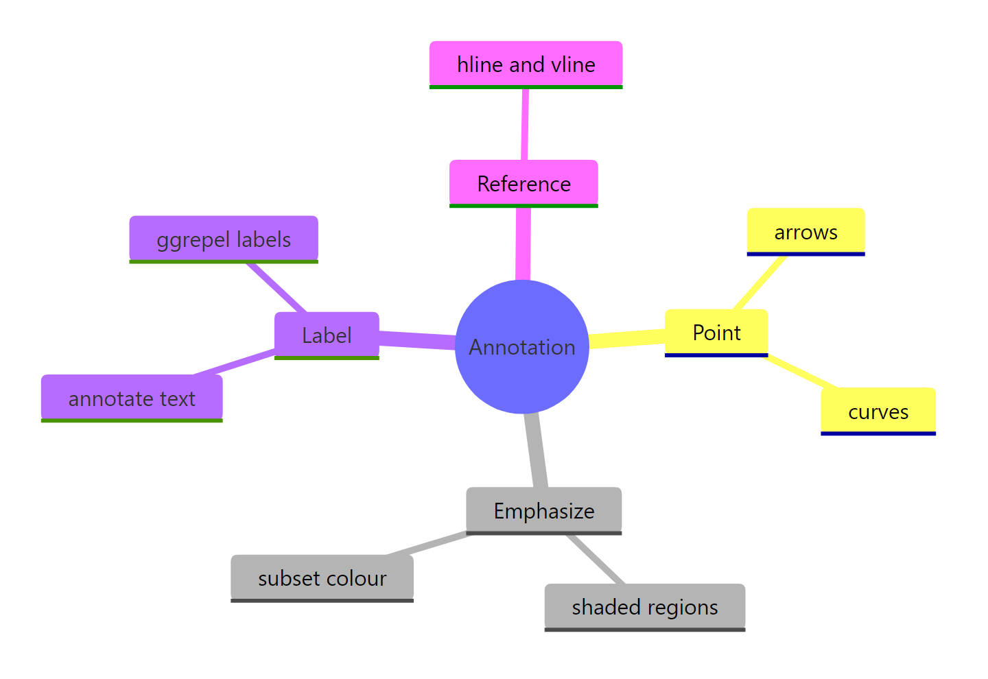
Figure 4: The chart-annotation toolkit at a glance.
| Job | Technique | Key function |
|---|---|---|
| Add one caption | Text at fixed coordinates | annotate("text", ...) |
| Point at a feature | Segment or curve with an arrowhead | annotate("segment"/"curve", arrow = arrow()) |
| Shade a period | Full-height translucent rectangle | annotate("rect", ymin = -Inf, ymax = Inf) |
| Mark a threshold | Reference line | geom_hline(), geom_vline() |
| Emphasise a subset | Grey base, recolour on top | second geom_line() on a subset |
| Name lines directly | Labels at line ends, no overlaps | ggrepel::geom_text_repel() |
The through-line across all of them is the same: emphasis is de-emphasis. Every technique here works by making one thing louder and everything else quieter, whether through colour, weight, or a pointing arrow. Add marks sparingly, aim each one at a real question the reader has, and a plain chart becomes a clear argument.
References
- Wickham, H., Navarro, D., Pedersen, T. L. - ggplot2: Elegant Graphics for Data Analysis (3e), Chapter 8: Annotations. Link
- ggplot2 documentation -
annotate()reference. Link - ggplot2 documentation -
geom_segment()andarrow(). Link - ggrepel documentation - repelling text labels. Link
- gghighlight documentation - highlight lines and points. Link
- R Graph Gallery - How to annotate a plot in ggplot2. Link
- Wickham, H., Cetinkaya-Rundel, M., Grolemund, G. - R for Data Science (2e), Communication. Link
Continue Learning
- ggplot2 Labels and Annotations, Done Cleanly - manage titles, axis labels, and captions with
labs()so your chart's text stays uncluttered. - Build a Complete ggplot2 Theme from Scratch - style the non-data layer (fonts, grids, backgrounds) into a reusable house style.
- ggplot2 annotate() in R: Add Text, Lines, and Shapes - a focused reference on the
annotate()function and its five common patterns.