Pie Charts and Polar Coordinates in ggplot2: When and How
A pie chart in ggplot2 is a stacked bar chart bent into a circle. You build a single-bar geom_col() chart, then call coord_polar(theta = "y") to wrap the bar around a full turn, so each category becomes a wedge sized by its share of the whole.
That one idea is the whole trick, and once it clicks, everything else (percentage labels, donut holes, color palettes) is just an ordinary bar-chart option. We will build every plot with ggplot2 and lean on a little dplyr for the percentage math. You can run every block right here in your browser, so change a number, re-run, and watch the wedges move.
How does coord_polar() turn a bar chart into a pie?
ggplot2 has no geom_pie(), and it does not need one. A pie is what you get when you take one tall stacked bar and wrap its height around a circle. Let's build some data, draw the bar, then bend it.
We will use a small table of coffee shop revenue by product. Four categories is a comfortable number for a pie, which we will justify later. Run this first block to load the tools and see the raw numbers.
That printed the data frame: four products and their revenue in thousands of dollars. Latte is the biggest earner at 240, Tea the smallest at 60. Those four numbers are all a pie chart shows, just wrapped into a circle.
Before we make the circle, let's draw the shape that becomes the pie: a single stacked bar. We map every row to the same empty x position (x = ""), stack the revenues on the y axis, and color each segment by product. The result is one column split into four colored blocks.
Run that and you get a single tall bar. Its total height is 600 (the sum of all revenue), and it is divided into four segments whose heights match each product's value. The color = "white" argument draws thin white borders between segments, and width = 1 makes the bar fill the full plotting width so there are no gaps when we bend it.
Now for the payoff. We take that exact same bar and add one line: coord_polar(theta = "y"). This tells ggplot2 to treat the y axis as an angle instead of a height, so the bar's stacked segments sweep around a circle. We also add theme_void() to strip away the axes and gridlines, which belong on a bar chart but look like clutter on a pie.
Run it and the tall bar curls into a pie. Each segment's height became a wedge angle: Latte's 240 out of 600 sweeps through 40 percent of the circle, Tea's 60 sweeps through just 10 percent. Nothing about the data or the bars changed. We only changed the coordinate system the bars are drawn in.
theme_void() clears all of that so only the wedges and legend remain.The diagram below shows the same idea in miniature. One stacked bar is the raw material, and the choice you make in coord_polar() decides which circular chart it becomes.
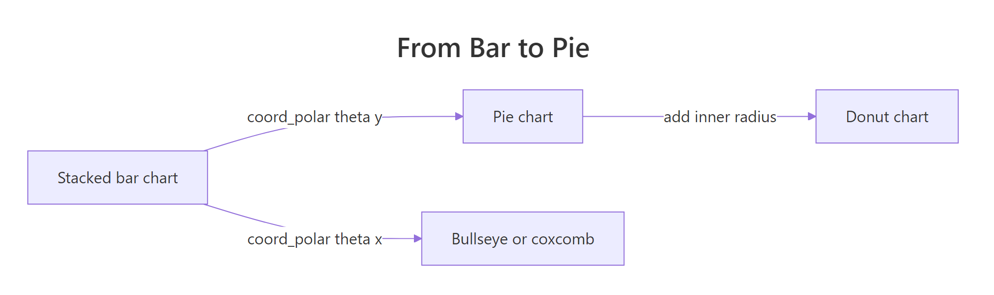
Figure 1: coord_polar bends one stacked bar into a pie, a bullseye, or a donut.
Try it: Take the pie above and rotate it so the slices start from the 3 o'clock position instead of 12 o'clock. The coord_polar() function has a start argument measured in radians, and a quarter turn is pi / 2.
Click to reveal solution
Explanation: start shifts the 12 o'clock origin by the given number of radians. A value of pi / 2 is a quarter turn, so the first wedge now begins at the 3 o'clock mark.
How do I add percentage labels to a ggplot2 pie chart?
A pie without labels forces the reader to eyeball each wedge. Adding the percentage inside each slice is the single most common request, and it trips up a lot of people because the label has to land in the middle of the correct wedge. The clean way is to compute the shares first, then let ggplot2 place the text.
Let's calculate each product's share of total revenue. We use dplyr's mutate() to add two columns: share (the fraction of the total) and label (that fraction formatted as a percent with scales::percent(); the scales:: prefix calls a function straight from the scales package without a separate library() line). The |> between sales and mutate() is R's pipe: it takes the value on its left and feeds it in as the first argument on its right, so sales |> mutate(...) is the same as mutate(sales, ...), just read left to right. Printing the table lets us check the math before we plot.
The shares read cleanly: Espresso 30 percent, Latte 40 percent, Cappuccino 20 percent, Tea 10 percent. They sum to 100, which is exactly what a part-to-whole chart should do. Now we drop those percent labels onto the pie.
We add a geom_text() layer with the same fill mapping as the bars, and we position each label with position_stack(vjust = 0.5). The position_stack() helper stacks the labels the same way the segments are stacked, and vjust = 0.5 nudges each one to the vertical middle of its slice.
Run it and each wedge now carries its percentage, centered in the slice. Because the label text is computed from the same revenue column that sizes the bars, every number lands on the wedge it describes, no manual angle math required.
geom_text() layer must use the same width = 1, the same fill mapping, and position_stack(vjust = 0.5). Drop any of those and your labels drift off their slices or bunch up at the center.Try it: Change the labels so each slice shows the raw revenue number (like 240) instead of a percentage.
Click to reveal solution
Explanation: The label aesthetic accepts any column. Map it to revenue and each wedge shows its dollar value instead of its share.
How do I make a donut chart in ggplot2?
A donut chart is a pie with a hole punched in the middle. That empty center is useful: it gives you a place to print a total or a headline number, and many people find the ring easier on the eye than a solid disc. There are two ways to make one, an old trick that works everywhere and a newer function that is cleaner.
The classic trick uses the x axis, which we have not touched so far. Instead of x = "", we set x = 2, which pushes all the bars out to a fixed radius. Then xlim(0.5, 2.5) reserves empty space from radius 0.5 down to the center, and that reserved space becomes the hole.
Run it and the pie now has a clean hole in the middle. The wedge angles are identical to the pie, because theta = "y" still controls the angles. All we changed is where the bars sit along the radius, leaving the center empty.
Since ggplot2 3.5.0 there is a purpose-built function, coord_radial(), that makes a donut without the xlim sleight of hand. It takes an inner.radius argument between 0 and 1 that sets the hole size directly. Here 0.4 means the inner 40 percent of the radius is empty.
Run it and you get the same ring, but now the code states its intent directly: this is a radial plot with a 40 percent hole. No fixed x value, no xlim range to reason about.
packageVersion("ggplot2"). The xlim trick in the previous block works on every version, so reach for it if you need to support older setups.Try it: Make the donut hole bigger. Set inner.radius to 0.6 and see how much extra center space opens up.
Click to reveal solution
Explanation: inner.radius scales from 0 (a full pie) to nearly 1 (a thin ring). At 0.6 the inner 60 percent of the radius is hollow, leaving a slim band of wedges.
When should you use a pie chart instead of a bar chart?
Now the harder half of the title: when. Pie charts have a real weakness. People are good at comparing lengths but poor at comparing angles and areas, which is exactly what a pie asks them to do. The official ggplot2 documentation is blunt about it and tells you to use polar coordinates "with extreme caution." So when is a pie the right call?
A pie earns its place when three things are true: you are showing parts of a single whole, you have only a handful of categories (roughly five or fewer), and a rough sense of proportion is enough. "About half the revenue is Latte" is a job a pie does well. The moment you need the reader to rank close values or compare across several groups, a pie starts to fail.
The decision path below sums it up. Most of the time it points you at a bar chart, and that is the honest answer.
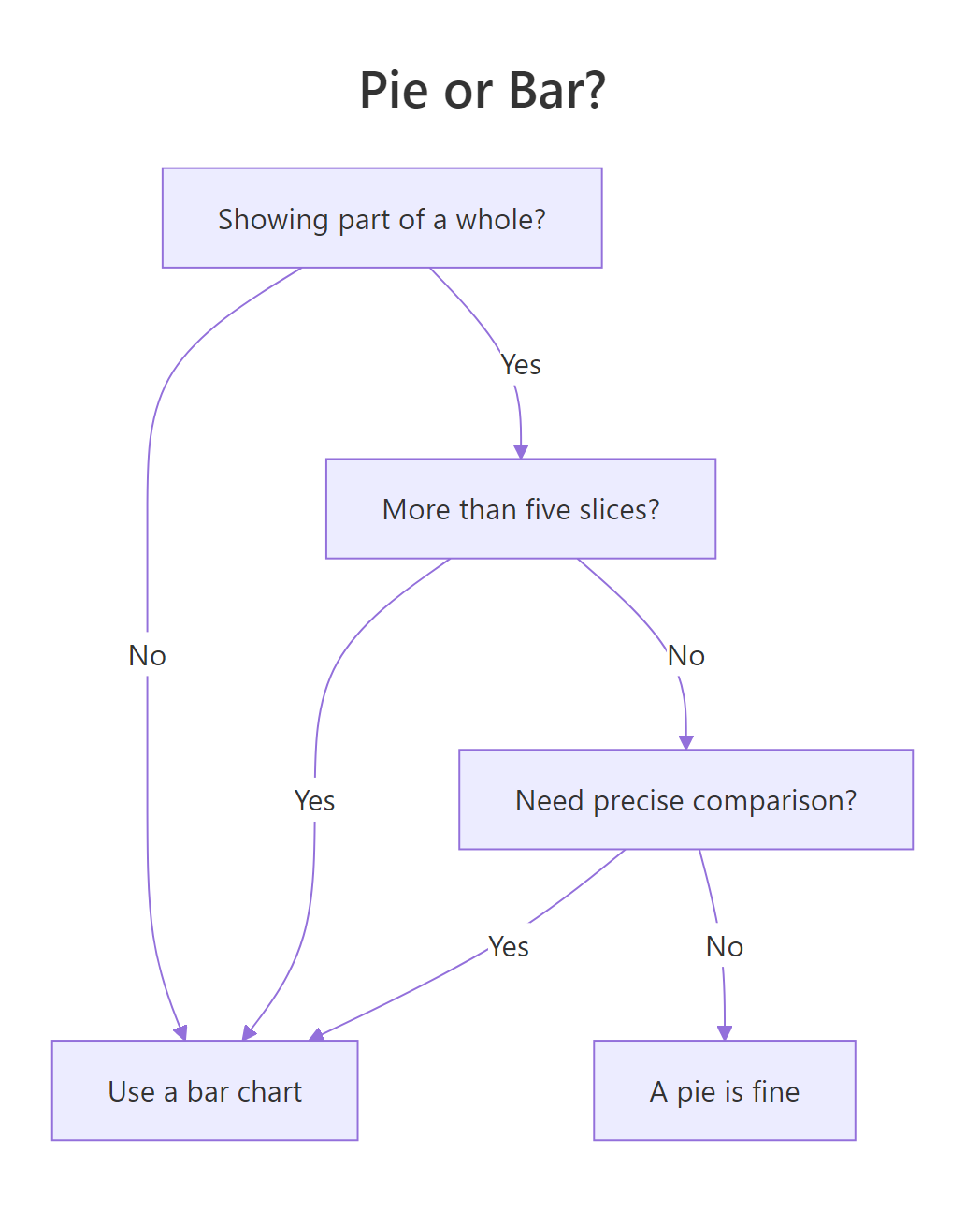
Figure 2: A quick decision path for choosing a pie chart or a bar chart.
To see why a bar chart is often the safer choice, here is the same coffee data as a horizontal bar chart. We map product to x, add value labels with geom_text(), and flip the chart sideways with coord_flip() so the product names are easy to read.
Run it and notice how much faster you can rank the products. On the pie you had to judge wedge angles; here you just compare bar lengths against a shared baseline. That baseline is the whole advantage. Every bar starts at zero, so equal differences look equal everywhere on the chart.
Try it: The bar chart above lists products in their original order. Sort it so the largest bar sits at the top. Wrap the product mapping in reorder(product, revenue).
Click to reveal solution
Explanation: reorder(product, revenue) sorts the product factor by revenue. After coord_flip(), the largest value ends up at the top of the chart.
What else can coord_polar() and coord_radial() do?
A pie is only one thing you can do by wrapping an axis. The choice of which axis to wrap, the theta argument, opens up a small family of circular charts. So far we always used theta = "y", which wraps the value axis and gives a pie. Switch to theta = "x" and you wrap the category axis instead, which spreads the categories around the circle and lets each bar grow outward.
That switch turns a grouped bar chart into a wind rose, also called a coxcomb, the style Florence Nightingale famously used. Each category gets an equal angular slice, and the bar's length becomes its distance from the center.
Run it and the four products fan out around the circle, each as a petal whose length shows its revenue. This is the same geom_col() as our pie, only now the angle encodes the category and the radius encodes the value, the exact opposite of a pie.
theta = "y" wraps the value axis and gives a pie, while theta = "x" wraps the category axis and gives a wind rose. One argument decides which kind of circular chart you get.The newer coord_radial() can also draw a partial circle, which is handy for gauge-style charts. Setting start and end to different radian values sweeps the plot through only part of a full turn. Here we sweep from -pi/2 to pi/2, a half circle, and keep a small hole with inner.radius.
Run it and the wedges fill a half-moon rather than a full disc. Partial polar plots like this are useful for dashboard gauges where a semicircle reads more like a dial than a pie does.
Try it: Turn a plain bar chart into a wind rose yourself. Start from a bar chart of the sales data and add coord_polar(theta = "x").
Click to reveal solution
Explanation: With theta = "x" the category axis wraps around the circle, so each product becomes an equal-angle petal whose length is its revenue.
Complete Example: a labeled donut from raw order data
Let's tie the pieces together on data that looks more like the real world. Instead of pre-summarized revenue, we start with a raw list of individual orders and build a finished, labeled donut from scratch.
First we count how often each drink was ordered. The table() function tallies the vector, and we reshape the result into a tidy data frame. Then we add the share and a percent label, just as before. We round the percentages to whole numbers for a clean look.
The table shows twelve orders split across four drinks, with Latte leading at 42 percent. One honest wrinkle: the rounded labels read 17, 25, 42, and 17, which add up to 101 rather than 100. That is normal rounding, and it is worth knowing so a stray extra percent never surprises you.
Now we build the donut. We combine the xlim hole trick, the percentage labels centered with position_stack(), and an annotate() call that drops the total order count into the empty center.
Run it and you get a polished donut: labeled wedges around the ring, and "12 orders" printed in the hole. Every technique from this tutorial is in that one chart, the bar-to-pie bend, the hole, the centered labels, and the center annotation.
Practice Exercises
These exercises combine several ideas from the tutorial. They run in the same session as the code above, so they use fresh variable names to avoid clobbering anything. Try each one before opening the solution.
Exercise 1: Label a survey pie
You are given a survey data frame of favorite tools. Build a pie chart with each slice labeled by its percentage, centered in the wedge.
Click to reveal solution
Explanation: This is the labeled-pie recipe applied to new data. The geom_col() plus coord_polar(theta = "y") pair makes the pie, and the geom_text() layer with position_stack(vjust = 0.5) centers each percentage in its slice.
Exercise 2: A donut with a center total
Using the same survey data, build a donut chart with coord_radial() and print the total number of users in the hole.
Click to reveal solution
Explanation: coord_radial(inner.radius = 0.5) opens a hole across the inner half of the radius, and the annotate() call places the total, 100 users, at the center point.
Exercise 3: Pick the right chart for many categories
You have sales across seven regions. A pie would crowd seven thin slices, so make the choice the decision tree recommends and build a sorted horizontal bar chart instead.
Click to reveal solution
Explanation: Seven categories are too many for a readable pie. A bar chart, sorted with reorder(region, sales) and flipped with coord_flip(), lets the reader rank all seven regions at a glance against a shared zero baseline.
Frequently Asked Questions
Why did my pie chart come out as a single tall bar instead of a circle? The bar only becomes a pie once you add coord_polar(theta = "y"). If you leave that line out, or if you set a real x value instead of x = "", ggplot2 draws the plain stacked bar it started from. Check that both the empty x = "" mapping and the coord_polar(theta = "y") line are present.
How do I change the colors of a ggplot2 pie chart? The wedges are colored by the fill scale, so add a fill scale layer to any chart in this tutorial. scale_fill_brewer(palette = "Set2") applies a ready-made palette, and scale_fill_manual(values = c("Espresso" = "#8c510a", "Latte" = "#d8b365")) lets you set one color per category by name. Because a pie is a filled bar chart, every fill option you know from bar charts works here unchanged.
How do I control the order of the pie slices? The wedges follow the factor order of the category column, so reorder that column before you plot. Wrapping the mapping in reorder(product, revenue), or setting explicit levels with factor(product, levels = c(...)), changes the order the slices are drawn in. This is the same reorder() step used for the sorted bar chart earlier.
Should I use base R's pie() function instead? Base R ships a built-in pie() that is quicker for a throwaway chart. It does not share the ggplot2 grammar, though, so you cannot reuse the themes and scales you built for your other charts. If your project already uses ggplot2, build the pie from geom_col() so it matches the rest of your work.
Summary
A pie chart in ggplot2 is a stacked bar chart in polar coordinates. Master that one idea and every option follows from ordinary bar-chart knowledge.
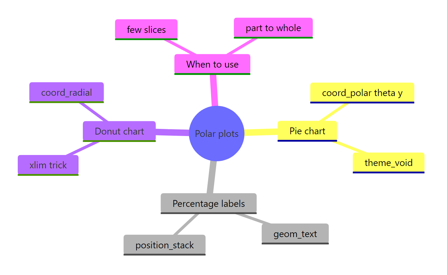
Figure 3: The main moving parts of polar plots in ggplot2.
| Task | How to do it |
|---|---|
| Make a pie | geom_col() plus coord_polar(theta = "y") |
| Clean it up | Add theme_void() to remove axes and grid |
| Add percent labels | geom_text() with position_stack(vjust = 0.5) |
| Make a donut (any version) | Set x = 2 and add xlim(0.5, 2.5) |
| Make a donut (3.5.0+) | coord_radial(theta = "y", inner.radius = 0.4) |
| Make a wind rose | coord_polar(theta = "x") on a bar chart |
| Choose wisely | Prefer a bar chart unless you have a few parts of one whole |
The honest takeaway on "when": pies work for a quick part-to-whole glance across a few categories, but people read lengths more accurately than angles, so a sorted bar chart is the safer default for anything precise or crowded.
References
- ggplot2 - Polar coordinates (coord_polar) reference. Link
- Tidyverse blog - ggplot2 3.5.0: Introducing coord_radial(). Link
- ggplot2 - coord_radial reference. Link
- R Graph Gallery - Pie chart with ggplot2. Link
- Wickham, H., Cetinkaya-Rundel, M., Grolemund, G. - R for Data Science, 2nd Edition. Chapter on data visualization. Link
- scales package - label formatting (percent, comma). Link
Continue Learning
- Position Adjustments in ggplot2: Stack, Dodge, Jitter, Fill - a deeper look at
position_stack()and its siblings, the same helpers that place your pie labels. - Text Labels in ggplot2: geom_text, geom_label and ggrepel - more ways to add and position labels, including how to keep them from overlapping.
- Build a Complete ggplot2 Theme from Scratch - go beyond
theme_void()and design a reusable look for all your charts.